✅ Week 08 - Lab Solutions
Clustering using k-means and dbscan
This solution file follows the format of a Jupyter Notebook file .ipynb you had to fill in during the lab session.
⚙️ Setup
Downloading the student solutions
Click on the below button to download the student notebook.
Loading libraries
import numpy as np
import pandas as pd
from sklearn.cluster import KMeans, DBSCAN
from sklearn.preprocessing import StandardScaler
from sklearn.pipeline import Pipeline
from umap import UMAP
from lets_plot import *
LetsPlot.setup_html()
Employing k-means on a two-dimensional customer segmentation data set (30 minutes)
We will create a data frame object named customers that has two features
incomeshows income of customers in thousands of USDspending_scoreprovides a 0-100 index that compares spending amongst customers
# Open the data set, and select only the variables needed for the analysis
customers = pd.read_csv("../data/customers-data.csv").filter(items=["income","spending_score"])
Let’s plot the correlation between both variables using a scatter plot.
(
  ggplot(customers, aes("income", "spending_score")) +
  geom_point() +
  theme_minimal() +
  theme(panel_grid_minor = element_blank()) +
  labs(x = "Income", y = "Spending score")
)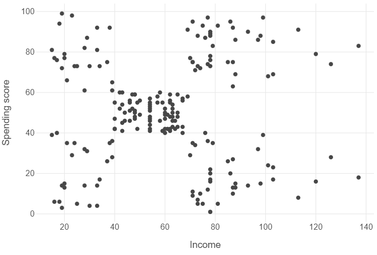
Looking at the graph, we can see that there are distinct segments of customers organised into somewhat distinct clusters.
🗣️ CLASSROOM DISCUSSION:
How many clusters do you see? Can you describe intuitively what each cluster represents?
Intuitively, we could point to around 5 clusters, though we can also see that some clusters are more tightly integrated than others.
- Low income, low spending score
- Low income, high spending score
- Middling income, middling spending score
- High income, low spending score
- High income, high spending score
Implementing k-means clustering
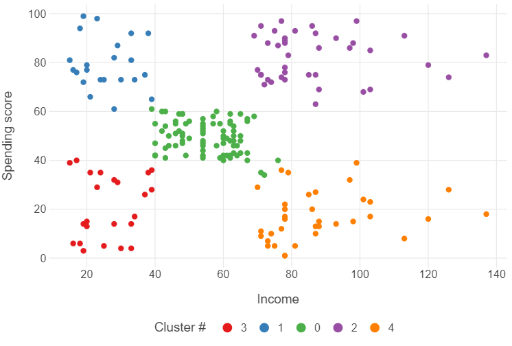
Implementing k-means clustering in Python is fairly straightforward. We build a pipeline that standardises the data and instantiates a k-means model with 5 clusters. We then fit this pipeline to customers.
# Instantiate a model
pipe = Pipeline([("scaler", StandardScaler()), ("kmeans", KMeans(n_clusters=5))])

# Fit the model to the data
_ = pipe.fit(customers)
After this, we can create a new variable (cluster) by finding the vector of cluster assignments in kclust_customers, and converting the results into a factor. After that, we can use some simple modifications to our ggplot to see some results.
# Identify cluster labels for each row
kmeans_labels = [str(i) for i in pipe.named_steps["kmeans"].labels_]

# Create a data frame based on customers by adding the cluster labels
plot_kmeans = customers
plot_kmeans["labels"] = kmeans_labels

(
  ggplot(plot_kmeans, aes("income", "spending_score", colour = "labels")) +
  geom_point() +
  theme_minimal() +
  theme(panel_grid_minor = element_blank(),
        legend_position = "bottom") +
  labs(x = "Income", y = "Spending score",
       colour = "Cluster #")
)
Validating k-means
We can tell intuitively that 5 clusters probably makes the most sense. However, in most cases, we will not have the luxury of being able to do this, and will need to validate our choice of cluster number.
The elbow method
One widely used method is the elbow method. Simply put, when we see distinct “elbows” in the plot, we decide that adding more clusters will not result in a significant reduction in the total within-sum cluster sum of squared errors. As a result, we can stop and use that many clusters.
We can create an elbow plot using the nested tibble approach.
# Create a function that returns inertia scores for a range of k
def find_optimal_cluster(k, data):
    # Create a pipeline that scales the data then fits k-means models over a range of k
    pipe = Pipeline([("scaler",StandardScaler()),("kmeans",KMeans(n_clusters=k))])
    # Fit the model to the data
    pipe.fit(data)
    # Return the inertia_ attribute
    return pipe.named_steps["kmeans"].inertia_

# Create a data frame with the k range and associated inertia scores
inertias_df = pd.DataFrame({"k":range(1,10), "inertia": [find_optimal_cluster(k, customers) for k in range(1,10)]})

# Plot the output
(
  ggplot(inertias_df, aes("k", "inertia")) +
  geom_point() +
  geom_line(linetype = "dashed") +
  labs(x = "Number of clusters", y = "Inertia")

)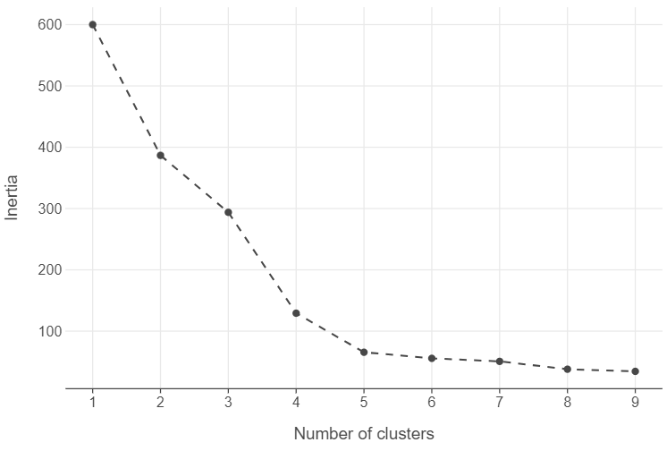
The elbow method is undoubtedly the most popular method to determine the number of clusters in \(k-\)means and it is likely the most intuitive too. However, there are doubts about its reliability and many are the voices in the scientific community that are calling to stop using it altogether or at least supplement it with alternative methods. See, for example, this post or this one or this ACM SIGKDD Explorations Newsletter paper.
Is k-means clustering always the right choice?
The answer is emphatically no. Due to the fact that k-means clustering uses the distance between points to identify clusters, it will typically try to create evenly sized clusters when clusters should, in fact, be uneven.
Example 1: Odd conditional distributions
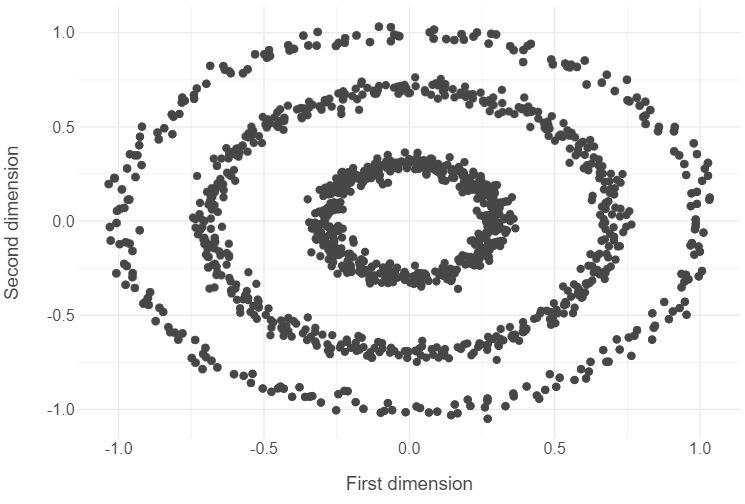
# Open the circles data
circles = pd.read_csv("../data/circles-data.csv").drop("label",axis=1)

# Plot x1 and x2 features in circles data
(
  ggplot(circles, aes("x1", "x2")) +
  geom_point() +
  theme_minimal() +
  labs(x = "First dimension", y = "Second dimension")
)
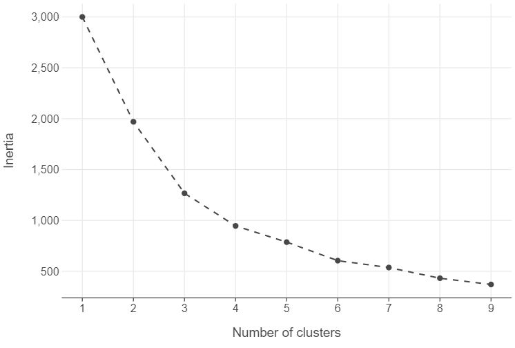
Find the optimal number of clusters
# Create a data frame with the k range and associated inertia scores
inertias_df = pd.DataFrame({"k":range(1,10), "inertia": [find_optimal_cluster(k, circles) for k in range(1,10)]})

# Plot the output
(
  ggplot(inertias_df, aes("k", "inertia")) +
  geom_point() +
  geom_line(linetype = "dashed") +
  labs(x = "Number of clusters", y = "Inertia")

)
Run the model
# Instantiate model
kmeans_model = KMeans(n_clusters=4)

# Fit to the data
_ = kmeans_model.fit(circles)
Plot the results
kmeans_labels = [str(i) for i in kmeans_model.labels_]

(
  ggplot(circles, aes("x1", "x2", colour = kmeans_labels)) +
  geom_point() +
  theme_minimal() +
  theme(panel_grid_minor = element_blank(),
        legend_position = "bottom") +
  labs(x = "First dimension", y = "Second dimension",
       colour = "Cluster #")

)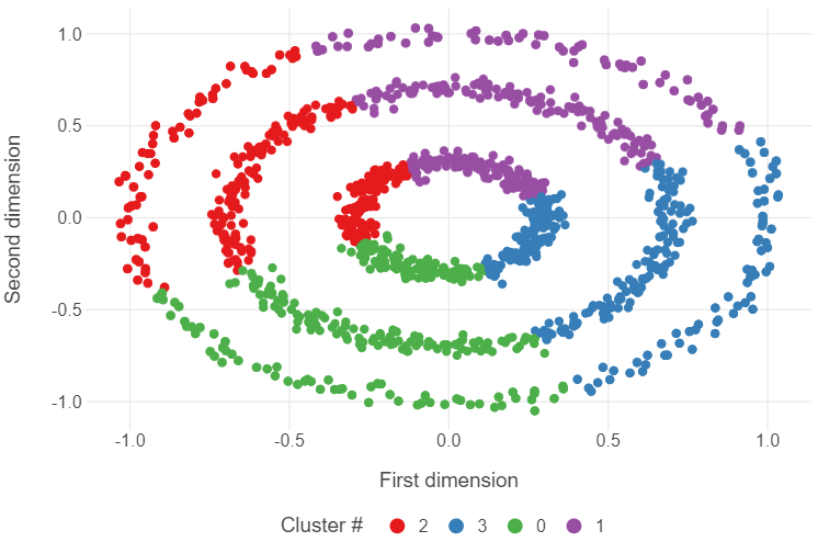
🗣️ CLASSROOM DISCUSSION:
What went wrong?
Essentially, the k-means algorithm partitioned the feature space into 4 distinct slices, ignoring the nested ring structure of the data.
👉 NOTE: To see more about how different clustering algorithms produce different kinds of clusters in different scenarios, click here.
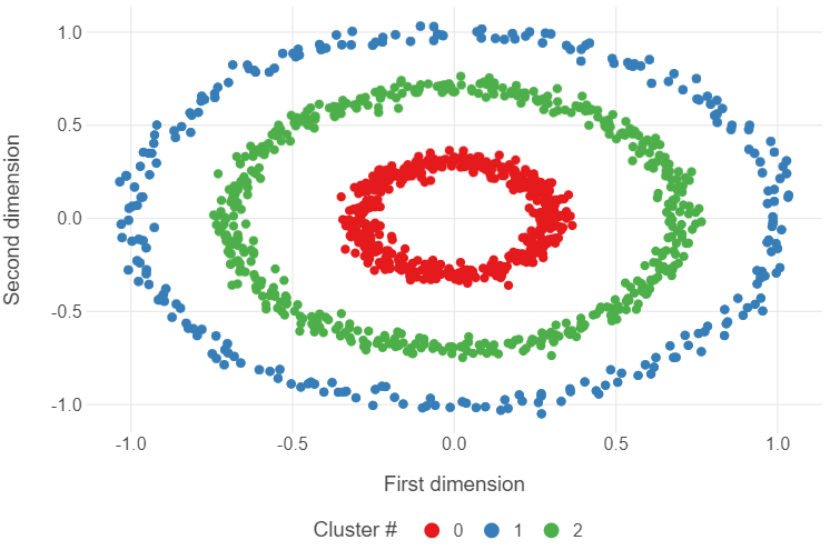
Introducing DBSCAN (30 minutes)
The DBSCAN algorithm overcomes some of the short-comings of the k-means algorithm by using the distance between nearest points.
The below code will implement dbscan.
dbscan_model = DBSCAN(min_samples=4, eps=0.15)

dbscan_model.fit(circles)

dbscan_labels = [str(i) for i in dbscan_model.labels_]

(
  ggplot(circles, aes("x1", "x2", colour = dbscan_labels)) +
  geom_point() +
  theme_minimal() +
  theme(panel_grid_minor = element_blank(),
        legend_position = "bottom") +
  labs(x = "First dimension", y = "Second dimension",
       colour = "Cluster #")

)
Applying dbscan to the customer segmentation data set
Use eps = 0.6 and min_samples = 4 when applying dbscan to the customer segmentation data.
# Create a pipeline that standardises the data and instantiates a DBSCAN
pipe_dbscan = Pipeline([("standardise",StandardScaler()), ("dbscan", DBSCAN(min_samples=4, eps=0.6))])

# Fit the pipeline to the customers data
pipe_dbscan.fit(customers)

# Retrieve the labels using a list comprehension
dbscan_labels = [str(i) for i in pipe_dbscan.named_steps["dbscan"].labels_]

# Create a list of outlier labels
outlier_labels = [np.where(row == "-1", "Yes", "No") for row in dbscan_labels]
Try plotting the results yourself to see the differences.
(
  ggplot(customers, aes("income", "spending_score", colour = dbscan_labels, shape = outlier_labels)) +
  geom_point() +
  theme_minimal() +
  theme(panel_grid_minor = element_blank(),
        legend_position = "bottom") +
  scale_shape_manual(values = [16,4]) +
  scale_color_viridis() +
  labs(x = "Income", y = "Spending score",
       colour = "Cluster #", shape = "Outlier")
)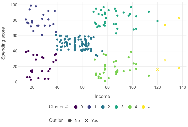
👥 DISCUSS IN PAIRS/GROUPS:
What difference in clustering do you see with dbscan?
We now have 5 outlier observations!
Using DBSCAN with UMAP
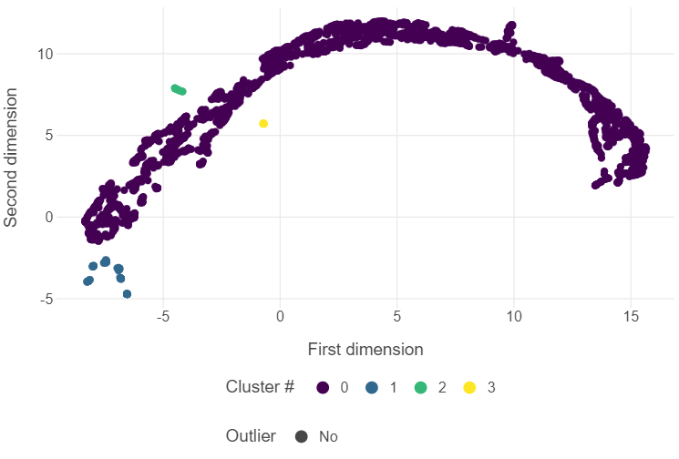
You will remember from last week that we can employ Uniform Manifold Approximation and Projection (UMAP) to create two-dimensional representations of data. With the Varieties of Democracy (V-Dem) data set, we found that employing UMAP led to several highly repressive regimes forming their own distinct cluster. We can employ DBSCAN on the UMAP embeddings to find new insights into political regimes.
📝Task: Let’s load the data!
vdem = pd.read_csv("../data/vdem-data-subset.csv")📝Task: Next, we can build a UMAP model, fit it to vdem and retrieve the embeddings.
# Set a random seed
np.random.seed(123)

# Instantiate a UMAP with the relevant hyperparameter choice
reducer = UMAP(n_neighbors=100)

# Create a subset of the data using only variables beginning with "v2x"
vdem_subset = vdem[vdem.columns[vdem.columns.str.contains("v2x")]].to_numpy()

# Fit / transform the model to the subset of data to obtain the embeddings
embedding = reducer.fit_transform(vdem_subset)

# Convert the embeddings to a data frame
embedding = pd.DataFrame(embedding, columns = ["first_dim", "second_dim"])
📝Task: After this, we can instantiate a DBSCAN, fit it to the embeddings, and plot the results. Try experimenting with different combinations of minimum points and epsilon neighbourhood.
# Instantiate a dbscan
dbscan_model = DBSCAN(min_samples = 6, eps = 1.15)

# Fit the model to the data
dbscan_model.fit(embedding)

# Retrieve the labels using a list comprehension
dbscan_labels = [str(i) for i in dbscan_model.labels_]

# Create a list of outlier labels
outlier_labels = [np.where(row == "-1", "Yes", "No") for row in dbscan_labels]

# Add the country_year variable in vdem to the embeddings
embedding["country_year"] = vdem["country_year"]

# Plot the output
(
  ggplot(embedding, aes("first_dim", "second_dim", colour = dbscan_labels, shape = outlier_labels)) +
  geom_point(tooltips = layer_tooltips().line('@country_year')) +
  theme_minimal() +
  theme(panel_grid_minor = element_blank(),
        legend_position = "bottom") +
  scale_shape_manual(values = [16,4]) +
  scale_color_viridis() +
  labs(x = "First dimension", y = "Second dimension",
       colour = "Cluster #", shape = "Outlier")
)