
✅ A model solution for the W04 formative
What follows is a possible solution for the W04 formative. If you want to render the .qmd that was used to generate this page for yourselves, use the download button below:
⚙️ Setup
We start, as usual, by loading libraries.
import pandas as pd
import re
import missingno as msno
import sweetviz as sv
from lets_plot import *
LetsPlot.setup_html()
from sklearn.model_selection import train_test_split
from sklearn.linear_model import LinearRegression, Lasso
from sklearn.metrics import r2_score, root_mean_squared_error, mean_absolute_error, mean_absolute_percentage_error
import numpy as np
import miceforest as mf
from sklearn.preprocessing import LabelEncoderFor cleaner formatting (and coding), it’s good practice to load all the libraries you’ll be using in your .qmd (or Jupyter Notebook) at the beginning of the file.
Question 1
Loading the data
Importing the data should only require the pd.read_csv method.
df=pd.read_csv('../../data/Life_Expectancy_Data.csv')When loading the data, you should only ever use relative paths and not absolute paths (i.e not full paths that are specific to your machine).
Doing so ensures your code is more reproducible!
We quickly inspect the content of the loaded dataframe by taking a look at the first 5 rows of it
df.head()| Country | Year | Status | Life expectancy | Adult Mortality | infant deaths | Alcohol | percentage expenditure | Hepatitis B | Measles | … | Polio | Total expenditure | Diphtheria | HIV/AIDS | GDP | Population | thinness 1-19 years | thinness 5-9 years | Income composition of resources | Schooling | |
|---|---|---|---|---|---|---|---|---|---|---|---|---|---|---|---|---|---|---|---|---|---|
| 0 | Afghanistan | 2015 | Developing | 65.0 | 263.0 | 62 | 0.01 | 71.279624 | 65.0 | 1154 | … | 6.0 | 8.16 | 65.0 | 0.1 | 584.259210 | 33736494.0 | 17.2 | 17.3 | 0.479 | 10.1 |
| 1 | Afghanistan | 2014 | Developing | 59.9 | 271.0 | 64 | 0.01 | 73.523582 | 62.0 | 492 | … | 58.0 | 8.18 | 62.0 | 0.1 | 612.696514 | 327582.0 | 17.5 | 17.5 | 0.476 | 10.0 |
| 2 | Afghanistan | 2013 | Developing | 59.9 | 268.0 | 66 | 0.01 | 73.219243 | 64.0 | 430 | … | 62.0 | 8.13 | 64.0 | 0.1 | 631.744976 | 31731688.0 | 17.7 | 17.7 | 0.470 | 9.9 |
| 3 | Afghanistan | 2012 | Developing | 59.5 | 272.0 | 69 | 0.01 | 78.184215 | 67.0 | 2787 | … | 67.0 | 8.52 | 67.0 | 0.1 | 669.959000 | 3696958.0 | 17.9 | 18.0 | 0.463 | 9.8 |
| 4 | Afghanistan | 2011 | Developing | 59.2 | 275.0 | 71 | 0.01 | 7.097109 | 68.0 | 3013 | … | 68.0 | 7.87 | 68.0 | 0.1 | 63.537231 | 2978599.0 | 18.2 | 18.2 | 0.454 | 9.5 |
5 rows × 22 columns
A closer look at the dataframe’s column names gives us important information about the patterns we’ll need to deal with when renaming the columns: special characters like - and / , spaces and inconsistent capitalization of terms.
df.columnsIndex(['Country', 'Year', 'Status', 'Life expectancy ', 'Adult Mortality',
'infant deaths', 'Alcohol', 'percentage expenditure', 'Hepatitis B',
'Measles ', ' BMI ', 'under-five deaths ', 'Polio', 'Total expenditure',
'Diphtheria ', ' HIV/AIDS', 'GDP', 'Population',
' thinness 1-19 years', ' thinness 5-9 years',
'Income composition of resources', 'Schooling'],
dtype='object')Renaming columns
I rename the thinness 1-19 years column using the pandas rename method
df.rename(columns={' thinness  1-19 years':'thinness_10_19_years'},inplace=True)
df| Country | Year | Status | Life expectancy | Adult Mortality | infant deaths | Alcohol | percentage expenditure | Hepatitis B | Measles | … | Polio | Total expenditure | Diphtheria | HIV/AIDS | GDP | Population | thinness_10_19_years | thinness 5-9 years | Income composition of resources | Schooling | |
|---|---|---|---|---|---|---|---|---|---|---|---|---|---|---|---|---|---|---|---|---|---|
| 0 | Afghanistan | 2015 | Developing | 65.0 | 263.0 | 62 | 0.01 | 71.279624 | 65.0 | 1154 | … | 6.0 | 8.16 | 65.0 | 0.1 | 584.259210 | 33736494.0 | 17.2 | 17.3 | 0.479 | 10.1 |
| 1 | Afghanistan | 2014 | Developing | 59.9 | 271.0 | 64 | 0.01 | 73.523582 | 62.0 | 492 | … | 58.0 | 8.18 | 62.0 | 0.1 | 612.696514 | 327582.0 | 17.5 | 17.5 | 0.476 | 10.0 |
| 2 | Afghanistan | 2013 | Developing | 59.9 | 268.0 | 66 | 0.01 | 73.219243 | 64.0 | 430 | … | 62.0 | 8.13 | 64.0 | 0.1 | 631.744976 | 31731688.0 | 17.7 | 17.7 | 0.470 | 9.9 |
| 3 | Afghanistan | 2012 | Developing | 59.5 | 272.0 | 69 | 0.01 | 78.184215 | 67.0 | 2787 | … | 67.0 | 8.52 | 67.0 | 0.1 | 669.959000 | 3696958.0 | 17.9 | 18.0 | 0.463 | 9.8 |
| 4 | Afghanistan | 2011 | Developing | 59.2 | 275.0 | 71 | 0.01 | 7.097109 | 68.0 | 3013 | … | 68.0 | 7.87 | 68.0 | 0.1 | 63.537231 | 2978599.0 | 18.2 | 18.2 | 0.454 | 9.5 |
| … | … | … | … | … | … | … | … | … | … | … | … | … | … | … | … | … | … | … | … | … | … |
| 2933 | Zimbabwe | 2004 | Developing | 44.3 | 723.0 | 27 | 4.36 | 0.000000 | 68.0 | 31 | … | 67.0 | 7.13 | 65.0 | 33.6 | 454.366654 | 12777511.0 | 9.4 | 9.4 | 0.407 | 9.2 |
| 2934 | Zimbabwe | 2003 | Developing | 44.5 | 715.0 | 26 | 4.06 | 0.000000 | 7.0 | 998 | … | 7.0 | 6.52 | 68.0 | 36.7 | 453.351155 | 12633897.0 | 9.8 | 9.9 | 0.418 | 9.5 |
| 2935 | Zimbabwe | 2002 | Developing | 44.8 | 73.0 | 25 | 4.43 | 0.000000 | 73.0 | 304 | … | 73.0 | 6.53 | 71.0 | 39.8 | 57.348340 | 125525.0 | 1.2 | 1.3 | 0.427 | 10.0 |
| 2936 | Zimbabwe | 2001 | Developing | 45.3 | 686.0 | 25 | 1.72 | 0.000000 | 76.0 | 529 | … | 76.0 | 6.16 | 75.0 | 42.1 | 548.587312 | 12366165.0 | 1.6 | 1.7 | 0.427 | 9.8 |
| 2937 | Zimbabwe | 2000 | Developing | 46.0 | 665.0 | 24 | 1.68 | 0.000000 | 79.0 | 1483 | … | 78.0 | 7.10 | 78.0 | 43.5 | 547.358878 | 12222251.0 | 11.0 | 11.2 | 0.434 | 9.8 |
2938 rows × 22 columns
I write a function to rename the columns of the dataframe as required:
- removing trailing/leading spaces from column names
- removing special characters (e.g
-,/) i.e non-alphanumeric characters and replacing them by_ - replacing sequences of multiple
_that the renaming could have produced by a single_ - finally, converting all column names to lowercase
# Function to clean column names correctly
def clean_column_name(name):
    name = name.strip()  # Remove leading/trailing spaces
    name = re.sub(r'[^a-zA-Z0-9]+', '_', name)  # Replace non-alphanumeric sequences (incl. spaces, dashes) with _
    name = re.sub(r'_+', '_', name)  # Replace multiple _ with a single one
    return name.lower()  # Convert to lowercase

# Print before renaming
print("Before renaming:", df.columns.tolist())

# Apply function to all column names
df.rename(columns=lambda col: clean_column_name(col), inplace=True)

# Print after renaming
print("After renaming:", df.columns.tolist())
Having a look at the column names and first rows of the dataframe after renaming shows that our renaming worked as intended
df.columnsIndex(['Country', 'Year', 'Status', 'Life expectancy ', 'Adult Mortality',
'infant deaths', 'Alcohol', 'percentage expenditure', 'Hepatitis B',
'Measles ', ' BMI ', 'under-five deaths ', 'Polio', 'Total expenditure',
'Diphtheria ', ' HIV/AIDS', 'GDP', 'Population', 'thinness_10_19_years',
' thinness 5-9 years', 'Income composition of resources', 'Schooling'],
dtype='object')df.head()| Country | Year | Status | Life expectancy | Adult Mortality | infant deaths | Alcohol | percentage expenditure | Hepatitis B | Measles | … | Polio | Total expenditure | Diphtheria | HIV/AIDS | GDP | Population | thinness_10_19_years | thinness 5-9 years | Income composition of resources | Schooling | |
|---|---|---|---|---|---|---|---|---|---|---|---|---|---|---|---|---|---|---|---|---|---|
| 0 | Afghanistan | 2015 | Developing | 65.0 | 263.0 | 62 | 0.01 | 71.279624 | 65.0 | 1154 | … | 6.0 | 8.16 | 65.0 | 0.1 | 584.259210 | 33736494.0 | 17.2 | 17.3 | 0.479 | 10.1 |
| 1 | Afghanistan | 2014 | Developing | 59.9 | 271.0 | 64 | 0.01 | 73.523582 | 62.0 | 492 | … | 58.0 | 8.18 | 62.0 | 0.1 | 612.696514 | 327582.0 | 17.5 | 17.5 | 0.476 | 10.0 |
| 2 | Afghanistan | 2013 | Developing | 59.9 | 268.0 | 66 | 0.01 | 73.219243 | 64.0 | 430 | … | 62.0 | 8.13 | 64.0 | 0.1 | 631.744976 | 31731688.0 | 17.7 | 17.7 | 0.470 | 9.9 |
| 3 | Afghanistan | 2012 | Developing | 59.5 | 272.0 | 69 | 0.01 | 78.184215 | 67.0 | 2787 | … | 67.0 | 8.52 | 67.0 | 0.1 | 669.959000 | 3696958.0 | 17.9 | 18.0 | 0.463 | 9.8 |
| 4 | Afghanistan | 2011 | Developing | 59.2 | 275.0 | 71 | 0.01 | 7.097109 | 68.0 | 3013 | … | 68.0 | 7.87 | 68.0 | 0.1 | 63.537231 | 2978599.0 | 18.2 | 18.2 | 0.454 | 9.5 |
5 rows × 22 columns
Question 2
To look at missingness patterns, we plot the nullity matrix using the missingno library
msno.matrix(df)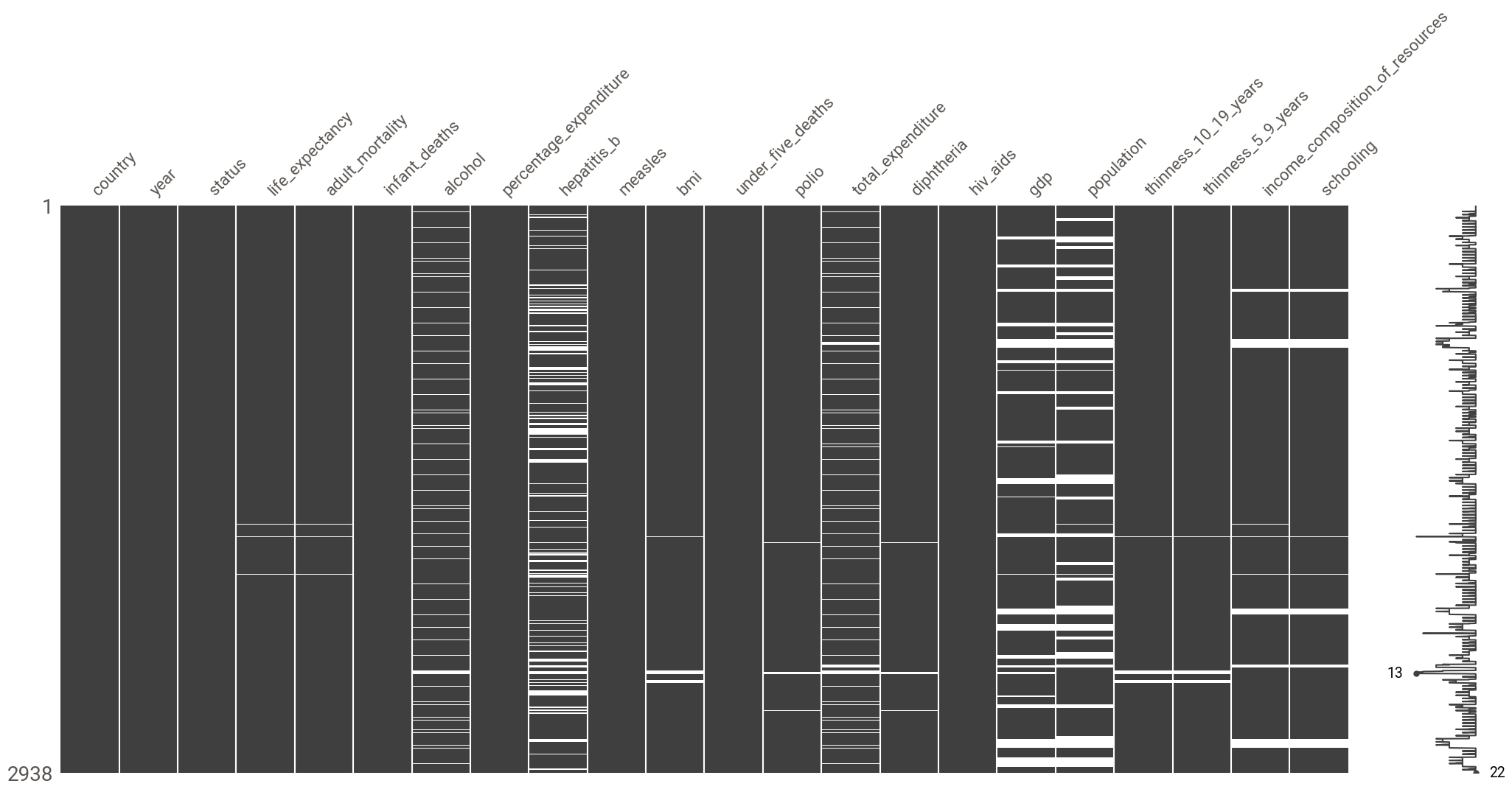
There seems to be a MAR mechanism at play here:
- there seems to be a correlation in the missingness patterns of
income_composition_of_resources,schooling(not exactly surprising when you know thatincome_composition_of_resourcesis the human development index andschoolingis a component of that index) - there is a correlation between the pattern of missingness in
gdpandpopulation(again, not wholly unexpected, asgdpis, in fact, GDP per capita i.e GDP divided by population - which also points to the fact that thegdpcolumn is not named correctly!) total_expenditureis correlated withhepatitis_bandalcohol(again not exactly surprising given thattotal_expenditurerepresents the general government expenditure on health as a percentage of total government expenditure (%) and such expenditure would increase as hepatitis B immunization coverage increases and would also increase with an increase of alcohol consumption (and an increase of its burden on the healthcare system))
report = sv.analyze(df)
report.show_notebook()
The variables with the most missing values are population (22% of missing values) and hepatitis_b (19%). Other variables with missing values include:
life_expectancy(<1%)adult_mortality(<1%)polio(<1%)diphteria(<1%)bmi(1%)thinness_10_19_years(1%)thinness_5_9_years(1%)schooling(6%)income_composition_of_resources(6%)alcohol(7%)total_expenditure(8%)gdp(15%)
Given the fact the proportion of missing values is rather low and the fact we have a MAR mechanism at play, the best approach to take to deal with the missing data prior to modeling (but after train/test split to avoid data leakage!) is to perform imputation. The variables with missing values are all numerical but the dataset contains categorical values (e.g status): we could perform K-NN imputation or multiple imputation (for more robust imputation) after label encoding the categorical values.
Question 3
Renaming gdp column
We rename gdp as gdp_per_capita
df.rename(columns={'gdp':'gdp_per_capita'},inplace=True)
df| country | year | status | life_expectancy | adult_mortality | infant_deaths | alcohol | percentage_expenditure | hepatitis_b | measles | … | polio | total_expenditure | diphtheria | hiv_aids | gdp_per_capita | population | thinness_10_19_years | thinness_5_9_years | income_composition_of_resources | schooling | |
|---|---|---|---|---|---|---|---|---|---|---|---|---|---|---|---|---|---|---|---|---|---|
| 0 | Afghanistan | 2015 | Developing | 65.0 | 263.0 | 62 | 0.01 | 71.279624 | 65.0 | 1154 | … | 6.0 | 8.16 | 65.0 | 0.1 | 584.259210 | 33736494.0 | 17.2 | 17.3 | 0.479 | 10.1 |
| 1 | Afghanistan | 2014 | Developing | 59.9 | 271.0 | 64 | 0.01 | 73.523582 | 62.0 | 492 | … | 58.0 | 8.18 | 62.0 | 0.1 | 612.696514 | 327582.0 | 17.5 | 17.5 | 0.476 | 10.0 |
| 2 | Afghanistan | 2013 | Developing | 59.9 | 268.0 | 66 | 0.01 | 73.219243 | 64.0 | 430 | … | 62.0 | 8.13 | 64.0 | 0.1 | 631.744976 | 31731688.0 | 17.7 | 17.7 | 0.470 | 9.9 |
| 3 | Afghanistan | 2012 | Developing | 59.5 | 272.0 | 69 | 0.01 | 78.184215 | 67.0 | 2787 | … | 67.0 | 8.52 | 67.0 | 0.1 | 669.959000 | 3696958.0 | 17.9 | 18.0 | 0.463 | 9.8 |
| 4 | Afghanistan | 2011 | Developing | 59.2 | 275.0 | 71 | 0.01 | 7.097109 | 68.0 | 3013 | … | 68.0 | 7.87 | 68.0 | 0.1 | 63.537231 | 2978599.0 | 18.2 | 18.2 | 0.454 | 9.5 |
| … | … | … | … | … | … | … | … | … | … | … | … | … | … | … | … | … | … | … | … | … | … |
| 2933 | Zimbabwe | 2004 | Developing | 44.3 | 723.0 | 27 | 4.36 | 0.000000 | 68.0 | 31 | … | 67.0 | 7.13 | 65.0 | 33.6 | 454.366654 | 12777511.0 | 9.4 | 9.4 | 0.407 | 9.2 |
| 2934 | Zimbabwe | 2003 | Developing | 44.5 | 715.0 | 26 | 4.06 | 0.000000 | 7.0 | 998 | … | 7.0 | 6.52 | 68.0 | 36.7 | 453.351155 | 12633897.0 | 9.8 | 9.9 | 0.418 | 9.5 |
| 2935 | Zimbabwe | 2002 | Developing | 44.8 | 73.0 | 25 | 4.43 | 0.000000 | 73.0 | 304 | … | 73.0 | 6.53 | 71.0 | 39.8 | 57.348340 | 125525.0 | 1.2 | 1.3 | 0.427 | 10.0 |
| 2936 | Zimbabwe | 2001 | Developing | 45.3 | 686.0 | 25 | 1.72 | 0.000000 | 76.0 | 529 | … | 76.0 | 6.16 | 75.0 | 42.1 | 548.587312 | 12366165.0 | 1.6 | 1.7 | 0.427 | 9.8 |
| 2937 | Zimbabwe | 2000 | Developing | 46.0 | 665.0 | 24 | 1.68 | 0.000000 | 79.0 | 1483 | … | 78.0 | 7.10 | 78.0 | 43.5 | 547.358878 | 12222251.0 | 11.0 | 11.2 | 0.434 | 9.8 |
2938 rows × 22 columns
Creating a gdp_per_capita column
GDP is simply GDP per capita multipled by population. We use this to create a gdp column
df['gdp'] = df['gdp_per_capita']*df['population']Plotting and discussing GDP per capita distributions
Overall GDP per capita distribution
Let’s plot the overall distribution of GDP per capita for all countries
ggplot(df, aes(x='gdp_per_capita')) + \
    geom_histogram(bins=30, fill='blue', color='black', alpha=0.7) + \
    ggtitle("Distribution of GDP per Capita") + \
    xlab("GDP per Capita (USD)") + \
    ylab("Frequency") + \
    theme_minimal()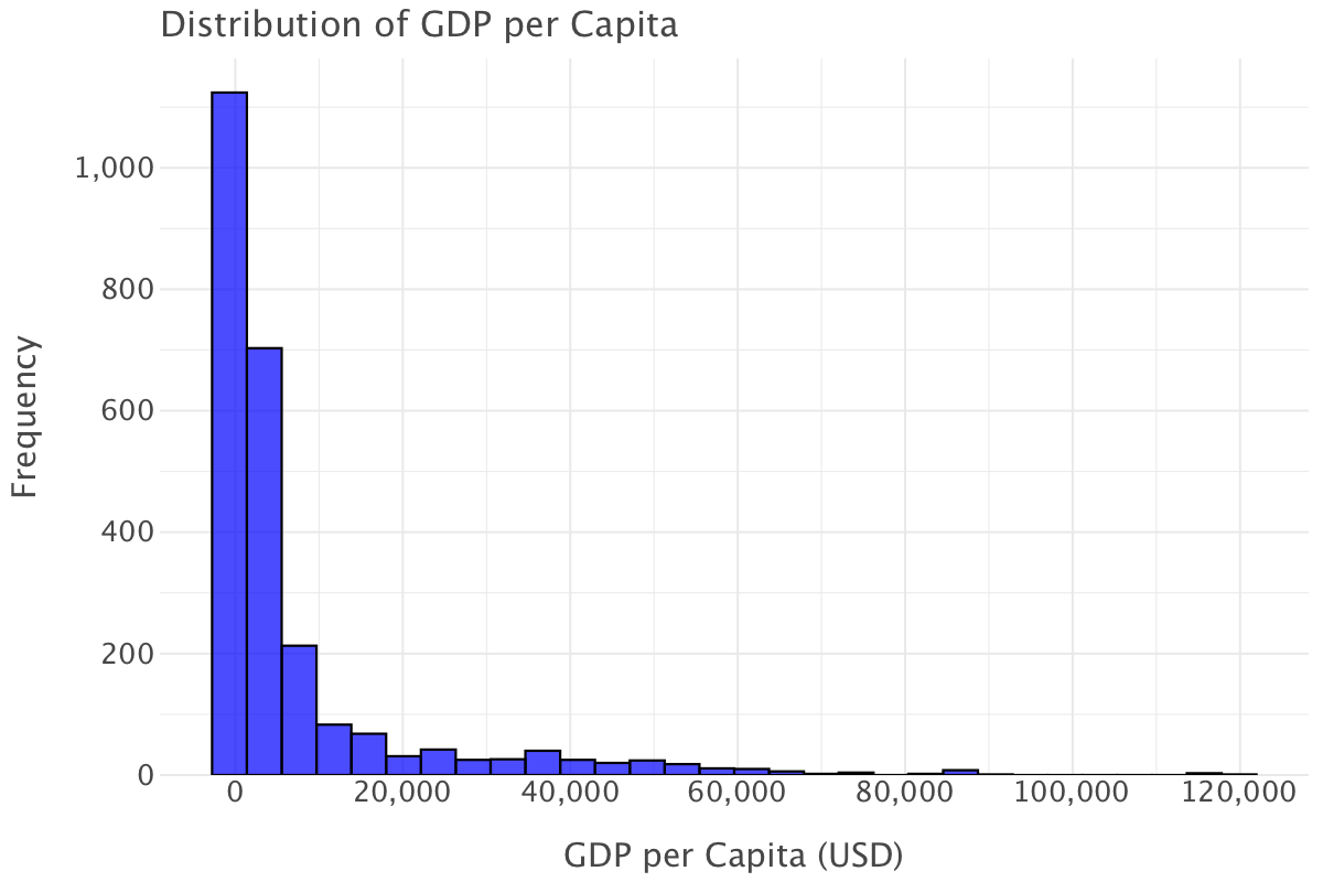
This is a heavily right-skewed distribution that indicates that wealth is not spread equally among countries and that most countries have low GDP per capita. There are a few outliers at very high values of GDP per capita (> $60,000) that correspond to wealthier nations.
GDP per capita for developing countries
Let’s now plot the GDP per capita for developing countries
ggplot(df.query("status=='Developing'"), aes(x='gdp_per_capita')) + \
    geom_histogram(bins=30, fill='blue', color='black', alpha=0.7) + \
    ggtitle("Distribution of GDP per Capita for developing countries") + \
    xlab("GDP per Capita (USD)") + \
    ylab("Frequency") + \
    theme_minimal()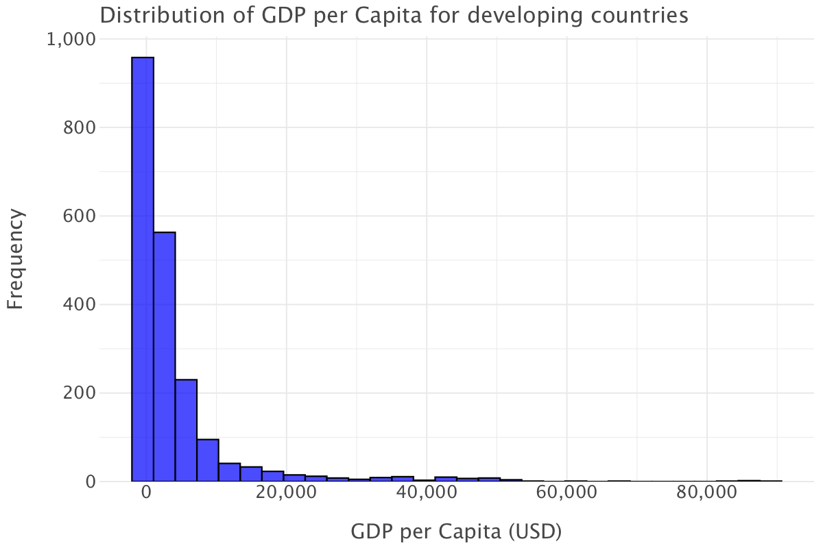
The GDP per capita for developing countries mirrors sensibly the same distribution as the overall one: most countries have low to extremely low GDP per capita. Note that the higher end of the scale has lower values than the overall plot (the maximum here is at around $89,000 as opposed to around $120,000 in the overall plot) and that even fewer countries reach the higher end of the scale.
GDP per capita for developed countries
Let’s plot GDP per capita for developed countries
ggplot(df.query("status=='Developed'"), aes(x='gdp_per_capita')) + \
    geom_histogram(bins=30, fill='blue', color='black', alpha=0.7) + \
    ggtitle("Distribution of GDP per Capita for developed countries") + \
    xlab("GDP per Capita (USD)") + \
    ylab("Frequency") + \
    theme_minimal()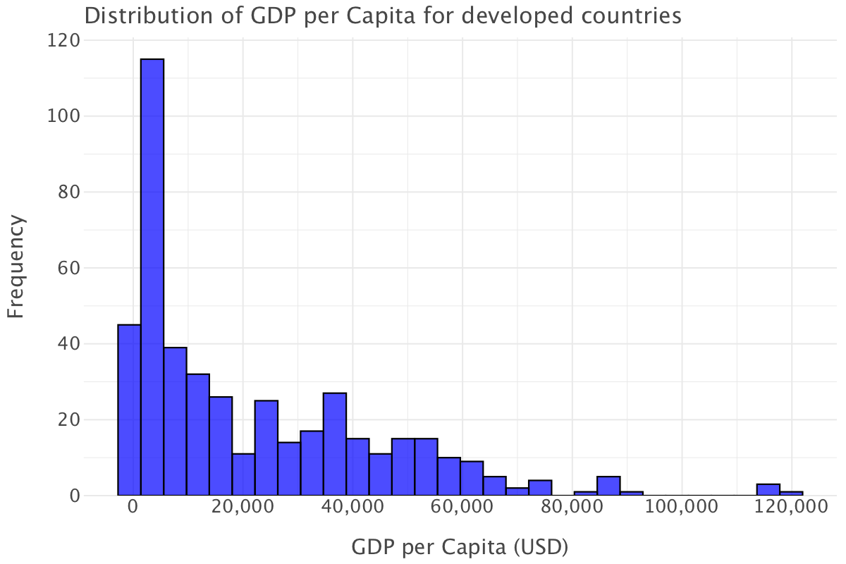
Compared to the overall plot, this distribution still shows right-skewness but it’s not as extreme.
Most developed countries have GDP per capita values above $10,000, and the distribution is more spread out. There are more countries with GDP per capita values in the $20,000 to $60,000 range. Unlike in the overall GDP per capita plot, there are no extreme concentrations at the very low end.
The highest bar is still at the lower end, which suggests that, even among countries classified as developed, a significant number have relatively lower GDP per capita (perhaps emerging economies within the developed category). Such an observation brings into question this whole notion of development: do we simply quantify a country’s development/economic wellbeing through measurements like GDP/GDP per capita or are other parameters to be taken into account? See the Stiglitz-Fitoussi-Sen report(Stiglitz, Sen, and Fitoussi 2009) on this point.
Again, we have a few outlier countries with a GDP per capita higher than $100,000, most likely wealthy countries like Switzerland, Luxembourg or Norway.
Overall, the distribution of GDP per capita for developed countries is more balanced though disparities still exist within developed countries.
Question 4
Distributions of human development index
Overall human development index distribution
Let’s plot the overall development index distribution
ggplot(df, aes(x='income_composition_of_resources')) + \
    geom_histogram(aes(y='..density..'), bins=30, fill='blue', color='black', alpha=0.6) + \
    geom_density(color='red', size=1.2) + \
    ggtitle("Histogram & Density of HDI") + \
    xlab("HDI") + \
    ylab("Density") + \
    theme_classic()
In contrast with the GDP per capita overall distribution, this is a more (slightly) left-skewed distribution.
There are outliers at the very low end of the scale (human development index equals 0!). Let’s check to which countries they correspond:
df[df['income_composition_of_resources']==0]| country | year | status | life_expectancy | adult_mortality | infant_deaths | alcohol | percentage_expenditure | hepatitis_b | measles | … | total_expenditure | diphtheria | hiv_aids | gdp_per_capita | population | thinness_10_19_years | thinness_5_9_years | income_composition_of_resources | schooling | gdp | |
|---|---|---|---|---|---|---|---|---|---|---|---|---|---|---|---|---|---|---|---|---|---|
| 74 | Antigua and Barbuda | 2005 | Developing | 74.6 | 147.0 | 0 | 8.15 | 1455.608186 | 99.0 | 0 | … | 4.41 | 99.0 | 0.1 | 11371.938950 | NaN | 3.5 | 3.4 | 0.0 | 0.0 | NaN |
| 75 | Antigua and Barbuda | 2004 | Developing | 74.4 | 149.0 | 0 | 7.28 | 22.862952 | 97.0 | 0 | … | 4.21 | 97.0 | 0.1 | 1352.837400 | NaN | 3.5 | 3.4 | 0.0 | 0.0 | NaN |
| 76 | Antigua and Barbuda | 2003 | Developing | 74.2 | 151.0 | 0 | 7.16 | 1158.065259 | 99.0 | 0 | … | 4.53 | 99.0 | 0.1 | 9739.825560 | NaN | 3.5 | 3.5 | 0.0 | 0.0 | NaN |
| 77 | Antigua and Barbuda | 2002 | Developing | 74.0 | 153.0 | 0 | 7.21 | 927.407585 | 99.0 | 0 | … | 4.41 | 98.0 | 0.1 | 9386.716452 | NaN | 3.6 | 3.5 | 0.0 | 0.0 | NaN |
| 78 | Antigua and Barbuda | 2001 | Developing | 73.8 | 154.0 | 0 | 7.51 | 163.767698 | 96.0 | 0 | … | 4.48 | 97.0 | 0.1 | 9358.154162 | NaN | 3.6 | 3.5 | 0.0 | 0.0 | NaN |
| … | … | … | … | … | … | … | … | … | … | … | … | … | … | … | … | … | … | … | … | … | … |
| 2853 | Vanuatu | 2004 | Developing | 69.6 | 169.0 | 0 | 0.85 | 334.167337 | 63.0 | 0 | … | 4.12 | 69.0 | 0.1 | 1787.947230 | 24143.0 | 1.6 | 1.5 | 0.0 | 10.7 | 4.316641e+07 |
| 2854 | Vanuatu | 2003 | Developing | 69.4 | 173.0 | 0 | 1.20 | 27.298391 | 64.0 | 165 | … | 4.20 | 69.0 | 0.1 | 158.527240 | 198964.0 | 1.6 | 1.6 | 0.0 | 10.4 | 3.154121e+07 |
| 2855 | Vanuatu | 2002 | Developing | 69.3 | 176.0 | 0 | 1.24 | 171.137361 | 66.0 | 101 | … | 3.52 | 7.0 | 0.1 | 1353.934819 | 193956.0 | 1.7 | 1.6 | 0.0 | 10.2 | 2.626038e+08 |
| 2856 | Vanuatu | 2001 | Developing | 69.1 | 179.0 | 0 | 0.91 | 163.105292 | 68.0 | 7 | … | 3.37 | 7.0 | 0.1 | 1362.617310 | 18929.0 | 1.7 | 1.6 | 0.0 | 10.1 | 2.579298e+07 |
| 2857 | Vanuatu | 2000 | Developing | 69.0 | 18.0 | 0 | 1.21 | 21.900752 | 7.0 | 9 | … | 3.28 | 71.0 | 0.1 | 1469.849149 | 18563.0 | 1.7 | 1.7 | 0.0 | 9.6 | 2.728481e+07 |
130 rows × 23 columns
df[df['income_composition_of_resources']==0]['country'].unique()array(['Antigua and Barbuda', 'Bahamas', 'Bhutan',
'Bosnia and Herzegovina', 'Burkina Faso', 'Cabo Verde', 'Chad',
'Comoros', 'Equatorial Guinea', 'Eritrea', 'Ethiopia', 'Georgia',
'Grenada', 'Guinea-Bissau', 'Kiribati', 'Lebanon', 'Madagascar',
'Micronesia (Federated States of)', 'Montenegro', 'Nigeria',
'Oman', 'Saint Lucia', 'Saint Vincent and the Grenadines',
'Seychelles', 'South Sudan', 'Suriname',
'The former Yugoslav republic of Macedonia', 'Timor-Leste',
'Turkmenistan', 'Uzbekistan', 'Vanuatu'], dtype=object)Looking at the list of countries where the human index is 0, we can deduce two things:
- the value is either due to an entry error or due to the fact the statistics was not computed for many of these countries, if not all of these countries (this seems likely for Oman, Seychelles, Nigeria, Georgia, Ethiopia)
- the human development index is likely very low in some of the countries in the list (known low income countries such as Bhutan or Cabo Verde or countries with a recent history of war and conflict such as the former Yugoslav republics or South Sudan) but the 0 values is again likely due to the statistic not been available in these countries rather than simply mirroring a situation where the statistic has been computed and been found equal to 0
Aside from this, the values of the human development index are typically higher than 0.25 and most are in the range [0.6-0.8], indicating mid to satisfactory levels of human development overall.
The overall median (0.677) of human development index confirms this observation.
np.nanmedian(df['income_composition_of_resources'])0.677Distribution for developing countries
ggplot(df.query("status=='Developing'"), aes(x='income_composition_of_resources')) + \
    geom_histogram(aes(y='..density..'), bins=30, fill='blue', color='black', alpha=0.6) + \
    geom_density(color='red', size=1.2) + \
    ggtitle("Histogram & Density of HDI for developing countries") + \
    xlab("HDI") + \
    ylab("Density") + \
    theme_classic()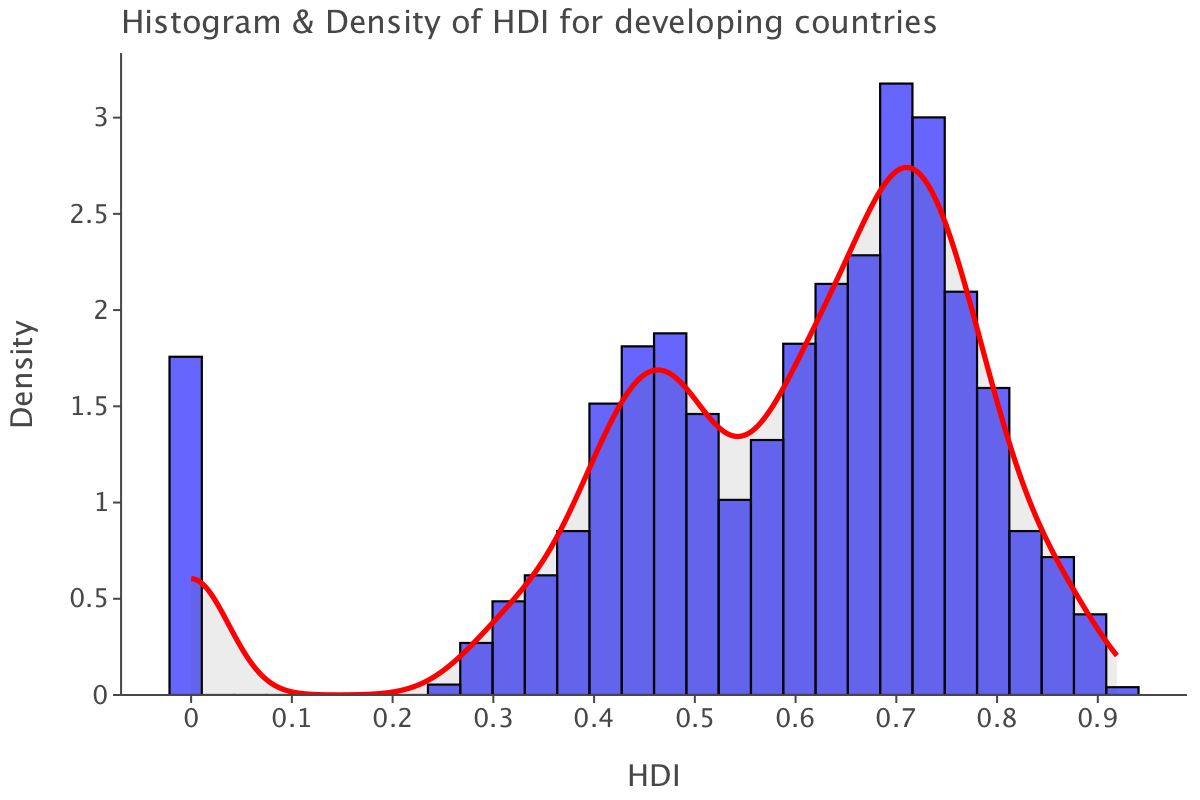
The distribution is sensibly similar to the overall one. Our outliers at 0 are still there. The higher end of the scale is a tad lower at 0.92. While most values are still found between the [0.6-0.8] range, we also have a fair concentration of values at the [0.4-0.5], indicating there seems to be at least two distinct clusters of developing countries when it comes to human development index.
And as expected, the median of values for developing countries is slightly lower than the overall median.
np.nanmedian(df.query("status=='Developing'")['income_composition_of_resources'])0.631Distribution for developed countries
Let’s plot the distribution for developed countries.
ggplot(df.query("status=='Developed'"), aes(x='income_composition_of_resources')) + \
    geom_histogram(aes(y='..density..'), bins=30, fill='blue', color='black', alpha=0.6) + \
    geom_density(color='red', size=1.2) + \
    ggtitle("Histogram & Density of HDI for developed countries") + \
    xlab("HDI") + \
    ylab("Density") + \
    theme_classic()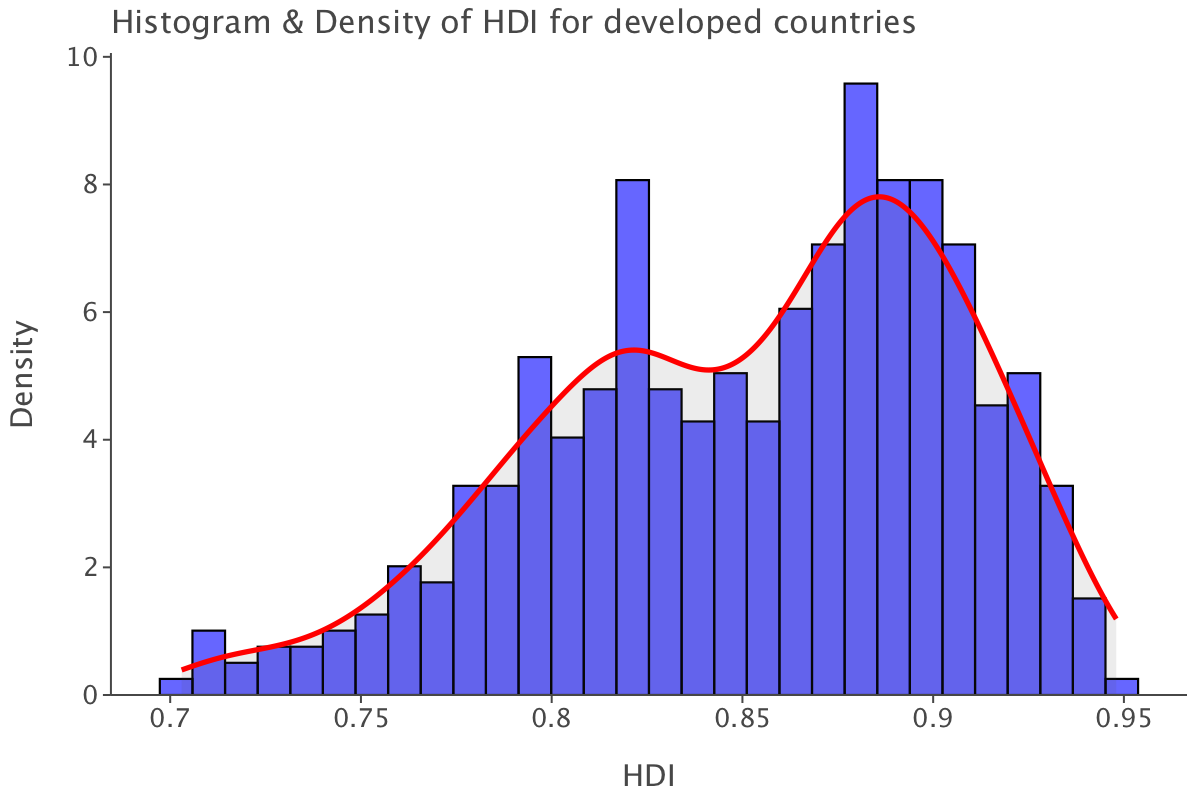
The distribution is less left-skewed than the overall one. The range of values is also narrower as all values are within the range [0.7-0.95], which also means that the human development index is generally higher in developed countries than developing ones. At first glance, it looks as if the human development index differentiates between developing and developed countries better than GDP per capita did.
Question 5
Train-test split
We split the data in training and test set. We drop variables such as country, year, gdp, population, which won’t be used for modeling.
x_train, x_test, y_train, y_test = train_test_split(df.drop(['life_expectancy','country','year','gdp','population'], axis=1), df[['life_expectancy']], test_size=0.3, stratify=df["status"],random_state = 42)Before proceeding, we take a quick look at the types of the variables in our training set.
x_train.dtypesstatus object
adult_mortality float64
infant_deaths int64
alcohol float64
percentage_expenditure float64
hepatitis_b float64
measles int64
bmi float64
under_five_deaths int64
polio float64
total_expenditure float64
diphtheria float64
hiv_aids float64
gdp_per_capita float64
thinness_10_19_years float64
thinness_5_9_years float64
income_composition_of_resources float64
schooling float64
dtype: objectFurther processing of training and test sets: label encoding and imputation
Not all variables are numeric e.g status. So we use scikit-learn’s LabelEncoder to label encode status (and convert it to a numerical feature).
label_encoder = LabelEncoder()
x_train['status'] = label_encoder.fit_transform(x_train['status'].astype(str))x_train| status | adult_mortality | infant_deaths | alcohol | percentage_expenditure | hepatitis_b | measles | bmi | under_five_deaths | polio | total_expenditure | diphtheria | hiv_aids | gdp_per_capita | thinness_10_19_years | thinness_5_9_years | income_composition_of_resources | schooling | |
|---|---|---|---|---|---|---|---|---|---|---|---|---|---|---|---|---|---|---|
| 612 | 1 | 285.0 | 7 | 3.82 | 0.000000 | 7.0 | 315 | 25.0 | 10 | 69.0 | 2.79 | 82.0 | 3.5 | NaN | 8.0 | 7.6 | 0.558 | 10.7 |
| 775 | 1 | 166.0 | 6 | 6.02 | 664.558524 | 83.0 | 0 | 53.6 | 8 | 85.0 | 4.60 | 88.0 | 0.9 | 5451.669600 | 3.3 | 3.3 | 0.697 | 12.9 |
| 294 | 1 | 232.0 | 1 | 0.17 | 27.489070 | 93.0 | 6 | 19.5 | 1 | 93.0 | 6.30 | 93.0 | 0.4 | 177.234497 | 16.8 | 17.5 | 0.000 | 10.9 |
| 2264 | 1 | 25.0 | 27 | 0.29 | 5.397369 | NaN | 5839 | 17.5 | 50 | 49.0 | 4.63 | 52.0 | 0.5 | 473.453380 | 12.3 | 12.3 | 0.378 | 5.2 |
| 1915 | 0 | 66.0 | 0 | 6.59 | 15268.064450 | NaN | 3 | 58.9 | 0 | 93.0 | 9.26 | 93.0 | 0.1 | 87646.753460 | 0.7 | 0.7 | 0.936 | 17.4 |
| … | … | … | … | … | … | … | … | … | … | … | … | … | … | … | … | … | … | … |
| 772 | 1 | 157.0 | 6 | 5.93 | 97.522115 | 8.0 | 0 | 56.8 | 7 | 82.0 | 4.12 | 83.0 | 0.3 | 627.555440 | 3.3 | 3.2 | 0.709 | 13.2 |
| 2567 | 1 | 194.0 | 13 | 0.86 | 1.142004 | NaN | 38 | 31.6 | 16 | 84.0 | 4.59 | 85.0 | 0.3 | 17.815972 | 4.1 | 4.1 | 0.535 | 9.7 |
| 1190 | 1 | 193.0 | 1100 | 3.00 | 64.605901 | 44.0 | 33634 | 16.4 | 1500 | 79.0 | 4.33 | 82.0 | 0.2 | 1461.671957 | 26.9 | 27.7 | 0.580 | 10.8 |
| 1301 | 1 | 138.0 | 1 | 3.65 | 37.171088 | 96.0 | 0 | 52.0 | 1 | 96.0 | 5.66 | 96.0 | 0.5 | 521.333630 | 1.8 | 1.7 | 0.725 | 12.8 |
| 2804 | 0 | 112.0 | 28 | 8.52 | 0.000000 | 93.0 | 66 | 63.8 | 33 | 92.0 | 15.15 | 96.0 | 0.1 | NaN | 0.7 | 0.6 | NaN | NaN |
2056 rows × 18 columns
y_train| life_expectancy | |
|---|---|
| 612 | 62.9 |
| 775 | 72.7 |
| 294 | 67.4 |
| 2264 | 57.5 |
| 1915 | 81.0 |
| … | … |
| 772 | 73.4 |
| 2567 | 64.0 |
| 1190 | 66.8 |
| 1301 | 75.3 |
| 2804 | 77.5 |
2056 rows × 1 columns
We do the same for the test data.
label_encoder = LabelEncoder()
x_test['status'] = label_encoder.fit_transform(x_test['status'].astype(str))
Now that it’s done, we proceed to impute missing values, first in the training set then the test set (to avoid data leakage). We’ll use multiple imputation.
np.random.seed(42)

x_train = x_train.reset_index(drop=True)
y_train = y_train.reset_index(drop=True)

df_train_imp = mf.ImputationKernel(
  pd.concat([x_train,y_train],axis=1),
  save_all_iterations_data=True,
  random_state=100
)
# Run the MICE algorithm for 5 iterations
df_train_imp.mice(5)
# Return the completed dataset (for MICE)
df_train_imp_mice = df_train_imp.complete_data(dataset=0)np.random.seed(42)
x_test = x_test.reset_index(drop=True)
y_test = y_test.reset_index(drop=True)
df_test_imp = mf.ImputationKernel(
pd.concat([x_test,y_test],axis=1),
save_all_iterations_data=True,
random_state=100
)
# Run the MICE algorithm for 5 iterations
df_test_imp.mice(5)
# Return the completed dataset (for MICE)
df_test_imp_mice = df_test_imp.complete_data(dataset=0)Creating a linear regression model
We create a linear regression model using all variables to predict life_expectancy (as stated before country, year, gdp and population were dropped when creating the training/test split and are not used in this model)
# Create a model instance of a linear regression
linear_model = LinearRegression()

# Fit this instance to the training set
linear_model.fit(df_train_imp_mice.drop('life_expectancy', axis=1),df_train_imp_mice[['life_expectancy']])LinearRegression()In a Jupyter environment, please rerun this cell to show the HTML representation or trust the notebook.
On GitHub, the HTML representation is unable to render, please try loading this page with nbviewer.org.
LinearRegression()
We compute test set metrics for this model
# Create predictions for the test set
linear_preds = linear_model.predict(df_test_imp_mice.drop('life_expectancy', axis=1))

# Calculate performance metrics
r2 = r2_score(df_test_imp_mice[['life_expectancy']], linear_preds)
rmse = root_mean_squared_error(df_test_imp_mice[['life_expectancy']], linear_preds)
mae = mean_absolute_error(df_test_imp_mice[['life_expectancy']], linear_preds)

# Print results
print("The R2 metric for this model is:",np.round(r2, 3),", the MAE is", np.round(mae, 3)," and the RMSE is ", np.round(rmse, 3),"\n")
The R2 metric for this model is: 0.817 , the MAE is 2.957 and the RMSE is 4.029These metrics tell us the following:
- this model explains close to 82% of the variance of the data (based on \(R^2\)). However, this model includes quite a few predictors, potentially artificially inflating the \(R^2\) score, so it might be worth looking at the adjusted \(R^2\) to account for the number of predictors
- the model prediction are off by almost 3 years on average based on MAE and 4 based on RMSE. The discrepancy between MAE and RMSE indicates quite a few outlier residuals, which are more heavily weighted in RMSE. Given the scale of life expectancy (the average life expectancy was 66.8 and 71.8 years in 2000 and 2015 respectively, which are the first and last year of data represented in our dataset). This represents predictions that are off by 4.2 to 4.5% (based on MAE) or 5.6 to 6% based on RMSE. This looks like an acceptable scale of error.
Let’s quickly compute adjusted \(R^2\) for this model:
adj_r2 = 1 - (1-linear_model.score(df_test_imp_mice.drop('life_expectancy', axis=1), df_test_imp_mice[['life_expectancy']]))*(len(df_test_imp_mice[['life_expectancy']])-1)/(len(df_test_imp_mice[['life_expectancy']])-df_test_imp_mice.drop('life_expectancy', axis=1).shape[1]-1)
print("The adjusted R2 for this model is:", adj_r2)
The adjusted R2 for this model is: 0.8132287101060904Adjusted \(R^2\) for this model is extremely close to \(R^2\), which means that the variables in our model do not exhibit high collinearity and all have explanatory power.
Let’s now examine this model’s residuals and draw the residuals vs fitted plot.
predictions = linear_model.predict(df_train_imp_mice.drop('life_expectancy', axis=1)).flatten()
residuals = df_train_imp_mice[['life_expectancy']] - linear_model.predict(df_train_imp_mice.drop('life_expectancy', axis=1))
residuals = residuals.values.flatten()

residuals_df = pd.DataFrame({
    'Predicted': predictions,
    'Residuals': residuals
})

# Residuals vs fitted plot
ggplot(residuals_df) + \
    geom_point(aes(x='Predicted', y='Residuals')) + \
    geom_hline(yintercept=0, color='red', size=1) + \
    ggtitle('Residuals Plot for Linear Regression') + \
    xlab('Predicted values') + \
    ylab('Residuals')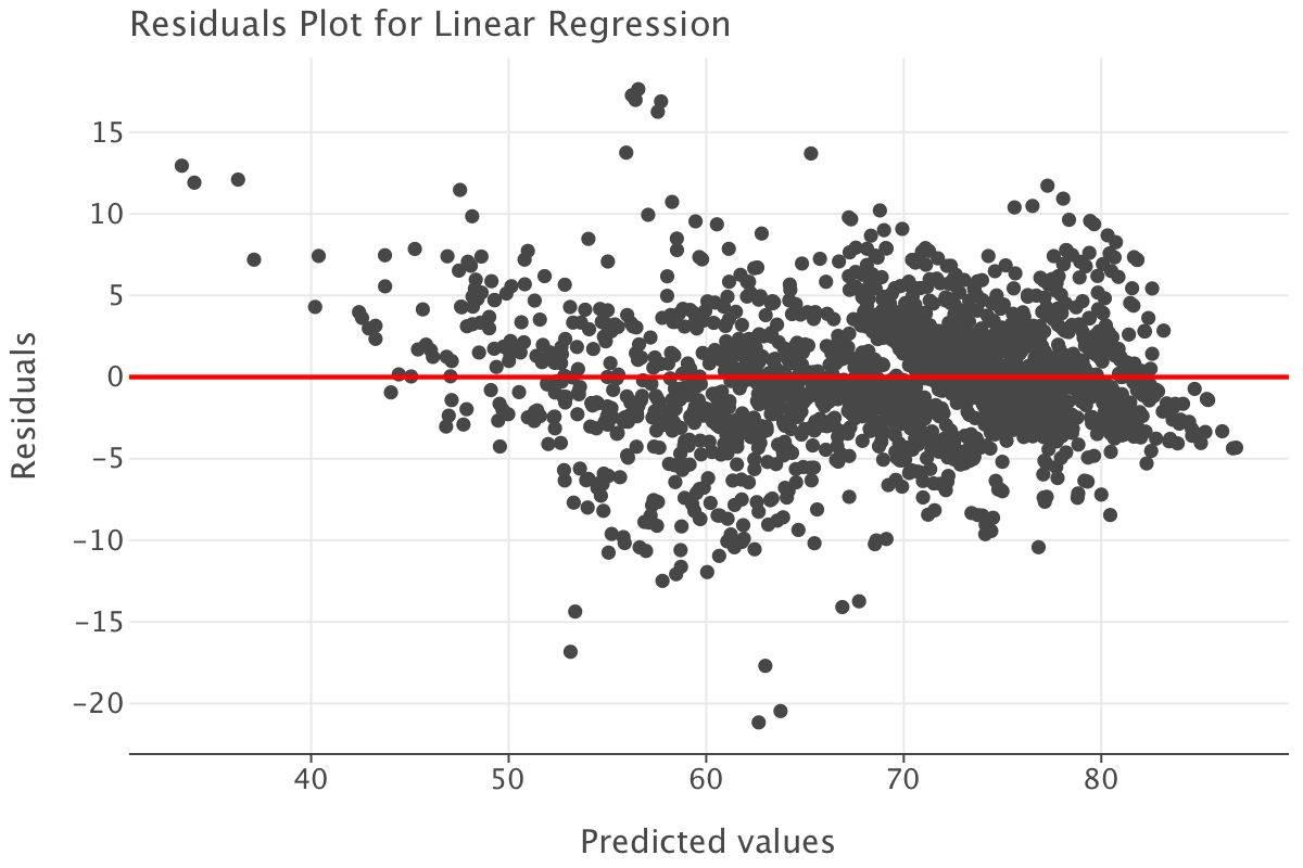
Here are the main observations from the residuals plot:
- the points are fairly randomly scattered around the horizontal line at zero and there are no obvious patterns to suggest non-linearity or heteroscedasticity. Most of the residuals seem to fall within a reasonable range from the horizontal line at zero, which indicates that the model is not systematically over- or under-predicting at different values
- there is a slightly higher concentration of residuals between 60 and 80 on the x-axis. This suggests that this is the range where most of our observations lie, which is not exactly surprising given the expected range of life expectancy!
- a few points stand out as potential outliers (e.g., around 40 on the x-axis and -15 to -20 on the y-axis). These deserve further investigation to understand if they are genuine extreme values or data errors. Many also happen to fall in areas where we have fewer life expectancy observations e.g the [30-40] range or [50-60] range.
In general, this residuals plot suggests that the linear regression model is likely a reasonable fit for the data but we might need to investigate outlier residuals more thoroughly to ensure they are dealt with appropriately.
Creating a LASSO model
# Create a model instance of a linear regression
lasso_model = Lasso(alpha=0.02,max_iter=2000)

# Fit this instance to the training set
lasso_model.fit(df_train_imp_mice.drop('life_expectancy', axis=1),df_train_imp_mice[['life_expectancy']])
Lasso(alpha=0.02, max_iter=2000)In a Jupyter environment, please rerun this cell to show the HTML representation or trust the notebook.
On GitHub, the HTML representation is unable to render, please try loading this page with nbviewer.org.
Lasso(alpha=0.02, max_iter=2000)
# Create predictions for the test set
lasso_preds = lasso_model.predict(df_test_imp_mice.drop('life_expectancy', axis=1))

# Calculate performance metrics
r2 = r2_score(df_test_imp_mice[['life_expectancy']], lasso_preds)
rmse = root_mean_squared_error(df_test_imp_mice[['life_expectancy']], lasso_preds)
mae = mean_absolute_error(df_test_imp_mice[['life_expectancy']], lasso_preds)

# Print results
print("The R2 metric for this model is:",np.round(r2, 3),", the MAE is", np.round(mae, 3)," and the RMSE is ", np.round(rmse, 3),"\n")
The R2 metric for this model is: 0.816 , the MAE is 2.967 and the RMSE is 4.039adj_r2_lasso = 1 - (1-lasso_model.score(df_test_imp_mice.drop('life_expectancy', axis=1), df_test_imp_mice[['life_expectancy']]))*(len(df_test_imp_mice[['life_expectancy']])-1)/(len(df_test_imp_mice[['life_expectancy']])-df_test_imp_mice.drop('life_expectancy', axis=1).shape[1]-1)
print("The adjusted R2 for this model is:", adj_r2_lasso)The adjusted R2 for this model is: 0.8122625566583088The metrics for this model are very close to the metrics for the linear model (a 0.001 drop in \(R^2\) and adjusted \(R^2\) as a 0.01 increase in both MAE and RMSE) so they tell sensibly the same story as for the linear model (with the linear model having a tiny edge).
predictions_lasso = lasso_model.predict(df_train_imp_mice.drop('life_expectancy', axis=1)).flatten()
residuals_lasso = df_train_imp_mice[['life_expectancy']].values.flatten() - lasso_model.predict(df_train_imp_mice.drop('life_expectancy', axis=1))

residuals_df_lasso = pd.DataFrame({
    'Predicted': predictions_lasso,
    'Residuals': residuals_lasso
})

# Residuals vs fitted plot
ggplot(residuals_df_lasso) + \
    geom_point(aes(x='Predicted', y='Residuals')) + \
    geom_hline(yintercept=0, color='red', size=1) + \
    ggtitle('Residuals Plot for LASSO Regression') + \
    xlab('Predicted values') + \
    ylab('Residuals')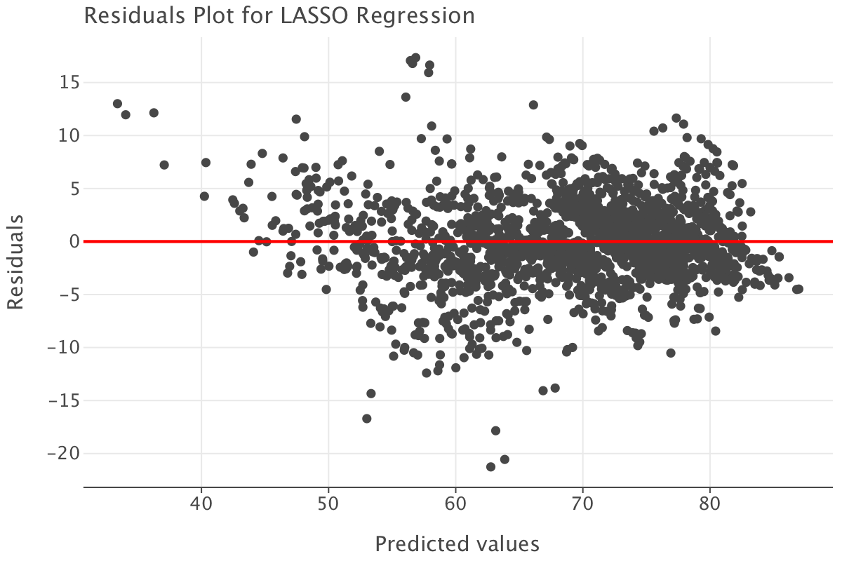
The residuals plot presents a similar pattern to that of the linear model. Again, the conclusion is the LASSO model seems like a reasonable fit and that we need to investigate outliers further.
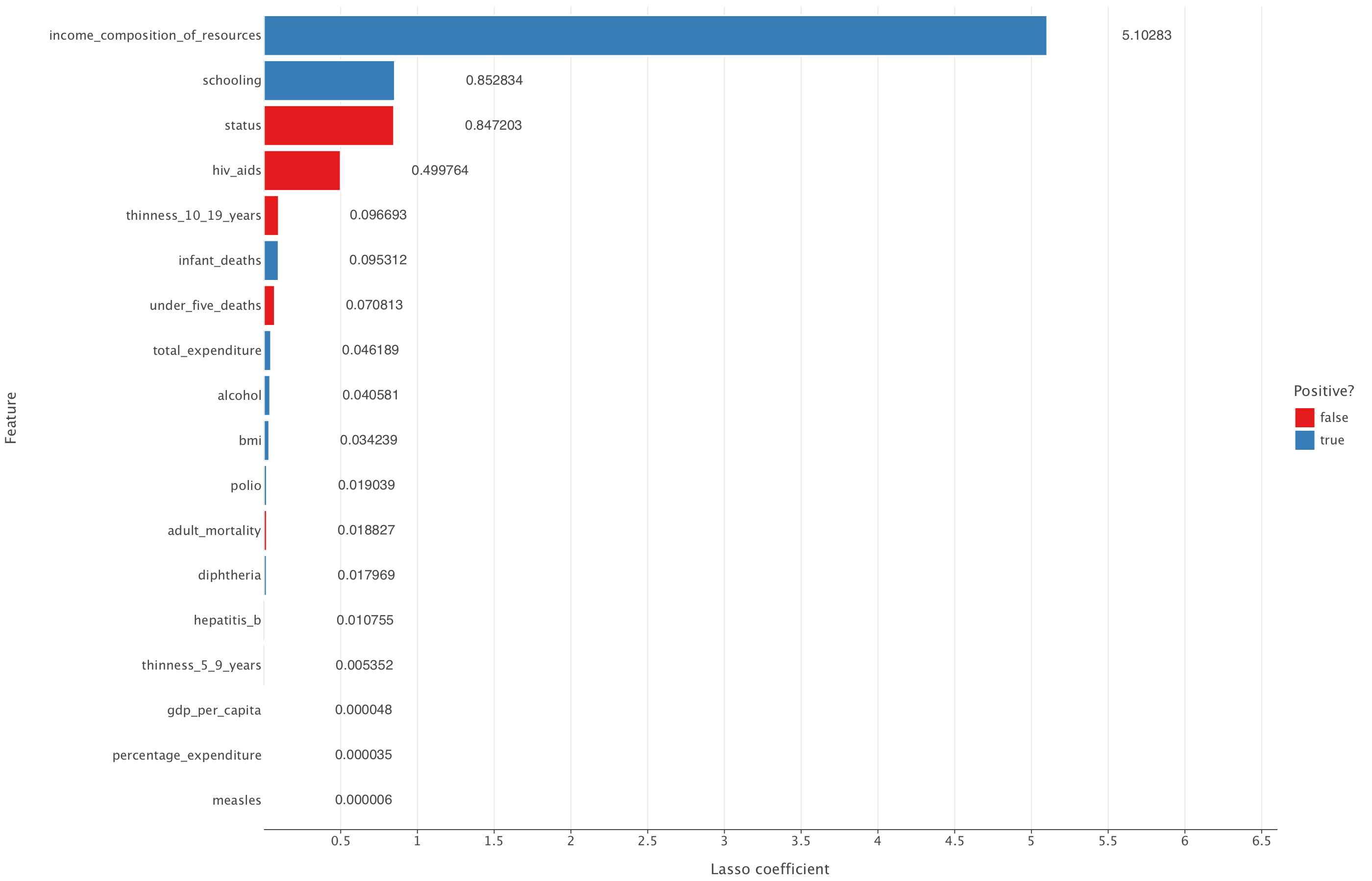
Let’s have a look at the coefficients reduced to 0 by the LASSO model.
lasso_output = pd.DataFrame({"feature": df_train_imp_mice.drop('life_expectancy', axis=1).columns, "coefficient": lasso_model.coef_})

# Code a positive / negative vector
lasso_output["positive"] = np.where(lasso_output["coefficient"] >= 0, True, False)

# Take the absolute value of the coefficients
lasso_output["coefficient"] = np.abs(lasso_output["coefficient"])

# Remove the constant and sort the data frame by (absolute) coefficient magnitude
lasso_output = lasso_output.query("feature != 'const'").sort_values("coefficient")lasso_output["coefficient_rounded"] = lasso_output["coefficient"].round(6)
(
ggplot(lasso_output, aes("coefficient", "feature", fill = "positive")) +
geom_bar(stat = "identity") +
geom_text(aes(label="coefficient_rounded"), ha="left", va="center", nudge_x=0.65) +
theme(panel_grid_major_y = element_blank()) +
labs(x = "Lasso coefficient", y = "Feature",
fill = "Positive?")+
ggsize(1400, 900)+
coord_cartesian(xlim=(min(lasso_output["coefficient"]), max(lasso_output["coefficient"]) + 1.5)) # Add margin
)
Let’s now plot the linear regression model coefficients
linear_output = pd.DataFrame({"feature": df_train_imp_mice.drop('life_expectancy', axis=1).columns, "coefficient": linear_model.coef_.flatten()})

# Code a positive / negative vector
linear_output["positive"] = np.where(linear_output["coefficient"] >= 0, True, False)

# Take the absolute value of the coefficients
linear_output["coefficient"] = np.abs(linear_output["coefficient"])

# Remove the constant and sort the data frame by (absolute) coefficient magnitude
linear_output = linear_output.query("feature != 'const'").sort_values("coefficient")linear_output["coefficient_rounded"] = linear_output["coefficient"].round(6)
(
ggplot(linear_output, aes("coefficient", "feature", fill="positive")) +
geom_bar(stat="identity") +
geom_text(aes(label="coefficient_rounded"), ha="left", va="center", nudge_x=0.65) +
theme(panel_grid_major_y=element_blank()) +
labs(x="Linear regression coefficient", y="Feature", fill="Positive?") +
ggsize(1400, 900) + # Increase figure size
coord_cartesian(xlim=(min(linear_output["coefficient"]), max(linear_output["coefficient"]) + 1.5)) # Add margin
)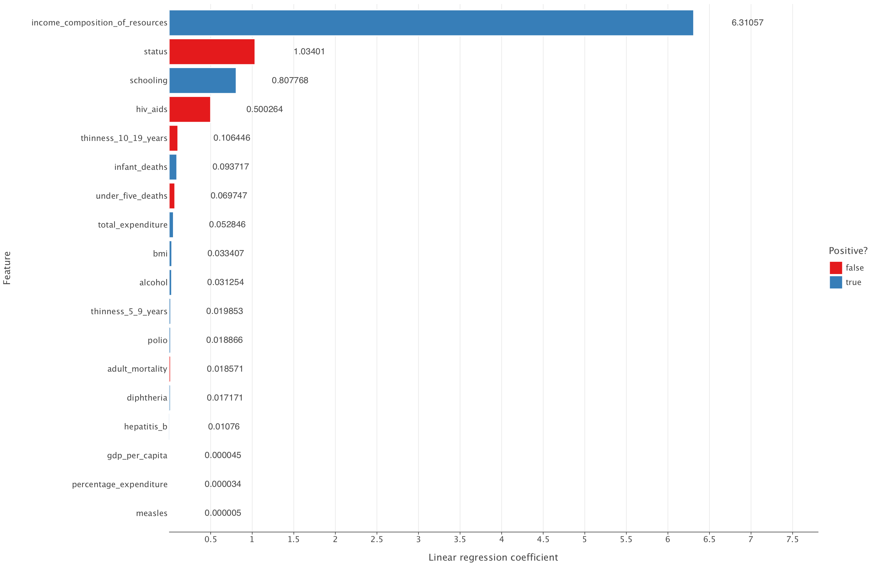
From this, we can see that the LASSO model reduces all coefficients but none of them to 0. All coefficients that are present in the linear regression model are also present in the LASSO model.
Overall, given that LASSO doesn’t improve on the linear regression metrics and also doesn’t reduce the number of predictive variables in the model compared to linear regression, it might be best to simply select the linear regression model in this case.