
✅ A possible model solution for the W10 summative
What follows is a possible solution for the W10 summative. If you want to render the .qmd that was used to generate this page for yourselves, use the download button below:
Note that I purposely avoided very elaborate solutions here and I’ve avoided optimizing the performance of the models to death. I tried to go for rather straightforward but justified solutions.
⚙️ Setup
We start, as usual, by loading libraries.
import pandas as pd
import missingno as msno
import sweetviz as sv
import numpy as np
from sklearn.preprocessing import MinMaxScaler
from sklearn.linear_model import LinearRegression
from sklearn.model_selection import TimeSeriesSplit
from sklearn.model_selection import TimeSeriesSplit, RandomizedSearchCV, learning_curve
from sklearn.utils.class_weight import compute_class_weight
from sklearn.preprocessing import StandardScaler
from sklearn.linear_model import LogisticRegression
from sklearn.ensemble import RandomForestRegressor
import lightgbm as lgb
import re
from sklearn.metrics import r2_score, mean_absolute_error,f1_score, precision_score, recall_score, roc_auc_score,average_precision_score, balanced_accuracy_score, roc_curve, precision_recall_curve,confusion_matrix
from lets_plot import *

LetsPlot.setup_html()
Part 1
Question 1
Loading the data requires the read_stata() method from from pandas (see the pandas documentation).
yuan = pd.read_stata('../../data/yuan_inflation_data.dta')msno.matrix(yuan)
report = sv.analyze(yuan)
report.show_notebook()
This dataset is clean and does not have any missing values. The scales of the variables vary widely (nominal money issues is in the millions for example). Some variables are skewed (e.g CPI, nominal money issues and total wars).We have a mix of numerical and categorical variables (emperorname is categorical).
def plot_hist_with_density(df, col):
    return (
        ggplot(df) +
        geom_histogram(aes(x=col, y='..density..'), bins=30, fill='#547AB0', color='black', alpha=0.6) +
        geom_density(aes(x=col), color='#547AB0', size=1.2,alpha=0.3) +
        ggtitle(f'Distribution of {col}\n with Density Overlay') +
        theme_minimal()

    )

# Step 2: Variables to visualize
vars_to_plot = ['cpi', 'totalwar', 'nominal', 'pop', 'nomgrants', 'disaster']
plots = [plot_hist_with_density(yuan, var) for var in vars_to_plot]
gggrid(plots, ncol=3)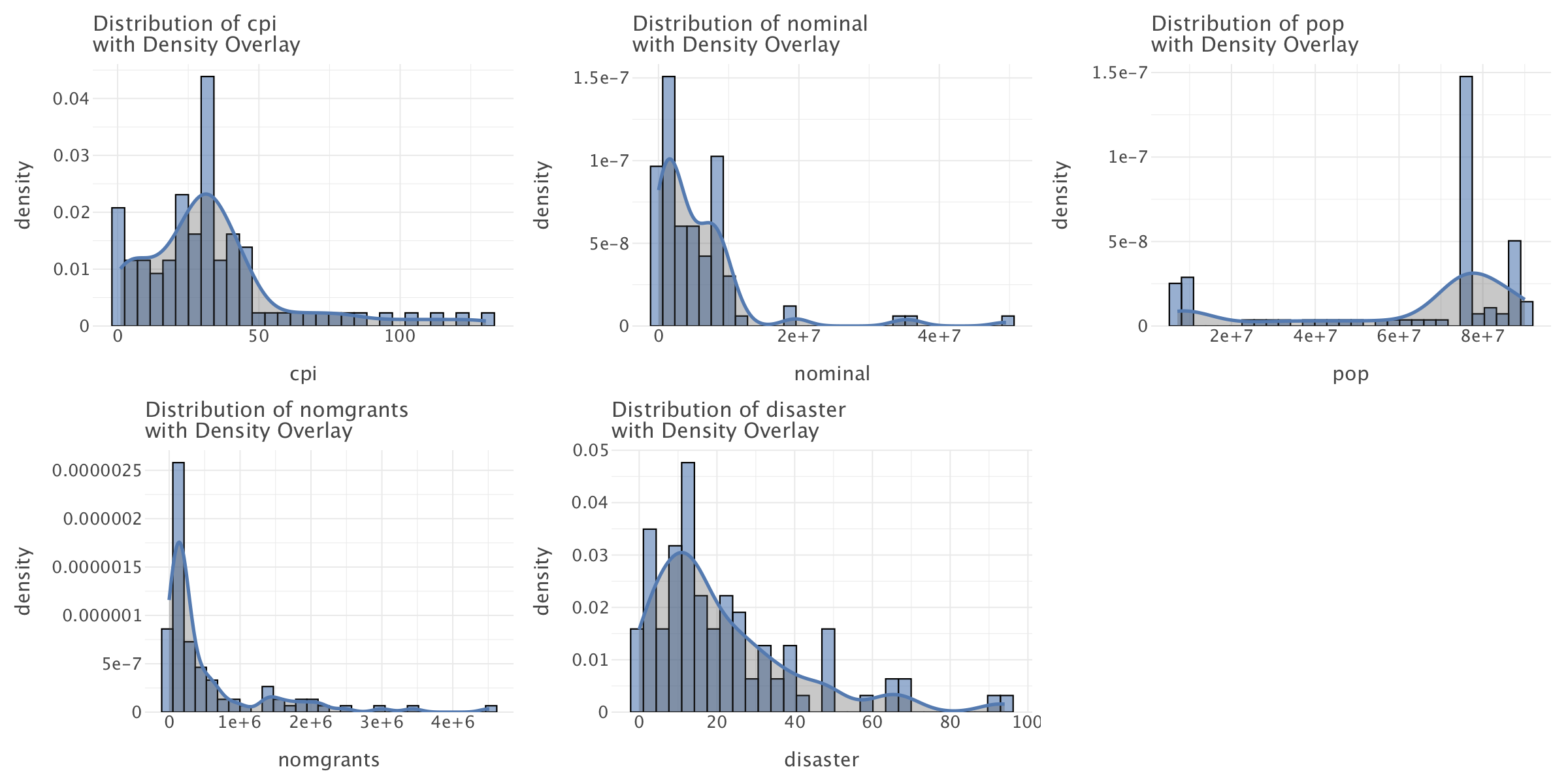
Most of the variables in the dataset do not follow a normal distribution and most follow an exponential distribution (e.g totalwar,nominal,cpi,nomgrants,disaster). This is likely reflective of a state where a spiralling economic and political crisis gradually took hold until the dynasty collapsed.
def plot_line(df, col, color):
    match col:
        case 'cpi':
            y_label = 'CPI (%)'
        case 'nominal':
            y_label = 'Nominal Money Issues'
        case 'pop':
            y_label = 'Population'
        case 'nomgrants':
            y_label = 'Number of Imperial Grants'
        case 'disaster':
            y_label = 'Number of Disasters'
        case _:
            y_label = 'Unknown'
    return (
        ggplot(df) +
        geom_line(aes(x='year', y=col),color=color) +
        geom_point(aes(x='year', y=col),color=color) +
        ggtitle(f'Evolution of {y_label} for most of \nthe Yuan dynasty (1260-1355)') +
        scale_x_continuous(name='Year', breaks=sorted(df['year'].unique()), labels=[str(y) for y in sorted(df['year'].unique())])+
        ylab(y_label)+
        theme_minimal()
    )

# Step 2: Variables to visualize
vars_to_plot = ['cpi', 'nominal', 'pop', 'nomgrants', 'disaster']
colors = ['#3EB489', '#e6a817', '#4682b4', '#b53389', '#ed2939']
plots = [plot_line(yuan, var,color) for var,color in zip(vars_to_plot,colors)]
g=gggrid(plots, ncol=2)
g+=ggsize(1400,1200)
g.show()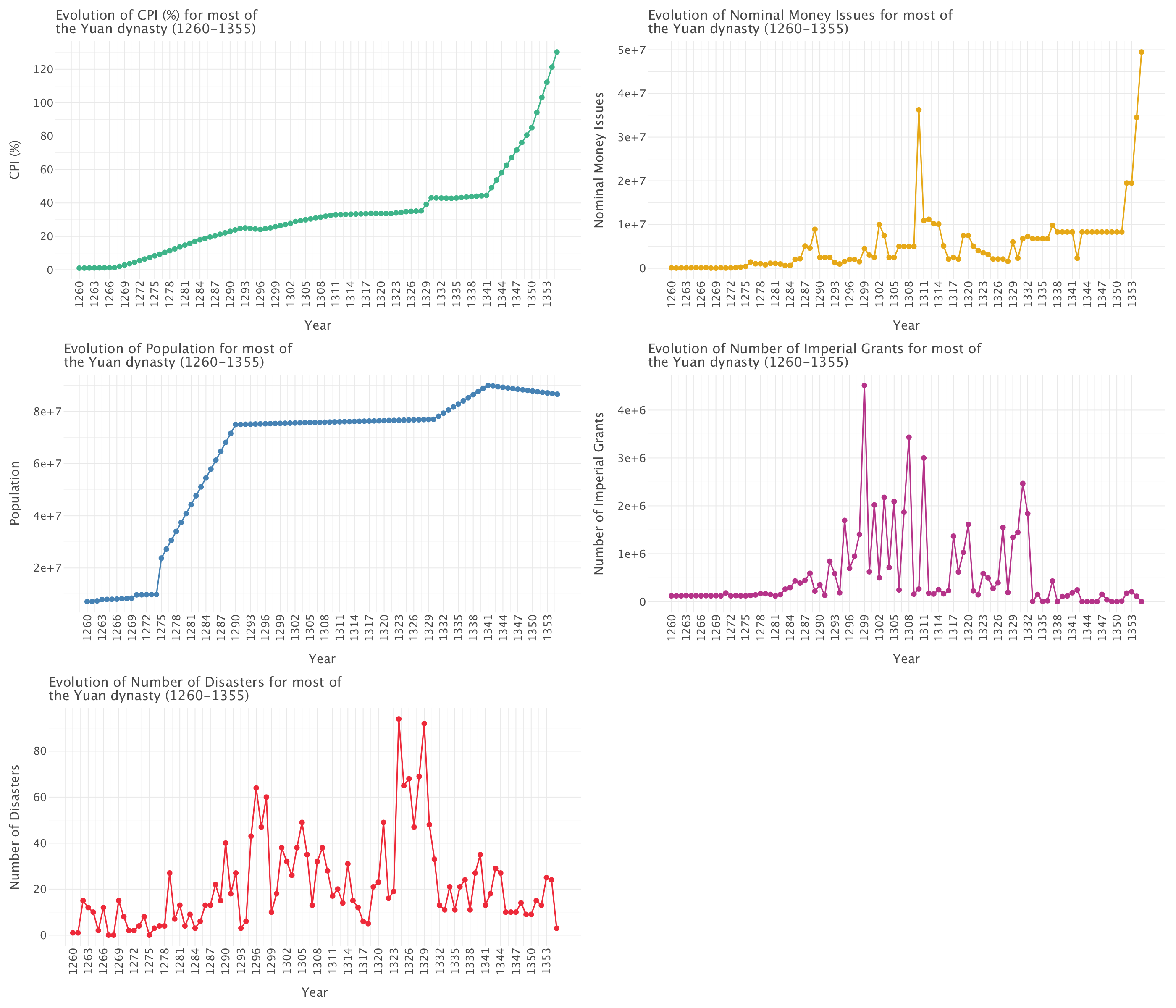
This graph allows to examine five critical indicators that track the rise and fall of the Yuan dynasty, revealing classic patterns of dynastic cycle in imperial China.
Consumer Price Index (CPI)
- Pattern: Three distinct phases:
- Gradual increase (1260-1300)
- Plateau/slight increase (1300-1340)
- Dramatic exponential increase (1340-1355)
- Interpretation: The final phase exhibits classic exponential growth characteristics as the curve steepens dramatically, indicating severe monetary instability and economic breakdown toward the dynasty’s end.
Nominal Money Issues
- Pattern: Initially low and stable, with sporadic printing showing spikes around 1310, followed by enormous increases after 1350.
- Interpretation: The massive currency expansion aligns perfectly with the CPI surge, suggesting monetary overexpansion that fueled runaway inflation as the dynasty approached collapse.
Population
- Pattern: Four distinct phases:
- Modest initial level (~10 million, 1260-1275)
- Sharp increase between 1275-1290 (quadrupling to ~70-75 million)
- Long plateau (1290-1330)
- Final peak around 1340, followed by slight decline
- Interpretation: This follows a logistic growth curve (S-curve) rather than simple exponential growth. The rapid early growth reflects initial stability and prosperity under Mongol rule, while the plateau suggests reaching agricultural and administrative carrying capacity. The late decline correlates with economic crisis and conflicts.
Imperial Grants
- Pattern: Relatively flat early on, then fluctuating significantly with major spikes particularly around 1310-1320.
- Interpretation: Likely indicates administrative or political instability, with grants used strategically to secure loyalty or reward service during increasingly turbulent times.
Number of Disasters
- Pattern: Considerable volatility with major peaks around 1290 and dramatic spikes during 1320-1330.
- Interpretation: Reflects increasing natural or human-made disasters, potentially compounding internal stressors and undermining state capacity.
The Classic Dynastic Cycle
The data presents a textbook example of the dynastic cycle in Chinese history: 1. Early Stability and Growth (1260-1290): Characterized by population expansion and modest inflation 2. Middle Period Challenges (1290-1340): Marked by fluctuating imperial grants and increased disasters 3. Final Period of Severe Instability (1340-1355): Defined by exponential inflation, currency devaluation, and demographic decline
The correlation between rising inflation, increased money printing, and growing rebellions (as seen in the war types graph below) in the final decades points directly to the economic and political breakdown that ultimately led to the dynasty’s fall in 1368. This pattern exemplifies how economic mismanagement and internal instability can accelerate dynastic decline.
# Step 1: Prepare the data for the stacked bars
war_types = ['rebellion', 'external', 'unification']
df_long = yuan.melt(id_vars='year', value_vars=war_types, var_name='war_type', value_name='count')

# Ensure year is treated as a categorical variable for plotting
df_long['year'] = df_long['year'].astype(str)

# Step 2: Prepare the data for the totalwar line plot
df_totalwar = yuan[['year', 'totalwar']].copy()
df_totalwar['year'] = df_totalwar['year'].astype(str)

# Step 3: Plot the stacked bars and totalwar line
p = (
    ggplot() +
    # Stacked bar plot
    geom_bar(aes(x='year', y='count', fill='war_type'), data=df_long, stat='identity') +
    # Line for totalwar
    geom_line(aes(x='year', y='totalwar'), data=df_totalwar, color='black', size=1.2) +
    # Points for totalwar
    geom_point(aes(x='year', y='totalwar'), data=df_totalwar, color='black', size=2) +
    ggtitle('Evolution of war types during the Yuan dynasty\n and relationship between totalwar and other war-related variables') +
    xlab('Year') +
    ylab('Count') +
    theme(axis_text_x=element_text(angle=90, hjust=1))+
    ggsize(1200,800)
)

p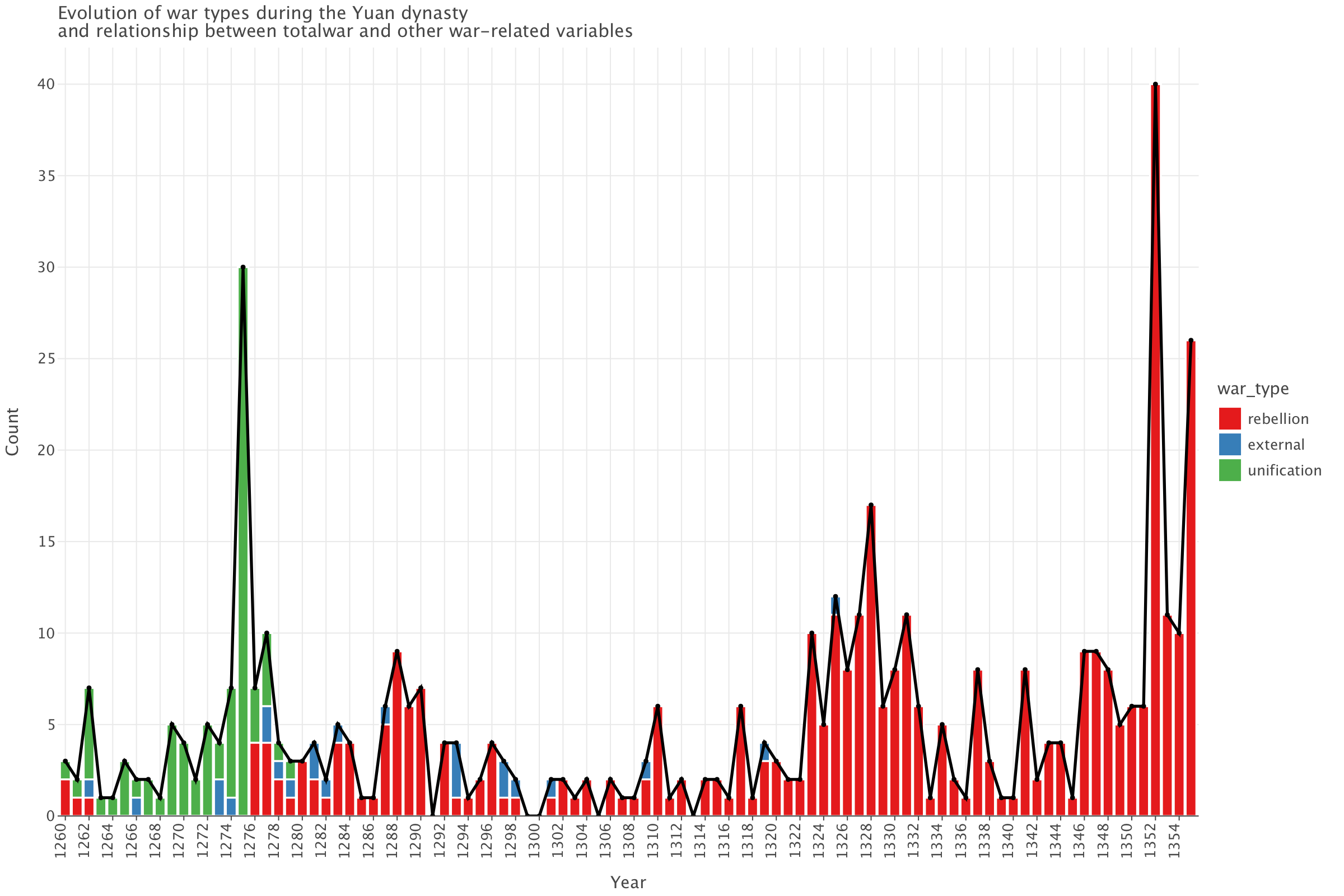
The nature of wars changes during the course of the Yuan dynasty: most of the wars are unification wars (led against remnants of the Song dynasty) until around 1278. From then on, it’s mostly rebellions. Quite remarkably, the Yuan waged relatively few external wars. This graph also shows three distinct periods:
- 1260-1278: a period characterized by an an increase in wars (mainly of unification against remnants of the Song) with a peak in 1275
- 1279-1322: a period of relative stability with relatively few wars per year
- 1323-1355: a period where the number of wars (mainly rebellions) steadily increases signalling worsening political crisis and instability (which eventually led to the fall of the dynasty in 1368)
And finally, the graph demonstrates that totalwar=external+rebellion+unification
Question 2
Top 10 years with most wars/disasters and overlap with highest nominal money issues
# Get top 10 years for total wars, nominal money issues, and disasters
top_wars = yuan.nlargest(10, 'totalwar')[['year', 'totalwar']]
top_money = yuan.nlargest(10, 'nominal')[['year', 'nominal']]
top_disasters = yuan.nlargest(10, 'disaster')[['year', 'disaster']]

# Find overlapping years
overlapping_war_money = set(top_wars['year']).intersection(set(top_money['year']))
overlapping_disaster_money = set(top_disasters['year']).intersection(set(top_money['year']))

# Print results
print(f"Top 10 years with most total wars:\n{top_wars}")
print(f"Top 10 years with most nominal money issues:\n{top_money}")
print(f"Top 10 years with most disasters:\n{top_disasters}")
print(f"Years with both high wars and high nominal money issues: {overlapping_war_money}")
print(f"Years with both high disasters and high nominal money issues: {overlapping_disaster_money}")
Top 10 years with most total wars:
year totalwar
92 1352 40
15 1275 30
95 1355 26
68 1328 17
65 1325 12
67 1327 11
71 1331 11
93 1353 11
17 1277 10
63 1323 10
Top 10 years with most nominal money issues:
year nominal
95 1355 49500000
50 1310 36259200
94 1354 34500000
92 1352 19500000
93 1353 19500000
52 1312 11211680
51 1311 10900000
53 1313 10200000
54 1314 10100000
42 1302 10000000
Top 10 years with most disasters:
year disaster
64 1324 94
69 1329 92
68 1328 69
66 1326 68
65 1325 65
36 1296 64
38 1298 60
45 1305 49
61 1321 49
70 1330 48
Years with both high wars and high nominal money issues: {1352, 1353, 1355}
Years with both high disasters and high nominal money issues: set()Analysis of the years of overlap between high number of wars and high number of nominal issues
There is an overlap between high numbers of wars and high nominal money issues in the years 1352, 1353, and 1355:
- 1352: 40 wars with 19,500,000 in nominal money issues
- 1353: 11 wars with 19,500,000 in nominal money issues
- 1355: 26 wars with the highest money issuance of 49,500,000
This period falls during the final decades of Yuan rule when the dynasty was experiencing significant instability. The data suggests an escalating crisis where the government was likely printing more currency to finance military efforts against growing rebellions, particularly the Red Turban Rebellion which began around 1351 (and ended up overthrowing the Yuan).
Relationship between warfare and money issuance
Three possible relationships between warfare and money issuance emerge:
- Military campaigns necessitated increased money issuance to fund armies
- Economic instability from excessive money issuance contributed to social unrest and conflict
- Both factors reinforced each other in a negative cycle
The massive increase in money issuance during these years (especially the jump to 49,500,000 in 1355) would have likely caused severe inflation. Historical accounts confirm that by the late Yuan period, paper money had depreciated dramatically, aligning with your data showing unprecedented levels of issuance.
Analysis of the spike in money issuance around 1310-1314
There’s an interesting spike in money issuance around 1310-1314, which doesn’t correspond with high levels of warfare or disasters. This might represent an earlier attempt at economic stimulus or financial reorganization that preceded the later crisis.
Disaster Patterns
Interestingly, there’s no overlap between years with high disasters and high nominal money issues. This might indicate that natural disasters didn’t directly drive monetary policy.
While disasters don’t overlap with money issuance, they do cluster in the 1320s (particularly 1324-1329). These natural disasters may have weakened the dynasty’s economic foundation and administrative capacity before the more acute military crises of the 1350s.
The temporal sequence suggests that financial mismanagement (possibly beginning with the 1310s issuance spike) may have contributed to economic instability, which later combined with natural disasters and eventually erupted into widespread rebellion in the 1350s.
Administrative Breakdown
The extremely high money issuance in 1354-1355 might indicate a last-ditch effort to maintain control as the dynasty approached collapse. This pattern of governance breakdown shows the Yuan government responding to challenges with increasingly desperate financial measures. The data supports historical accounts that the late Yuan government resorted to excessive money printing while simultaneously dealing with widespread rebellion, ultimately contributing to its downfall in 1368.
Evolution over time of CPI, total wars, disasters and nominal money issues
# Initialize Min-Max Scaler
scaler = MinMaxScaler()

# Apply Min-Max Scaling to relevant columns
scaled_cols = ['cpi', 'totalwar', 'disaster', 'nominal']
yuan_scaled = yuan.copy()
yuan_scaled[scaled_cols] = scaler.fit_transform(yuan[scaled_cols])

# Highlight key years in the dataset
highlight_years = {1352, 1353, 1355}  # Years with both high wars & high money issuance
yuan_scaled['highlight'] = yuan_scaled['year'].apply(lambda x: 'Highlighted (High wars+High money issuance)' if x in highlight_years else 'Normal')

# Convert to long format
yuan_melted = yuan_scaled.melt(id_vars=['year', 'highlight'], value_vars=scaled_cols, var_name='Variable', value_name='Value')

# Create a mapping for more explicit legend labels
legend_labels = {
    'cpi': 'Normalized Consumer Price Index (CPI)',
    'totalwar': 'Normalized Total Wars',
    'disaster': 'Normalized Natural Disasters',
    'nominal': 'Normalized Nominal Money Issues'
}

# Replace variable names with explicit labels
yuan_melted['Variable'] = yuan_melted['Variable'].map(legend_labels)

# Define custom color mapping
custom_colors = {
    'Normalized Consumer Price Index (CPI)': '#edae49',
    'Normalized Total Wars': '#d1495b',
    'Normalized Natural Disasters': '#00798c',
    'Normalized Nominal Money Issues': '#30638e'
}

# Assign smaller sizes to points
size_mapping = {'Highlighted': 5, 'Normal': 0}  # Set highlighted points to size 5, normal to invisible (0)

# Create plot
plot = (ggplot(yuan_melted) +
        geom_line(aes(x='year', y='Value', color='Variable')) +
        geom_point(aes(x='year', y='Value', shape='highlight', size='highlight'),
                   color='black', alpha=0.7) +
        scale_size_manual(values=size_mapping) +  # Set smaller highlight point size
        scale_color_manual(values=custom_colors) +  # Apply custom colors
        scale_x_continuous(name='Year', breaks=sorted(yuan['year'].unique()), labels=[str(y) for y in sorted(yuan['year'].unique())])+
        labs(title="Trends in CPI, Wars, Disasters, and Money Issues (1260-1355)",
             x="Year", y="Min-Max Scaled Values", color="Indicator") +  # Change legend title
        theme_minimal())
plot += ggsize(1600,1000)
plot.show()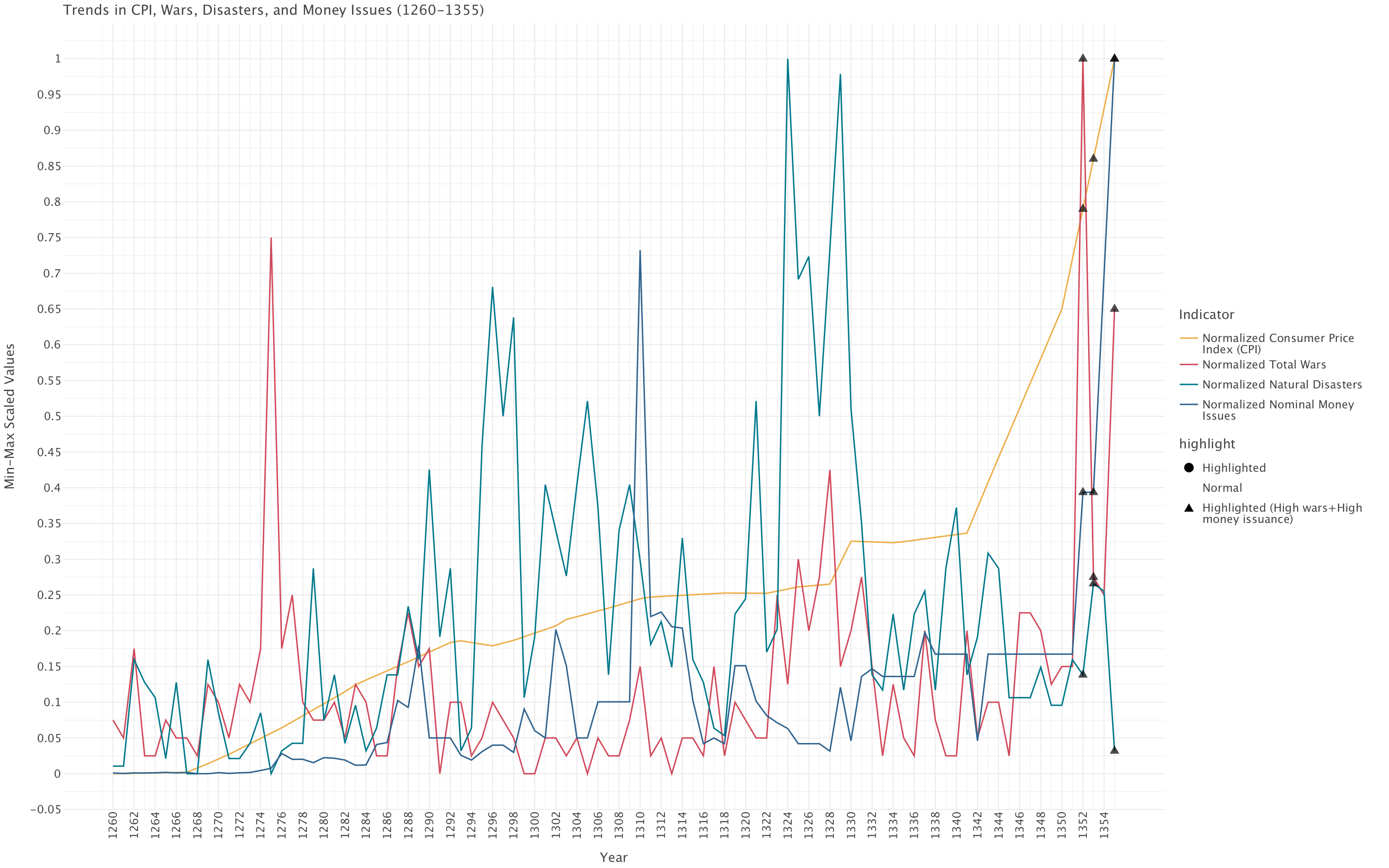
Before plotting the different variables in our data, we apply min-max scaling. Why is that?
- Our variables (disasters: 0-94, nominal money: 22.9K-49.5M, wars: 0-40, CPI: 1-130) have drastically different scales. Min-max scaling brings them all to a common [0,1] range, allowing us to directly observe relative movements and turning points.
- We’re analyzing relationships between wars, money issuance, disasters, and inflation. Min-max scaling helps identify temporal relationships (does money issuance peak before or after war events?) by normalizing amplitude differences.
- For historical analysis, understanding when variables reached their relative maximums and minimums is often more informative than their absolute values. Min-max scaling emphasizes these relative positions.
Comparison with Alternative Methods
Log transformation
We wouldn’t be able to apply the log transformation here: some variables (e.g disasters, wars) have zero values, which a log transformation can’t handle. On top of this, while a log transformation works well for exponential data like CPI, it would inappropriately compress the count data (wars, disasters) which isn’t exponentially distributed.
Standardization
Standardization would only be appropriate if the variables we were plotting followed a normal distribution: none of the variables we have do. On top of this, standardization would center our variables around their means, but variables with similar means but different variances would still be difficult to compare visually.
Interpretation of the plot
Based on this plot, several key patterns emerge:
End-of-Dynasty Crisis (1350-1355): The most striking feature is the dramatic spike in all indicators at the very end of the period. Wars (red line) and money issues (blue line) both reach their absolute maximum in the 1350s, while CPI (yellow line) shows a steep upward trajectory. This aligns with the historical collapse of the Yuan dynasty, suggesting a desperate government resorting to massive currency issuance to fund military campaigns against rebellions.
Disaster Patterns: Natural disasters (teal line) show several pronounced peaks throughout the period, with particularly intense clusters around 1290s, 1310s, and especially the 1320s. The highest disaster peaks (reaching near 1.0 on the scale) occur in what appears to be the 1320s.
Monetary Policy Evolution: Nominal money issues show relatively modest levels until approximately 1310, after which we see more frequent and larger spikes. This suggests a potential shift in fiscal policy (and begs the question about governance) around this time.
Inflation Trend: The CPI (yellow line) shows a generally steady upward trajectory throughout the entire period, with acceleration in the final decades. This continuous inflationary trend likely undermined economic stability over time.
Correlation Patterns:
- Wars and money issues show correlation at several points, particularly at the dynasty’s end
- Disasters do not consistently correlate with immediate money issuance
- The highlighted triangles at the end mark years with both high wars and high money issuance
Earlier War Spike: There’s a notable isolated spike in wars (red line) around 1275-1280, which doesn’t correspond with equivalent increases in money issuance. This mainly corresponds to the last wars of the Yuan with the remnants of the Song dynasty but could also represent external conflicts: the common characteristic here is that these conflicts were managed without extraordinary monetary measures.
The visualization effectively demonstrates how the dynasty experienced a catastrophic convergence of factors in its final years - escalating warfare, unprecedented money issuance, and accelerating inflation - creating a perfect storm that likely contributed to its downfall in 1368.
Part 2
Question 1
We exclude emperor and emperorname from the modeling as they do not provide meaningful information for the regression analysis. Given that totalwar=external+rebellion+unification, we can choose to either keep totalwar on its own or drop totalwar and keep external, rebellion and unification instead. Since knowing which types of wars the Yuan were engaged in at any point in time might be more informative than simply taking into account the total number of wars, in this analysis, we’ll keep external, rebellion and unification and drop totalwar.
yuan_reduced = yuan.drop(columns=['emperor','emperorname','totalwar'])Let’s split the data in training and test sets
training, test = (yuan_reduced.query(f'year {op} 1327') for op in ('<', '>='))target = 'cpi'
features = [col for col in yuan_reduced.columns if col not in [target,'year']]# Train the Model
model = LinearRegression()
model.fit(training[features], training[target])
# Predictions
training['predicted_cpi'] = model.predict(training[features])
test['predicted_cpi'] = model.predict(test[features])
# Evaluate Performance
metrics = {
"Set": ["Training", "Test"],
"R²": [r2_score(training[target], training['predicted_cpi']), r2_score(test[target], test['predicted_cpi'])],
"MAE": [mean_absolute_error(training[target], training['predicted_cpi']), mean_absolute_error(test[target], test['predicted_cpi'])]
}
metrics_df = pd.DataFrame(metrics)
print(metrics_df)
# Residual DataFrames
training['residuals'] = training[target] - training['predicted_cpi']
test['residuals'] = test[target] - test['predicted_cpi']
# Combine for Plotting
residuals_df = pd.concat([training.assign(Set='Training'), test.assign(Set='Test')])
# Residual Plot
plot = (ggplot(residuals_df) +
geom_point(aes(x='predicted_cpi', y='residuals', color='Set'), alpha=0.7) +
geom_hline(yintercept=0, linetype="dashed", color="red") +
labs(title="Residual Plot for Baseline Linear Regression",
x="Predicted CPI", y="Residuals") +
theme_minimal())
plot.show()Set R² MAE
0 Training 0.932165 2.558541
1 Test -0.921603 27.854257
/var/folders/5s/2df7vjxs371f0f47gzlnsjg40000gp/T/ipykernel_78851/2733624378.py:6: SettingWithCopyWarning:
A value is trying to be set on a copy of a slice from a DataFrame.
Try using .loc[row_indexer,col_indexer] = value instead
See the caveats in the documentation: https://pandas.pydata.org/pandas-docs/stable/user_guide/indexing.html#returning-a-view-versus-a-copy
training['predicted_cpi'] = model.predict(training[features])
/var/folders/5s/2df7vjxs371f0f47gzlnsjg40000gp/T/ipykernel_78851/2733624378.py:7: SettingWithCopyWarning:
A value is trying to be set on a copy of a slice from a DataFrame.
Try using .loc[row_indexer,col_indexer] = value instead
See the caveats in the documentation: https://pandas.pydata.org/pandas-docs/stable/user_guide/indexing.html#returning-a-view-versus-a-copy
test['predicted_cpi'] = model.predict(test[features])
/var/folders/5s/2df7vjxs371f0f47gzlnsjg40000gp/T/ipykernel_78851/2733624378.py:20: SettingWithCopyWarning:
A value is trying to be set on a copy of a slice from a DataFrame.
Try using .loc[row_indexer,col_indexer] = value instead
See the caveats in the documentation: https://pandas.pydata.org/pandas-docs/stable/user_guide/indexing.html#returning-a-view-versus-a-copy
training['residuals'] = training[target] - training['predicted_cpi']
/var/folders/5s/2df7vjxs371f0f47gzlnsjg40000gp/T/ipykernel_78851/2733624378.py:21: SettingWithCopyWarning:
A value is trying to be set on a copy of a slice from a DataFrame.
Try using .loc[row_indexer,col_indexer] = value instead
See the caveats in the documentation: https://pandas.pydata.org/pandas-docs/stable/user_guide/indexing.html#returning-a-view-versus-a-copy
test['residuals'] = test[target] - test['predicted_cpi']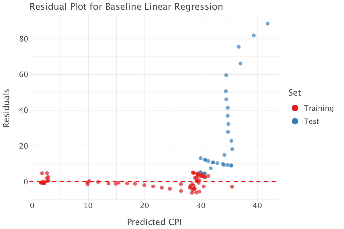
Interpretation of the metrics and residual plot
R² Scores
- Training R² = 0.932 : The model explains 93.21% of the variance in
cpifor the training set. This suggests an excellent fit. - Test R² = -0.921 : A negative R² means that the model performs worse than just predicting the mean on the test set. This is a strong sign of overfitting.
MAE
- Training MAE = 2.55: On average, the model’s predictions in the training set deviate from actual CPI by 2.55 units. Given that the scale of CPI goes from 1 to 130, this looks like a decent performance.
- Test MAE = 27.85: The test set error is almost 11× larger, meaning the model generalizes very poorly.
Residual Plot Analysis
- Training Residuals (Red Points):
- Residuals are small and centered around 0, which suggests a good fit on the training data.
- Test Residuals (Blue Points):
- A clear pattern emerges, especially for high predicted values.
- Test residuals increase dramatically at higher CPI values, indicating the model fails to generalize for later years.
Why is This Happening?
- Overfitting: The model fits the training data too well but doesn’t generalize to unseen data.
- Non-Linearity: The relationship between features and CPI is not truly linear.
- Exponential Growth in CPI: CPI increases rapidly in later years (clear pattern of hyperinflation), but a simple linear regression can’t capture this trend.
How could we improve things?
If we were intent on using a linear model:
- we could try using a log transformation on CPI:
- Since CPI grows exponentially, applying a log transform (
log(cpi)) may make the relationship more linear (also consider applying a log or a Yeo-Johnson transformation on skewed variables depending on whether they are positive or have negative or zero values).
- Since CPI grows exponentially, applying a log transform (
- we could also use regularization techniques (Ridge/Lasso Regression):
- These models prevent overfitting by penalizing large coefficients.
More generally, we should consider:
- using time-aware cross-Validation**:
- our current train-test split is based on time but captures very specific and distinct patterns in the training and test sets, so applying rolling or expanding window cross-validation would better reflect how the model performs on future data.
- trying non-linear models:
- the residual plots helped us uncover non-linear patterns in our data. Non-linear models would better capture these dynamics and complex relationships uncovered. We could, for example, try tree ensembles e.g random forest, or boosted trees such as XGBoost as they require minimal pre-processing, tend to have good performance out-of-the-box and retain some explainability.
Question 3
Since we picked up non-linear patterns in the the residual plots in the previous model, we’ll use a Random Forest model to try and improve our baseline model. We’ll also implement expanding window cross-validation and tune the model parameter for more robust model selection/validation. We have to use time-aware cross-validation as we would otherwise expose ourselves to data leakage (e.g predicting the past with the future!).
# Define Time-Aware Cross-Validation
#5-fold expanding window
tscv = TimeSeriesSplit(n_splits=5)
# Initialize Random Forest Regressor
rf = RandomForestRegressor(random_state=42, n_jobs=-1)We implement hyperparameter tuning for your Random Forest model using a randomized search approach. A randomized search approach is computationally more efficient than a an exhaustive grid search. By default, RandomizedSearchCV (just like GridSearchCV) tries to maximize the scoring metric: so if we want to minimize the MAE scoring metric i.e for it to be as low as possible, we need to maximize the negative MAE score i.e neg_mean_absolute_error! This code block returns the set of hyperparameters that produce the best performance wrt the scoring metric on average.
# Define hyperparameter grid
param_grid = {
    'n_estimators': [100, 300, 500, 800],  # Number of trees
    'max_depth': [None, 10, 20, 30],  # Depth of each tree
    'min_samples_split': [2, 5, 10],  # Minimum samples required to split a node
    'min_samples_leaf': [1, 2, 4],  # Minimum samples at a leaf node
    'max_features': ['sqrt', 'log2'],  # Number of features per split
}

# Perform Randomized Search with Time-Series CV
rf_random = RandomizedSearchCV(
    estimator=rf,
    param_distributions=param_grid,
    n_iter=20,  # Number of combinations to try
    cv=tscv,
    scoring='neg_mean_absolute_error',
    n_jobs=-1,
    random_state=42
)

# Fit the model
rf_random.fit(training.drop(columns=['year', 'cpi','predicted_cpi','residuals']), training['cpi'])

# Get best parameters
best_params = rf_random.best_params_
print("Best Hyperparameters:", best_params)
Best Hyperparameters: {'n_estimators': 100, 'min_samples_split': 2, 'min_samples_leaf': 1, 'max_features': 'sqrt', 'max_depth': 30}The best model is a model with 100 trees, with a minimum number of samples per split of 2, a minimum number of samples per leaf of 1 and a maximum depth of 30.
We then fit a Random Forest using the best parameters found previous and compute evaluation metrics on the test set.
rf_best = RandomForestRegressor(**best_params, random_state=42)
rf_best.fit(training.drop(columns=['year', 'cpi','predicted_cpi','residuals']), training['cpi'])

# Predictions
train_preds = rf_best.predict(training.drop(columns=['year', 'cpi','predicted_cpi','residuals']))
test_preds = rf_best.predict(test.drop(columns=['year', 'cpi','predicted_cpi','residuals']))

# Compute Metrics
train_r2 = r2_score(training['cpi'], train_preds)
test_r2 = r2_score(test['cpi'], test_preds)
train_mae = mean_absolute_error(training['cpi'], train_preds)
test_mae = mean_absolute_error(test['cpi'], test_preds)
print(f"Training R²: {train_r2:.4f}, MAE: {train_mae:.4f}")
print(f"Test R²: {test_r2:.4f}, MAE: {test_mae:.4f}")
Training R²: 0.9957, MAE: 0.6007
Test R²: -1.4810, MAE: 32.1640Again, the metrics show a pattern of severe overfitting: the model is learning the training data too well and can’t generalize to new data. It also points to the wide discrepancy in patterns between the training and test sets: the patterns before 1327 differ significantly from patterns after 1327 (we should most likely use a smaller train-test split gap or use a sliding window approach). Our data is highly non-stationary: the patterns before 1327 fit a relatively stable economic situation while the patterns after that date fit a gradually worsening political and economic crisis.
Diagnosing the model a bit further
Let’s dig into this model a bit further.
First, let’s have a look at feature importance for this model.
# Extract feature importances
importances = rf_best.feature_importances_
indices = np.argsort(importances)[::-1]

# Create dataframe for lets_plot
importance_df = pd.DataFrame({
    'feature': [features[i] for i in indices],
    'importance': importances[indices]
})

# Plot feature importances with lets_plot
importance_plot = (ggplot(importance_df)
                   + geom_bar(aes(x='feature', y='importance'), stat='identity')
                   + coord_flip()
                   + ggtitle('Feature Importances')
                   + xlab('Features')
                   + ylab('Importance')
                   + theme_minimal()
                   +ggsize(1000, 800))
importance_plot.show()

# Print feature importances
print("\nFeature Importances:")
for i in indices:
    print(f"{features[i]}: {importances[i]:.4f}")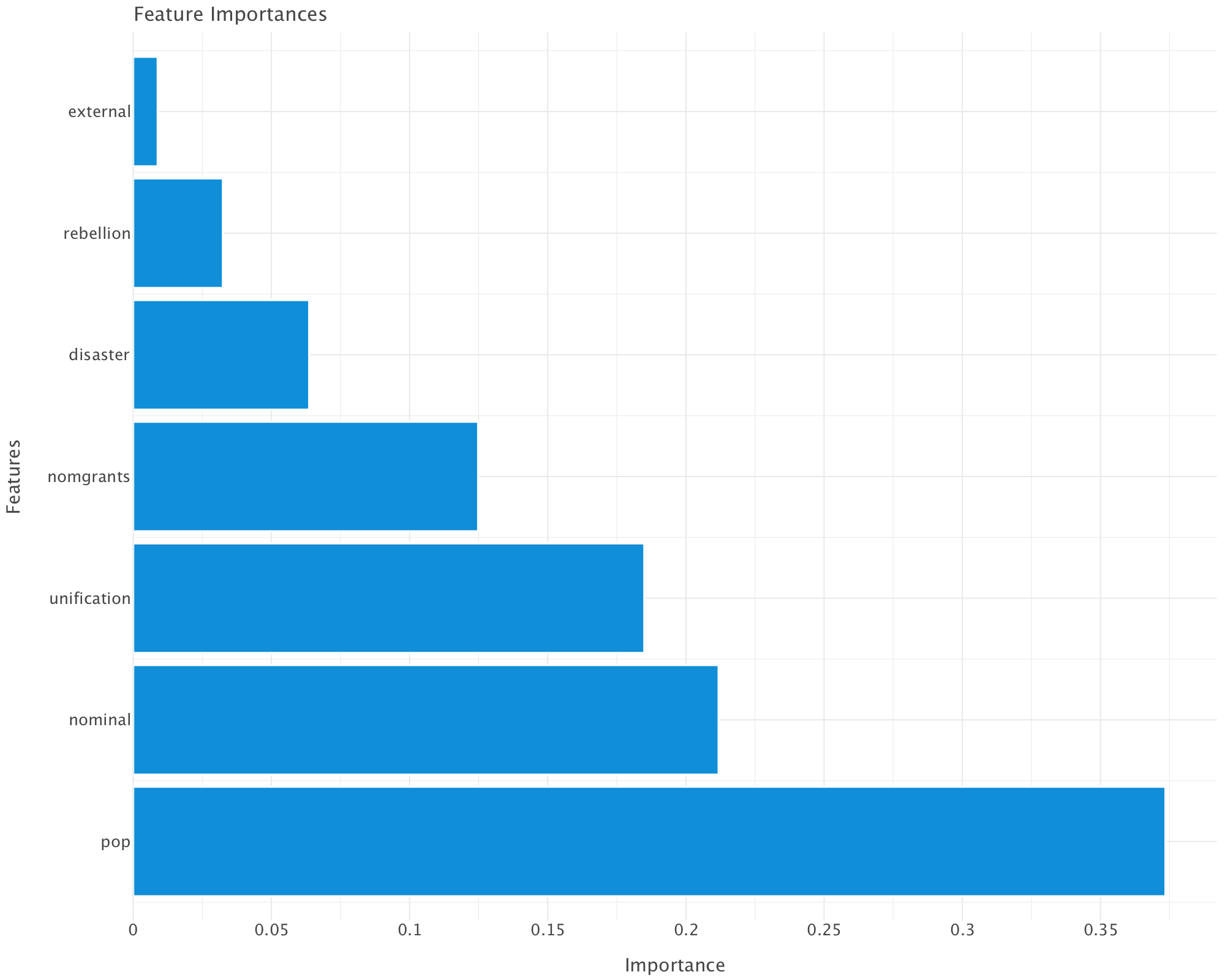
Feature Importances:
pop: 0.3735
nominal: 0.2118
unification: 0.1849
nomgrants: 0.1248
disaster: 0.0637
rebellion: 0.0324
external: 0.0088
Interpretation of Feature Importances
👣 Population (pop) – 37.35% (Most Important)
This makes sense since CPI (Consumer Price Index) is heavily influenced by population dynamics.
A growing population can increase demand for goods, potentially driving up prices (inflation). Conversely, a population decline might reduce demand and stabilize or deflate prices.
💰 Nominal Money Issues (nominal) – 21.18%
Its high importance suggests a strong link between money supply and inflation. Large issuances of nominal money (possibly due to excessive printing or overuse of paper currency) could lead to devaluation of money, increasing CPI. This aligns with classical inflation theory (more money in circulation = higher prices).
⚔️ Unification Wars (unification) – 18.49%
War expenses, resource allocation, and territorial expansion could disrupt economies. Unification wars may have spurred economic policies that affected inflation, such as increased taxation or monetary expansion to fund conquests.
🎖️ Imperial Grants (nomgrants) – 12.48%
This suggests that imperial grants had an impact on inflation. Large grants might have increased monetary circulation, pushing CPI higher.
🌪️ Disasters (disaster) – 6.37%
Disasters can destroy resources, reduce agricultural output, and cause temporary supply shocks that affect prices. However, their importance is lower than expected, which suggests that other factors (like monetary policy and wars) had a stronger influence on CPI.
🛡️ Rebellions (rebellion) – 3.24%
Rebellions might have caused localized economic disturbances but may not have had a systemic impact on CPI across all years.
🌍 External Wars (external) – 0.88% (Least Important)
Their importance is surprisingly low, which suggests that foreign conflicts had little effect on internal price levels. This might indicate that the Yuan economy was not highly trade-dependent or that external wars didn’t disrupt domestic markets significantly.
What does this means for our model?
Our model suggests inflation (CPI) in Yuan China was primarily driven by domestic economic factors rather than external conflicts.
Government monetary policy (nominal money issues, grants) and population changes were key drivers.
Wars played a role, but unification wars had a bigger impact than external conflicts or rebellions.
Disasters had a moderate impact—perhaps because economic resilience or policy responses mitigated their effects.
⚠️ These findings are obviously to be taken with a pinch of salt given what we know of the patterns of overfitting of our model. To get a more accurate idea of what is going on, we could try and extract feature importance over expanding time windows.
Now let’s look at learning curves. Learning curves show how model performance changes with increasing training data size, comparing training error (red) (i.e error on the set prior to 1327) with validation error (i.e error on the set from 1327 onwards) (blue).
# Generate learning curves
train_sizes, train_scores, val_scores = learning_curve(
    rf_best,
    training[features],
    training['cpi'],
    cv=tscv,
    scoring='neg_mean_absolute_error',
    train_sizes=np.linspace(0.1, 1.0, 10),
    n_jobs=-1
)

# Calculate means and standard deviations
train_mean = -np.mean(train_scores, axis=1)  # Convert back from negative
val_mean = -np.mean(val_scores, axis=1)      # Convert back from negative
train_std = np.std(train_scores, axis=1)
val_std = np.std(val_scores, axis=1)

# Create dataframe for lets_plot
learning_df = pd.DataFrame({
    'train_size': np.concatenate([train_sizes, train_sizes]),
    'error': np.concatenate([train_mean, val_mean]),
    'error_min': np.concatenate([train_mean - train_std, val_mean - val_std]),
    'error_max': np.concatenate([train_mean + train_std, val_mean + val_std]),
    'set': np.concatenate([['train']*len(train_sizes), ['validation']*len(train_sizes)])
})

# Plot learning curves with lets_plot
learning_plot = (ggplot(learning_df)
                + geom_line(aes(x='train_size', y='error', color='set'))
                + geom_point(aes(x='train_size', y='error', color='set'))
                + geom_ribbon(aes(x='train_size', ymin='error_min', ymax='error_max', fill='set'), alpha=0.2)
                + ggtitle('Learning Curves')
                + xlab('Training Data Size')
                + ylab('Mean Absolute Error')
                + theme_minimal()
                +ggsize(1000, 800))
learning_plot.show()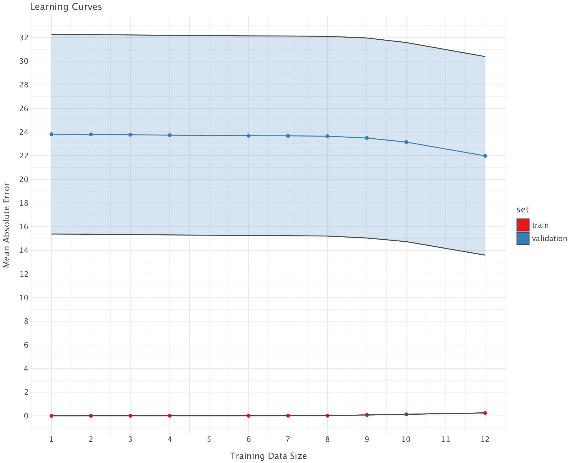
Interpretation of the Learning Curve
Train Error (Red, near 0)
- The training error is extremely low (near 0), meaning the model perfectly fits the training data.
- This is a sign of overfitting—the model memorizes training data instead of generalizing.
Validation Error (Blue, high and stable)
The validation MAE is very high (~24+) and does not decrease significantly with more data.
This suggests that adding more training data does not improve generalization. This indicates either of the following:
- A modeling issue (Random Forest might not be the best choice).
- Feature issues (some predictors might be noisy or not informative enough).
- Data shift (training and validation sets might come from different distributions - this is very likely as the economic pattern prior to 1327 are wildly different from the patterns from 1327 onwards)
Gap Between Train and Validation Errors
A large gap between training and validation errors confirms overfitting. The model is too complex and does not generalize well.
In building this new model, we didn’t go any further than changing models and implementing time-aware cross-validation/hyperparameter tuning. We could obviously have done some feature engineering e.g including lagged variables, etc. We could also try and implement strategies that explicitly take into account the data shift after 1327!
Part 3
Question 1
Let’s load the rates data in df dataframe and the economic indicators data in an economic_indicators dataframe.
df = pd.read_csv('../../data/BoE_interest_rates.csv')
economic_indicators = pd.read_csv('../../data/economic_indicators_interest_rate_setting.csv')
Let’s visualise the first lines of both dataframes before proceeding.
df.head()| Date | Rate | rate_change | |
|---|---|---|---|
| 0 | 1997-05-06 | 6.25 | 1 |
| 1 | 1997-06-06 | 6.50 | 1 |
| 2 | 1997-07-10 | 6.75 | 1 |
| 3 | 1997-08-07 | 7.00 | 1 |
| 4 | 1997-11-06 | 7.25 | 1 |
economic_indicators.head()| Date | CCI | Unemployment rate (aged 16 and over, seasonally adjusted): % | 10-year-gilt-yield | CPIH MONTHLY RATE 00: ALL ITEMS 2015=100 | Gross Value Added - Monthly (Index 1dp) :CVM SA | Monthly average Spot exchange rate, Sterling into US$ [a] XUMAGBD | Monthly average Spot exchange rates, Sterling into Euro [a] XUMASER | |
|---|---|---|---|---|---|---|---|---|
| 0 | 1997-01-01 | 102.2504 | 7.5 | 7.5552 | -0.3 | 62.0 | 0.6031 | 0.7376 |
| 1 | 1997-02-01 | 102.5327 | 7.3 | 7.1962 | 0.2 | 62.5 | 0.6156 | 0.7192 |
| 2 | 1997-03-01 | 102.6905 | 7.2 | 7.4544 | 0.2 | 62.6 | 0.6226 | 0.7172 |
| 3 | 1997-04-01 | 102.7900 | 7.2 | 7.6380 | 0.4 | 63.3 | 0.6137 | 0.7022 |
| 4 | 1997-05-01 | 102.9294 | 7.2 | 7.1681 | 0.4 | 62.7 | 0.6122 | 0.7034 |
We convert the Date column to datetime format in both dataframes and sort the dataframes by Date
df['Date'] = pd.to_datetime(df['Date'])
df = df.sort_values(by='Date')
economic_indicators['Date'] = pd.to_datetime(economic_indicators['Date'])
economic_indicators = economic_indicators.sort_values(by='Date')economic_indicators.tail()| Date | CCI | Unemployment rate (aged 16 and over, seasonally adjusted): % | 10-year-gilt-yield | CPIH MONTHLY RATE 00: ALL ITEMS 2015=100 | Gross Value Added - Monthly (Index 1dp) :CVM SA | Monthly average Spot exchange rate, Sterling into US$ [a] XUMAGBD | Monthly average Spot exchange rates, Sterling into Euro [a] XUMASER | |
|---|---|---|---|---|---|---|---|---|
| 330 | 2024-07-01 | 100.24810 | 4.1 | 4.1386 | 0.0 | 101.2 | 0.7775 | 0.8432 |
| 331 | 2024-08-01 | 100.00320 | 4.3 | 3.9444 | 0.4 | 101.3 | 0.7734 | 0.8518 |
| 332 | 2024-09-01 | 99.35313 | 4.3 | 3.9053 | 0.1 | 101.3 | 0.7566 | 0.8401 |
| 333 | 2024-10-01 | 99.03065 | 4.4 | 4.1993 | 0.6 | 101.1 | 0.7666 | 0.8353 |
| 334 | 2024-11-01 | 99.04012 | 4.4 | 4.4164 | 0.2 | 101.2 | 0.7844 | 0.8335 |
The last available economic indicators are in 01-11-2024. We need to make sure that we drop any row of df for which we don’t have matching economic indicators (i.e rates set beyond December 2024).
We drop rows from df that fall in months after the last available economic indicators.
# The last available date in economic_indicators
last_available_date = economic_indicators['Date'].max()
# Get the last day of the last available month (November 2024)
last_available_month_end = pd.to_datetime(f"{last_available_date.year}-{last_available_date.month:02d}-01") + pd.DateOffset(months=1) - pd.DateOffset(days=1)

# Filter out rows in df where the rate-setting date is beyond the end of the last available month (November 2024)
df = df[df['Date'] <= last_available_month_end]
Let’s check that this worked.
df.tail()| Date | Rate | rate_change | |
|---|---|---|---|
| 62 | 2023-05-11 | 4.50 | 1 |
| 63 | 2023-06-22 | 5.00 | 1 |
| 64 | 2023-08-03 | 5.25 | 1 |
| 65 | 2024-08-01 | 5.00 | -1 |
| 66 | 2024-11-07 | 4.75 | -1 |
# Step 1: List of economic indicators to compute averages for (excluding 'Date')
indicators = [col for col in economic_indicators.columns if col != 'Date']

# Step 2: Create the date range for the previous 3 months (first of each month)
# For each rate-setting date, generate the first day of the last 3 months
df['Date_prev_3_months'] = [pd.date_range(end=row['Date'], periods=3, freq='MS') for _, row in df.iterrows()]

# Step 3: Preserve the original rate-setting date before exploding
df['Original_Date'] = df['Date']

# Step 4: Expand the 'Date_prev_3_months' column into separate rows (one for each month)
expanded_df = df.explode('Date_prev_3_months')

# Step 5: Merge the expanded DataFrame with economic indicators on 'Date_prev_3_months'
merged_df = pd.merge(expanded_df, economic_indicators, left_on='Date_prev_3_months', right_on='Date', how='left')

# Step 6: Drop the redundant 'Date_y' column from the merge, as it duplicates 'Date'
merged_df.drop(columns=['Date_y'], inplace=True)

# Step 7: Group by 'Original_Date' and calculate the mean for each indicator over the previous 3 months
averages_df = merged_df.groupby('Original_Date')[indicators].mean()

# Step 8: Merge the averages back into the original df (df will now include rolling averages for the indicators)
df = pd.merge(df, averages_df, left_on='Original_Date', right_index=True, how='left')

# Step 9: Drop temporary columns used for merging (these are no longer needed)
df.drop(columns=['Date_prev_3_months', 'Original_Date'], inplace=True)

# Step 10: Display the final df with averages
print("Final df with averages:")
df.head()
Final df with averages:| Date | Rate | rate_change | CCI | Unemployment rate (aged 16 and over, seasonally adjusted): % | 10-year-gilt-yield | CPIH MONTHLY RATE 00: ALL ITEMS 2015=100 | Gross Value Added - Monthly (Index 1dp) :CVM SA | Monthly average Spot exchange rate, Sterling into US$ [a] XUMAGBD | Monthly average Spot exchange rates, Sterling into Euro [a] XUMASER | |
|---|---|---|---|---|---|---|---|---|---|---|
| 0 | 1997-05-06 | 6.25 | 1 | 102.803300 | 7.200000 | 7.420167 | 0.333333 | 62.866667 | 0.616167 | 0.707600 |
| 1 | 1997-06-06 | 6.50 | 1 | 102.885733 | 7.233333 | 7.315967 | 0.333333 | 63.000000 | 0.611333 | 0.698467 |
| 2 | 1997-07-10 | 6.75 | 1 | 102.910667 | 7.200000 | 7.122533 | 0.133333 | 63.033333 | 0.606367 | 0.683067 |
| 3 | 1997-08-07 | 7.00 | 1 | 102.891300 | 7.066667 | 7.096267 | 0.133333 | 63.266667 | 0.610233 | 0.670233 |
| 4 | 1997-11-06 | 7.25 | 1 | 102.958967 | 6.600000 | 6.652167 | 0.133333 | 63.933333 | 0.609667 | 0.679933 |
Step 1: List of Economic Indicators
indicators = [col for col in economic_indicators.columns if col != 'Date']- Purpose: This creates a list of column names (
indicators) fromeconomic_indicators, excluding the columnDate. This is important because we only want to compute averages for the economic indicators, not for theDatecolumn.
Step 2: Create the Date Range for the Previous 3 Months
df['Date_prev_3_months'] = [pd.date_range(end=row['Date'], periods=3, freq='MS') for _, row in df.iterrows()]- Purpose: This step creates a new column
Date_prev_3_monthsin thedfDataFrame.- For each row in
df, it generates a range of dates representing the first day of the last 3 months, based on theDatecolumn. pd.date_range(end=row['Date'], periods=3, freq='MS')generates a range of 3 dates, starting from the first day of the month (MSstands for “Month Start”) and going backwards in time from the date in theDatecolumn.
- For each row in
Example: If Date is “1997-05-06”, the result will be a range of dates: ['1997-05-01', '1997-04-01', '1997-03-01'].
Step 3: Preserve the Original Rate-Setting Date
df['Original_Date'] = df['Date']- Purpose: This saves a copy of the
Datecolumn in a new column calledOriginal_Date. This is important because we will modify theDatecolumn (by exploding theDate_prev_3_monthscolumn), and we still need access to the originalDatefor later calculations.
Step 4: Expand the ‘Date_prev_3_months’ Column into Separate Rows
expanded_df = df.explode('Date_prev_3_months')- Purpose: The
explode()function transforms each row indfthat has a list (such as the list of 3 months in theDate_prev_3_monthscolumn) into multiple rows. - After exploding, for each row in the original
df, we now have 3 rows—one for each of the months inDate_prev_3_months.
Example: If a row has Date_prev_3_months = ['1997-05-01', '1997-04-01', '1997-03-01'], it will be transformed into 3 rows, each with one of those dates.
Step 5: Merge the Expanded DataFrame with Economic Indicators
merged_df = pd.merge(expanded_df, economic_indicators, left_on='Date_prev_3_months', right_on='Date', how='left')- Purpose: This merges the exploded DataFrame (
expanded_df) with theeconomic_indicatorsDataFrame on the columnsDate_prev_3_months(fromexpanded_df) andDate(fromeconomic_indicators). - The
how='left'argument ensures that all rows fromexpanded_dfare kept, even if there is no corresponding match ineconomic_indicators. Missing values fromeconomic_indicatorswill be filled withNaN.
Step 6: Drop the Redundant ‘Date_y’ Column
merged_df.drop(columns=['Date_y'], inplace=True)- Purpose: After merging,
pandasautomatically adds suffixes to columns that have the same name (in this case,Date). It adds_xfor columns fromexpanded_dfand_yfor columns fromeconomic_indicators. Since we are interested in theDatefromexpanded_df(theDate_prev_3_months), we drop the redundantDate_ycolumn.
Step 7: Group by ‘Original_Date’ and Calculate the Mean for Each Indicator
averages_df = merged_df.groupby('Original_Date')[indicators].mean()- Purpose: This groups the merged DataFrame by
Original_Date(the originalDatecolumn we preserved). - Then, for each group (i.e., for each unique
Original_Date), it calculates the mean of the economic indicators (indicatorslist).- The
groupby()function splits the data into groups based onOriginal_Date, and then the.mean()function computes the average of all the numerical columns in theindicatorslist for each group.
- The
Result: The averages_df will contain one row per Original_Date and columns for the mean values of each indicator over the last 3 months.
Step 8: Merge the Averages Back into the Original DataFrame
df = pd.merge(df, averages_df, left_on='Original_Date', right_index=True, how='left')- Purpose: This merges the
averages_dfDataFrame (containing the rolling averages for each indicator) back into the originaldfDataFrame. - It matches rows on the
Original_Datecolumn indfwith the index inaverages_df(which is alsoOriginal_Dateafter thegroupby). - The result is that
dfnow contains the original columns along with the calculated averages for each indicator.
Step 9: Drop Temporary Columns Used for Merging
df.drop(columns=['Date_prev_3_months', 'Original_Date'], inplace=True)- Purpose: After merging the rolling averages, we no longer need the temporary columns
Date_prev_3_monthsandOriginal_Datethat were used for merging and intermediate processing. This step removes those columns.
Step 10: Display the Final DataFrame
print("Final df with averages:")
df.head()- Purpose: Finally, this displays the first few rows of the modified
df, which now includes the rolling averages for each indicator.
Summary:
- The code calculates rolling averages for each economic indicator over the previous 3 months for each rate-setting date (
Dateindf). - It works by creating a list of the first days of the previous 3 months, exploding the data to create multiple rows per date, merging with the economic indicators, and calculating the average for each date.
- The final DataFrame contains the original data with additional columns for the rolling averages of each economic indicator.
Let’s check the result of our processing
df.head()| Date | Rate | rate_change | CCI | Unemployment rate (aged 16 and over, seasonally adjusted): % | 10-year-gilt-yield | CPIH MONTHLY RATE 00: ALL ITEMS 2015=100 | Gross Value Added - Monthly (Index 1dp) :CVM SA | Monthly average Spot exchange rate, Sterling into US$ [a] XUMAGBD | Monthly average Spot exchange rates, Sterling into Euro [a] XUMASER | |
|---|---|---|---|---|---|---|---|---|---|---|
| 0 | 1997-05-06 | 6.25 | 1 | 102.803300 | 7.200000 | 7.420167 | 0.333333 | 62.866667 | 0.616167 | 0.707600 |
| 1 | 1997-06-06 | 6.50 | 1 | 102.885733 | 7.233333 | 7.315967 | 0.333333 | 63.000000 | 0.611333 | 0.698467 |
| 2 | 1997-07-10 | 6.75 | 1 | 102.910667 | 7.200000 | 7.122533 | 0.133333 | 63.033333 | 0.606367 | 0.683067 |
| 3 | 1997-08-07 | 7.00 | 1 | 102.891300 | 7.066667 | 7.096267 | 0.133333 | 63.266667 | 0.610233 | 0.670233 |
| 4 | 1997-11-06 | 7.25 | 1 | 102.958967 | 6.600000 | 6.652167 | 0.133333 | 63.933333 | 0.609667 | 0.679933 |
Let’s look at the current data
report = sv.analyze(df)
report.show_notebook()
This is a small dataset: only 67 observations, with 8 features (excluding date). There is also a large gap in the data: no rate setting data is available between 05-03-2009 and 04-08-2016, which is a period where rates remained stable at 0.5%.
Question 2
Let’s split our data into training and test set.
# Step 1: Ensure the DataFrame is sorted by Date (if not already sorted)
df = df.sort_values(by='Date')

# Step 2: Determine the split index (70% training, 30% test)
split_index = int(len(df) * 0.7)

# Step 3: Split into training and test sets
train_df = df.iloc[:split_index]  # First 70% for training
test_df = df.iloc[split_index:]   # Remaining 30% for testing

# Display the split results
print(f"Training set size: {len(train_df)}, Test set size: {len(test_df)}")
Training set size: 46, Test set size: 21Let’s check the distribution of the target variable rate_change in both training and test sets
# Check distribution of rate_change in the training set
train_distribution = train_df['rate_change'].value_counts(normalize=True)

# Check distribution of rate_change in the test set
test_distribution = test_df['rate_change'].value_counts(normalize=True)

# Display the proportions
print("Proportion of rate_change values in Training Set:\n", train_distribution)
print("\nProportion of rate_change values in Test Set:\n", test_distribution)
Proportion of rate_change values in Training Set:
rate_change
-1 0.565217
1 0.434783
Name: proportion, dtype: float64
Proportion of rate_change values in Test Set:
rate_change
1 0.761905
-1 0.238095
Name: proportion, dtype: float64# Convert distributions to DataFrame for plotting
train_df_plot = pd.DataFrame({'rate_change': train_df['rate_change']})
test_df_plot = pd.DataFrame({'rate_change': test_df['rate_change']})
# Create bar plots
train_plot = ggplot(train_df_plot, aes(x='rate_change')) + \
geom_bar(fill='blue', alpha=0.7) + \
scale_x_continuous(breaks=[-1, 1]) + \
ggtitle("Distribution of rate_change in Training Set")
test_plot = ggplot(test_df_plot, aes(x='rate_change')) + \
geom_bar(fill='red', alpha=0.7) + \
scale_x_continuous(breaks=[-1, 1]) + \
ggtitle("Distribution of rate_change in Test Set")
# Display plots
gggrid([train_plot,test_plot],ncol=1)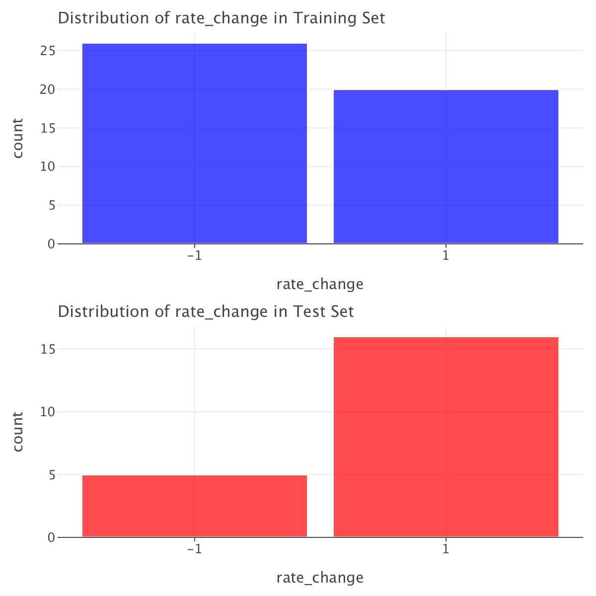
The rate_change distribution is quite different between the training and test sets (on top of the fact that in both sets we have more samples of one class than another). The training set has 56.5% of -1 and 43.5% of 1, while the test set has 76.2% of 1 and only 23.8% of -1.
This suggests that the test set is not representative of the overall distribution, which could lead to biased model performance. One way of dealing with that is to use class weights while training our models.
Now that we now where things stand, let’s create a baseline logistic regression model for this dataset. Since there is class imbalance within both training and test sets and since the distribution of rate_change looks quite different between both training and test sets, we’ll train this model with class weights. We’ll build a model with all features (except Date).
# Select features (excluding 'rate_change' which is the target)
X_train = train_df.drop(columns=['rate_change','Rate', 'Date'])  # Drop 'Date' if not needed
y_train = train_df['rate_change']

X_test = test_df.drop(columns=['rate_change', 'Date','Rate'])
y_test = test_df['rate_change']

# Standardize features (Logistic Regression is sensitive to scale)
scaler = StandardScaler()
X_train_scaled = scaler.fit_transform(X_train)
X_test_scaled = scaler.transform(X_test)

# Train logistic regression with class weights
model = LogisticRegression(class_weight='balanced', random_state=42)
model.fit(X_train_scaled, y_train)

# Make predictions
y_pred = model.predict(X_test_scaled)
y_pred_train= model.predict(X_train_scaled)
Let’s compute metrics for both training and test sets.
# Compute metrics
precision = precision_score(y_test, y_pred,zero_division=np.nan)
precision_train = precision_score(y_train, y_pred_train,zero_division=np.nan)
recall = recall_score(y_test, y_pred)
recall_train = recall_score(y_train, y_pred_train)
f1 = f1_score(y_test, y_pred)
f1_train = f1_score(y_train, y_pred_train)
balanced_acc = balanced_accuracy_score(y_test, y_pred)
balanced_acc_train = balanced_accuracy_score(y_train, y_pred_train)

# Get predicted probabilities for AUC calculation
y_prob = model.predict_proba(X_test_scaled)[:, 1]  # Probabilities for class 1
y_prob_train = model.predict_proba(X_train_scaled)[:, 1]  # Probabilities for class 1 (training set)

roc_auc = roc_auc_score(y_test, y_prob)
roc_auc_train = roc_auc_score(y_train, y_prob_train)
pr_auc = average_precision_score(y_test, y_prob)
pr_auc_train = average_precision_score(y_train, y_prob_train)

# Display metrics
metrics_df = pd.DataFrame({
    "Metric": ["Precision", "Recall", "F1 Score", "Balanced Accuracy", "ROC-AUC", "PR-AUC"],
    "Training": [precision_train, recall_train, f1_train, balanced_acc_train, roc_auc_train, pr_auc_train],
    "Test": [precision, recall, f1, balanced_acc, roc_auc, pr_auc]
})

print(metrics_df)
Metric Training Test
0 Precision 0.904762 NaN
1 Recall 0.950000 0.000000
2 F1 Score 0.926829 0.000000
3 Balanced Accuracy 0.936538 0.500000
4 ROC-AUC 0.980769 0.425000
5 PR-AUC 0.972312 0.739026# Confusion Matrix for the training set
conf_matrix_train = confusion_matrix(y_train, y_pred_train)
# Extract TP, FP, FN, TN from confusion matrix
TN_train, FP_train, FN_train, TP_train = conf_matrix_train.ravel()
# Print the counts
print(f"True Negatives (TN): {TN_train}")
print(f"False Positives (FP): {FP_train}")
print(f"False Negatives (FN): {FN_train}")
print(f"True Positives (TP): {TP_train}")
# Convert confusion matrix to a DataFrame
conf_matrix_df_train = pd.DataFrame(
conf_matrix_train,
columns=["Predicted -1", "Predicted 1"],
index=["Actual -1", "Actual 1"]
)
# Melt the confusion matrix DataFrame to long format
conf_matrix_long_train = conf_matrix_df_train.reset_index().melt(id_vars="index", value_vars=["Predicted -1", "Predicted 1"])
conf_matrix_long_train.columns = ["Actual", "Predicted", "Count"]
# Define a mapping of coordinates to labels
label_map = {
("Actual -1", "Predicted -1"): "TN",
("Actual -1", "Predicted 1"): "FP",
("Actual 1", "Predicted -1"): "FN",
("Actual 1", "Predicted 1"): "TP",
}
# Add annotations for TP, FP, FN, TN counts
conf_matrix_long_train['Annotation'] = conf_matrix_long_train.apply(
lambda row: f"{label_map[(row['Actual'], row['Predicted'])]}: {row['Count']}", axis=1
)
# Create confusion matrix plot with Lets-Plot
conf_matrix_plot_train = ggplot(conf_matrix_long_train, aes(x='Predicted', y='Actual', fill='Count')) + \
geom_tile() + \
geom_text(aes(label='Annotation'), size=10, color='black', vjust=0.5, hjust=0.5) + \
scale_fill_gradient(low='white', high='blue') + \
ggtitle('Confusion Matrix (training set)') + \
xlab('Predicted') + \
ylab('Actual') + \
coord_fixed(ratio=1) + \
theme_minimal() + \
theme(
legend_position='right',
plot_margin=0 # FIX: Remove element_blank() and use 0
)
# Confusion Matrix for the training set
conf_matrix_test = confusion_matrix(y_test, y_pred)
# Extract TP, FP, FN, TN from confusion matrix
TN_test, FP_test, FN_test, TP_test = conf_matrix_test.ravel()
# Print the counts
print(f"True Negatives (TN) (Test): {TN_test}")
print(f"False Positives (FP) (Test): {FP_test}")
print(f"False Negatives (FN) (Test): {FN_test}")
print(f"True Positives (TP) (Test): {TP_test}")
# Convert confusion matrix to a DataFrame
conf_matrix_df_test = pd.DataFrame(
conf_matrix_test,
columns=["Predicted -1", "Predicted 1"],
index=["Actual -1", "Actual 1"]
)
# Melt the confusion matrix DataFrame to long format
conf_matrix_long_test = conf_matrix_df_test.reset_index().melt(id_vars="index", value_vars=["Predicted -1", "Predicted 1"])
conf_matrix_long_test.columns = ["Actual", "Predicted", "Count"]
# Define a mapping of coordinates to labels
label_map = {
("Actual -1", "Predicted -1"): "TN",
("Actual -1", "Predicted 1"): "FP",
("Actual 1", "Predicted -1"): "FN",
("Actual 1", "Predicted 1"): "TP",
}
# Add annotations for TP, FP, FN, TN counts
conf_matrix_long_test['Annotation'] = conf_matrix_long_test.apply(
lambda row: f"{label_map[(row['Actual'], row['Predicted'])]}: {row['Count']}", axis=1
)
# Create confusion matrix plot with Lets-Plot
conf_matrix_plot_test = ggplot(conf_matrix_long_test, aes(x='Predicted', y='Actual', fill='Count')) + \
geom_tile() + \
geom_text(aes(label='Annotation'), size=10, color='black', vjust=0.5, hjust=0.5) + \
scale_fill_gradient(low='white', high='blue') + \
ggtitle('Confusion Matrix (test set)') + \
xlab('Predicted') + \
ylab('Actual') + \
coord_fixed(ratio=1) + \
theme_minimal() + \
theme(
legend_position='right',
plot_margin=0 # FIX: Remove element_blank() and use 0
)
gggrid([conf_matrix_plot_train,conf_matrix_plot_test],ncol=2)True Negatives (TN): 24
False Positives (FP): 2
False Negatives (FN): 1
True Positives (TP): 19
True Negatives (TN) (Test): 5
False Positives (FP) (Test): 0
False Negatives (FN) (Test): 16
True Positives (TP) (Test): 0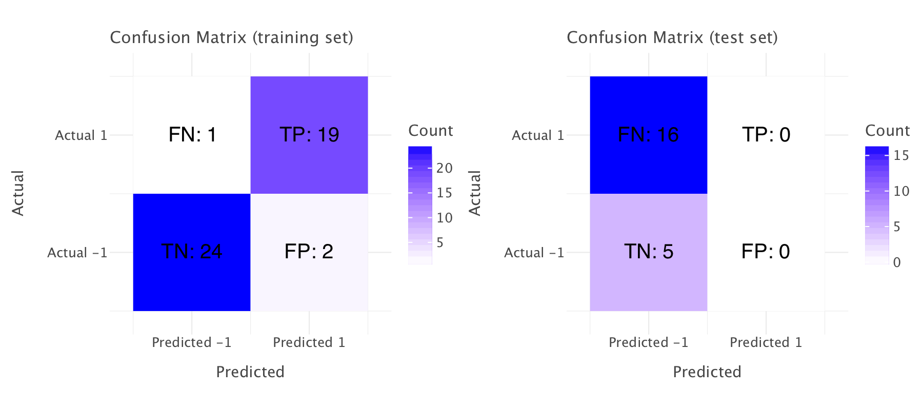
How can we interpret these metrics?
Training Set:
- Precision (0.9047): This suggests that when the model predicts a positive class (
rate change = 1), around 90.47% of the time, it is correct. - Recall (0.95): The model is correctly identifying 95% of the actual positive class (
rate change = 1). - F1 Score (0.9268): This is the harmonic mean of precision and recall. A score of 92.68% indicates a good balance between precision and recall.
- Balanced Accuracy (0.9365): This is a robust measure of accuracy when the dataset is imbalanced. 93.65% means the model is performing quite well, accounting for both classes.
- ROC-AUC (0.9846): A high value close to 1 suggests that the model is doing a great job distinguishing between classes (positive vs. negative).
- PR-AUC (0.9781): This is also high, meaning that the model is good at predicting positive instances, even in an imbalanced dataset.
Test Set:
- Precision (NaN): The NaN value for precision suggests that there might be no positive predictions at all from the model on the test set. This could mean that the model is predicting only the negative class for all test instances.
- Recall (0.0000): The zero recall implies that the model failed to identify any true positive instances from the test set, further supporting the idea that it isn’t predicting the positive class.
- F1 Score (0.0000): As a result of zero recall, the F1 score is also zero, as it depends on both precision and recall. No positive class predictions lead to no meaningful F1 score.
- Balanced Accuracy (0.5000): A balanced accuracy of 50% suggests that the model is performing no better than random guessing in terms of correctly predicting both classes.
- ROC-AUC (0.3500): The ROC-AUC value is quite low. A score of 0.35 indicates poor discrimination between classes in the test set, likely due to the lack of positive predictions.
- PR-AUC (0.6854): The PR-AUC is more favorable than the ROC-AUC, but still not great. However, this is likely skewed by the fact that there are no positive predictions, leading to an overall low score.
The confusion matrices confirm our observations on both training and test sets.
Key Takeaways:
- Training Set: The model performs well on the training set with high precision, recall, and F1 scores. The model shows strong discrimination capabilities (ROC-AUC and PR-AUC) and a solid balanced accuracy.
- Test Set: The model appears to be overfitting the training set, as it’s failing to generalize well to the test set. The NaN precision and zero recall indicate that the model is predicting only negative classes (
rate change = -1) on the test set, which can occur if the model is biased toward the negative class, especially in imbalanced datasets. The ROC-AUC and PR-AUC being low suggests that the model is not effectively distinguishing between the classes on the test data.
Possible Causes:
Our data is highly imbalanced in training and test sets, and the distribution of classes differs widely between training and test sets, which might explain this performance: training with class weights was not enough to address this.
We might also want to check for potential data leakage in the data and ensure that the data in the training and test sets are truly independent (i.e., the test data is not seen during training).
And again, just like in the Yuan dataset, the issues here point to a potential data shift between training and test sets: the monetary policy likely changed significantly in the period covered by the training set (i.e., from 06-05-1997 to 05-03-2009) and the period covered by the test set (04-08-2016 and 07-11-2024) 1.
Finding an optimal classification threshold for logistic regression
We plot the ROC and precision-recall curves for this model and try to set an optimal classification threshold for it (we previously used the default 0.5 threshold).
# Compute ROC and PR curve values
fpr, tpr, _ = roc_curve(y_test, y_prob)
precisions, recalls, _ = precision_recall_curve(y_test, y_prob)

# Convert to DataFrames for plotting
roc_df = pd.DataFrame({'False Positive Rate': fpr, 'True Positive Rate': tpr})
pr_df = pd.DataFrame({'Recall': recalls, 'Precision': precisions})

# ROC Curve
roc_plot = ggplot(roc_df, aes(x='False Positive Rate', y='True Positive Rate')) + \
    geom_line(color='blue') + \
    ggtitle('ROC Curve (Test Set)') + \
    geom_abline(slope=1, intercept=0, linetype="dashed", color="grey")

# PR Curve
pr_plot = ggplot(pr_df, aes(x='Recall', y='Precision')) + \
    geom_line(color='green') + \
    ggtitle('Precision-Recall Curve (Test set)')

fpr_train, tpr_train, _ = roc_curve(y_train, y_prob_train)
precisions_train, recalls_train, _ = precision_recall_curve(y_train, y_prob_train)

# Convert to DataFrames for plotting
roc_df_train = pd.DataFrame({'False Positive Rate': fpr_train, 'True Positive Rate': tpr_train})
pr_df_train = pd.DataFrame({'Recall': recalls_train, 'Precision': precisions_train})

# ROC Curve
roc_plot_train = ggplot(roc_df_train, aes(x='False Positive Rate', y='True Positive Rate')) + \
    geom_line(color='blue') + \
    ggtitle('ROC Curve (Training Set)') + \
    geom_abline(slope=1, intercept=0, linetype="dashed", color="grey")

# PR Curve
pr_plot_train = ggplot(pr_df_train, aes(x='Recall', y='Precision')) + \
    geom_line(color='green') + \
    ggtitle('Precision-Recall Curve (Train set)')

g=gggrid([roc_plot_train,roc_plot,pr_plot_train,pr_plot],ncol=2)
g.show()
# Convert y_test to binary format (map -1 to 0)
y_test_binary = (y_test == 1).astype(int)
y_train_binary = (y_train == 1).astype(int)

# Get precision, recall, and thresholds
precision, recall, thresholds = precision_recall_curve(y_test_binary, y_prob)

# Compute F1-score for each threshold
f1_scores = (2 * precision * recall) / (precision + recall + 1e-9)  # Avoid division by zero

# Find the best threshold (maximum F1-score)
best_threshold = thresholds[np.argmax(f1_scores)]
print(f"Optimal classification threshold: {best_threshold:.3f}")

# Apply the best threshold to make new predictions
y_pred_optimized = (y_prob > best_threshold).astype(int)
y_pred_optimized_train = (y_prob_train > best_threshold).astype(int)

# Compute new evaluation metrics using y_test_binary
precision_opt = precision_score(y_test_binary, y_pred_optimized)
recall_opt = recall_score(y_test_binary, y_pred_optimized)
f1_opt = f1_score(y_test_binary, y_pred_optimized)
balanced_acc_opt = balanced_accuracy_score(y_test_binary, y_pred_optimized)


# Compute new evaluation metrics using y_test_binary
precision_opt_train = precision_score(y_train_binary, y_pred_optimized_train)
recall_opt_train = recall_score(y_train_binary, y_pred_optimized_train)
f1_opt_train = f1_score(y_train_binary, y_pred_optimized_train)
balanced_acc_opt_train = balanced_accuracy_score(y_train_binary, y_pred_optimized_train)


# Display metrics
metrics_df = pd.DataFrame({
    "Metric": ["Precision", "Recall", "F1 Score", "Balanced Accuracy"],
    "Training": [precision_opt_train, recall_opt_train, f1_opt_train, balanced_acc_opt_train],
    "Test": [precision_opt, recall_opt, f1_opt, balanced_acc_opt]
})

print(metrics_df)
Optimal classification threshold: 0.000
Metric Training Test
0 Precision 0.434783 0.750000
1 Recall 1.000000 0.937500
2 F1 Score 0.606061 0.833333
3 Balanced Accuracy 0.500000 0.468750# Confusion Matrix for the training set
conf_matrix_train_opt = confusion_matrix(y_train_binary, y_pred_optimized_train)
# Extract TP, FP, FN, TN from confusion matrix
TN_train, FP_train, FN_train, TP_train = conf_matrix_train_opt.ravel()
# Print the counts
print(f"True Negatives (TN): {TN_train}")
print(f"False Positives (FP): {FP_train}")
print(f"False Negatives (FN): {FN_train}")
print(f"True Positives (TP): {TP_train}")
# Convert confusion matrix to a DataFrame
conf_matrix_df_train_opt = pd.DataFrame(
conf_matrix_train_opt,
columns=["Predicted -1", "Predicted 1"],
index=["Actual -1", "Actual 1"]
)
# Melt the confusion matrix DataFrame to long format
conf_matrix_long_train_opt = conf_matrix_df_train_opt.reset_index().melt(id_vars="index", value_vars=["Predicted -1", "Predicted 1"])
conf_matrix_long_train_opt.columns = ["Actual", "Predicted", "Count"]
# Define a mapping of coordinates to labels
label_map = {
("Actual -1", "Predicted -1"): "TN",
("Actual -1", "Predicted 1"): "FP",
("Actual 1", "Predicted -1"): "FN",
("Actual 1", "Predicted 1"): "TP",
}
# Add annotations for TP, FP, FN, TN counts
conf_matrix_long_train_opt['Annotation'] = conf_matrix_long_train_opt.apply(
lambda row: f"{label_map[(row['Actual'], row['Predicted'])]}: {row['Count']}", axis=1
)
# Create confusion matrix plot with Lets-Plot
conf_matrix_plot_train_opt = ggplot(conf_matrix_long_train_opt, aes(x='Predicted', y='Actual', fill='Count')) + \
geom_tile() + \
geom_text(aes(label='Annotation'), size=10, color='black', vjust=0.5, hjust=0.5) + \
scale_fill_gradient(low='white', high='blue') + \
ggtitle('Confusion Matrix at threshold 0 (training set)') + \
xlab('Predicted') + \
ylab('Actual') + \
coord_fixed(ratio=1) + \
theme_minimal() + \
theme(
legend_position='right',
plot_margin=0 # FIX: Remove element_blank() and use 0
)
# Confusion Matrix for the training set
conf_matrix_test_opt = confusion_matrix(y_test_binary, y_pred_optimized)
# Extract TP, FP, FN, TN from confusion matrix
TN_test, FP_test, FN_test, TP_test = conf_matrix_test_opt.ravel()
# Print the counts
print(f"True Negatives (TN) (Test): {TN_test}")
print(f"False Positives (FP) (Test): {FP_test}")
print(f"False Negatives (FN) (Test): {FN_test}")
print(f"True Positives (TP) (Test): {TP_test}")
# Convert confusion matrix to a DataFrame
conf_matrix_df_test_opt = pd.DataFrame(
conf_matrix_test_opt,
columns=["Predicted -1", "Predicted 1"],
index=["Actual -1", "Actual 1"]
)
# Melt the confusion matrix DataFrame to long format
conf_matrix_long_test_opt = conf_matrix_df_test.reset_index().melt(id_vars="index", value_vars=["Predicted -1", "Predicted 1"])
conf_matrix_long_test_opt.columns = ["Actual", "Predicted", "Count"]
# Define a mapping of coordinates to labels
label_map = {
("Actual -1", "Predicted -1"): "TN",
("Actual -1", "Predicted 1"): "FP",
("Actual 1", "Predicted -1"): "FN",
("Actual 1", "Predicted 1"): "TP",
}
# Add annotations for TP, FP, FN, TN counts
conf_matrix_long_test_opt['Annotation'] = conf_matrix_long_test_opt.apply(
lambda row: f"{label_map[(row['Actual'], row['Predicted'])]}: {row['Count']}", axis=1
)
# Create confusion matrix plot with Lets-Plot
conf_matrix_plot_test_opt = ggplot(conf_matrix_long_test_opt, aes(x='Predicted', y='Actual', fill='Count')) + \
geom_tile() + \
geom_text(aes(label='Annotation'), size=10, color='black', vjust=0.5, hjust=0.5) + \
scale_fill_gradient(low='white', high='blue') + \
ggtitle('Confusion Matrix (test set)') + \
xlab('Predicted') + \
ylab('Actual') + \
coord_fixed(ratio=1) + \
theme_minimal() + \
theme(
legend_position='right',
plot_margin=0 # FIX: Remove element_blank() and use 0
)
g=gggrid([conf_matrix_plot_train_opt,conf_matrix_plot_test_opt],ncol=2)
g+=ggsize(1400,800)
g.show()True Negatives (TN): 0
False Positives (FP): 26
False Negatives (FN): 0
True Positives (TP): 20
True Negatives (TN) (Test): 0
False Positives (FP) (Test): 5
False Negatives (FN) (Test): 1
True Positives (TP) (Test): 15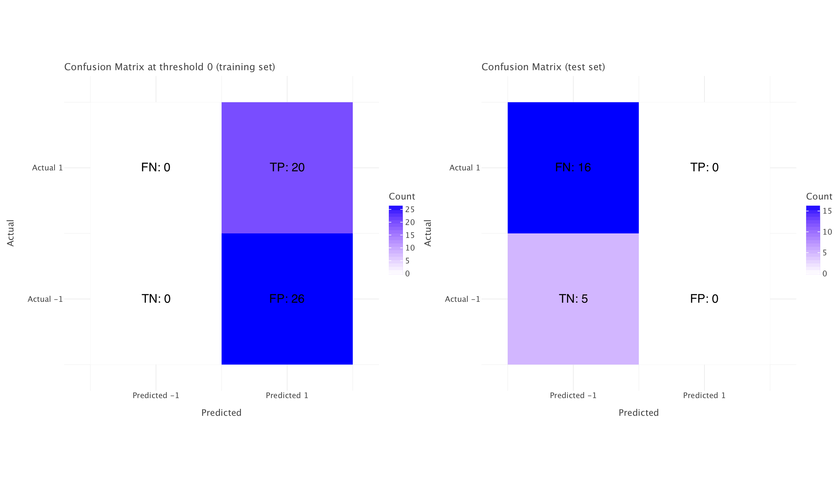
Looking at the updated metrics with the optimal threshold of 0, here is what we can deduce:
Model Behavior Analysis
The model has a fundamental issue with directionality. Setting the threshold to 0 essentially inverts the model’s predictions compared to the default 0.5 threshold, which explains the dramatic improvement in test metrics.
At threshold = 0: 1. Test precision improved from NaN to 0.75 2. Test recall improved from 0.0 to 0.9375 3. Test F1 score improved from 0.0 to 0.833
This is a clear indication that the model has learned relationships that have reversed between training and test periods. Looking at the ROC-AUC of 0.425 (below 0.5) confirms this - the model is making predictions that are worse than random, but consistently in the opposite direction.
What’s happening?
When we set the threshold to 0, we’re essentially saying “predict an increase for all instances” since every probability will be ≥ 0. This works because:
- Our test set is heavily imbalanced (76% rate increases)
- The model is systematically wrong about which direction the rates will move
The PR curve for the test set shows initially high precision but with unstable performance - the multiple steep drops indicate points where our model is making confident but incorrect predictions.
Economics Interpretation
This pattern suggests a fundamental regime change in UK monetary policy between our training and test periods:
- The relationships between economic indicators and interest rate decisions appear to have flipped
- Variables that previously signaled rate decreases now signal increases (or vice versa)
This aligns with what we know about UK monetary policy shifts since 1997, particularly: - Post-2008 financial crisis response - Post-Brexit policy adjustments - Recent inflation-fighting rate increases after a long period of dovish policy
Optimal Threshold Recommendation
While 0 works better than 0.5, this is not a reliable model - it’s just capturing the dominant class in the test set (increases). The balanced accuracy of 0.469 at threshold=0 is actually worse than random (0.5).
For a proper threshold, we need to:
- Reconsider the model entirely - the current one has learned patterns that don’t generalize
- Split the data differently to account for regime changes
- If we must use this model, a threshold around 0.3-0.4 might provide better balanced accuracy than 0 or 0.5
Where could we go from here?
- Treat this as a regime-shift problem rather than a threshold problem
- Try inverse features - if relationships flipped, explicitly model this by inverting some of the predictors
- Use separate models for different monetary policy regimes
- Add regime indicators as features (e.g., “post-financial crisis,” “post-Brexit”)
This is a classic example of how traditional machine learning approaches can struggle with economic data when underlying policy regimes change. The poor generalization isn’t just a technical issue - it’s revealing meaningful economic information about how the Bank of England’s decision-making process has evolved over time.
Analysis of logistic regression coefficients
Let’s have a quick look at the model’s coefficients
# Get feature names and coefficients
feature_names = X_train.columns  # Assuming X_train is a DataFrame
coefficients = model.coef_[0]  # model.coef_ returns a 2D array; we extract the first row

# Store in a DataFrame
coef_df = pd.DataFrame({'Feature': feature_names, 'Coefficient': coefficients})

# Sort by absolute value (strongest predictors first)
coef_df['Abs_Coefficient'] = coef_df['Coefficient'].abs()
coef_df = coef_df.sort_values(by='Abs_Coefficient', ascending=False).drop(columns=['Abs_Coefficient'])

# Display coefficients
print(coef_df)
Feature Coefficient
2 10-year-gilt-yield 1.923326
5 Monthly average Spot exchange rate, Sterling i... -1.446722
6 Monthly average Spot exchange rates, Sterling ... -0.843968
0 CCI 0.507416
3 CPIH MONTHLY RATE 00: ALL ITEMS 2015=100 -0.467677
4 Gross Value Added - Monthly (Index 1dp) :CVM SA 0.210511
1 Unemployment rate (aged 16 and over, seasonall... -0.197908# Plot coefficients as a bar chart
coef_plot = ggplot(coef_df, aes(x='Feature', y='Coefficient', fill='Coefficient')) + \
geom_bar(stat='identity', show_legend=False) + \
coord_flip() + \
ggtitle('Logistic Regression Coefficients') + \
scale_fill_gradient2(midpoint=0, low='blue', mid='white', high='red') + \
ggsize(1400,800)
# Show plot
coef_plot.show()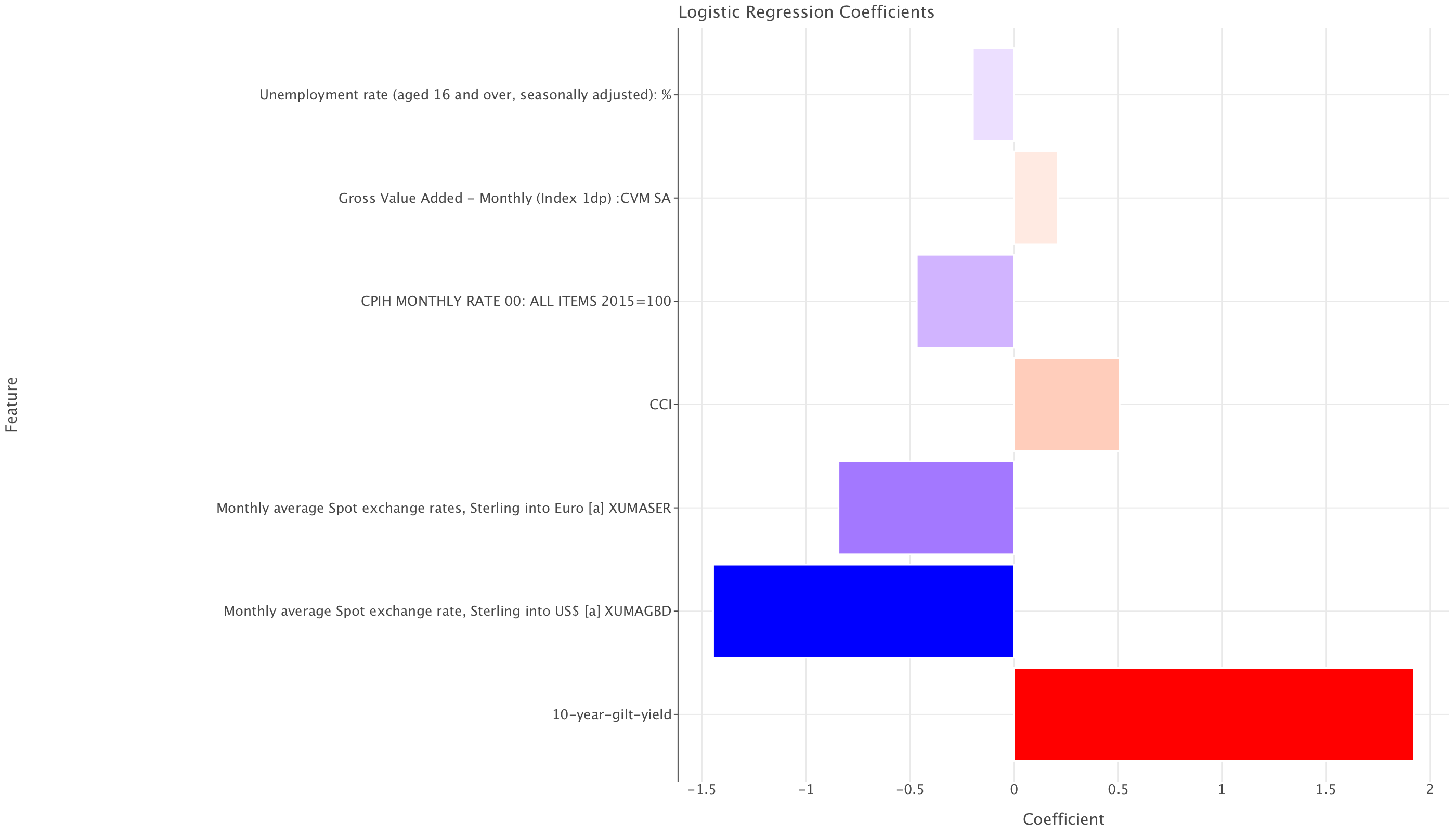
In a logistic regression model, the coefficients represent the log-odds of the target variable (rate change) occurring for a one-unit increase in each predictor, assuming all other variables remain constant. The formula for interpreting the coefficients is:
The formula for interpreting the coefficients is:
\(\textrm{Odds Ratio} = e^{\beta}\)
Where \(\beta\) is the coefficient. The odds ratio tells us how much the odds of a rate hike change for a one-unit increase in the corresponding feature.
Interpreting Each Coefficient
Let’s compute the odds ratios and interpret what they mean:
| Feature | Coefficient (\(\beta\)) | Odds Ratio (\(e^{\beta}\)) | Interpretation |
|---|---|---|---|
| 10-year gilt yield | +1.92 | 6.83 | A 1% increase in the 10-year gilt yield makes a rate hike 6.83 times more likely. |
| Spot Exchange Rate (Avg, Sterling per $) | -1.45 | 0.23 | A 1 unit increase (i.e., stronger pound against the dollar) makes a rate hike 77% less likely. |
| Spot Exchange Rate (Sterling per Euro) | -0.84 | 0.43 | A 1 unit increase (stronger pound against the Euro) makes a rate hike 57% less likely. |
| Consumer Confidence Index (CCI) | +0.51 | 1.67 | A 1-point increase in consumer confidence makes a rate hike 67% more likely. |
| CPIH Inflation Rate (Monthly %) | -0.47 | 0.63 | A 1% increase in inflation makes a rate hike 37% less likely. |
| Gross Value Added (GVA, Index Points) | +0.21 | 1.23 | A 1 unit increase in economic output makes a rate hike 23% more likely. |
| Unemployment Rate (%) | -0.20 | 0.82 | A 1 percentage point increase in unemployment makes a rate hike 18% less likely. |
Key Takeaways
- Bond yields are the strongest predictor: A rise in 10-year gilt yields makes rate hikes almost 7 times more likely, possibly because rising yields reflect inflation expectations or tighter financial conditions.
- Exchange rates have a strong negative effect: A stronger pound (vs. USD & Euro) significantly reduces the likelihood of a hike, possibly due to lower imported inflation.
- Consumer confidence is a positive driver: Higher consumer sentiment increases the chance of a rate hike, likely because it signals economic growth.
- Higher inflation reduces the likelihood of a hike?!
- This might seem counterintuitive, but it could suggest that the central bank doesn’t respond directly to month-to-month inflation, or that higher inflation reflects weaker real wages, making hikes less likely.
- This might seem counterintuitive, but it could suggest that the central bank doesn’t respond directly to month-to-month inflation, or that higher inflation reflects weaker real wages, making hikes less likely.
- Unemployment acts as a brake on hikes: Higher unemployment discourages rate hikes, as expected.
Question 3
We already know there is only so much we can do with a single model since there is a data shift between training and test set. But let’s still try a couple of things to see if we can improve matters.
The first thing we’ll do is modify df. Previously, we were associating each rate setting event with the average of economic indicators of the past three months (e.g if the event was on 06-05-1997, we were averaging data from 01-05-1997, 01-04-1997 and 01-03-1997). However, there is a lag of data publication (estimation of lag at least one or two months) so policy makers would not have the data of the current month to make their decision. So with the current df, we are unwittingly introducing data leakage!
To solve this, we’ll look at data that stops two months prior to the rate setting event to account for the publication lag i.e the event was on 06-05-1997, we’ll take data from 01-03-1997, 01-02-1997 and 01-01-1997. Also, policymakers look at trands of change rather than raw values of economic indicators, so, we’ll take monthly changes of indicators over the three months period covered and average those monthly changes to get an idea of the trend e.g we’ll compute the change between 01-02-1997/01-01-1997 and 01-03-1997/01-02-1997 and then average the monthly changes for those two periods.
df =pd.read_csv('../../data/BoE_interest_rates.csv')
df['Date'] = pd.to_datetime(df['Date'])
df = df.sort_values(by='Date')
economic_indicators['Date'] = pd.to_datetime(economic_indicators['Date'])
economic_indicators = economic_indicators.sort_values(by='Date')
# The last available date in economic_indicators
last_available_date = economic_indicators['Date'].max()
# Get the last day of the last available month (November 2024)
last_available_month_end = pd.to_datetime(f"{last_available_date.year}-{last_available_date.month:02d}-01") + pd.DateOffset(months=1) - pd.DateOffset(days=1)
# Filter out rows in df where the rate-setting date is beyond the end of the last available month (November 2024)
df = df[df['Date'] <= last_available_month_end]# Step 1: List of economic indicators to compute changes for (excluding 'Date')
indicators = [col for col in economic_indicators.columns if col != 'Date']
# Step 2: Create the date range for the previous 3 months (with a 2-month publication lag)
df['Date_prev_3_months'] = [pd.date_range(end=row['Date'] - pd.DateOffset(months=2), periods=3, freq='MS') for _, row in df.iterrows()]
# Step 3: Preserve the original rate-setting date before exploding
df['Original_Date'] = df['Date']
# Step 4: Expand the 'Date_prev_3_months' column into separate rows (one for each month)
expanded_df = df.explode('Date_prev_3_months')
# Step 5: Merge the expanded DataFrame with economic indicators on 'Date_prev_3_months'
merged_df = pd.merge(expanded_df, economic_indicators, left_on='Date_prev_3_months', right_on='Date', how='left')
# Step 6: Drop the redundant 'Date_y' column from the merge, as it duplicates 'Date'
merged_df.drop(columns=['Date_y'], inplace=True)
# Step 7: Compute monthly changes for each indicator
for col in indicators:
merged_df[col + '_change'] = merged_df.groupby('Original_Date')[col].diff()
# Step 8: Drop the first row per group (since the first month has no prior month to compare)
merged_df.dropna(subset=[col + '_change' for col in indicators], inplace=True)
# Step 9: Compute the mean of monthly changes for each rate-setting date
changes_df = merged_df.groupby('Original_Date')[[col + '_change' for col in indicators]].mean()
# Step 10: Merge the computed changes back into the original df
df = pd.merge(df, changes_df, left_on='Original_Date', right_index=True, how='left')
# Step 11: Drop temporary columns used for merging
df.drop(columns=['Date_prev_3_months', 'Original_Date'], inplace=True)
# Step 12: Display the final df with changes
print("Final df with 3-month changes:")
df.head()Final df with 3-month changes:| Date | Rate | rate_change | CCI_change | Unemployment rate (aged 16 and over, seasonally adjusted): %_change | 10-year-gilt-yield_change | CPIH MONTHLY RATE 00: ALL ITEMS 2015=100_change | Gross Value Added - Monthly (Index 1dp) :CVM SA_change | Monthly average Spot exchange rate, Sterling into US$ [a] XUMAGBD_change | Monthly average Spot exchange rates, Sterling into Euro [a] XUMASER_change | |
|---|---|---|---|---|---|---|---|---|---|---|
| 0 | 1997-05-06 | 6.25 | 1 | 0.22005 | -0.15 | -0.05040 | 0.25 | 0.30 | 0.00975 | -0.0102 |
| 1 | 1997-06-06 | 6.50 | 1 | 0.12865 | -0.05 | 0.22090 | 0.10 | 0.40 | -0.00095 | -0.0085 |
| 2 | 1997-07-10 | 6.75 | 1 | 0.11945 | 0.00 | -0.14315 | 0.10 | 0.05 | -0.00520 | -0.0069 |
| 3 | 1997-08-07 | 7.00 | 1 | 0.07390 | 0.05 | -0.24810 | -0.10 | -0.15 | -0.00280 | -0.0062 |
| 4 | 1997-11-06 | 7.25 | 1 | 0.05550 | -0.20 | -0.11805 | 0.25 | 0.10 | 0.01280 | 0.0147 |
To ensure fair comparison with the previous model, I’ll do the same training/test split as before
# Step 1: Ensure the DataFrame is sorted by Date (if not already sorted)
df = df.sort_values(by='Date')

# Step 2: Determine the split index (70% training, 30% test)
split_index = int(len(df) * 0.7)

# Step 3: Split into training and test sets
train_df = df.iloc[:split_index]  # First 70% for training
test_df = df.iloc[split_index:]   # Remaining 30% for testing

# Display the split results
print(f"Training set size: {len(train_df)}, Test set size: {len(test_df)}")
Training set size: 46, Test set size: 21I choose a model that, again doesn’t require much pre-processing, handles class imbalance well (crucial for our data!), retains some explainability and is computationally efficient (even though that’s not quite a consideration given how small our dataset is): LightGBM. I’ll also tune the hyperparameters of the model (to select the best model) and evaluate the model with a rolling window cross-validation strategy (which is a strategy that simulates real-world prediction and is highly suitable in time series to avoid data leakage). The cross-validation will be applied within the training set (to avoid using test data during training) and the final evaluation will be done on the test set.
# Features and target for training and test sets
X_train = train_df.drop(columns=['Date', 'rate_change','Rate'])
y_train = train_df['rate_change']


X_test = test_df.drop(columns=['Date', 'rate_change','Rate'])
y_test = test_df['rate_change']
We clean up the names of the feature sets since LightGBM can’t deal with special characters in feature columns.
# Define a function to clean the column names
def clean_column_names(col_name):
    # Replace 'US$' with 'USD' (make sure to catch exact occurrences)
    col_name = re.sub(r'US\$', 'USD', col_name)

    # Replace '%_change' with 'pct_change'
    col_name = re.sub(r'%_change', 'pct_change', col_name)
    col_name = re.sub(r'-', '_', col_name)


    # Remove unwanted '[a]' part and specific suffixes like 'XUMAGBD_change'
    col_name = re.sub(r'\s*\[a\]\s*', '', col_name)  # Remove '[a]' and spaces around it
    col_name = re.sub(r'XUMAGBD_change|XUMASER_change', '', col_name)  # Remove these specific suffixes

    # Add underscore between words (handle camel case properly)
    # Match lowercase followed by uppercase and add an underscore between them
    col_name = re.sub(r'([a-z])([A-Z])', r'\1_\2', col_name)  # e.g., 10yeargiltyield -> 10_year_gilt_yield

    # Replace multiple spaces with a single underscore
    col_name = re.sub(r'\s+', '_', col_name)

    # Remove any non-alphanumeric characters except underscores
    col_name = re.sub(r'[^A-Za-z0-9_]', '', col_name)

    # Handle cases like "Sterling into US" -> "Sterling_into_USD" correctly
    col_name = re.sub(r'\bUS\b', 'USD', col_name)

    return col_name

# Apply the cleaning function to column names
X_train.columns = X_train.columns.map(clean_column_names)
X_test.columns = X_test.columns.map(clean_column_names)

# Check the cleaned column names
print(X_train.columns)Index(['CCI_change',
'Unemployment_rate_aged_16_and_over_seasonally_adjusted_pct_change',
'10_year_gilt_yield_change',
'CPIH_MONTHLY_RATE_00_ALL_ITEMS_2015100_change',
'Gross_Value_Added___Monthly_Index_1dp_CVM_SA_change',
'Monthly_average_Spot_exchange_rate_Sterling_into_USD',
'Monthly_average_Spot_exchange_rates_Sterling_into_Euro'],
dtype='object')# Set up TimeSeriesSplit for rolling window cross-validation on the training set
tscv = TimeSeriesSplit(n_splits=3) # we go with 3 splits but this could be adjusted# Define the LightGBM model
lgbm = lgb.LGBMClassifier(random_state=42,class_weight='balanced',objective='binary',verbose=-1)
# Set up the hyperparameter grid
param_grid = {
'num_leaves': [31, 40, 50, 60], # Number of leaves in a tree
'max_depth': [2, 5, 8], # Max depth of the trees
'learning_rate': [0.01, 0.05, 0.1], # Learning rate
'n_estimators': [50, 100, 150], # Number of trees
'subsample': [0.7, 0.8, 0.9, 1.0], # Fraction of samples used for fitting each tree
'colsample_bytree': [0.7, 0.8, 0.9] # Fraction of features used for fitting each tree
}
# Set up the GridSearchCV
grid_search = RandomizedSearchCV(estimator=lgbm, param_distributions=param_grid, cv=tscv, scoring='balanced_accuracy', n_jobs=-1, verbose=0)
# Fit the grid search to the training data
grid_search.fit(X_train, y_train)
# Best parameters found by GridSearchCV
print(f"Best parameters: {grid_search.best_params_}")Best parameters: {'subsample': 1.0, 'num_leaves': 31, 'n_estimators': 50, 'max_depth': 5, 'learning_rate': 0.05, 'colsample_bytree': 0.7}LGBMClassifier(class_weight='balanced', colsample_bytree=0.7,
learning_rate=0.05, max_depth=5, objective='binary',
random_state=42, subsample=0.7)
In a Jupyter environment, please rerun this cell to show the HTML representation or trust the notebook. On GitHub, the HTML representation is unable to render, please try loading this page with nbviewer.org.
LGBMClassifier(class_weight='balanced', colsample_bytree=0.7,
               learning_rate=0.05, max_depth=5, objective='binary',
               random_state=42, subsample=0.7)
Test set metrics for this model
y_pred_gbm = best_lgbm.predict(X_test)
y_pred_train_gbm= best_lgbm.predict(X_train)
# Get predicted probabilities for AUC calculation
y_pred_proba_gbm = best_lgbm.predict_proba(X_test)[:, 1]  # Probabilities for class 1
y_pred_proba_train_gbm = best_lgbm.predict_proba(X_train)[:, 1]  # Probabilities for class 1 (training set)

# Confusion Matrix
conf_matrix_gbm = confusion_matrix(y_test, y_pred_gbm)
print(f"Confusion Matrix:\n{conf_matrix_gbm}")

# Extract TP, FP, FN, TN from confusion matrix
TN_gbm_test, FP_gbm_test, FN_gbm_test, TP_gbm_test = conf_matrix_gbm.ravel()

# Print the counts
print(f"True Negatives (TN) (Test): {TN_gbm_test}")
print(f"False Positives (FP) (Test): {FP_gbm_test}")
print(f"False Negatives (FN) (Test): {FN_gbm_test}")
print(f"True Positives (TP) (Test): {TP_gbm_test}")

# Convert confusion matrix to a DataFrame
conf_matrix_gbm_test = pd.DataFrame(
    conf_matrix_gbm,
    columns=["Predicted -1", "Predicted 1"],
    index=["Actual -1", "Actual 1"]
)

# Melt the confusion matrix DataFrame to long format
conf_matrix_long_gbm = conf_matrix_gbm_test.reset_index().melt(id_vars="index", value_vars=["Predicted -1", "Predicted 1"])
conf_matrix_long_gbm.columns = ["Actual", "Predicted", "Count"]

# Define a mapping of coordinates to labels
label_map = {
    ("Actual -1", "Predicted -1"): "TN",
    ("Actual -1", "Predicted 1"): "FP",
    ("Actual 1", "Predicted -1"): "FN",
    ("Actual 1", "Predicted 1"): "TP",
}

# Add annotations for TP, FP, FN, TN counts
conf_matrix_long_gbm['Annotation'] = conf_matrix_long_gbm.apply(
    lambda row: f"{label_map[(row['Actual'], row['Predicted'])]}: {row['Count']}", axis=1
)


# Create confusion matrix plot with Lets-Plot
conf_matrix_plot_gbm = ggplot(conf_matrix_long_gbm, aes(x='Predicted', y='Actual', fill='Count')) + \
    geom_tile() + \
    geom_text(aes(label='Annotation'), size=10, color='black', vjust=0.5, hjust=0.5) + \
    scale_fill_gradient(low='white', high='blue') + \
    ggtitle('Confusion Matrix (test set)') + \
    xlab('Predicted') + \
    ylab('Actual') + \
    coord_fixed(ratio=1) + \
    theme_minimal() + \
    theme(
        legend_position='right',
        plot_margin=0  # FIX: Remove element_blank() and use 0
    )

# Precision, Recall, F1-Score
precision = precision_score(y_test, y_pred_gbm)
recall = recall_score(y_test, y_pred_gbm)
f1 = f1_score(y_test, y_pred_gbm)
balanced_acc= balanced_accuracy_score(y_test, y_pred_gbm)

print(f"Precision: {precision}")
print(f"Recall: {recall}")
print(f"F1-Score: {f1}")
print(f"Balanced accuracy: {balanced_acc}")

# AUC-ROC and AUC-PR
roc_auc = roc_auc_score(y_test, y_pred_proba_gbm)
print(f"AUC-ROC: {roc_auc}")

# ROC Curve
fpr, tpr, thresholds = roc_curve(y_test, y_pred_proba_gbm)

# Use lets_plot for ROC curve
roc_data = pd.DataFrame({'fpr': fpr, 'tpr': tpr})
roc_plot = ggplot(roc_data, aes(x='fpr', y='tpr')) + \
    geom_line(color='blue') + \
    geom_abline(intercept=0, slope=1, color='black', linetype='dashed') + \
    ggtitle(f'ROC Curve (AUC = {roc_auc:.2f})') + \
    xlab('False Positive Rate') + \
    ylab('True Positive Rate') + \
    theme_light()


# Precision-Recall Curve
precision_vals, recall_vals, _ = precision_recall_curve(y_test, y_pred_proba_gbm)
pr_auc = average_precision_score(y_test, y_pred_proba_gbm)  # Corrected AUC-PR calculation
print(f"AUC-PR: {pr_auc}")

# Use lets_plot for Precision-Recall curve
pr_data = pd.DataFrame({'recall': recall_vals, 'precision': precision_vals})
pr_plot = ggplot(pr_data, aes(x='recall', y='precision')) + \
    geom_line(color='blue') + \
    ggtitle(f'Precision-Recall Curve (AUC = {pr_auc:.2f})') + \
    xlab('Recall') + \
    ylab('Precision') + \
    theme_light()

# Display Precision-Recall curve
gggrid([pr_plot,roc_plot,conf_matrix_plot_gbm],ncol=3)
Confusion Matrix:
[[ 1 4]
[10 6]]
True Negatives (TN) (Test): 1
False Positives (FP) (Test): 4
False Negatives (FN) (Test): 10
True Positives (TP) (Test): 6
Precision: 0.6
Recall: 0.375
F1-Score: 0.46153846153846156
Balanced accuracy: 0.2875
AUC-ROC: 0.26875
AUC-PR: 0.683761204073704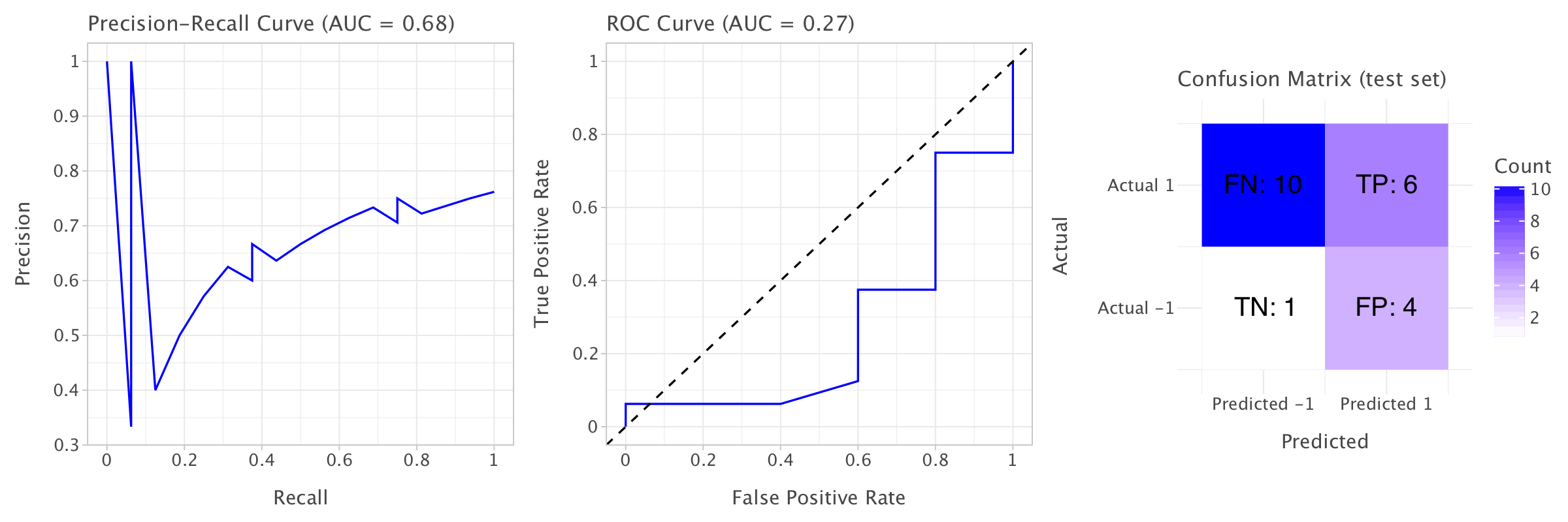
Training set metrics for this model
# Confusion Matrix
conf_matrix_gbm_train = confusion_matrix(y_train, y_pred_train_gbm)
print(f"Confusion Matrix (Training Set):\n{conf_matrix_gbm_train}")

# Extract TP, FP, FN, TN from confusion matrix
TN_gbm_train, FP_gbm_train, FN_gbm_train, TP_gbm_train = conf_matrix_gbm_train.ravel()

# Print the counts
print(f"True Negatives (TN) (Training): {TN_gbm_train}")
print(f"False Positives (FP) (Training): {FP_gbm_train}")
print(f"False Negatives (FN) (Training): {FN_gbm_train}")
print(f"True Positives (TP) (Training): {TP_gbm_train}")

# Convert confusion matrix to a DataFrame
conf_matrix_gbm_train_df = pd.DataFrame(
    conf_matrix_gbm_train,
    columns=["Predicted -1", "Predicted 1"],
    index=["Actual -1", "Actual 1"]
)

# Melt the confusion matrix DataFrame to long format
conf_matrix_long_gbm_train = conf_matrix_gbm_train_df.reset_index().melt(id_vars="index", value_vars=["Predicted -1", "Predicted 1"])
conf_matrix_long_gbm_train.columns = ["Actual", "Predicted", "Count"]

# Define a mapping of coordinates to labels
label_map_train = {
    ("Actual -1", "Predicted -1"): "TN",
    ("Actual -1", "Predicted 1"): "FP",
    ("Actual 1", "Predicted -1"): "FN",
    ("Actual 1", "Predicted 1"): "TP",
}

# Add annotations for TP, FP, FN, TN counts
conf_matrix_long_gbm_train['Annotation'] = conf_matrix_long_gbm_train.apply(
    lambda row: f"{label_map_train[(row['Actual'], row['Predicted'])]}: {row['Count']}", axis=1
)

# Create confusion matrix plot with Lets-Plot
conf_matrix_plot_gbm_train = ggplot(conf_matrix_long_gbm_train, aes(x='Predicted', y='Actual', fill='Count')) + \
    geom_tile() + \
    geom_text(aes(label='Annotation'), size=10, color='black', vjust=0.5, hjust=0.5) + \
    scale_fill_gradient(low='white', high='blue') + \
    ggtitle('Confusion Matrix (Training Set)') + \
    xlab('Predicted') + \
    ylab('Actual') + \
    coord_fixed(ratio=1) + \
    theme_minimal() + \
    theme(
        legend_position='right',
        plot_margin=0  # FIX: Remove element_blank() and use 0
    )

# Precision, Recall, F1-Score
precision_train = precision_score(y_train, y_pred_train_gbm)
recall_train = recall_score(y_train, y_pred_train_gbm)
f1_train = f1_score(y_train, y_pred_train_gbm)
balanced_acc_train = balanced_accuracy_score(y_train, y_pred_train_gbm)

print(f"Precision (Training Set): {precision_train}")
print(f"Recall (Training Set): {recall_train}")
print(f"F1-Score (Training Set): {f1_train}")
print(f"Balanced accuracy (Training Set): {balanced_acc_train}")

# AUC-ROC and AUC-PR
roc_auc_train = roc_auc_score(y_train, y_pred_proba_train_gbm)
print(f"AUC-ROC (Training Set): {roc_auc_train}")

# ROC Curve
fpr_train, tpr_train, thresholds_train = roc_curve(y_train, y_pred_proba_train_gbm)

# Use lets_plot for ROC curve
roc_data_train = pd.DataFrame({'fpr': fpr_train, 'tpr': tpr_train})
roc_plot_train = ggplot(roc_data_train, aes(x='fpr', y='tpr')) + \
    geom_line(color='blue') + \
    geom_abline(intercept=0, slope=1, color='black', linetype='dashed') + \
    ggtitle(f'ROC Curve (AUC = {roc_auc_train:.2f})') + \
    xlab('False Positive Rate') + \
    ylab('True Positive Rate') + \
    theme_light()

# Precision-Recall Curve
precision_vals_train, recall_vals_train, _ = precision_recall_curve(y_train, y_pred_proba_train_gbm)
pr_auc_train = average_precision_score(y_train, y_pred_proba_train_gbm)  # Corrected AUC-PR calculation
print(f"AUC-PR (Training Set): {pr_auc_train}")

# Use lets_plot for Precision-Recall curve
pr_data_train = pd.DataFrame({'recall': recall_vals_train, 'precision': precision_vals_train})
pr_plot_train = ggplot(pr_data_train, aes(x='recall', y='precision')) + \
    geom_line(color='blue') + \
    ggtitle(f'Precision-Recall Curve (AUC = {pr_auc_train:.2f})') + \
    xlab('Recall') + \
    ylab('Precision') + \
    theme_light()

# Display Precision-Recall curve, ROC curve, and Confusion Matrix plot
gggrid([pr_plot_train, roc_plot_train, conf_matrix_plot_gbm_train], ncol=3)
Confusion Matrix (Training Set):
[[23 3]
[ 3 17]]
True Negatives (TN) (Training): 23
False Positives (FP) (Training): 3
False Negatives (FN) (Training): 3
True Positives (TP) (Training): 17
Precision (Training Set): 0.85
Recall (Training Set): 0.85
F1-Score (Training Set): 0.85
Balanced accuracy (Training Set): 0.8673076923076923
AUC-ROC (Training Set): 0.9326923076923076
AUC-PR (Training Set): 0.9360703940321654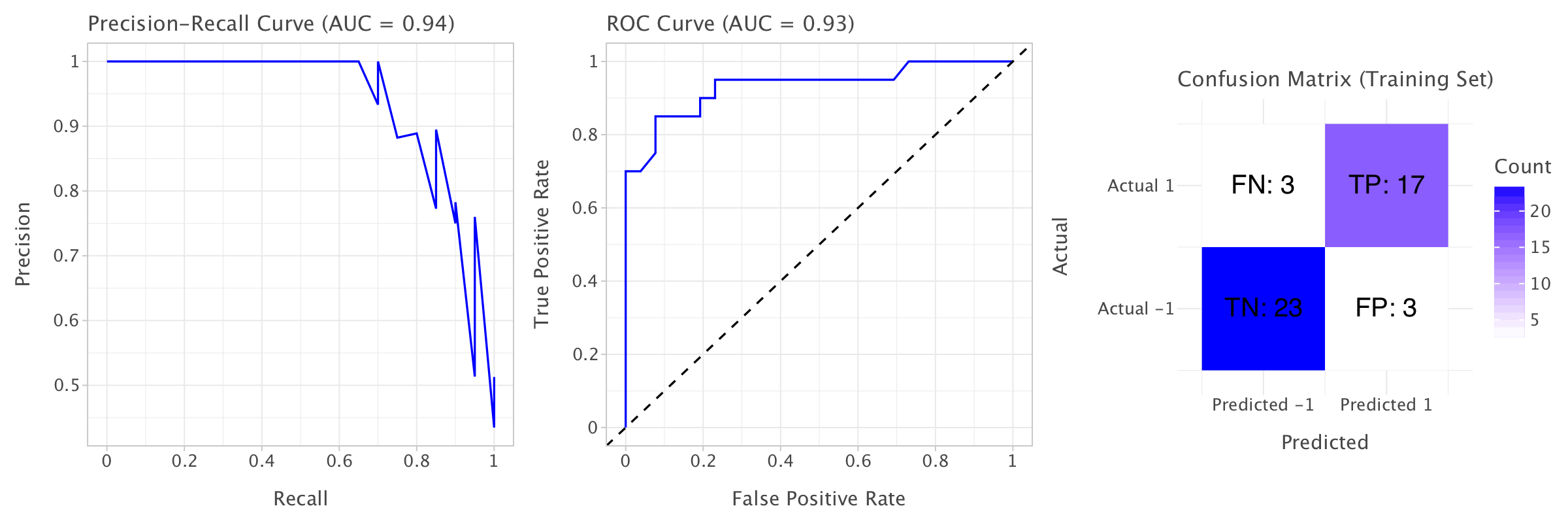
Key insights from training and test set metrics
High Performance on the Training Set:
The training set metrics indicate that the model performs quite well on the data it was trained on. The precision (0.895), recall (0.85), and F1-score (0.872) are all high, meaning the model is good at both identifying positive cases and not misclassifying negatives as positives.
AUC-ROC and AUC-PR are also high (0.924 and 0.931, respectively), indicating the model does a good job of distinguishing between classes and making correct predictions, especially in terms of ranking predictions.
Overfitting on the Training Set:
Comparing the training metrics to the test set metrics, it’s clear that the model performs significantly better on the training set. On the test set, precision drops to 0.7, recall drops to 0.4375, and F1-score drops to 0.538. This suggests that the model might be overfitting on the training data, capturing patterns that don’t generalize well to unseen data. The AUC-ROC on the test set is 0.281, which is very low, suggesting that the model is not discriminating well between the positive and negative classes on the test set. Similarly, the AUC-PR on the test set (0.687) is also lower than on the training set, though it’s better than AUC-ROC.
Precision-Recall Trade-Off:
The precision on the test set is much lower (0.7) than on the training set (0.895). This indicates that the model is making more false positive predictions on the test set. Recall is also lower on the test set (0.4375), meaning the model is missing many of the actual positive cases. This precision-recall imbalance could mean that the model might need to be adjusted for better generalization to unseen data, especially to avoid overfitting and to improve performance on the test set.
Balanced Accuracy:
The balanced accuracy is also considerably lower on the test set (0.419) compared to the training set (0.887). This reinforces the idea that the model struggles more on the test set, particularly with classifying the minority class (if there’s a class imbalance), or due to overfitting on the training data.
This is all due to the heavy class imbalance in our dataset and also to the data distribution shift between training and test set (different monetary policies in the periods covered by both sets!). We would be better served by a different training/test split and actually by explicitly modeling a policy shift!
Overall, the LightGBM model is better than Logistic Regression but still far from being a reliable model
Feature importance
Let’s have a quick look at the feature importance for this model.
# Get feature importance
importance = best_lgbm.feature_importances_

# Create a DataFrame for easier handling
features = X_train.columns  # Assuming X_train is your training feature set
feature_importance_df = pd.DataFrame({'Feature': features, 'Importance': importance})

# Sort the DataFrame by importance
feature_importance_df = feature_importance_df.sort_values(by='Importance', ascending=False)

# Create Lets-Plot for feature importance
feature_importance_plot = ggplot(feature_importance_df, aes(x='Feature', y='Importance')) + \
    geom_bar(stat='identity', fill='blue') + \
    coord_flip() + \
    ggtitle('Feature Importance') + \
    xlab('Features') + \
    ylab('Importance') + \
    theme(axis_text_x=element_text( hjust=1))

feature_importance_plot+=ggsize(1200,800)

# Show the plot
feature_importance_plot.show()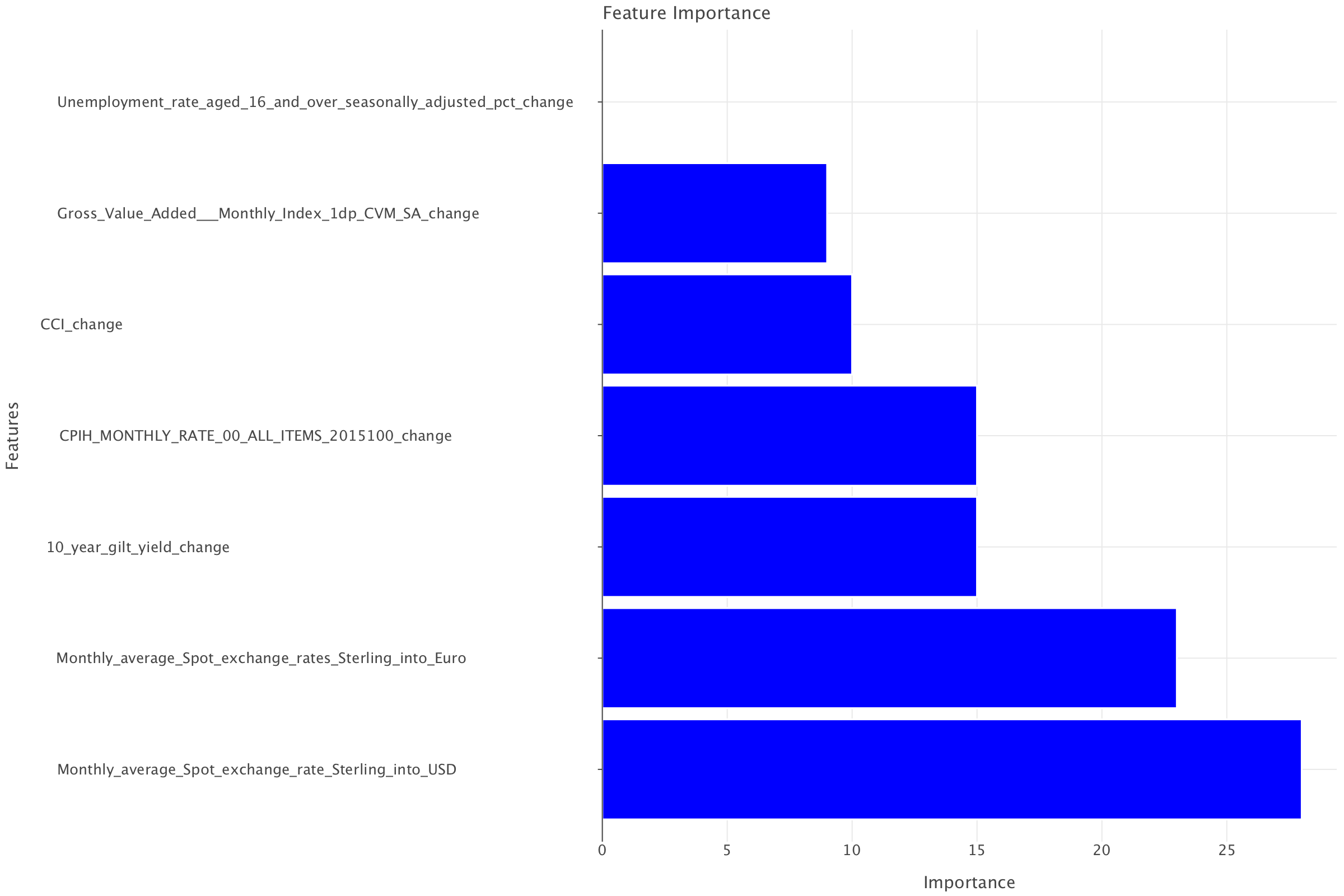
Logistic regression highlighted gilts earlier and still had exchange rates as important but as less imprtant than gilts. For LightGBM, exchange rates take precedence (in the same ordering as for logistic regression, the sterling to USD exchange rate appearing to be slightly more significant than the sterling to Euro rate) before gilt yields. But it is still remarkable that both models highlight the same features in the top 3 albeit in slightly different ordering.
A note on the interpretation of false positives and false negatives in the context of this dataset
From a macro-economic perspective, false positives (predicting a rate hike when there should have been a rate cut) and false negatives (predicting a rate cut when there should have been a rate hike) have different implications, and the severity depends on the economic context. Here’s a breakdown of both:
False Positives (FP) – predicting a rate hike instead of a rate cut
- Market overreaction: If the model incorrectly predicts a rate hike, financial markets might prematurely price in higher interest rates. This could lead to higher borrowing costs, a stronger currency, and lower stock prices.
- Unnecessary tightening: If central banks or policymakers were to follow such a prediction, they might tighten monetary conditions too soon, leading to slower economic growth, reduced business investment, and lower consumer spending.
- Housing & business Loans impact: Higher expected interest rates could discourage borrowing, which is especially harmful when the economy actually needs stimulus.
- Deflationary risks: In cases where an economy is already weak or experiencing low inflation, an incorrect expectation of higher rates could exacerbate deflationary pressures, further slowing down demand and wages.
False Negatives (FN) – Predicting a rate cut instead of a rate hike
- Inflationary pressures: If rates should have gone up (to curb inflation), but the model predicts a rate cut, this could lead to higher-than-expected inflation as borrowing remains cheap and demand continues to rise unchecked.
- Asset bubbles: Low rates for too long can fuel asset bubbles in real estate, equities, and bonds, increasing financial system risk.
- Weakened currency & capital flight: If rate hikes are expected but do not happen, the currency may weaken, leading to capital outflows from the country, higher import prices, and inflationary risks.
- Delayed policy action: Central banks rely on expectations, and if markets incorrectly price in rate cuts, it could delay necessary tightening, leading to an overheated economy and a harder correction later.
Are false positives or false negatives worse?
It depends on the economic cycle:
In an inflationary environment (like post-pandemic 2022-2024), false negatives (FN) are worse i.e predicting rate cuts instead of rate hikes. This means that, in such an environment, recall is more important than precision.
If inflation is already high, failing to predict necessary rate hikes can lead to inflation spiraling out of control. Central banks would then need even more aggressive rate hikes later, causing economic shocks.
In a deflationary/recessionary environment, false positives (FP) are worse. If the economy is weak and rate cuts are needed, but a false signal predicts a hike, it can worsen the downturn, reducing demand and increasing unemployment.
In short:
- False Negatives (FN) are generally more dangerous in inflationary periods, because failing to raise rates in time can let inflation run out of control, requiring harsher corrective measures later.
- False Positives (FP) are riskier in a recession or low-growth scenario, as unnecessary tightening can weaken the economy further.
In today’s context (i.e in the test data which covers Brexit uncertainty (2016+), COVID-19 (2020-2021), and the inflation surge (2021-2024)), false negatives are likely the bigger risk because they could lead to inflation becoming entrenched. On the contrary, because the training data covers several financial crises periods (1997-1998 Asian Financial Crisis, 2000-2002 Dot-Com Bubble & Recession and the 2008 Global Financial Crisis), false positives are likely to be a more important consideration for that dataset!
Footnotes
A large part of the period covered by the test set was marked by a steady increase in rates as a response to high inflationary pressures. Here’s a more detailed timeline of interest rate changes across the periods covered by the datasets:
1997 to 2009:
- 1997-2007: The Bank of England’s Monetary Policy Committee (MPC) increased interest rates in July 2007, reaching 5.75%.
- 2008-2009: The financial crisis and severe economic recession led to significant interest rate cuts. By March 2009, rates were slashed to 0.5%, the lowest in the Bank’s history. The Bank also implemented quantitative easing, injecting money into the banking system to encourage lending. If you want to get a better idea of the Bank’s decisions, you can take a look at this article
2016 to 2024:
- 2016: After the Brexit vote, interest rates were cut to 0.25% in August 2016.
- 2016-2021: Rates remained at 0.25% for several years.
- 2021-2024: The Bank of England began raising interest rates in response to rising inflation. By December 2021, the base rate increased to 0.25%. The base rate has since increased to 5.25% (August 2023). The Bank is currently cautiously decreasing rates again (in the period covered in the dataset, the rate was down to 4.75% and we are currently down to 4.5%)
- 1997-2007: The Bank of England’s Monetary Policy Committee (MPC) increased interest rates in July 2007, reaching 5.75%.