# Uncomment and run the line below if needed (optional)
# install.packages("reshape2")💻 LSE DS202A 2024: Week 07 - Lab Solution
Welcome to week 7 of DS202A!
🥅 Learning Objectives
By the end of this lab, you will be able to:
- Understand the concept of dimensionality reduction
- Apply principal component analysis (PCA) to perform dimensionality reduction
- Know how to interpret principal components
- Apply PCA as a pre-processing step for a supervised learning model
Use the link below to download the lab materials:
⚙️ Setup(5 mins)
Load the libraries for today’s lab. If there is a library you haven’t installed yet, install them like in install.packages("reshape2").
library(tidyverse)
library(psychTools)
library(rsample)
library(tidymodels)
library(reshape2)
We’ll also define a custom ggplot theme to use later on.
custom_theme <- function() {
  theme_minimal() +
    theme(panel.grid.minor = element_blank(),
          legend.position = "bottom")
}
Load the data set. We only do some basic, necessary operations here, like removing columns that contain null values (t25 and t26) as well as some that we simply decide to ignore for this lab (like mo, ageyr, etc). We also change our target variable (see later in this lab) to be of type factor.
data = holzinger.swineford %>%
  as_tibble() %>%
  select(-c(t25_frmbord2, t26_flags, mo, ageyr, grade, female, agemo)) %>%
  mutate(across(c(school), as.factor))

# Print the number of rows and columns
paste("Rows:", nrow(data))
paste("Columns:", ncol(data))
[1] "Rows: 301"
[1] "Columns: 26"Part I: Exploratory Data Analysis (10 mins)
It is always a good idea to explore the data first to understand the variables it contains and their relationships, even better visually, to extent possible/feasible.
However, even before we do that, we need to split the data into training and testing sets.
Why split the data before EDA? The reason is that we would bias our results as soon as we get a chance to see the test set. Perhaps we see something that influences our decisions about how to process the data, which variables or model to choose, etc. You should therefore, strictly speaking, always perform you train/test split as early as possible and perform EDA only on the training set.
👉 Note: we have only performed any absolutely necessary processing steps before the split, like removing some variables that we don’t want to consider at all, and making sure each column has the right data type.
set.seed(12345)
data_split <- initial_split(data, strata = "school", prop = 0.8)

train_data <- training(data_split)
test_data  <- testing(data_split)

paste("We have", nrow(train_data), "training points.")
paste("And", nrow(test_data), "test points.")
[1] "We have 240 training points."
[1] "And 61 test points."One of the many challenges that come with high dimensional data sets (i.e. lots of columns), is that is is difficult to explore them.
However, consider using plots that incorporate multiple variables (or even all if feasible) at once. For example, we could visualize the correlation matrix of all variables using a heatmap.
data %>%
  select(starts_with("t")) %>%
  cor() %>%
  melt(value.name="correlation") %>%
  ggplot(aes(x = Var1, y = Var2, fill = correlation)) +
  geom_tile(color = "white") +
  scale_fill_gradient2(low = "blue", high = "red", mid = "white",
                       midpoint = 0, limit = c(-1,1), space = "Lab",
                       name="Correlation") +
  theme_minimal() +
  theme(axis.text.x = element_text(angle = 45, vjust = 1,
                                   size = 10, hjust = 1)) +
  coord_fixed() +
  labs(title = "Correlation Matrix")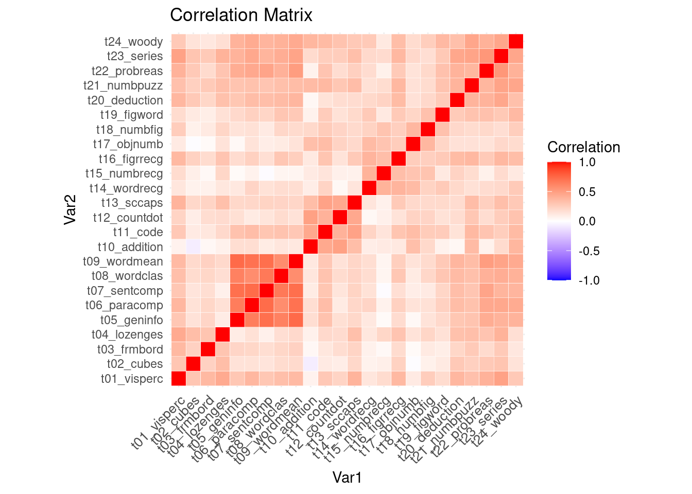
💡 Tip: For better visibility, open the plot in a separate browser window.
🗣️ CLASSROOM DISCUSSION: What do you take away from this plot, especially when you think about using all these variables to train a supervised learning model (such as linear or logistic regression)?
Part II: Dimensionality Reduction using PCA (25 mins)
Besides making data exploration and visualization difficult, high dimensional data comes with other challenges too, in particular with regards to supervised learning.
🧑🏫 TEACHING MOMENT:
The Curse of Dimensionality 🪄
No, that’s not a Harry Potter spell but it refers to the problems that often arise when dealing with high dimensional data (ie lots of variables).
Machine learning models tend to perform badly with too many predictors - there is a higher chance for overfitting, plus there is also a much bigger computational cost associated to training models with many variables.
Dimensionality Reduction to the Rescue 🧑⚕️
We want to reduce the number of variables. Intuitively, this could work because there are often strong correlations between many of the individual variables. In other words, there is redundancy in the data.
Dimensionality reduction refers to a collection of methods that can help reduce the number of variables while preserving most of the information. PCA is one such method.
Principal Component Analysis (PCA) 💡
However, rather than deciding which variables to keep and which ones to throw out (that would fall under “variable selection”), we want to compress our high dimensional data into a low dimensional set of variables while retaining as much information from the original data as possible.
To perform PCA, we can simply integrate it as a step in a recipe.
pca_recipe <-
  recipe(school ~ ., data = train_data) %>%
  # we'll update the role of the case column since it shouldn't be a predictor
  update_role(case, new_role = "ID") %>%
  # remove zero variance predictors as they don't carry any information
  step_zv(all_numeric_predictors()) %>%
  # normalize the data to avoid out-sized impact of some variables
  step_normalize(all_numeric_predictors()) %>%
  # apply principal component analysis, we'll just decide to keep 5 for now
  # we'll set keep original cols to TRUE for now
  step_pca(all_numeric_predictors(), num_comp = 5, keep_original_cols=TRUE) %>%
  # we'll append prep here in order to use the recipe on its own with bake() to preview our data
  prep()


pca_data = pca_recipe %>%
  bake(train_data) %>%
  # just reordering the columns here so we can see our 5 principal components first
  select(case, PC1, PC2, PC3, PC4, PC5, school, everything())

head(pca_data)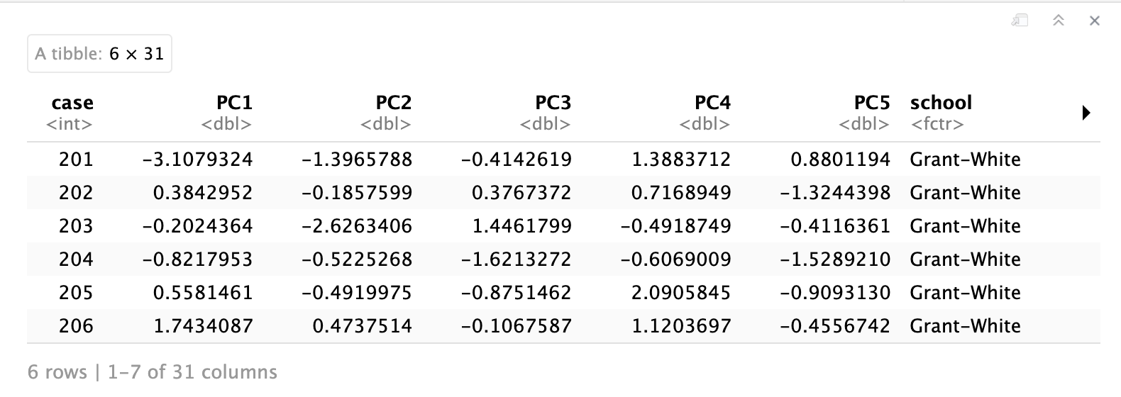
Review of what happened here: We have just applied dimensionality reduction (using PCA) to our 24 numeric variables. Think of the resulting five principle components as a compressed version of our original 24 variables.
👉 Note: we have set
keep_original_cols=TRUEwhich means the principal components were added to our dataframe instead of replacing our original 24 variables - we’ll still need them later on, but in practice you often want to replcae them.
The principal components are ordered by how much variance (or think “information”) are contained in them. That is, PC1 points in the direction of the largest variance in the data, PC2 in the direction of the second largest variance, etc.
We can visualize how much variance is contained in each principal component, which can also help us decide how many dimensions we may want to keep.
# this is a little awkward but we just want to
# extract the fitted PCA "model" that is hidden inside the recipe
pca_fit <- pca_recipe$steps[[3]]$res

# the eigenvalues determine the amount of variance explained
eigenvalues <-
  pca_fit %>%
  tidy(matrix = "eigenvalues")

eigenvalues %>%
  ggplot(aes(PC, percent)) +
  geom_col()+
  geom_text(aes(label = round(percent, 2)), vjust = -0.2, size=3) +
  labs(title="Variance Explained")


eigenvalues %>%
  ggplot(aes(PC, cumulative)) +
  geom_col()+
  geom_text(aes(label = round(cumulative, 2)), vjust = -0.5, size=3) +
  labs(title="Cumulative Variance Explained")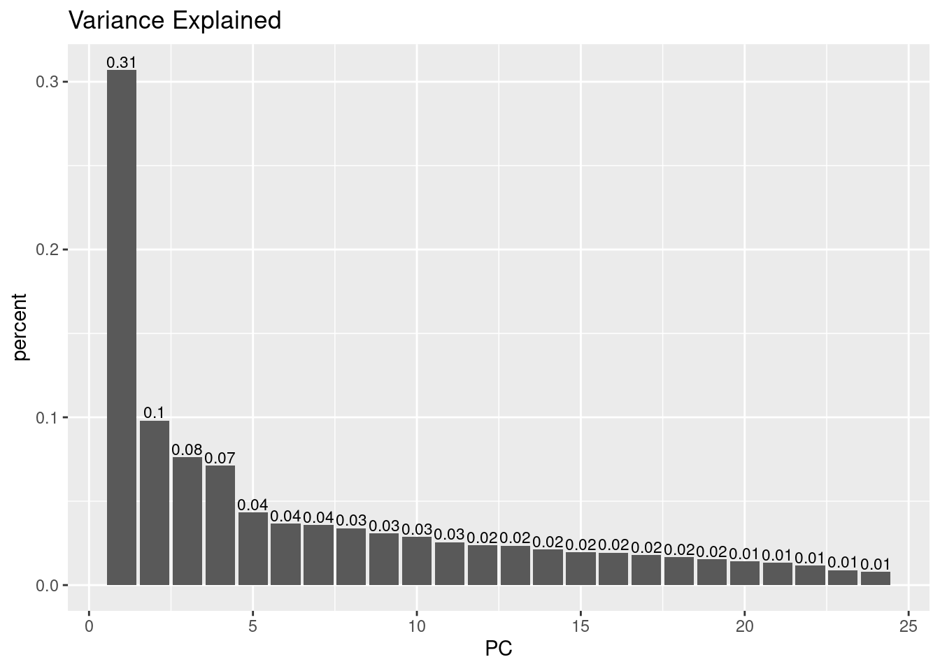
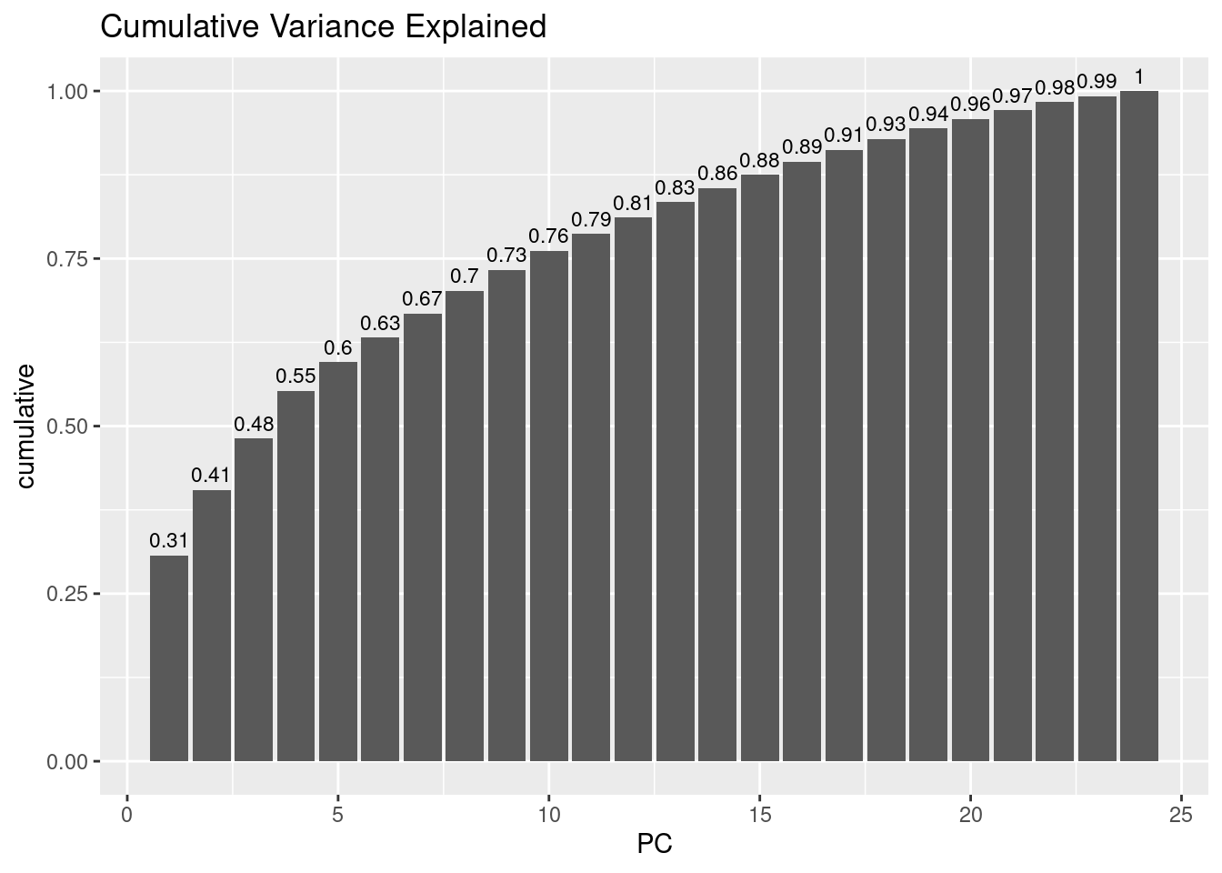
🗣️ CLASSROOM DISCUSSION: Based on this plot, how many principal components would you pick, and why?
💡 Important call-out: This is a good point to call out that PCA will always compute as many principal components as there are variables to begin with. So why is it a “dimensionality reduction” technique you may wonder? Well, the principal components are sorted by the amount of variance that is contained in them, as mentioned. So by selecting only the first N components and discarding the rest (whatever N may be), this will effectively reduce the dimensionality.
Can we visualize the principal components? Yes, let’s visualize the first two, i.e. the ones are point in the direction of largest (and second largest) variance in the data.
ggplot(pca_data, aes(PC1, PC2)) +
  geom_point(alpha=0.7, size=2) +
  ggtitle("Principal Components 1 and 2", subtitle = "2-dimensional representation of our 20+ numeric predictors") +
  custom_theme()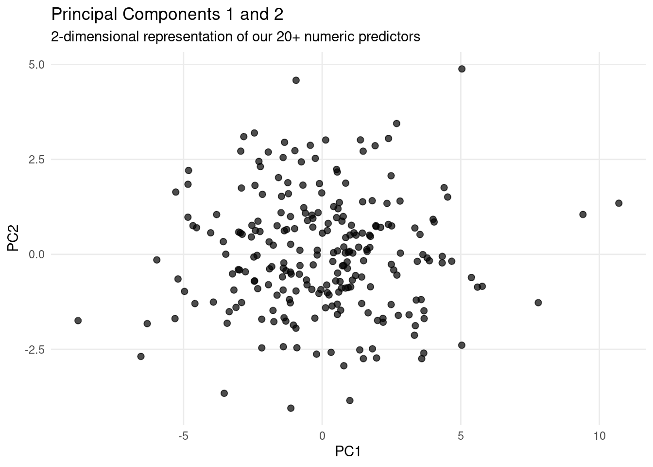
Part III: Game Time (25 mins)
Now that we understand and visualized the principal components, we have yet to explore what information from our original variables is still contained in them.
In this part we’ll play a game that will help you find out.
The following block of code produces a plot that shows which original variables have contributed to each of the first five principal components. Don’t worry about the code too much, it’s just the plot that matters here.
pca_data = pca_data %>%
  mutate(name = case_when(
    case == 307 ~ "Rachel",
    case == 298 ~ "Ross",
    case == 151 ~ "Phoebe",
    case == 50 ~ "Joey",
    case == 243 ~ "Monica",
    case == 7 ~ "Chandler"
    # otherwise just leave NA
  ))

tidied_pca <- tidy(pca_recipe, 3)

ignore_cols = c("t01_visperc", "t03_frmbord", "t06_paracomp", "t07_sentcomp", "t12_countdot", "t14_wordrecg", "t13_scapps", "t09_wordmean", "t19_figword")

plot_df <-
  tidied_pca %>%
  filter(!(terms %in% ignore_cols)) %>%
  filter(component %in% paste0("PC", 1:5)) %>%
  arrange(desc(abs(value))) %>%
  group_by(component) %>%
  # Get 10 biggest contributors to this PC
  slice_head(n=10) %>%
  mutate(component = fct_inorder(component))

terms_levels <-
  plot_df %>%
  group_by(terms) %>%
  summarise(sum_value=sum(abs(value))) %>%
  arrange(desc(terms)) %>%
  pull(terms)

plot_df$terms <- factor(plot_df$terms, levels=terms_levels)

ggplot(plot_df, aes(value, terms, fill = abs(value))) +
  geom_col() +
  scale_fill_viridis_c(name="Abs value") +
  geom_vline(aes(xintercept=0), linetype="dotted") +
  facet_wrap(~component, nrow = 1) +
  labs(title="Which variables contributed the most (together) to a particular PC?",
       subtitle="Use this to solve the task.",
       captions="Contribution of most important\n features to each component. Some test variables were removed only for better visibility of the plot.",
       y = NULL) +
  # Prettify plot a bit
  theme_bw() +
  theme(plot.title=element_text(size=rel(1.2)),
        plot.subtitle = element_text(size=rel(1)),
        axis.title=element_text(size=rel(1.3)),
        axis.title.x=element_text(margin=margin(t=10)),
        axis.title.y=element_text(margin=margin(r=10)),
        axis.text.y=element_text(size=rel(1.25)))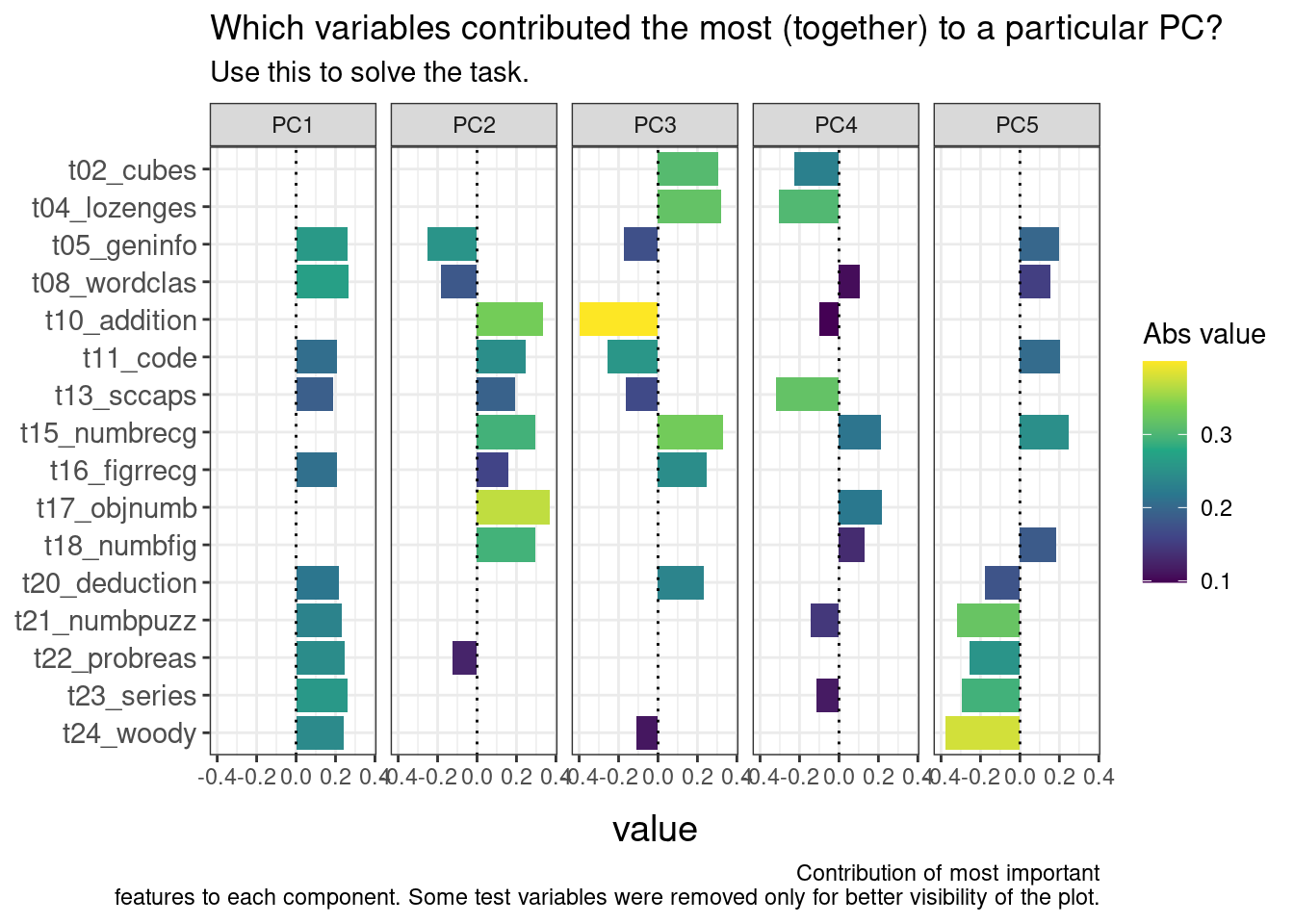
With the next chunk of code, you will plot two principal components at a time. This will be helpful for you, as you can choose two components to plot. We’ll start out with PC1 and PC2.
ggplot(pca_data, aes(PC1, PC2, label=name, color=name)) +
  geom_point(alpha=0.7, size=2) +
  ggtitle("Principal Components") +
  geom_text(check_overlap=TRUE, vjust = 0, nudge_y = 0.1) +
  custom_theme()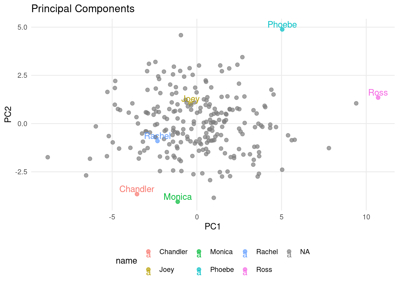
Rules for the Game
Teams
- Play together as a table
- Write down your answers to questions 3-8 (questions 1 and 2 will be done together)
How to solve the questions
- Find out which principal component(s) contain the information needed to answer the question based on the PCA contribution plot.
- Visualize the principal component(s) using the scatter plot.
- Use information from both plots to answer the question. (Pro tip: you can also strategically change the color of the scattered points to help you answer the question - but this is optional, you don’t have to do that).
Questions
Done together with your class teacher:
- Q1: Ross is likely to be good at
t08_wordclas.True or False? True (PC1+PC2) - Q2: Who is especially likely to be good at
t13_sccaps? Joey (mainly PC4)
Your turn:
- Q3: Who is likely good at
t18_numbfig? Phoebe (PC2) - Q4: Ross is likely much better at
t18_numbfigthan Joey? False (PC2) - Q5: Who is most likely to be good at
t04_lozenges? Joey (PC3+PC4) - Q6: Monica seems to be around average at
t04_lozenges? True (PC3+PC4) - Q7: Both PC2 and PC3 contain information about
t10_addition? True - Q8: The variable with the strongest (absolute) contribution to PC5 is
t15_numbrecg? False
Part IV: PCA + Supervised Learning = ❤ (well, sometimes) (30 mins)
Dimensionality reduction isn’t just for understanding data—it can also help train better models. But why does reducing information lead to better performance even though we lose information?
It comes down to a trade-off with the curse of dimensionality. By reducing the number of features, PCA removes redundancy and noise, making it less likely for the model to overfit.
Revisiting LASSO (with Logistic Regression)
To combat overfitting, we can also apply a penalty to large coefficients, keeping the model simpler. The LASSO penalty has the added bonus of setting some coefficients to zero, effectively performing variable selection.
While both LASSO and PCA aim to reduce the number of features, they do so in different ways—and can actually complement each other. That’s what we’re going to explore here.
The Task:
Predict the school based on test scores (binary classification).
We’ll start with a baseline mode - no LASSO or PCA yet - just to establish a reference point. Afterwards, we’ll try to improve upon the baseline by applying PCA and LASSO.
lr_model =
  logistic_reg(penalty=0.0, mixture=1) %>%
  set_engine('glmnet')

set.seed(123)
folds <- vfold_cv(train_data, v = 5)

no_pca_recipe =
  recipe(school ~ ., data = train_data) %>%
  update_role(case, new_role = "ID")

lr_workflow <-
  workflow() %>%
  add_model(lr_model) %>%
  add_recipe(no_pca_recipe)

lr_fit_rs = lr_workflow %>%
  fit_resamples(folds)

collect_metrics(lr_fit_rs)
🎯 ACTION POINTS
Your task is now to integrate PCA into the recipe, and to apply a LASSO penalty.
- In the code block below, add the PCA step from earlier in this lab (include also the two pre-processing steps we used).
- Set an arbitrary LASSO penalty (use a value between 0 and 1).
💡 Tip: make sure your model trains only on the principal components, excluding our original test variables. A small tweak to the PCA step is therefore required.
lr_model =
  # TODO: set a penalty (leave the mixture at 1)
  logistic_reg(penalty=0.5, mixture=1) %>%
  set_engine('glmnet')

pca_recipe =
  recipe(school ~ ., data = train_data) %>%
  update_role(case, new_role = "ID") %>%
  #################
  ## TODO: your code here
  step_zv(all_numeric_predictors()) %>%
  step_normalize(all_numeric_predictors()) %>%
  step_pca(all_numeric_predictors(), num_comp=5)
  #################

lr_workflow <-
  workflow() %>%
  add_model(lr_model) %>%
  add_recipe(pca_recipe) # now using the PCA recipe

lr_fit_rs = lr_workflow %>%
  fit_resamples(folds)

collect_metrics(lr_fit_rs)
How do we know if our arbitrarily chosen values for the penalty and the number of principal components were optimal? They are probably not.
For the number of principal components, you may sometimes hear the (also more or less arbitrary) rule of thumb suggesting you keep at least 80% of the variance.However, selecting a value by hand or based on a dubious rule of thumb isn’t very scientific. As data scientists, we want to do better than that.
The solution is, as so often, the test set. We want to do what works best on the test set. It’s that plain and simple (not really of course, but you get the point).
Grid Search for Hyper-Parameter Tuning
🎯 ACTION POINT
Edit the code cell below to tune both the LASSO penalty as well as the number of principal components. Only two small but important changes are needed.
lr_model =
  # TODO: your change is required
  logistic_reg(penalty=tune(), mixture=1) %>%
  set_engine('glmnet')

pca_tune_recipe =
  recipe(school ~ ., data = train_data) %>%
  update_role(case, new_role = "ID") %>%
  #################
  ## TODO: your code here (mostly from above, only one small change is necessary)
  step_zv(all_numeric_predictors()) %>%
  step_normalize(all_numeric_predictors()) %>%
  step_pca(all_numeric_predictors(), num_comp=tune())
  #################

tune_workflow <-
  workflow() %>%
  add_model(lr_model) %>%
  add_recipe(pca_tune_recipe)


pca_grid <- expand.grid(num_comp = c(5,10,15,20,21,22,23,24),
                        penalty=c(0.001, 0.005, 0.01, 0.02, 0.05, 0.08))

tune_results <-
  tune_grid(tune_workflow,
            resamples = folds,
            grid = pca_grid)


collect_metrics(tune_results) %>%
  filter(.metric == "accuracy") %>%
  ggplot(aes(x = factor(num_comp), y = factor(penalty), fill = mean)) +
  geom_tile() +
  scale_fill_viridis_c() +
  labs(
    title="Grid Search Results", x = 'Number of Principal Components',
    y = 'LASSO Penalty',fill = 'Accuracy'
  ) +
  geom_text(aes(label = round(mean, 3)), color = "white", size = 3, fontface = "bold") +
  custom_theme()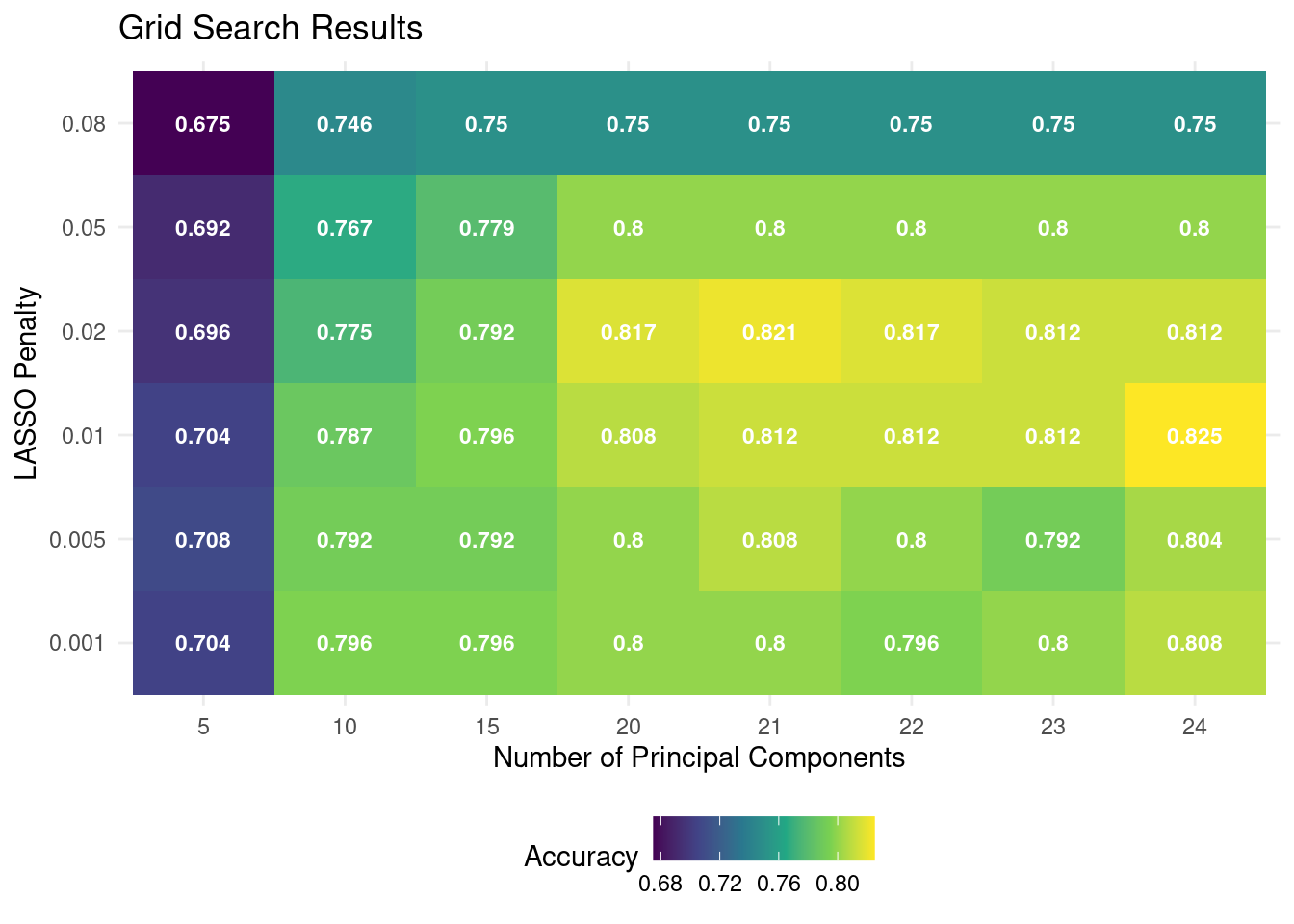
🗣️ CLASSROOM DISCUSSION: Based on this plot, what was the best model? How many principal components would you choose? Can you recognize any over- and underfitting in the plot?
Latly, the only thing left is to choose a final model, retrain it on the full dataset, and compute the final test set metrics.
We’ll select a model by using the select_by_one_std_err function which selects the simplest model that is within one standard error of the best model.
chosen_model = tune_results %>%
  select_by_one_std_err(metric = "accuracy", desc(penalty), desc(num_comp))

final_wf <-
  tune_workflow %>%
  finalize_workflow(chosen_model)

final_fit <-
  final_wf %>%
  last_fit(data_split)

final_fit %>%
  collect_metrics()
