✅ Week 05 Lab - Solutions
2024/25 Autumn Term
This solution file follows the format of the Quarto file .qmd you had to fill in during the lab session. If you want to render the document yourselves and play with the code, you can download the .qmd version of this solution file by clicking on the button below:
You’ll also need to download the following models/pre-trained model outputs and put them within a new models folder within your DS202A project folder.
Loading packages and data
🚨 Remember to install any packages that you might not have installed before e.g rpart.plot, viridis or xgboost.
library("ggsci")
library("janitor")
library("kknn")
library("rpart.plot")
library("scales")
library("tidymodels")
library("tidyverse")
library("viridis")
library("xgboost")

theme_scatter <- function() {

  theme_minimal() +
    theme(panel.grid.minor = element_blank(),
          legend.position = "bottom")

}

theme_dot <- function() {

  theme_minimal() +
    theme(panel.grid = element_blank(),
          legend.position = "bottom")

}

theme_line <- function() {

  theme_minimal() +
    theme(panel.grid.minor = element_blank(),
          panel.grid.major.x = element_blank(),
          legend.position = "bottom")

}

theme_histogram <- function() {

  theme_minimal() +
    theme(panel.grid.minor = element_blank(),
          panel.grid.major.x = element_blank())

}

theme_bar <- function() {

  theme_minimal() +
    theme(panel.grid.minor = element_blank(),
          panel.grid.major.y = element_blank())

}
Predicting Post-Traumatic Stress Disorder with k Nearest Neighbours (50 minutes)
Today, we are going to be demonstrating the utility of hyperparameter tuning using k-fold cross validation.
Exploring a feature space
We are going to take a look at data on Mexican survey respondents to an online health risk questionnaire during the COVID-19 pandemic (see (Garibay Rubio et al. 2024)). The data providers created a code for whether or not the users suffered from PTSD. We will expand an example given for k nearest neighbours in the paper (see page 10), using two predictors. The full data set consists of
ptsd <-
  read_csv("data/ptsd-for-knn.csv") %>%
  mutate(ptsd = as.factor(ptsd))
Rows: 33234 Columns: 3
── Column specification ─────────────────────────────────────────────────────────────────────────────────────────────────────────────────────────────────────────────────
Delimiter: ","
dbl (3): ptsd, anxiety, acute_stressptsd: 1 if the user has, 0 if the user does not have (the outcome)anxiety: 0-10 self-reported anxiety scale.acute_stress: 0-10 self-reported acute stress scale.
Let’s use ggplot to explore this feature space.
ptsd %>%
  select(ptsd, anxiety, acute_stress) %>%
  group_by(anxiety, acute_stress) %>%
  summarise(ptsd = mean(ptsd == 1, na.rm = TRUE)) %>%
  ungroup() %>%
  ggplot(aes(anxiety, acute_stress, colour = ptsd)) +
  geom_point(size = 5) +
  scale_x_continuous(breaks = 0:10) +
  scale_y_continuous(breaks = 0:10) +
  scale_colour_viridis(labels = percent, breaks = c(0, 0.4, 0.8), option = "cividis") +
  theme_dot() +
  labs(x = "Anxiety question", y = "Acute stress question",
       colour = "Proportion of grid with PTSD")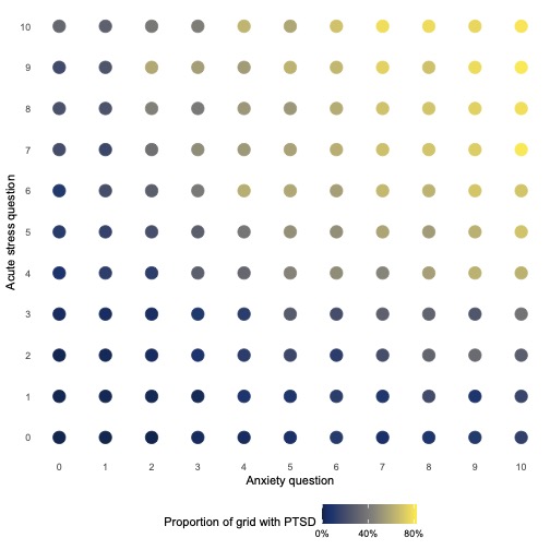
👉 NOTE: The actual data set has many features that can be used. We are only using 2 features as it is hard to visualise a feature space that is more than two dimensions.
🗣️ CLASSROOM DISCUSSION:
What does this graph show? How can we identify individuals diagnosed with PTSD? What boundaries can we draw between the two classes?
We see that at the higher values of anxiety and acute stress, individuals in the sample are more likely to have a PTSD diagnosis. We have used colour to distinguish between the proportion of points on the grid that have a PTSD diagnosis.
👨🏻🏫 TEACHING MOMENT:
All machine learning algorithms can draw boundaries.
Introducing k Nearest Neighbours
An algorithm that can be used to classify data points is k Nearest Neighbours (kNN for short). This algorithm works by taking the neighbours of an observation and having them “vote” on whether or not the observation in question belongs to a specific class.
👉 NOTE: The “neighbours” decide the fate of a data point based on them calculating their proximity to it in relation to other data points that do not belong to their neighbourhood.
The question is, how many neighbours get to vote in the decision? This is the key hyperparameter of nearest neighbours and something that we need to experiment with. The most widely acknowledged way to experiment with hyperparameters is via k-fold cross-validation.
k-fold Cross-validation
Let’s split our sample into training and testing sets.
set.seed(123)

ptsd_split <- initial_split(ptsd, prop = 0.75, strata = ptsd)
ptsd_train <- training(ptsd_split)
ptsd_test <- testing(ptsd_split)
ptsd_cv <- vfold_cv(ptsd_train, v = 5)

ptsd_cv
# 5-fold cross-validation
# A tibble: 5 × 2
splits id
<list> <chr>
1 <split [19939/4985]> Fold1
2 <split [19939/4985]> Fold2
3 <split [19939/4985]> Fold3
4 <split [19939/4985]> Fold4
5 <split [19940/4984]> Fold5We added an extra line of code: ptsd_cv <- vfold_cv(ptsd_train, v = 5). All this does is take our training data and perform 5 random splits in ptsd whereby the majority of the data is used to train the model and the rest is then used to evaluate it (a.k.a. a hold-out set) before it is evaluated on the test data. We can then calculate cross-validated scores by simply taking the mean of each set of evaluation scores. Before we provide a final evaluation, in other words, we are internally auditing our models by building and evaluating them based on different subsets of the data. In doing so, k-fold cross validation provides an extra layer of protection against overfitting when tuning hyperparameters and, as such, should always be used.
The below code instantiates a kNN classifier.
🚨 ATTENTION: You will need to have the kknn package installed for this algorithm to work.
knn_model <-
  nearest_neighbor(neighbors = tune()) %>%
  set_mode("classification") %>%
set_engine("kknn")👨🏻🏫 TEACHING MOMENT:
What does setting neighbors = tune() mean?
Instead of using a singular value, we are telling tidymodels to try a range of different values
Pre-processing
We are going to use a simple recipe to pre-process the data. All that is happening is that both features are normalised, meaning we subtract the mean from each feature and divide by their standard deviation.
⚠️ WARNING: Any algorithm that uses distance metrics must use this preprocessing step as features with higher variances will play a disproportionately high amount of influence. So, when you hear “this algorithm utilizes distance measures”, think “standardise features!”
knn_rec <-
  recipe(ptsd ~ ., data = ptsd_train) %>%
  step_normalize(all_numeric_predictors())
👉 NOTE: Check out this link to find out what a recipe is and why they are useful.
Creating a workflow
Now that we have a model to build and a recipe to follow, we can combine both into a workflow.
👉 NOTE: Check out this link to find out what a workflow is and why they are useful.
wf_knn <-
  workflow() %>%
  add_model(knn_model) %>%
  add_recipe(knn_rec)
Deciding upon performance metrics
Your lecturer will have made you aware of the upsides and downsides to each performance metric. With tidymodels you do not have to settle for one, so we are going to pick three to create a metric set.
class_metrics <- metric_set(recall, precision, f_meas)Creating a nearest neighbours grid
We then need to specify a parameter grid.
👉 NOTE: This task often involves a lot of experimentation so do not take these values to be gospel for any future kNN models you build.
grid_knn <- tibble(neighbors = c(100, 500, 1000, 3000))🗣️ CLASSROOM DISCUSSION:
Which number in the grid would represent the most “complex” model?
Having less neighbours would result in a more fragmented model.
👨🏻🏫 TEACHING MOMENT:
Your teacher will present some output to see what happens when we vary k.
# Estimate the models (uncomment to run)
# knn_models <- read_rds("models/knn_models_code.R")

# Load a model that is already estimated
knn_models <- read_rds("models/knn_models_output.R")

knn_models %>%
  unnest(grid) %>%
  ggplot() +
  facet_wrap(. ~ paste0("k = ", k)) +
  geom_point(aes(anxiety, acute_stress, colour = prop_ptsd), size = 5) +
  geom_tile(aes(anxiety, acute_stress, fill = .pred_class == 1), alpha = 0.25) +
  scale_x_continuous(breaks = seq(0, 10, 2)) +
  scale_y_continuous(breaks = seq(0, 10, 2)) +
  scale_colour_viridis(option = "cividis") +
  scale_fill_manual(values = c("lightgrey", "navy")) +
  theme_dot() +
  labs(x = "Anxiety question", y = "Acute stress question",
       colour = "Proportion with PTSD",
       fill = "Predicted PTSD?")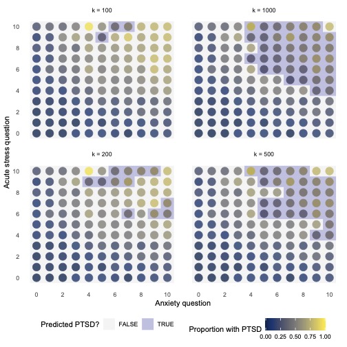
Estimating a cross-validated model
We now have all the information we need to estimate a cross-validated model. We have
- A workflow, consisting of a model and a recipe
- A series of 5 resampled data sets
- A metric set containing several evaluation metrics and
- A range of hyperparameter options to tune our models.
This will result in 20 different models (5-folds \(\times\) 4 hyperparameter combinations) running, which may be slow on your laptops. To get the most out of them, we add doParallel::registerDoParallel() to have your laptop run the models in parallel by using multiple cores.
🚨 ATTENTION: You will need to have the doParallel package installed for doParallel::registerDoParallel() to work.
doParallel::registerDoParallel()

knn_model_cv <-
  tune_grid(
    wf_knn,
    resamples = ptsd_cv,
    metrics = class_metrics,
    grid = grid_knn,
    control = control_resamples(event_level = "second")
  )
👉 NOTE: This may take a while to run, so relax for a bit!
Plot hyperparameters
After knn_model_cv compiles, try using the function collect_metrics() on the model object. This results in a tibble of cross-validated performance metrics for each hyperparameter combination. Plot the results of this using a graph of your choice!
knn_model_cv %>%
  collect_metrics() %>%
  mutate(neighbors = as.factor(neighbors)) %>%
  ggplot(aes(neighbors, mean, colour = .metric, group = .metric)) +
  geom_point(size = 2.5) +
  geom_line(linetype = "dashed") +
  scale_colour_bmj() +
  theme_line() +
  labs(x = "Number of neighbours", y = "Mean cross-validated metric",
       colour = NULL)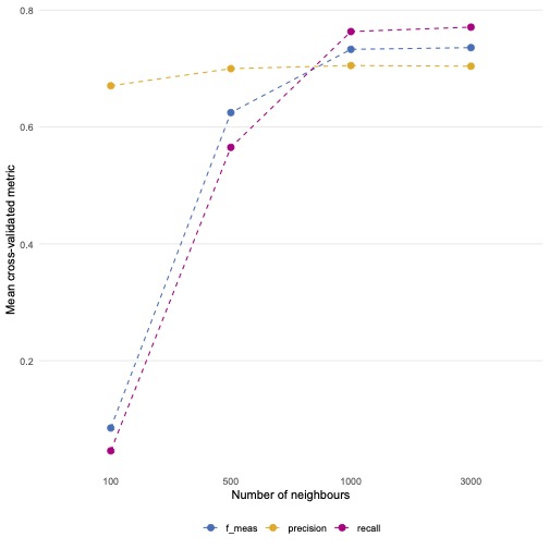
🗣️ CLASSROOM DISCUSSION:
Which model is best?
If we look at the f1-score, models with a k of 3,000 work the best.
Fit the best model to the full training set
We can then build a final model using the best hyperparameter combination. Let’s take the f1-score as the measure that we want to maximise.
# Select the best model

highest_f1 <- select_best(knn_model_cv, metric = "f_meas")
highest_f1
# A tibble: 1 × 2
neighbors .config
<dbl> <chr>
1 3000 Preprocessor1_Model4# Use the best parameter combination and fit on the entire training data
knn_model_final <-
wf_knn %>%
finalize_workflow(highest_f1) %>%
fit(ptsd_train)Evaluate the model on the test set
From there, all we need to do is follow the evaluation step that we have done for previous models.
knn_model_final %>%
  augment(new_data = ptsd_test) %>%
  f_meas(truth = ptsd, estimate = .pred_class, event_level = "second")
# A tibble: 1 × 3
.metric .estimator .estimate
<chr> <chr> <dbl>
1 f_meas binary 0.737Removing superfluous objects
rm(list = ls(pattern = "grid|high|knn|ptsd|metric"))
gc()
Predicting childcare costs in US counties with tree-based models (40 minutes)
We are going to see how hyperparameter tuning using a decision tree, Random Forest and XGBoost can help improve classification performance. We will take the following steps:
- Perform some exploratory data analysis
- Plot a decision tree
- Build a random forest model
- Tune the learning rate using XGBoost
Exploring the data set
childcare <- read_csv("data/childcare-costs.csv")Rows: 23593 Columns: 57
── Column specification ───────────────────────────────────────────────────────────────────────────────────────────────────────────────────────────────────────────────────────────
Delimiter: ","
chr (3): county_name, state_name, state_abbreviation
dbl (54): county_fips_code, study_year, unr_16, funr_16, munr_16, unr_20to64...
ℹ Use `spec()` to retrieve the full column specification for this data.
ℹ Specify the column types or set `show_col_types = FALSE` to quiet this message.Click here to see a full list of variables. Let’s explore the data with a few visualisations.
Median child care costs are ~ $96.53 a week per county
med_cost <- median(childcare$mcsa)

childcare %>%
  ggplot(aes(mcsa)) +
  geom_histogram(bins = 40, fill = "lightgrey", colour = "black") +
  geom_vline(xintercept = med_cost, linewidth = 2, linetype = "dashed", colour = "red") +
  theme_histogram() +
  scale_x_continuous(labels = dollar) +
  scale_y_continuous(labels = comma) +
  labs(x = "Weekly cost of childcare (USD)", y = "Count")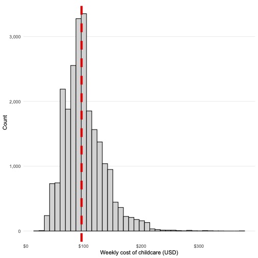
The costs of childcare increase in counties with higher median incomes
childcare %>%
  ggplot(aes(mhi_2018, mcsa)) +
  geom_point(alpha = 0.125, size = 2) +
  geom_smooth(method = "lm", se = FALSE) +
  theme_scatter() +
  scale_x_continuous(labels = dollar) +
  scale_y_continuous(labels = dollar) +
  labs(x = "Household income (2018 USD)",
       y = "Weekly cost of childcare (USD)")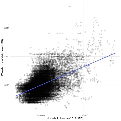
There is considerable variation in the costs of childcare based on the ethnic composition of the county
👉 NOTE: We adapted this graph from Julia Silge (click here for her analysis of the same data set).
childcare %>%
  select(mcsa, starts_with("one_race_"), -one_race_other, two_races) %>%
  pivot_longer(-mcsa, names_to = "race", values_to = "perc") %>%
  mutate(race = str_remove(race, "one\\_race\\_"),
         race = case_when(race == "w" ~ "Both White",
                          race == "b" ~ "Both Black",
                          race == "i" ~ "Both Native",
                          race == "a" ~ "Both Asian",
                          race == "h" ~ "Both Hispanic",
                          race == "two_races" ~ "Mixed Parents")) %>%
  ggplot(aes(perc, mcsa)) +
  facet_wrap(. ~ race, scales = "free_x") +
  geom_point(alpha = 0.05) +
  geom_smooth(method = "lm", se = FALSE) +
  theme_scatter() +
  labs(x = "Percent of racial family types in counties",
       y = "Weekly cost of childcare (USD)")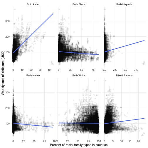
Create a grouped train / test split
If you have inspected childcare, you will see that it tracks r length(unique(childcare$county_name)) counties from r min(childcare$study_year) to r max(childcare$study_year). This poses an interesting challenge for when we perform a train / test split. If we interpret childcare as purely cross-sectional and perform an initial split without taking the time-series dimension into account, we run the risk of:
- Using future values to predict the past
- Using information from the same county in the training and testing sets
Naturally, a few solutions follow from this issue:
- Use earlier years to train the model and later years to test it.
- Use some counties to train the model and other counties to test it.
We will opt for the latter. This can be done by using the group_initial_split function, which takes all the same parameters as initial_split and includes a group parameter. Try using this function below.
# Set a seed

set.seed(123)

# Create a grouped initial split

childcare_split <-
  group_initial_split(childcare,
                      group = county_name,
                      prop = 0.75)

# Isolate the train and test sets

childcare_train <- training(childcare_split)
childcare_test <- testing(childcare_split)
We can also create cross-validation folds using group_vfold_cv. Try using this below to create a 5-fold cross-validation grid.
# Set a seed

set.seed(123)

# Create 5-fold cross-validation grid, grouped by county name

childcare_cv <- group_vfold_cv(childcare_train, group = county_name, v = 5)
Create a decision tree
Use the following steps
- Use the
decision_treefunction - Set mode equal to “regression”
- Set the engine to “rpart”
🚨 ATTENTION: You will need to have the rpart package installed for this algorithm to work.
dt_model <-
  decision_tree() %>%
  set_mode("regression") %>%
  set_engine("rpart")
Develop a recipe
The recipe is fairly straightforward. The only step we have added is to assign the county and state features as IDs, meaning they will not play a part in the model building process.
childcare_rec <-
  childcare_train %>%
  recipe(mcsa ~ .) %>%
  update_role(starts_with(c("county", "state")), new_role = "id")
Fit the model
As we are not experimenting with hyperparameters at this point, we can simply build a workflow and fit it directly to the training data.
dt_fit <-
  workflow() %>%
  add_recipe(childcare_rec) %>%
  add_model(dt_model) %>%
  fit(data = childcare_train)
Describe the following plot
🚨 ATTENTION: You will need to have the rpart.plot package installed for this plot to render.
rpart.plot(extract_fit_engine(dt_fit), roundint=FALSE)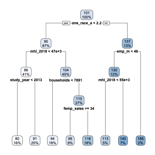
🗣️ CLASSROOM DISCUSSION:
Which feature has the algorithm deemed most important for splitting the data? Can you explain what the tree is doing?
Because decision trees are top-down and greedy, the algorithm will perform a split using the variable and threshold that minimises the residual sum of squares
Evaluate the model on the test set
Let’s see how well our simple decision tree does. Create a metric set with the RMSE and r-squared metrics and use them to evaluate the decision tree.
regress_metrics <- metric_set(rsq, rmse)

dt_fit %>%
  augment(new_data = childcare_test) %>%
  regress_metrics(mcsa, .pred)
# A tibble: 2 × 3
.metric .estimator .estimate
<chr> <chr> <dbl>
1 rsq standard 0.246
2 rmse standard 30.4 Instantiate a random forest model
- Use the
rand_forestfunction - Set
mtry = round(sqrt(52), 0)andtrees = 1e3
🗣️ CLASSROOM DISCUSSION:
Why do we do this? What happens if we set mtry equal to the number of features?
We need to limit the number of variables to create a series of different decision trees. Not doing this would result a series of highly correlated decision trees.
- Set the mode to “regression”
- Set the engine to “ranger”
rf_model <-
  rand_forest(mtry = round(sqrt(52), 0), trees = 1e3) %>%
  set_mode("regression") %>%
  set_engine("ranger")
Fit the model
Use the same syntax used earlier.
doParallel::registerDoParallel()

rf_fit <-
  workflow() %>%
  add_recipe(childcare_rec) %>%
  add_model(rf_model) %>%
  fit(data = childcare_train)
Evaluate the mode on the test set
rf_fit %>%
  augment(new_data = childcare_test) %>%
  regress_metrics(mcsa, .pred)
# A tibble: 2 × 3
.metric .estimator .estimate
<chr> <chr> <dbl>
1 rsq standard 0.436
2 rmse standard 26.2 🗣️ CLASSROOM DISCUSSION:
Do we see an improvement?
Yes, we see a reduction of error. Our model is now typically off by 26.3 dollars as opposed to 30.4.
Instantiate an XGBoost model
- Use the
boost_treefunction - Set
learn_rate = tune() - Set
mtry = round(sqrt(52), 0)andtrees = 1e3 - Set the mode to “regression”
- Set the engine to “xgboost”
🚨 ATTENTION: You will need to have the xgboost package installed for this algorithm to work.
xgb_model <-
  boost_tree(mtry = round(sqrt(52), 0), trees = 1e3,
             learn_rate = tune()) %>%
  set_mode("regression") %>%
  set_engine("xgboost")
Create a workflow
Use a similar format to the chunk used to create the kNN workflow.
xgb_wf <-
  workflow() %>%
  add_recipe(childcare_rec) %>%
  add_model(xgb_model)
Create a hyperparameter tuning grid
Use c(0.0001, 0.001, 0.01, 0.1, 0.2, 0.3) as the experimental values. Remember, that all you need to do is create a tibble of these values with the exact same hyperparameter name used in the model for this grid to work.
xgb_grid <- tibble(learn_rate = c(0.0001, 0.001, 0.01, 0.1, 0.2, 0.3))Estimating a cross-validated model
We now have all the information we need to estimate a cross-validated model. We have
- A workflow, consisting of a model and a recipe
- A series of 5 resampled data sets
- A metric set containing two evaluation metrics and
- A range of hyperparameter options to tune our models.
doParallel::registerDoParallel()

xgb_cv_fit <-
  tune_grid(
    xgb_wf,
    resamples = childcare_cv,
    metrics = regress_metrics,
    grid = xgb_grid
  )
Which learning rate produces the best RMSE?
Produce a graph that visualises the best result.
xgb_cv_fit %>%
  collect_metrics() %>%
  filter(.metric == "rmse") %>%
  ggplot(aes(as.factor(learn_rate), mean, group = 1)) +
  geom_point() +
  geom_line(linetype = "dashed") +
  theme_line() +
  labs(x = "Learn rate", y = "Mean Cross-Validated RMSE")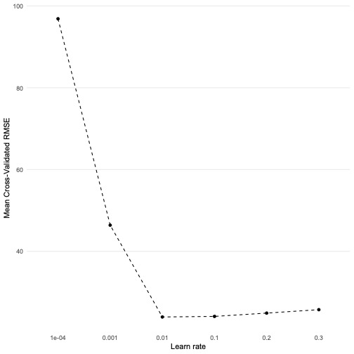
Select and estimate the model with the lowest RMSE
lowest_rmse <- select_best(xgb_cv_fit, metric = "rmse")

xgb_final_fit <-
  xgb_wf %>%
  finalize_workflow(lowest_rmse) %>%
  fit(childcare_train)
Evaluate the model on the test set
xgb_final_fit %>%
  augment(new_data = childcare_test) %>%
  regress_metrics(mcsa, .pred)
# A tibble: 2 × 3
.metric .estimator .estimate
<chr> <chr> <dbl>
1 rsq standard 0.464
2 rmse standard 25.5 🗣️ CLASSROOM DISCUSSION:
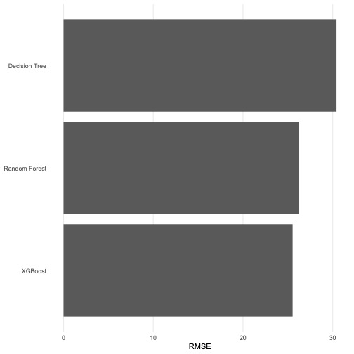
How should we rank each model?
XGBoost \(>\) Random Forest \(>\) Decision Tree
(Bonus) Create a graph that summarises our findings!
A bar graph will provide an excellent visual summary. We encourage you to use something like this in your summative work if you are asked to compare different ML models.
list(
  "Decision Tree" = dt_fit %>%
    augment(new_data = childcare_test) %>%
    rmse(mcsa, .pred),
  "Random Forest" = rf_fit %>%
    augment(new_data = childcare_test) %>%
    rmse(mcsa, .pred),
  "XGBoost" = xgb_final_fit %>%
    augment(new_data = childcare_test) %>%
    rmse(mcsa, .pred)
) %>%
  bind_rows(.id = "model") %>%
  mutate(model = fct_reorder(model, .estimate)) %>%
  ggplot(aes(.estimate, model)) +
  geom_col() +
  theme_bar() +
  labs(x = "RMSE", y = NULL)