✅ Week 02 Lab - Solutions
2024/25 Autumn Term
This solution file follows the format of the Quarto file .qmd you had to fill in during the lab session. If you want to render the document yourselves and play with the code, you can download the .qmd version of this solution file by clicking on the button below:
📋 Lab Tasks
🛠 Part I: Data manipulation with dplyr (40 min)
⚙️ Setup
Import required libraries:
library(ggsci)       # for nice colour themes
library(psymetadata) # imports meta-analyses in psychology
library(tidyverse)
Try this option if having issues with the imports above
library(dplyr)       # for data manipulation
library(tidyr)       # for data reshaping
library(readr)       # for reading data
library(tidyselect)  # for selecting columns
library(ggsci)       # for nice colour themes
library(psymetadata) # imports meta-analyses in psychology
No need to load any data here: we can already have access to the meta-analyses by loading psymetadata. Let’s proceed! 😉
1.3. Let’s print the Gnambs (2020) study on the colour red and cognitive performance to inspect it (to read the study click here).
gnambs2020 es_id study_id author pub_year country color n design yi vi
1 1 1 arthur2016 2016 US green 76 between 0.42962966 0.05399213
2 2 1 arthur2016 2016 US green 164 between 0.02241093 0.02439540
3 3 1 arthur2016 2016 US green 87 between 0.08424910 0.04602388
4 4 2 bertrams2015 2015 DE gray 33 between 0.04243733 0.12135082
5 5 2 bertrams2015 2015 DE gray 38 between 0.36195605 0.10727940
6 6 3 caschera2015 2015 US green 16 between -0.40603799 0.25515209
7 7 3 caschera2015 2015 US green 16 between -1.06405824 0.28538187
8 8 4 castell2018 2018 DE white 87 between -0.15592584 0.04612282
9 9 4 castell2018 2018 DE blue 82 between 0.05975972 0.04891862
10 10 4 castell2018 2018 DE white 87 between 0.62738053 0.04824519
11 11 4 castell2018 2018 DE blue 82 between 0.24486849 0.04926245
12 12 5 drummond2017 2017 US green 61 between -0.53809445 0.06796472
13 13 5 drummond2017 2017 US black 80 between -0.09004085 0.05005067
14 14 6 elliot2007 2007 US green 46 between -0.08153267 0.08974087
15 15 6 elliot2007 2007 US black 44 between -0.20421041 0.09310546
16 16 6 elliot2007 2007 DE green 30 between -1.24221480 0.15905163
17 17 6 elliot2007 2007 DE white 31 between -0.99518508 0.14514075
18 18 6 elliot2007 2007 DE green 22 between -1.50566649 0.23485678
19 19 6 elliot2007 2007 DE gray 18 between -0.75788046 0.24095508
20 20 6 elliot2007 2007 DE green 40 between -0.52792523 0.10449391
21 21 6 elliot2007 2007 DE gray 35 between -0.47919619 0.11765950
22 22 7 elliot2019 2019 US green 40 within 0.09816078 0.10012044
23 23 7 elliot2019 2019 US green 135 within 0.10710784 0.02967374
24 24 8 gnambs2010 2010 AT green 131 between -0.51065384 0.03153143
25 25 8 gnambs2010 2010 DE blue 133 between -0.03721585 0.03021875
26 26 8 gnambs2010 2010 DE blue 128 between -0.07885028 0.03165265
27 27 9 gnambs2015 2015 AT gray 97 between -0.09021946 0.04131855
28 28 10 hulshof2013 2013 NL blue 122 between -0.36350974 0.03333725
29 29 11 larsson2015 2015 UK green 185 between -0.11950249 0.02184435
30 30 11 larsson2015 2015 UK green 187 between -0.10166396 0.02155653
31 31 11 larsson2015 2015 UK green 187 between -0.04280798 0.02153380
32 32 11 larsson2015 2015 UK green 187 between 0.02817422 0.02153102
33 33 11 larsson2015 2015 UK green 187 between 0.08502521 0.02154823
34 34 12 maier2008 2008 DE gray 20 between -1.36525072 0.24659774
35 35 12 maier2008 2008 DE gray 22 between -0.95957841 0.20274524
36 36 13 pedley2016 2016 UK blue 42 between 0.01800906 0.09524196
37 37 13 pedley2016 2016 UK green 42 between 0.16483926 0.09556157
38 38 13 pedley2016 2016 UK gray 42 between -0.36178666 0.09679630
39 39 13 pedley2016 2016 UK blue 88 between 0.05403447 0.04547113
40 40 13 pedley2016 2016 UK green 88 between 0.15787682 0.04559617
41 41 13 pedley2016 2016 UK blue 30 between 0.61282103 0.13959249
42 42 13 pedley2016 2016 UK green 30 between 0.27583259 0.13460139
43 43 13 pedley2016 2016 UK gray 30 between 0.38843495 0.13584803
44 44 13 pedley2016 2016 UK white 32 between -1.22135442 0.14830792
45 45 13 pedley2016 2016 UK green 30 between 0.21855065 0.13412941
46 46 13 pedley2016 2016 UK white 30 between 0.49173897 0.13736345
47 47 14 shi2015 2015 CN blue 58 between -0.56622416 0.07172939
48 48 15 smajic2014 2014 US green 137 between -0.15571391 0.02928713
49 49 15 smajic2014 2014 US blue 31 between 0.02065594 0.13248551
50 50 15 smajic2014 2014 US green 32 between -0.01510595 0.12698769
51 51 15 smajic2014 2014 US white 30 between 0.08862273 0.13901979
52 52 15 smajic2014 2014 US blue 25 between 0.44648793 0.16632469
53 53 15 smajic2014 2014 US green 24 between 0.10958691 0.17167876
54 54 15 smajic2014 2014 US white 20 between 0.21923470 0.23929683
55 55 16 steele2015 2015 US gray 206 between -0.11662028 0.01945049
56 56 16 steele2015 2015 US green 203 between 0.07272187 0.01971794
57 57 17 steele2016 2016 US gray 163 between -0.05925117 0.02455157
58 58 17 steele2016 2016 US green 188 between -0.04358281 0.02128165
59 59 18 steele2017 2017 US gray 266 between -0.07336750 0.01504771
60 60 18 steele2017 2017 US green 246 between -0.01016984 0.01626037
61 61 19 steele2018 2018 US gray 282 between -0.01069011 0.01418460
62 62 19 steele2018 2018 US green 277 between -0.07549990 0.01445091
63 63 20 thorstenson2015 2015 US green 82 between -0.47312263 0.05014540
64 64 20 thorstenson2015 2015 US gray 86 between -0.37206302 0.04741730
65 65 21 vukovic2017 2017 RS black 96 between 0.07110487 0.04169300
66 66 21 vukovic2017 2017 RS green 95 between 0.16987675 0.04226181
67 67 22 zhang2014 2014 CN green 24 between -1.10909168 0.19229342
1.4. As you can see, printing gnambs2020 results in the whole contents of the data frame being printed out.
⚠️ Do not make a habit out of this.
Printing whole data frames is too much information and can severely detract from the overall flow of the document. Remember that, at the end of the day, data scientists must be able to effectively communicate their work to both technical and non-technical users, and it impresses no-one when whole data sets (particularly extremely large ones!) are printed out. Instead, we can print tibbles which are a data frame with special properties.
gnambs2020 %>%
  as_tibble()
# A tibble: 67 × 10
es_id study_id author pub_year country color n design yi vi
<int> <int> <chr> <int> <chr> <chr> <int> <chr> <dbl> <dbl>
1 1 1 arthur2016 2016 US green 76 between 0.430 0.0540
2 2 1 arthur2016 2016 US green 164 between 0.0224 0.0244
3 3 1 arthur2016 2016 US green 87 between 0.0842 0.0460
4 4 2 bertrams2015 2015 DE gray 33 between 0.0424 0.121
5 5 2 bertrams2015 2015 DE gray 38 between 0.362 0.107
6 6 3 caschera2015 2015 US green 16 between -0.406 0.255
7 7 3 caschera2015 2015 US green 16 between -1.06 0.285
8 8 4 castell2018 2018 DE white 87 between -0.156 0.0461
9 9 4 castell2018 2018 DE blue 82 between 0.0598 0.0489
10 10 4 castell2018 2018 DE white 87 between 0.627 0.0482
# ℹ 57 more rows
# ℹ Use `print(n = ...)` to see more rowsNote that we can tell the dimensions of the data (r nrow(gnambs2020) rows and r ncol(gnambs2020) columns) and can see the first ten rows and however many columns can fit into the R console. This is a much more compact way of introducing a data frame.
Try it out:
nrow(gnambs2020)[1] 67 ncol(gnambs2020)[1] 10For the majority of these labs, we will work with tibbles instead of base R data frames. This is not only because they have a nicer output when we print them, but also because we can do advanced things like create list columns (more on this later).
1.5. We can further inspect the data frame using the glimpse() function from the dplyr package. This can be especially useful when you have lots of columns, as printing tibbles typically only shows as many columns that can fit into the R console.
gnambs2020 %>%
  glimpse()
Rows: 67
Columns: 10
$ es_id <int> 1, 2, 3, 4, 5, 6, 7, 8, 9, 10, 11, 12, 13, 14, 15, 16, 17, 18, 19, 20, 21, 22, 23, 24, 25, 26,…
$ study_id <int> 1, 1, 1, 2, 2, 3, 3, 4, 4, 4, 4, 5, 5, 6, 6, 6, 6, 6, 6, 6, 6, 7, 7, 8, 8, 8, 9, 10, 11, 11, 1…
$ author <chr> "arthur2016", "arthur2016", "arthur2016", "bertrams2015", "bertrams2015", "caschera2015", "cas…
$ pub_year <int> 2016, 2016, 2016, 2015, 2015, 2015, 2015, 2018, 2018, 2018, 2018, 2017, 2017, 2007, 2007, 2007…
$ country <chr> "US", "US", "US", "DE", "DE", "US", "US", "DE", "DE", "DE", "DE", "US", "US", "US", "US", "DE"…
$ color <chr> "green", "green", "green", "gray", "gray", "green", "green", "white", "blue", "white", "blue",…
$ n <int> 76, 164, 87, 33, 38, 16, 16, 87, 82, 87, 82, 61, 80, 46, 44, 30, 31, 22, 18, 40, 35, 40, 135, …
$ design <chr> "between", "between", "between", "between", "between", "between", "between", "between", "betwe…
$ yi <dbl> 0.42962966, 0.02241093, 0.08424910, 0.04243733, 0.36195605, -0.40603799, -1.06405824, -0.15592…
$ vi <dbl> 0.05399213, 0.02439540, 0.04602388, 0.12135082, 0.10727940, 0.25515209, 0.28538187, 0.04612282…1.6. 👥 DISCUSS IN PAIRS/GROUPS: Time to switch to another study. Type ?barroso2021 in the console. What columns are in the Barroso et al (2021) study? What is this study about?
1.7. Let’s explore another study again. Let’s take a look at the Maldonado et al (2020) study which explores age differences in executive function.
maldonado2020 %>%
  as_tibble()
# A tibble: 1,268 × 13
es_id study_id author domain n1 n2 n_total mean_age1 mean_age2 miyake task yi vi
<int> <int> <chr> <chr> <int> <int> <int> <chr> <chr> <chr> <chr> <dbl> <dbl>
1 1 1 Aguirre, 2014 updating 48 48 96 20.5 68.31 no Volu… 0.871 2.29e+0
2 2 2 Balouch, 2013 shifting 28 29 57 24.64 67.86 no Trai… -0.258 7.19e-2
3 3 2 Balouch, 2013 processing s… 28 29 57 24.64 67.86 no Digi… 1.53 9.80e-1
4 4 2 Balouch, 2013 updating 28 29 57 24.64 67.86 no Tea … 0.396 1.14e-1
5 5 3 Barulli, 2013 shifting 20 18 38 24.7 68.2 no Shif… 2.73 3.45e+4
6 6 4 Bernard, 2013 shifting 10 16 26 21.7 61.9 no Trai… 1.25 1.94e+0
7 7 4 Bernard, 2013 updating 10 16 26 21.7 61.9 no Ster… 2.00 8.24e+1
8 8 4 Bernard, 2013 processing s… 10 16 26 21.7 61.9 no Choi… 0.671 4.12e+2
9 9 5 Brand, 2013 updating 251 46 297 24.55 70.35 no Dice… 0.428 1.63e-1
10 10 5 Brand, 2013 shifting 251 46 297 24.55 70.35 yes Modi… 0.782 5.39e-2
# ℹ 1,258 more rows
# ℹ Use `print(n = ...)` to see more rowsAs you can see, the study includes different domains (remember to look at ?maldonado2020). We can see how different domains are included in the meta-analysis and the number of studies that focus on each domain by using the count function.
maldonado2020 %>%
  as_tibble() %>%
  count(domain)
# A tibble: 4 × 2
domain n
<chr> <int>
1 inhibition 289
2 processing speed 270
3 shifting 208
4 updating 501Suppose we only wanted to compare effect sizes and variances for the “updating” domain. We can employ the filter verb to do this. How many rows do you think will be in this data frame?
maldonado2020 %>%
  as_tibble() %>%
  filter(domain == "updating")
# A tibble: 501 × 13
es_id study_id author domain n1 n2 n_total mean_age1 mean_age2 miyake task yi vi
<int> <int> <chr> <chr> <int> <int> <int> <chr> <chr> <chr> <chr> <dbl> <dbl>
1 1 1 Aguirre, 2014 updating 48 48 96 20.5 68.31 no Voluntary… 0.871 2.29
2 4 2 Balouch, 2013 updating 28 29 57 24.64 67.86 no Tea Task 0.396 0.114
3 7 4 Bernard, 2013 updating 10 16 26 21.7 61.9 no Sternberg… 2.00 82.4
4 9 5 Brand, 2013 updating 251 46 297 24.55 70.35 no Dice Task 0.428 0.163
5 11 5 Brand, 2013 updating 251 46 297 24.55 70.35 no Iowa Gamb… 0.766 2.45
6 15 9 Cavallini, 2013 updating 30 29 59 23.63 74.99 no Dual Task 2.00 0.916
7 16 9 Cavallini, 2013 updating 30 29 59 23.63 74.99 no Verbal Fl… 1.78 1.01
8 22 13 Gorlick, 2013A updating 37 30 67 21.74 66.87 no Rule Lear… 0.147 0.856
9 23 14 Gorlick, 2013B updating 34 31 65 21.88 67.35 no Rule Lear… 0.143 0.877
10 31 19 Mathias, 2013 updating 63 15 78 24.67 69.13 no Progressi… 1.44 0.151
# ℹ 491 more rows
# ℹ Use `print(n = ...)` to see more rows1.8. Now, let’s look at the Nuijten et al (2020) study on intelligence. Suppose we were only interested in the unique study ID, effect size and variance. We can select these columns which produces a data frame with a reduced number of columns.
nuijten2020 %>%
  as_tibble() %>%
  select(study_id, yi, vi)
# A tibble: 2,443 × 3
study_id yi vi
<dbl> <dbl> <dbl>
1 32 0.371 0.00267
2 636 0.390 0.0122
3 1267 0.603 0.00855
4 1182 0.658 0.00296
5 1901 0.324 0.00495
6 1124 0.231 0.00253
7 1027 0.386 0.00297
8 837 0.514 0.00467
9 22 0.469 0.0189
10 1069 0.688 0.0156
# ℹ 2,433 more rows
# ℹ Use `print(n = ...)` to see more rowsSometimes, you may want to change variable names to make them more descriptive. yi and vi may not be helpful, so we can change them to something like effect_size and effect_variance by using the rename function.
nuijten2020 %>%
  as_tibble() %>%
  select(study_id, yi, vi) %>%
  rename(effect_size = yi, effect_variance = vi)
# A tibble: 2,443 × 3
study_id effect_size effect_variance
<dbl> <dbl> <dbl>
1 32 0.371 0.00267
2 636 0.390 0.0122
3 1267 0.603 0.00855
4 1182 0.658 0.00296
5 1901 0.324 0.00495
6 1124 0.231 0.00253
7 1027 0.386 0.00297
8 837 0.514 0.00467
9 22 0.469 0.0189
10 1069 0.688 0.0156
# ℹ 2,433 more rows
# ℹ Use `print(n = ...)` to see more rowsNote: you can also rename columns by citing their relative position in the data frame.
nuijten2020 %>%
  as_tibble() %>%
  select(study_id, yi, vi) %>%
  rename(effect_size = 2, effect_variance = 3)
# A tibble: 2,443 × 3
study_id effect_size effect_variance
<dbl> <dbl> <dbl>
1 32 0.371 0.00267
2 636 0.390 0.0122
3 1267 0.603 0.00855
4 1182 0.658 0.00296
5 1901 0.324 0.00495
6 1124 0.231 0.00253
7 1027 0.386 0.00297
8 837 0.514 0.00467
9 22 0.469 0.0189
10 1069 0.688 0.0156
# ℹ 2,433 more rows
# ℹ Use `print(n = ...)` to see more rows1.9. Now let’s create a new variable. We’ll do this with the Agadullina et al (2018) meta-analysis on out-group entitativity and prejudice. Suppose we want to see how many effect sizes are statistically significant. We can calculate t-values by dividing the effect size by the square root of the effect variance (a.k.a. the standard error). To do this, we can use the mutate function to create a new variable effect_tvalue.
👨🏻🏫 TEACHING MOMENT: Your tutor will briefly explain a succinct way of understanding t-values.
agadullina2018 %>%
  as_tibble() %>%
  # Let's use some of the code in the previous subsection
  select(study_id, yi, vi) %>%
  rename(effect_size = yi, effect_variance = vi) %>%
  mutate(effect_tvalue = effect_size / sqrt(effect_variance))
# A tibble: 85 × 4
study_id effect_size effect_variance effect_tvalue
<int> <dbl> <dbl> <dbl>
1 1 0.814 0.00526 11.2
2 1 0.228 0.00526 3.14
3 1 0.521 0.00526 7.18
4 1 0.657 0.00526 9.05
5 2 -0.383 0.0118 -3.53
6 2 -0.189 0.0118 -1.74
7 2 0.492 0.00339 8.46
8 2 0.209 0.00171 5.05
9 2 0.212 0.00171 5.13
10 2 -0.485 0.00180 -11.4
# ℹ 75 more rows
# ℹ Use `print(n = ...)` to see more rowsNow that we have created a new column, we may want to calculate some summary statistics. For example, we can ask how big the t-values are, on average. We can pipe in the summarise command to calculate this average. (Note: we want to take the average of the absolute values, so we need to use the abs function wrapped inside mean.)
# We copy and paste the code in the above chunk ...
agadullina2018 %>%
  as_tibble() %>%
  select(study_id, yi, vi) %>%
  rename(effect_size = yi, effect_variance = vi) %>%
  mutate(effect_tvalue = effect_size / sqrt(effect_variance)) %>%
# ... and pipe in summarise
  summarise(effect_tvalue = mean(abs(effect_tvalue)))
# A tibble: 1 × 1
effect_tvalue
<dbl>
1 6.071.10 As a final part, suppose we think that there may be average differences in t-values based on the design of the study. Agadullina et al (2018) have data from both cross-sectional observational studies and experiments. We can tweak our pipeline to calculate group means based on design by using the group_by function.
agadullina2018 %>%
  as_tibble() %>%
  # Remember to select the design column
  select(study_id, yi, vi, design) %>%
  rename(effect_size = yi, effect_variance = vi) %>%
  mutate(effect_tvalue = effect_size / sqrt(effect_variance)) %>%
  group_by(design) %>%
  summarise(effect_tvalue = mean(abs(effect_tvalue)))
# A tibble: 2 × 2
design effect_tvalue
<chr> <dbl>
1 Cross-sectional 6.74
2 Experiment 2.66We can see that, on average, the effects of cross-sectional studies are r round(6.74/2.66, 1) times more precisely estimated! We’ll explore this discrepancy graphically in the next part of this lab.
📋 Part 2: Data visualisation with ggplot(50 min)
They say a picture paints a thousand words, and we are, more often than not, inclined to agree with them (whoever “they” are)! Thankfully, we can use perhaps the most widely used package, ggplot2 (click here for documentation) to paint such pictures or (more accurately) build such graphs.
2.1 Histograms
Suppose we want to plot the distribution of an outcome of interest. We can use a histogram to plot the effect sizes found in Nuijten et al (2020).
📝 Note: Step-by-step
If you are not familiar with using ggplot for plotting, the line by line construction of the plot below might be useful. The + operator is used to add layers to the plot.
nuijten2020 %>%
  as_tibble() %>%
  ggplot(aes(es)) +
  geom_histogram()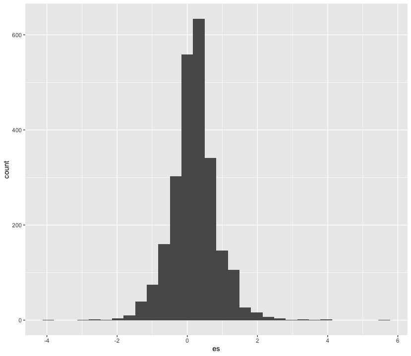
👥 WORK IN PAIRS/GROUPS:
- Include the following custom theme:
theme_histogram <- function() {

  theme_minimal() +
  theme(panel.grid.minor = element_blank(),
        panel.grid.major.x = element_blank())

}- Change a few parameters in the
geom_histogramlayer. Set binsto 100colourto “black”fillto “lightgrey”alphato 0.5
#modify your code here
nuijten2020 %>%
  as_tibble() %>%
  ggplot(aes(es)) +
  geom_histogram(bins = 100, colour = "black", fill = "lightgrey", alpha = 0.5) +
  theme_histogram() +
  labs(x = "Effect sizes in Nuijten et al (2020)", y = "Count")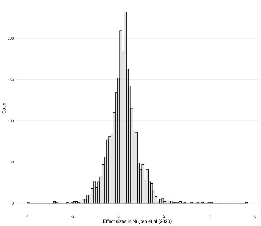
🗣️ CLASSROOM DISCUSSION:
Are there any alterations to this graph that would make it better?
2.2 Bar graphs
We counted the number of studies in the Maldonado et al (2020) meta analysis that featured different domains. We can use ggplot to create a bar graph. We first need to specify what we want on the x and y axes, which constitute the first and second argument of the aes function.
maldonado2020 %>%
  as_tibble() %>%
  count(domain, name = "n_studies") %>%
  ggplot(aes(n_studies, domain)) +
  geom_col()
👥 WORK IN PAIRS/GROUPS:
- Include the following custom theme:
theme_bar <- function() {

  theme_minimal() +
  theme(panel.grid.minor = element_blank(),
        panel.grid.major.y = element_blank())

}- Edit the axes. Use “Number of studies” on the x-axis and “Domain” on the y-axis by adding the
labsfunction. - Check out the
fct_reorderfunction to order the domains by the number of studies. You can do this in a separatemutateline or in theaeswrapper.
maldonado2020 %>%
  as_tibble() %>%
  count(domain, name = "n_studies") %>%
  mutate(domain = fct_reorder(domain, n_studies)) %>%
  ggplot(aes(n_studies, domain)) +
  geom_col() +
  theme_bar() +
  labs(x = "Number of studies", y = "Domain")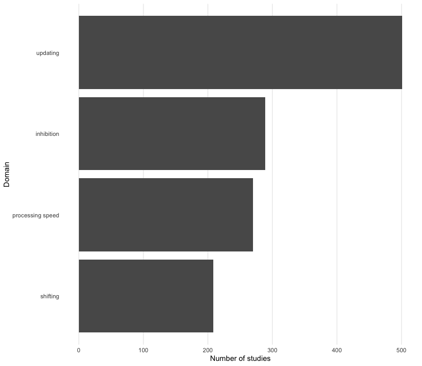
👉 NOTE: Don’t like horizontal bars? Well, we can also create vertical bars too. Can you guess how we code this?
2.3 Scatter plots
Scatter plots are the best way to graphically summarise the relationship between two quantitative variables. Suppose we wanted to track effect sizes and statistical significance on intelligence studies found in Nuijten et al. (2020). We can use a scatter plot to visualise this, distinguishing effect sizes by whether or not they achieve conventional levels of significance (p < 0.05) using colour.
nuijten2020 %>%
  as_tibble() %>%
  drop_na(yi) %>%
  ggplot(aes(year, yi, colour = abs(yi / sqrt(vi)) > 1.96)) +
geom_point() 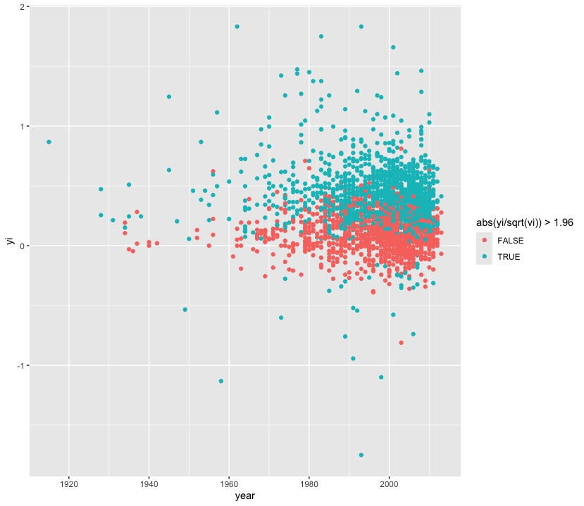
👥 WORK IN PAIRS/GROUPS:
- Include the following custom theme:
theme_scatter <- function() {

  theme_minimal() +
  theme(panel.grid.minor = element_blank(),
        legend.position = "bottom")

}- Only include studies from 1980 onward.
- Include a horizontal dashed line using
geom_hline. - It is hard to see the number of studies, try these two things:
- Replace
geom_pointwithgeom_jitter. - Try adding translucency to each point.
- Replace the colour scheme (try
scale_colour_cosmic()) - Label the x-axis with “Year”, the y-axis with “Effect sizes in Nuijten et al. (2020)”, and colour with “Statistically significant?”
nuijten2020 %>%
  as_tibble() %>%
  drop_na() %>%
  filter(year >= 1980) %>%
  ggplot(aes(year, yi, colour = abs(yi / sqrt(vi)) > 1.96)) +
  geom_hline(yintercept = 0, linetype = "dashed") +
  geom_jitter(alpha = 0.5) +
  theme_scatter() +
  scale_colour_cosmic() +
  labs(x = "Year", y = "Effect sizes in Nuijten et al. (2020)", colour = "Statistically significant?")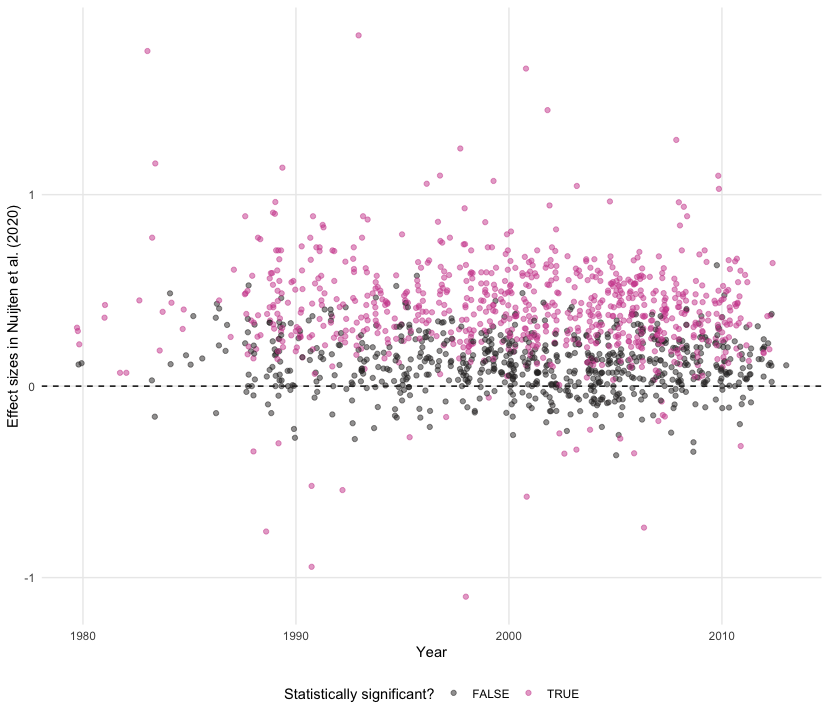
2.4 Line plots
Line plots can be used to track parameters of interest over time. With Nuijten et al (2020), we can see how many studies were included in their meta-analysis over time.
nuijten2020 %>%
  as_tibble() %>%
  count(year) %>%
  ggplot(aes(year, n)) +
  geom_line()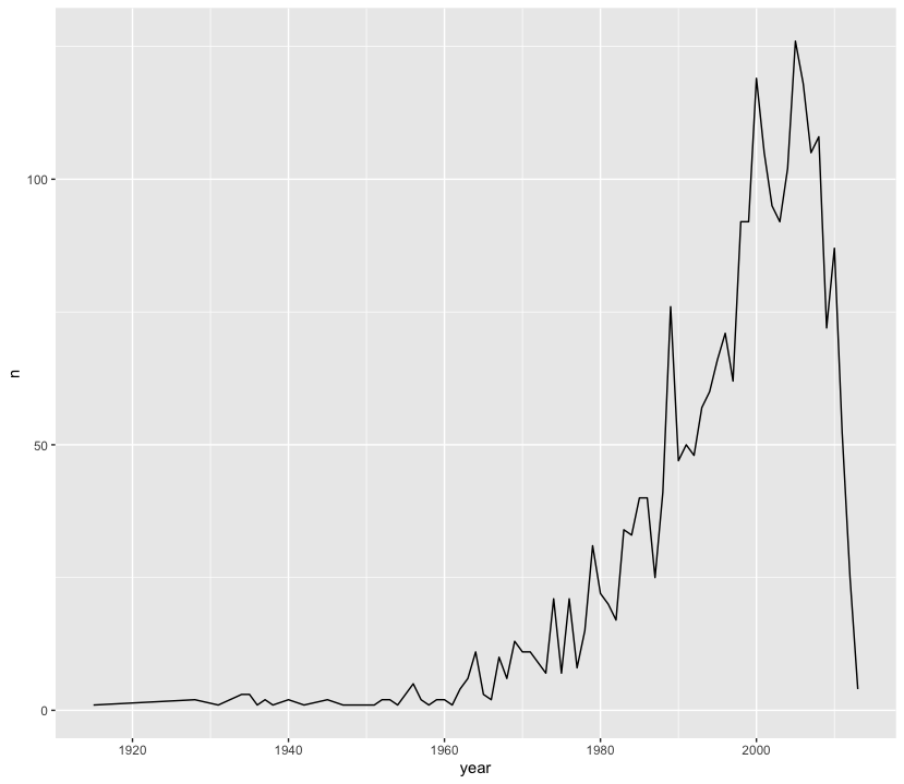
👥 WORK IN PAIRS/GROUPS:
- Include the following custom theme:
theme_line <- function() {

  theme_minimal() +
  theme(panel.grid.minor = element_blank(),
        panel.grid.major.x = element_blank())

}- Change layer from a line to an area (note: this may not be suitable in all cases)
- Fill the area in “midnightblue” and set the alpha to 0.5
- Capitalise the x-axis and change the y-axis to “Number of studies”
nuijten2020 %>%
  as_tibble() %>%
  count(year) %>%
  ggplot(aes(year, n)) +
  geom_area(fill = "midnightblue", alpha = 0.5) +
  theme_line() +
  labs(x = "Year", y = "Number of Studies in Nuijten (2020)")
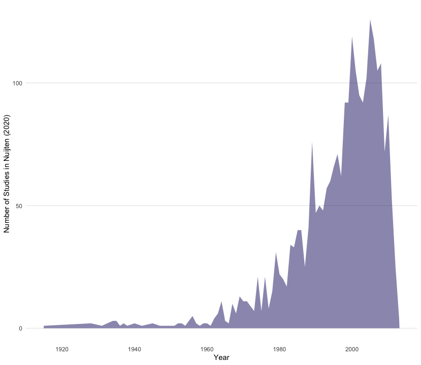
👉 NOTE: We think this line plot works in this context, and that it is useful to introduce you to this style of charting progress over time. However, for others contexts filling the area under the line may not work, so do bear this in mind when making decisions!
2.5 Box plots
Box plots are an excellent way to summarise the distribution of values across different strata over key quantities of interest (e.g. median, interquartile range). Recall that Agadullina et al (2018) code whether or not a study is cross-sectional or experimental and that we found average discrepancies in terms of significance levels between these two strata. We can use box plots to graphically illustrate this.
agadullina2018 %>%
  as_tibble() %>%
  mutate(ti = abs(yi / sqrt(vi))) %>%
  ggplot(aes(design, ti, fill = design)) +
  geom_boxplot()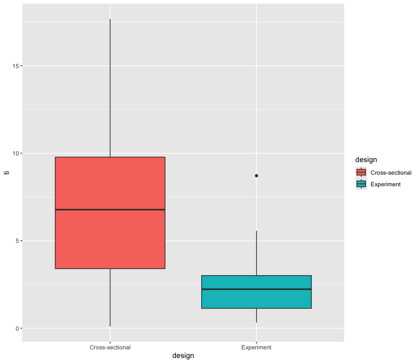
👥 WORK IN PAIRS/GROUPS:
- Include the following custom theme:
theme_boxplot <- function() {

  theme_minimal() +
  theme(panel.grid = element_blank(),
        legend.position = "none")

}- Add
scale_fill_bmj() - Set the alpha values in the box plot layer to 0.75
- Set the x-axis label to
NULLand y-axis to “T-values in Agadullina et al (2018)”
agadullina2018 %>%
  as_tibble() %>%
  mutate(ti = abs(yi / sqrt(vi))) %>%
  ggplot(aes(design, ti, fill = design)) +
  geom_boxplot(alpha = 0.75) +
  theme_boxplot() +
  scale_fill_bmj() +
  labs(x = NULL, y = "T-values in Agadullina et al (2018)")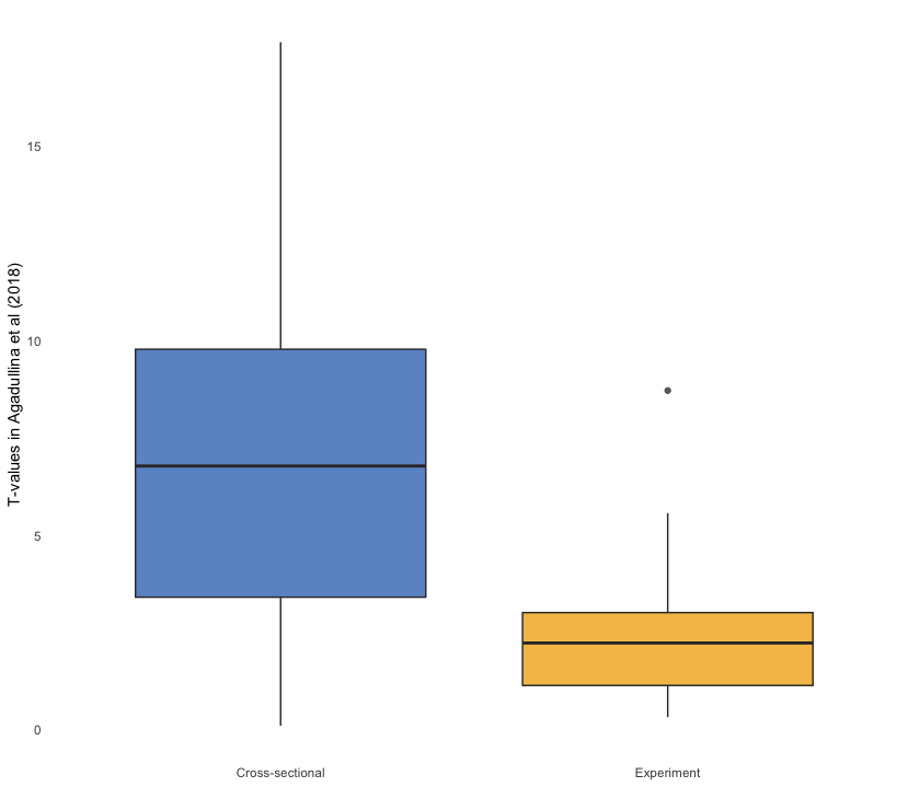
2.6 Density plots
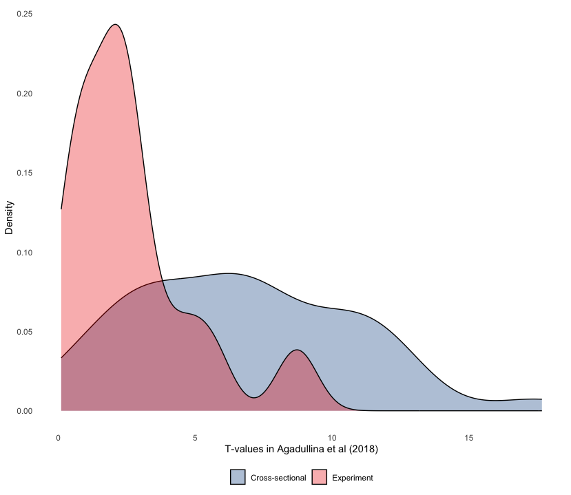
Let’s look at another way of showing discrepancies found in Agadullina et al (2018), namely density plots. Although we cannot see quantities of interest, we can get a better sense of how t-values are distributed across different strata in a more raw manner.
agadullina2018 %>%
  as_tibble() %>%
  mutate(ti = yi / sqrt(vi)) %>%
  ggplot(aes(abs(ti), fill = design)) +
geom_density() 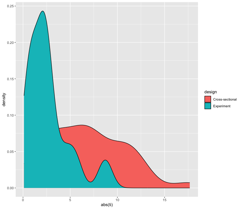
👥 WORK IN PAIRS/GROUPS:
- Include the following custom theme:
theme_density <- function() {

  theme_minimal() +
  theme(panel.grid = element_blank(),
        legend.position = "bottom")

}- Add
scale_fill_lancet() - Set the alpha values in the density layer to 0.75
- Set the x-axis label to “T-values in Agadullina et al (2018)” and y-axis to “Density”
agadullina2018 %>%
  as_tibble() %>%
  mutate(ti = yi / sqrt(vi)) %>%
  ggplot(aes(abs(ti), fill = design)) +
  geom_density(alpha = 0.325) +
  theme_density() +
  scale_fill_lancet() +
  labs(x = "T-values in Agadullina et al (2018)", y = "Density",
       fill = NULL)