
flowchart LR
A["--------------- Lots of Dimensions ---------------"] --> B{PCA}
B --> C["-- Few Dimensions --"]
✅ Week 09 - Lab Solutions
PCA and k-means clustering
Instead of just reading the solutions, you might want to download the .qmd file and run the code yourself. You can download the .qmd file by clicking on the download button below:
📋 Lab Tasks
No need to wait! Start reading the tasks and tackling the action points below when you come to the classroom.
⚙️ Setup
Load the libraries for today’s lab.
# Tidyverse packages we will use
library(ggplot2)
library(dplyr)
library(tidyr)
library(readr)
library(lubridate)

# Tidymodel packages we will use
library(rsample)
library(yardstick)
library(parsnip)
library(recipes)
library(workflows)
library(rpart)
library(tune)
library(broom)
library(purrr)

# New libraries for today
library(tidyclust)
Part I : Looking back at clustering (~25 min)
🎯 ACTION POINTS
- Read the data set:
It is the dataset you’ve (just) downloaded (or downloaded for the W08 lecture).
# Modify the filepath if needed
filepath <- "data/marketing_campaign.csv"
marketing_tbl <- read_csv(filepath)
Rows: 2240 Columns: 29
── Column specification ─────────────────────────────────────────────────────────────────────────────────────────────────────────────────────────
Delimiter: ","
chr (3): Education, Marital_Status, Dt_Customer
dbl (26): ID, Year_Birth, Income, Kidhome, Teenhome, Recency, MntWines, MntF...
ℹ Use `spec()` to retrieve the full column specification for this data.
ℹ Specify the column types or set `show_col_types = FALSE` to quiet this message.- Re-create the new columns from the lecture:
df <-
    marketing_tbl %>%
    # Convert data type using lubridate
    mutate(Dt_Customer = dmy(Dt_Customer)) %>%

    # Pretend today is the last date in the dataset
    # Calculate how long the customer has been with the company
    mutate(Customer_Age = (max(Dt_Customer) - Dt_Customer) / ddays(1)) %>%
    select(-Dt_Customer) %>%

    # How much has the customer spent in total across all categories
    mutate(TotalSpent = rowSums(across(starts_with("Mnt")))) %>%

    # Remove unnecessary features
    select(-Z_CostContact, -Z_Revenue, -Response) %>%

janitor::clean_names()- Finalize the pre-processing of the dataset with a recipe
recipe_kmeans <- recipe(~ ., data = df) %>%
    update_role(c(id, education, marital_status, year_birth), new_role = "ID") %>%
    step_impute_knn(income, neighbors = 3) %>%
    step_normalize(all_numeric_predictors())
Can you make sense of all the steps in the recipe?
- We already encountered
step_impute_knnin the W08 lab. What does that correspond to? Your data could contain missing values (and one of our data columnsincomedoes). Instead of potentially distorting the distribution of the data by simply removing the missing values, we perform missing value imputation, i.e we’re trying to estimate the values of the blanks.
One of the methods for doing this is the k-nearest neighbours method, which estimates missing values based on the characteristics of similar neighboring data points. In practice, this means that:
the subset of data points that have non-missing values for the target variable are identified (i.e if the target variable is
income, the subset of data points which have a value forincomeare identified)calculate the Euclidean distance between the data point with the missing value and each data point in the subset that was identified in the previous step. The Euclidean distance calculation ignores the feature that has a missing value and only uses the features that have complete values (e.g if
incomeis the feature with missing value,incomeis not taken into account in the Euclidean distance calculations)select the K closest neighbours (K is a parameter passed to the imputation algorithm and gives the number of neighbours to take into account in the final calculation) based on the Euclidean distance previously calculated.
The final imputed value is obtained as follows:
\[ x_j=\frac{\sum_{i=1}^K w_i v_i}{\sum_{i=1}^K w_i} \]
where
\[ \begin{split} &K \quad \text{number of neighbours} \\ &w_i \quad \text{Euclidian distance between i-th number and data point with missing value}\\ &v_i \quad \text{value of feature containing missing value in i-th neighbour} \end{split} \]
The step_impute_knn step performs (as you can expect from the name), k-nearest neighbour imputation (also abbreviated as KNN imputation). And in our case, we choose K to be 3 and choose to impute the single column with missing values, i.e to try and estimate missing values in the income column.
step_normalizenormalizes all numerical predictors so that all numerical predictor columns have a standard deviation of one and a mean of zero. This is especially critical prior to applying PCA so that no feature has an outsize contribution when creating the principal components!update_roleallows us to ignore certain variables (e.g non-numerical) in our further computations and analysis…
🗣️ GROUP THEN CLASSROOM DISCUSSION
- Let’s have a look at (part of) the dataframe that results from all the pre-processing steps we’ve gone through in the setup:
recipe_kmeans %>% prep(df) %>% bake(df) %>% print(n=10,width=Inf)
# A tibble: 2,240 × 27
      id year_birth education  marital_status income kidhome teenhome recency
   <dbl>      <dbl> <fct>      <fct>           <dbl>   <dbl>    <dbl>   <dbl>
 1  5524       1957 Graduation Single          0.235  -0.825   -0.930   0.307
 2  2174       1954 Graduation Single         -0.235   1.03     0.907  -0.384
 3  4141       1965 Graduation Together        0.771  -0.825   -0.930  -0.798
 4  6182       1984 Graduation Together       -1.02    1.03    -0.930  -0.798
 5  5324       1981 PhD        Married         0.241   1.03    -0.930   1.55
 6  7446       1967 Master     Together        0.409  -0.825    0.907  -1.14
 7   965       1971 Graduation Divorced        0.135  -0.825    0.907  -0.522
 8  6177       1985 PhD        Married        -0.748   1.03    -0.930  -0.591
 9  4855       1974 PhD        Together       -0.872   1.03    -0.930  -1.04
10  5899       1950 PhD        Together       -1.86    1.03     0.907   0.652
   mnt_wines mnt_fruits mnt_meat_products mnt_fish_products mnt_sweet_products
       <dbl>      <dbl>             <dbl>             <dbl>              <dbl>
 1     0.984      1.55             1.68               2.46             1.48
 2    -0.870     -0.636           -0.713             -0.650           -0.631
 3     0.363      0.571           -0.177              1.34            -0.147
 4    -0.870     -0.561           -0.651             -0.504           -0.583
 5    -0.389      0.420           -0.217              0.155           -0.00152
 6     0.642      0.395           -0.305             -0.687            0.362
 7    -0.205      0.973           -0.0131             0.228            0.531
 8    -0.677     -0.410           -0.492             -0.632           -0.631
 9    -0.861     -0.661           -0.633             -0.632           -0.583
10    -0.820     -0.661           -0.713             -0.669           -0.631
   mnt_gold_prods num_deals_purchases num_web_purchases num_catalog_purchases
            <dbl>               <dbl>             <dbl>                 <dbl>
 1         0.843                0.349            1.41                   2.51
 2        -0.729               -0.168           -1.11                  -0.569
 3        -0.0388              -0.686            1.41                  -0.226
 4        -0.748               -0.168           -0.750                 -0.911
 5        -0.556                1.38             0.329                  0.116
 6        -0.575               -0.168            0.689                  0.458
 7        -0.326                0.867            1.05                   0.116
 8        -0.403               -0.168           -0.0305                -0.911
 9        -0.806               -0.686           -0.390                 -0.911
10        -0.595               -0.686           -1.11                  -0.911
   num_store_purchases num_web_visits_month accepted_cmp3 accepted_cmp4
                 <dbl>                <dbl>         <dbl>         <dbl>
 1             -0.551                 0.694        -0.280        -0.284
 2             -1.17                 -0.130        -0.280        -0.284
 3              1.29                 -0.543        -0.280        -0.284
 4             -0.551                 0.282        -0.280        -0.284
 5              0.0645               -0.130        -0.280        -0.284
 6              1.29                  0.282        -0.280        -0.284
 7              0.372                 0.282        -0.280        -0.284
 8             -0.551                 1.11         -0.280        -0.284
 9             -1.17                  1.52         -0.280        -0.284
10             -1.78                  6.05          3.57         -0.284
   accepted_cmp5 accepted_cmp1 accepted_cmp2 complain customer_age total_spent
           <dbl>         <dbl>         <dbl>    <dbl>        <dbl>       <dbl>
 1        -0.280        -0.262        -0.116  -0.0973        1.53       1.68
 2        -0.280        -0.262        -0.116  -0.0973       -1.19      -0.961
 3        -0.280        -0.262        -0.116  -0.0973       -0.206      0.283
 4        -0.280        -0.262        -0.116  -0.0973       -1.06      -0.918
 5        -0.280        -0.262        -0.116  -0.0973       -0.953     -0.305
 6        -0.280        -0.262        -0.116  -0.0973       -0.300      0.183
 7        -0.280        -0.262        -0.116  -0.0973        1.18      -0.0262
 8        -0.280        -0.262        -0.116  -0.0973        0.314     -0.725
 9        -0.280        -0.262        -0.116  -0.0973        0.170     -0.930
10        -0.280        -0.262        -0.116  -0.0973       -1.22      -0.925
# ℹ 2,230 more rows
# ℹ Use `print(n = ...)` to see more rows
Thinking back to the k-means algorithm you’ve encountered in the W08 lecture, do you think:
- this dataframe is easily visualized?
- this dataframe is easily clustered?
- why or why not?
We can’t visualise 23 numerical features easily in one-go. If we were to make two-dimensional scatterplots two features at a time, we’d need 253(!) scatterplots and the information gained from these scatterplots could only be partial (there could be relationships between more than two features at a time that we’re not capturing).
Obviously, the data is also not easily clustered and there is computational cost associated with the number of features (k-means is \(O(n^2)\) after all in the number of features).
Part II: Dimensionality Reduction (40 min)
Our data set has 23 numeric variables in total. That would be a lot of predictors for a model. So far, we have only used one or a few predictors, but not more.
Pay Attention
🧑🏫 TEACHING MOMENT:
(Your class teacher will explain the motivation for dimensionality reduction, focusing on the why rather than the how (it will be explained in this week’s lecture.)
(You will see this concept again in the W09 lecture, don’t worry if you don’t fully understand it yet.)
The Curse of Dimensionality 🪄
No, that’s not a Harry Potter spell but it refers to the problems that often arise when dealing with high dimensional data (ie lots of variables).
Machine learning models tend to perform badly with too many predictors - there is a higher chance for overfitting, plus there is also a much bigger computational cost associated to training models with many variables.
Dimensionality Reduction to the Rescue 🧑⚕️
We want to reduce the number of variables. Intuitively, this could work because there are probably strong correlations between many of the individual variables, so there seems to be some redundancy in the data.
Dimensionality reduction refers to a collection of methods that can help reduce the number of variables while preserving most of the information.
Principal Component Analysis 💡
However, rather than deciding which variables to keep and which ones to throw out (that would fall under “variable selection”), we want to compress our high dimensional data into a low dimensional set of variables while retaining as much information from the original data as possible.
In this lab, we will take this idea to the extreme and reduce the dimensionality of all data set to just 2. That has the additional benefit that we can also plot the results on a grid in two dimensions.
Prep the Data
- Let’s create a new recipe.
pca_recipe <-
  # we don't have an outcome variable here
  recipe(~., data = df) %>%
  #make sure to ignore non-numeric columns (education, marital_status) and irrelevant predictors (id, year_birth) from the list of predictors
  update_role(c(id, education, marital_status, year_birth), new_role = "ID") %>%
  #apply knn imputation to fill missing values on only column with missing values in our data (i.e income)
  step_impute_knn(income, neighbors = 3) %>%
  # remove zero variance predictors as they don't carry any information
  step_zv(all_numeric_predictors()) %>%
  # normalize the data to avoid out-sized impact of some variables
  step_normalize(all_numeric_predictors()) %>%
  prep()

summary(pca_recipe)
# A tibble: 27 × 4
variable type role source
<chr> <list> <chr> <chr>
1 id <chr [2]> ID original
2 year_birth <chr [2]> ID original
3 education <chr [3]> ID original
4 marital_status <chr [3]> ID original
5 income <chr [2]> predictor original
6 kidhome <chr [2]> predictor original
7 teenhome <chr [2]> predictor original
8 recency <chr [2]> predictor original
9 mnt_wines <chr [2]> predictor original
10 mnt_fruits <chr [2]> predictor original
# ℹ 17 more rows
# ℹ Use `print(n = ...)` to see more rowsThis is our pre-processed data.
Note all columns have been standardized now too, so they have mean 0 and variance 1. This is a recommended (or even necessary) step prior to performing PCA in order to avoid that large-range variables (which naturally have a higher variance) have an out-sized impact on the results.
Perform PCA
- Now, we can perform dimensionality reduction using PCA on this data.
This can be done simply by appending a step_pca() to our recipe. We’ll also set the num_comp=2, meaning that we want to reduce the dimensionality to just 2. We’ll also keep the original variables rather than replacing them here as we’ll still use some of them later in part III.
pca_recipe <-
 # we don't have an outcome variable here
  recipe(~., data = df) %>%
  #make sure to ignore non-numeric columns (education, marital_status) and irrelevant predictors (id, year_birth) from the list of predictors
  update_role(c(id, education, marital_status, year_birth), new_role = "ID") %>%
  #apply knn imputation to fill missing values on only column with missing values in our data (i.e income)
  step_impute_knn(income, neighbors = 3) %>%
  # remove zero variance predictors as they don't carry any information
  step_zv(all_numeric_predictors()) %>%
  # normalize the data to avoid out-sized impact of some variables
  step_normalize(all_numeric_predictors()) %>%
  # apply principal component analysis
  step_pca(all_numeric_predictors(), num_comp = 2, keep_original_cols=TRUE) %>%
  prep()

# apply the recipe to our data set
pca_results <- bake(pca_recipe, df)
pca_results %>%
  select(PC1, PC2) %>%
  head()
# A tibble: 6 × 2
PC1 PC2
<dbl> <dbl>
1 -3.92 0.691
2 2.65 -0.844
3 -1.64 -0.314
4 2.62 -1.25
5 0.461 -0.0735
6 -0.735 0.887 Plot the Results
- Our data now contains the newly created two principal components (added to the end of the columns). We can plot them.
ggplot(pca_results, aes(PC1, PC2)) +
  geom_point(alpha=0.3,color="#7038d1") +
  ggtitle("Principal Components", subtitle = "2-dimensional representation of our 20+ numeric predictors")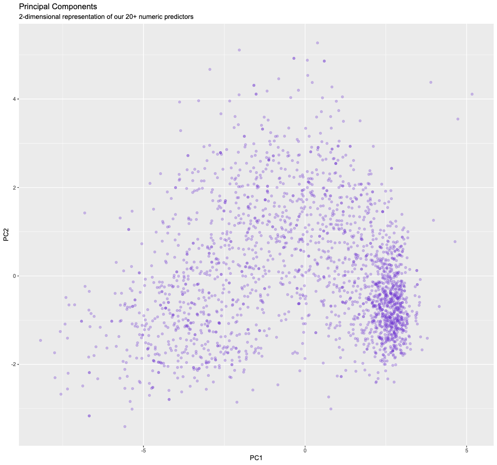
There is clearly still some structure/information in our data, and we will exploit this in part II.
So how much information did we retain/lose?
- We can answer this by looking at how much of the variance of the original data is contained in the first
n=1,2,…principal components.
The first principal component is the one that captures the most the variance, then the second, and so on.
# this is a little awkward but we just want to
# extract the fitted PCA that is hidden inside the recipe
pca_fit <- pca_recipe$steps[[4]]$res

# the eigenvalues determine the amount of variance explained
eigenvalues <-
  pca_fit %>%
  tidy(matrix = "eigenvalues")

eigenvalues %>%
  filter(PC <= 23) %>%
  ggplot(aes(PC, percent)) +
  geom_col()+
  geom_text(aes(label = percent), vjust = -0.2)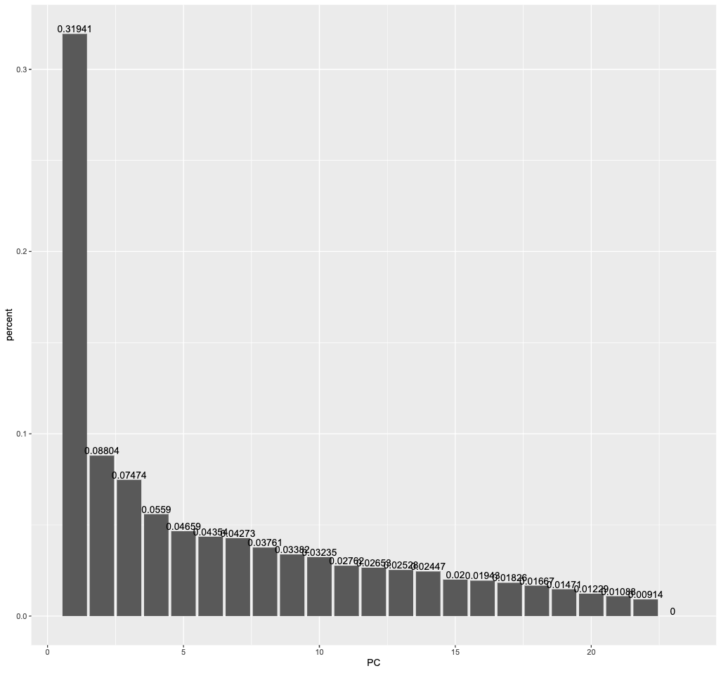
The first principal component captures more than 30 percent of the variance in all the numeric predictors we had initially. The second principal component still captures almost 9 percent.
eigenvalues %>%
  filter(PC <= 23) %>%
  ggplot(aes(PC, cumulative)) +
  geom_col()+
  geom_text(aes(label = cumulative), vjust = -0.2)
Cumulatively, the first 2 components retain 40 percent of the variance. If we wanted to retain at least 80 percent of the variance, we would need to include at least 11 principal components. That’s still much less than the 20+ columns we had initially.
If we were to plot all principal components here, only they would contain the full 100 percent of the variance.
Part II: K-Means Clustering (45 min)
👥 IN PAIRS:
- Run k-means clustering on our two principal components from part II. Pick a number of clusters to pass to k-means.
#replace 3 by the number of clusters of your choice
kclust =
  pca_results %>%
  select(PC1, PC2) %>%
  kmeans(centers = 3)

tidy(kclust)
# A tibble: 3 × 5
PC1 PC2 size withinss cluster
<dbl> <dbl> <int> <dbl> <fct>
1 -3.75 -0.845 563 1634. 1
2 -0.612 1.62 615 1758. 2
3 2.34 -0.492 1062 1335. 3 The centroids (as x and y coordinates) found by the k-means algorithm are shown in the table above. With those cluster centroids, we can now apply the clustering to our data set
- What happens exactly: You can think of this as the analogue to making “predictions”, whereas “fitting” the model is the process of finding the centroids itself. Making predictions means we assign a cluster label to each point depending on the closest centroid.
Visualized, it looks like this:
augment(kclust, pca_results) %>%
  ggplot() +
  geom_point(aes(x=PC1, y=PC2, color=.cluster), alpha=0.3) +
  geom_point(data = tidy(kclust), aes(x=PC1, y=PC2), size = 6, shape = "x")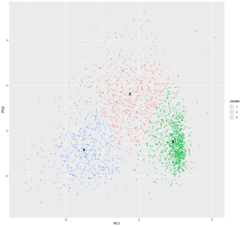
Pay Attention
🗣 Class Discussion: Your class teacher will mediate a discussion: Was your choice of k a good one? Why or why not?
So how many clusters do we need?
This is the BIG question when doing clustering. Since we don’t have any labels, there is no obvious answer to this question.
- To start with, we can do the same thing again but for different values of
k, say betweenk=1andk=9, and then see if we can decide which one provides the best fit.
# this is a very compact way to perform k-means clustering for various k
kclusts <-
  tibble(k = 1:9) %>%
  mutate(
    kclust = map(k, ~kmeans(select(pca_results, PC1, PC2), .x)),
    tidied = map(kclust, tidy),
    glanced = map(kclust, glance),
    augmented = map(kclust, augment, pca_results)
  )

clusters <-
  kclusts %>%
  unnest(cols = c(tidied))

assignments <-
  kclusts %>%
  unnest(cols = c(augmented))

clusterings <-
  kclusts %>%
unnest(cols = c(glanced))- Let’s visualize the results using a facet plot.
ggplot(assignments, aes(x = PC1, y = PC2)) +
  geom_point(aes(color = .cluster), alpha = 0.7) +
  facet_wrap(~ k) +
  geom_point(data = clusters, size = 4, shape = "x")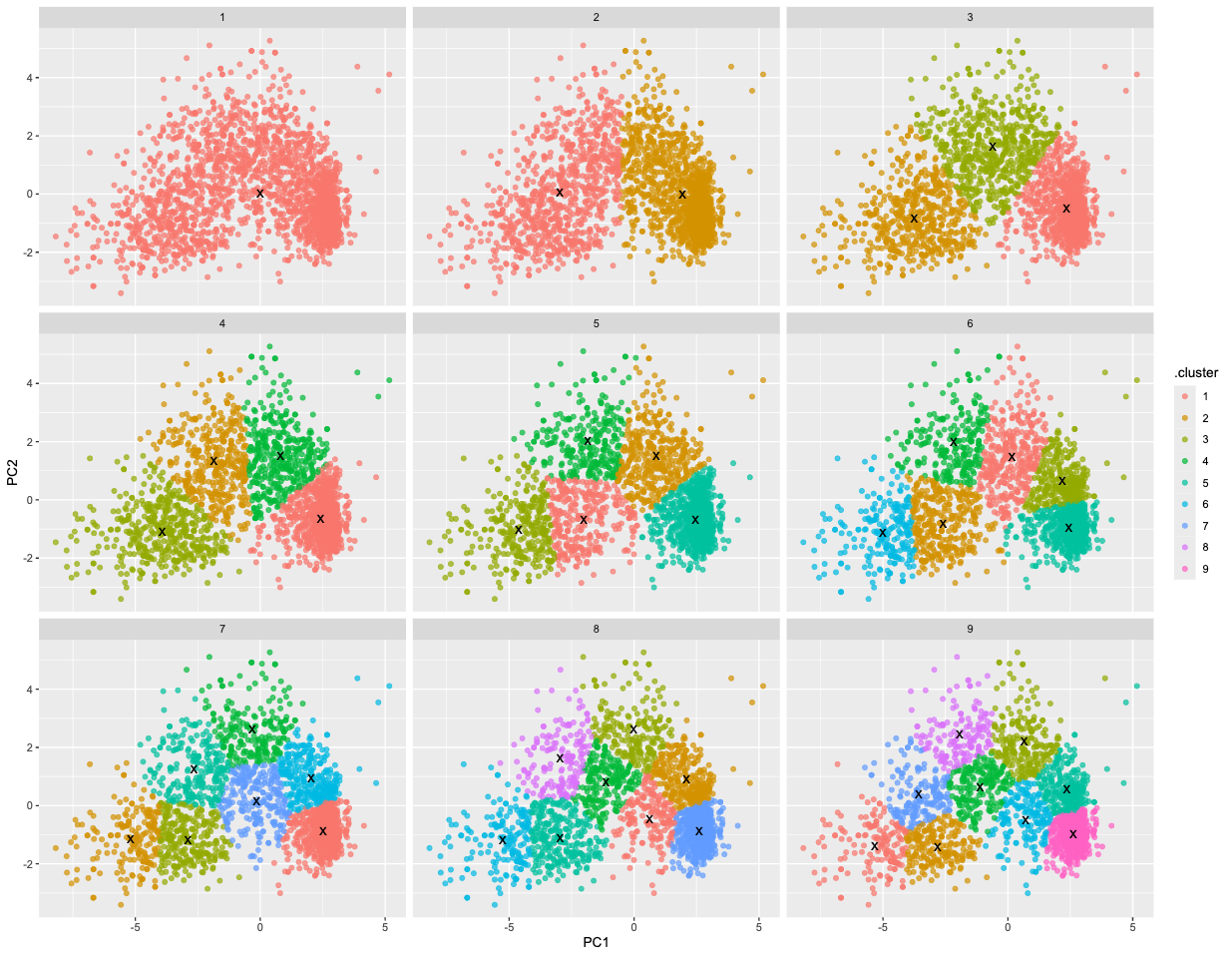
Pay Attention
🗣 Discussion: Based on this plot, what is the best choice for k?
Judging the fit only visually has of course limitations (we couldn’t even do that if we had more dimensions than 2). So what’s the alternative?
One commonly used method to choose the best number of clusters is the “elbow method”. It relies on the “within cluster sum of squares” (WCSS).
This metric will always keep decreasing as k increases. However, rather than choosing the max k, we may find that a moderate k is good enough such that the WCSS does not actually decrease that much further afterwards (ie the plot often looks like an elbow).
ggplot(clusterings, aes(k, tot.withinss)) +
  geom_line(color="red",alpha=0.5,linewidth=1) +
  geom_point(color="red",size=4)+
  theme_grey(base_size = 15)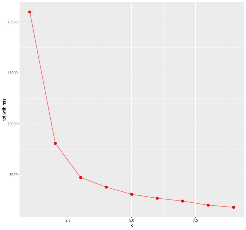
Pay Attention
🗣 Discussion: Based on the elbow method, which k would you choose? Does the plot even show a clear “elbow”?
It’s rather tricky to determine a neat elbow in this curve but 3 seems like a reasonable estimate here…