
DS202A - W04 Summative
2022/23 Autumn Term
Loading necessary libraries
library(dplyr)
library(tidyr)
library(readr)
library(lubridate)
library(tidyselect)
library(tidymodels)
library(ggplot2)
Task 1: Downloading and loading the data into the required dataframe
First, I download and load the data into the required ‘df_uk’ dataframe. I do this so all R browsers where this code is ran have the same starting point.
url <- "http://publicdata.landregistry.gov.uk/market-trend-data/house-price-index-data/UK-HPI-full-file-2023-06.csv"
download.file(url, "data/UK-HPI-full-file-2023-06.csv") # I download the data to ensure that the file has the same starting point in all R browsers where the code is ran
filepath <- "data/UK-HPI-full-file-2023-06.csv"
uk_hpi <- read_csv(filepath) # I load the data from the defined location I downloaded it to using the previous lines

df_uk <-
    uk_hpi %>%
    rename(region = RegionName) %>% # I rename the dataset's region name column so it is a bit more intuitive to use
    filter(region == "United Kingdom") # I filter the data into a dataframe containing just the UK data
I have filtered the data to only use the data concerning the United Kingdom from the HPI dataset and renamed the region name column to be a tad more intuitive to use in further code.
Task 2: Creating the training and test dataframes
cutoff_date <- as.Date("2019-12-31") # Before and on this date, the data go into the training data, and after this date, the data go into the testing data

df_uk <- df_uk %>%
  rename(date = Date) %>% # I rename the date column to have a small first letter for consistency with the region column
  mutate(date = lubridate::dmy(date)) # To be able to filter by date, I am mutating the date data to be in the date format (otherwise it is saved as characters and cannot be filtered

df_uk_train <- df_uk %>%
  filter(date <= cutoff_date) # Creating the training dataset

df_uk_test <- df_uk %>%
  filter(date > cutoff_date) # Creating the testing dataset
First, I have determined a cutoff date that splits the data - anything before and on this date is the training data, and anything after it is the testing data. I then renamed the date column to have a small capital letter for consistency with the region name column. I transform the data in the date column to be in the date format (instead of characters) so I can filter it (as characters cannot be filtered). I then filter the data depending on its relationship to the cutoff date (smaller than or, equal to, or bigger than) into the two corresponding datasets.
Task 3: Pre-processing the dataset
Opening the dataset, I see many NAs, so I first drop all NAs in the sales volume column so I can see visually see a trend. I will also rename the column for consistency with the region and date columns.
df_uk_train <- df_uk_train %>%
  rename(salesvolume = SalesVolume) %>%
  drop_na(salesvolume)
Based on the previous labs, I think a good predictor of sales volume would be last month’s sales volume. Hence, I will create 3 lagged variables and use them as predictors. This makes sense, as the lags would include previous market factors and retain the consistency these may hold over the medium term through 3-month lag, while also adjusting for more recent changes by using a 1-month’s lag.
df_uk_train <- df_uk_train %>%
  arrange(date) %>% # I first order the rows by date to ensure the lag function uses last month's sales volume as the lag
  mutate(
    salesvolume_lag1 = lag(salesvolume, 1),
    salesvolume_lag2 = lag(salesvolume, 2),
    salesvolume_lag3 = lag(salesvolume, 3)
  )
Looking at the dataset, other factors that could predict sales volume are average price (which would likely affect the sales volume negatively) and the availability of mortgages. Sadly, the mortgage data is missing in the training data, so I will build a model using the three months of sales volume lag and average price as predictors. The 12-month price change could also be used, but I reckon its effects would be similar to the average price and not predict much more variance beyond it. The 1-month change could also be a predictor. However, I think its effect would also be small given the short-term time horizon would probably only force a couple people to make their purchase. As I am not permitted to use current data, I will lag the average price by 1 month. I will also only use the relevant variables from now on and drop the rest of the data from the dataset.
selected_cols    <- c("date", "region", "AveragePrice", "salesvolume", "salesvolume_lag1", "salesvolume_lag2", "salesvolume_lag3") # I define all the columns I want in my dataset
df_uk_train <- df_uk_train %>%
  select(all_of(selected_cols)) %>% # I am selecting all the columns I want to keep in my dataset
  rename(averageprice = AveragePrice) %>% # I rename the average price column for consistency
  mutate(averageprice_lag = lag(averageprice, 1)) %>% # I lag the average price
  drop_na()
Task 4: Creating the model
Having pre-processed the dataset, I will now construct the model as explained before, with three months of sales volume lag and the prior month’s average sale price as predictors for the sales volume.
model1_specifications <-
    linear_reg() %>%
    set_engine("lm") %>%
    set_mode("regression") # Here I have defined the specifications for the type of model I want to run (linear model)

model1 <-
    model1_specifications %>%
    fit(salesvolume ~ salesvolume_lag1 + salesvolume_lag2 + salesvolume_lag3 + averageprice_lag, data=df_uk_train) # I am fitting the model I specified before with the predictors and data

model1$fit %>% summary() # Here I call for a model summary

par(mfrow = c(2,2)) # I want the visual measures of model fit that follow this line to be presented in a 2x2 panel
plot(model1$fit) # I am creating visual measures of model fit using my model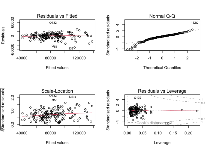
The model summary indicates that the relationship between sales volume lags and sales volume is large and positive for the last month (lag1) and the third-to-last month (lag3), with the former having a medium positive correlation (0.617) and the latter a weaker positive correlation (0.208). The second-to-last month (lag2) and average price lag have smaller correlations (0.078 and -0.171 respectively). Sales volume lag1 and lag3 are also statistically significant predictors of sales volume, with p-values of below 0.01, whereas lag2 and average price lag are not statistically significant, with p-values above 0.35. The model’s intercept is near zero, but it is not statistically significant with a p-value over 0.1. The model’s R-squared value is 0.729, indicating it explains 72.9% of the variance in sales volume. The overall model fit is also good, as the F-statistic is high and statistically significant, at a value of 115.8 and p-value below 0.0001.
As for visual fit measures, the scale-location and Q-Q plots show some outliers, but roughly fit the desired distributions. The scale-location graph is slightly more curved than ideal, but not too significantly so.
Based on these findings, I will create a new model excluding average price lag and salesvolume lag 2, as they do not explain much of the variance beyond lag1 and lag3.
model2 <-
    model1_specifications %>%
    fit(salesvolume ~ salesvolume_lag1 + salesvolume_lag3, data=df_uk_train) # I am fitting the model I specified before with the new predictors

model2$fit %>% summary() # Model summary

par(mfrow = c(2,2)) # Creating the 2x2 panel
plot(model2$fit) # Visual measures of model fit to be stored in the panel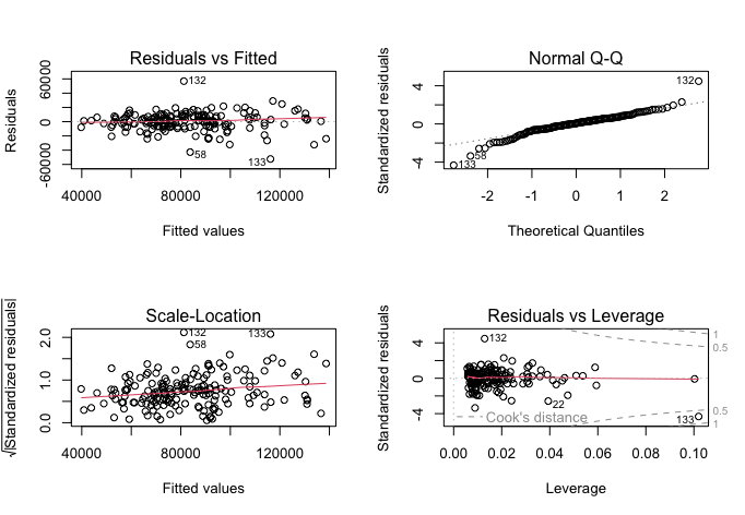
The updated model is superior to the prior one, as it achieves a very similar outcome with fewer predictors. Though it does not make much intuitive sense for the model to predict sales volumes better by excluding the second month’s lag, the model’s F-statistic is now 232.5 at the same p-value, fitting the data even better. The R-squared value has decreased slightly to 0.728, explaining 72.8% of the variance, going to show that the other two variables in my initial model only explained less than 0.1% of all variance that lag1 and lag3 could not explain. Further, the model intercept is again near-zero, but it is now statistically significant at a p-value below 0.02. Sales volume lag1 has a correlation coefficient of 0.653 and is statistically significant with a p-value below 0.0001, meaning a 1-point increase in sales volume in the previous month would predict a 0.653-point increase in the next month. Lag3 has a coefficient of 0.242 and p-value below 0.0002, meaning a 1-point increase in sales volume three months before would statistically significantly predict a 0.242 increase in the next month’s sales volume.
The scale-location and Q-Q plots retain roughly the same shape, with slightly more uniform residuals vs leverage plots.
Task 5: Further examining model fit
I will now plot the model’s residuals and mean absolute error with training data.
df_training_augment <- model2 %>% augment(df_uk_train) # Here I augment the model with residuals and fitted values with the training data to plot the residuals against the fitted values

training_residuals <- ggplot(df_training_augment, aes(x = .pred, y = .resid)) + # I define the  plot axes and dataset to be drawing from
    geom_point(alpha=0.6, size=2, color="blue", stroke=1) + # I add the residuals as a scatterplot and customise the points
    geom_hline(yintercept = 0, linetype = "dashed") + # I add the origin to make the graph easier to interpret
    labs(x = "Fitted values", y = "Residuals", title="Residuals vs Fitted values") + # I add labels
    theme_minimal() # I add a theme to make the graph background less intrusive
print(training_residuals)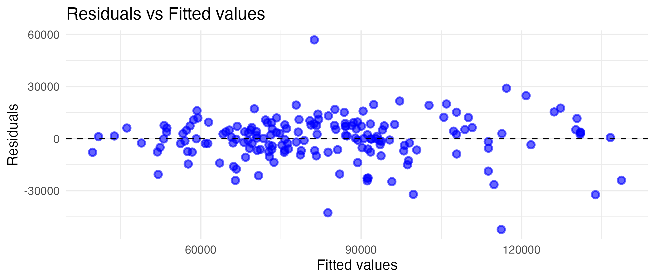
Looking at the graph, there is a fair tendency towards a linear relationship, especially at the lower values. At higher fitted values, the relationship becomes less linear. This makes sense, as months with exceedingly higher sales volumes would likely be predicted by something other than past performance (which is what lag1 and lag3 are), and since the linear model does not capture them, they would be a tad further from a perfectly linear relationship.
I will now calculate the MAE and plot it.
mae_training <-
    df_training_augment %>%
    mae(truth = salesvolume, estimate = .pred) # Here I use the previously augmented dataset and calculate the MAE between the actual and predicted values
print(mae_training)

training_mae_data <-
    df_training_augment %>%
    group_by(year = year(date)) %>%
    mae(salesvolume, .pred) # I group the MAE values by year in a new dataset for the plot to be a bit less crowded, slimming down the number of observations by a factor of 12

df_uk_train %>%
  summary() # I summarise the dataset to compare it to the MAE

training_mae_plot <-
    ggplot(training_mae_data, aes(x=year, y=.estimate, color=.metric)) + # I define the plot axes and dataset
      geom_line() + # I define that the plot should be a line graph
      geom_point() + # I add points at each data point to better define the graph
      ylim(c(0, NA)) + # I define the minimum y-value as 0 (as MAE cannot be negative) and the maximum as NA (whatever the actual maximum is)
      theme_minimal() + # I simplify the graph theme to make it less intrusive
      scale_color_manual(values = "blue") + # I add the colour I want
      guides(color = guide_legend(title = "Values")) + # I change the legend title from ".metric" to something better
      labs(x = "Year", y = "MAE", title="MAE between observed and predicted sales volumes by year") # Defining the graph labels and title
print(training_mae_plot)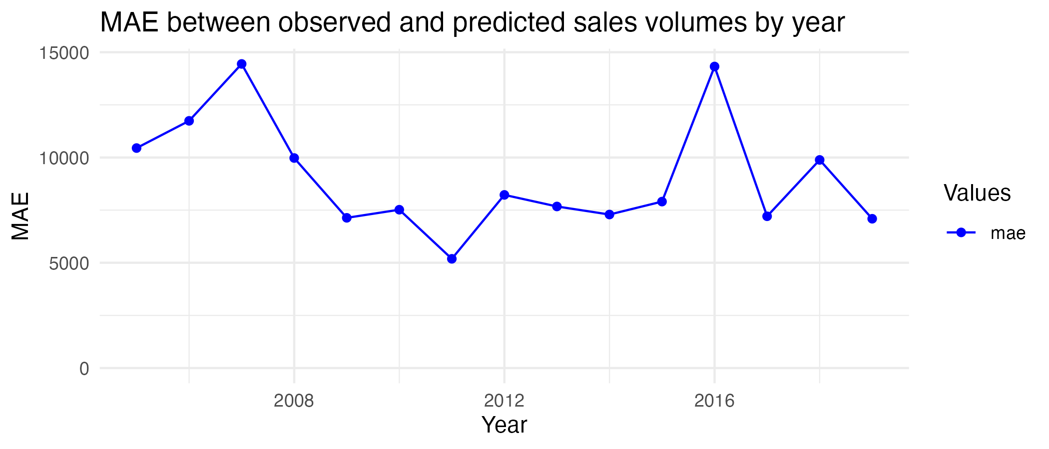
The MAE between the model and observed values is 9046.5, meaning the model’s predictions are off by an average of 9046.5 sales per month. Given the observed values for sales volume are, on average, around 81,000-83,000, this error is not too big, but it is considerable. From the yearly plot, it can be seen the highest MAEs are just below 15,000 in 2007 and 2016, and the lowest is around 5,000 in 2011. Based on these results and other metrics discussed before, I believe the model fits the training data relatively well.
Task 6: Examining the model’s ability to predict future data
Before I can plot anything, I have to add the same sales volume lags to the testing dataset (as I only did this for the training data before).
testing_cols    <- c("date", "region", "salesvolume", "salesvolume_lag1", "salesvolume_lag3") # I define the columns to be retained

df_uk_test <- df_uk_test %>%
  arrange(date) %>% # I order the rows by date to use last month's sales volume as the lag
  rename(salesvolume = SalesVolume) %>% # I rename sales volume for consistency
  mutate(
    salesvolume_lag1 = lag(salesvolume, 1),
    salesvolume_lag3 = lag(salesvolume, 3) # I lag sales volume by 1 and 3 months
  ) %>%
  select(all_of(testing_cols)) %>% # I select all pre-defined columns
  drop_na() # I drop all NAs
To examine the model’s ability to predict future data, I will first augment it with the testing data and plot the residuals against fitted values (as before). Thereafter, I will calculate and plot the MAE.
```r warning=FALSE df_testing_augment <- model2 %>% augment(df_uk_test) # I augment the model with residuals and fitted values with the test data
test_residuals <- ggplot(df_testing_augment, aes(x = .pred, y = .resid)) + # I define the plot axes and data source geom_point(alpha=0.6, size=2, color=“dark green”, stroke=1) + # I add and customise the residuals geom_hline(yintercept = 0, linetype = “dashed”) + # I add the origin labs(x = “Fitted values”, y = “Residuals”, title=“Residuals vs Fitted values”) + # I add labels theme_minimal() # I add a theme print(test_residuals)

Looking at the graph, there is a considerable tendency towards linearity at lower fitted values (as with the training data), however, deviations from this are especially pronounced at higher fitted values. Also, the datapoints that do tend towards linearity are less densely populated, than with the training data, suggesting the model may fit the test data worse than the training data.
To test model fit further, I will calculate and plot MAE.
```r
mae_testing <-
df_testing_augment %>%
mae(truth = salesvolume, estimate = .pred) # I calculate the MAE
print(mae_testing)
testing_mae_data <-
df_testing_augment %>%
group_by(year = year(date)) %>%
mae(salesvolume, .pred) # I group the MAE values by year
df_uk_train %>%
summary() # I summarise the dataset to compare it to the MAE
testing_mae_plot <-
ggplot(testing_mae_data, aes(x=year, y=.estimate, color=.metric)) + # I define the plot axes and dataset
geom_line() + # I make the plot a line graph
geom_point() + # I add points for each observation
ylim(c(0, NA)) + # I define the minimum y-value as 0 and the maximum as NA
theme_minimal() + # I simplify the graph theme
scale_color_manual(values = "dark green") + # I add colour
guides(color = guide_legend(title = "Values")) + # I change the legend title
labs(x = "Year", y = "MAE", title="MAE between observed and predicted sales volumes by year") # Defining labels
print(testing_mae_plot)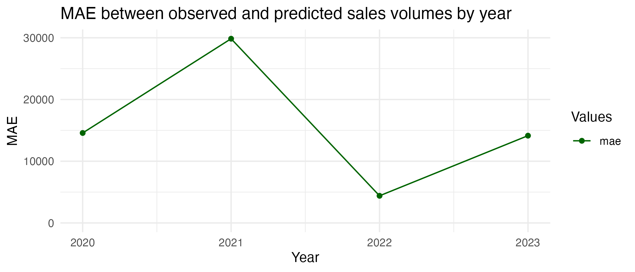
As the visual check also suggested, this model fits the testing data worse. The MAE here is 16180.7, which is 55.9% higher than with the training data. There is an average difference of 15,180.7 sales per month between predicted and observed values in the testing data, and this difference is greatest in 2021 (around 30,000) and lowest in 2022 (below 5,000). This is a significant deviation, as the sales volumes in the testing data range from 31,422 to 146,253, meaning the misprediction can be up to roughly 50%. The model cannot predict the future as well as it did the past. This could be partly due to the interruption from the COVID-years, as house sales volumes would have differed quite erratically relative to the training period, and past trends in sales would understandably not have been as prominent in determining house sales as things like lockdowns and peoples’ inability to move house or visit for viewings.
Task 7: Further analysis
I chose the lagged house sales volumes as predictors of future sales, as I reckoned that recent trends in house sales would have predicted future sales well, as, unlike other variables in the dataset, they would already intrinsically have accounted for market more recent factors affecting sales. I also initially included average lagged sales price, as I thought that could be a good predictor given people would likely have attempted to take advantage of lower prices and pass on higher ones. However, it was not a statistically significant predictor and did not explain much of the variance as outlined prior. Further, with regards to lag, I am unsure why a two-month lag explained less variance than 3-month lag and only chose to exclude it as it was not significant with the training data. It may have had something to do with more medium-term sales having priced in larger general trends than 2-month ones, however, this still does not explain all that much.
I have included the other model I tried. If I could have, I would have also tended out variables like interest rates, unemployment rates, consumer confidence, and population growth. Those variables would have had a bearing on the amount of money people had on hand or could use as leverage to purchase properties (low-interest rates fuelled much of the pre-2007 housing boom in the US), how confident they felt in their ability to get by without the sum of savings a house would cost (i.e. if unemployment rises and consumer confidence falls, this would decrease sales) and how high demand would be (growing population means more people need a place to live, presumably meaning more house sales).
I learned from this exercise that it is acceptable to try to predict a variable using various predictors before settling on an optimal set. I also learned how to use MAE in practice as a measure of how well data fit a model, as well as the importance of considering the odds of certain years being exceptional from others (i.e., how the COVID years were not alike pre-pandemic years in terms of the same variables predicting human decision-making) and analysing their contexts for more clarity.
I believe my code could be further streamlined if I made the same changes to both testing and training data sets within the same chunk as opposed to doing the testing set later. However, I did this to retain consistency with the order of the questions. It could also have been more efficient by using recipes and workflows; however, as those were Week 4 topics, I did not use them.