
DS202A - W04 Summative
2022/23 Autumn Term
LSE DS202A - AT4 - SUMMATIVE
UK House Prices: The UK HPI Data Set
Preliminary: Loading packages and loading Data.
library(dplyr)       # Data Manipulation
library(lubridate)   # Working with Dates
library(tidymodels)  # Creating models
library(tidyverse)

uk_hpi <- readr::read_csv("Data/UK-HPI-full-file-2023-06.csv")
glimpse(uk_hpi)
Here, I first loaded all packages for intended use to prevent function errors in case a package is not loaded initially.
Making sense of the data set: The UK-HPI data set includes 54 columns, the main ones being the Date, Region Name, Average Price, monthly and yearly % changes in price (£). This includes values for the average of all house types and Detached, Semi-detached, Terraced houses and Flats.
Question 1: Creating a data frame containing data only for the UK.
This code contains the making of a new data frame containing observations for the whole of the UK only. I wanted to look at the Sales Volume alongside Average house price and monthly house price change, so I selected these columns and incorporated them into the new, shorter dataframe, making it easier to analyse.
I then used the mutate() function to convert the Date column into the date format, utilising the lubridate function.
The Dates were arranged in descending order in order to see the most recent data, some of which had to be dropped due to missing values.
selected_columns <- c("Date", "RegionName", "SalesVolume", "1m%Change", "AveragePrice")

df_uk <-
  uk_hpi %>%
  select(all_of(selected_columns)) %>%
  rename(Date = Date, Region = RegionName, Sales_Volume = SalesVolume, Monthly_Change = `1m%Change`, Average_Price = AveragePrice) %>%
    filter(Region == "United Kingdom") %>%
    mutate(Date = dmy(Date)) %>%
    arrange(desc(Date)) %>%
  drop_na(Sales_Volume)

df_uk
# A tibble: 220 × 5
Date Region Sales_Volume Monthly_Change Average_Price
<date> <chr> <dbl> <dbl> <dbl>
1 2023-04-01 United Kingdom 39580 0.5 285010
2 2023-03-01 United Kingdom 53063 -0.7 283635
3 2023-02-01 United Kingdom 48821 -0.6 285648
4 2023-01-01 United Kingdom 51444 -0.9 287274
5 2022-12-01 United Kingdom 70248 -1 289844
6 2022-11-01 United Kingdom 80197 0.3 292674
7 2022-10-01 United Kingdom 79740 -0.2 291819
8 2022-09-01 United Kingdom 83404 0.6 292273
9 2022-08-01 United Kingdom 84839 0.8 290609
10 2022-07-01 United Kingdom 82532 2 288331
# ℹ 210 more rows
# ℹ Use `print(n = ...)` to see more rowsIn the above code, I had to drop ‘NA’ values for the Sales_Volume column as the most recent months have a delay in the statistics so weren’t reported.
Question 2: Creating separate data sets for training and testing.
The following code creates two new data frames:
df_uk_train, containing data from the UK up until December 2019
df_uk_test, containing data from the UK from January 2020 onwards.
df_uk_train <-
  df_uk %>%
  filter(Date <= ymd("2019-12-01")) %>%
  mutate(Sales_Volume_PrevMonth = lead(Sales_Volume, 1)) %>%
  drop_na(Sales_Volume_PrevMonth) %>%
  mutate(Average_Price_PrevMonth = lead(Average_Price, 1)) %>%
  drop_na(Average_Price_PrevMonth) %>%
  relocate(.after = Date, Region, Monthly_Change, Average_Price, Average_Price_PrevMonth, Sales_Volume, Sales_Volume_PrevMonth)
df_uk_train

df_uk_test <-
  df_uk %>%
  filter(Date >= ymd("2020-01-01")) %>%
  mutate(Sales_Volume_PrevMonth = lead(Sales_Volume, 1)) %>%
  drop_na(Sales_Volume_PrevMonth) %>%
  mutate(Average_Price_PrevMonth = lead(Average_Price, 1)) %>%
  drop_na(Average_Price_PrevMonth) %>%
  relocate(.after = Date, Region, Monthly_Change, Average_Price, Average_Price_PrevMonth, Sales_Volume, Sales_Volume_PrevMonth)
df_uk_test
I used the lead() function instead of lag() as the dates are in descending order, beginning with the most recent date down to the latest. This meant using the lag() function would give me lagged variables containing not the Sales Volume of the previous month but the month ahead. Therefore, using the lead() function fixed this. I could have just ordered by ascending order, but I wanted to observe the most recent dates as they tend to be missing due to delays in reports.
Question 3: Creating a linear model.
Here, a linear model is created to predict Sales Volume per month (representing the number of houses sold on that particular month) using Average_Price_PrevMonth and Sales_Volume_PrevMonth (Average House Price and Sales Volumes of the previous months) as predictors.
I used both the summary() and tidy() functions to observe the model statistic. I preferred using the summary() function as this gave me detailed information about the multiple R2 which showed that my model explained 70% of variance in Sales Volume.
SV_Model <- linear_reg() %>%
  set_engine("lm") %>%
  fit(Sales_Volume ~ Sales_Volume_PrevMonth + Average_Price_PrevMonth, data = df_uk_train)

summary(SV_Model)

tidy(SV_Model)

SV_Model$fit %>% summary()
Call:
stats::lm(formula = Sales_Volume ~ Sales_Volume_PrevMonth + Average_Price_PrevMonth,
data = data)
Residuals:
Min 1Q Median 3Q Max
-65395 -6052 1159 7141 60955
Coefficients:
Estimate Std. Error t value Pr(>|t|)
(Intercept) 1.384e+04 7.996e+03 1.731 0.0852 .
Sales_Volume_PrevMonth 8.371e-01 4.199e-02 19.937 <2e-16 ***
Average_Price_PrevMonth -1.046e-03 4.186e-02 -0.025 0.9801
---
Signif. codes: 0 ‘***’ 0.001 ‘**’ 0.01 ‘*’ 0.05 ‘.’ 0.1 ‘ ’ 1
Residual standard error: 13330 on 175 degrees of freedom
Multiple R-squared: 0.7021, Adjusted R-squared: 0.6987
F-statistic: 206.2 on 2 and 175 DF, p-value: < 2.2e-16Y (no. of houses sold that month) = 13840 + 0.84 x (no. of houses sold last month) - 0.00105 x (Average House Price last month).
The model predicts/estimates that if the sales volume of the previous month hypothetically was 0, holding the average house price of the previous month constant, the model predicts that the number of houses sold in this month would be 13840. So, for every unit increase in houses sold last month, we expect the number of houses sold this month to increase by 84%, controlling for the average house price last month. Further, for every £1 increase in average house price last month holding Sales Volume last month constant, we expect the number of houses sold this month to decrease by 0.105%.
This would imply that due to increasing costs of house prices, house sales were reduced as a result. I later look at the context of why this is and how this develops across time due to COVID.
4. Note
*Reminder to self: Cannot use future data so that data points do not refer to future/same months of the outcome variable; models cannot be created with data from the same month or the future as this would then not be predicting future data. Therefore, I used lagged versions of my predictor variables within the model.
Question 5: Presenting model fit
mae_training <-
SV_Model %>%
  augment(df_uk_train) %>%
  mae(truth = Sales_Volume, estimate = .pred)
mae_training

ggplot(SV_Model %>% augment(df_uk_train), aes(.pred,.resid)) +
  geom_point(color = "lightblue") +
  geom_hline(yintercept = 0, linetype = "solid") +
  labs(x = "Fitted/Predicted Values", y = "Residuals", title = "Residuals vs Fitted Plot") +
  theme_light()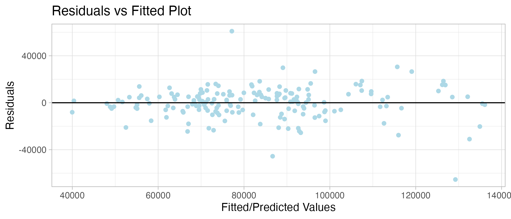
Here, I computed residual and predicted values using the augment () function in order to plot them against each other and calculate the Mean Absolute Error (MAE).
The MAE for the training model is 9239, meaning the model is off by 9239 units of house sales. The model appears to be a good fit as the residuals are normally distributed, and the variance is approximately the same across predictors.
Question 6: Predicting the future using the model
The following code uses the training dataset to predict Sales Volume in the testing set. This was convenient as I could use the same model on the dataset as they have the same variables and columns.
mae_testing <-
SV_Model %>%
  augment(df_uk_test) %>%
  mae(truth = Sales_Volume, estimate = .pred)
mae_testing

ggplot(SV_Model %>% augment(df_uk_test), aes(.pred,.resid)) +
  geom_point(color = "pink") +
  geom_hline(yintercept = 0, linetype = "solid") +
  labs(x = "Fitted/Predicted Values", y = "Residuals", title = "Residuals vs Fitted Plot") +
  theme_light()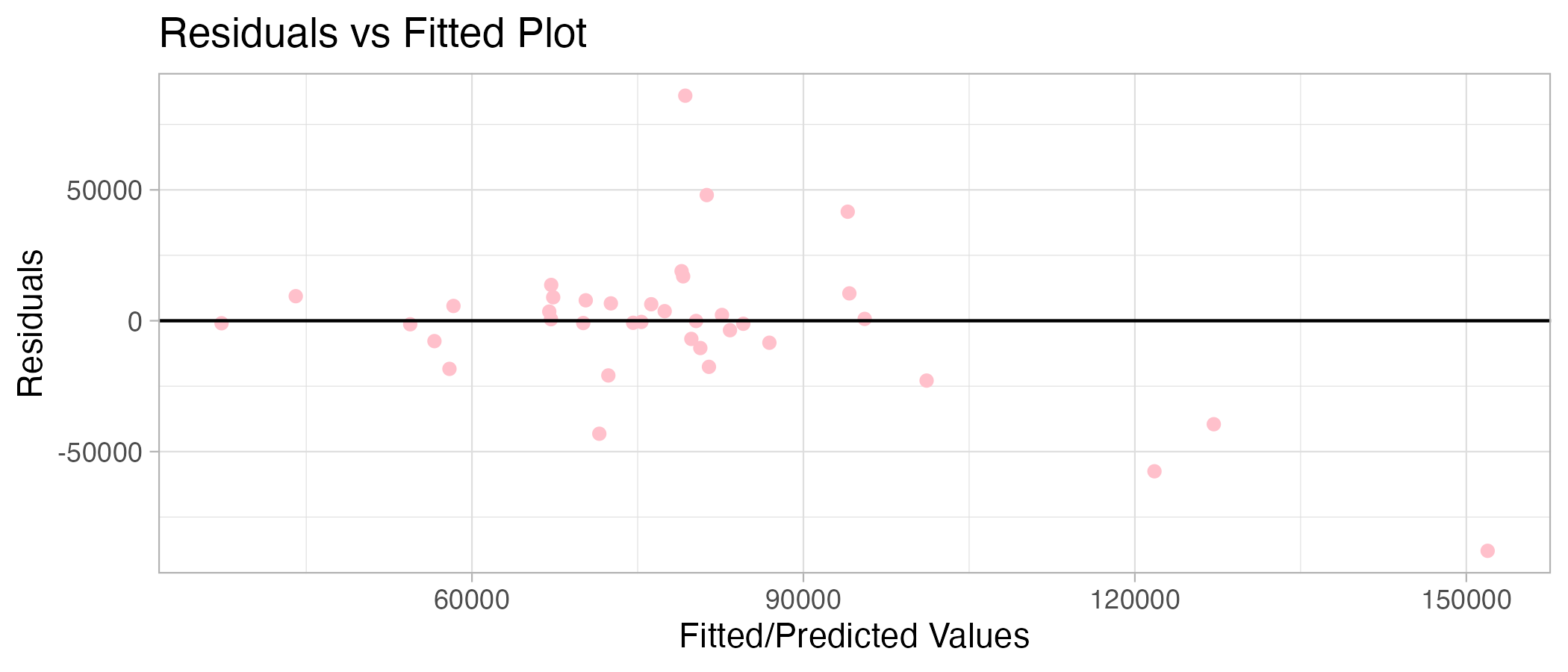
The error is much higher for the testing data set as the MAE is 16889, almost twice as high! This may be because something in the data changed. For example, sales volumes may be drastically different after January 2020 due to the COVID-19 pandemic. Therefore, the training set may be too suited to pre-COVID UK house sales and, therefore, worse at predicting sales volumes in the testing set (during and post-COVID). Houses sold may have decreased during this time due to lockdown restrictions and other life conditions.
We can check this:
min(df_uk_train$Sales_Volume)[1] 31422min(df_uk_test$Sales_Volume)[1] 28356.33Here, we can see that the minimum number of house sales per month was smaller (fewer houses sold) for the testing set by 3066 units, where the dates were from January 2020 onwards. This is compared to a higher minimum value of houses sold for the training set, where the dates were up to December 2019. This suggests that houses sold for the period post-2019 were lower than pre-2019, meaning that using model estimates of the training set may be inefficient in predicting house sales due to the changing context of the testing set dates.
This can be visualised through a plot showing the changes in house sales across the two data sets:
ggplot(df_uk_train, aes(x = Date, y = Sales_Volume)) +
  geom_line(linewidth = 1.5, alpha = 0.8, color = "lightblue") +
  xlab("Date/Year") +
  ylab("Sales Volume") +
  ggtitle("No. Of Houses Sold Up Until December 2019") +
  theme_light()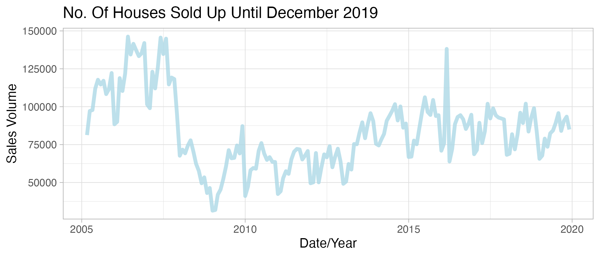
ggplot(df_uk_test, aes(x = Date, y = Sales_Volume)) +
  geom_line(linewidth = 1.5, alpha = 0.8, color = "pink") +
  xlab("Date/Year") +
  ylab("Sales Volume") +
  ggtitle("No. Of Houses Sold From January 2020") +
  theme_light()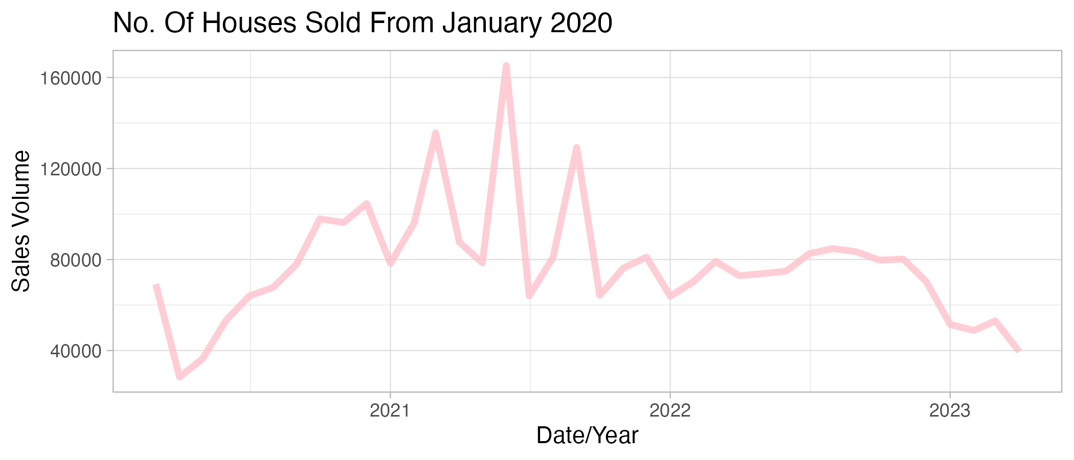
The plots show that there is a general increase in house sales from 2010 and a decrease in house sales from 2021 onwards.
Question 7: Explaining my choices
Why did I choose the variables I did?
I chose the Average price as a variable to predict Sales Volume as I had the intuition that as average house prices increase, house sales would decrease due to housing becoming more expensive. Hence less people would be able to afford/consider buying. I wanted to see if this was the case within the UK. I also wanted to see if the previous month Sales Volume would predict later house sales to gauge whether there was a trend in house price sales across months or if this was random.
How did you come up with this particular configuration?
I chose to use a multiple linear regression so that I did not have to manually conduct multiple linear regressions. On top of this, I considered the potential of confounding variables that could affect sales volume more so than sales volume trends previously, such as Average House Price of the previous month.
Did you try anything else that didn’t work?
I tried to use the variable ‘OldSalesVolume’ to predict the Sales Volume of the present month. However, I was unsure of the time range for this section of data, so hesitated in determining what time range I was using to predict Sales Volume.
What did you learn from this exercise?
This exercise highlighted to me the importance of checking your data sets regularly, which I overlooked in the beginning. From re-checking that my dates were correctly filtered, it ensured that my data sets were separated and that earlier dates were able to predict future dates accordingly.
Another key learning curve I encountered was the changes in interpretation of model statistics. For example, I learnt the importance of understanding that the measured units of my predictors and outcome variables are preserved, hence, the model predictions were at first, hard to wrap my head around. Following some research into the UK HPI data set I recognised the units variables were measured, I was able to use the correct terminology to read the intercept and corresponding slopes as well as what they imply.