
DS202A - W04 Summative
2022/23 Autumn Term
Introduction
I began this report following the structure of the questions in the README. Clear answers to questions 1-6 (excluding 4 - as it is not an answerable question) should be found for the first model. Following this, the report is organised one model at a time, without question numbers. However I follow roughly the same steps each time I go through the process of creating and testing a new model. Question 7 is not answered directly until the very end, but I have explained my choices throughout the report. I have colour-coded the headings to make it clearer which model I’m working on - please see the table of contents for a clearer summary of the structure.
Setup
Installing libraries
library(tidyverse)    # for data manipulation
library(dplyr)        # for data manipluation
library(lubridate)    # for working with dates
library(tidymodels)   # for pre-processing and modelling
library(tidyselect)   # for selecting columns
Loading the UK HPI dataset
df <- readr::read_csv("data/UK-HPI-full-file-2023-06.csv")Q1: Filtering the data for only the whole of the UK
df_uk <- df %>%
  filter(RegionName == "United Kingdom")
Q2: Spliting the UK dataframe into training and testing data
- df_uk_train = data up until December 2019
- df_uk_test = data from January 2020 onwards
Firstly, the dates must be put into the correct format:
df_uk <- df_uk %>% mutate(Date=lubridate:::dmy(Date))Then the data can be split by date:
df_uk_train <- df_uk %>% filter(Date <   ymd("2020-01-01"))
df_uk_test  <- df_uk %>% filter(Date >=  ymd("2020-01-01"))
Model1: SalesVolume ~ SalesVolume_lag1
Q3: Creating a linear model using tidymodels that can predict the variable SalesVolume per month
The fist model I will try will use the number of houses sold (SalesVolume) in the previous month as a predictor for the number of houses that will be sold in the current month.
Pre-processing the dataframes
- adding a month column in abbreviation format
- adding a lagged variable:
- I will model the SalesVolume of the previous month as a predictor of the SalesVolume of the current month, i.e. y = SalesVolume this month (predicted) and x = previous month’s SalesVolume
- to do this, I will add a column for the SalesVolume of the previous month, called SalesVolume_lag1 - see below
- getting rid of rows with missing information under SalesVolume and SalesVolume_lag1
df_uk_train <- df_uk_train %>%
  mutate(Month=month(Date, label = TRUE),
         SalesVolume_lag1 = lag(SalesVolume, 1)) %>%
  tidyr::drop_na(SalesVolume, SalesVolume_lag1)
df_uk_test <- df_uk_test %>%
mutate(Month=month(Date, label = TRUE),
SalesVolume_lag1 = lag(SalesVolume, 1)) %>%
tidyr::drop_na(SalesVolume, SalesVolume_lag1)Fitting a linear reggression model to df_uk_train using tidymodels
model1 <-
    linear_reg() %>%
    set_engine("lm") %>%
    fit(SalesVolume ~ SalesVolume_lag1, data = df_uk_train)
Q5: Plotting residuals and calculating the MAE of model1 on the data relative to df_uk_train
Plotting the residuals against the fitted values
plot1_df <- model1 %>% augment(df_uk_train)
g1 <- ggplot(plot1_df, aes(x = .pred, y = .resid)) +
    geom_point(alpha=0.2, size=3, color="blue", stroke=1) +
    geom_hline(yintercept = 0, linetype = "dashed") +
    labs(x = "Fitted values", y = "Residuals", title="Model1: Residuals vs Fitted") +
    theme_bw() +
    theme(axis.title.x = element_text(size = rel(1.2)),
          axis.text.x = element_text(size = rel(1)),
          axis.title.y = element_text(size = rel(1.2)),
          axis.text.y = element_text(size = rel(1)),
          plot.title = element_text(size = rel(1.5), face = "bold",
          hjust = 0.5))
g1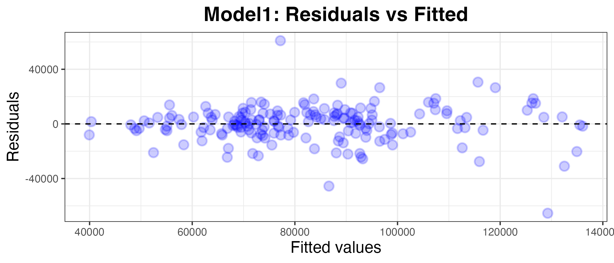
Calculating the Mean Absolute Error (MAE)
model1 %>%
    augment(df_uk_train) %>%
mae(truth = SalesVolume, estimate = .pred)| .metric | .estimator | .estimate |
|---|---|---|
| mae | standard | 9194.611 |
The MAE of model1 is 9194.611 houses. This means that the model is off by an average of 9194.611 sold houses each month. This value is almost meaningless without comparing it to the average number of houses sold per month. To help me decide whether or not model1 is ‘good’ enough (i.e. fits the data well), I will calculate the mean absolute percentage error (MAPE) of the model as a more standardised and easily comparable measure of how well the model fits the data. The MAPE is the mean of all absolute percentage errors between the predicted and actual values.
How well does this model fit?
Below are the summary statistics for df_uk_train:
summary(df_uk_train$SalesVolume) Min. 1st Qu. Median Mean 3rd Qu. Max.
31422 66956 81587 83170 95384 146253 The mean SalesVolume for df_uk_train is 83170. This means that the mean absolute percentage error (MAPE) for model1 is roughly:
9194.611*100/8317011.06%. But we can calculate a more accurate value using the mape() function in R.
model1 %>%
    augment(df_uk_train) %>%
mape(truth = SalesVolume, estimate = .pred)| .metric | .estimator | .estimate |
|---|---|---|
| mape | standard | 11.99293 |
So the MAPE is 12.0%. Generally, a MAPE value lower than 20% is considered ‘a good value ’good’1. So, I will accept that model1 fits the training data well.
Q6: Calculating the residuals and the MAE of model1 on the data relative to df_uk_test
Calculating the MAE
model1 %>%
    augment(df_uk_test) %>%
mae(truth = SalesVolume, estimate = .pred)| .metric | .estimator | .estimate |
|---|---|---|
| mae | standard | 16559.47 |
The MAE increased when the model1 (that was trained on df_uk_train) was applied to df_uk_test. This is no surprise, given that the model was trained on df_uk_train, so it will have the best possible fit for this data, while df_uk_train will very from this, however slightly. It could be the case that the data follows a different trend post-Jan 2020.
Calculating the MAPE
model1 %>%
    augment(df_uk_test) %>%
mape(truth = SalesVolume, estimate = .pred)| .metric | .estimator | .estimate |
|---|---|---|
| mape | standard | 23.11028 |
The MAPE of model1 relative to df_uk_test is 23.1%. Like the MAE, this is higher than for the training data. This is also unsurprising, for the same reasons as outlined above.
Now, however, the MAPE is out of the range that is generally considered ‘good’. So, model1 does not predict the future accurately.
I will now try using different variables as predictors in order to find an imporoved model for the SalesVolume.
Model2: SalesVolume ~ AveragePrice_lag1
I would like to explore whether past house prices will affect the number of houses sold. Perhaps high prices would be a deterrent for potential house-buyers and may put them off buying houses, or maybe encourage them to buy a house soon before prices rise. Therefore, I am interested to see whether house prices from the previous month affect the number of houses sold in the current month.
Pre-processing
- adding a lagged variable:
- this time, for model2, I will try using the average house price of the previous month as a predictor for the number of houses sold in the current month
- to do this, I will add a column for the AveragePrice of the previous month, called AveragePrice_lag1
- getting rid of rows with missing information under AveragePrice and AveragePrice_lag1
df_uk_train <- df_uk_train %>%
  mutate(AveragePrice_lag1 = lag(AveragePrice, 1)) %>%
  tidyr::drop_na(AveragePrice, AveragePrice_lag1)
df_uk_test <- df_uk_test %>%
mutate(AveragePrice_lag1 = lag(AveragePrice, 1)) %>%
tidyr::drop_na(AveragePrice, AveragePrice_lag1)Fitting a linear regression model
model2 <-
    linear_reg() %>%
    set_engine("lm") %>%
    fit(SalesVolume ~ AveragePrice_lag1, data = df_uk_train)

model2 %>% tidy()| term | estimate | std.error | statistic | p.value |
|---|---|---|---|---|
| (Intercept) | 5.354218e+04 | 13966.754752 | 3.833544 | 0.0001757 |
| AveragePrice_lag1 | 1.589916e-01 | 0.074099 | 2.145664 | 0.0332702 |
Plotting residuals and calculating the MAE of model2 on the data relative to df_uk_train
plot2_df <- model2 %>% augment(df_uk_train)
g2 <- ggplot(plot2_df, aes(x = .pred, y = .resid)) +
    geom_point(alpha=0.2, size=3, color="red", stroke=1) +
    geom_hline(yintercept = 0, linetype = "dashed") +
    labs(x = "Fitted values", y = "Residuals", title="Model2: Residuals vs Fitted") +
    theme_bw() +
    theme(axis.title.x = element_text(size = rel(1.2)),
          axis.text.x = element_text(size = rel(1)),
          axis.title.y = element_text(size = rel(1.2)),
          axis.text.y = element_text(size = rel(1)),
          plot.title = element_text(size = rel(1.5), face = "bold",
          hjust = 0.5))
g2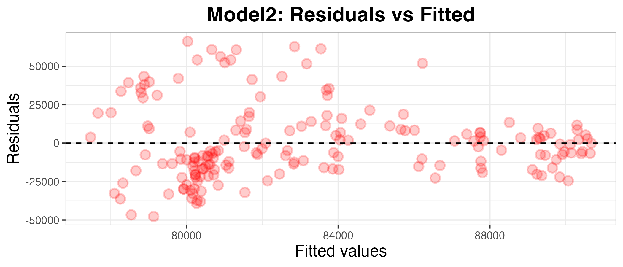
I can see by looking at the residuals axis of the plot that the residuals for model2 are much more deviated than for model1, so it appears to be a worse model. To confirm this, I have calculated the MAPE below:
model2 %>%
    augment(df_uk_train) %>%
mape(truth = SalesVolume, estimate = .pred)| .metric | .estimator | .estimate |
|---|---|---|
| mape | standard | 24.60164 |
The MAPE is 24.6%. Since the MAPE is high when the model is applied to the data it was trained on, we can tell that the avarage house price for the previous month is not a good predictor for the number of houses will be sold in the current month. Given that this is considered a ‘bad’ model (as well as a worse model than model1), I will move on to testing a new predictor.
Model3: SalesVolume ~ AveragePrice_lag12
Maybe one month is not enough time for house prices to affect sales. I will now explore whether house prices from one year ago are able to predict the number of houses sold in the current month.
Pre-processing
- adding a lagged variable:
- this time, for model3, I will try using the average house price one year ago as a predictor for the number of houses sold in the current month
- to do this, I will add a column for the AveragePrice of the same month, 1 year ago, called AveragePrice_lag12
- getting rid of rows with missing information under AveragePrice_lag12
df_uk_train <- df_uk_train %>%
  mutate(AveragePrice_lag12 = lag(AveragePrice, 12)) %>%
  tidyr::drop_na(AveragePrice_lag12)
df_uk_test <- df_uk_test %>%
mutate(AveragePrice_lag12 = lag(AveragePrice, 12)) %>%
tidyr::drop_na(AveragePrice_lag12)Fitting a linear regression model
model3 <-
    linear_reg() %>%
    set_engine("lm") %>%
    fit(SalesVolume ~ AveragePrice_lag12, data = df_uk_train)

model3 %>% tidy()| term | estimate | std.error | statistic | p.value |
|---|---|---|---|---|
| (Intercept) | 7.951627e+04 | 15731.041464 | 5.0547367 | 0.0000011 |
| AveragePrice_lag12 | 1.184230e-02 | 0.084769 | 0.1397009 | 0.8890677 |
Plotting the residuals against the fitted values
plot3_df <- model3 %>% augment(df_uk_train)
g3 <- ggplot(plot3_df, aes(x = .pred, y = .resid)) +
    geom_point(alpha=0.2, size=3, color="purple", stroke=1) +
    geom_hline(yintercept = 0, linetype = "dashed") +
    labs(x = "Fitted values", y = "Residuals", title="Model3: Residuals vs Fitted") +
    theme_bw() +
    theme(axis.title.x = element_text(size = rel(1.2)),
          axis.text.x = element_text(size = rel(1)),
          axis.title.y = element_text(size = rel(1.2)),
          axis.text.y = element_text(size = rel(1)),
          plot.title = element_text(size = rel(1.5), face = "bold",
          hjust = 0.5))
g3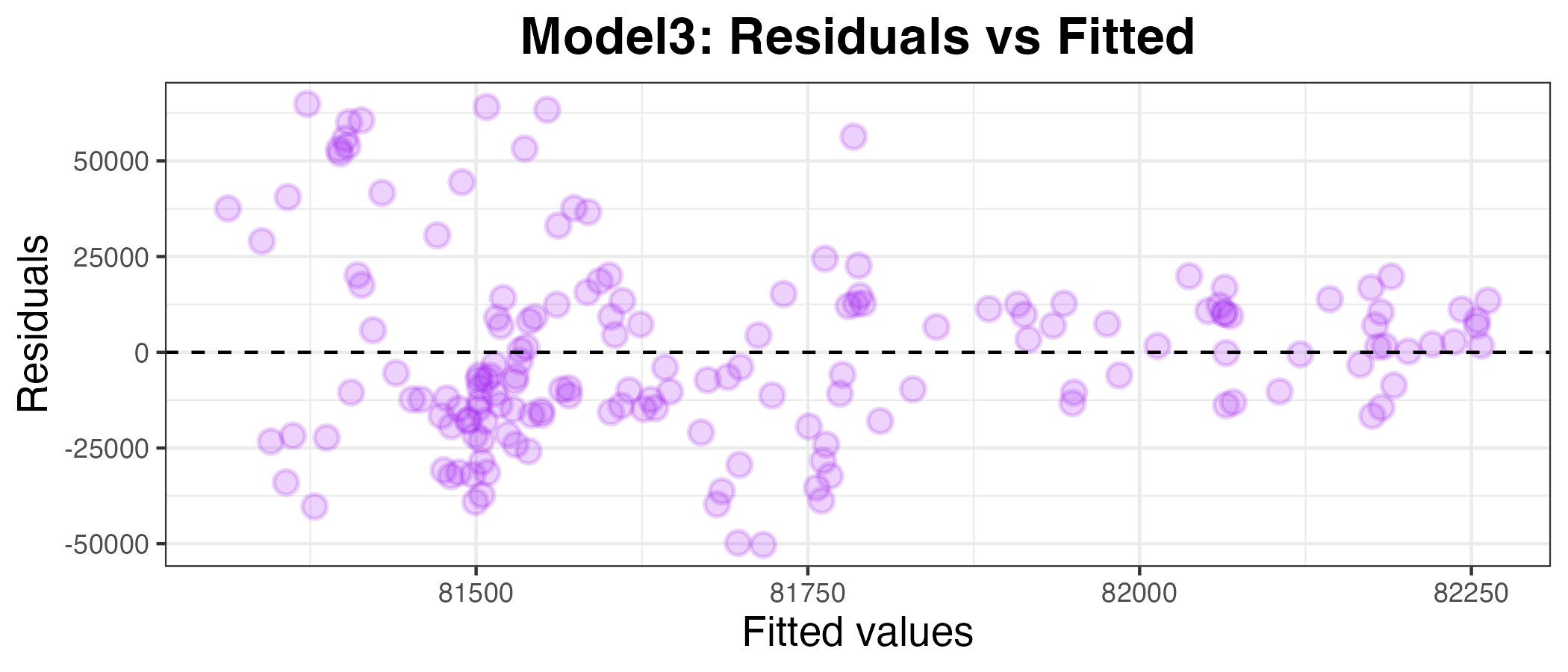
This also appears to be a bad model for SalesVolume. To confirm this, I have calculated the MAPE below:
model3 %>%
    augment(df_uk_train) %>%
mape(truth = SalesVolume, estimate = .pred)| .metric | .estimator | .estimate |
|---|---|---|
| mape | standard | 25.6354 |
The MAPE is 25.6%. This is also too high to be considered a ‘good’ model.
Model4: SalesVolume ~ SalesVolume_lag12
Pre-processing
- adding a lagged variable:
- this time, for model4, I will try using the sales volume from one year ago as a predictor for the number of houses sold in the current month
- to do this, I will add a column for the SalesVolume of the same month, 1 year ago, called SalesVolume_lag12
- getting rid of rows with missing information under SalesVolume_lag12
df_uk_train <- df_uk_train %>%
  mutate(SalesVolume_lag12 = lag(SalesVolume, 12)) %>%
  tidyr::drop_na(SalesVolume_lag12)
df_uk_test <- df_uk_test %>%
mutate(SalesVolume_lag12 = lag(SalesVolume, 12)) %>%
tidyr::drop_na(SalesVolume_lag12)Fitting a linear regression model
model4 <-
    linear_reg() %>%
    set_engine("lm") %>%
    fit(SalesVolume ~ SalesVolume_lag12, data = df_uk_train)

model4 %>% tidy()
Plotting the residuals against the fitted values
plot4_df <- model4 %>% augment(df_uk_train)
g4 <- ggplot(plot4_df, aes(x = .pred, y = .resid)) +
    geom_point(alpha=0.2, size=3, color="green", stroke=1) +
    geom_hline(yintercept = 0, linetype = "dashed") +
    labs(x = "Fitted values", y = "Residuals", title="Model4: Residuals vs Fitted") +
    theme_bw() +
    theme(axis.title.x = element_text(size = rel(1.2)),
          axis.text.x = element_text(size = rel(1)),
          axis.title.y = element_text(size = rel(1.2)),
          axis.text.y = element_text(size = rel(1)),
          plot.title = element_text(size = rel(1.5), face = "bold",
          hjust = 0.5))
g4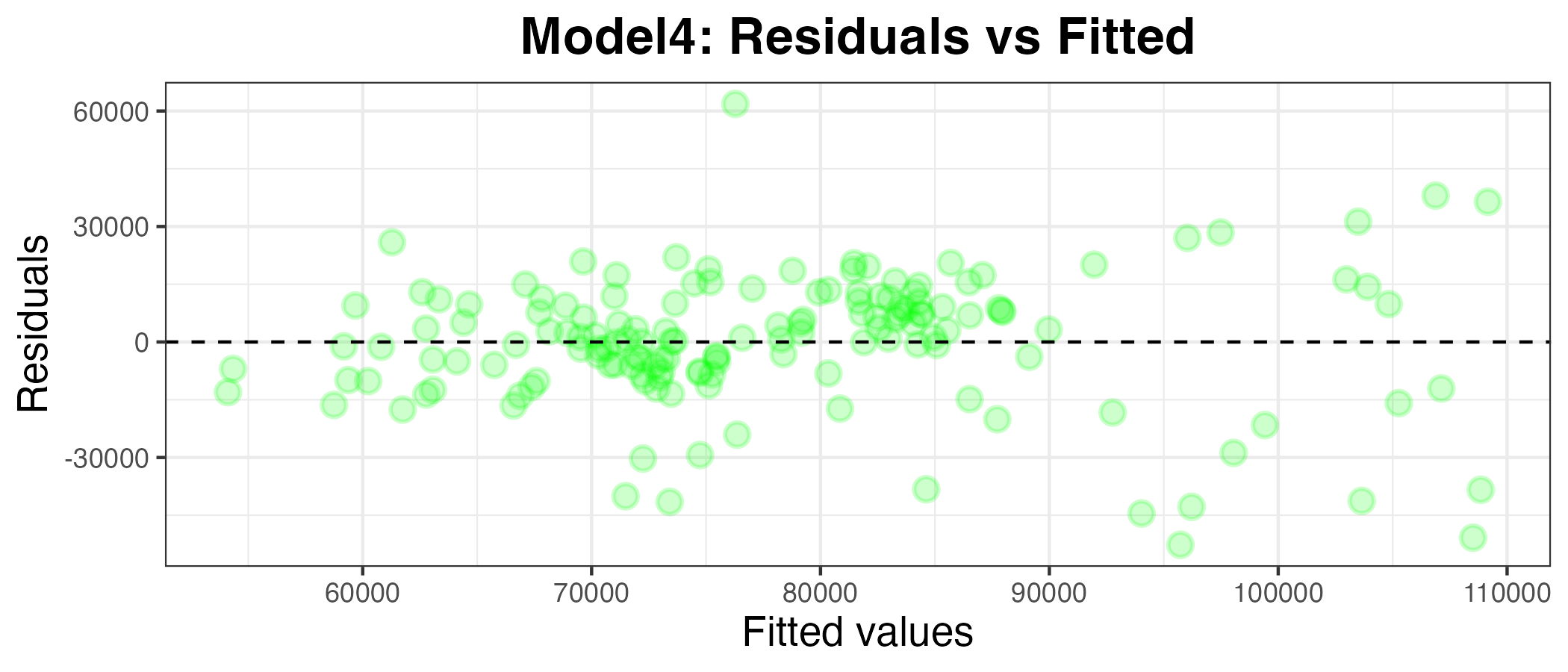
This also appears to be a worse model than model1. To confirm this, I have calculated the MAPE below:
model4 %>%
    augment(df_uk_train) %>%
mape(truth = SalesVolume, estimate = .pred)| .metric | .estimator | .estimate |
|---|---|---|
| mape | standard | 18.30044 |
The MAPE is 18.3%. This is better than model2 and model3, but still not quite as good as model1, with a MAPE of 12.0% (both MAPEs using training data).
Model5: SalesVolume ~ SalesVolume_lag1 + AveragePrice_lag1
Pre-processing
- there is no preprocessing required for thid model, as the variables I want to use as predictors were already created for previous models
Fitting a multi-linear regression model
model5 <-
    linear_reg() %>%
    set_engine("lm") %>%
    fit(SalesVolume ~ SalesVolume_lag1 + AveragePrice_lag1, data = df_uk_train)

model5 %>% tidy()| term | estimate | std.error | statistic | p.value |
|---|---|---|---|---|
| (Intercept) | 2640.9979317 | 8247.3314246 | 0.3202245 | 0.7492408 |
| SalesVolume_lag1 | 0.7353518 | 0.0562531 | 13.0721944 | 0.0000000 |
| AveragePrice_lag1 | 0.0943656 | 0.0491521 | 1.9198697 | 0.0567598 |
Plotting the residuals against the fitted values
plot5_df <- model5 %>% augment(df_uk_train)
g5 <- ggplot(plot5_df, aes(x = .pred, y = .resid)) +
    geom_point(alpha=0.2, size=3, color="orange", stroke=1) +
    geom_hline(yintercept = 0, linetype = "dashed") +
    labs(x = "Fitted values", y = "Residuals", title="Model5: Residuals vs Fitted") +
    theme_bw() +
    theme(axis.title.x = element_text(size = rel(1.2)),
          axis.text.x = element_text(size = rel(1)),
          axis.title.y = element_text(size = rel(1.2)),
          axis.text.y = element_text(size = rel(1)),
          plot.title = element_text(size = rel(1.5), face = "bold",
          hjust = 0.5))
g5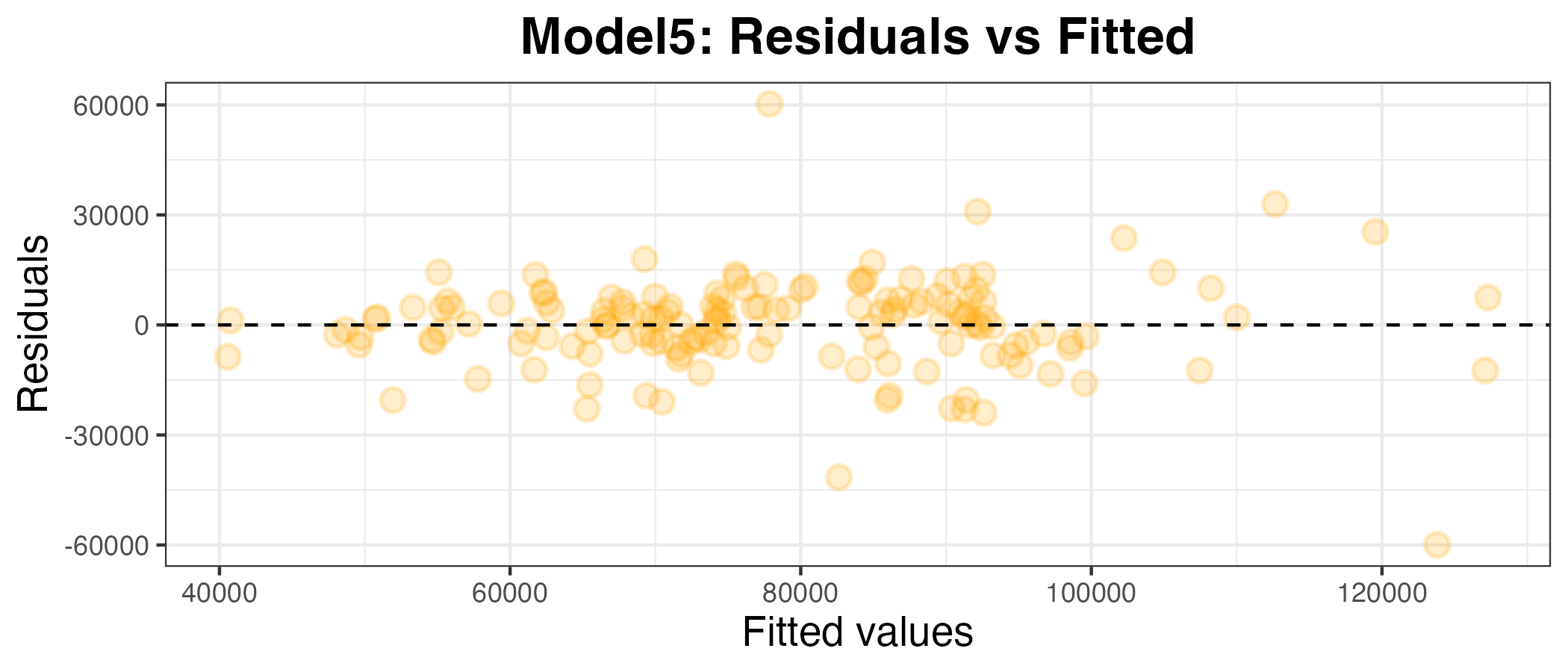
model5 %>%
    augment(df_uk_train) %>%
mape(truth = SalesVolume, estimate = .pred)| .metric | .estimator | .estimate |
|---|---|---|
| mape | standard | 11.93931 |
The MAPE for model5 is 11.9%. This is lower than the MAPE for model1 (12.0%) by a very small margin, suggesting that this is a slightly better fit for the training data.
Calculating the MAPE of the predictions (using the testing data)
model5 %>%
    augment(df_uk_test) %>%
mape(truth = SalesVolume, estimate = .pred)| .metric | .estimator | .estimate |
|---|---|---|
| mape | standard | 22.07257 |
The MAPE for model5 relative to the testing data is 22.1%. This is also lower than model1 (23.1%). This shows that the combination of the number of houses sold and the price of the houses in the previous month is a better predictor of the number of houses sold in the current month than the number of houses sold in the previous month alone.
Therefore, model5, using SalesVolume_lag1 and AveragePrice_lag1 as predictors in a multi-linear regression model, is the best at predicting the future out of the models I tested.
Q7
Question 7 was made up of multiple sub-questions: Why did you choose the variables you did? How did you come up with this particular configuration? Did you try anything else that didn’t work? What did you learn from this exercise? I have explained my choices throughout this report, but the final question is answered below.
What did I learn from this exercise?
The main lesson I learned from this exercise is that it is not practical for humans to find the best predictor of a particular variable by manually selecting variables/combinations of variables and creating (multi-)linear regression models in a trial-and-error style approach. However, I also learned that there are techniques which can be used by data scientists to find the best model by testing all possibile models, without this human trial-and-error process. I look forward to learning about this in the future!
References
Allwright, Stephen (2022) What is a Good MAPE Score?
Mean absolute percent error, Yardstick, Tidymodels
Quarto, Citations & Footnotes
Course materials
ChatGPT:
- I used ChatGPT to find out how to add hyperlinks in R Quarto Markdown. I the used the code format it gave me ([Link text](url)) and adapted it to my own use.
Footnotes
Allwright (2022)↩︎
Comments