🧐 Analysis of W03 Formative submissions
2023/24 Autumn Term
This page contains an analysis of your submissions for the ✏️ W03 Formative. Here, I show some solutions to the problem set, comment on the most common mistakes and give advice for the future.
📊 Submission statistics
| Enrolled in DS202A |
Accepted Assignment via GitHub |
Submitted Formative |
% |
|---|---|---|---|
| 60 | 46 | 41 | 68% |
Number of late submissions: \(\frac{5}{41} = 12\%\).
I organised this page into sections related to the marking criteria of the 📝 W04 Summative assignment so it is easier for you to spot and avoid these mistakes in the future.
📓 Notebook Organisation
Malformated HTML pages
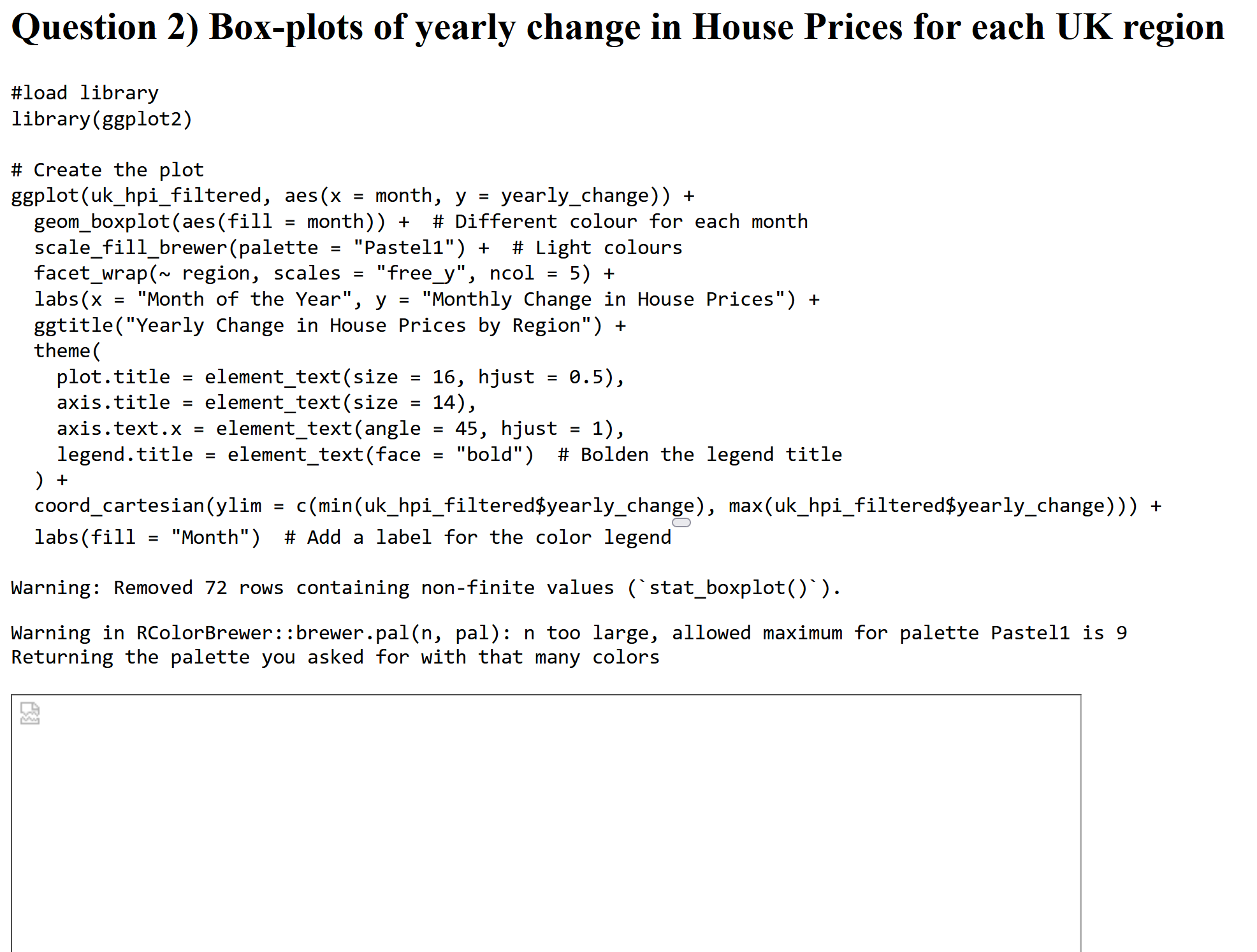
The number one issue I found when I looked at the .html pages produced is that many didn’t have any formatting or were missing images. This was an issue in around 60% of the submissions. See example below:

For sure, this is not how the page looked to you when you clicked on ‘Render’, so what happened?
One of the significant advantages of Quarto is that it allows for much flexibility when creating code-related documents. You can create academic articles, webpages, presentations, reports, entire books and even CVs using the same tools 1. This flexibility requires a lot of configuration, and getting lost in the process is easy. The problem above occurs because, by default, Quarto produces many different files when it converts your .qmd file to .html. The main file is the .html file, but there are also .css and .js files containing the styling and JavaScript code, respectively, and the images you use in your notebook. If you don’t tell Quarto to include these files in the .html file, you will end up with a page that looks like the one above.
The trick here is to set self-contained: true in your notebook’s header, guaranteeing that everything (images, styling, etc.) will go into a single HTML file, making it easier for whoever is reading your report to understand your thought process and code. I added a template for setting up your notebook to help you produce a nice HTML page with a single file. You have probably already seen it on the 📝 W04 Summative page:
---
title: "DS202A - W04 Summative"
author: <CANDIDATE_NUMBER>
output: html
self-contained: true
---
Some of you who weren’t aware of the self-contained option did the right thing in submitting all the files produced by Quarto. However, to make things easier, I recommend that you set self-contained: true in your notebook’s header.
💡 Pro-tip: You can customise your page’s appearance by adding themes.
Common file name issues
Pay close attention to the instructions when naming your files. We saw many submissions that didn’t follow the naming convention of using the candidate number as the file name. For example, I found files named ds202a-formative.qmd instead of <CANDIDATE_NUMBER>.qmd. Although this is a minor point, it makes it easier for us to track and identify your submissions.
Also, many students submitted the source file (.qmd) but forgot to submit the HTML page. We want both files! We want to see that you can produce a report-like document from your code, but we also want to know the source code itself.
Misc of other formatting issues
Some of you had a different
outputformat in the header. For example, I encountered a few like this:--- title: "LSE_DS202A_FORMATIVE_1" format: markdown ---The result will not be a webpage but a text file, thus going against the assignment requirement. So set
output: htmlin your notebook’s header.Others used
.Rmdfiles, which is okay; you can also produce HTML pages from the old R Markdown format. Just don’t forget to upload your HTML page to GitHub when submitting your assignment.When you are in ‘prototyping mode’, experimenting with and tweaking the code, it is natural to print out a lot of things, either with the
print()command or by simply leaving a massive data frame or the result of aglimpse()at the end of a code chunk. This produces many lines in your HTML pages and requires a lot of scrolling up and down to understand what is going on. So, when you are happy with your code, go into ‘reporting mode’ and revisit the notebook, removing any unnecessary outputs.For example, when revising your notebook, instead of leaving the following at the end of a code chunk:
df$MonthConsider using:
df %>% distinct(Month)Or, if the column
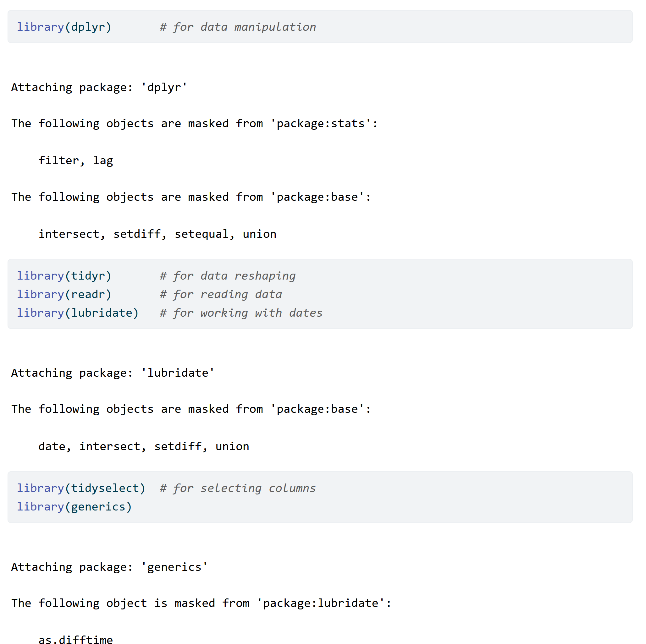
Monthwas a factor, you could use:levels(df$Month)Part of these outputs also occur when we load the libraries, producing a lot of unnecessary messages like this:

You can suppress these messages by adding
message = FALSEandwarning = FALSEto the offending code chunks like this:
💡 Pro-tip: You can customise your code chunks in many other ways. Read all about it on
knitr’s documentation page or Quarto’s Chunk Options page.Avoid identifying yourself by accident in your code! Some of you had something like the following in your notebooks:
read_csv("/Users/jon/Downloads/uk-hpi-full-...")Note that the path above reveals that I am jon! To make things fairer to you, try to use relative paths instead. Take a look at 👨🏫 Week 02 - R/RStudio + tidyverse recap material for more on paths.
🖥️ Code
Part 1: Creating dummy variables
I will replicate some tips I gave to you over Slack here. Note: you could have renamed the variables, but I will use the original names just to make things easier to follow.
Q1
Create a new column called month that contains the month of the year. Ensure the month is a three-letter abbreviation encoded as a factor.
The actual solution is straightforward, but let me highlight a good way of reasoning about this question:
Thought 01: Your first thought should be: “Ok, I need to use the same data as before (uk_hpi) but to add a new column. How do I add a column?”
You could realise that
uk_hpi$new_column <- ...does the trick, and we would accept that. But hopefully, asking yourself this question would make you realise that the function of mutate() is precisely to create new (or overwrite existing) columns.Thought 02: ‘This mutate function seems to be what I need, but how should I use it?’
This would hopefully prompt you to look up the documentation of mutate. You can do this by searching ‘mutate’ on dplyr documentation, looking at the cheatsheet, or typing
?mutateon your Console. You’d then browse the examples to realise that you need something like:df <- uk_hpi %>% .... %>% # previous steps mutate(month = ...)You might not know what to add in the
...just yet, but you would have nailed the scaffolding.Thought 03: “I know how to create a new column, but how do I extract the month of the Date column??”
I hope that you will associate anything related to dates, times with the lubridate package. You would search for ‘month’ on the lubridate documentation page, look at the cheatsheet or type
??monthon your Console. Reading the month() documentation examples will help you realise that you could do something like:df <- uk_hpi %>% .... %>% # previous steps mutate(month = month(Date, abbr=TRUE, label=TRUE))The code above extracts the month (as a three-letter abbreviation) for every single element in the Date column, and the result is already a factor! So I don’t need to do anything else.
Some of you did something like this:
df <-
    uk_hpi %>%
    .... %>% # previous steps
    mutate(month = factor(month(Date, label = TRUE, abbr = TRUE)))
Although this is fine, it adds an unnecessary step of converting the month to a factor. The month() function already returns a factor, so you don’t need to convert it again.
Q2
You are to create five plots, one for each selected region (‘England’, ‘Scotland’, ‘Wales’, ‘Northern Ireland’, ‘United Kingdom’).
Each plot should be a boxplot of the yearly change in house prices where the x-axis is the month of the year, and the y-axis is the monthly change in house prices.
Alternatively (and preferred), you can create a single plot with five facets, one for each region.
In hindsight, it wasn’t easy to understand exactly what variable should be on the Y-axis, given the many different time scales present in the data. And even I got confused and probably went back and forth on 12m%Change and 1m%Change in my advice to you. If this were a graded assignment, you would not lose points for using the ‘wrong’ variable! The 1m%Change variable is probably more appropriate for this question, so I will show code for that one:
How to go about this question?
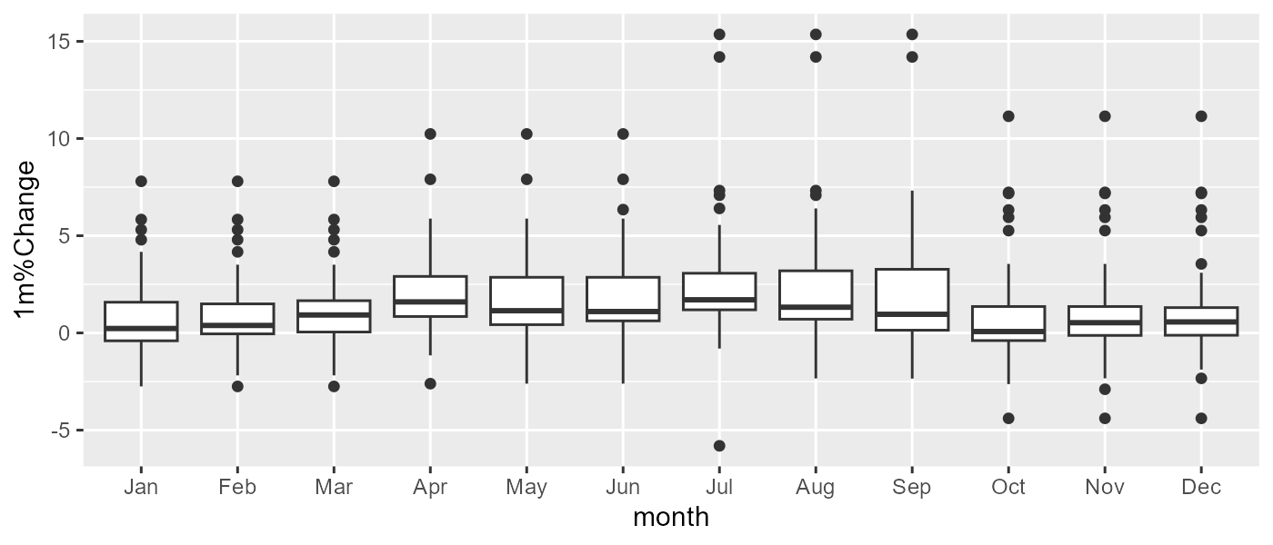
Start simple. Pick a single country first and map the plot’s aesthetics (x for what goes in the X-axis, y for what goes in the Y-axis, etc.). Then, add the geom.
g <- ggplot(df %>% filter(RegionName == 'England'), aes(x = month, y = `1m%Change`)) +
    geom_boxplot()
g
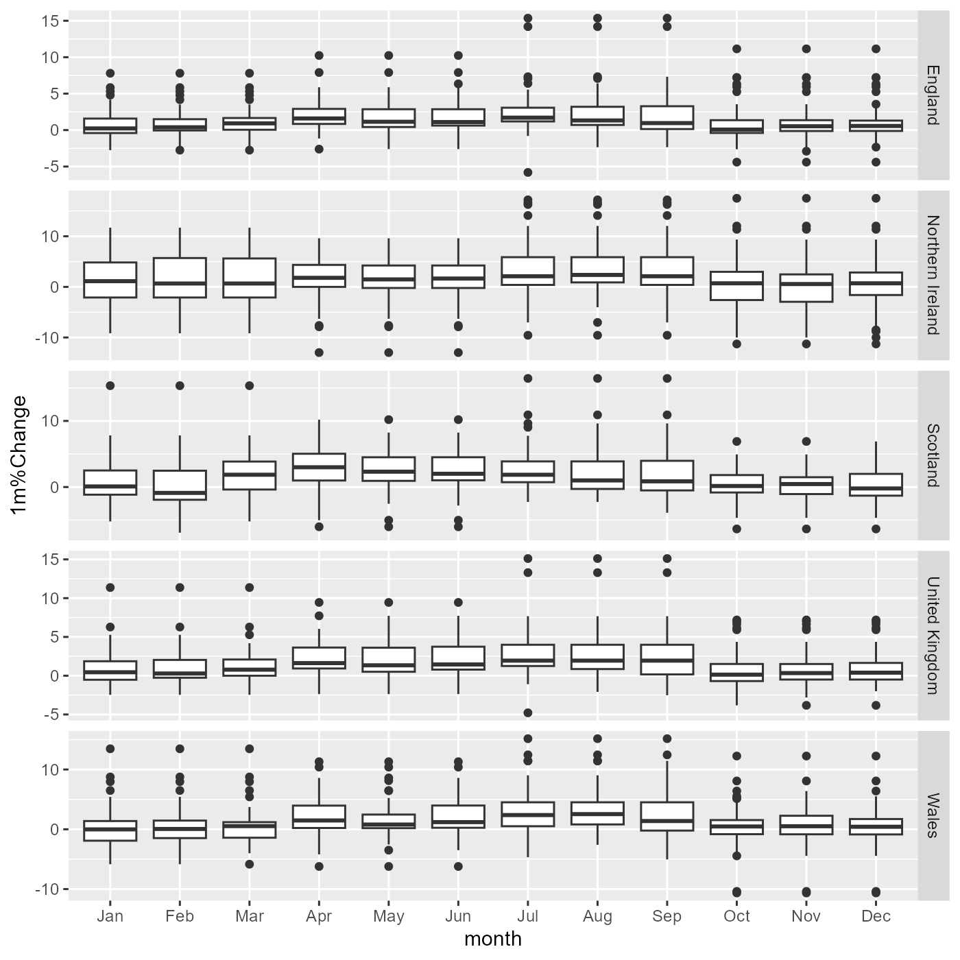
This will print a correct plot for England. You could add separate code chunks for the other countries, but the ultimately best thing would be to facet the plot:
g <- ggplot(df, aes(x = month, y = `1m%Change`)) +
    geom_boxplot() +
    facet_grid(RegionName ~ ., scales="free_y")
g
The rest would be customisation: use a better theme, add meaningful titles and a colour palette, etc.. (this is the sort of thing that would give you a tiny bit of extra points in a summative assignment if done well).
A common mistake I noticed was the use of colours in a way that didn’t
Q3
Do you sense that there is a seasonal pattern in the data? If so, what is it?
The plot itself is probably insufficient to answer this question, but it looks like percentage changes increase slightly in the Summer months, and there seems to be a more considerable variance in the Winter months, as seen by wider boxes.
Part 2: Creating lagged variables (more advanced)
Q4:
Create a new column called yearly_change_lag1 that contains the yearly change from the previous month.
There is not a lot of surprise here, as we have been doing this in the labs and lectures for a couple of weeks. But there are a few key things you need to remember:
- you need to
group_byregion first so that the data from one region doesn’t leak to the others - to sort the data by date (in ascending order) before using
lag()
df <-
    uk_hpi %>%
    ... %>% # previous steps
    group_by(RegionName) %>%
    arrange(Date) %>%
    mutate(yearly_change_lag1 = lag(yearly_change))
If you don’t follow the order above, the first region will have an NA in the first month, but the other regions will incorrectly have the value from the previous region. If you use this dataset to train the algorithm, you will train it with incorrect data!
Therefore, this would be incorrect:
df <-
    uk_hpi %>%
    ... %>% # previous steps
    arrange(RegionName, Date) %>%
    mutate(yearly_change_lag1 = lag(yearly_change))
Funnily enough, sorting like this works if you use recipes (recall 🛣️ Week 04 - Lab Roadmap) but not if you are manipulating the data with dplyr functions.
Q5
Add 11 more lagged variables to the dataset, called
yearly_change_lag2toyearly_change_lag12.
The simplest way is to add the other lags:
df <-
    uk_hpi %>%
    ... %>% # previous steps
    group_by(RegionName) %>%
    arrange(Date) %>%
    mutate(yearly_change_lag1 = lag(yearly_change),
           yearly_change_lag2 = lag(yearly_change, 2),
           ...
           yearly_change_lag12 = lag(yearly_change, 12)
    )
I was glad many of you got annoyed with manually adding these many variables! It also annoys me. Luckily, now that you have been to Week 04 Lab, you now know that if you move your pre-processing code to a recipe, you can use the step_lag() function to create all of these variables with a single line by just specifying the number of lags you want:
recipe <-
    recipe(yearly_change ~ ., data = uk_hpi) %>%
    ... %>% # previous steps
    step_lag(yearly_change, 1:12, role = "predictor", prefix = "yearly_change_lag")
Q6
Drop the rows with missing values.
Just add tidyr::drop_na() to the end of your pipeline:
df <-
    uk_hpi %>%
    ... %>% # previous steps
    drop_na()
Q7
Reorder the rows by date in descending order. Reorder the columns so that they follow the order below:
This is a question of using arrange() and select() in the right order:
df <-
    uk_hpi %>%
    ... %>% # previous steps
    drop_na() %>%
    arrange(desc(Date)) %>%
    select(RegionName, Date, yearly_change, yearly_change_lag1:yearly_change_lag12)
💡 I added a pro tip there. You can use the colon operator (:) to select a range of columns with the same prefix. You could also use string::starts_with() or stringr::ends_with() to select columns that start or end with a particular string, respectively.
📃 Documentation of your thought process
In most cases, the comments you added to parts of your code chunk were sufficient for this assignment, but I would like to signal a few things for the future:
We will increasingly ask you to decide on variables and modelling choices. Adding text to your notebook outside code chunks to document your thought process will be the best approach here. Comment lines (preceded by
#) inside the code chunks will not be suitable for this purpose.A common mistake I saw people making is adding comments within a
print()function. This is not a good way of documenting your thought process but to print out the results of computations.
Conclusion
I am glad to see your engagement with the problem set, especially one that is not graded. I hope you found this feedback helpful and that you will use it to improve your work in the future.
Footnotes
See Quarto’s guide for more.↩︎
