
✅ LSE DS202A 2025: Week 02 - Lab Solutions
Here are the solutions for lab 2.
🛠 Part I: Data manipulation with dplyr
⚙️ Setup
Import required libraries:
library(ggsci) # for nice colour themes
library(psychTools)
library(psymetadata) # imports meta-analyses in psychology
library(tidyverse)
Try this option if having issues with the imports above
library(dplyr)       # for data manipulation
library(tidyr)       # for data reshaping
library(readr)       # for reading data
library(tidyselect)  # for selecting columns
library(ggsci)       # for nice colour themes
library(psymetadata) # imports meta-analyses in psychology
No need to load any data here: we can already have access to the Holzinger-Swineford dataset by loading psychTools. Let’s proceed! 😉
1.3. Let’s load the Holzinger-Swineford dataset, which contains mental ability test scores for school children, to inspect it.
hs_data <-
holzinger.swineford
hs_data
case school grade female ageyr mo agemo t01_visperc t02_cubes
1 1 Pasteur 7 1 13 1 157 2.8571 7.75
2 2 Pasteur 7 2 13 7 163 4.5714 5.25
3 3 Pasteur 7 2 13 1 157 3.8571 5.25
4 4 Pasteur 7 1 13 2 158 4.5714 7.75
5 5 Pasteur 7 2 12 2 146 4.1429 4.75
6 6 Pasteur 7 2 14 1 169 4.5714 5.00
7 7 Pasteur 7 1 12 1 145 2.4286 6.00
8 8 Pasteur 7 2 12 2 146 4.8571 6.25
9 9 Pasteur 7 2 13 0 156 3.8571 5.75
10 11 Pasteur 7 2 12 5 149 3.0000 5.25
11 12 Pasteur 7 1 12 2 146 3.1429 5.75
12 13 Pasteur 7 1 12 11 155 5.0000 6.00
13 14 Pasteur 7 2 12 7 151 4.8571 4.50
14 15 Pasteur 7 2 12 8 152 5.1429 5.50
15 16 Pasteur 7 1 12 6 150 5.0000 5.75
16 17 Pasteur 7 2 12 1 145 4.0000 4.75
17 18 Pasteur 7 2 14 11 179 3.7143 4.75
18 19 Pasteur 7 1 13 5 161 4.2857 6.75
19 20 Pasteur 7 2 12 8 152 4.8571 5.25
20 21 Pasteur 7 2 12 3 147 5.4286 8.75
21 22 Pasteur 7 1 14 10 178 5.0000 8.00
22 23 Pasteur 7 1 12 9 153 5.7143 8.50
23 24 Pasteur 7 1 12 11 155 4.2857 6.25
24 25 Pasteur 7 2 12 8 152 3.2857 5.50
25 26 Pasteur 7 1 12 3 147 4.8571 5.50
26 27 Pasteur 7 1 12 7 151 4.5714 4.00
27 28 Pasteur 7 1 12 8 152 4.7143 5.25
28 29 Pasteur 7 2 13 2 158 5.1429 5.00
29 30 Pasteur 7 2 12 5 149 4.0000 6.00
30 31 Pasteur 7 2 12 2 146 4.2857 4.50
t03_frmbord t04_lozenges t05_geninfo t06_paracomp t07_sentcomp
1 4.8 0.375 3.6364 2.3333 5.75
2 4.8 2.125 3.0909 1.6667 3.00
3 4.8 1.875 1.8182 1.0000 1.75
4 6.4 3.000 3.8182 2.6667 4.50
5 4.8 0.875 3.3636 2.6667 4.00
6 4.4 2.250 2.8182 1.0000 3.00
7 4.8 1.000 3.6364 3.3333 6.00
8 5.2 1.875 2.6364 3.6667 4.25
9 4.4 1.500 2.6364 2.6667 5.75
10 4.0 0.750 3.0000 2.6667 5.00
11 5.2 2.000 3.4545 2.0000 3.50
12 6.0 2.875 3.0000 2.6667 4.50
13 6.0 4.125 3.0000 2.6667 4.00
14 6.4 1.750 2.9091 4.6667 4.00
15 5.2 3.625 4.9091 5.0000 5.50
16 5.2 2.375 2.4545 2.6667 4.25
17 7.2 1.500 3.1818 2.0000 4.00
18 6.8 2.250 2.2727 2.0000 2.50
19 5.6 4.000 5.6364 4.3333 5.25
20 5.2 3.000 3.7273 3.6667 3.75
21 6.8 2.000 2.0000 1.6667 2.50
22 6.4 4.125 2.1818 2.0000 3.25
23 6.4 1.875 3.3636 3.3333 5.75
24 6.0 1.625 3.1818 2.6667 3.00
25 4.8 1.250 4.0909 2.3333 3.75
26 6.4 3.375 4.1818 1.6667 3.50
27 6.4 4.500 1.6364 2.6667 2.25
28 7.2 2.125 2.4545 1.6667 3.00
29 5.6 4.250 2.8182 2.0000 3.00
30 5.2 0.750 2.7273 2.6667 3.25
t08_wordclas t09_wordmean t10_addition t11_code t12_countdot
1 4.4 1.2857 3.3913 5.2857 5.75
2 4.4 1.2857 3.7826 6.0000 6.25
3 2.4 0.4286 3.2609 3.5000 3.90
4 4.2 2.4286 3.0000 4.6429 5.30
5 5.0 2.5714 3.6957 4.5000 6.30
6 5.0 0.8571 4.3478 6.5714 6.65
7 6.4 2.8571 4.6957 4.6429 6.20
8 5.0 1.2857 3.3913 5.7143 5.15
9 3.8 2.7143 4.5217 3.7143 4.65
10 5.0 2.5714 4.1304 5.2857 4.55
11 4.4 1.5714 3.7391 4.2857 5.70
12 5.4 2.7143 3.6957 5.0714 5.15
13 6.2 2.2857 5.8696 4.8571 5.20
14 5.0 1.5714 5.1304 4.8571 4.70
15 5.4 3.0000 4.0000 4.5714 4.35
16 3.6 0.7143 4.0870 4.2143 3.80
17 4.8 1.2857 3.6957 4.1429 6.65
18 3.4 1.7143 4.0000 4.3571 5.25
19 6.8 3.7143 3.9130 6.7143 4.85
20 4.8 2.5714 3.4783 4.4286 5.35
21 4.0 0.5714 2.6087 3.1429 4.60
22 3.6 2.1429 4.4783 5.2143 5.45
23 5.0 3.1429 3.4783 4.4286 4.60
24 4.4 1.0000 5.8261 4.5714 5.30
25 5.4 1.2857 4.6957 4.2857 4.60
26 5.2 1.4286 5.7391 4.7857 6.25
27 4.0 0.7143 4.1304 4.7857 5.10
28 4.4 1.1429 2.8261 4.0000 5.55
29 4.2 2.0000 5.1304 6.4286 5.85
30 3.6 1.8571 4.6522 4.6429 4.85
t13_sccaps t14_wordrecg t15_numbrecg t16_figrrecg t17_objnumb
1 6.3611 5.4545 3.2857 5.7143 1.50
2 7.9167 6.7273 3.1429 6.2857 3.00
3 4.4167 5.4545 3.1429 5.5714 0.25
4 4.8611 6.4545 2.4286 5.0000 1.25
5 5.9167 7.0000 5.1429 6.8571 3.75
6 7.5000 4.9091 3.0000 6.8571 1.50
7 4.8611 1.0000 1.1429 3.1429 1.00
8 3.6667 6.7273 4.5714 7.1429 2.75
9 7.3611 6.7273 4.0000 7.0000 4.50
10 4.3611 5.9091 4.1429 6.2857 1.25
11 4.3056 5.7273 3.2857 7.2857 2.25
12 4.1389 5.1818 5.7143 7.4286 1.50
13 5.8611 5.0909 4.1429 6.7143 2.00
14 4.4444 6.9091 3.2857 6.5714 1.75
15 5.8611 5.2727 3.0000 6.5714 1.25
16 5.1389 6.4545 2.2857 6.1429 0.75
17 5.2500 4.9091 3.0000 6.2857 3.25
18 5.4444 3.5455 3.5714 6.0000 0.75
19 5.7500 5.5455 1.5714 7.2857 0.75
20 4.9167 6.9091 5.1429 7.0000 1.25
21 5.3889 5.3636 4.7143 5.7143 2.00
22 7.0000 5.3636 4.4286 7.0000 2.25
23 5.0000 5.0909 2.8571 6.4286 2.00
24 6.7778 5.7273 4.7143 6.1429 1.50
25 4.1389 4.0000 4.1429 7.1429 2.25
26 4.3333 5.9091 5.7143 7.7143 1.50
27 4.5278 7.2727 4.8571 7.1429 3.00
28 4.4167 5.6364 4.8571 6.0000 1.75
29 8.6111 7.8182 4.4286 6.4286 2.50
30 5.4444 7.4545 2.8571 7.5714 1.75
t18_numbfig t19_figword t20_deduction t21_numbpuzz
1 2.25 4.00 0.1667 3.50
2 3.00 2.50 -0.1667 3.25
3 1.25 1.50 -0.1667 2.25
4 0.75 2.50 -0.1111 2.50
5 3.50 3.50 1.6111 3.75
6 1.50 3.50 0.5000 0.50
7 0.75 1.25 1.0000 2.50
8 3.25 2.25 0.8333 2.25
9 1.50 2.75 0.6667 3.75
10 2.00 2.75 1.8333 2.00
11 2.25 3.25 0.5556 2.25
12 3.00 3.00 2.6667 4.50
13 3.00 4.50 1.1667 3.25
14 1.50 2.50 0.5000 3.00
15 1.00 2.00 2.0000 3.75
16 2.50 0.75 1.1667 3.50
17 3.00 1.75 0.2778 1.25
18 0.50 3.00 1.3889 3.75
19 0.50 3.50 2.6667 5.75
20 2.50 3.25 1.0000 4.00
21 1.75 2.50 3.0000 3.75
22 2.50 3.75 4.8333 4.75
23 1.00 3.75 1.5000 3.25
24 2.25 2.50 0.0000 3.50
25 1.25 1.75 1.6667 3.25
26 3.00 3.75 3.5556 4.25
27 2.50 5.00 2.6667 3.50
28 3.00 4.75 1.1667 3.50
29 3.00 3.50 0.5556 3.25
30 1.00 1.25 -0.1667 2.75
t22_probreas t23_series t24_woody t25_frmbord2 t26_flags
1 3.7778 0.5556 6.00 NA NA
2 2.3333 0.1111 3.00 NA NA
3 2.0000 0.7778 5.00 NA NA
4 2.4444 0.6667 4.75 NA NA
5 2.1111 0.4444 5.00 NA NA
6 1.7778 1.1111 5.50 NA NA
7 2.1111 0.3333 3.75 NA NA
8 2.4444 2.0000 6.00 NA NA
9 2.0000 1.8889 4.50 NA NA
10 2.7778 0.8889 4.00 NA NA
11 2.1111 0.5556 6.00 NA NA
12 3.5556 1.0000 6.25 NA NA
13 2.4444 2.3333 6.75 NA NA
14 2.1111 0.4444 5.75 NA NA
15 3.7778 3.8889 8.00 NA NA
16 2.3333 1.7778 6.25 NA NA
17 1.7778 0.8889 4.50 NA NA
18 1.6667 1.6667 4.75 NA NA
19 5.2222 4.0000 6.75 NA NA
20 4.2222 2.8889 5.50 NA NA
21 2.1111 2.5556 4.75 NA NA
22 3.0000 3.2222 7.00 NA NA
23 2.3333 0.8889 4.75 NA NA
24 2.2222 0.5556 5.75 NA NA
25 2.4444 1.3333 5.00 NA NA
26 2.6667 2.3333 7.25 NA NA
27 2.6667 2.6667 6.75 NA NA
28 1.8889 1.3333 4.00 NA NA
29 2.2222 2.0000 6.75 NA NA
30 2.2222 1.4444 5.00 NA NA
[ reached 'max' / getOption("max.print") -- omitted 271 rows ]1.4. As you can see, printing hs_data results in the whole contents of the data frame being printed out.
⚠️ Do not make a habit out of this.
Printing whole data frames is too much information and can severely detract from the overall flow of the document. Remember that, at the end of the day, data scientists must be able to effectively communicate their work to both technical and non-technical users, and it impresses no-one when whole data sets (particularly extremely large ones!) are printed out. Instead, we can print tibbles which are a data frame with special properties.
hs_data |>
  as_tibble()

# A tibble: 301 × 33
    case school  grade female ageyr    mo agemo t01_visperc t02_cubes t03_frmbord
   <int> <chr>   <int>  <dbl> <int> <int> <int>       <dbl>     <dbl>       <dbl>
 1     1 Pasteur     7      1    13     1   157        2.86      7.75         4.8
 2     2 Pasteur     7      2    13     7   163        4.57      5.25         4.8
 3     3 Pasteur     7      2    13     1   157        3.86      5.25         4.8
 4     4 Pasteur     7      1    13     2   158        4.57      7.75         6.4
 5     5 Pasteur     7      2    12     2   146        4.14      4.75         4.8
 6     6 Pasteur     7      2    14     1   169        4.57      5            4.4
 7     7 Pasteur     7      1    12     1   145        2.43      6            4.8
 8     8 Pasteur     7      2    12     2   146        4.86      6.25         5.2
 9     9 Pasteur     7      2    13     0   156        3.86      5.75         4.4
10    11 Pasteur     7      2    12     5   149        3         5.25         4
# ℹ 291 more rows
# ℹ 23 more variables: t04_lozenges <dbl>, t05_geninfo <dbl>, t06_paracomp <dbl>,
#   t07_sentcomp <dbl>, t08_wordclas <dbl>, t09_wordmean <dbl>, t10_addition <dbl>,
#   t11_code <dbl>, t12_countdot <dbl>, t13_sccaps <dbl>, t14_wordrecg <dbl>,
#   t15_numbrecg <dbl>, t16_figrrecg <dbl>, t17_objnumb <dbl>, t18_numbfig <dbl>,
#   t19_figword <dbl>, t20_deduction <dbl>, t21_numbpuzz <dbl>, t22_probreas <dbl>,
#   t23_series <dbl>, t24_woody <dbl>, t25_frmbord2 <dbl>, t26_flags <dbl>
# ℹ Use `print(n = ...)` to see more rows
Note that we can tell the dimensions of the data (r nrow(hs_data) rows and r ncol(hs_data) columns) and can see the first ten rows and however many columns can fit into the R console. This is a much more compact way of introducing a data frame.
Try it out:
ncol(hs_data)

[1] 33
For the majority of these labs, we will work with tibbles instead of base R data frames. This is not only because they have a nicer output when we print them, but also because we can do advanced things like create list columns (more on this later).
1.5. We can further inspect the data frame using the glimpse() function from the dplyr package. This can be especially useful when you have lots of columns, as printing tibbles typically only shows as many columns that can fit into the R console.
hs_data |>
  glimpse()

Rows: 301
Columns: 33
$ case          <int> 1, 2, 3, 4, 5, 6, 7, 8, 9, 11, 12, 13, 14, 15, 16, 17, 18, 19…
$ school        <chr> "Pasteur", "Pasteur", "Pasteur", "Pasteur", "Pasteur", "Paste…"
$ grade         <int> 7, 7, 7, 7, 7, 7, 7, 7, 7, 7, 7, 7, 7, 7, 7, 7, 7, 7, 7, 7, 7…
$ female        <dbl> 1, 2, 2, 1, 2, 2, 1, 2, 2, 2, 1, 1, 2, 2, 1, 2, 2, 1, 2, 2, 1…
$ ageyr         <int> 13, 13, 13, 13, 12, 14, 12, 12, 13, 12, 12, 12, 12, 12, 12, 1…
$ mo            <int> 1, 7, 1, 2, 2, 1, 1, 2, 0, 5, 2, 11, 7, 8, 6, 1, 11, 5, 8, 3,…
$ agemo         <int> 157, 163, 157, 158, 146, 169, 145, 146, 156, 149, 146, 155, 1…
$ t01_visperc   <dbl> 2.8571, 4.5714, 3.8571, 4.5714, 4.1429, 4.5714, 2.4286, 4.857…
$ t02_cubes     <dbl> 7.75, 5.25, 5.25, 7.75, 4.75, 5.00, 6.00, 6.25, 5.75, 5.25, 5…
$ t03_frmbord   <dbl> 4.8, 4.8, 4.8, 6.4, 4.8, 4.4, 4.8, 5.2, 4.4, 4.0, 5.2, 6.0, 6…
$ t04_lozenges  <dbl> 0.375, 2.125, 1.875, 3.000, 0.875, 2.250, 1.000, 1.875, 1.500…
$ t05_geninfo   <dbl> 3.6364, 3.0909, 1.8182, 3.8182, 3.3636, 2.8182, 3.6364, 2.636…
$ t06_paracomp  <dbl> 2.3333, 1.6667, 1.0000, 2.6667, 2.6667, 1.0000, 3.3333, 3.666…
$ t07_sentcomp  <dbl> 5.75, 3.00, 1.75, 4.50, 4.00, 3.00, 6.00, 4.25, 5.75, 5.00, 3…
$ t08_wordclas  <dbl> 4.4, 4.4, 2.4, 4.2, 5.0, 5.0, 6.4, 5.0, 3.8, 5.0, 4.4, 5.4, 6…
$ t09_wordmean  <dbl> 1.2857, 1.2857, 0.4286, 2.4286, 2.5714, 0.8571, 2.8571, 1.285…
$ t10_addition  <dbl> 3.3913, 3.7826, 3.2609, 3.0000, 3.6957, 4.3478, 4.6957, 3.391…
$ t11_code      <dbl> 5.2857, 6.0000, 3.5000, 4.6429, 4.5000, 6.5714, 4.6429, 5.714…
$ t12_countdot  <dbl> 5.75, 6.25, 3.90, 5.30, 6.30, 6.65, 6.20, 5.15, 4.65, 4.55, 5…
$ t13_sccaps    <dbl> 6.3611, 7.9167, 4.4167, 4.8611, 5.9167, 7.5000, 4.8611, 3.666…
$ t14_wordrecg  <dbl> 5.4545, 6.7273, 5.4545, 6.4545, 7.0000, 4.9091, 1.0000, 6.727…
$ t15_numbrecg  <dbl> 3.2857, 3.1429, 3.1429, 2.4286, 5.1429, 3.0000, 1.1429, 4.571…
$ t16_figrrecg  <dbl> 5.7143, 6.2857, 5.5714, 5.0000, 6.8571, 6.8571, 3.1429, 7.142…
$ t17_objnumb   <dbl> 1.50, 3.00, 0.25, 1.25, 3.75, 1.50, 1.00, 2.75, 4.50, 1.25, 2…
$ t18_numbfig   <dbl> 2.25, 3.00, 1.25, 0.75, 3.50, 1.50, 0.75, 3.25, 1.50, 2.00, 2…
$ t19_figword   <dbl> 4.00, 2.50, 1.50, 2.50, 3.50, 3.50, 1.25, 2.25, 2.75, 2.75, 3…
$ t20_deduction <dbl> 0.1667, -0.1667, -0.1667, -0.1111, 1.6111, 0.5000, 1.0000, 0.…
$ t21_numbpuzz  <dbl> 3.50, 3.25, 2.25, 2.50, 3.75, 0.50, 2.50, 2.25, 3.75, 2.00, 2…
$ t22_probreas  <dbl> 3.7778, 2.3333, 2.0000, 2.4444, 2.1111, 1.7778, 2.1111, 2.444…
$ t23_series    <dbl> 0.5556, 0.1111, 0.7778, 0.6667, 0.4444, 1.1111, 0.3333, 2.000…
$ t24_woody     <dbl> 6.00, 3.00, 5.00, 4.75, 5.00, 5.50, 3.75, 6.00, 4.50, 4.00, 6…
$ t25_frmbord2  <dbl> NA, NA, NA, NA, NA, NA, NA, NA, NA, NA, NA, NA, NA, NA, NA, N…
$ t26_flags     <dbl> NA, NA, NA, NA, NA, NA, NA, NA, NA, NA, NA, NA, NA, NA, NA, N…
1.7. Let’s explore the Holzinger-Swineford dataset further. This dataset includes students from different schools and grades.
hs_data |>
  as_tibble()


# A tibble: 301 × 33
    case school  grade female ageyr    mo agemo t01_visperc t02_cubes t03_frmbord
   <int> <chr>   <int>  <dbl> <int> <int> <int>       <dbl>     <dbl>       <dbl>
 1     1 Pasteur     7      1    13     1   157        2.86      7.75         4.8
 2     2 Pasteur     7      2    13     7   163        4.57      5.25         4.8
 3     3 Pasteur     7      2    13     1   157        3.86      5.25         4.8
 4     4 Pasteur     7      1    13     2   158        4.57      7.75         6.4
 5     5 Pasteur     7      2    12     2   146        4.14      4.75         4.8
 6     6 Pasteur     7      2    14     1   169        4.57      5            4.4
 7     7 Pasteur     7      1    12     1   145        2.43      6            4.8
 8     8 Pasteur     7      2    12     2   146        4.86      6.25         5.2
 9     9 Pasteur     7      2    13     0   156        3.86      5.75         4.4
10    11 Pasteur     7      2    12     5   149        3         5.25         4
# ℹ 291 more rows
# ℹ 23 more variables: t04_lozenges <dbl>, t05_geninfo <dbl>, t06_paracomp <dbl>,
#   t07_sentcomp <dbl>, t08_wordclas <dbl>, t09_wordmean <dbl>, t10_addition <dbl>,
#   t11_code <dbl>, t12_countdot <dbl>, t13_sccaps <dbl>, t14_wordrecg <dbl>,
#   t15_numbrecg <dbl>, t16_figrrecg <dbl>, t17_objnumb <dbl>, t18_numbfig <dbl>,
#   t19_figword <dbl>, t20_deduction <dbl>, t21_numbpuzz <dbl>, t22_probreas <dbl>,
#   t23_series <dbl>, t24_woody <dbl>, t25_frmbord2 <dbl>, t26_flags <dbl>
# ℹ Use `print(n = ...)` to see more rows
As you can see, the dataset includes different grades and schools. We can see how different grades are distributed in the dataset and the number of students in each grade by using the count function.
hs_data |>
  as_tibble() |>
  count(grade)

# A tibble: 2 × 2
  grade     n
  <int> <int>
1     7   157
2     8   144
Suppose we only wanted to look at students from the “Grant-White” school. We can employ the filter verb to do this. How many rows do you think will be in this data frame?
hs_data |>
  as_tibble() |>
  filter(school == "Grant-White")

# A tibble: 145 × 33
    case school      grade female ageyr    mo agemo t01_visperc t02_cubes t03_frmbord
   <int> <chr>       <int>  <dbl> <int> <int> <int>       <dbl>     <dbl>       <dbl>
 1   201 Grant-White     7      1    13     0   156        3.29      4.75         5.2
 2   202 Grant-White     7      2    11    10   142        4.71      5.5          4.8
 3   203 Grant-White     7      1    12     6   150        4.86      6            5.6
 4   204 Grant-White     7      1    11    11   143        4.14      5.75         4.8
 5   205 Grant-White     7      1    12     5   149        2.29      6.25         4.4
 6   206 Grant-White     7      2    12     6   150        4.29      6.25         4.8
 7   208 Grant-White     7      2    12     8   152        5.14      8.25         7.6
 8   209 Grant-White     7      2    11    11   143        4         6.25         4
 9   210 Grant-White     7      2    12     5   149        4.29      6.25         6
10   211 Grant-White     7      2    12     5   149        2.86      6.25         5.2
# ℹ 135 more rows
# ℹ 23 more variables: t04_lozenges <dbl>, t05_geninfo <dbl>, t06_paracomp <dbl>,
#   t07_sentcomp <dbl>, t08_wordclas <dbl>, t09_wordmean <dbl>, t10_addition <dbl>,
#   t11_code <dbl>, t12_countdot <dbl>, t13_sccaps <dbl>, t14_wordrecg <dbl>,
#   t15_numbrecg <dbl>, t16_figrrecg <dbl>, t17_objnumb <dbl>, t18_numbfig <dbl>,
#   t19_figword <dbl>, t20_deduction <dbl>, t21_numbpuzz <dbl>, t22_probreas <dbl>,
#   t23_series <dbl>, t24_woody <dbl>, t25_frmbord2 <dbl>, t26_flags <dbl>
# ℹ Use `print(n = ...)` to see more rows
1.8. Now, let’s focus on specific variables of interest. Suppose we were only interested in the case ID, grade, gender, and age. We can select these columns which produces a data frame with a reduced number of columns.
hs_data |>
  as_tibble() |>
  select(case, grade, female, ageyr)

# A tibble: 301 × 4
    case grade female ageyr
   <int> <int>  <dbl> <int>
 1     1     7      1    13
 2     2     7      2    13
 3     3     7      2    13
 4     4     7      1    13
 5     5     7      2    12
 6     6     7      2    14
 7     7     7      1    12
 8     8     7      2    12
 9     9     7      2    13
10    11     7      2    12
# ℹ 291 more rows
# ℹ Use `print(n = ...)` to see more rows
Sometimes, you may want to change variable names to make them more descriptive. female and ageyr may not be as clear, so we can change them to something like gender and age by using the rename function.
hs_data |>
  as_tibble() |>
  select(case, grade, female, ageyr) |>
  rename(gender = female, age = ageyr)

# A tibble: 301 × 4
    case grade gender   age
   <int> <int>  <dbl> <int>
 1     1     7      1    13
 2     2     7      2    13
 3     3     7      2    13
 4     4     7      1    13
 5     5     7      2    12
 6     6     7      2    14
 7     7     7      1    12
 8     8     7      2    12
 9     9     7      2    13
10    11     7      2    12
# ℹ 291 more rows
# ℹ Use `print(n = ...)` to see more rows
Note: you can also rename columns by citing their relative position in the data frame.
hs_data |>
  as_tibble() |>
  select(case, grade, female, ageyr) |>
  rename(gender = 3, age = 4)

# A tibble: 301 × 4
    case grade gender   age
   <int> <int>  <dbl> <int>
 1     1     7      1    13
 2     2     7      2    13
 3     3     7      2    13
 4     4     7      1    13
 5     5     7      2    12
 6     6     7      2    14
 7     7     7      1    12
 8     8     7      2    12
 9     9     7      2    13
10    11     7      2    12
# ℹ 291 more rows
# ℹ Use `print(n = ...)` to see more rows
1.9. Now let’s create a new variable. We’ll continue working with the Holzinger-Swineford dataset. Suppose we want to create a more descriptive gender variable. The current female variable is coded numerically, so we can create a categorical version using the mutate function.
👨🏻🏫 TEACHING MOMENT: Your tutor will briefly explain how the if_else function works for creating categorical variables.
hs_data |>
  as_tibble() |>
  # Let's use some of the code in the previous subsection
  select(case, grade, female, ageyr) |>
  rename(gender = 3, age = 4) |>
  mutate(gender_cat = if_else(gender == 2, "female", "male"))

# A tibble: 301 × 5
    case grade gender   age gender_cat
   <int> <int>  <dbl> <int> <chr>
 1     1     7      1    13 male
 2     2     7      2    13 female
 3     3     7      2    13 female
 4     4     7      1    13 male
 5     5     7      2    12 female
 6     6     7      2    14 female
 7     7     7      1    12 male
 8     8     7      2    12 female
 9     9     7      2    13 female
10    11     7      2    12 female
# ℹ 291 more rows
# ℹ Use `print(n = ...)` to see more rows
Now that we have created a new column, we may want to calculate some summary statistics. For example, we can see how many students are in each gender category. We can pipe in the count command to calculate this.
hs_data |>
  as_tibble() |>
  # Let's use some of the code in the previous subsection
  select(case, grade, female, ageyr) |>
  rename(gender = 3, age = 4) |>
  mutate(gender_cat = if_else(gender == 2, "female", "male")) |>
  count(gender_cat)

# A tibble: 2 × 2
  gender_cat     n
  <chr>      <int>
1 female       155
2 male         146
1.10 As a final part, suppose we think that there may be average differences in test performance based on gender. We can tweak our pipeline to calculate group means for a specific test (in this case, number recognition) by using the group_by function.
hs_data |>
  as_tibble() |>
  # Let's use some of the code in the previous subsection
  select(case, grade, female, ageyr, t15_numbrecg) |>
  rename(gender = 3, age = 4) |>
  mutate(gender_cat = if_else(gender == 2, "female", "male")) |>
  group_by(gender_cat) |>
  summarise(mean_numbrecg = mean(t15_numbrecg))

# A tibble: 2 × 2
  gender_cat mean_numbrecg
  <chr>              <dbl>
1 female              3.86
2 male                3.85
We can see some differences in average performance between the groups! We’ll explore these patterns graphically in the next part of this lab.
📋 Part 2: Data visualisation with ggplot(50 min)
They say a picture paints a thousand words, and we are, more often than not, inclined to agree with them (whoever “they” are)! Thankfully, we can use perhaps the most widely used package, ggplot2 (click here for documentation) to paint such pictures or (more accurately) build such graphs.
2.1 Histograms
Suppose we want to plot the distribution of an outcome of interest. We can use a histogram to plot the cube test scores from the Holzinger-Swineford dataset.
Design Considerations:
- Bin width matters: Too few bins oversimplify the distribution; too many create noise. Start with 20-40 bins for most datasets and adjust based on your data’s characteristics.
- Transparency aids comparison: Using alpha transparency (0.5-0.8) allows overlapping distributions to remain visible when comparing groups.
- Reduce visual clutter: Remove unnecessary grid lines, especially vertical ones that compete with the bars for attention.
- Clear labeling: Descriptive axis labels help readers understand what they’re viewing without referring to external documentation.
👥 DESIGN EXERCISE:
Consider how adjusting bin count affects the story your histogram tells. Experiment with transparency levels to find the balance between visibility and clarity. Think about when vertical grid lines add value versus when they create visual noise.
theme_histogram <- function() {
  theme_minimal() +
    theme(
      panel.grid.minor = element_blank(),
      panel.grid.major.x = element_blank()
    )
}

#modify your code here
hs_data |>
  as_tibble() |>
  ggplot(aes(t02_cubes)) +
  geom_histogram(
    bins = 25,
    colour = "black",
    fill = "lightgrey",
    alpha = 0.5
  ) +
  theme_histogram() +
  labs(x = "Cube test scores", y = "Count")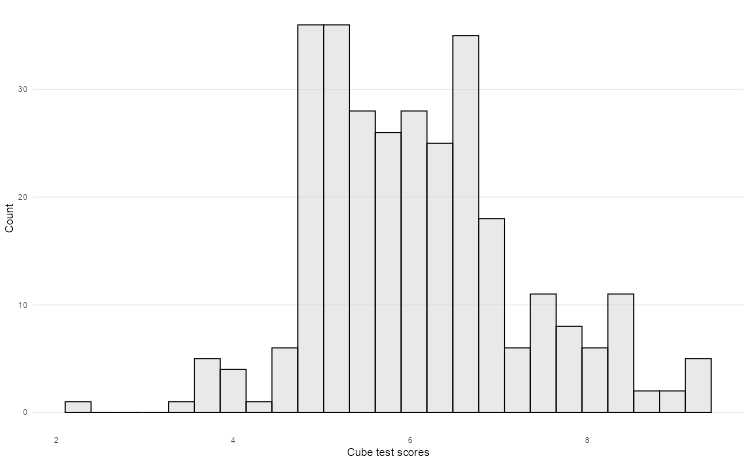
2.2 Bar graphs
We counted the number of students in different schools in the Holzinger-Swineford dataset. We can use ggplot to create a bar graph. We first need to specify what we want on the x and y axes, which constitute the first and second argument of the aes function.
Design Principles:
- Start from zero: Bar length represents magnitude, so truncated axes can mislead viewers about relative differences.
- Order thoughtfully: Arrange categories by frequency, alphabetically, or by meaningful progression rather than randomly.
- Minimize decoration: Remove unnecessary elements like 3D effects, heavy borders, or excessive grid lines that don’t aid comprehension.
- Consider orientation: Horizontal bars work better for long category names and make labels more readable.
👥 DESIGN EXERCISE:
Practice creating clean, focused bar charts. Consider when to use horizontal versus vertical orientation. Experiment with different ordering strategies and observe how they change the story your visualisation tells.
theme_bar <- function() {
  theme_minimal() +
    theme(
      panel.grid.minor = element_blank(),
      panel.grid.major.y = element_blank()
    )
}

hs_data |>
  as_tibble() |>
  count(school) |>
  ggplot(aes(n, school)) +
  geom_col() +
  theme_bar() +
  labs(x = "Number of students", y = "School")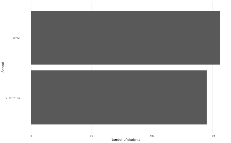
2.3 Scatter plots
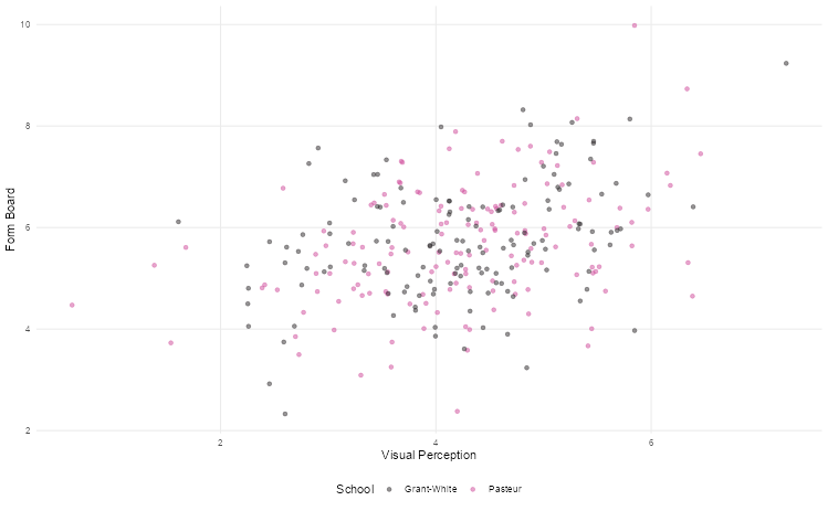
Scatter plots are the best way to graphically summarise the relationship between two quantitative variables. Suppose we wanted to explore the relationship between visual perception and form board test scores in the Holzinger-Swineford dataset. We can use a scatter plot to visualise this, distinguishing points by school using colour.
Effective Design Strategies:
- Handle overplotting: Use transparency, jittering, or smaller point sizes when dealing with many overlapping points.
- Scale appropriately: Consider log transformations for skewed data to reveal relationships that might be hidden in linear scales.
- Guide the eye: Clear axis labels and appropriate scales help viewers understand the relationship being shown.
- Show uncertainty: Consider adding trend lines or confidence intervals when appropriate to highlight patterns.
👥 DESIGN EXERCISE:
Explore how different transformations (log, square root) can reveal hidden patterns in your data. Practice using transparency effectively to handle overplotting while maintaining readability.
theme_scatter <- function() {
  theme_minimal() +
    theme(panel.grid.minor = element_blank(), legend.position = "bottom")
}

hs_data |>
  as_tibble() |>
  ggplot(aes(t01_visperc, t03_frmbord, colour = school)) +
  geom_jitter(alpha = 0.5) +
  theme_scatter() +
  scale_colour_cosmic() +
  labs(
    x = "Visual Perception",
    y = "Form Board",
    colour = "School"
  )
2.4 Line plots
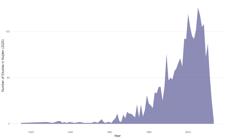
Line plots can be used to track parameters of interest over time. For this section, we’ll use the Nuijten et al (2020) dataset (nuijten2020) which contains longitudinal data to see how many studies were included in their meta-analysis over time.
Design Best Practices:
- Connect meaningfully: Only connect points where the progression between them is meaningful (typically time-based data).
- Choose appropriate styling: Dotted lines can suggest uncertainty or projection; solid lines imply measured data.
- Layer thoughtfully: Combining points with lines helps readers identify individual measurements while seeing the overall trend.
- Scale to show variation: Ensure your y-axis scale reveals meaningful variation without exaggerating minor fluctuations.
- Consider filled areas: Area charts can effectively show cumulative quantities or emphasize the magnitude of change, but use them judiciously.
👥 DESIGN EXERCISE:
Experiment with different line styles to convey different types of information. Consider when adding area fill enhances understanding versus when it creates confusion. Practice setting appropriate time axis intervals that match your data’s natural rhythm.
theme_line <- function() {
  theme_minimal() +
    theme(
      panel.grid.minor = element_blank(),
      panel.grid.major.x = element_blank()
    )
}

nuijten2020 |>
  as_tibble() |>
  count(year) |>
  ggplot(aes(year, n)) +
  geom_area(fill = "midnightblue", alpha = 0.5) +
  theme_line() +
  labs(x = "Year", y = "Number of Studies in Nuijten (2020)")
2.5 Box plots
Box plots are an excellent way to summarise the distribution of values across different strata over key quantities of interest (e.g. median, interquartile range). We can use the Holzinger-Swineford dataset to explore differences in test performance across different grades using box plots to graphically illustrate this.
Design Considerations:
- Handle extreme values: Log scales can be essential when comparing groups with very different ranges or when dealing with skewed data.
- Simplify visual elements: Remove unnecessary grid lines that don’t aid in reading values or making comparisons.
- Provide context: Clear group labels and axis titles help viewers understand what comparisons they’re making.
- Consider alternatives: Violin plots or strip charts might better serve your purpose when sample sizes are small or when showing full distributions is important.
👥 DESIGN EXERCISE:
Practice deciding when log transforms reveal meaningful patterns. Experiment with removing different grid elements to create cleaner, more focused visualisations.
theme_boxplot <- function() {
  theme_minimal() +
    theme(panel.grid = element_blank(), legend.position = "none")
}

hs_data |>
  as_tibble() |>
  ggplot(aes(as.factor(grade), t16_figrrecg)) +
  geom_boxplot(alpha = 0.75) +
  theme_boxplot() +
  scale_fill_bmj() +
  labs(x = "Grade", y = "Figure Recognition Scores")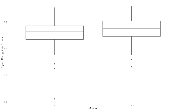
2.6 Density plots
Let’s look at another way of showing differences in the Holzinger-Swineford dataset, namely density plots. Although we cannot see exact quantities, we can get a better sense of how test scores are distributed across different groups (in this case, gender) in a more detailed manner.
Effective Design Elements:
- Transform when needed: Log scales can reveal patterns in skewed data that would be invisible on linear scales.
- Minimize visual noise: Reduce grid lines and other decorative elements that don’t contribute to understanding.
- Consider bandwidth: The smoothing parameter affects how much detail versus generalization your plot shows.
- Enable comparison: When showing multiple densities, use transparency and distinct colors to enable easy comparison.
👥 DESIGN EXERCISE:
Explore how different transformations affect the insights you can draw from density plots. Practice balancing detail with clarity by adjusting smoothing parameters.
theme_density <- function() {
  theme_minimal() +
    theme(panel.grid = element_blank(), legend.position = "bottom")
}

hs_data |>
  as_tibble() |>
  mutate(gender = if_else(female == 2, "female", "male")) |>
  ggplot(aes(t23_series, fill = gender)) +
  geom_density(alpha = 0.325) +
  theme_density() +
  scale_fill_lancet() +
  labs(x = "Series Completion Scores", y = "Density", fill = NULL)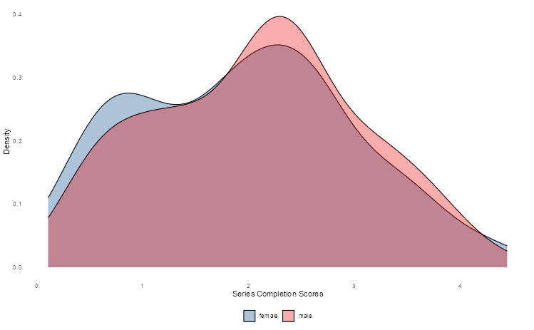
Universal Design Principles
Across all visualisation types, several principles enhance effectiveness:
Accessibility: Ensure your visualisations work for colorblind viewers and can be understood in black and white. Use patterns, shapes, and positioning alongside color.
Clarity: Every element should serve a purpose. Remove or de-emphasize anything that doesn’t directly contribute to understanding your data.
Context: Provide enough information for viewers to understand what they’re seeing without overwhelming them with unnecessary detail.
Consistency: Use consistent scales, colors, and styling across related visualisations to enable easy comparison.
Focus: Direct attention to the most important insights through strategic use of color, size, and positioning.
Remember: the goal of data visualisation is to facilitate understanding and insight, not to showcase technical capabilities. Always prioritize clarity and accessibility over visual complexity.