
used (Mb) gc trigger (Mb) max used (Mb)
Ncells 806715 43.1 1397725 74.7 1397725 74.7
Vcells 1589893 12.2 8388608 64.0 2839456 21.7✅ LSE DS202A 2025: Week 04 - Student Solutions
Here are the solutions for lab 4.
Downloading the student solutions
Click on the below button to download the student notebook.
Import required libraries:
library("ggsci")
library("tidymodels")
library("tidyverse")
library("kknn")
📋 Lab Tasks
Part I - Exploratory data analysis (20 min)
The first step is to load the dataset. In this lab, we will be using the diabetes dataset which contains health-related data. It includes variables associated with medical conditions, lifestyle factors and demographic information:
diabetes: indicates whether the individual has diabetes.high_bp: indicates whether the individual has high blood pressure.high_chol: indicates whether the individual has high cholesterol.chol_check: indicates whether the individual has had their cholesterol checked.bmi: represents the individual’s Body Mass Index.smoker: indicates whether the individual is a smoker.stroke: indicates whether the individual has had a stroke.heart_diseaseor_attack: indicates whether the individual has/had heart disease/attack.phys_activity: indicates whether the individual engages in physical activity.fruitsandveggies: indicate the consumption of fruits and vegetables.hvy_alcohol_consum: indicates heavy alcohol consumption.no_docbc_cost: refers to whether an individual was unable to see a doctor due to cost-related barriers.any_healthcare: indicates whether the individual has any form of healthcare.gen_hlth: indicates the individual’s self-reported general health.diff_walk: indicates whether the individual has difficulty walking of faces mobility challenges.sex: indicates the individual’s gender.age: represents the individual’s age.education: represents the individual’s education level.income: represents the individual’s income level.
diabetes_data <- read_csv("data/diabetes.csv")Question 1: Check the dimensions of the dataframe. Check whether there are any missing values.
diabetes_data

# A tibble: 25,368 × 20
   diabetes high_bp high_chol chol_check   bmi smoker stroke
      <dbl>   <dbl>     <dbl>      <dbl> <dbl>  <dbl>  <dbl>
 1        0       0         0          1    21      0      0
 2        0       1         1          1    28      0      0
 3        0       0         0          1    24      0      0
 4        0       0         0          1    27      1      0
 5        0       0         1          1    31      1      0
 6        0       1         1          1    33      0      0
 7        0       0         1          1    29      1      0
 8        0       0         1          1    27      1      0
 9        0       1         1          1    25      0      0
10        0       0         0          1    33      1      0
# ℹ 25,358 more rows
# ℹ 13 more variables: heart_diseaseor_attack <dbl>, phys_activity <dbl>,
#   fruits <dbl>, veggies <dbl>, hvy_alcohol_consump <dbl>, any_healthcare <dbl>,
#   no_docbc_cost <dbl>, gen_hlth <dbl>, diff_walk <dbl>, sex <dbl>, age <dbl>,
#   education <dbl>, income <dbl>
# ℹ Use `print(n = ...)` to see more rows
diabetes_data |>
  summarise(across(everything(), ~ sum(is.na(.x)))) |>
  glimpse()

Rows: 1
Columns: 20
$ diabetes               <int> 0
$ high_bp                <int> 0
$ high_chol              <int> 0
$ chol_check             <int> 0
$ bmi                    <int> 0
$ smoker                 <int> 0
$ stroke                 <int> 0
$ heart_diseaseor_attack <int> 0
$ phys_activity          <int> 0
$ fruits                 <int> 0
$ veggies                <int> 0
$ hvy_alcohol_consump    <int> 0
$ any_healthcare         <int> 0
$ no_docbc_cost          <int> 0
$ gen_hlth               <int> 0
$ diff_walk              <int> 0
$ sex                    <int> 0
$ age                    <int> 0
$ education              <int> 0
$ income <int> 0Challenge: What are the types of the variables in the dataset (continuous, discrete, categorical, ordinal)? Can you figure out how to convert them to the appropriate R data types efficiently?
age and bmi are continuous. high_bp,high_chol, chol_check,smoker, stroke, heart_diseaseor_attack,phys_activity,fruits,veggies, hvy_alcohol_consum, no_docbc_cost,any_healthcare, diff_walk and sex are categorical variables (binary). gen_hlth, education and income are categorical (ordinal) variables.
Step 1: Explore your data types
First, let’s see what we’re working with:
# Check current data types
glimpse(diabetes_data)

Rows: 25,368
Columns: 20
$ diabetes               <dbl> 0, 0, 0, 0, 0, 0, 0, 0, 0, 0, 0, 0, 0, 0, 0, 0, 0…
$ high_bp                <dbl> 0, 1, 0, 0, 0, 1, 0, 0, 1, 0, 0, 0, 0, 1, 0, 0, 0…
$ high_chol              <dbl> 0, 1, 0, 0, 1, 1, 1, 1, 1, 0, 0, 0, 0, 1, 0, 0, 0…
$ chol_check             <dbl> 1, 1, 1, 1, 1, 1, 1, 1, 1, 1, 1, 1, 1, 1, 1, 1, 1…
$ bmi                    <dbl> 21, 28, 24, 27, 31, 33, 29, 27, 25, 33, 27, 36, 3…
$ smoker                 <dbl> 0, 0, 0, 1, 1, 0, 1, 1, 0, 1, 1, 1, 1, 1, 1, 0, 0…
$ stroke                 <dbl> 0, 0, 0, 0, 0, 0, 0, 0, 0, 0, 0, 0, 0, 0, 0, 0, 0…
$ heart_diseaseor_attack <dbl> 0, 0, 0, 0, 0, 0, 0, 0, 0, 0, 0, 0, 0, 0, 0, 0, 0…
$ phys_activity          <dbl> 0, 1, 1, 1, 0, 0, 1, 0, 1, 1, 1, 0, 1, 0, 1, 0, 1…
$ fruits                 <dbl> 1, 1, 1, 0, 1, 1, 1, 0, 1, 1, 1, 0, 1, 1, 1, 0, 1…
$ veggies                <dbl> 1, 1, 1, 1, 1, 1, 1, 0, 1, 1, 1, 0, 1, 1, 1, 1, 1…
$ hvy_alcohol_consump    <dbl> 0, 0, 0, 1, 0, 0, 0, 0, 0, 0, 0, 0, 1, 1, 1, 0, 0…
$ any_healthcare         <dbl> 1, 1, 1, 1, 1, 0, 1, 1, 1, 1, 1, 1, 1, 1, 1, 1, 1…
$ no_docbc_cost          <dbl> 0, 0, 0, 0, 1, 0, 0, 0, 0, 0, 0, 0, 0, 0, 0, 0, 0…
$ gen_hlth               <dbl> 3, 3, 1, 2, 4, 4, 1, 3, 1, 2, 2, 3, 4, 2, 1, 2, 1…
$ diff_walk              <dbl> 0, 0, 0, 0, 1, 0, 0, 0, 0, 0, 0, 0, 0, 0, 0, 0, 0…
$ sex                    <dbl> 0, 0, 1, 1, 0, 0, 1, 1, 1, 1, 0, 1, 0, 0, 1, 1, 0…
$ age                    <dbl> 7, 13, 1, 2, 8, 7, 10, 10, 8, 8, 10, 7, 1, 11, 3,…
$ education              <dbl> 4, 6, 4, 4, 3, 3, 6, 4, 6, 5, 6, 4, 6, 6, 5, 4, 5…
$ income                 <dbl> 2, 6, 7, 7, 2, 6, 8, 8, 8, 8, 8, 6, 7, 8, 6, 8, 6…

# Or try:
# str(diabetes_data)
# sapply(diabetes_data, class)
Step 2: Classify your variables
Look at each variable and think about what type it should be:
- Continuous variables (can take any value in a range) → should be
numeric - Discrete variables (whole numbers, counts, scales) → should be
integer - Categorical variables (distinct categories, yes/no) → should be
factor
🤔 Think about it: Which variables in your dataset fall into each category?
Step 3: Transform efficiently
Here’s your challenge: Can you convert multiple variables at once without writing separate mutate() statements for each one?
continuous_vars <- c("age", "bmi")
discrete_vars <- c("gen_hlth", "education", "income")
categorical_vars <- c(
  "diabetes",
  "high_bp",
  "high_chol",
  "chol_check",
  "smoker",
  "stroke",
  "heart_diseaseor_attack",
  "phys_activity",
  "fruits",
  "veggies",
  "hvy_alcohol_consump",
  "any_healthcare",
  "no_docbc_cost",
  "diff_walk",
  "sex"
)

diabetes_data <-
  diabetes_data |>
  mutate(
    across(all_of(continuous_vars), ~ as.numeric(.x)),
    across(all_of(discrete_vars), ~ as.integer(.x)),
    across(all_of(categorical_vars), ~ as.factor(.x))
  )
Step 4: Check your work
After your transformations, your data should look something like this:
> diabetes_data |> head(10) |> glimpse()
Rows: 10
Columns: 20
$ diabetes               <fct> 0, 0, 0, 0, 0, 0, 0, 0, 0, 0
$ high_bp                <fct> 0, 1, 0, 0, 0, 1, 0, 0, 1, 0
$ high_chol              <fct> 0, 1, 0, 0, 1, 1, 1, 1, 1, 0
$ chol_check             <fct> 1, 1, 1, 1, 1, 1, 1, 1, 1, 1
$ bmi                    <dbl> 21, 28, 24, 27, 31, 33, 29, 27, 25, 33
$ smoker                 <fct> 0, 0, 0, 1, 1, 0, 1, 1, 0, 1
$ stroke                 <fct> 0, 0, 0, 0, 0, 0, 0, 0, 0, 0
$ heart_diseaseor_attack <fct> 0, 0, 0, 0, 0, 0, 0, 0, 0, 0
$ phys_activity          <fct> 0, 1, 1, 1, 0, 0, 1, 0, 1, 1
$ fruits                 <fct> 1, 1, 1, 0, 1, 1, 1, 0, 1, 1
$ veggies                <fct> 1, 1, 1, 1, 1, 1, 1, 0, 1, 1
$ hvy_alcohol_consump    <fct> 0, 0, 0, 1, 0, 0, 0, 0, 0, 0
$ any_healthcare         <fct> 1, 1, 1, 1, 1, 0, 1, 1, 1, 1
$ no_docbc_cost          <fct> 0, 0, 0, 0, 1, 0, 0, 0, 0, 0
$ gen_hlth               <int> 3, 3, 1, 2, 4, 4, 1, 3, 1, 2
$ diff_walk              <fct> 0, 0, 0, 0, 1, 0, 0, 0, 0, 0
$ sex                    <fct> 0, 0, 1, 1, 0, 0, 1, 1, 1, 1
$ age                    <dbl> 7, 13, 1, 2, 8, 7, 10, 10, 8, 8
$ education              <int> 4, 6, 4, 4, 3, 3, 6, 4, 6, 5
$ income                 <int> 2, 6, 7, 7, 2, 6, 8, 8, 8, 8
Discussion questions:
- What’s the advantage of converting categorical variables to factors?
Advantages of Converting Categorical Variables to Factors
Converting categorical variables to factors in R ensures proper model behavior for both logistic regression and k-NN:
1. Correct encoding: Factors are automatically converted to dummy variables in logistic regression, preventing R from treating categories as ordered numeric values (e.g., preventing the model from assuming category “3” is three times category “1”).
2. Proper distance calculations for k-NN: When factors are dummy-encoded, k-NN calculates distances correctly. Without factor conversion, k-NN treats categorical values as numeric, creating artificial ordering and incorrect distance metrics.
3. tidymodels compatibility: Recipe steps like step_dummy() and step_normalize() rely on factor status to distinguish categorical from numeric variables, ensuring only appropriate transformations are applied to each variable type.
4. Reference level control: Factors allow explicit control over which category serves as the baseline for model coefficients, improving interpretability.
Without factor conversion, models may produce incorrect results by treating categorical variables as continuous numeric predictors.
- Why might you want discrete variables as integers vs. numeric?
- How would you handle this if you had 50+ variables to transform?
Ask Claude for help!
Once you’ve attempted this challenge, ask Claude: “Can you show me the most efficient tidyverse way to transform multiple variables by type? What are the best practices for variable type conversion?”
Best practices to discover:
- 🎯 Efficiency: Transform multiple variables at once
- 🎯 Clarity: Group variables by their intended type
- 🎯 Reproducibility: Make your transformations explicit and documented
- 🎯 Validation: Always check your results with
glimpse()orstr()
Exploring the diabetes dataset: EDA challenge (15 minutes) 🎯 YOUR TURN TO EXPLORE! Now that you’ve transformed your variables, it’s time to dig into the data and uncover some interesting patterns. Your mission: Create 2-3 visualizations or summaries that reveal something interesting about diabetes and related health factors. Some ideas to spark your curiosity:
What’s the distribution of diabetes in the dataset? How does BMI relate to diabetes status? Are there age patterns in diabetes prevalence? Do lifestyle factors (smoking, physical activity, diet) show interesting relationships? What about the relationship between income/education and health outcomes? Are there gender differences in any of the health measures? How do different health conditions cluster together?
Distribution of diabetes
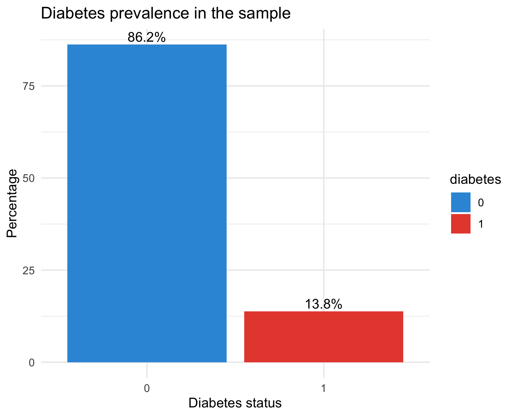
diabetes_data %>%
  count(diabetes) %>%
  mutate(pct = n / sum(n) * 100) %>%
  ggplot(aes(x = diabetes, y = pct, fill = diabetes)) +
  geom_col() +
  geom_text(aes(label = sprintf("%.1f%%", pct)), vjust = -0.3) +
  scale_fill_manual(values = c("#3498db", "#e74c3c")) +
  labs(title = "Diabetes prevalence in the sample",
       x = "Diabetes status", y = "Percentage") +
  theme_minimal()
There are way fewer cases of diabetes in the dataset than there are healthy samples: our dataset has class imbalance
Diabetes prevalence per age group
diabetes_data %>%
  group_by(age) %>%
  summarise(prev = mean(as.numeric(diabetes) == 2, na.rm = TRUE)) %>%
  ggplot(aes(x = age, y = prev)) +
  geom_line(color = "#2c3e50") +
  geom_point(color = "#e74c3c") +
  scale_y_continuous(labels = scales::percent) +
  labs(title = "Diabetes prevalence by age group",
       x = "Age group (coded)", y = "Prevalence") +
  theme_minimal()
Diabetes prevalence increases steadily with age. The slight dip in the highest ages could be due to two reasons:
The last two age codes may represent the oldest-old (where the healthiest survive → selection bias).
Sample sizes at high ages might be small.
Prevalence per physical activity level
# Physical activity vs diabetes
diabetes_data %>%
  group_by(phys_activity) %>%
  summarise(prev = mean(as.numeric(diabetes) == 2, na.rm = TRUE)) %>%
  ggplot(aes(x = phys_activity, y = prev, fill = phys_activity)) +
  geom_col() +
  scale_y_continuous(labels = scales::percent) +
  labs(title = "Diabetes prevalence by physical activity",
       x = "Physically active", y = "Prevalence") +
  theme_minimal()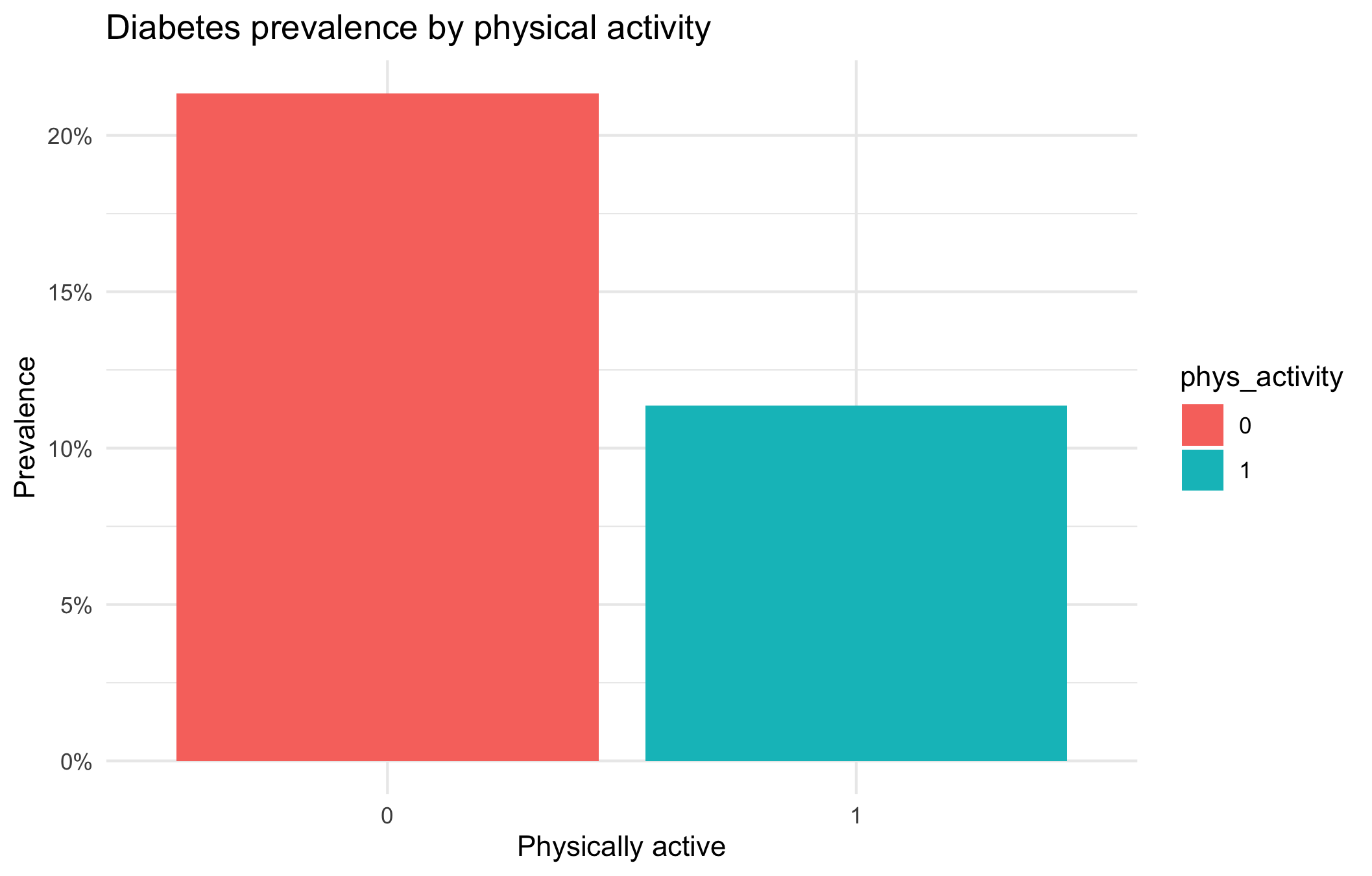
The bar plot illustrates the relationship between physical activity and diabetes prevalence. Individuals who are not physically active (phys_activity = 0) show a higher prevalence of diabetes (approximately 21%), whereas those who are physically active (phys_activity = 1) exhibit a lower prevalence (around 11%).
This indicates that physical activity is associated with a reduced prevalence of diabetes. In other words, individuals who engage in regular physical activity are less likely to have diabetes compared to those who are inactive.
It is important to note that this analysis demonstrates an association rather than causation. Other factors such as age, body mass index (BMI), diet, and socioeconomic status may also contribute to the observed difference in diabetes prevalence.
Diabetes prevalence per gender
# Diabetes prevalence by sex
diabetes_data %>%
  group_by(sex) %>%
  summarise(prev = mean(as.numeric(diabetes) == 2, na.rm = TRUE)) %>%
  ggplot(aes(x = sex, y = prev, fill = sex)) +
  geom_col() +
  scale_y_continuous(labels = scales::percent) +
  labs(title = "Diabetes prevalence by sex",
       x = "Sex", y = "Prevalence") +
  theme_minimal()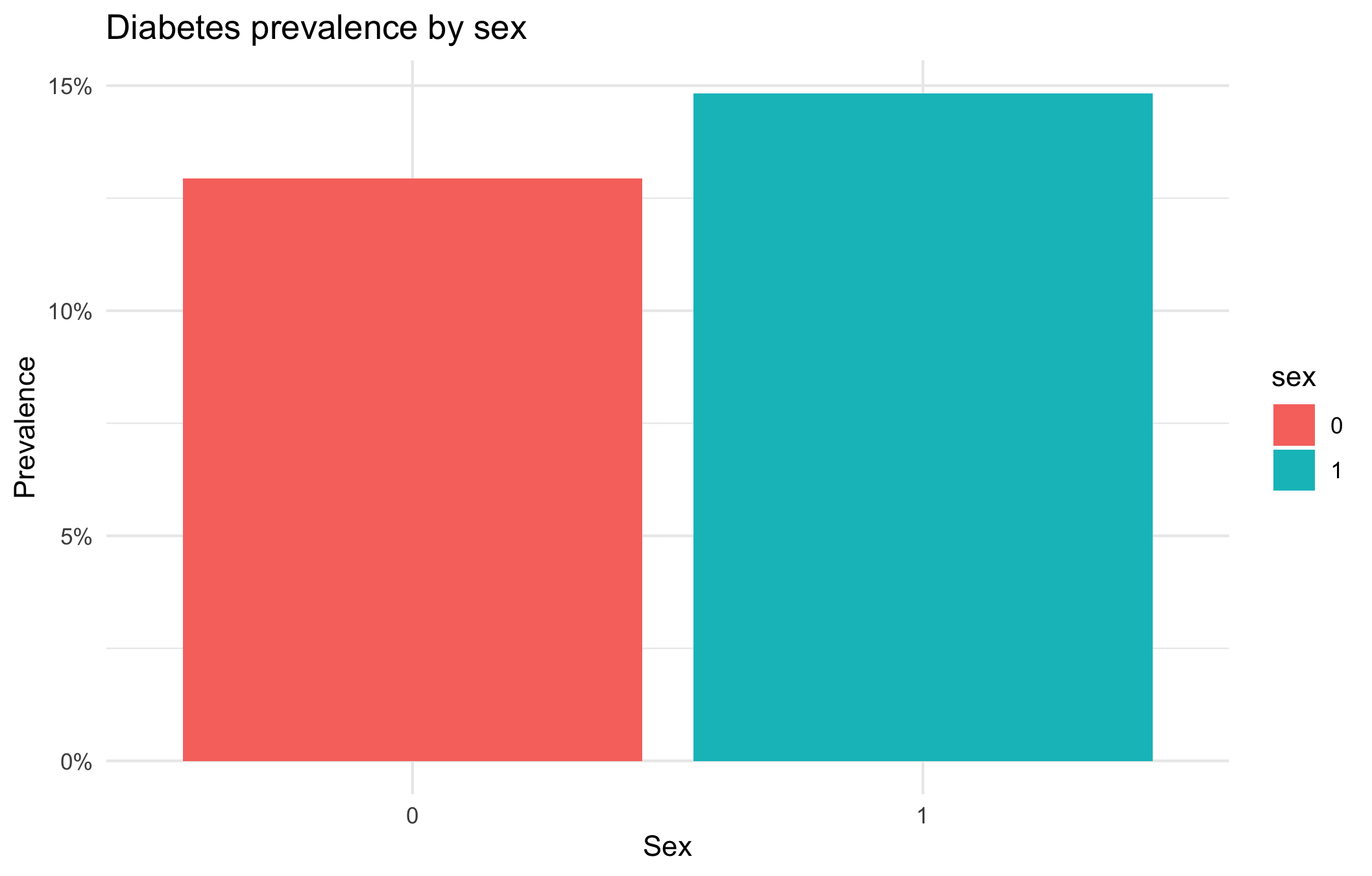
The prevalence of diabetes is slightly higher in women (could be due to the fact that they tend to live longer).
Correlations between comorbidities
# Select binary health indicators and compute correlations
health_vars <- diabetes_data %>%
select(diabetes, high_bp, high_chol, stroke,
heart_diseaseor_attack, diff_walk)
# Convert to numeric (0/1)
health_num <- health_vars %>%
mutate(across(everything(), ~ as.numeric(.) - 1))
corr_matrix <- cor(health_num, use = "pairwise.complete.obs")
# Visualise
library(reshape2)
corr_matrix %>%
melt() %>%
ggplot(aes(x = Var1, y = Var2, fill = value)) +
geom_tile() +
geom_text(aes(label = round(value, 2)), color = "white") +
scale_fill_gradient2(low = "#3498db", high = "#e74c3c", mid = "white", midpoint = 0) +
labs(title = "Correlation of chronic health conditions",
x = "", y = "", fill = "Correlation") +
theme_minimal() +
theme(axis.text.x = element_text(angle = 45, hjust = 1))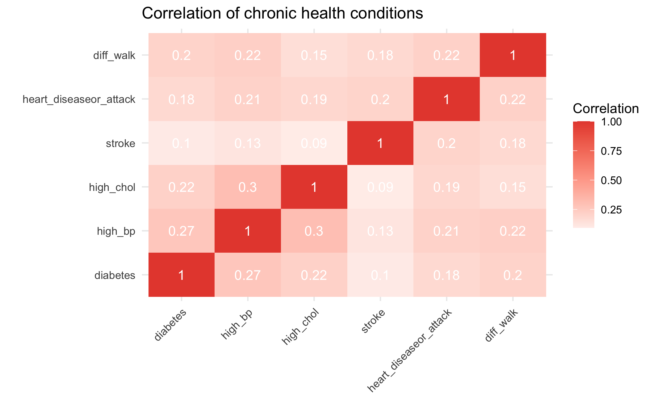 Chronic conditions cluster moderately: diabetes, hypertension, and high cholesterol frequently co-occur, reflecting shared metabolic and lifestyle risk factors.
Class discussion
We’ll share some of the most interesting findings and discuss:
What patterns surprised you the most?
What questions do your findings raise?
How might these insights inform public health strategies?
What additional data would help explain these patterns?
Part II - Fitting a logistic regression
We want to perform a logistic regression using the available variables in the dataset to predict whether an individual has diabetes.
👨🏻🏫 TEACHING MOMENT: Your class teacher will formalize the logistic regression in the context of the data at our disposal.
Now, we need to split the data into training and testing sets. Having a test set will help us evaluate how well the model generalizes.
In the training phase, we will use part of the data to fit the logistic regression model.
In the testing phase, we will assess the model’s performance on the remaining data (test set) which was not used during training.
Question 1: Why can’t we rely solely on the model’s performance on the training set to evaluate its ability to generalize?
We can’t rely solely on a model’s performance on the training set because that performance reflects how well the model fits the data it has already seen — not how well it will perform on new, unseen data.
A model that performs very well on the training set may have overfit, meaning it has learned noise or idiosyncrasies specific to that dataset rather than general patterns. As a result, it will likely perform poorly when applied to new samples from the same population.
To properly assess generalization, we need to evaluate the model on data not used during training — typically through a validation or test set, or by using techniques like cross-validation.
Question 2: Split the dataset into training and testing sets using 75% of the data for training and 25% for testing.
set.seed(123)

split_grid <- initial_split(diabetes_data, prop = 0.75, strata = diabetes)
train <- training(split_grid)
test <- testing(split_grid)💡Tip: When using initial_split try specifying strata = diabetes. This ensures that the training and test sets will have identical proportions of the outcome.
Challenge: Can you figure out how to fit a logistic regression model using the tidymodels framework?
Hint: Look back at the lasso section from Lab 3 - you’ll need to modify that approach. Think about: - What type of model specification do you need for logistic regression? - What engine should you use? - How do you fit the model to your training data?
model <-
  logistic_reg() |>
  fit(diabetes ~ ., data = train)
Question 3: Should all variables be included in the model? How might you decide?
Not necessarily.
Including every available variable in a classification model can hurt performance rather than help it.
Irrelevant or highly correlated predictors can add noise, increase multicollinearity, and make model coefficients unstable.
This may lead to overfitting — where the model fits the training data well but performs poorly on new data.
Deciding which variables to include usually involves a mix of:
Theoretical reasoning: include predictors that are expected (based on prior evidence or domain knowledge) to affect the outcome.
Empirical validation: use tools such as cross-validation, AIC/BIC, or regularization (e.g., LASSO) to identify variables that improve predictive performance without unnecessary complexity.
Practical considerations: avoid variables that are redundant, poorly measured, or unavailable in future prediction settings.
The goal is a model that is parsimonious, stable, and generalizes well — not one that simply maximizes fit on the training data.
Question 4: Once you have your model fitted, try to generate predictions and evaluate performance. How do you interpret logistic regression coefficients differently from linear regression?
summary(model$fit)

Call:
stats::glm(formula = diabetes ~ ., family = stats::binomial,
    data = data)

Coefficients:
                         Estimate Std. Error z value Pr(>|z|)
(Intercept)             -7.534466   0.334759 -22.507  < 2e-16 ***
high_bp1                 0.828299   0.055054  15.045  < 2e-16 ***
high_chol1               0.657774   0.050809  12.946  < 2e-16 ***
chol_check1              1.028935   0.244147   4.214 2.50e-05 ***
bmi                      0.060443   0.003311  18.253  < 2e-16 ***
smoker1                 -0.077750   0.048463  -1.604   0.1086
stroke1                  0.060800   0.093133   0.653   0.5139
heart_diseaseor_attack1  0.274445   0.065499   4.190 2.79e-05 ***
phys_activity1          -0.045627   0.052866  -0.863   0.3881
fruits1                 -0.112121   0.049981  -2.243   0.0249 *
veggies1                -0.072613   0.058018  -1.252   0.2107
hvy_alcohol_consump1    -0.983620   0.152806  -6.437 1.22e-10 ***
any_healthcare1          0.031944   0.120491   0.265   0.7909
no_docbc_cost1           0.061150   0.082576   0.741   0.4590
gen_hlth                 0.507024   0.027349  18.539  < 2e-16 ***
diff_walk1              -0.066814   0.061151  -1.093   0.2746
sex1                     0.230670   0.049621   4.649 3.34e-06 ***
age                      0.125081   0.010148  12.326  < 2e-16 ***
education               -0.027124   0.025683  -1.056   0.2909
income                  -0.053043   0.013027  -4.072 4.67e-05 ***
---
Signif. codes:  0 ‘***’ 0.001 ‘**’ 0.01 ‘*’ 0.05 ‘.’ 0.1 ‘ ’ 1

(Dispersion parameter for binomial family taken to be 1)

    Null deviance: 15250  on 19024  degrees of freedom
Residual deviance: 11965  on 19005  degrees of freedom
AIC: 12005

Number of Fisher Scoring iterations: 6👨🏻🏫 CLASS DISCUSSION: We’ll discuss model interpretation together:
- How do we read logistic regression output?
- What do the coefficients represent?
- How do p-values help us understand variable importance?
- What metrics should we use to evaluate classification performance?
1️⃣ How do we read logistic regression output?
Each row in the output corresponds to one predictor.
- The Estimate column shows how that variable affects the log-odds of the outcome (here, having diabetes).
- The Std. Error quantifies uncertainty in that estimate.
- The z value and Pr(>|z|) (p-value) test whether the coefficient differs significantly from zero.
For example, the positive coefficient for bmi (0.06) means that as BMI increases, the log-odds of having diabetes increase — holding all other variables constant.
Model-level metrics such as deviance and AIC summarize overall fit — lower AIC generally indicates a better-fitting model among alternatives.
2️⃣ What do the coefficients represent?
Each coefficient represents the change in the log-odds of diabetes associated with a one-unit increase in the predictor, holding other variables fixed.
Exponentiating the coefficient gives the odds ratio (OR): \[ \text{OR} = e^{\text{Estimate}} \]
- If OR > 1 → the variable increases the odds of diabetes.
- If OR < 1 → the variable decreases the odds.
Examples:
bmi= 0.060 → OR = exp(0.060) ≈ 1.06 → each unit increase in BMI raises odds of diabetes by about 6%.hvy_alcohol_consump1= −0.98 → OR ≈ 0.37 → heavy drinkers have roughly 63% lower odds of diabetes (holding other factors constant).
3️⃣ How do p-values help us understand variable importance?
The p-value tests the null hypothesis that a coefficient = 0 (no effect).
- Small p-values (typically < 0.05) suggest the variable is statistically associated with diabetes after adjusting for other predictors.
- Large p-values mean the evidence for an effect is weak.
In this model, variables such as high_bp, bmi, gen_hlth, and age have very small p-values → strong evidence they are important predictors. However, p-values do not measure practical importance or predictive contribution — only statistical evidence.
For prediction tasks, effect size (odds ratio) and validation metrics are better indicators of variable usefulness.
4️⃣ What metrics should we use to evaluate classification performance?
Since the diabetes data is imbalanced (fewer positives than negatives), accuracy is misleading. We should focus on metrics that account for imbalance:
| Metric | What it measures | When to use |
|---|---|---|
| Confusion matrix | Counts of TP, FP, FN, TN | Always a good diagnostic |
| Precision / Recall / F1-score | Trade-off between false positives and false negatives | When positive class is rare (e.g. diabetes) |
| ROC curve & AUC | Discrimination ability across all thresholds | General evaluation of ranking ability |
| Precision–Recall AUC | Performance on rare positive classes | Especially useful under strong imbalance |
| Calibration curve | How well predicted probabilities reflect true risk | For risk modelling or interpretability |
Also compare training vs validation performance to detect overfitting.
✅ Summary takeaway
- Logistic regression coefficients describe changes in log-odds, interpretable via odds ratios.
- p-values test statistical significance but not predictive power.
- Evaluate classification using AUC, precision–recall, and F1, not accuracy, especially with class imbalance.
- Always validate performance on unseen data before interpreting or deploying the model.
Quick explanation of calibration curve
Calibration curve — what it is and why it matters
A calibration curve (or reliability plot) checks whether the predicted probabilities from your model actually match observed frequencies in the data.
For a well-calibrated model:
Among all individuals predicted to have a 0.7 (70%) chance of diabetes, about 70% should actually have diabetes.
In practice:
Divide the predictions into bins (e.g., 0–0.1, 0.1–0.2, …, 0.9–1.0).
For each bin, compute:
- Mean predicted probability
- Observed proportion of positives (actual diabetes cases)
Plot observed proportions (y-axis) vs predicted probabilities (x-axis).
- A perfectly calibrated model lies on the 45° line (predicted = observed).
- If the curve lies below the line → the model overestimates risk.
- If the curve lies above the line → the model underestimates risk.
Why it’s important
- Logistic regression is often well-calibrated by design, unlike some machine learning models (e.g. random forests, SVMs, XGBoost - which we’ll see in Week 5), which may be overconfident.
- Calibration is crucial for risk communication (e.g., “This patient has a 30% probability of diabetes”) and for decision thresholds (e.g., when to intervene).
- A model can have a high AUC (good ranking ability) but poor calibration (bad probabilities).
In R (example)
library(ggplot2)
library(dplyr)

# Suppose your model is `model_logit`
diabetes_data <- diabetes_data %>%
  mutate(
    pred_prob = predict(model_logit, type = "response"),
    bin = cut(pred_prob, breaks = seq(0, 1, 0.1))
  ) %>%
  group_by(bin) %>%
  summarise(
    mean_pred = mean(pred_prob),
    obs_rate = mean(diabetes)
  )

ggplot(diabetes_data, aes(x = mean_pred, y = obs_rate)) +
  geom_line(color = "#3498db") +
  geom_abline(intercept = 0, slope = 1, linetype = "dashed", color = "gray40") +
  labs(
    title = "Calibration Curve for Diabetes Model",
    x = "Mean predicted probability",
    y = "Observed proportion of diabetes"
  ) +
  coord_equal() +
  theme_minimal()
✅ Takeaway
Calibration shows whether your predicted probabilities are trustworthy, not just whether they rank cases correctly.
Part III - Evaluation
Question 1: We are going to generate predictions on the training and testing set using our logistic regression model.
# Generate predictions on the training set
train_preds <-
  model |>
  augment(new_data = train, type.predict = "response", data = diabetes_data)

# Generate predictions on the testing set
test_preds <-
  model |>
augment(new_data = test, type.predict = "response", data = diabetes_data)💡Tip: When using augment for logistic regression, specify type.predict = "response".
Question 2: Copy and paste pull(test_preds, .pred_1)[1:10] into the console and hit enter to get the first ten predictions for the test set. The model’s predictions are scores ranging between 0 and 1 while the target variable diabetes is binary and takes only the values 0 or 1. How can we use the predictions to classify whether an individual has diabetes?
pull(test_preds, .fitted)[1:10]*The model’s predictions are probabilities that an individual has diabetes (values between 0 and 1).
To make binary classifications, we choose a threshold — commonly 0.5:*
*If the predicted probability ≥ 0.5 → classify as having diabetes (1);
otherwise → classify as not having diabetes (0).*
This converts probabilities into class labels, allowing comparison with the observed outcomes.
*However, if the dataset is imbalanced (as it is here, with relatively few diabetes cases), 0.5 may not be the optimal cutoff.
We can adjust the threshold based on the ROC curve or precision–recall trade-off to balance sensitivity (recall for positives) and specificity (true negatives).*
Question 3: We are going to set a threshold of 0.5. All scores higher than 0.5 will be classified as 1 (diabetes) and scores of 0.5 or lower will be classified as 0 (no diabetes).
# Convert predicted scores to binary outcomes for the training set
train_preds <-
  train_preds |>
  mutate(.pred_class = as.factor(if_else(.pred_1 > 0.5, 1, 0)))

# Convert predicted scores to binary outcomes for the testing set
test_preds <-
  test_preds |>
  mutate(.pred_class = as.factor(if_else(.pred_1 > 0.5, 1, 0)))
Question 4: Let’s create a confusion matrix to see how well our model performs:
train_preds |>
  conf_mat(truth = diabetes, estimate = .pred_class)

          Truth
Prediction     0     1
         0 16049  2215
         1   356   405
test_preds |>
  conf_mat(truth = diabetes, estimate = .pred_class)

          Truth
Prediction    0    1
         0 5363  738
         1  106  136
Question 5: Table discussion
- How would you evaluate whether this model is good or bad?
We evaluate model quality by comparing predicted vs actual outcomes using performance metrics derived from the confusion matrix.
From the test confusion matrix:
| Metric | Formula | Value | Interpretation |
|---|---|---|---|
| Accuracy | (TP + TN) / Total | (136 + 5363) / (136 + 738 + 106 + 5363) = 0.86 | High overall accuracy, but misleading due to imbalance |
| Sensitivity (Recall) | TP / (TP + FN) | 136 / (136 + 738) = 0.16 | Detects only ~16% of diabetics |
| Specificity | TN / (TN + FP) | 5363 / (5363 + 106) = 0.98 | Excellent at identifying non-diabetics |
| Precision (PPV) | TP / (TP + FP) | 136 / (136 + 106) = 0.56 | Of predicted diabetics, ~56% actually diabetic |
| F1-score | Harmonic mean of precision and recall | ≈ 0.25 | Balances both — relatively low |
Interpretation
- The model is highly conservative — it rarely predicts “diabetic,” which yields high specificity but poor recall.
- This makes it unsuitable for screening, where missing positive cases (false negatives) can have serious consequences.
- However, its high specificity could be valuable if we want to flag only the most certain cases for further testing.
- The ROC AUC or PR AUC should also be checked to see if performance improves with a different threshold.
✅ Takeaway
The model appears “good” in accuracy but bad at identifying diabetics — it overfits to the majority class. For imbalanced health data, we should assess recall, precision, F1, AUC, and possibly adjust the classification threshold or rebalance the data to improve sensitivity.
To judge whether the model is “good”:
- Check overall accuracy (if and only if your dataset is not imbalanced as this metric is overinflated and misleading in the case of imbalance!).
- Examine sensitivity (recall) and specificity to assess trade-offs.
- Compute AUC (ROC or PR) for threshold-independent performance.
- Consider calibration — do predicted probabilities reflect real risks?
If the goal is screening or early detection, the model’s low sensitivity means it would miss too many diabetics → not good enough for that purpose. If the goal is just to flag high-confidence positives, performance might be acceptable but needs improvement.
Discuss with your table partners:
- What does each cell in the confusion matrix represent?
- What would make you confident in this model?
- What concerns might you have?
- How might the consequences of false positives vs false negatives differ in a medical context?
Class Discussion: We’ll discuss what these different metrics mean and when each might be most important.
Understanding threshold impacts on precision, recall, and F1-score
Question 6: What is the problem with setting an arbitrary threshold α=0.8? How should we expect the precision and the recall to behave if we increase the threshold α? If we decrease α?
First of all, we need to consider how balanced our data are between different classes in the outcome. If we plot the distribution of predictions of diabetes, for example, very few observations have a probability of above 0.5, let alone 0.8! This will result in recall being very low. However, setting the threshold too low will result in reduced precision as more individuals with a low probability of having diabetes will nevertheless be classified as such.
Question 7: Compute the precision, recall, and F1-score for the test set for different values of the threshold α. Compute them for α ∈ {0.1, 0.2, 0.3, 0.4, 0.5, 0.6, 0.7}.
# Create a list of probability thresholds
alpha_list <- c(0.1, 0.2, 0.3, 0.4, 0.5, 0.6, 0.7)

# Define our metric set with precision, recall, and F1-score
class_metrics <- metric_set(precision, recall, f_meas)
class_metrics <- partial(
  class_metrics,
  event_level = "second"
)

ev_metrics <- map_dfr(
  alpha_list,
  ~ augment(model, new_data = test) |>
    mutate(.pred = as.factor(if_else(.pred_1 > .x, "1", "0"))) |>
    class_metrics(truth = diabetes, estimate = .pred) |>
    mutate(alpha = .x), # Add the actual alpha value
  .id = NULL # Remove the automatic ID column
)
Visualizing performance across thresholds
Question 8: Create a plot that shows performance over different thresholds, using colour to distinguish between the different evaluation metrics (precision, recall, F1-score).
ev_metrics |>
  ggplot(aes(alpha, .estimate, colour = .metric)) +
  geom_line(linetype = "dashed") +
  geom_point() +
  scale_colour_uchicago() +
  labs(
    x = "Probability threshold",
    y = "Evaluation metric estimate",
    colour = "Evaluation metric"
  ) +
  theme(legend.position = "right")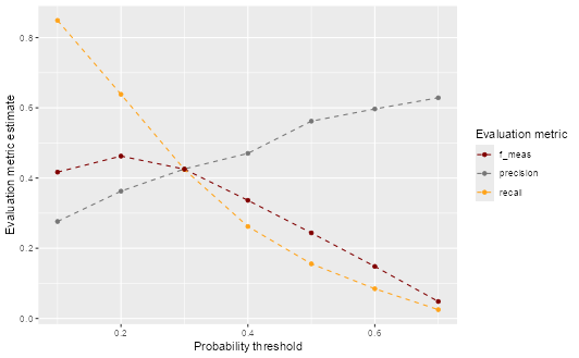
Creating a precision-recall curve
Question 9: Based on the precision and recall values you calculated, create a precision-recall plot to visualize the relationship between these two metrics. How does the shape of the precision-recall curve help you assess model performance? What trade-offs do you observe between precision and recall?
ev_metrics |>
  filter(.metric %in% c("precision", "recall")) |>
  pivot_wider(
    id_cols = alpha,
    names_from = .metric,
    values_from = .estimate
  ) |>
  ggplot(aes(x = recall, y = precision)) +
  geom_point(color = "turquoise4") +
  geom_text(
    aes(label = paste0("α = ", alpha)),
    position = position_nudge(x = -0.045)
  ) +
  geom_line(linetype = "dashed", color = "turquoise4") +
  labs(x = "Recall", y = "Precision", title = "Precision-Recall Curve")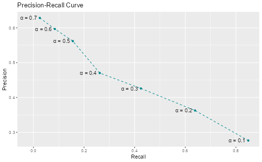
The precision-recall curve shows the fundamental trade-off between these two metrics. As we lower the threshold to catch more positive cases (higher recall), we also classify more false positives (lower precision). The curve helps us visualize this trade-off and choose an appropriate threshold based on our priorities.
Part IV - Cross-validation
In this part, we will explore a technique often used in Machine Learning to evaluate the performance and generalizability of our models. Cross-validation is often used to get a better estimation of the model’s performance on new data (test set).
💡Tip: We have been creating a lot of objects that, in turn, have used up a lot of memory. It is worth, sometimes, removing the objects we have no use for anymore. We can then use gc() (“garbage collection” 😂) which can then help free up memory in RStudio.
The idea of \(k\)-fold cross validation is to split a dataset into a training set and testing set (just as we did previously), then to split the training set into \(k\) folds.
👨🏻🏫 TEACHING MOMENT: Your class teacher will give more details on how cross-validation works and what its purpose is.
Challenge: Can you figure out how to perform leave-one-out cross-validation using tidymodels?
Important: Sample only 500 observations from your training data - leave-one-out CV on the full dataset would take too long!
Hints:
- Check the tidymodels documentation for leave-one-out cross-validation functions
- Look for functions starting with
loo_ - You’ll need to create resamples, fit models to each fold, and evaluate performance
set.seed(123)

# Sample 500 observations for computational efficiency
train_sample <- slice_sample(train, n = 500)

# Create leave one out resamples

loocv <- loo_cv(train_sample)

# Instantiate a logistic regression model

logit <- logistic_reg()

# Register multiple cores

doParallel::registerDoParallel()

# Create a nested tibble of fitted models

loocv_fit <-
  loocv |>
  mutate(
    train = map(splits, ~ training(.x)),
    holdout = map(splits, ~ testing(.x)),
    fit = map(train, ~ fit(logit, diabetes ~ ., data = .x))
  )

# Apply the model to the training data

loocv_preds <-
  loocv_fit |>
  mutate(preds = map2(fit, holdout, ~ augment(.x, new_data = .y)))

# Unnest the predictions and calculate evaluation metrics

loocv_preds |>
  unnest(preds) |>
  class_metrics(truth = diabetes, estimate = .pred_class)

# A tibble: 3 × 3
  .metric   .estimator .estimate
  <chr>     <chr>          <dbl>
1 precision binary         0.429
2 recall    binary         0.158
3 f_meas    binary         0.231
Resources: - Leave-one-out cross-validation documentation - Look specifically for the loo_cv() function
Questions to think about:
- Why do we use cross-validation instead of just train/test splits?
- What are the advantages and disadvantages of leave-one-out CV?
- How does the CV performance compare to your single train/test split?
1️⃣ Why do we use cross-validation instead of just train/test splits?
A single train/test split gives only one estimate of model performance, which can vary depending on how the data were divided. If the sample is small or imbalanced, this estimate can be unstable or misleading — some splits may be “lucky” or “unlucky.”
Cross-validation (CV) reduces this variance by repeatedly splitting the data into multiple folds, training on some and testing on others. Each observation is used for both training and validation, ensuring a fairer and more reliable performance estimate.
Key benefits:
- Uses data more efficiently (especially when sample size is limited).
- Provides a more stable estimate of generalization error.
- Helps with model selection (choosing parameters or algorithms) based on consistent out-of-sample results.
2️⃣ What are the advantages and disadvantages of leave-one-out CV (LOOCV)?
Advantages:
- Uses almost all data for training in each iteration (n−1 observations).
- Provides an almost unbiased estimate of the true generalization error.
- No randomness from fold assignment — results are deterministic.
Disadvantages:
- Computationally expensive — fits the model n times (often infeasible for large datasets).
- High variance: each training set is very similar to the full dataset, so the validation results are highly correlated — estimates fluctuate a lot.
- Often, k-fold CV (e.g. k = 5 or 10) gives a better bias–variance trade-off.
3️⃣ How does the CV performance compare to your single train/test split?
Cross-validation performance is usually a more stable and trustworthy estimate of model generalization than a single train/test split.
In the diabetes classification context:
- If the CV performance (e.g., AUC or F1-score) is similar to your test-set performance → your train/test split was representative, and the model generalizes well.
- If CV gives lower scores → your single split probably overestimated performance (you got a lucky split).
- If CV gives higher scores → the test split may have been unusually difficult or unbalanced.
The key point: Cross-validation reduces dependence on one arbitrary split and gives a mean performance estimate with variability, helping you judge model stability.
✅ Takeaway
| Concept | Main idea |
|---|---|
| Cross-validation | Reduces variance of performance estimates by averaging over multiple splits. |
| LOOCV | Low bias but high variance and high computational cost. |
| CV vs train/test | CV gives a more robust, data-efficient measure of model generalization. |
Part V - \(k\)-nearest neighbours (X min)
💡Tip: See previous tip for why the below code is necessary.
rm(list = ls(pattern = "loocv|ev_metrics_new"))
gc()👨🏻🏫 TEACHING MOMENT: Your class teacher will explain how \(k\)-nn works.
Question 1: Start by normalizing the continuous variables. Explain why it can be useful to carry out this transformation.
# Create a standardise function

standardise <- function(.x) {
  out <- (.x - mean(.x)) / sd(.x)
  out
}

# Apply function to training and testing data

train_std <-
  train |>
  mutate(across(where(is.double), ~ standardise(.x)))

test_std <-
  test |>
  mutate(across(where(is.double), ~ standardise(.x)))
Normalizing continuous variables is important for algorithms like k-Nearest Neighbours (kNN) because these models rely on distance calculations (usually Euclidean distance) to determine similarity between observations.
If variables are measured on different scales — for example:
ageranges from 0–100bmiranges from 15–50incomeranges from 1–8
then variables with larger numeric ranges dominate the distance metric, even if they are not more important for prediction.
Normalization (e.g., scaling variables to 0–1 or standardizing to mean 0, SD 1) ensures that each feature contributes equally to distance computations, allowing the algorithm to weigh variables fairly.
Without normalization:
Distance is biased toward large-scale variables
Nearest neighbours may be determined by scale, not true similarity
Model performance can degrade significantly
Question 2: Perform a \(k\)-nn classification with \(k=5\). Generate the predictions for the set and compute both precision and recall.
# Register multiple cores

doParallel::registerDoParallel()

# Fit a kNN model

knn_fit <-
  nearest_neighbor(neighbors = 5) |>
  set_mode("classification") |>
  set_engine("kknn") |>
  fit(diabetes ~ ., data = train_std)

# Evaluate the model on the test set

knn_fit |>
  augment(new_data = test_std) |>
  class_metrics(truth = diabetes, estimate = .pred_class)

# A tibble: 3 × 3
  .metric   .estimator .estimate
  <chr>     <chr>          <dbl>
1 precision binary         0.352
2 recall    binary         0.240
3 f_meas    binary         0.286
Does \(k\)-NN outperform logistic regression?
new_model <-
  logistic_reg() |>
  fit(diabetes ~ ., data = train)

new_preds <-
  new_model |>
  augment(new_data = test, type.predict = "response")

new_preds |>
  class_metrics(truth = diabetes, estimate = .pred_class)

# A tibble: 3 × 3
  .metric   .estimator .estimate
  <chr>     <chr>          <dbl>
1 precision binary         0.562
2 recall    binary         0.156
3 f_meas    binary         0.244
No — based on the reported metrics, kNN does not outperform logistic regression on this dataset.
Let’s compare them directly:
| Metric | Logistic Regression | kNN | Interpretation |
|---|---|---|---|
| Precision | ~0.56 | 0.56 | Almost identical – both models are equally good at confirming diabetes when predicted positive. |
| Recall (Sensitivity) | ~0.16 | 0.16 | Both models detect only about 15–16% of actual diabetics — very low. |
| F1-score | ~0.25 | 0.24 | Logistic regression is slightly higher, though both are poor overall. |
Interpretation
- Both models struggle with the class imbalance (few diabetic cases).
- Logistic regression performs slightly better overall (higher F1), and it’s simpler, faster, and easier to interpret.
- The similarity in results suggests that data quality and imbalance — not model complexity — are the main limiting factors.
Key insight
kNN’s performance depends heavily on:
- Feature scaling (done correctly, which you did)
- Choice of k (the number of neighbours)
- Data density — it performs poorly when classes overlap or the signal is weak
Given the low recall, both models might benefit from:
- Threshold tuning (e.g., lowering cutoff from 0.5)
- Resampling strategies (e.g., SMOTE or class weighting)
- Feature engineering or nonlinear models
✅ Takeaway
kNN does not outperform logistic regression — both have similar precision and recall, with logistic regression slightly better overall. The limiting factor is not model type but class imbalance and overlapping predictors.
💰🎁🎉 Bonus:
How does context matter in terms of defining superior performance?
Model performance can’t be judged by metrics alone — what counts as “superior” depends on the context and purpose of the model.
In the diabetes prediction setting:
If the model is used for screening (identifying individuals at risk), we care most about recall (sensitivity) — missing a true diabetic is costly.
- A model with higher recall may be superior for early detection.
If the model is used for confirming diagnosis (after medical tests), we may prioritize precision — avoiding false alarms is more important.
- In that case, a high-precision model, even with lower recall, could be better.
If the goal is risk stratification or resource allocation, good calibration (accurate probabilities) might matter more than raw classification accuracy.
Thus, “superior performance” is not universal — it depends on:
- The relative costs of false positives and false negatives
- The intended use of the model
- The population and prevalence of the condition
✅ Takeaway
Context defines what “good” means: in medicine, missing a case (low recall) may be worse than a false alarm, so the best model depends on how predictions will be used and what errors are most costly.