
✅ LSE DS202A 2025: Week 07 - Solutions
Welcome to week 7 of DS202A!
This lab explores three approaches to dimensionality reduction: PCA, MCA, and Autoencoders.
Note: You can access the executable version of this file on Nuvolos is you want to try things out for yourselves!
🥅 Learning Objectives
By the end, you will be able to:
- Explain the motivation behind dimensionality reduction
- Apply PCA for continuous data
- Use MCA for categorical data
- Implement autoencoders for non-linear dimensionality reduction
- Compare and interpret results across methods
⚙️ Setup (5 mins)
# Load required libraries
library(corrplot)
library(factoextra)
library(FactoMineR)
library(patchwork)
library(psychTools)
library(reshape2)
library(rsample)
library(tidymodels)
library(tidyverse)
library(torch)
(you might have to install new libraries: install.packages('factoextra','FactoMineR','psychTools','reshape2','torch') or librarian:::shelf(factoextra,FactoMineR,psychTools,reshape2,torch) (if you have the librarian library installed) )
🧑🏫 Teaching Moment: The Curse of Dimensionality 🪄
As the number of variables (dimensions) grows:
- Data become sparse — points sit far apart; similarity becomes harder to judge.
- Models risk overfitting — they can memorise quirks of high-dimensional noise.
- Computation grows — training becomes slower and sometimes unstable.
Dimensionality reduction helps by compressing many variables into fewer, informative dimensions that preserve most of the structure:
- PCA (continuous data): finds new linear axes (principal components) that capture the largest variance.
- MCA (categorical data): places categories in space using chi-square distances based on co-occurrence patterns.
- Autoencoders (neural nets): learn to squeeze inputs into a small set of numbers and rebuild them, enabling non-linear compressions when needed.
Why it matters in practice:
- Fewer, well-chosen dimensions can reduce overfitting, speed up downstream models, and clarify the structure you’re modelling.
- Different methods make different assumptions (linearity, data type, distance), which guides which one you should use.
Part I: Principal Component Analysis (PCA) — Continuous Data (20 mins)
📊 About the Data
The Holzinger–Swineford IQ dataset (1939) 1 measures performance on multiple cognitive tests. We use PCA to summarise broad ability patterns.
🗣 Class Discussion:
Two IQ tests are strongly correlated. What should you expect PCA to do with them?
Solution
If two tests are highly correlated (people who score high on one tend to score high on the other), PCA typically assigns them similar loadings on the same component.
- A loading is the correlation between an original variable and a principal component (a weighted sum of all variables).
- Large positive loading → the test increases when the component increases.
- Large negative loading → the test decreases when the component increases.
- Near-zero loading → the test contributes little to that component.
When two tests both have large, same-sign loadings on (say) PC1, they “move together” along that direction. PCA then represents their shared variance with one axis rather than two — this is how PCA reduces redundancy.
Load and Prepare Data
data <- holzinger.swineford |>
  as_tibble() |>
  select(-c(t25_frmbord2, t26_flags, mo, ageyr, grade, female, agemo)) |>
  mutate(across(c(school), as.factor))

set.seed(12345)
data_split <- initial_split(data, strata = "school", prop = 0.8)
train_data <- training(data_split)
test_data <- testing(data_split)
Explore Relationships
train_data |>
  select(starts_with("t")) |>
  cor() |>
  melt(value.name = "correlation") |>
  ggplot(aes(x = Var1, y = Var2, fill = correlation)) +
  geom_tile(color = "white") +
  scale_fill_gradient2(low = "blue", high = "red", mid = "white") +
  theme_minimal() +
  theme(axis.text.x = element_text(angle = 45, vjust = 1, hjust = 1)) +
  labs(title = "IQ Test Correlation Matrix")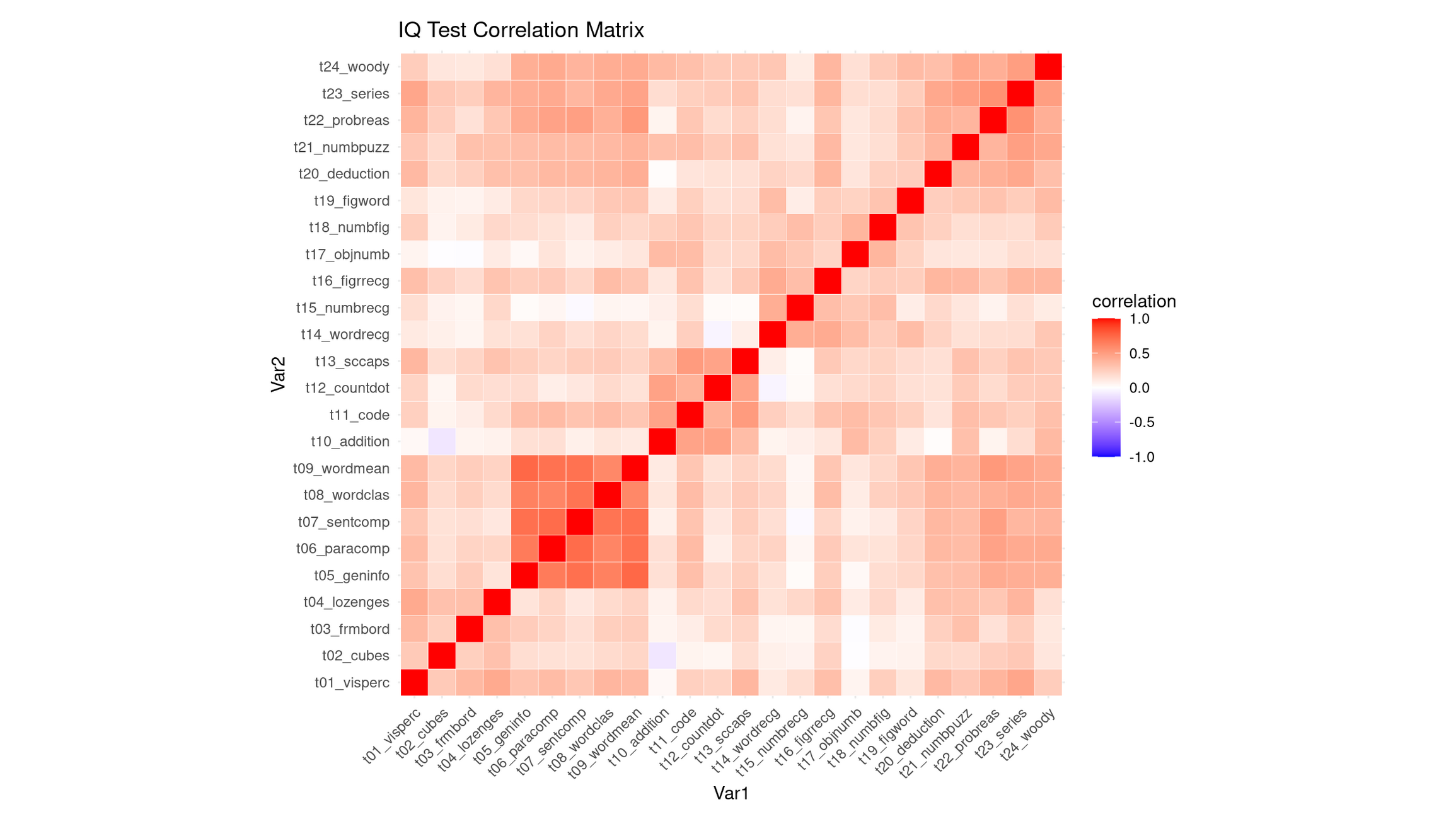
💭 Reflection: What can you say about this correlation heatmap?
Reflection: Interpreting the Correlation Heatmap
The heatmap shows that most IQ subtests are positively correlated, as indicated by the generally warm (light-to-medium red) colors. This means that students who score well on one task tend to score well on many others. As expected, the diagonal is bright red because each variable correlates perfectly with itself. Importantly, there are no strong negative correlations (very little blue), so none of the tests contradict or oppose each other.
While the matrix is broadly warm, it is not uniform, and several clear pockets of stronger correlations stand out:
Verbal comprehension / general knowledge block (strongest cluster): Subtests such as
t09_wordmean,t07_sentcomp,t08_wordclas,t06_paracomp, andt05_geninfoform the most conspicuous deep-red region. These tasks all depend heavily on verbal comprehension, vocabulary, reading-related reasoning, and general cultural knowledge, so strong correlations are expected.Numerical / arithmetic reasoning cluster: Tests like
t10_addition,t12_countdot,t15_numbrec, andt18_numbfigshow moderately strong correlations with each other. These tasks draw on basic arithmetic fluency, quantitative reasoning, and number-memory processes, creating a cohesive numerical factor.Abstract reasoning / problem-solving cluster (higher-order reasoning tasks): The set
t24_woody,t23_series,t22_probreas,t21_numpuzz, andt20_deductionalso forms a visible red pocket. These tasks all require pattern recognition, rule induction, logic, and multi-step reasoning, so the correlation between them is sensible.Cross-cluster linkage: Interestingly, the abstract reasoning tasks (
t24–t20) correlate not only among themselves, but also fairly strongly with the verbal comprehension block (t05–t09). This suggests that the ability required to perform high-level reasoning tasks is not purely spatial or numerical, but draws on general verbal–conceptual processing, producing a bridge between clusters.
Compared to these, the spatial–visual items (e.g., t01_visperc, t02_cubes, t03_frmbord) appear less strongly correlated, forming only a mild cluster—consistent with spatial tasks being somewhat more independent in the Holzinger–Swineford battery.
Why This Strongly Supports PCA
This structure—broad positive correlations plus meaningful variation in their strengths—is exactly the scenario where PCA is justified:
- The pervasive warm coloration indicates substantial shared variance, implying a general factor that influences nearly all subtests.
- The presence of distinct correlation pockets (verbal, numerical, abstract reasoning) indicates multiple secondary dimensions that PCA can uncover.
- The cross-cluster correlations, especially between reasoning tasks and verbal comprehension tasks, suggest that components may not strictly correspond to isolated skill domains but instead reflect overlapping cognitive processes—a pattern PCA is well-suited to decompose.
Thus, the heatmap demonstrates both a strong common core and meaningful substructure, giving a clear rationale for using PCA to identify a general ability component (PC1) and one or more more specialized secondary components (PC2, PC3, etc.).
Apply PCA
# PCA recipe
pca_recipe <- recipe(school ~ ., data = train_data) |>
  update_role(case, new_role = "ID") |>
  step_zv(all_numeric_predictors()) |>
  step_normalize(all_numeric_predictors()) |>
  step_pca(
    all_numeric_predictors(),
    num_comp = 5,
    keep_original_cols = TRUE
  ) |>
  prep()

# Transform training data
pca_data <- pca_recipe |>
  bake(train_data) |>
  select(case, PC1, PC2, PC3, PC4, PC5, school, everything())
Interpret PCA Results
pca_fit <- pca_recipe$steps[[3]]$res
eigenvalues <- pca_fit |> tidy(matrix = "eigenvalues")
# Variance explained
p1 <- eigenvalues |>
ggplot(aes(PC, percent)) +
geom_col(fill = "steelblue") +
geom_text(aes(label = round(percent, 2)), vjust = -0.3) +
labs(title = "Variance Explained by Each PC", y = "Percent Variance") +
theme_minimal()
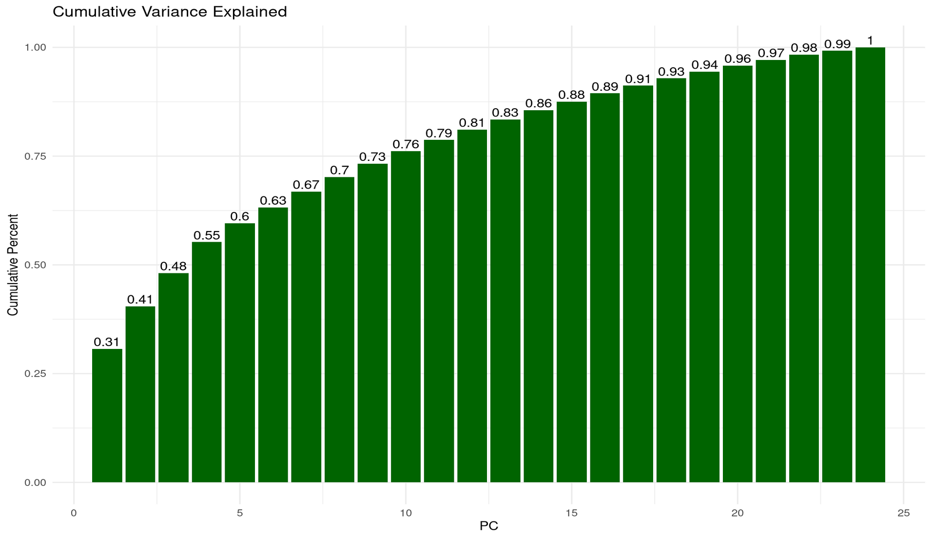
# Cumulative variance
p2 <- eigenvalues |>
ggplot(aes(PC, cumulative)) +
geom_col(fill = "darkgreen") +
geom_text(aes(label = round(cumulative, 2)), vjust = -0.3) +
labs(title = "Cumulative Variance Explained", y = "Cumulative Percent") +
theme_minimal()
p1 + p2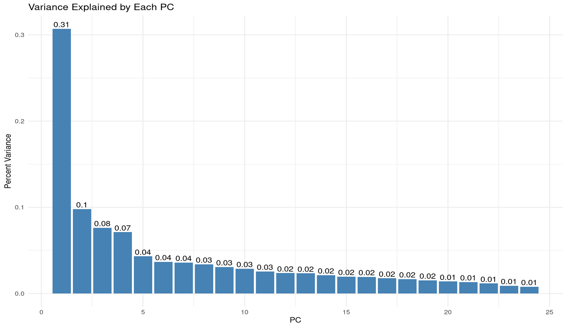
💬 Reflection
We set
num_comp = 5in our PCA step. Why might that be reasonable for this dataset?From the plots above, how much cumulative variance is explained by 2, 3, or 5 components?
Why might 2 components be chosen by default for visualisation, and what are the risks of doing so without checking variance explained?
Reflection: Choosing num_comp = 5
Setting num_comp = 5 is reasonable because the variance-explained plots show a strongly unbalanced eigenvalue structure, where the first few components capture a large share of the systematic variation, and the remaining components each add only very small increments.
From the per-PC variance bars:
- PC1 explains ~31% of the total variance — a dominant “general factor”.
- PC2 explains ~10%,
- PC3 explains ~8%,
- PC4 and PC5 contribute ~7% and ~4%, respectively. After PC5 the contributions drop below ~4% and quickly fall into the 1–2% range, indicating diminishing returns.
From the cumulative variance plot:
- 2 PCs ≈ 41% of variance explained
- 3 PCs ≈ 48%
- 5 PCs ≈ 60%
Thus, 5 components strike a sensible balance: they retain ∼60% of the structure while discarding many near-noise components. Going much higher adds little information; going much lower risks oversimplifying.
Why 2 components are often used for visualisation (and the risks)
Using 2 PCs is common because it allows simple 2D scatterplots where clusters, gradients, or patterns can be visualised intuitively. This is especially useful for pedagogical purposes or exploratory analysis.
However, the risk is clear from the variance explained:
- 2 PCs capture only ~41% of the variance.
- In other words, nearly 60% of the dataset’s structure is invisible in a 2D PCA plot.
This means a 2D PCA scatter may look clean or interpretable even though it represents less than half of the true variability. Clusters can appear more or less distinct than they actually are, and important relationships among subtests (e.g., separations between verbal, numerical, and reasoning tasks) may lie largely in PCs 3–5.
Summary
num_comp = 5is reasonable because it retains about 60% of meaningful variance while still compressing heavily.- 2 components are convenient but insufficient for understanding the dataset’s structure—they show only ~41% of the shared variance and can lead to overconfident interpretations of a highly reduced view.
- 3–5 components provide a more faithful representation, aligning better with the multi-factor structure suggested by the correlation heatmap (verbal, numerical, reasoning, plus a general factor).
Visualise First Two Components
ggplot(pca_data, aes(PC1, PC2, color = school)) +
  geom_point(alpha = 0.7, size = 2) +
  labs(
    title = "First Two Principal Components",
    subtitle = "Colored by school"
  ) +
  theme_minimal()
Interpretation of the PC1–PC2 Scatterplot (with context)
The PC1–PC2 scatterplot shows substantial overlap between students from Grant-White and Pasteur. Neither school forms a distinct cluster along the first two principal components, which aligns with the fact that PC1 and PC2 together explain only ~41% of the total variance—far too little to expect clean separation in two dimensions. Any school-related differences, if they exist, likely lie in higher PCs or are simply small.
In the historical context of the Holzinger–Swineford study, this overlap is unsurprising: both schools were located in the same district, drew from similar populations, and followed similar curricula. Thus, the PCA projection suggests that cognitive performance profiles were broadly comparable across the two schools, with no strong grouping by school on the major dimensions of variation.
Visualise PCA Loadings (what defines each component?)
pca_loadings <- pca_fit |>
  tidy(matrix = "loadings") |>
  filter(PC %in% c(1, 2, 3)) |>
  mutate(
    PC = factor(PC, levels = c("1", "2", "3")),
    abs_value = abs(value),
    sign = ifelse(value >= 0, "Positive", "Negative")
  )

ggplot(
  pca_loadings,
  aes(x = reorder(column, abs_value), y = value, fill = sign)
) +
  geom_col() +
  facet_wrap(~PC, scales = "free_y") +
  coord_flip() +
  scale_fill_manual(values = c("Positive" = "steelblue", "Negative" = "coral")) +
  labs(
    x = "Original Variables",
    y = "Loading Value",
    fill = "Direction"
  ) +
  theme_minimal() +
  theme(
    axis.text.y = element_text(size = 8),
    strip.text = element_text(face = "bold"),
    panel.grid.major.y = element_blank()
  )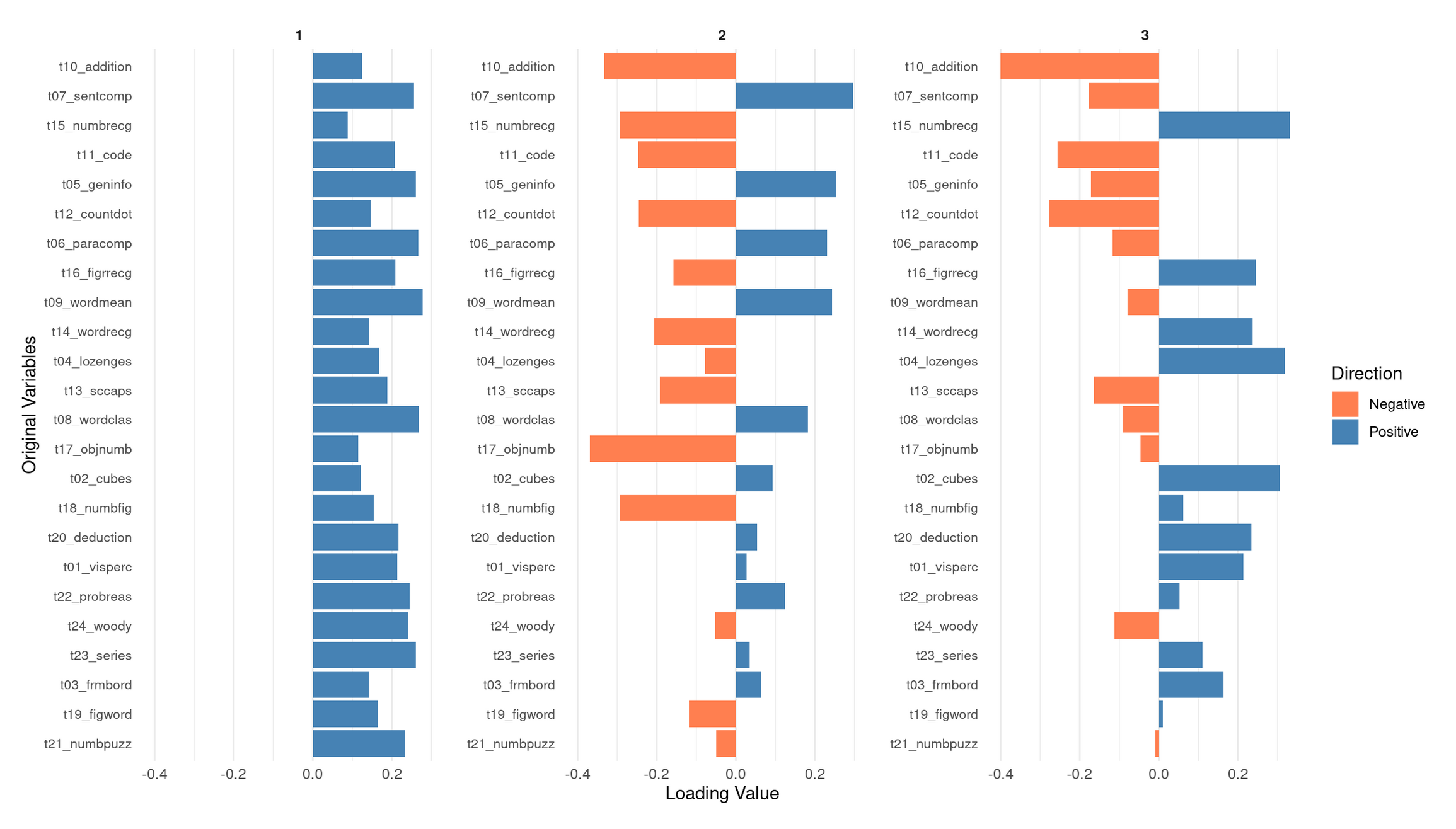
💭 Reflection: What does this loadings plot tell you?
PC1: A general performance / “g-like” component
PC1 shows moderate positive loadings across nearly all subtests—verbal, numerical, spatial, and abstract reasoning. No variables load negatively, and the magnitudes are relatively even across domains. This means that students who score high on PC1 tend to perform above average on most tests, regardless of the specific cognitive skill involved.
This broad positive-loading pattern is characteristic of what psychometricians call g, the general factor: a statistical regularity in which individuals who do well on one cognitive task tend to do well across a wide range of others. In PCA terms, a “g-like” component simply indicates that PC1 captures overall cognitive performance across the entire battery, rather than isolating a single domain such as verbal or spatial ability. Given that PC1 explains by far the largest share of variance (~31%), this global interpretation is consistent with the dataset’s correlation structure.
PC2: A verbal/knowledge vs. spatial–perceptual contrast
PC2 shows a clear positive–negative split in its loadings, suggesting that it contrasts two different ability profiles:
Positive loadings (verbal comprehension + knowledge-based tasks):
- t09_wordmean (word meaning)
- t07_sentcomp (sentence completion)
- t05_geninfo (general information)
- t06_paracomp (paragraph comprehension)
- t12_countdot (counting/attention task with verbal elements)
These tasks rely on vocabulary, reading comprehension, linguistic reasoning, and background knowledge. Students with high PC2 scores tend to excel in linguistically mediated and knowledge-based tasks.
Negative loadings (spatial, perceptual, and nonverbal reasoning tasks):
- t02_cubes
- t17_objnumb
- t18_numbfig
- t19_figword
- t20_deduction
These tasks require spatial visualization, perceptual discrimination, pattern recognition, or nonverbal reasoning.
Interpretation:
PC2 is best interpreted as a verbal/knowledge vs. spatial–perceptual ability dimension. A high PC2 score indicates relative strength in verbal/knowledge abilities; a low score indicates relative strength in spatial–perceptual reasoning. This aligns with the modest clusters visible in the correlation heatmap.
PC3: Higher-order reasoning vs. basic arithmetic/processing
PC3 reveals yet another coherent dimension:
Positive loadings (complex, rule-based reasoning tasks + some spatial tasks):
- t23_series (series completion)
- t24_woody (Woodrow’s figure test)
- t22_probreas (problem reasoning)
- t13_sccaps (symbol classification)
- t04_lozenges (spatial/visual comparison)
These tasks involve pattern induction, logical inference, multi-step reasoning, and complex visual discrimination. High PC3 scorers tend to excel in this type of abstract reasoning.
Negative loadings (arithmetic fluency, coding, basic processing tasks):
- t10_addition
- t11_code (symbol coding task)
- t12_countdot (processing speed / attention)
- Mildly negative: t07_sentcomp
These tasks rely more on basic computational fluency, symbol manipulation speed, and lower-level processing.
Interpretation:
PC3 appears to contrast higher-order, abstract reasoning with basic arithmetic and processing skills. Students who score high on PC3 tend to be better at complex reasoning tasks; students who score low may have relatively stronger basic computational or processing-speed skills.
Overall Summary
- PC1 represents a broad, domain-general general performance factor (g-like) shared across all subtests.
- PC2 expresses a verbal/knowledge vs. spatial–perceptual contrast.
- PC3 distinguishes complex abstract reasoning from basic arithmetic and processing-speed abilities.
Together, these three PCs reveal a multidimensional cognitive structure consistent with the correlation heatmap and variance-explained plots: a strong general factor (PC1) embedded within more specific contrasts (PC2, PC3), matching the classic profile of the Holzinger–Swineford dataset.
Part II: Multiple Correspondence Analysis (MCA) — Categorical Data (20 mins)
🌍 About the Data
In this part, you’ll use items from the World Values Survey (WVS) on ethical attitudes.
“The World Values Survey (WVS) is an international research program devoted to the scientific and academic study of social, political, economic, religious and cultural values of people in the world. The project’s goal is to assess which impact values stability or change over time has on the social, political and economic development of countries and societies” (Source: World Values Survey website)
For more details on the WVS, see the World Values Survey website or the reference in footnote 22.
Original responses are 0–10; here each item is binarised into “support” vs “oppose” using the global median for interpretability.
🗣 Class discussion
- Why can’t you run PCA on categorical variables?
- What might “distance” mean in MCA?
Why can’t you run PCA on categorical variables?
PCA is based on covariances, variances, and Euclidean distances, all of which assume numeric, continuous measurements with meaningful magnitudes and intervals. Categorical labels (e.g., “red / blue / green” or “agree / disagree”) do not have numeric spacing, no ordering (for nominal data), and no interpretable notion of difference like “blue minus green.” Because PCA treats variables as points in a Euclidean vector space, applying it directly to categories would produce arbitrary and meaningless geometry.
What does “distance” mean in MCA?
In MCA, points represent categories, not numeric quantities. Thus, the “distance” cannot be Euclidean magnitude. Instead:
- MCA uses chi-square distance, which measures how different the response profiles of categories are.
- Two categories are close if they tend to be selected by similar groups of individuals (i.e., they co-occur frequently in the same rows).
- Distances therefore reflect associations and co-occurrence patterns, not magnitudes or physical spacing.
In other words, MCA maps categories into a geometric space where closeness means “chosen together in similar patterns,” not “numerically similar.”
Load and Prepare Ethical Norms Data
values <- c(
  "cheating_benefits", "avoid_transport_fare", "stealing_property",
  "cheating_taxes", "accept_bribes", "homosexuality", "sex_work",
  "abortion", "divorce", "sex_before_marriage", "suicide",
  "euthanasia", "violence_against_spouse", "violence_against_child",
  "social_violence", "terrorism", "casual_sex", "political_violence",
  "death_penalty"
)

norms <- read_csv("data/wvs-wave-7-ethical-norms.csv") |>
  mutate(across(everything(), ~ as.factor(if_else(.x > median(.x), "y", "n"))))

colnames(norms) <- values
Apply MCA
# Treat the first variable as supplementary (projected after axes are built)
mca <- MCA(norms, quali.sup = 1, graph = FALSE)
💬 Reflection Why mark a variable as supplementary here?
Why make a variable supplementary in MCA?
In MCA, supplementary variables are categorical variables whose categories are projected onto the MCA map after the axes are built. They:
- do not influence the construction or orientation of the dimensions,
- avoid contributing marginal-frequency effects to the geometry, and
- are used purely for interpretation, not for defining the latent structure.
Analysts mark a variable as supplementary when it is not central to the structure they want to uncover, is highly imbalanced, or might distort the axes by dominating the chi-square distances.
In this analysis, quali.sup = 1 means the first column of the dataset — cheating_benefits — is supplementary. This item is treated this way because its “yes” vs. “no” split is strongly skewed in many WVS samples. If included as an active variable, its large marginal imbalance could overweight the item and pull the MCA axes toward its dominant category.
Marking it as supplementary allows you to see where its categories fall in the moral-norm space defined by the other items, without letting it shape or distort that space.
Practical reading:
- If
cheating_benefits_ylies nearcheating_taxes_yandstealing_property_y, it suggests a shared tolerance-for-dishonesty direction that is already captured by the active set. If it lands elsewhere, it nuances interpretation without having biased the axes.
Visualise MCA Results
# Biplot: categories in 2D space
fviz_mca_biplot(mca, repel = TRUE, label = "var", invisible = "ind") +
  labs(title = "MCA Biplot: Ethical Attitudes") +
  theme_minimal()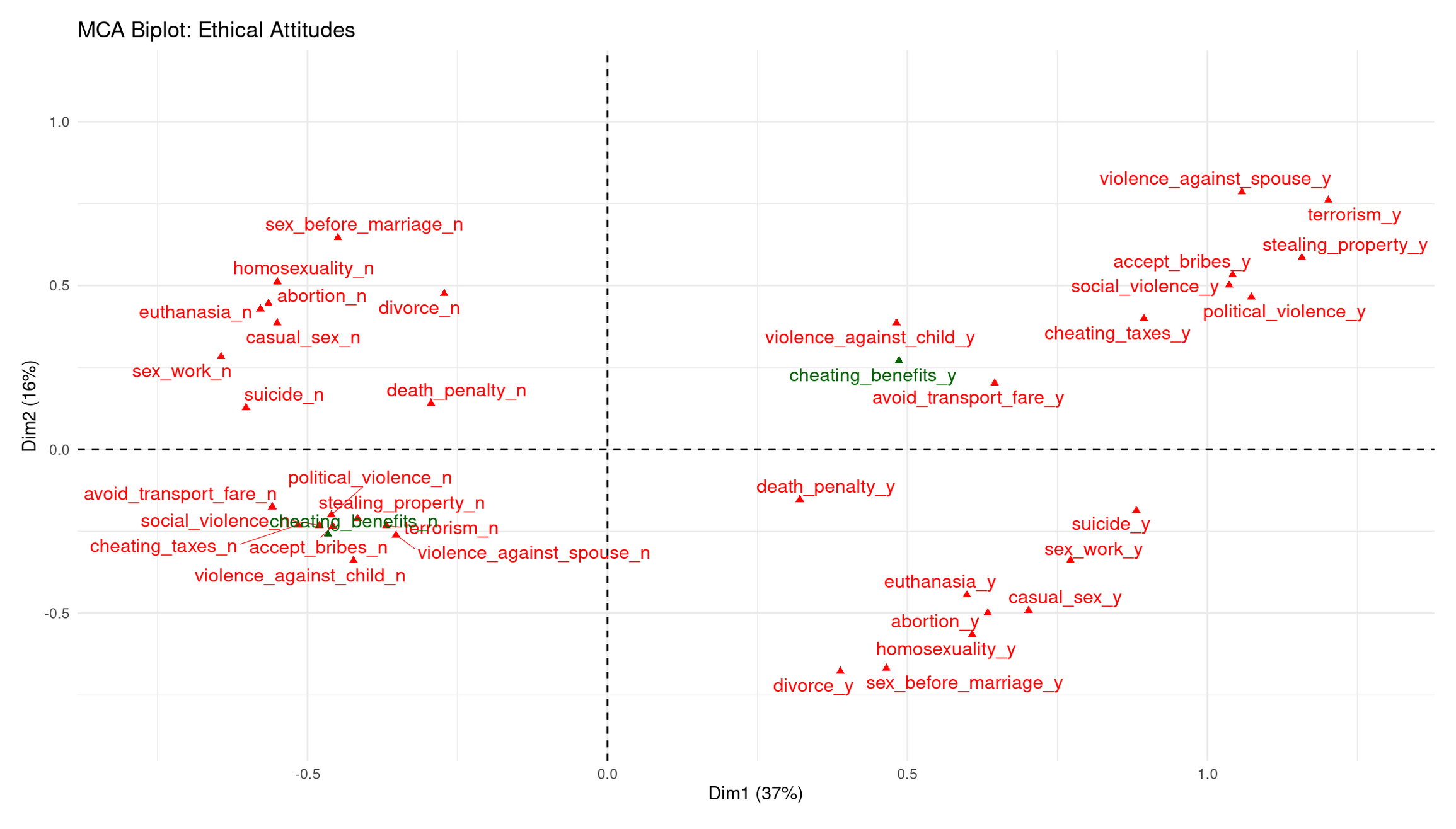
# Contribution of variables to the first dimension
fviz_contrib(mca, choice = "var", axes = 1, top = 10) +
  labs(title = "Contribution to Dimension 1") +
  theme_minimal()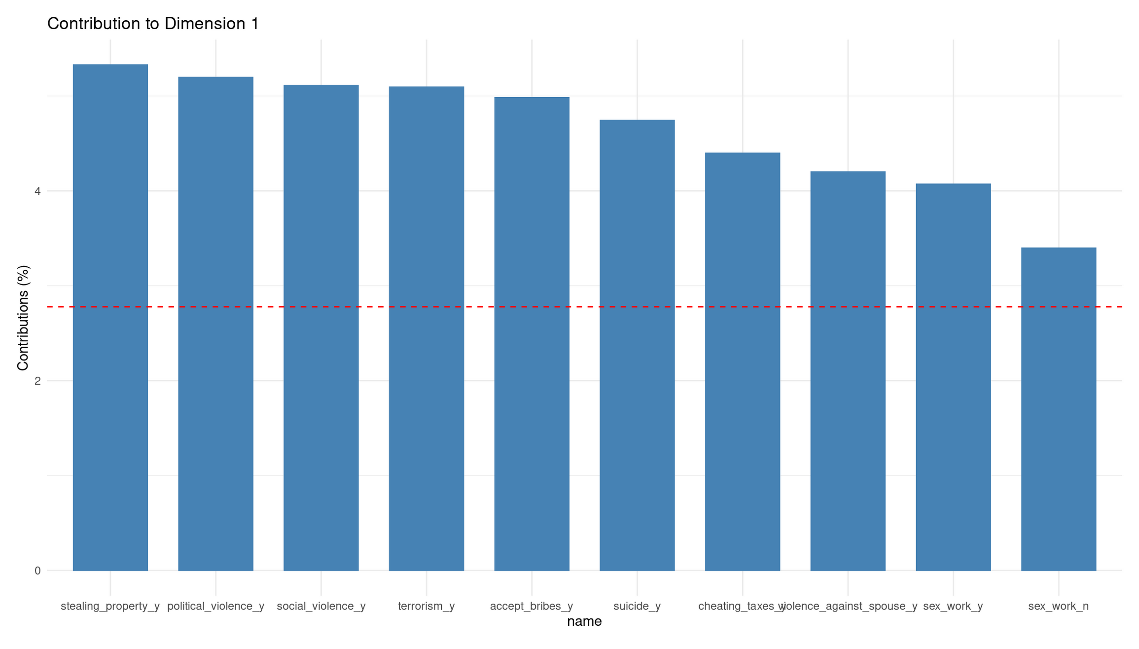
Dim 1 (37%): Permissive ↔︎ Acceptable-Violence/Corruption axis
Dim 1 clearly separates categories along a spectrum of moral acceptance:
Right side (positive Dim 1): Strong clustering of **“_y”** categories for violence, corruption, and property violations (violence_against_spouse_y, terrorism_y, stealing_property_y, accept_bribes_y, cheating_taxes_y, social_violence_y, etc.). These represent respondents who consider serious antisocial behavior acceptable.
Left side (negative Dim 1): Corresponding **“_n”** categories cluster together (political_violence_n, social_violence_n, stealing_property_n). These represent people who reject those forms of wrongdoing.
Dim 1 therefore captures a general tolerance vs. rejection of harmful, antisocial acts.
Dim 2 (16%): Personal-morality ↔︎ Public-harm axis
Dim 2 separates:
Upper side (positive Dim 2): “_n” responses to personal/sexual morality items (sex_before_marriage_n, homosexuality_n, abortion_n, casual_sex_n, euthanasia_n). These represent a restrictive stance on personal/sexual ethics.
Lower side (negative Dim 2): “_y” categories for divorce, euthanasia, abortion, sex_work, casual_sex, etc. These reflect a permissive stance on personal/private morality.
Thus, Dim 2 distinguishes private-morality attitudes rather than violence or corruption.
Where does the supplementary variable fall?
- cheating_benefits_y lands on the right, near corruption/cheating items → consistent with that cluster.
- cheating_benefits_n lands on the left, near rejections of corruption.
This confirms that omitting it from the axis construction did not distort the moral structure—it simply fits into the corruption/cheating dimension already defined by the active items.
Interpretation of Contributions to Dimension 1
The contribution barplot shows which categories define Dim 1 most strongly.
Top contributors (all “_y” categories):
- stealing_property_y
- political_violence_y
- social_violence_y
- terrorism_y
- accept_bribes_y
- suicide_y
- cheating_taxes_y
- violence_against_spouse_y
Each contributes well above the average (red dashed line).
Interpretation
Dim 1 is strongly driven by acceptance of violence, corruption, and serious wrongdoing. The fact that all high contributors are “yes, acceptable” categories means:
- Dim 1 reflects moral permissiveness toward harmful acts, not personal-morality issues.
- Its opposite pole (negative) represents rejection of antisocial behavior.
This matches the structure seen in the biplot: Dim 1 is basically a “tolerance of harm/corruption” axis.
Part III: Autoencoders — Non-linear Dimensionality Reduction (25 mins)
🧠 Concept
An autoencoder is a small neural network that tries to copy its input using fewer numbers:
- The encoder first squeezes many numbers into a smaller set (encoded features).
- The decoder then tries to rebuild the original from those few numbers.
If rebuilding is accurate, those few numbers capture most of the important information.
👉 Here, you return to the Holzinger–Swineford IQ dataset and learn a compact representation of the test scores.
💬 Reflection How is this similar to PCA? What extra flexibility might a neural network provide?
Solution
Both PCA and autoencoders reduce many variables to a smaller set of latent features:
PCA finds the best linear combinations of variables that capture maximum variance.
An autoencoder can learn non-linear transformations, allowing it to model curved relationships, interactions, and patterns that PCA cannot represent.
Because of this extra flexibility, an autoencoder can uncover more complex structure in the Holzinger–Swineford test scores—but it also requires more data, tuning, and regularization to avoid overfitting.
Prepare Data for Autoencoders
autoencoder_data <- holzinger.swineford |>
  as_tibble() |>
  select(-c(case, t25_frmbord2, t26_flags, mo, ageyr, grade, school, agemo, female))

data_cleaned <- recipe(~., data = autoencoder_data) |>
  step_zv(all_numeric_predictors()) |>
  step_normalize(all_numeric_predictors()) |>
  prep() |>
  bake(new_data = NULL)
Define Autoencoder Architecture
iq_autoencoder <- nn_module(
  "IQAutoencoder",

  initialize = function(input_dim = 24, encoding_dim = 6) {
    # Encoder
    self$encoder <- nn_sequential(
      nn_linear(input_dim, 16),
      nn_relu(),
      nn_dropout(0.2),
      nn_linear(16, 12),
      nn_relu(),
      nn_dropout(0.2),
      nn_linear(12, encoding_dim)
    )
    # Decoder
    self$decoder <- nn_sequential(
      nn_linear(encoding_dim, 12),
      nn_relu(),
      nn_dropout(0.2),
      nn_linear(12, 16),
      nn_relu(),
      nn_dropout(0.2),
      nn_linear(16, input_dim)
    )
  },

  forward = function(x) {
    encoded <- self$encoder(x)
    decoded <- self$decoder(encoded)
    return(decoded)
  },

  encode = function(x) {
    self$encoder(x)
  }
)
Train the Autoencoder
# Split to emulate train/validation
ae_split <- initial_split(as.data.frame(data_cleaned), prop = 0.8)
train_df <- training(ae_split)
val_df <- testing(ae_split)

train_data_ae <- torch_tensor(as.matrix(train_df), dtype = torch_float32())
val_data_ae   <- torch_tensor(as.matrix(val_df), dtype = torch_float32())

# Initialize and train
model <- iq_autoencoder(input_dim = 24, encoding_dim = 6)
optimizer <- optim_adam(model$parameters, lr = 0.001)
criterion <- nn_mse_loss()

epochs <- 100
train_losses <- c()

cat("Training autoencoder...\n")
for (epoch in 1:epochs) {
  model$train()
  output <- model(train_data_ae)
  loss <- criterion(output, train_data_ae)
  optimizer$zero_grad()
  loss$backward()
  optimizer$step()
  train_losses <- c(train_losses, loss$item())
  if (epoch %% 20 == 0) cat(sprintf("Epoch %d: Loss %.4f\n", epoch, loss$item()))
}
cat("Training complete!\n")
🗣️ Class discussion
- Why use MSE here?
- What are its limits and what else could you use?
Solutions (Loss choice)
Why MSE? The autoencoder tries to reconstruct continuous, standardised IQ test scores. MSE measures the average squared reconstruction error, which aligns well with Euclidean geometry and the optimization goals of typical autoencoders.
Limits of MSE:
- Highly sensitive to outliers (squares large errors).
- Assumes all features have equal importance.
- Penalizes positive and negative errors symmetrically.
- Encourages smooth predictions, which may blur sharp structure.
Alternatives:
- MAE (L1 loss) — robust to outliers; encourages sparsity.
- Huber loss — combines MSE + MAE; reduces outlier influence.
- BCE — for binary inputs/outputs (not appropriate here).
- KL divergence — used in variational autoencoders to regularize the latent space.
- Cosine similarity loss — when direction/shape matters more than magnitude.
For this lab, MSE is the correct choice because all features are continuous, standardised, and we want faithful numeric reconstruction.
Extract and Analyse Encoded Representations
model$eval()
data_tensor <- torch_tensor(as.matrix(data_cleaned), dtype = torch_float32())

with_no_grad({
  encoded_data <- as.data.frame(as.matrix(model$encode(data_tensor)$cpu()))
  colnames(encoded_data) <- paste0("AE_Component_", 1:6)
})

# Training loss plot
tibble(epoch = 1:epochs, loss = train_losses) %>%
  ggplot(aes(epoch, loss)) +
  geom_line(color = "steelblue", linewidth = 1) +
  labs(title = "Autoencoder Training Loss",
       y = "Reconstruction Loss",
       x = "Epoch") +
  theme_minimal() +
  theme(panel.grid.minor = element_blank())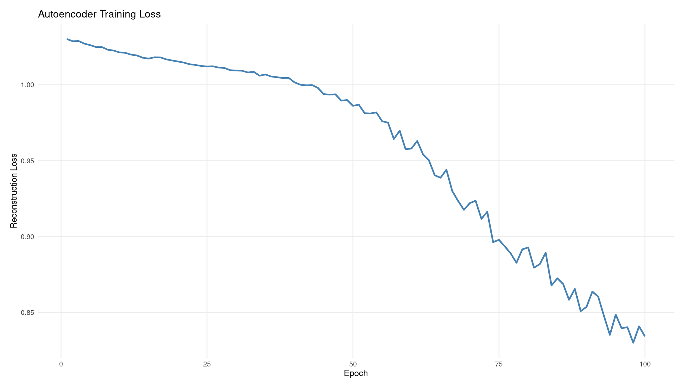
💭 Reflection: What does this plot tell you?
Interpretation: Autoencoder training loss
The reconstruction loss decreases from ≈1.01 → ≈0.84 over 100 epochs, showing that the autoencoder is gradually improving its ability to reproduce the input IQ scores. The overall downward shape indicates successful learning.
Why the curve wiggles:
- Training uses mini-batch gradient steps, not a full-dataset average each time.
- Each small batch nudges the model slightly differently, producing gentle fluctuations.
- This is normal and often desirable: it prevents the model from locking into bad local minima.
What 20% dropout does:
- Randomly disables a fraction of hidden units during training.
- Prevents trivial “identity copying” through single pathways.
- Encourages the network to learn distributed, robust encodings rather than memorising exact inputs.
Diagnostics from the shape:
- Good: steady downward trend with minor noise (what you see).
- Plateauing early: learning rate too low or the model too small.
- Oscillating or rising loss: unstable optimisation, too high learning rate, or insufficient regularisation.
- Very sharp drops then rising: possible overfitting or batch-size issues.
# Heatmap: correlations between original variables and AE components
correlations_ae <- cor(as.matrix(data_cleaned), encoded_data)
rownames(correlations_ae) <- colnames(data_cleaned)

corrplot(correlations_ae,
         method = "color",
         title = "Original IQ Tests vs Autoencoder Components",
         mar = c(0, 0, 2, 0),
         tl.cex = 0.8)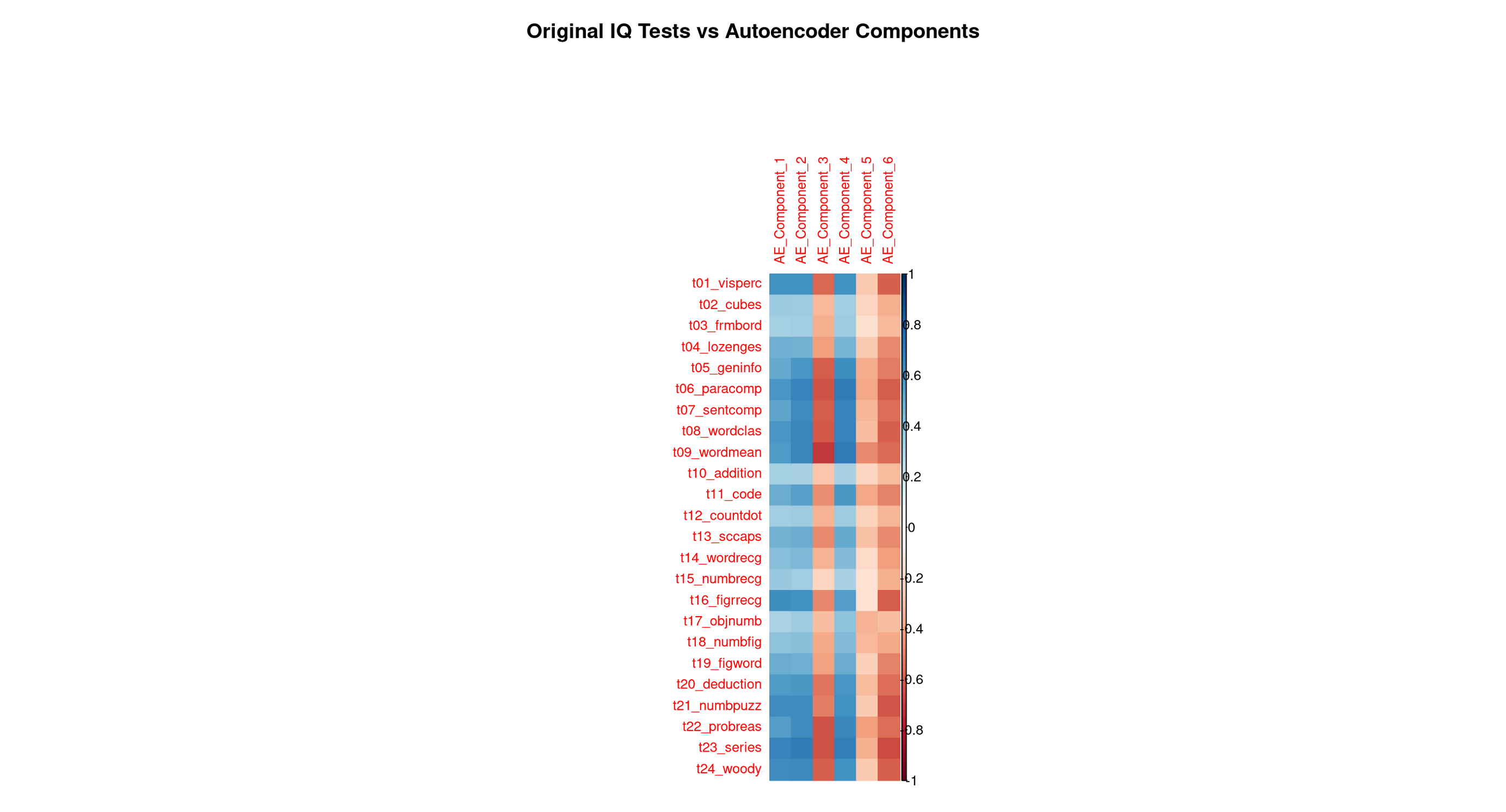
Each row corresponds to one original Holzinger–Swineford test. Each column corresponds to one of the six latent features the autoencoder learned. The colour (red/blue intensity) shows how strongly a test is associated with each learned feature.
This is the autoencoder equivalent of PCA loadings, but not restricted to linear patterns.
2. Step-by-step reading guide
A. Row-wise reading (per test)
What latent feature predicts this test best?
Scan left → right along a row.
The darkest cell reveals the encoded feature most responsible for reconstructing that test.
If:
- One cell dominates → the test is captured by a single, well-defined ability dimension.
- Several cells are dark → the test taps multiple latent abilities (e.g., reasoning + verbal comprehension).
Row-wise patterns tell you how the network represents each original test.
B. Column-wise reading (per encoded feature)
What does this latent feature “mean”?
- Scan top → bottom down a column.
- The darkest rows tell you which tests define that latent dimension.
- These defining tests give the component its psychological interpretation.
Column-wise patterns tell you what ability or skill each latent feature corresponds to.
C. Block structure (global patterns)
Look for:
- vertical blocks → a latent feature grouping a family of related tests
- horizontal spreads → tests depending on multiple abilities
- rectangular clusters → stable subdomains (e.g., complex numeric reasoning)
Autoencoders can reveal nonlinear skill clusters, so blocks may differ from PCA.
3. Optional: Exploration code (recommended for review)
A. For each test: which AE component correlates most?
best_comp_by_var_tbl <-
  correlations_ae %>%
  as_tibble(rownames = "test") %>%
  pivot_longer(-test, names_to = "AE_component", values_to = "correlation") %>%
  mutate(abs_corr = abs(correlation)) %>%
  group_by(test) %>%
  slice_max(abs_corr, n = 1, with_ties = FALSE) %>%
  select(test, AE_component, correlation) %>%
  arrange(test)

best_comp_by_var_tbl
B. For each AE component: which tests define it?
top_vars_by_comp_tbl <-
  correlations_ae %>%
  as_tibble(rownames = "test") %>%
  pivot_longer(-test, names_to = "AE_component", values_to = "correlation") %>%
  mutate(abs_corr = abs(correlation)) %>%
  group_by(AE_component) %>%
  slice_max(abs_corr, n = 10, with_ties = FALSE) %>%
  arrange(AE_component, desc(abs_corr))

top_vars_by_comp_tbl
This helps you verify the interpretations below.
4. Full Interpretation: What Each Autoencoder Component Represents
🔵 AE Component 1 — Broad verbal–conceptual reasoning (very close to PCA PC1)
This feature shows strong correlations with many verbal, comprehension, and conceptual tasks:
- Word meaning
- Word classification
- Sentence completion
- Paragraph comprehension
- General information
These tasks all draw on:
- knowledge
- vocabulary
- verbal reasoning
- comprehension of written material
- the ability to link concepts across different verbal contexts
This component also correlates moderately with several reasoning problems, showing that it spans not just verbal recall but high-level conceptual integration.
👉 Interpretation: A broad verbal–conceptual reasoning factor, very close to PCA’s PC1 (which captured the largest shared variance in the dataset).
This is the autoencoder’s analogue of a general reasoning/knowledge ability.
🔵 AE Component 2 — Spatial–figural manipulation (very close to PCA PC2)
Correlations concentrate on the classic spatial/figural tasks:
- Cubes
- Form board
- Lozenges
- Figure comparison tasks
These tasks all require:
- mental rotation
- shape decomposition and assembly
- figural reasoning
- visual–spatial organisation
👉 Interpretation: A clear spatial–figural reasoning component, aligning almost perfectly with PCA’s PC2.
🔵 AE Component 3 — Basic numeric processing and simple quantitative operations
This component highlights tasks involving:
- Addition
- Counting dots
- Number recognition
- Object number
- Figure–number tasks
These tasks rely on:
- quick counting
- simple number manipulation
- recognition of numeric patterns
- elementary arithmetic
- working memory for small numeric units
👉 Interpretation: A basic numeric-processing factor, focusing on procedural, low-level quantitative tasks.
Comparison to PCA: PCA’s PC3 and PC4 both touched parts of this cluster, but neither isolated it cleanly. The autoencoder forms a cleaner and more coherent numeric-processing dimension.
🔵 AE Component 4 — Higher-order numerical, inductive, and logical reasoning
Dark correlations appear for the most complex reasoning tasks:
- Problem reasoning
- Series completion
- Woodrow-type figure sequences
- Deduction tasks
- Number puzzles
These require:
- rule discovery
- pattern induction
- logical sequencing
- multi-step reasoning
- abstraction over numeric/symbolic relations
👉 Interpretation: A complex numerical reasoning factor that captures the “logic/induction” side of cognitive ability.
Comparison to PCA: PCA did not cleanly disentangle simple vs complex numeric skills. The autoencoder creates two distinct numeric factors (AE3 basic vs AE4 complex). This is a classic nonlinear refinement impossible for PCA to represent.
🔵 AE Component 5 — Perceptual speed, symbol matching, and rapid visual processing
This feature spikes for:
- Coding
- Figure recognition
- Visual discrimination tasks
- fast symbol–pattern matching tasks
These involve:
- rapid identification
- visual scanning
- symbol association
- timed perceptual processing
👉 Interpretation: A perceptual speed / symbol-processing factor.
Comparison to PCA: This factor does not appear cleanly in PCA’s early components — it gets absorbed into low-variance PCs. The AE isolates it because neural networks can form nonlinear representations emphasizing speed and perceptual distinctiveness, not just variance.
🔵 AE Component 6 — Subtle verbal–analytic nuance / refinement factor
This feature shows:
- small but meaningful correlations with some verbal comprehension tasks
- small correlations with some reasoning tasks
- a weak but consistent pattern across a mixture of tests
This is typical of the “tail” latent dimensions:
- it picks up subtle distinctions left over after the major factors,
- capturing small, nonlinear overlaps between verbal and reasoning tests.
👉 Interpretation: A residual verbal–analytic refinement component, capturing nuanced variance after the major abilities are accounted for.
Comparison to PCA: PC5, PC6, and beyond contain similarly small, mixed patterns, though PCA’s small components are usually noisier.
5. Graphical comparison: Autoencoder vs PCA
Before comparing principal component analysis (PCA) results with autoencoder results, both models must be applied to the same individuals, in the same row order, and using a common identifier. Otherwise the correlations between the two sets of components are meaningless.
Why PCA was trained only on the training split (tidymodels rule)
In the tidymodels framework, all preprocessing steps are treated as part of the model. This includes:
- centering,
- scaling,
- removing zero-variance variables,
- and computing principal components.
Because preprocessing is part of the model, it must follow the same rule as model training:
All preprocessing parameters must be estimated using training data only, otherwise information from the testing data leaks into the workflow.
For example:
- The means and standard deviations used for scaling must be computed only on the training cases.
- The principal component directions (the PCA “rotation”) must also be learned only from the training cases.
In this lab workflow, PCA was originally intended for use in supervised modelling, so it was trained correctly on the 240 training cases.
This requirement is not mathematical — it is a statistical safeguard.
Why the autoencoder was trained on all 301 individuals
The autoencoder is used in a purely unsupervised way in this lab. It is not used to make predictions about a test set, and it is not evaluated with performance metrics that depend on a clean train/test split.
Because of this, there is no possibility of information from the test portion “leaking” into a predictive model. Therefore, it was acceptable for the autoencoder to be trained on all 301 individuals.
This difference produces a mismatch:
- PCA scores: only 240 individuals (training set)
- Autoencoder scores: 301 individuals (entire dataset)
Why PCA is applied again to the full dataset for comparison
For the purpose of comparing the structure of PCA with the structure learned by the autoencoder, we need PCA scores for all 301 individuals.
It is important to note:
- We are not re-estimating PCA.
- We are not re-fitting preprocessing steps.
- We are only applying the PCA transformation learned from the training data to new rows.
This is completely safe because we are not performing a predictive modelling evaluation. It simply ensures that PCA and the autoencoder describe the same individuals, which is necessary for a fair comparison.
Re-encode the dataset for the autoencoder and attach case identifiers
During preprocessing for the autoencoder, the case identifier was removed. To compare with PCA outputs, we need identifiers again.
Rather than altering earlier code, we simply perform a fresh encoding pass and add a synthetic identifier (row number), which is valid because both PCA and the autoencoder are applied to the full dataset in the same order.
model$eval()

autoencoder_input <- data_cleaned %>%
  as.matrix() %>%
  torch_tensor(dtype = torch_float32())

with_no_grad({
  encoded_full <- as.data.frame(as.matrix(model$encode(autoencoder_input)$cpu()))
})

colnames(encoded_full) <- paste0("Autoencoder_Component_", 1:6)

# Create synthetic identifiers: valid because row order is preserved
encoded_full$case <- seq_len(nrow(encoded_full))
Compute correlations between PCA and autoencoder components
Apply the trained PCA recipe to the entire dataset and attach matching identifiers:
pca_full <- pca_recipe %>%
  bake(new_data = data) %>%
  mutate(case = row_number()) %>%
  select(case, starts_with("PC"))
Join the PCA and autoencoder scores:
pca_autoencoder_combined <- pca_full %>%
  left_join(encoded_full, by = "case")

# Only keep PCA components and AE components
comparison <-
  pca_autoencoder_combined %>%
    select(starts_with("PC"), starts_with("Autoencoder_Component_")) %>%
    cor(use = "pairwise.complete.obs")

# Extract the PCA rows and AE columns only
comparison_pca_ae <-
  comparison[
    grep("^PC", rownames(comparison)),
    grep("^Autoencoder_Component", colnames(comparison))
  ]
Plot as a tidyverse heatmap
# Flip matrix so AE components are rows and PCs are columns
comparison_flipped <- t(comparison_pca_ae)

comparison_flipped %>%
  as_tibble(rownames = "Autoencoder_Component") %>%
  pivot_longer(-Autoencoder_Component,
               names_to = "PCA_Component",
               values_to = "correlation") %>%
  ggplot(aes(x = PCA_Component,
             y = Autoencoder_Component,
             fill = correlation)) +
  geom_tile(color = "white") +
  scale_fill_gradient2(
    low = "blue", mid = "white", high = "red",
    midpoint = 0, limits = c(-1, 1)
  ) +
  theme_minimal(base_size = 14) +
  labs(
    title = "Correlation Between PCA and Autoencoder Components",
    x = "PCA Components",
    y = "Autoencoder Components",
    fill = "Correlation"
  )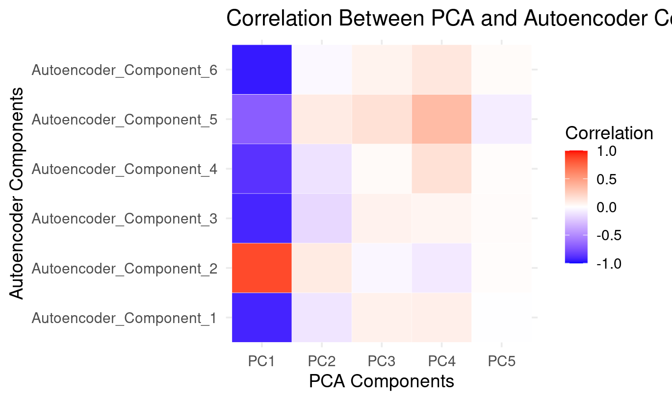
How to Read the PCA × Autoencoder Comparison Heatmap
PC1: The dominant factor shared by both methods (strong correlations with all autoencoder components)
- Strong positive correlation with Autoencoder_Component_2
- Strong negative correlations with Autoencoder_Component_1, 3, 4, 5, and 6
This mirrors what the PCA loadings show:
- PC1 is a general performance factor across verbal, numeric, and reasoning tasks.
The autoencoder spreads this dominant pattern across almost all six latent components:
PC1 is the backbone of both methods. The autoencoder distributes it across many components instead of isolating it in just one.
PC2: Weak and diffuse — small positives with AE2 and AE5, small negatives with the rest
The heatmap shows:
- small positive correlations with Autoencoder_Component_2 and Autoencoder_Component_5
- small negative correlations with Autoencoder_Component_1, 3, 4, and 6
From the PCA loading plot, PC2 captures a weak verbal–spatial contrast.
The autoencoder does not isolate this contrast as a meaningful latent direction:
PC2’s structure is spread thinly and does not form a dedicated autoencoder component.
PC3 and PC4: Weak but patterned — expressed mainly through Autoencoder_Component_5
Both PC3 and PC4:
- show weak positive correlations with Autoencoder_Component_5
- show small negative correlations with AE1, AE3, AE4
- have near-zero correlations elsewhere
Based on PCA loadings:
- PC3 reflects basic numeric processing
- PC4 reflects complex symbol-based reasoning
Autoencoder_Component_5 captures a blend of these:
The autoencoder combines pieces of PC3 and PC4 into a single numeric/symbol-processing dimension.
This is a nonlinear reorganization of PCA’s mid-level variance.
PC5: Essentially absent — almost no correlation with autoencoder components
PC5 shows:
- almost all white cells
- tiny, negligible correlations with AE5 and AE6
PC5 represents very little variance and no coherent cognitive structure. The autoencoder simply ignores this:
PC5 is a noise-like component that the autoencoder does not reconstruct.
*6. Final Summary**
The autoencoder and PCA agree very strongly on the major cognitive dimension in the data:
- PCA expresses this as PC1
- The autoencoder expresses this across all its components, especially Autoencoder_Component_2
However, beyond this dominant factor:
What PCA contributes
- clean, orthogonal decompositions
- interpretable linear contrasts (verbal–spatial, basic vs complex numeric reasoning)
What the autoencoder contributes
- nonlinear reorganization of secondary patterns
- splitting the general factor into several complementary directions
- recombining numeric and reasoning contrasts differently
- ignoring low-variance (noise) components like PC5
Interpretation Table
| Autoencoder Component | Best Description | PCA Relation |
|---|---|---|
| AE_Component_1 | Negative direction of general performance | Mirrors PC1 with reversed polarity |
| AE_Component_2 | Positive direction of general performance | Strongly aligned with PC1 |
| AE_Component_3 | Negative general factor + small numeric contrast | Partially overlaps PC1, faint PC3 |
| AE_Component_4 | Negative general factor + reasoning emphasis | Mostly PC1 inversion |
| AE_Component_5 | Mixed numeric + symbol processing (PC3/PC4 blend) | Only autoencoder component tied to PC3/PC4 |
| AE_Component_6 | Another nonlinear inversion of the general factor | Weakly related to PC1; no PCA counterpart |
Overall Conclusion
PCA preserves the dominant linear variance pattern, while the autoencoder decomposes it into several nonlinear subcomponents and reorganizes the secondary numeric/reasoning contrasts.
Both methods agree strongly on the “big picture,” but the autoencoder uncovers structure PCA cannot isolate.
# Quick 2D view of the first two AE components
ggplot(encoded_data, aes(x = AE_Component_1, y = AE_Component_2)) +
  geom_point(alpha = 0.6, color = "darkred", size = 2) +
  labs(
    title = "Autoencoder Components 1 vs 2",
    x = "AE_Component_1",
    y = "AE_Component_2"
  ) +
  geom_hline(yintercept = 0, linetype = "dashed", alpha = 0.5) +
  geom_vline(xintercept = 0, linetype = "dashed", alpha = 0.5) +
  theme_minimal()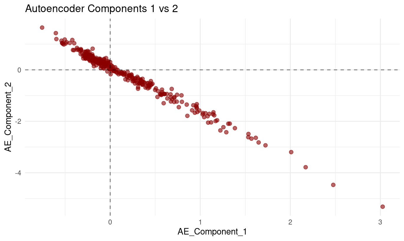
The plot of Autoencoder_Component_1 (x-axis) against Autoencoder_Component_2 (y-axis) displays a:
- very clear downward-sloping relationship, and
- tight clustering of points around a single line.
As values of Component 1 increase, values of Component 2 consistently decrease. The points form a smooth, almost perfectly linear band, with very little deviation above or below the line.
What this means
From the plot alone, we can conclude:
The two components are strongly inversely related. Their values change together in a highly predictable opposite-direction pattern.
The relationship is nearly linear. The lack of scatter indicates that the model uses these two latent dimensions in a coordinated way.
This pattern is perfectly normal for autoencoders. Unlike PCA, autoencoders do not enforce orthogonality between latent dimensions. Components can — and often do — encode related or opposing aspects of the same underlying structure.
This does not indicate a modelling problem. It simply shows that the autoencoder found a representation where increasing one latent direction naturally corresponds to decreasing another.
How to interpret this behaviour conceptually
Although autoencoder components are not directly interpretable the way PCA loadings are, a relationship this tight implies:
- The model is capturing a single strong underlying pattern,
- but represents it internally through two opposing latent directions, which helps the decoder reconstruct the original variables flexibly.
Summary
Autoencoder Component 1 and Component 2 show a very strong, nearly perfectly linear negative relationship in the scatterplot. As one increases, the other decreases in a tightly coordinated manner. This reflects how the autoencoder organizes a dominant underlying pattern in the data — not an error, but a normal feature of nonlinear latent representations.
Part IV: Method Comparison and Discussion (15 mins)
Side-by-Side Comparison
if (exists("pca_data") && exists("encoded_data")) {
  p_pca <- pca_data |>
    ggplot(aes(PC1, PC2)) +
    geom_point(alpha = 0.6, color = "blue") +
    labs(title = "PCA: First 2 Components") +
    theme_minimal()

  p_ae <- encoded_data |>
    ggplot(aes(AE_Component_1, AE_Component_2)) +
    geom_point(alpha = 0.6, color = "red") +
    labs(title = "Autoencoder: First 2 Components") +
    theme_minimal()

  p_pca + p_ae
}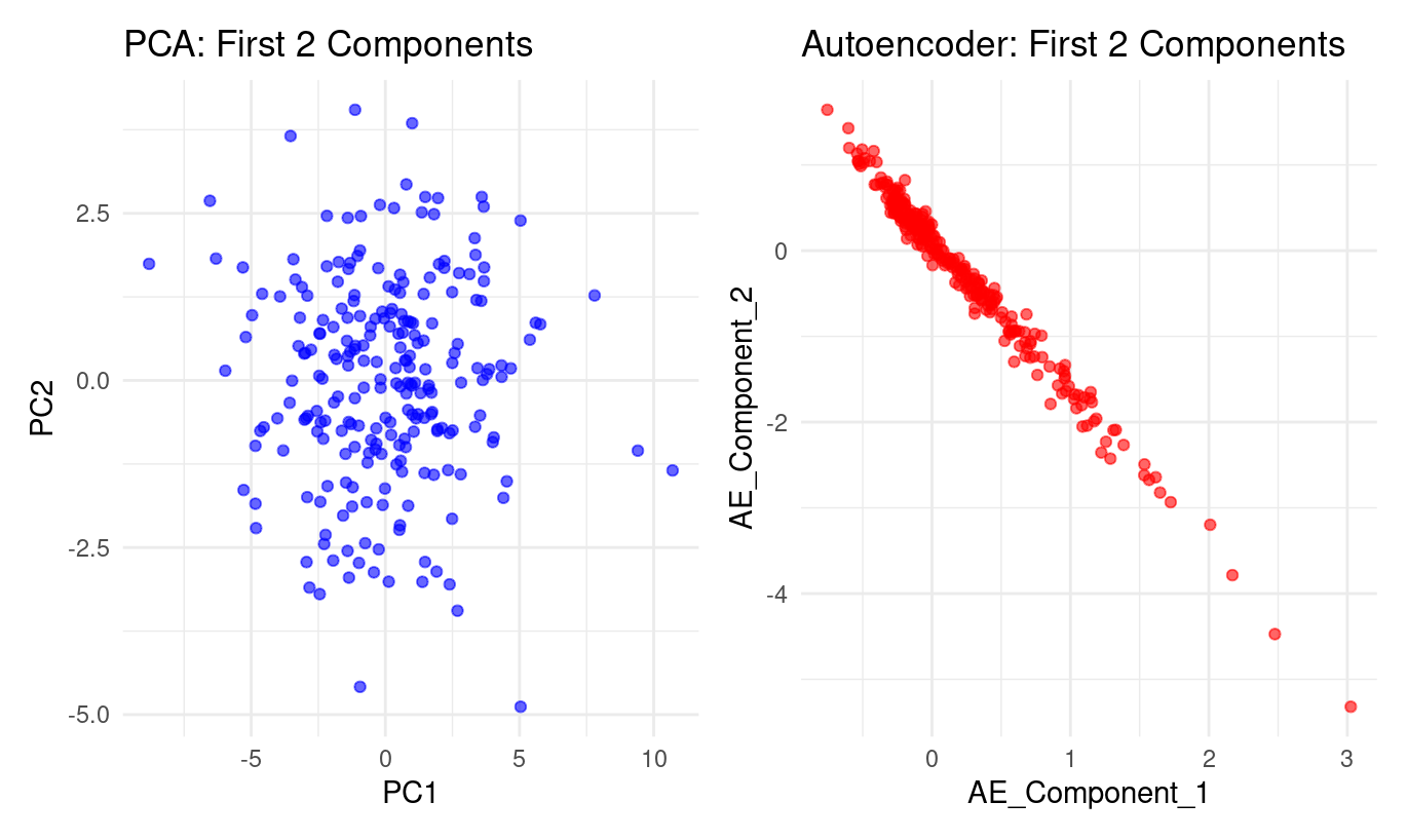
🗣️Class discussion
- How do auto-encoders and PCA compare?
- What does this plot tell you?
The two panels show a striking contrast in how PCA and the autoencoder represent the same dataset:
PCA (left panel):
PC1 and PC2 form a roughly circular cloud.
The points spread in many directions with no clear curve or boundary in the PC1–PC2 plane.
This is typical of PCA:
it looks for orthogonal directions of greatest variance,
but these directions must be straight lines,
so PCA will not uncover nonlinear structure if the data lie on a curved manifold.
Autoencoder (right panel):
Autoencoder Component 1 and Component 2 form a nearly perfect curved line.
The data concentrate along a smooth, one-dimensional trajectory, almost like a bent string.
This indicates the autoencoder has discovered a nonlinear relationship between the latent factors.
Where PCA spreads the information across two linear dimensions, the autoencoder compresses it into something that behaves almost like one curved dimension.
In short:
PCA finds straight axes of variation; the autoencoder discovers a curved, nonlinear structure that PCA cannot express.
What does the plot tell you?
From the autoencoder panel:
Component 1 and Component 2 are tightly linked. The points lie almost exactly on a curve—no wide dispersion, no clouds. This shows the autoencoder has encoded the data in a way where these two latent directions are strongly dependent.
The relationship is nonlinear. It’s not a straight line: the curve bends more strongly at the extremes. This is precisely the kind of structure PCA cannot represent, but an autoencoder can.
Most of the meaningful variation may lie along a single nonlinear factor. Because the second autoencoder component adds almost no additional “spread,” the model is effectively compressing the original 24 variables into one dominant nonlinear dimension.
The autoencoder learned a smoother, more organised internal representation. The PCA plot looks noisy and diffuse; the autoencoder plot forms an ordered, high-signal pattern. This reflects the autoencoder’s ability to model subtle nonlinear dependencies between the original tests.
Bottom line
PCA: linear, orthogonal axes → diffuse cloud
Autoencoder: nonlinear, flexible representation → nearly one-dimensional curved manifold
The plot shows the autoencoder captures underlying structure that PCA cannot reveal.
🧹 Pre-processing & Missing Values
💬 Reflection
Each method you’ve used today — PCA, MCA, and Autoencoders — made different assumptions about the input data. Before you decide which one to apply to a new dataset, ask yourself:
- Can this method handle missing values directly, or do I need to impute first?
- Does the method require normalised/scaled variables, or can I leave raw values?
- What does “distance” mean for the algorithm — and does scaling or encoding affect that distance?
Think through these before reading the summary below.
Comparison: Pre-processing and Missing Values
| Method | Handles Missing Values? | Needs Normalization? | Notes |
|---|---|---|---|
| PCA | ❌ Requires complete numeric data → you must impute (mean/median, kNN, or model-based). | ✅ Yes. PCA uses variance and Euclidean distance — variables with larger scales dominate unless standardised. | Center and scale continuous predictors. Drop near-constant columns first. |
| MCA | ⚠️ Can treat “missing” as a category, but that changes interpretation. Prefer to impute or remove missing entries. | ❌ Not needed — variables are categorical; scaling doesn’t apply. | Uses chi-square distances among category profiles. Large imbalances can skew results. |
| Autoencoder | ⚠️ Requires numeric input. Must impute or use masking/denoising AEs for missing entries. | ✅ Strongly recommended. Neural nets train best with standardised/normalised features. | Scaling ensures stable gradients and balanced feature influence. |
Why this matters (concrete pitfalls):
- Running PCA on unscaled variables can let a feature measured in seconds dominate one measured in points.
- Feeding
NAs to an autoencoder breaks reconstruction; at minimum you must impute or mask them. - Treating “missing” as a normal category in MCA can create a fake cluster around missingness — interpret with caution.
Checklist before reducing dimensionality:
- Inspect missingness (MCAR vs MAR vs MNAR),
- Standardise/normalise where needed,
- Remove constant or near-constant variables,
- Verify that encoding (numeric/categorical) matches the method’s assumptions.
Key Takeaways
🔑 When to use each method:
- PCA: When you have continuous data and want interpretable linear combinations
- MCA: When working with categorical data or contingency tables
- Autoencoders: When you suspect non-linear relationships or need flexible architectures
Discussion Questions
- Which method captured the most information with fewer dimensions?
- PCA (linear): ~41% with 2 PCs, ~48% with 3 PCs, ~60% with 5 PCs (from your plots).
- Autoencoder (non-linear): you don’t report “variance explained,” but the lower reconstruction loss with 6 features indicates stronger overall retention than 3–5 linear PCs.
- Trade-off: PCA provides transparent variance accounting and interpretability; AE provides stronger compression but needs careful validation.
- How do the visualisations differ and what do they imply?
- PCA scatter (PC1 vs PC2): broad, roughly symmetric cloud → several directions matter; good for explanation and linear downstream models.
- MCA biplot: categories grouped by co-occurrence patterns → reveals value dimensions (e.g., permissive vs restrictive; personal morality vs violence/corruption).
- AE scatter: tight, curved band → many tests lie on a low-dimensional non-linear manifold; good for compression and sometimes unsupervised separation
- When choose autoencoders over PCA?
- When you expect curved/non-linear relationships or want denoising / imputation capability.
- For clustering/outlier detection, AE embeddings may produce better separation.
- For very large/complex data (images, audio, text), AE-style models often outperform PCA in representation power.
- Trade-offs: interpretability vs flexibility
- PCA/MCA: transparent, fast, defensible with loadings/contributions; limited to linear structure.
- AE: flexible and powerful; but features are abstract. Use learning curves, correlation heatmaps, and downstream performance to justify them.
- What if the data were longitudinal, not cross-sectional?
- PCA: still helpful per timepoint or on engineered trajectories, but inherently static and linear.
- AE: extend to temporal encoders/sequence models to capture non-linear change over time, potentially revealing developmental arcs that PCA won’t represent natively.
Extension Activities
🚀 Try these on your own:
- Experiment with different numbers of components/dimensions**
Try rerunning each method with different dimensionalities:
- PCA: vary
num_compto see how much variance you retain and how stable the first components are. - Autoencoders: change the size of the encoding layer (e.g., 2, 4, 6, 10) to see how reconstruction quality and latent space structure change.
- MCA: inspect how the interpretation of MCA dimensions changes when you examine more or fewer dimensions.
Look for when the structure becomes clearer, and when extra dimensions stop adding interpretable information.
- Apply these methods to your own datasets
Choose datasets with enough variables to make dimensionality reduction meaningful (e.g., USArrests, BikeShare, BrainCancer from ISLR2).
Apply:
- PCA if your variables are numeric
- MCA if variables are categorical
- Autoencoders if you want a nonlinear reduction of numeric data
Compare what each method uncovers. Do certain datasets show clearer clusters or stronger latent factors?
- Combine dimensionality reduction with clustering or classification
You can apply clustering or supervised learning after reducing dimensions:
Clustering:
- k-means
- hierarchical clustering
- DBSCAN (useful if structure is nonlinear or cluster shapes are irregular)
Classification: Use PCA components, MCA dimensions, or autoencoder encodings as inputs to models like logistic regression, trees, or SVMs.
Compare whether lower-dimensional representations make the clusters clearer or improve model stability.
- Explore other variants like kernel PCA or variational autoencoders
tidymodels options)
recipes includes kernel PCA steps you can experiment with:
step_kpca()— general kernel PCAstep_kpca_poly()— polynomial kernelstep_kpca_rbf()— radial-basis (Gaussian) kernel
These are useful if you think the structure might be nonlinear, similar to what you saw with the autoencoder.
For more on kernel PCA, have a look at this page or this one.
Variational Autoencoders (VAEs) in torch
VAEs extend autoencoders by learning:
- a mean vector (μ)
- a log-variance vector (log σ²)
- a sampling step from the latent distribution
- a decoder that reconstructs the data
Hints for building one:
Create two linear layers for μ and log σ².
Sample latent points using the “reparameterisation trick”:
z = mu + eps * exp(0.5 * logvar)The loss combines:
- reconstruction error (e.g., MSE)
- KL divergence (encourages a well-behaved latent space)
VAEs are ideal if you want to explore probabilistic latent spaces or generate new synthetic data.
For VAEs, have a look at this page
Congratulations! You’ve now experienced three fundamental approaches to dimensionality reduction. Each has its strengths and appropriate use cases in your toolkit.
Footnotes
Holzinger, K. J., & Swineford, F. (1939). A study in factor analysis: The stability of a bi-factor solution. Supplementary Educational Monographs, no. 48. Chicago: University of Chicago, Department of Education. You can also see the documentation i.e
?holzinger.swineford(in the console) for more of a description of the dataset↩︎Haerpfer, C., Inglehart, R., Moreno, A., Welzel, C., Kizilova, K., Diez-Medrano J., M. Lagos, P. Norris, E. Ponarin & B. Puranen (eds.). 2022. World Values Survey: Round Seven – Country-Pooled Datafile Version 6.0. Madrid, Spain & Vienna, Austria: JD Systems Institute & WVSA Secretariat. doi:10.14281/18241.24↩︎