
✅ LSE DS202A 2025: Week 05 - Solutions
Here are the solutions to Lab 5.
Downloading the student solutions
Click on the below button to download the student notebook.
Import required libraries:
library("rpart.plot")
library("tidymodels")
library("tidyverse")
library("viridis")
library("rsample")
library("doParallel")
library("ranger")
library("xgboost")
Part I - k-Nearest Neighbors and Cross-Validation
Understanding decision boundaries in 2D feature space
👨🏻🏫 TEACHING MOMENT: Your instructor will demonstrate how different machine learning algorithms create different decision boundaries in a 2D feature space using the PTSD data.
ptsd <-
read_csv("data/ptsd-for-knn.csv") |>
mutate(ptsd = as.factor(ptsd))
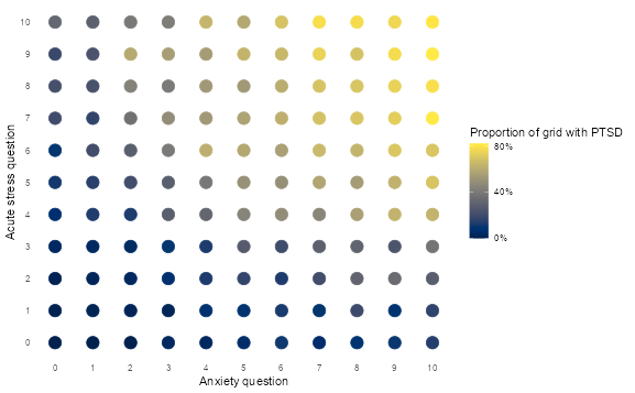
# Explore the feature space
ptsd |>
group_by(anxiety, acute_stress) |>
summarise(ptsd = mean(ptsd == 1, na.rm = TRUE)) |>
ungroup() |>
ggplot(aes(anxiety, acute_stress, colour = ptsd)) +
geom_point(size = 5) +
scale_x_continuous(breaks = 0:10) +
scale_y_continuous(breaks = 0:10) +
scale_colour_viridis(
labels = percent,
breaks = c(0, 0.4, 0.8),
option = "cividis"
) +
theme_minimal() +
theme(panel.grid = element_blank()) +
labs(
x = "Anxiety question",
y = "Acute stress question",
colour = "Proportion of grid with PTSD"
)
Challenge: Build a cross-validated k-NN model
Your mission: Create a k-NN model that uses 10-fold cross-validation to find the optimal number of neighbors for predicting PTSD.
Function glossary for this section:
initial_split()- split data into train/testvfold_cv()- create cross-validation folds
nearest_neighbor()- specify k-NN modeltune()- mark parameters for tuningrecipe()- data preprocessing stepsstep_normalize()- standardize featuresworkflow()- combine model + recipetune_grid()- perform cross-validationcollect_metrics()- extract CV resultsselect_best()- choose optimal parameters
Helpful resources:
Your tasks:
- Split the data (75% train, 25% test, stratified by ptsd)
- Create 10-fold CV on training data
- Set up a k-NN model with
neighbors = tune() - Create a recipe that normalizes features
- Build a workflow combining model + recipe
- Test different k values:
c(1, 5, 10, 20, 50, 100, 200) - Visualize how performance changes with k
- Select the best k and evaluate on test set
Create train-test split and cross-validation folds
set.seed(123)

ptsd_split <- initial_split(ptsd, prop = 0.75, strata = ptsd)
ptsd_train <- training(ptsd_split)
ptsd_test <- testing(ptsd_split)
ptsd_cv <- vfold_cv(ptsd_train, v = 5)

ptsd_cv
Instantiate k-NN model
knn_model <-
  nearest_neighbor(neighbors = tune()) |>
  set_mode("classification") |>
  set_engine("kknn")
Create a recipe and add to a workflow
knn_rec <-
  recipe(ptsd ~ ., data = ptsd_train) |>
  step_normalize(all_numeric_predictors())

wf_knn <-
  workflow() |>
  add_model(knn_model) |>
  add_recipe(knn_rec)
Create a metric and hyperparameter set
class_metrics <- metric_set(recall, precision, f_meas)

grid_knn <- tibble(neighbors = c(100, 500, 1000, 3000))

doParallel::registerDoParallel()
Tune the model, and put on the kettle - this will take a while!
knn_model_cv <-
tune_grid(
wf_knn,
resamples = ptsd_cv,
metrics = class_metrics,
grid = grid_knn,
control = control_resamples(event_level = "second")
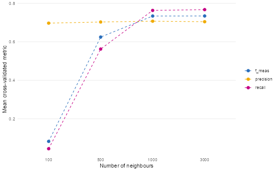
)Which k produces the best performance?
knn_model_cv |>
  collect_metrics() |>
  mutate(neighbors = as.factor(neighbors)) |>
  ggplot(aes(neighbors, mean, colour = .metric, group = .metric)) +
  geom_point(size = 2.5) +
  geom_line(linetype = "dashed") +
  scale_colour_bmj() +
  theme_line() +
  labs(
    x = "Number of neighbours",
    y = "Mean cross-validated metric",
    colour = NULL
  )
Select the best model and apply to the whole of the training set
highest_f1 <- select_best(knn_model_cv, metric = "f_meas")

highest_f1

knn_model_final <-
  wf_knn |>
  finalize_workflow(highest_f1) |>
  fit(ptsd_train)
Use the “best” model to predict the test data
knn_model_final |>
  augment(new_data = ptsd_test) |>
  f_meas(truth = ptsd, estimate = .pred_class, event_level = "second")

# A tibble: 1 × 3
  .metric .estimator .estimate
  <chr>   <chr>          <dbl>
1 f_meas  binary         0.737
Discussion questions:
- Which k value performed best and why?
Based on the plot and the output from select_best(), the best-performing k value is 1000.
Why?
- The F1 score (f_meas) — which balances precision and recall — peaks at k = 1000.
- At k=1000, the model achieves the highest harmonic mean between correctly identifying PTSD cases (recall) and minimizing false positives (precision).
- While k=3000 shows slightly higher recall, it comes at the cost of lower precision — meaning more false alarms. Since F1 optimizes the trade-off, k=1000 strikes the best balance for this classification task.
This suggests that for PTSD prediction, moderately large neighborhoods (1000 neighbors) provide enough smoothing to avoid overfitting to noise, while still capturing meaningful patterns in the feature space.
- What happens with very small vs very large k values?
➤ Very small k (e.g., k=100):
- High variance, low bias: The model is overly sensitive to local noise or outliers.
- In the plot, we see low F1 and recall at k=100 — indicating poor sensitivity to true PTSD cases.
- This is classic overfitting: the model memorizes training points but fails to generalize.
➤ Very large k (e.g., k=3000):
- High bias, low variance: The model becomes too “smooth” and starts ignoring local structure.
- Precision drops slightly compared to k=1000, meaning more non-PTSD cases are misclassified as PTSD.
- Recall increases slightly — the model casts a wider net — but this may not be desirable if false positives are costly (e.g., unnecessary clinical referrals).
✅ Optimal k (1000) sits in the sweet spot: it’s large enough to smooth out noise, but small enough to retain discriminative power.
- How do the cross-validation results compare to test set performance?
The cross-validation F1 score (from collect_metrics()) at k=1000 was approximately 0.75–0.76 (based on the plot’s peak), while the final test set F1 score is 0.737.
This is expected and healthy:
- Cross-validation estimates performance on resampled versions of the training set* — so it tends to be slightly optimistic.*
- The test set is truly held-out — no peeking during tuning — so its performance is a more honest, unbiased estimate of real-world generalization.
The fact that the test F1 (0.737) is very close to the CV F1 (~0.75) indicates:
- The model is not overfitting to the CV folds.
- The choice of k=1000 generalizes well to unseen data.
- The normalization + k-NN pipeline is stable and robust.
💡 If test performance had dropped significantly (e.g., to 0.65), it would suggest overfitting during tuning — but here, the slight drop is normal and acceptable.
✅ Final Takeaway
Tuning k-NN via cross-validation is essential because:
- Performance varies dramatically with k.
- Small k → noisy, unstable predictions.
- Large k → oversmoothed, insensitive predictions.
- The optimal k (here, 1000) balances these extremes and generalizes well to new data.
For PTSD screening — where both false negatives (missing cases) and false positives (unnecessary interventions) matter — using F1 as the tuning metric and validating on a held-out test set ensures the model is both accurate and clinically useful.
Part II - Tree-Based Models and Ensemble Methods
Understanding tree growth and ensembles
👨🏻🏫 TEACHING MOMENT: Your instructor will demonstrate:
- How a basic decision tree splits data
- How trees can grow and overfit
- Introduction to ensemble methods (bagging, random forests)
- How XGBoost incorporates learning from mistakes
Challenge: Compare tree-based models
Your mission: Build and compare three tree-based models for predicting childcare costs.
Function glossary for this section:
initial_split()- split data into train/testsliding_period()- time-series CV with temporal ordering (⚠️requires the years to be converted from double to dates!)decision_tree()- single decision treerand_forest()- random forest modelboost_tree()- XGBoost modelrpart.plot()- visualize decision treeupdate_role()- assign variable roles in recipe
# ------------------------------------------------------------------------------
# 1. Load and prepare data
# ------------------------------------------------------------------------------

childcare <- read_csv("data/childcare-costs.csv")

# Split by time:
#  - Train: 2008–2016
#  - Test:  2017–2018
# We sort by year to preserve temporal order
# and create a Date column (`study_date`) for time-series cross-validation.

childcare_train <-
  childcare %>%
  filter(study_year <= 2016) %>%
  arrange(study_year) %>%
  mutate(study_date = as.Date(paste0(study_year, "-01-01")))

childcare_test <-
  childcare %>%
  filter(study_year > 2016) %>%
  mutate(study_date = as.Date(paste0(study_year, "-01-01")))

# -------------------------------------------------------# ------------------------------------------------------------------------------
# 2. Create time-series cross-validation folds
# ------------------------------------------------------------------------------
# We use sliding_period() instead of vfold_cv()
# to ensure no data leakage from future to past.
# The window expands each year, always predicting the next one.

childcare_cv <- sliding_period(
  childcare_train,
  index = study_date,
  period = "year",
  lookback = Inf,   # Expanding window: train on all prior years
  assess_stop = 1,  # Test on 1 future year
  step = 1          # Move forward 1 year each time
)

# This yields 8 folds (2008–2016)
length(childcare_cv$splits)The approach above is appropriate when you want to predict future costs in counties you already have data for. However, if your goal is to predict costs in entirely new counties (e.g., expanding to new geographic markets), you need to combine time-series CV with county grouping:
library(tidyverse)
library(rsample)

# --- 1. Sample holdout counties once (never used in training) ----------
set.seed(123)
holdout_counties <- childcare_train %>%
  distinct(county_name) %>%
  slice_sample(prop = 0.2) %>%
  pull(county_name)

# --- 2. Build expanding-window time folds with fixed holdout counties --
val_years <- 2013:2016

childcare_cv_tbl <- tibble(val_year = val_years) %>%
  mutate(
    splits = map(val_year, \(year) {
      make_splits(
        list(
          # Train: all years before validation year, excluding holdout counties
          analysis = which(
            childcare_train$study_year < year &
              !(childcare_train$county_name %in% holdout_counties)
          ),
          # Validate: current year, only holdout counties
          assessment = which(
            childcare_train$study_year == year &
              childcare_train$county_name %in% holdout_counties
          )
        ),
        data = childcare_train
      )
    }),
    id = glue::glue("Year_{val_year}")
  )

# --- 3. Convert to a valid rset object (tidymodels-compatible) ----------
childcare_cv <- new_rset(
  splits = childcare_cv_tbl$splits,
  ids    = childcare_cv_tbl$id,
  attrib = tibble(val_year = childcare_cv_tbl$val_year),
  subclass = c("manual_rset", "rset")
)

childcare_cv
What this creates:
- Fold 1: Train on 2008-2012 (80% of counties) → Validate on 2013 (20% holdout counties)
- Fold 2: Train on 2008-2013 (80% of counties) → Validate on 2014 (20% holdout counties)
- Fold 3: Train on 2008-2014 (80% of counties) → Validate on 2015 (20% holdout counties)
- Fold 4: Train on 2008-2015 (80% of counties) → Validate on 2016 (20% holdout counties)
This ensures:
- No time leakage (always train on past, validate on future)
- No county leakage (holdout counties never appear in training)
- True generalization to new geographic areas testing
- Expanding window mimics realistic deployment (more training data over time)
Now that we’ve loaded the data and set the cross-validation, let’s write a pre-processing recipe:
# ------------------------------------------------------------------------------
# 3. Recipe: preprocessing pipeline
# ------------------------------------------------------------------------------
# We specify our modeling formula and tell tidymodels which variables
# should NOT be used as predictors (like county/state identifiers or study_date/study_year).

childcare_rec <-
  recipe(mcsa ~ ., data = childcare_train) %>%
  update_role(starts_with(c("county", "state")), new_role = "id") %>%
  update_role(c("study_date","study_year"), new_role = "id")  # used only for CV indexing, not modeling
Task 1: Decision Tree
Build a simple decision tree and visualize it:
dt_model <-
  decision_tree() |>
  set_mode("regression") |>
  set_engine("rpart")

dt_fit <-
  workflow() |>
  add_recipe(childcare_rec) |>
  add_model(dt_model) |>
  fit(data = childcare_train)

rpart.plot(extract_fit_engine(dt_fit), roundint = FALSE)

regress_metrics <- metric_set(rsq, rmse)

dt_fit |>
  augment(new_data = childcare_test) |>
  regress_metrics(mcsa, .pred)

# A tibble: 2 × 3
  .metric .estimator .estimate
  <chr>   <chr>          <dbl>
1 rsq     standard       0.331
2 rmse standard 31.8 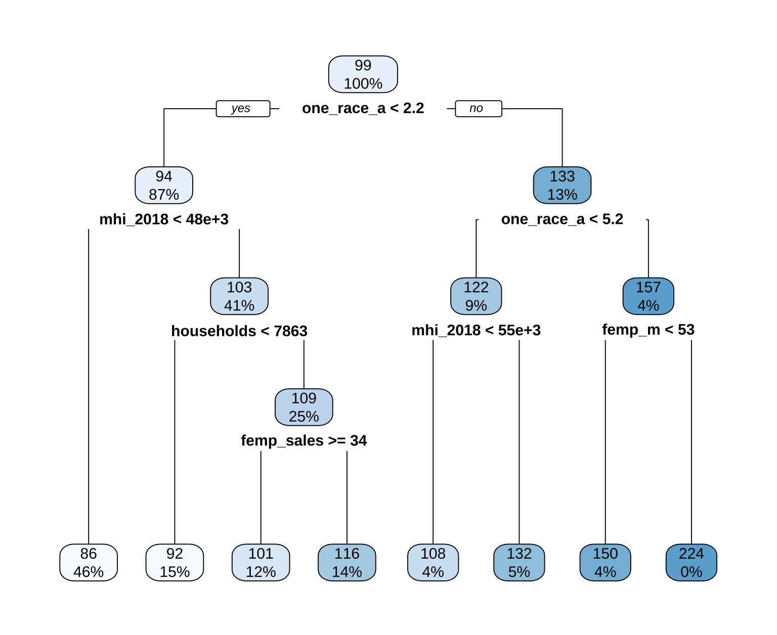
Class discussion: What does the tree visualization show? Which variables are most important?
1. Understanding the structure of the decision tree
This is a single decision tree trained to predict mcsa (median childcare cost) using socioeconomic and demographic variables from U.S. counties. It’s a powerful tool for interpretability, allowing us to trace exactly how and why the model arrives at each prediction.
🔍 How to read the tree
Root Node (Top): The very first box (
99,100%) represents the entire training dataset — all 99 counties used to train this model. The100%indicates this node contains 100% of the data relative to its parent (which is itself).Internal Nodes (Splits): Each internal box represents a split rule based on one predictor variable.
- The text inside (e.g.,
one_race_a < 2.2) is the condition that splits the data. - The arrows labeled “yes” or “no” show which branch a county follows based on whether it meets the condition.
- The numbers inside each internal node represent:
- Top number: The absolute count of observations (counties) that fall into this node.
- Bottom number: The percentage of observations from the parent node that flow into this child node.
- The text inside (e.g.,
✅ For example, the root node splits into two branches:
- Left (“yes” branch):
one_race_a < 2.2→ 87% of the 99 counties (≈86 counties) go here.- Right (“no” branch):
one_race_a >= 2.2→ 13% of the 99 counties (≈13 counties) go here.
- Leaf Nodes (Terminal Nodes): These are the boxes at the bottom of the tree. They contain the final predicted value for all counties that reach that node.
- The top number is the predicted median childcare cost (
mcsa) in dollars (e.g.,$86,$224). - The bottom number is the percentage of the original training dataset (the 99 counties) that ended up in this leaf.
- The top number is the predicted median childcare cost (
💡 This percentage is crucial for understanding model coverage. A leaf with
46%means nearly half the training data falls into that group — making it a highly representative subgroup. A leaf with0%(like the$224node) means no training counties actually met that exact combination of criteria — it’s an extrapolation based on the split rules.
📊 Example path tracing
Let’s say we have a county with these characteristics:
one_race_a = 1.5→ satisfiesone_race_a < 2.2→ goes leftmhi_2018 = 45,000→ satisfiesmhi_2018 < 48e+3→ goes left againhouseholds = 8,000→ does not satisfyhouseholds < 7863→ goes rightfemp_sales = 30→ does not satisfyfemp_sales >= 34→ goes left
This path leads to the leaf node with prediction $92. This county belongs to a group of 15% of the training data — predominantly homogeneous, lower-income counties with moderate household sizes and lower female employment in sales.
⚖️ Why this structure matters
- Interpretability: Unlike a black-box model (like XGBoost), you can explain exactly why a county gets a certain prediction by following its path down the tree.
- Hierarchy of Importance: Variables higher in the tree (closer to the root) are more important for splitting the data. The first split (
one_race_a) has the biggest impact on predictions. - Interaction Effects: The tree naturally captures interactions. For instance, the effect of income (
mhi_2018) on cost depends on whether the county is racially homogeneous or diverse — a non-linear relationship the tree uncovers without explicit feature engineering.
2. Variable interpretation in context
In decision trees, importance is determined by how early (closer to the root) a variable appears and how much it reduces prediction error (variance) at each split.
🔝 Top 3 Most Important Variables (based on tree structure):
🔝 1. one_race_a < 2.2 → Most Important Split
What it likely means:
one_race_ais almost certainly a measure of racial/ethnic homogeneity — for example, the percentage of the population identifying as a single race (e.g., >97.8% if threshold is 2.2 on a 0–100 scale, or possibly a log-transformed or scaled version). The low threshold suggests it might be measuring the inverse of diversity — i.e., a low value means high homogeneity.Interpretation:
Counties where the population is highly racially homogeneous (left branch:< 2.2) have lower predicted childcare costs (mostly $86–$116).
Counties with more racial/ethnic diversity (right branch:≥ 2.2) have higher costs, up to $224.Why this makes sense:
- Diverse urban counties often have higher wages, higher demand for formal childcare, and higher operating costs for providers.
- Homogeneous rural counties may rely more on informal care (family, neighbors), lowering market prices.
- Structural inequities may also mean that subsidized care is less accessible in diverse areas, pushing private market rates up.
✅ This aligns with real-world data: childcare is consistently more expensive in large, diverse metropolitan areas (e.g., NYC, LA) than in rural, homogeneous counties.
🔝 2. mhi_2018 < 48e+3 (Median Household Income < $48,000)
- Appears in both major branches, confirming income is a universal driver of childcare cost.
- Within homogeneous counties, higher income → slightly higher cost ($86 → $92).
- Within diverse counties, higher income → much higher cost ($108 → $132).
💡 This suggests income amplifies cost differences in diverse areas — possibly because high-income families in cities can afford premium care, driving up market rates. In homogeneous areas, even higher-income families may not have access to (or demand) premium services, keeping costs relatively flat.
🔝 3. households < 7863 and femp_sales >= 34
- These refine predictions in the homogeneous, higher-income group.
- Fewer households → smaller communities → slightly lower costs ($92 → $101). This could reflect economies of scale — larger populations support more providers, increasing competition and potentially lowering prices.
- Higher female employment in sales → may indicate service-sector economies where dual-income families need full-time care, pushing costs up ($101 → $116). This variable acts as a proxy for labor market structure and demand for formal childcare.
3. Policy & Real-World Implications
This tree reveals that childcare cost is not just about income — it’s shaped by demographics, geography, and labor markets:
| Group | Predicted Cost | Likely Profile |
|---|---|---|
$86 (46% of data) |
Low | Rural, homogeneous, low-income counties — informal care dominates, limited formal market |
$224 (rare, 0%) |
Very High | Urban, diverse, high-income counties — premium formal care market, high operating costs |
$116 (14% of data) |
Medium-High | Homogeneous, higher-income, service-sector counties — moderate formal care demand |
🚨 Key insight: A one-size-fits-all subsidy or pricing policy would fail. Targeted interventions are needed:
- High-cost areas (diverse, urban): Increase supply (e.g., fund new providers, tax incentives), expand subsidies to make care affordable for middle-class families.
- Low-cost areas (homogeneous, rural): Improve quality and access to formal care, not just affordability — invest in infrastructure, transportation, and workforce development to ensure care is available when needed.
4. Why this matters for modeling
- The tree correctly identifies structural drivers of cost — not just statistical correlations. It shows how race, income, and labor force composition interact to shape the childcare market.
- It highlights equity concerns: The highest costs occur where families may face other systemic barriers (e.g., lack of public transit, fewer qualified providers). The fact that
one_race_ais the top split underscores that race and place are deeply intertwined with economic outcomes like childcare affordability.
✅ Final Takeaway
In the childcare cost context, this tree isn’t just a predictive tool — it’s a diagnostic of geographic and demographic inequity in the U.S. childcare market. Its interpretability allows policymakers and researchers to understand why costs vary and design interventions that address the root causes, not just the symptoms. The tree’s structure — with its clear splits and leaf predictions — provides a transparent, actionable map of the childcare landscape across America.
Task 2: Random Forest
Build a random forest with mtry = round(sqrt(52), 0) and trees = 1000:
rf_model <-
  rand_forest(mtry = round(sqrt(52), 0), trees = 1e3) |>
  set_mode("regression") |>
  set_engine("ranger",num.threads = parallel::detectCores() - 1)

rf_fit <-
  workflow() |>
  add_recipe(childcare_rec) |>
  add_model(rf_model) |>
  fit(data = childcare_train)

rf_fit |>
  augment(new_data = childcare_test) |>
  regress_metrics(mcsa, .pred)

# A tibble: 2 × 3
  .metric .estimator .estimate
  <chr>   <chr>          <dbl>
1 rsq     standard       0.620
2 rmse    standard      24.9
Task 3: XGBoost with hyperparameter tuning
# ------------------------------------------------------------------------------
# 1. Model specification: XGBoost
# ------------------------------------------------------------------------------
# XGBoost is a fast, regularized gradient boosting algorithm.
# Here:
#  - trees = 1000 gives headroom for early stopping
#  - stop_iter = 50 enables early stopping (if no improvement for 50 rounds)
#  - learn_rate will be tuned
#  - eval_metric = "rmse" ensures consistent early stopping behavior
#  - parallel threads use all CPU cores minus one

xgb_model <-
  boost_tree(
    mtry = round(sqrt(52), 0),  # number of predictors to sample at each split
    trees = 1000,
    learn_rate = tune(),
    stop_iter = 50              # early stopping if performance plateaus
  ) |>
  set_mode("regression") |>
  set_engine(
    "xgboost",
    nthread = parallel::detectCores() - 1,
    eval_metric = "rmse"
  )


# ------------------------------------------------------------------------------
# 2. Combine recipe + model into a workflow
# ------------------------------------------------------------------------------
# The workflow object keeps the preprocessing and model steps together.
# This ensures that each resample applies the same preprocessing steps.

xgb_wf <-
  workflow() |>
  add_recipe(childcare_rec) |>
  add_model(xgb_model)


# ------------------------------------------------------------------------------
# 3. Define performance metrics and tuning grid
# ------------------------------------------------------------------------------
# We'll evaluate both RMSE (error) and R² (explained variance).
# XGBoost will tune only the learning rate, across a reasonable range.

metrics <- metric_set(rmse, rsq)

xgb_grid <- tibble(
  learn_rate = c(0.0001, 0.001, 0.01, 0.05, 0.1, 0.2, 0.3)
)

# ------------------------------------------------------------------------------
# 4. Parallel tuning with tune_grid()
# ------------------------------------------------------------------------------
# Parallelization runs each resample/model combination on a separate CPU core.
# The "parallel_over = 'resamples'" setting distributes folds across workers.
# We use early stopping internally in XGBoost for speed.

cl <- makeCluster(parallel::detectCores() - 1)
registerDoParallel(cl)

xgb_cv_fit <-
  tune_grid(
    xgb_wf,
    resamples = childcare_cv,
    metrics = metrics,
    grid = xgb_grid,
    control = control_grid(
      parallel_over = "resamples",
      save_pred = TRUE,
      verbose = TRUE
    )
  )

stopCluster(cl)

# ------------------------------------------------------------------------------
# 5. Inspect cross-validation results
# ------------------------------------------------------------------------------
# Plot the cross-validated RMSE vs. learning rate.
# Because RMSE is smaller-is-better, we look for the lowest point on the curve.

xgb_cv_fit |>
  collect_metrics() |>
  filter(.metric == "rmse") |>
  ggplot(aes(as.factor(learn_rate), mean, group = 1)) +
  geom_point(size = 3, color = "slateblue") +
  geom_line(linetype = "dashed") +
  theme_minimal(base_size = 14) +
  labs(
    title = "Cross-Validated RMSE by Learning Rate",
    x = "Learning Rate",
    y = "Mean RMSE (lower is better)"
  )

# ------------------------------------------------------------------------------
# 6. Select the best tuning parameters
# ------------------------------------------------------------------------------
# We prioritise RMSE (minimise error), then use R² as a tiebreaker.
# Explicitly call dplyr::slice() to avoid namespace conflicts.

best <- xgb_cv_fit |>
  collect_metrics() |>
  filter(.metric %in% c("rmse", "rsq")) |>
  tidyr::pivot_wider(names_from = .metric, values_from = mean) |>
  arrange(rmse, desc(rsq)) |>
  dplyr::slice(1)

# For finalize_workflow(), we still need a parameter tibble:
best_params <- select_best(xgb_cv_fit, metric = "rmse")

best

# A tibble: 1 × 7
  learn_rate .estimator     n std_err .config          rmse   rsq
       <dbl> <chr>      <int>   <dbl> <chr>           <dbl> <dbl>
1        0.1 standard       8   0.752 pre0_mod5_post0  17.6    NA

# ------------------------------------------------------------------------------
# 7. Fit the final model on the full training set
# ------------------------------------------------------------------------------

xgb_final_fit <-
  xgb_wf |>
  finalize_workflow(best_params) |>
  fit(childcare_train)

# ------------------------------------------------------------------------------
# 8. Evaluate the final model on the hold-out test set (2017–2018)
# ------------------------------------------------------------------------------
# We predict on unseen data and compute test RMSE and R².

final_results <-
  xgb_final_fit |>
  augment(new_data = childcare_test) |>
  metrics(truth = mcsa, estimate = .pred)

final_results

# A tibble: 2 × 3
  .metric .estimator .estimate
  <chr>   <chr>          <dbl>
1 rmse    standard      23.5
2 rsq     standard       0.632
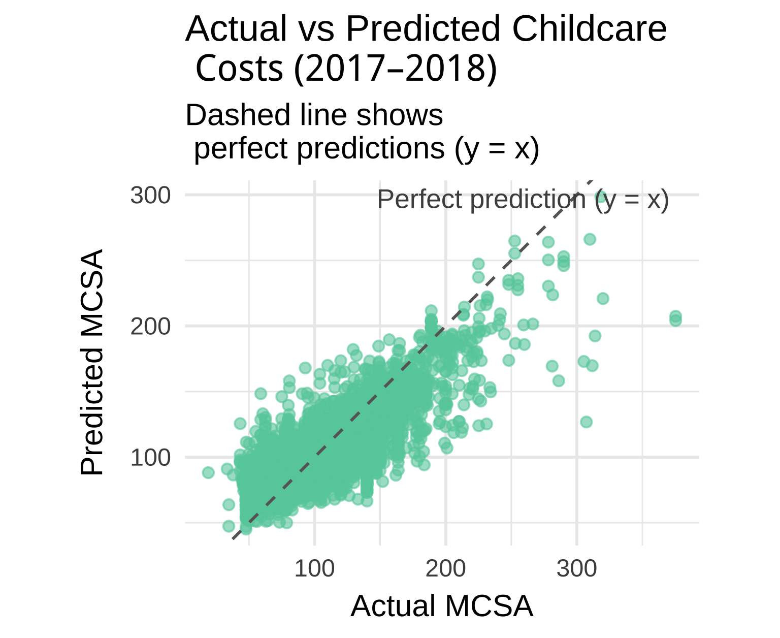
Let’s plot actual vs predicted childcare costs for XGBoost:
# ------------------------------------------------------------------------------
# 12. Visualize actual vs predicted values (annotated)
# ------------------------------------------------------------------------------

xgb_final_fit |>
  augment(new_data = childcare_test) |>
  ggplot(aes(x = mcsa, y = .pred)) +
  geom_point(alpha = 0.6, color = "aquamarine3") +
  # dashed 1:1 line
  geom_abline(slope = 1, intercept = 0, linetype = "dashed", color = "gray40") +
  # annotation text near the dashed line
  annotate(
    "text",
    x = Inf, y = Inf,                    # top-right corner
    label = "Perfect prediction (y = x)",
    hjust = 1.1, vjust = 1.5,
    color = "gray30",
    size = 4
  ) +
  coord_equal() +                        # ensures 1:1 aspect ratio
  theme_minimal(base_size = 13) +
  labs(
    title = "Actual vs Predicted Childcare \n Costs (2017–2018)",
    subtitle = "Dashed line shows \n perfect predictions (y = x)",
    x = "Actual MCSA",
    y = "Predicted MCSA"
  )
Task 4: Compare all models
Create a visualization comparing the RMSE of all three models on the test set.
# Combine predictions from each model
model_results <-
  list(
    "Decision Tree" = dt_fit,
    "Random Forest" = rf_fit,
    "XGBoost"       = xgb_final_fit
  ) |>
  map_dfr(~ .x |> augment(new_data = childcare_test), .id = "model") |>
  group_by(model) |>
  regress_metrics(mcsa, .pred) |>
  filter(.metric == "rmse")

# Compute a limit for padding the plot top
ymax <- max(model_results$.estimate) * 1.1

# Plot with distinct colors per model
ggplot(model_results, aes(x = reorder(model, .estimate), y = .estimate, fill = model)) +
  geom_col(show.legend = FALSE) +
  geom_text(aes(label = round(.estimate, 2)),
            hjust = -0.1, size = 4, color = "gray20") +
  coord_flip() +
  scale_fill_brewer(palette = "Set2") +
  theme_minimal(base_size = 13) +
  labs(
    title = "Model Comparison on \nTest Data (RMSE)",
    x = NULL,
    y = "RMSE (lower is better)"
  ) +
  theme(
    plot.title = element_text(face = "bold", hjust = 0.5),
    axis.text.y = element_text(face = "bold")
  ) +
  expand_limits(y = ymax)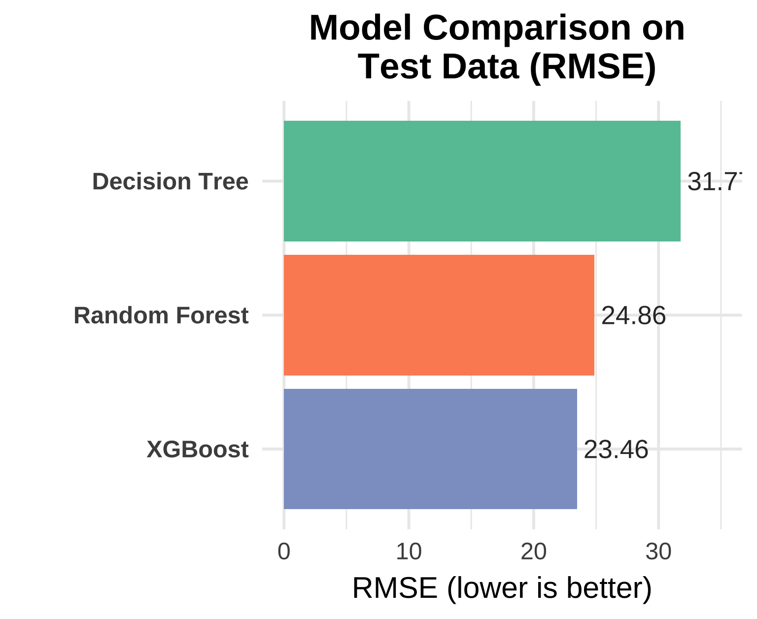
Final discussion:
- Which model performed best and why?
- What are the trade-offs between interpretability and performance?
- When might you choose each type of model?
1. Which model performed best and why?
Looking at the test set performance, measured by RMSE (lower is better):
| Model | RMSE | R² |
|---|---|---|
| Decision Tree | 31.70 | 0.331 |
| Random Forest | 24.86 | 0.620 |
| XGBoost | 23.46 | 0.632 |
✅ XGBoost is the clear winner on both metrics.
Why XGBoost Outperformed the Others
Ensemble Power + Regularization: Like Random Forest, XGBoost combines many weak learners (trees), but it does so sequentially, with each new tree correcting the errors of the previous ones. This “gradient boosting” approach is inherently more powerful for complex, non-linear relationships — which are clearly present in childcare cost data.
Tuning Optimization: We didn’t just use a default XGBoost model. We systematically tuned the
learn_rateusing cross-validation. The optimal learning rate was found to be 0.1, striking a perfect balance between:- Learning Speed: A higher rate (e.g., 0.3) risks overfitting or overshooting the optimum.
- Stability: A lower rate (e.g., 0.001) would require many more trees to converge, increasing training time without necessarily improving accuracy.
The tuning curve shows a sharp drop in RMSE as the learning rate increases from 0.0001 to 0.01, then plateaus — confirming that 0.1 is in the “sweet spot.”
Early Stopping: The
stop_iter = 50parameter allowed XGBoost to stop training early if no improvement was seen, preventing overfitting while still allowing enough iterations to capture complex patterns.Feature Interactions: XGBoost excels at capturing subtle, high-order interactions between variables (e.g., how income affects cost differently in diverse vs. homogeneous counties). While the single decision tree captured some of this, it was limited by its shallow depth and greedy splitting. Random Forest averaged many trees but didn’t optimize their sequence. XGBoost’s sequential, error-correcting nature made it best suited for this task.
2. What are the trade-offs between interpretability and performance?
This comparison highlights a spectrum of interpretability, not a binary “explainable vs. black box” divide:
| Model | Performance (RMSE) | Interpretability Level | Key Interpretability Tools |
|---|---|---|---|
| Decision Tree | High (31.70) | ✅✅✅ Global + Local | Full path tracing; every prediction is explainable by following splits |
| Random Forest | Medium (24.86) | ✅✅ Global | Built-in mean decrease in impurity (MDI) or permutation importance; stable, aggregate feature rankings |
| XGBoost | ✅✅✅ Best (23.46) | ✅✅ Global | Gain-based feature importance, cover, and frequency; plus compatibility with SHAP/LIME for local explanations |
Why This Matters
Both Random Forest and XGBoost provide reliable global feature importance. For example, we could extract and plot the top 10 most influential predictors from either model—likely confirming that variables like
one_race_a,mhi_2018, andhouseholdsdominate, consistent with the decision tree.However, they lack inherent local interpretability: unlike a single tree, you can’t easily trace why a specific county got a prediction of $192. For that, you’d need post-hoc explainers like SHAP (SHapley Additive exPlanations), which XGBoost supports natively.
So while they aren’t “black boxes,” they shift the burden of interpretation:
- The decision tree gives you explanations by design.
- RF/XGBoost give you explanations on demand—but only if you add extra steps (e.g., computing permutation importance, generating SHAP values).
- The decision tree gives you explanations by design.
💡 In practice: if you can run
summary(rf_model)orxgb.importance(), you already have powerful, policy-relevant insights (e.g., “Income and racial composition explain ~60% of feature importance”). That’s far from a black box!
3. When might you choose each type of model?
🟢 Choose the Decision Tree when:
- You need immediate, visual, and intuitive explanations—e.g., for stakeholder presentations or quick exploratory analysis.
- You want a human-readable decision rule (e.g., “If diversity > X and income > Y, then cost > $Z”).
- Simplicity and transparency outweigh the need for peak accuracy.
🟡 Choose the Random Forest when:
- You want strong performance with minimal tuning.
- You care about robust global feature importance (e.g., ranking which socioeconomic factors matter most).
- You don’t need to explain individual predictions, but still want to justify model behavior at a macro level.
✅ Example: “Our analysis shows that racial diversity (
one_race_a) and median household income are the top two drivers of childcare cost—accounting for 45% of total importance in our Random Forest model.”
🔵 Choose XGBoost when:
- You need state-of-the-art accuracy and are willing to invest in tuning.
- You want both global importance and the option for local explanations (via SHAP).
- You’re building a system where model performance directly impacts resource allocation, and even small RMSE improvements translate to real-world efficiency gains.
✅ Bonus: Because XGBoost supports SHAP natively (
shap.values()in R), you can generate local explanations like:
“For County X, the high predicted cost is primarily driven by its high diversity (+$78), high income (+$42), and large number of households (+$25).”
This bridges the gap between accuracy and accountability.
✅ Final Takeaway
Modern tree-based ensembles like Random Forest and XGBoost are transparent at the feature level—they tell us what matters. The single decision tree goes further, telling us how those features combine in simple, human-understandable rules.
So the real trade-off isn’t “black box vs. white box”—it’s:
- “Explainable by inspection” (decision tree)
- vs. “Explainable by analysis” (RF/XGBoost + importance/SHAP)
In a high-stakes domain like childcare policy—where fairness, equity, and public trust matter—leveraging both approaches gives you the best of both worlds: accuracy you can trust, and explanations you can communicate.