
✅ Week 09 - Lab Solutions
Introduction to anomaly detection in Python
⚙️ Setup
Downloading the student solutions
Click on the below button to download the student notebook.
Loading libraries
Let’s start by loading the relevant libraries!
import numpy as np
import pandas as pd
from sklearn.preprocessing import StandardScaler
from sklearn.pipeline import Pipeline
from sklearn.cluster import KMeans, DBSCAN
from sklearn.ensemble import IsolationForest
from sklearn.neighbors import LocalOutlierFactor, NearestNeighbors
from sklearn.metrics import calinski_harabasz_score
from kneed import KneeLocator
from yellowbrick.cluster import KElbowVisualizer
from prince import FAMD
import matplotlib.pyplot as plt
import seaborn as sns
import plotly.express as px
import plotly.io as pio
import plotly.graph_objects as go
from plotly.subplots import make_subplots
Part I: Introducing a new data set (10 minutes)
In this lab, we will use outlier detection to deepen our appreciation of 2000s and 2010s pop music. Using data from Spotify, we have a list of features for 919 popular singles that were released in the 1990s. Features include:
artist: Name of the Artist.song: Name of the Track.duration_ms: Duration of the track in milliseconds.explicit: The lyrics or content of a song or a music video contain one or more of the criteria which could be considered offensive or unsuitable for children.year: Release Year of the track.popularity: The higher the value the more popular the song is.danceability: Danceability describes how suitable a track is for dancing based on a combination of musical elements including tempo, rhythm stability, beat strength, and overall - regularity. A value of 0.0 is least danceable and 1.0 is most danceable.energy: Energy is a measure from 0.0 to 1.0 and represents a perceptual measure of intensity and activity.key: The key the track is in. Integers map to pitches using standard Pitch Class notation. E.g. 0 = C, 1 = C♯/D♭, 2 = D, and so on. If no key was detected, the value is -1.loudness: The overall loudness of a track in decibels (dB). Loudness values are averaged across the entire track and are useful for comparing relative loudness of tracks. Loudness is the quality of a sound that is the primary psychological correlate of physical strength (amplitude). Values typically range between -60 and 0 db.mode: Mode indicates the modality (major or minor) of a track, the type of scale from which its melodic content is derived. Major is represented by 1 and minor is 0.speechiness: Speechiness detects the presence of spoken words in a track. The more exclusively speech-like the recording (e.g. talk show, audio book, poetry), the closer to 1.0 the attribute value. Values above 0.66 describe tracks that are probably made entirely of spoken words. Values between 0.33 and 0.66 describe tracks that may contain both music and speech, either in sections or layered, including such cases as rap music. Values below 0.33 most likely represent music and other non-speech-like tracks.acousticness: A confidence measure from 0.0 to 1.0 of whether the track is acoustic. 1.0 represents high confidence the track is acoustic.instrumentalness: Predicts whether a track contains no vocals. “Ooh” and “aah” sounds are treated as instrumental in this context. Rap or spoken word tracks are clearly “vocal”. The closer the instrumentalness value is to 1.0, the greater likelihood the track contains no vocal content. Values above 0.5 are intended to represent instrumental tracks, but confidence is higher as the value approaches 1.0.liveness: Detects the presence of an audience in the recording. Higher liveness values represent an increased probability that the track was performed live. A value above 0.8 provides strong likelihood that the track is live. valence: A measure from 0.0 to 1.0 describing the musical positiveness conveyed by a track. Tracks with high valence sound more positive (e.g. happy, cheerful, euphoric), while tracks with low valence sound more negative (e.g. sad, depressed, angry).tempo: The overall estimated tempo of a track in beats per minute (BPM). In musical terminology, tempo is the speed or pace of a given piece and derives directly from the average beat duration.genre: Genre of the track.
# Load the data set
hits = pd.read_csv("data/2000s-hits-data.csv")

# Print the shape attribute
print(hits.shape)(2000, 18)🗣CLASSROOM DISCUSSION
(Your class teacher will mediate this discussion)
- How would you explore this data if dimensionality reduction was not an option?
Scatter plots for relationships between two continuous features. Box plots to assess relationships between continuous features over categorical features.
- How would you answer: what are the most common types of songs one can find on this data set?
We could try k-means clustering and look at key quantities of interest such as the centroids of those clusters over a range of different features.
Part II: Factor Analysis of Mixed Data (FAMD) (20 minutes)
Let’s create a list of different musical attributes, and filter the data frame to only include said attributes:
# Define which columns are numeric and which are categorical
numeric_cols = ["danceability", "energy", "loudness", "speechiness",
                "acousticness", "instrumentalness", "liveness", "valence"]
categorical_cols = ["mode", "explicit"]

# Create a list of musical attributes
music_attrs = categorical_cols + numeric_cols

# Create a new filtered data frame
hits_attrs = hits.filter(items=music_attrs)

# Ensure categorical columns are treated as categorical
hits_attrs[categorical_cols] = hits_attrs[categorical_cols].astype('category')
🎯 ACTION POINTS
- To try to make sense of the sheer number of combinations of attributes, we will run FAMD and apply it to our data set:
# Option 1: Using FAMD (recommended for mixed data)
# FAMD handles both numeric and categorical variables automatically
pipe = Pipeline([
    ("famd", FAMD(
        n_components = 10,
        n_iter=3,
        random_state=42,
        engine='sklearn'
    ))
])

# Call the fit_transform method
components = pipe.fit_transform(hits_attrs)- How much ‘information’ are we keeping after compressing the data with FAMD?
If we take the first 5 components, we can explain around 70% of the variance among our features
# Get the explained variance from FAMD
# In prince, you need to calculate the proportion from eigenvalues
eigenvalues = pipe.named_steps["famd"].eigenvalues_
total_inertia = eigenvalues.sum()
explained_variance_ratio = eigenvalues / total_inertia

# Create a data frame with cumulative variance
variance_explained = pd.DataFrame({
    "component": range(1, 11),  # Changed to 11 to match 10 components
    "variance": np.cumsum(explained_variance_ratio[:11])
})

# Create the plot
plt.figure(figsize=(8, 6))
sns.barplot(data=variance_explained, x="component", y="variance", color="steelblue")

# Customize the plot
plt.xlabel("Principal Component")
plt.ylabel("Cumulative Variance")
plt.title("The first 5 components explain ~70% of the variation amongst\nour features!")
plt.grid(axis='x', visible=False)
plt.tight_layout()
plt.show()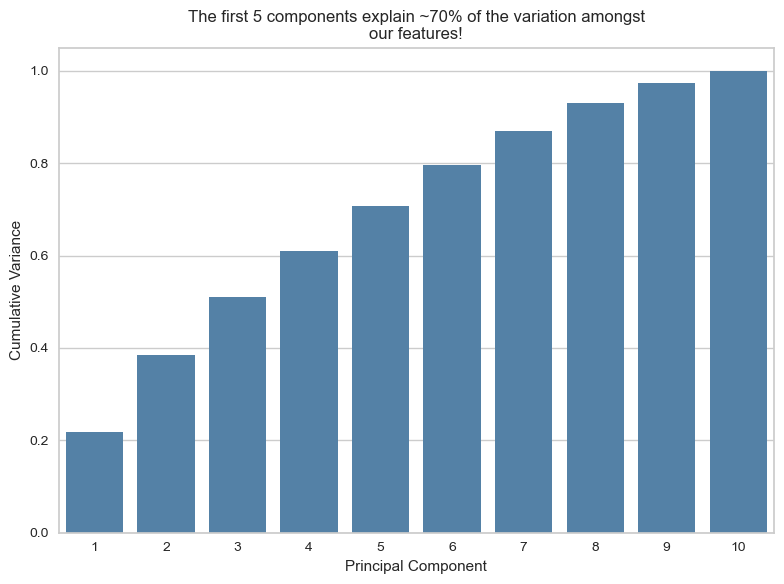
- Let’s focus on the first two components, as they are common plotting practices.
Think of the plot below as a ~39% compressed 2D representation of our 10 musical attributes.
# The FAMD transformation already returns a DataFrame of component scores.
# We therefore simply copy it and rename the columns to more informative labels
# (FAMD1, FAMD2, …) rather than recreating the DataFrame, which could introduce
# alignment issues.

components_df = components.copy()
components_df.columns = [f"FAMD{i+1}" for i in range(components_df.shape[1])]

# Add information on artist and track to the data frame
output_df = pd.concat([components_df, hits[["song","artist"]].reset_index(drop=True)], axis=1)

# Set renderer to browser
#pio.renderers.default = "browser"

# Your existing code...
fig = px.scatter(output_df,
                 x="FAMD1",
                 y="FAMD2",
                 hover_data={"artist": True,
                            "song": True},
                 opacity=0.5)

fig.update_layout(
    xaxis_title="FAMD1",
    yaxis_title="FAMD2",
    width=900,
    height=700
)

fig.show() # This will now open in your default browser🧑🏫 TEACHING MOMENT
Your class teacher will now guide the conversation and explain the plot below. If needed, they will recap how FAMD works.
# Get the FAMD model
famd_model = pipe.named_steps["famd"]

# Calculate correlations between original variables and components
list_dfs = []

for i in range(4):  # First 4 components
    component_values = components_df[f"FAMD{i+1}"]

    loadings = []
    for col in hits_attrs.columns:
        if hits_attrs[col].dtype in ['float64', 'int64']:
            # Numeric variables - calculate correlation
            corr = hits_attrs[col].corr(component_values)
        else:
            # Categorical variables - calculate correlation with numeric encoding
            corr = hits_attrs[col].astype('category').cat.codes.corr(component_values)
        loadings.append(corr)

    df = pd.DataFrame({
        "features": hits_attrs.columns,
        "loadings": loadings,
        "component": i + 1
    })
    list_dfs.append(df)

# Concatenate all dataframes
loadings_df = pd.concat(list_dfs, ignore_index=True)

# Create absolute loadings column
loadings_df["abs_loadings"] = np.abs(loadings_df["loadings"])

# Create the plot
fig, axes = plt.subplots(2, 2, figsize=(14, 10))
axes = axes.flatten()

for idx, component in enumerate([1, 2, 3, 4]):
    comp_data = loadings_df[loadings_df["component"] == component].sort_values("loadings")

    # Create horizontal bar plot with color based on absolute value
    bars = axes[idx].barh(comp_data["features"], comp_data["loadings"])

    # Color bars using viridis colormap
    norm = plt.Normalize(vmin=0, vmax=comp_data["abs_loadings"].max())
    colors = plt.cm.viridis(norm(comp_data["abs_loadings"]))

    for bar, color in zip(bars, colors):
        bar.set_color(color)

    # Formatting
    axes[idx].set_xlabel("Loadings")
    axes[idx].set_ylabel("Features")
    axes[idx].set_title(f"Component {component}")
    axes[idx].axvline(x=0, color='black', linestyle='-', linewidth=0.8)
    axes[idx].grid(axis='x', alpha=0.3)

plt.tight_layout()
plt.show()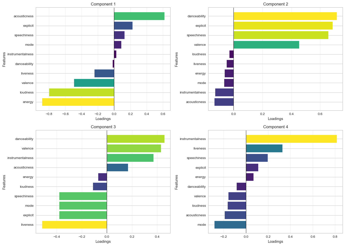
🗣️ Discussion:
- How does Figure 3 help you interpret Figure 2?
We can see precisely which variables ended up contributing to each component.
- How does the above help you think about the attributes of the most common type of songs?
We can look at component 1 (the component that explains the largest variance among features), which shows songs with high acousticness and low energy.
Part III: Anomaly detection techniques (1 hour)
👥 IN PAIRS, go through the action points below and discuss your impressions and key takeaways.
🎯 ACTION POINTS
- Take a look at the clusters identified by DBSCAN! We will employ a method that can help you determine values for the epsilon neighbourhood and minimum samples hyperparameters. We adapted this code from here.
# Set min_samples equal to 2 times the number of dimensions
min_samples = 4

# Instantiate nearest neighbours model, setting n_neighbors equal to min_sample
nearest_neighbors = NearestNeighbors(n_neighbors=min_samples)

# Fit the model to the first two principle components
neighbors = nearest_neighbors.fit(output_df[["FAMD1","FAMD2"]])

# Extract the distances and indices from the nearest neighbours model
distances, indices = neighbors.kneighbors(output_df[["FAMD1","FAMD2"]])

# Sort the distances from the 4th dimension of the distances matrix
distances = np.sort(distances[:,min_samples-1], axis=0)
# Identify the knee point
i = np.arange(len(distances))
knee = KneeLocator(
i,
distances,
S=1,
curve="convex",
direction="increasing",
interp_method="polynomial"
)
eps = distances[knee.knee]
# Plot the k-distance graph
plt.figure(figsize=(8,6))
plt.plot(i, distances, color="steelblue", linewidth=2)
# Horizontal line showing the recommended epsilon
plt.axhline(eps, color="red", linestyle="--", label=f"Suggested eps ≈ {eps:.3f}")
# Optional: vertical knee location
plt.axvline(knee.knee, color="grey", linestyle=":", alpha=0.7)
plt.xlabel("Points (sorted by distance)")
plt.ylabel(f"{min_samples}-NN distance")
plt.title("k-distance graph for choosing DBSCAN epsilon")
plt.legend()
plt.tight_layout()
plt.show()
print(f"We should set the epsilon neighbourhood value to ~ {np.round(eps,4)}!")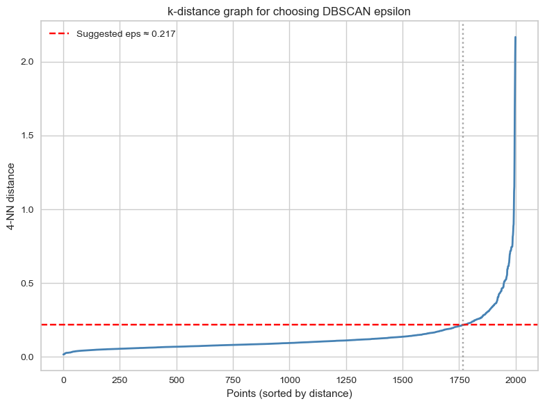
We should set the epsilon neighbourhood value to ~ 0.217!# Instantiate a DBSCAN model
dbscan = DBSCAN(eps = eps, min_samples = min_samples)
# Fit the model to the first two principle component features
_ = dbscan.fit(output_df[["FAMD1","FAMD2"]])# Prepare the data
to_plot = output_df.copy()
to_plot["dbscan"] = [str(lab) for lab in dbscan.labels_]
to_plot["dbscan_outlier"] = np.where(to_plot["dbscan"] == "-1", "Yes", "No")
# Create the interactive plot
fig = px.scatter(to_plot,
x="FAMD1", # Changed from PC1 to FAMD1
y="FAMD2", # Changed from PC2 to FAMD2
color="dbscan_outlier",
hover_data={"song": True,
"artist": True,
"dbscan_outlier": False, # Hide from hover
"FAMD1": ":.3f",
"FAMD2": ":.3f"},
labels={"dbscan_outlier": "Outlier"},
color_discrete_map={"Yes": "#F8766D", "No": "#00BFC4"}) # ggplot2 default colors
# Customize layout
fig.update_layout(
xaxis_title="FAMD1",
yaxis_title="FAMD2",
width=900,
height=700,
legend_title_text="Outlier"
)
# Customize hover template for cleaner tooltips
fig.update_traces(
hovertemplate="<b>%{customdata[0]}</b><br>" +
"Artist: %{customdata[1]}<br>" +
"FAMD1: %{x:.3f}<br>" +
"FAMD2: %{y:.3f}<br>" +
"<extra></extra>"
)
fig.write_html("dbscan_outliers.html", auto_open=True)🗣 Discussion: How well do you think DBSCAN performs at anomaly detection on the two principle components?
It is pretty good, and we can visually perceive that. The algorithm is able to identify clear ‘outliers’ in the data. Just remember that we are looking at just the two first principal components, and these two PCs don’t encode all the variables in the data the same way.
Unfortunately, the k-distance plot method is just that: a heuristic, which means it’s not fool-proof. You’d have to examine the plot in more details to check if the outliers found really make sense…
🎯 ACTION POINTS
- Take a look at the clusters identified by k-means:
In Week 08, we used the elbow method to guide the choice of the number of clusters. Here we introduce an alternative metric, the Calinski–Harabasz (CH) score, which evaluates clustering quality by comparing between-cluster separation with within-cluster compactness. Higher scores indicate better-defined clusters so the number of clusters that maximises the CH score is typically considered the most appropriate.
# Instantiate a k-means model
model = KMeans(random_state=42)

# Instantiate a visualizer from the yellowbrick library
visualizer = KElbowVisualizer(model, k=(2,10), metric = "calinski_harabasz", timings=False, force_model=True)

# Fit the visualizer to the first two principle components
visualizer.fit(output_df[["FAMD1","FAMD2"]])

# Finalize and render the figure
visualizer.show() 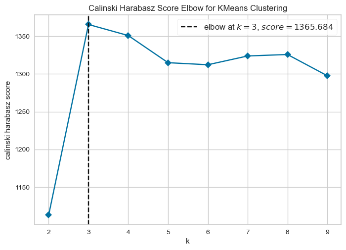
# Instantiate a model
kmeans = KMeans(n_clusters=3, random_state=42)

# Fit the model to the data
_ = kmeans.fit(output_df[["FAMD1","FAMD2"]])

# Create a data frame based on customers by adding the cluster labels
to_plot["kmeans"] = [str(i) for i in kmeans.labels_]

# Create the interactive plot
fig = px.scatter(to_plot,
                 x="FAMD1",
                 y="FAMD2",
                 color="kmeans",
                 hover_data={"song": True,
                            "artist": True,
                            "kmeans": True,
                            "FAMD1": ":.3f",
                            "FAMD2": ":.3f"},
                 labels={"kmeans": "Cluster #"},
                 color_discrete_sequence=px.colors.qualitative.Set1)

# Customize layout with minimal theme
fig.update_layout(
    xaxis_title="FAMD1",
    yaxis_title="FAMD2",
    width=900,
    height=700,
    legend_title_text="Cluster #",
    legend=dict(
        orientation="h",
        yanchor="top",
        y=-0.15,
        xanchor="center",
        x=0.5
    ),
    plot_bgcolor='white',
    xaxis=dict(gridcolor='lightgray', showline=True, linecolor='black'),
    yaxis=dict(gridcolor='lightgray', showline=True, linecolor='black')
)

# Customize hover template
fig.update_traces(
    hovertemplate="<b>%{customdata[0]}</b><br>" +
                  "Artist: %{customdata[1]}<br>" +
                  "Cluster: %{customdata[2]}<br>" +
                  "FAMD1: %{x:.3f}<br>" +
                  "FAMD2: %{y:.3f}<br>" +
                  "<extra></extra>"
)

fig.write_html("kmeans_clusters.html", auto_open=True)
🗣 Discussion: How well do you think k-means performs at anomaly detection on the two principal components?
Not particularly well. The k-means algorithm partitions the feature space into 3 different chunks, whereas we want to identify outliers, a.k.a. points that exist outside the main “blob”.
🎯 ACTION POINTS
- Take a look at the clusters identified by the isolation forest:
# Instantiate a model
pipe_iso = Pipeline([("scaler", StandardScaler()), ("isoforest", IsolationForest(random_state=123))])

# Fit model to training data
pipe_iso.fit(output_df[["FAMD1","FAMD2"]])

# Calculate the anomaly scores for the same data frame
to_plot["isoforest"] = pipe_iso.score_samples(output_df[["FAMD1","FAMD2"]])

# Thresholds to try out
iso_ths = [-0.7, -0.65, -0.6, -0.55]

# Create variables that exceed each threshold
for th in iso_ths:
    to_plot[f"iso_th_{th}"] = to_plot["isoforest"] <= th

# Keep only the track, artist, first two components and various isoforest threshold variables
feats_to_keep = to_plot.columns[to_plot.columns.str.contains("song|artist|FAMD[1-2]|iso_th")]

# Create a melted data frame to plot
to_plot_melted = (
    to_plot
    .filter(items = feats_to_keep)
    .melt(id_vars = feats_to_keep[feats_to_keep.str.contains("song|artist|FAMD")])
    .rename(columns = {"variable":"th", "value": "isoforest_outlier"})
    .assign(th = lambda x: x["th"].str.replace("iso_th_","Threshold = "))
)

# Convert boolean to Yes/No for better display
to_plot_melted["isoforest_outlier"] = to_plot_melted["isoforest_outlier"].map({True: "Yes", False: "No"})

# Create subplots - 2x2 grid for 4 thresholds
fig = make_subplots(
    rows=2,
    cols=2,
    subplot_titles=to_plot_melted["th"].unique(),
    horizontal_spacing=0.12,
    vertical_spacing=0.15
)

# Color map for outliers
color_map = {"Yes": "#F8766D", "No": "#00BFC4"}

# Add scatter plots for each threshold
for idx, th in enumerate(sorted(to_plot_melted["th"].unique())):
    row = idx // 2 + 1
    col = idx % 2 + 1

    # Filter data for this threshold
    th_data = to_plot_melted[to_plot_melted["th"] == th]

    # Add traces for each outlier category
    for outlier_status in ["No", "Yes"]:
        subset = th_data[th_data["isoforest_outlier"] == outlier_status]

        fig.add_trace(
            go.Scatter(
                x=subset["FAMD1"],
                y=subset["FAMD2"],
                mode='markers',
                marker=dict(color=color_map[outlier_status], size=6, opacity=0.7),
                name=outlier_status,
                legendgroup=outlier_status,
                showlegend=(idx == 0),  # Only show legend for first subplot
                customdata=subset[["song", "artist"]],
                hovertemplate="<b>%{customdata[0]}</b><br>" +
                             "Artist: %{customdata[1]}<br>" +
                             "FAMD1: %{x:.3f}<br>" +
                             "FAMD2: %{y:.3f}<br>" +
                             "<extra></extra>"
            ),
            row=row, col=col
        )

# Update axes labels
for i in range(1, 3):
    for j in range(1, 3):
        fig.update_xaxes(title_text="FAMD1", row=i, col=j)
        fig.update_yaxes(title_text="FAMD2", row=i, col=j)

# Update layout
fig.update_layout(
    height=800,
    width=1000,
    title_text="Isolation Forest Outliers by Threshold",
    legend_title_text="Outlier?",
    hovermode='closest'
)

fig.write_html("isoforest_outliers_faceted.html", auto_open=True)
🗣 Discussion: What is the relationship between the anomaly score and the number of outliers in the data?
As the anomaly score decreases, the number of outliers designated by the isolation forest will decrease.
🎯 ACTION POINTS
- Let’s see if the Local Outlier Factor (LOF) performs better than DBSCAN/Isolation Forest.
We use the LocalOutlierFactor() function to calculate local outlier factors:
# Instantiate a Local Outlier Factor model, setting nearest neighbors to 10
lof = LocalOutlierFactor(n_neighbors = 10)

# Fit the model to the first two principle components
lof.fit(output_df[["FAMD1","FAMD2"]])

# Append the negative outlier factor score to the data frame, using absolute values
to_plot["lof"] = np.abs(lof.negative_outlier_factor_)
# Normalize LOF scores for marker size
lof_normalized = (to_plot["lof"] - to_plot["lof"].min()) / (to_plot["lof"].max() - to_plot["lof"].min())
to_plot["size"] = 20 + lof_normalized * 200
# Interactive scatter plot
fig = px.scatter(
to_plot,
x="FAMD1",
y="FAMD2",
color="lof",
size="size",
color_continuous_scale="viridis",
opacity=0.6,
hover_data=["artist", "song"]
)
fig.update_layout(
width=900,
height=700,
xaxis_title="FAMD1",
yaxis_title="FAMD2",
)
fig.add_annotation(
text="Note: larger, lighter dots indicate higher LOF scores!",
xref="paper",
yref="paper",
x=0.5,
y=-0.12,
showarrow=False,
font=dict(size=11)
)
fig.show()🗣 Discussion: Does LOF perform better than DBSCAN or isolation forests to detect ‘anomalous’ samples?
This is maybe a bit of a trick question. Instead of thinking about anomalies in a global sense, the LOF looks at outliers by taking distinct areas of the graph and calculating outlier scores from that vantage point. DBSCAN and isolation forests (when properly tuned) by contrast look at global outliers.
LOF provides a different, complementary picture of the data. It doesn’t single out outliers but shows you how a particular sample is an outlier of its neighbourhood.