
✅ A model solution for the W05 formative
What follows is a possible solution for the W05 formative.
Library import code
#| code-fold: true

import pandas as pd
import matplotlib.pyplot as plt
import seaborn as sns
import plotly.express as px
import plotly.graph_objects as go
import numpy as np
import missingno as msno

import statsmodels.api as sm
from statsmodels.stats.outliers_influence import variance_inflation_factor
from sklearn.model_selection import train_test_split
from sklearn.linear_model import LinearRegression, Ridge, Lasso, ElasticNet
from sklearn.preprocessing import StandardScaler
from sklearn.experimental import enable_iterative_imputer
from sklearn.impute import IterativeImputer
from sklearn.ensemble import RandomForestRegressor
from sklearn.feature_selection import RFE
from sklearn.feature_selection import SequentialFeatureSelector
from sklearn.feature_selection import mutual_info_regression
from sklearn.metrics import (
    mean_absolute_error,
    mean_squared_error,
    r2_score,
    confusion_matrix,
    classification_report,
    accuracy_score,
    precision_score,
    recall_score,
    f1_score
)Make sure to import all libraries at the top of your document.
This ensures that:
- All dependencies are declared transparently.
- Your code is reproducible from a clean session.
- Readers (and markers) can immediately see which packages are required.
- Execution does not depend on hidden state from previous notebook cells.
Avoid importing libraries midway through the document unless absolutely necessary. A clean, well-structured script or Quarto document should run from top to bottom without manual intervention.
Question 1 – Understanding the CEPII bilateral trade data
Before constructing any indicators, we must fully understand what this dataset represents and how it is structured. We do not jump into aggregation before understanding the economic meaning of a row.
Loading the dataset
We load the dataset in full.
gravity = pd.read_csv("../../data/Gravity_V202211.csv")

gravity.shape(4699296, 87)When loading data, make sure to use a relative path (and not an absolute path) that mirrors your repository structure.
Absolute paths (e.g. C:/Users/...) only work on your machine and break reproducibility.
Relative paths ensure that:
- The project runs on any machine.
- The repository structure is respected.
- Others can clone the repository and reproduce your results without editing file paths.
For example, if your repository structure is:
project/
│
├── data/
├── scripts/
└── analysis.qmd
Then your data should be loaded using something like:
pd.read_csv("data/filename.csv")This makes the project portable and self-contained.
In this case, since the dataset is large and may exceed GitHub’s file size limit, it has not been pushed to the repository. In a fully reproducible project, explicit instructions would normally be provided explaining where to obtain the data and how to load it.
For example, a reproducible workflow would typically include:
- A link to the official data source (e.g. CEPII website).
- The exact dataset version used.
- Any preprocessing steps required before loading.
- Instructions on where to place the file within the repository structure (e.g.
data/raw/).
Without these details, another researcher cannot fully reproduce the analysis, even if all modelling code is provided.
When large datasets cannot be included directly, clear acquisition and setup instructions are essential for transparency and reproducibility.
The output tells us how many rows and columns the dataset contains: the number of rows is very large (close to 4.7 million rows), because each row represents a bilateral relationship (over many years of data collection).
We inspect the column names.
gravity.columnsIndex(['year', 'country_id_o', 'country_id_d', 'iso3_o', 'iso3_d', 'iso3num_o',
'iso3num_d', 'country_exists_o', 'country_exists_d',
'gmt_offset_2020_o', 'gmt_offset_2020_d', 'distw_harmonic',
'distw_arithmetic', 'distw_harmonic_jh', 'distw_arithmetic_jh', 'dist',
'main_city_source_o', 'main_city_source_d', 'distcap', 'contig',
'diplo_disagreement', 'scaled_sci_2021', 'comlang_off', 'comlang_ethno',
'comcol', 'col45', 'legal_old_o', 'legal_old_d', 'legal_new_o',
'legal_new_d', 'comleg_pretrans', 'comleg_posttrans',
'transition_legalchange', 'comrelig', 'heg_o', 'heg_d', 'col_dep_ever',
'col_dep', 'col_dep_end_year', 'col_dep_end_conflict', 'empire',
'sibling_ever', 'sibling', 'sever_year', 'sib_conflict', 'pop_o',
'pop_d', 'gdp_o', 'gdp_d', 'gdpcap_o', 'gdpcap_d', 'pop_source_o',
'pop_source_d', 'gdp_source_o', 'gdp_source_d', 'gdp_ppp_o',
'gdp_ppp_d', 'gdpcap_ppp_o', 'gdpcap_ppp_d', 'pop_pwt_o', 'pop_pwt_d',
'gdp_ppp_pwt_o', 'gdp_ppp_pwt_d', 'gatt_o', 'gatt_d', 'wto_o', 'wto_d',
'eu_o', 'eu_d', 'fta_wto', 'fta_wto_raw', 'rta_coverage', 'rta_type',
'entry_cost_o', 'entry_cost_d', 'entry_proc_o', 'entry_proc_d',
'entry_time_o', 'entry_time_d', 'entry_tp_o', 'entry_tp_d',
'tradeflow_comtrade_o', 'tradeflow_comtrade_d', 'tradeflow_baci',
'manuf_tradeflow_baci', 'tradeflow_imf_o', 'tradeflow_imf_d'],
dtype='object')We also inspect the first few rows.
gravity.head()| year | country_id_o | country_id_d | iso3_o | iso3_d | iso3num_o | iso3num_d | country_exists_o | country_exists_d | gmt_offset_2020_o | … | entry_time_o | entry_time_d | entry_tp_o | entry_tp_d | tradeflow_comtrade_o | tradeflow_comtrade_d | tradeflow_baci | manuf_tradeflow_baci | tradeflow_imf_o | tradeflow_imf_d | |
|---|---|---|---|---|---|---|---|---|---|---|---|---|---|---|---|---|---|---|---|---|---|
| 0 | 1948 | ABW | ABW | ABW | ABW | 533.0 | 533.0 | 0 | 0 | NaN | … | NaN | NaN | NaN | NaN | NaN | NaN | NaN | NaN | NaN | NaN |
| 1 | 1949 | ABW | ABW | ABW | ABW | 533.0 | 533.0 | 0 | 0 | NaN | … | NaN | NaN | NaN | NaN | NaN | NaN | NaN | NaN | NaN | NaN |
| 2 | 1950 | ABW | ABW | ABW | ABW | 533.0 | 533.0 | 0 | 0 | NaN | … | NaN | NaN | NaN | NaN | NaN | NaN | NaN | NaN | NaN | NaN |
| 3 | 1951 | ABW | ABW | ABW | ABW | 533.0 | 533.0 | 0 | 0 | NaN | … | NaN | NaN | NaN | NaN | NaN | NaN | NaN | NaN | NaN | NaN |
| 4 | 1952 | ABW | ABW | ABW | ABW | 533.0 | 533.0 | 0 | 0 | NaN | … | NaN | NaN | NaN | NaN | NaN | NaN | NaN | NaN | NaN | NaN |
5 rows × 87 columns
From this inspection, we identify:
iso3_o: exporting country (origin)iso3_d: importing country (destination)year: year of observationtradeflow_baci: value of exports (in USD)
What does one row represent?
Each row represents:
Exports from country A to country B in year t.
That means:
- The dataset is not country-level.
- The unit of observation is exporter–importer–year.
- Each exporting country appears multiple times per year (once per partner).
For example, if France exports to 150 countries in 2019, France will appear in 150 separate rows for that year.
This is why the dataset is described as bilateral rather than country-level.
Time coverage
We now inspect the time dimension.
years = gravity["year"].astype(int)

min_year = int(years.min())
max_year = int(years.max())

print(f"Start year: {min_year}, End year: {max_year}")
Start year: 1948, End year: 2021This gives us the range of years present in the data i.e data that starts in 1948 and ends in 2021.
Let’s check whether all years in that range are present in the data or if there is any coverage gap:
expected_years = set(range(min_year, max_year + 1))
observed_years = set(years.unique())

missing_years = sorted(expected_years - observed_years)

if missing_years:
    print("Missing years:", missing_years)
else:
    print("No gaps in year coverage.")
No gaps in year coverage.This means there is no gap in coverage within the range of years present in the dataset (i.e there is data for every year between 1948 and 2021)
Now, let’s check how many exporters are present per year.
exporters_per_year = (
    gravity.groupby("year")["iso3_o"]
    .nunique()
    .reset_index(name="num_exporters")
)

fig = px.line(
    exporters_per_year,
    x="year",
    y="num_exporters",
    markers=True,
    title="The number of exporting countries<br>stays constant over time",
)

fig.update_layout(
    xaxis_title="Year",
    yaxis_title="Number of exporters",
    hovermode="x unified"
)

fig
The number of exporters represented in the data stays constant over the year.
We also count the number of exporter–importer pairs per year.
pairs_per_year = gravity.groupby("year").size().reset_index(name="num_pairs")
fig = px.line(
    pairs_per_year,
    x="year",
    y="num_pairs",
    markers=True,
    title="The number of exporter-importer pairs<br>is constant over time",
)

fig.update_layout(
    xaxis_title="Year",
    yaxis_title="Number of exporter-importer pairs",
    hovermode="x unified"
)

fig
The number of exporter-importer pairs is also constant over time. This only tells us that the data coverage is constant but doesn’t tell us much about trade patterns themselves
However, when we restrict attention to positive trade relationships — that is, exporter–importer pairs with strictly positive trade flows — a different picture emerges.
Unlike the total number of possible pairs, which is mechanically determined by the number of countries in the dataset, the number of active trade links reflects the extent to which countries are actually engaged in trade with one another.
positive_pairs = (
    gravity[gravity["tradeflow_baci"] > 0]
    .groupby("year")
    .size()
    .reset_index(name="positive_pairs")
)

fig = px.line(
    positive_pairs,
    x="year",
    y="positive_pairs",
    markers=True,
    title="Increasing number of active trade relationships<br> suggests expanding global connectivity",
)

fig.update_layout(
    xaxis_title="Year",
    yaxis_title="Number of positive trade relationships pairs",
    hovermode="x unified"
)

fig
The plot of positive trade relationships shows a clear upward trend from the mid-1990s through the late 2010s. This suggests that over time, a larger number of country pairs are trading with one another. In other words, the global trade network becomes progressively more interconnected. The visible decline in 2020 is likely consistent with the disruption of global trade during the COVID-19 pandemic.
To better interpret this evolution, we compute network density, defined as the share of all possible exporter–importer pairs that exhibit positive trade:
\[ \text{Density} = \frac{\text{Number of positive trade relationships}}{\text{Total possible country pairs}} \]
This normalised measure accounts for the fact that the country set remains constant.
total_pairs = gravity.groupby("year").size()
positive_pairs = gravity[gravity["tradeflow_baci"] > 0].groupby("year").size()

density = (positive_pairs / total_pairs).reset_index(name="density")
fig = px.line(
    density,
    x="year",
    y="density",
    markers=True,
    title="Increasing trade network density suggests<br> broader partner diversification at the global level",
)

fig.update_layout(
    xaxis_title="Year",
    yaxis_title="Network density",
    hovermode="x unified"
)

fig
The density plot reveals that the proportion of active trade relationships increases substantially over time — from roughly one-fifth of possible country pairs in the late 1990s to around one-half by the late 2010s.
This indicates not merely growth in trade volumes, but a structural deepening of global economic integration: countries are trading with a wider set of partners. The decline observed in 2020 again reflects a contraction in the effective connectivity of the global trade network.
Importantly, these patterns describe the structure of trade relationships, not the size of trade flows. They motivate the later construction of country-level concentration measures, since increasing network density does not necessarily imply that individual countries are diversified in their export portfolios.
Scale and skewness of bilateral trade flows
We begin by examining the distribution of bilateral trade values.
gravity["tradeflow_baci"].describe()count 6.948280e+05
mean 4.445421e+05
std 4.678032e+06
min 1.000000e-03
25% 6.392825e+01
50% 1.613026e+03
75% 3.154437e+04
max 5.009282e+08
Name: tradeflow_baci, dtype: float64The summary statistics reveal extreme right-skewness. The mean trade flow (≈ 444,542 USD) is almost 275 times larger than the median (≈ 1,613 USD), indicating that a small number of very large trade relationships dominate the average. In other words, the mean is not representative of a “typical” bilateral relationship.
Dispersion is also substantial. The standard deviation (≈ 4.7 million USD) exceeds the mean by roughly an order of magnitude, confirming heavy tails and large variability across country pairs.
The range is enormous: trade flows vary from 0.001 USD to over 500 million USD — spanning more than eleven orders of magnitude. This level of heterogeneity is characteristic of international trade data.
To better understand the lower tail of the distribution, we examine the proportion of very small trade flows:
float((gravity["tradeflow_baci"] < 100).mean())0.04170922623303576Approximately 4.2% of bilateral relationships involve trade flows below 100 USD. While not the majority, this confirms the presence of many economically negligible flows.
At the upper tail, the 99th percentile of trade flows is:
float(gravity["tradeflow_baci"].quantile(0.99))8171109.259739949Only 1% of trade relationships exceed roughly 8.17 million USD. Yet these large flows account for a disproportionately large share of global trade:
threshold = gravity["tradeflow_baci"].quantile(0.99)
top_1 = gravity[gravity["tradeflow_baci"] >= threshold]["tradeflow_baci"].sum()
total = gravity["tradeflow_baci"].sum()
float(top_1 / total)0.6258628801133919The top 1% of trade relationships account for approximately 62.6% of total trade value. This concentration highlights the dominance of major trading corridors (e.g. large economies trading with each other) in shaping global trade aggregates.
We also verify whether zero trade flows are present:
float((gravity["tradeflow_baci"] == 0).sum())0.0There are no exact zeros in this dataset; even very small flows are recorded as positive values. This is important for modelling decisions (e.g. log transformations), since we do not need to handle structural zeros explicitly.
We now visualise the raw distribution.
plt.hist(gravity["tradeflow_baci"], bins=50)
plt.title("Bilateral trade flows are extremely right-skewed")
plt.xlabel("Trade flow (USD)")
plt.ylabel("Frequency")
plt.show()
The raw scale is dominated by a handful of very large trade flows, compressing the vast majority of observations near zero. This makes it difficult to visually interpret the structure of the bulk of the distribution.
To better visualise dispersion across orders of magnitude, we examine log-transformed values.
plt.hist(np.log1p(gravity["tradeflow_baci"]), bins=50)
plt.title("Log-transformed trade flows reveal approximate log-normality")
plt.xlabel("log(1 + trade flow)")
plt.ylabel("Frequency")
plt.show()
After log transformation, the distribution becomes much more symmetric and approximately bell-shaped. This is consistent with well-established findings in gravity modelling, where trade flows are often assumed to follow a log-normal distribution.
These patterns have direct implications for later analysis:
- Raw trade values are unsuitable for linear modelling without transformation.
- Extreme skewness implies that large trade flows exert disproportionate influence.
- Concentration measures (e.g. HHI) may be heavily affected by dominant partners.
- Log transformations or normalised indicators are more appropriate summaries when constructing country-level variables.
In short, bilateral trade is highly unequal across country pairs: a small number of relationships account for the majority of global trade, while many relationships remain economically minor. This structural heterogeneity motivates careful aggregation and transformation before proceeding to country-level modelling.
Country-level illustration
To make the structure of bilateral trade relationships concrete, we focus on a single year and compare one large exporter to one smaller (but economically meaningful) exporter.
Before selecting a year, we reflect on what we want this illustration to capture. The earlier network density plots showed that global trade relationships expanded steadily through the 2000s and 2010s before contracting in 2020. Because 2020 reflects a major global disruption associated with the COVID-19 pandemic, using it for structural illustration risks capturing temporary shock effects rather than stable trade patterns.
We therefore select 2019 for illustration. This choice is motivated by three considerations:
- It is the most recent year prior to the pandemic shock, and therefore reflects relatively stable pre-disruption trade patterns.
- It lies near the peak of network density, meaning that the global trade network is highly interconnected.
- It maximises contemporary relevance while avoiding structural breaks.
gravity_2019 = gravity[gravity["year"] == 2019].copy()We first compute total exports by exporter in 2019.
totals_2019 = (
    gravity_2019.groupby("iso3_o")["tradeflow_baci"]
    .sum()
    .sort_values(ascending=False)
)

totals_2019.head()
iso3_o
CHN 2.602804e+09
USA 1.517438e+09
DEU 1.423811e+09
JPN 6.907045e+08
KOR 5.559240e+08
Name: tradeflow_baci, dtype: float64The upper tail of this distribution confirms what we expect: a small number of countries dominate global export volumes.
However, before selecting a “small exporter” for comparison, it is important to inspect the lower tail of the distribution carefully.
totals_2019.tail(15)iso3_o
VDR 0.0
CSK 0.0
VAT 0.0
MTQ 0.0
MYT 0.0
GUF 0.0
GLP 0.0
FRO 0.0
PRI 0.0
ESH 0.0
REU 0.0
DDR 0.0
SUN 0.0
LIE 0.0
SCG 0.0
Name: tradeflow_baci, dtype: float64Inspection of the bottom entries reveals that several codes have zero recorded exports in 2019. These include historical country codes (e.g. former political entities) and certain territorial or special-status entities that are not economically active exporters in this year.
Selecting the absolute smallest exporter mechanically would therefore produce a misleading comparison: we might end up comparing China to a historical code or a territory with no economic relevance.
To ensure that we select a country that meaningfully participates in trade in 2019, we restrict attention to exporters with strictly positive total exports.
positive_totals_2019 = totals_2019[totals_2019 > 0]
positive_totals_2019.tail(15)
iso3_o
SHN 23101.794
STP 22278.950
TKL 19614.029
SXM 19429.307
TUV 17931.291
CXR 17878.056
TON 14860.064
TCA 14259.457
SPM 7418.826
MSR 6350.075
CCK 4618.688
MNP 3885.540
NFK 2756.989
WLF 1989.099
PCN 1922.017
Name: tradeflow_baci, dtype: float64This filtered list still contains very small entities. Among the smallest positive exporters, many correspond to micro-territories (e.g. Pitcairn Islands, Christmas Island, etc.), whose trade volumes are extremely small and whose economic structure differs fundamentally from that of sovereign states.
For an analytically meaningful comparison, we therefore select:
CHN(China), the largest exporter in 2019, andTON(Tonga), a small sovereign exporter from the lower tail of the positive-export distribution.
This allows us to compare:
- A globally dominant trading economy,
- A small island economy that actively participates in international trade.
large_country = "CHN"
small_country = "TON"

positive_totals_2019.loc[[large_country, small_country]]
iso3_o
CHN 2.602804e+09
TON 1.486006e+04
Name: tradeflow_baci, dtype: float64The scale difference is enormous. China’s total exports are approximately:
\[ \frac{2.60 \times 10^9}{1.49 \times 10^4} \approx 175{,}000 \]
times larger than Tonga’s.
This illustrates the extreme dispersion in global export capacity across countries. However, scale alone does not capture how exports are distributed across partners.
We therefore examine export concentration through the share of exports accounted for by the top five destinations.
We compute the share of exports accounted for by the top five destinations for each country.
def top_k_share(df_country, k=5):
    total = df_country["tradeflow_baci"].sum()
    top_k = df_country.sort_values("tradeflow_baci", ascending=False).head(k)
    share = top_k["tradeflow_baci"].sum() / total
    return share, top_k

chn_data = gravity_2019[gravity_2019["iso3_o"] == large_country]
ton_data = gravity_2019[gravity_2019["iso3_o"] == small_country]

chn_top5_share, chn_top5 = top_k_share(chn_data, k=5)
ton_top5_share, ton_top5 = top_k_share(ton_data, k=5)

print(f"Top-5 export share for {large_country}: {chn_top5_share:.3f}")
print(f"Top-5 export share for {small_country}: {ton_top5_share:.3f}")Top-5 export share for CHN: 0.402
Top-5 export share for TON: 0.897We also inspect the identities and trade values of the top partners.
chn_top5[["iso3_d", "tradeflow_baci"]]| iso3_d | tradeflow_baci | |
|---|---|---|
| 763233 | USA | 4.270040e+08 |
| 753095 | HKG | 2.620376e+08 |
| 754353 | JPN | 1.495683e+08 |
| 754871 | KOR | 1.109780e+08 |
| 750357 | DEU | 9.674598e+07 |
ton_top5[["iso3_d", "tradeflow_baci"]]| iso3_d | tradeflow_baci | |
|---|---|---|
| 4175817 | USA | 5596.096 |
| 4167455 | KOR | 2648.902 |
| 4159537 | AUS | 2127.026 |
| 4171007 | NZL | 1993.041 |
| 4166937 | JPN | 969.765 |
This difference is economically meaningful.
For China:
- The top five destinations (USA, HKG, JPN, KOR, DEU) account for about 40% of total exports.
- Exports are spread across many partners.
- Even the largest bilateral flow (to the USA) represents only a fraction of total exports.
For Tonga:
- The top five destinations account for nearly 90% of total exports.
- Trade is highly concentrated.
- A small number of relationships dominate total exports.
- The largest bilateral flow (to the USA) represents a substantial share of Tonga’s total exports.
This contrast illustrates two structurally different trade profiles:
| Large diversified exporter (China) | Small concentrated exporter (Tonga) |
|---|---|
| High total exports | Very low total exports |
| Many trading partners | Fewer economically meaningful partners |
| Lower top-5 share | Very high top-5 share |
| More diversified export structure | High partner dependence |
The key takeaway is that countries differ not only in how much they trade, but in how concentrated their trade relationships are.
This matters for development and welfare because:
- High concentration can increase vulnerability to partner-specific shocks.
- Diversification may reduce exposure to geopolitical or demand risk.
- Concentration patterns may correlate with institutional development, income level, or trade policy structure.
However, our comparison so far is descriptive and country-specific.
To move from anecdotal comparison to systematic analysis, we require formal country-level measures of concentration and diversification that:
- Apply consistently to all exporters,
- Collapse bilateral flows into one interpretable summary per country,
- Can be merged with macroeconomic outcomes.
Why aggregation is required
The country-level illustration above makes a deeper structural issue explicit.
Each row in the CEPII dataset represents:
- One exporter,
- One importer,
- One year,
- One bilateral trade flow value.
For China in 2019, there are hundreds of rows — one for each trading partner. For Tonga, there are also hundreds of rows — even though many flows are extremely small.
In other words, the CEPII dataset is structured at the exporter–importer–year level.
However, our outcome variable — adjusted net national income growth — is measured at the country-year level.
This creates a fundamental mismatch in the unit of analysis.
If we attempted to regress country-level income growth directly on bilateral trade flows:
- Each country would appear hundreds of times in the regression dataset.
- Observations would not be independent at the country level.
- Countries with more trading partners would mechanically receive more weight.
- Countries would effectively be double-counted (or counted hundreds of times).
- The unit of analysis would be inconsistent between predictors and outcome.
This would invalidate interpretation and distort inference.
The problem is not merely technical — it is conceptual. We would be combining:
- A country-level outcome,
- With relationship-level predictors.
These operate at different levels of aggregation.
To build a coherent modelling dataset, we must therefore align the unit of analysis.
Aggregation is necessary in order to:
- Align the unit of analysis to country-year,
- Prevent double-counting,
- Ensure that each country contributes one observation per year,
- Construct interpretable summaries of trade structure.
Importantly, aggregation is not a neutral transformation.
The moment we aggregate bilateral flows, we must decide which aspect of trade structure we wish to emphasise:
- Total export scale?
- Concentration across partners?
- Diversification?
- Dependence on a single dominant partner?
- Exposure to geopolitical clustering?
Each aggregation choice encodes an economic assumption about what matters.
The China–Tonga comparison illustrates why this matters. China trades with many partners and spreads risk across them, while Tonga relies heavily on a small number of destinations. A country-level measure should capture such structural differences systematically rather than anecdotally.
Thus, aggregation fundamentally shifts the level of analysis:
- From individual trade relationships,
- To structural characteristics of a country’s overall trade profile.
In the next question, we formalise this step by constructing country-level concentration indicators — such as the Herfindahl–Hirschman Index (HHI) — which summarise how export shares are distributed across trading partners.
This transforms bilateral data into a modelling-ready country-level dataset while preserving economically meaningful information about trade structure.
Question 2 – Aggregating bilateral trade flows into country-level indicators
In Question 1, we established that the CEPII Gravity dataset is structured at the exporter–importer–year level, while our outcome variable (adjusted net national income growth) is measured at the country level. To align the unit of analysis, we must aggregate bilateral flows into country-level indicators.
In this question, we construct interpretable measures of export structure for each exporting country in a given year. We continue using 2019, consistent with Question 1.
gravity_2019 = gravity[gravity["year"] == 2019].copy()Missingness and what we do about it (before aggregation)
Before constructing concentration indicators, we must check whether bilateral trade flows are fully observed.
gravity_2019[["iso3_o", "iso3_d", "tradeflow_baci"]].isna().sum()iso3_o 0
iso3_d 0
tradeflow_baci 32384
dtype: int64In our data:
- exporter (
iso3_o): no missing values - importer (
iso3_d): no missing values - trade flow (
tradeflow_baci): non-trivial missingness
We also verify whether zeros are used to represent “no trade”:
int((gravity_2019["tradeflow_baci"] == 0).sum())0There are no zero trade flows in 2019. This matters because it implies that missing trade values are not being explicitly coded as zeros.
At this stage, we must make a principled decision: how should missing trade flows be treated when constructing a country-level concentration measure?
A tempting option would be to impute missing flows. However, imputation here would be problematic for two reasons:
- Trade flows are extremely skewed, and missingness is unlikely to be random. Model-based imputation would add strong assumptions about the bilateral trade-generating process.
- Our goal is not to predict missing bilateral trade flows. Our goal is to construct a transparent structural summary of trade relationships. If we impute flows, the resulting HHI would become partly model-driven rather than purely data-derived.
Given this, the most defensible approach is to compute concentration indices conditional on observed trade flows. That is, we drop missing tradeflow values and interpret them as unobserved or negligible flows for the purpose of measuring recorded trade concentration.
We proceed by restricting to observed flows:
gravity_2019_obs = gravity_2019.dropna(subset=["tradeflow_baci"]).copy()
gravity_2019_obs[["iso3_o", "iso3_d", "tradeflow_baci"]].isna().sum()
iso3_o 0
iso3_d 0
tradeflow_baci 0
dtype: int64This choice should be kept in mind when interpreting HHI later: concentration is computed over recorded bilateral flows, and countries with poorer coverage may have concentration measures that reflect data limitations as well as genuine trade structure.
Step 1: Total exports by exporter (from observed flows)
We compute total exports for each exporter as the sum of its observed bilateral flows:
total_exports_2019 = (
    gravity_2019_obs
    .groupby("iso3_o")["tradeflow_baci"]
    .sum()
    .rename("total_exports")
)
total_exports_2019.head()
iso3_o
ABW 9.372390e+04
AFG 2.496945e+06
AGO 3.686795e+07
AIA 4.718417e+04
ALB 2.830572e+06
Name: total_exports, dtype: float64Export shares will require dividing by total exports, so we verify that totals are strictly positive:
int((total_exports_2019 <= 0).sum())0Any exporter with total exports equal to zero would yield undefined shares. (In 2019, exporters with zero total exports were already identified in Question 1; working with observed flows ensures that HHI is only defined for exporters with positive total exports.)
Step 3: Export concentration (HHI)
We compute the Herfindahl–Hirschman Index:
\[ HHI_c = \sum_j s_{cj}^2 \]
Intuition:
- If exports are spread evenly across many partners → shares are small → HHI is low.
- If exports are concentrated in a few partners → some shares are large → HHI is high.
- If all exports go to one partner → HHI = 1.
hhi_2019 = (
    gravity_2019_obs
    .groupby("iso3_o")["export_share"]
    .apply(lambda x: (x**2).sum())
    .rename("hhi")
)

hhi_2019.head()
iso3_o
ABW 0.271831
AFG 0.284480
AGO 0.359164
AIA 0.363542
ALB 0.212542
Name: hhi, dtype: float64We combine total exports and HHI into a clean country-level dataset:
trade_structure_2019 = pd.concat([total_exports_2019, hhi_2019], axis=1)
trade_structure_2019.head()| total_exports | hhi | |
|---|---|---|
| iso3_o | ||
| ABW | 9.372390e+04 | 0.271831 |
| AFG | 2.496945e+06 | 0.284480 |
| AGO | 3.686795e+07 | 0.359164 |
| AIA | 4.718417e+04 | 0.363542 |
| ALB | 2.830572e+06 | 0.212542 |
Each row now corresponds to one exporter in 2019, which is the correct level of analysis for merging with macro-level indicators.
Alternative interpretations of concentration
The Herfindahl–Hirschman Index (HHI) measures export concentration as
\[ HHI_c = \sum_j s_{cj}^2 \]
where \(s_{cj}\) is the share of exports from country \(c\) going to partner \(j\).
Because shares are squared:
- Large export shares are amplified.
- Small shares contribute very little.
- Concentration increases nonlinearly as exports become dependent on a few destinations.
Although HHI is widely used, its raw values are not always intuitive. For example, what does an HHI of 0.19 or 0.36 mean economically?
To make interpretation clearer, it is common to report simple transformations.
Diversification index: \(1 - HHI\)
\[ \text{Diversification}_c = 1 - HHI_c \]
This simply reverses the scale:
- High HHI → low diversification
- Low HHI → high diversification
It remains bounded between 0 and 1 and preserves the same ranking across countries.
Effective number of partners: \(\frac{1}{HHI}\)
\[ \text{Effective partners}_c = \frac{1}{HHI_c} \]
This transformation is especially intuitive.
If exports were evenly distributed across ( k ) partners, then
\[ HHI = \frac{1}{k} \quad \Rightarrow \quad \frac{1}{HHI} = k \]
Thus, \(1/HHI\) approximates the number of equally weighted partners that would produce the observed concentration level.
For illustration:
- If HHI = 0.50 → effective partners ≈ 2
- If HHI = 0.20 → effective partners ≈ 5
- If HHI = 0.10 → effective partners ≈ 10
Using our actual summary statistics:
- Mean HHI ≈ 0.192
- Median HHI ≈ 0.133
- Minimum ≈ 0.031
- Maximum ≈ 0.849
This implies:
- The average country’s trade structure resembles being evenly spread across roughly 5 effective partners.
- Some countries are highly diversified (HHI ≈ 0.03 → ≈ 32 effective partners).
- Some are extremely concentrated (HHI ≈ 0.85 → ≈ 1.2 effective partners).
We compute these transformations below:
trade_structure_2019["diversification"] = 1 - trade_structure_2019["hhi"]
trade_structure_2019["effective_partners"] = 1 / trade_structure_2019["hhi"]

trade_structure_2019.head()| total_exports | hhi | diversification | effective_partners | |
|---|---|---|---|---|
| iso3_o | ||||
| ABW | 9.372390e+04 | 0.271831 | 0.728169 | 3.678754 |
| AFG | 2.496945e+06 | 0.284480 | 0.715520 | 3.515187 |
| AGO | 3.686795e+07 | 0.359164 | 0.640836 | 2.784246 |
| AIA | 4.718417e+04 | 0.363542 | 0.636458 | 2.750712 |
| ALB | 2.830572e+06 | 0.212542 | 0.787458 | 4.704949 |
These transformations do not add new information; they provide more interpretable representations of the same concentration structure.
Coverage diagnostic (important given missingness)
Because tradeflow_baci contains missing values, it is important to assess whether measured export concentration may partly reflect incomplete bilateral coverage.
We compute, for each exporter, the fraction of potential bilateral observations in 2019 that have missing tradeflow values:
coverage_2019 = (
    gravity_2019
    .assign(missing_flow=gravity_2019["tradeflow_baci"].isna())
    .groupby("iso3_o")["missing_flow"]
    .mean()
    .rename("missing_flow_rate")
)

trade_structure_2019 = trade_structure_2019.merge(
    coverage_2019,
    left_index=True,
    right_index=True,
    how="left"
)

trade_structure_2019[["hhi", "missing_flow_rate"]].describe()| hhi | missing_flow_rate | |
|---|---|---|
| count | 224.000000 | 224.000000 |
| mean | 0.191896 | 0.460867 |
| std | 0.166603 | 0.209810 |
| min | 0.031245 | 0.115079 |
| 25% | 0.080940 | 0.285714 |
| 50% | 0.133119 | 0.466270 |
| 75% | 0.223843 | 0.627976 |
| max | 0.849354 | 0.924603 |
From the summary statistics:
- Mean missing_flow_rate ≈ 0.461
- Median ≈ 0.466
- Some exporters exceed 0.90
This means that, on average, nearly half of potential bilateral partner observations are missing in 2019.
However, missing_flow_rate measures the fraction of partner pairs without recorded tradeflow, not the fraction of trade value missing.
Given the extreme skewness documented in Question 1:
- Trade value is concentrated in relatively few large bilateral relationships.
- Many missing entries likely correspond to very small or negligible flows.
- HHI is driven primarily by large shares.
Nonetheless, missingness could mechanically increase measured concentration if:
- Many small flows are unrecorded,
- Only dominant relationships are recorded,
- Smaller economies have poorer reporting coverage.
For this reason:
- HHI should be interpreted as concentration conditional on recorded flows.
- The coverage diagnostic allows later robustness checks.
- We retain missing_flow_rate for interpretation and possible modelling controls.
Importantly, we deliberately chose not to impute missing bilateral flows. Imputation would introduce model-driven structure into HHI, potentially biasing concentration downward by adding artificial small flows. Instead, we preserve transparency and compute concentration strictly from observed data.
Why these indicators are meaningful
Total exports measure scale.
Concentration measures capture structure.
These dimensions are conceptually distinct.
Two countries can:
- Have similar export totals,
- Yet differ dramatically in partner dependence.
A concentrated exporter:
- Is more exposed to partner-specific demand shocks,
- May be vulnerable to trade disruptions,
- May reflect limited diversification or geopolitical dependence.
A diversified exporter:
- Spreads exposure across many markets,
- May be more resilient,
- May reflect broader integration or more complex export baskets.
Because HHI is scale-invariant, it captures structural features independently of country size. It therefore complements total trade measures rather than duplicating them.
These structural characteristics are plausible candidates for explaining—or at least correlating with—welfare-relevant outcomes such as adjusted net national income growth.
Resulting dataset
After aggregation, we obtain a country-level dataset for 2019 containing:
- Total exports (scale)
- HHI (concentration)
- Diversification measures
- Effective number of partners
- Missing-flow coverage diagnostic
trade_structure_2019.reset_index().head()| iso3_o | total_exports | hhi | diversification | effective_partners | missing_flow_rate | |
|---|---|---|---|---|---|---|
| 0 | ABW | 9.372390e+04 | 0.271831 | 0.728169 | 3.678754 | 0.690476 |
| 1 | AFG | 2.496945e+06 | 0.284480 | 0.715520 | 3.515187 | 0.464286 |
| 2 | AGO | 3.686795e+07 | 0.359164 | 0.640836 | 2.784246 | 0.400794 |
| 3 | AIA | 4.718417e+04 | 0.363542 | 0.636458 | 2.750712 | 0.710317 |
| 4 | ALB | 2.830572e+06 | 0.212542 | 0.787458 | 4.704949 | 0.476190 |
Each row now corresponds to one exporting country, fully aligned with the unit of the outcome variable. The dataset is therefore ready to be merged with World Bank and KOF indicators in Question 3.
Question 3 – Building the Modelling Dataset
In Questions 1 and 2, we explored the CEPII Gravity dataset and constructed country-level trade structure indicators using 2019 as a worked example. However, the final modelling dataset must satisfy several structural requirements.
A coherent modelling dataset must ensure:
- Trade predictors and the outcome variable refer to the same year.
- The modelling year is selected transparently and empirically.
- The outcome variable is fully observed in the modelling sample.
- Predictor missingness is handled explicitly and appropriately.
- Any preprocessing decisions avoid information leakage into later modelling steps.
In this question, we determine the modelling year, recompute trade structure indicators for that year, merge all datasets, and diagnose missingness. We deliberately do not perform imputation here. That will be done in Question 4 after the training/test split to avoid leakage.
3.1 Choosing a common year
The core issue here is temporal alignment. We cannot build a meaningful predictive model if predictors and outcome refer to different years, because the model would then implicitly combine multiple “states of the world” without acknowledging lags, shocks, or timing assumptions. For example, a country’s trade structure in 2018 and its adjusted net national income growth in 2020 are not comparable without explicitly modelling the lag and its economic interpretation. Even if the model “runs”, the coefficients and performance would not correspond to a coherent economic story.
So the goal of 3.1 is to identify a single year that is simultaneously valid for:
- CEPII-derived trade indicators (from Gravity),
- KOF Trade Globalisation indicators (de facto and de jure), and
- World Bank indicators (including the outcome).
We choose the year using an empirical criterion: maximise country overlap, while also ensuring the outcome is observed and the year is substantively interpretable (e.g., not dominated by structural shock regimes like COVID years unless that is explicitly part of the modelling goal).
3.1.1 Loading macroeconomic and globalisation datasets (and harmonising identifiers)
We load the World Bank and KOF datasets:
world_bank = pd.read_csv("../../data/world_bank_indicators_2017_2021.csv")
kof = pd.read_excel("../../data/kof_trade_globalisation.xlsx")
Before doing anything else, we inspect the structure, because different sources often use different country identifiers and variable naming conventions.
print("World Bank dataset columns:", world_bank.columns)
print("KOF dataset columns:", kof.columns)
World Bank dataset columns: Index(['country_code', 'country_name', 'year', 'NY.GDP.TOTL.RT.ZS',
'NY.ADJ.NNAT.GN.ZS', 'NY.GDP.PCAP.PP.CD', 'SP.POP.TOTL', 'SI.POV.GINI',
'SE.SEC.CUAT.UP.ZS', 'NE.TRD.GNFS.ZS', 'GE.EST'],
dtype='object')
KOF dataset columns: Index(['code', 'country', 'year', 'KOFGI', 'KOFGIdf', 'KOFGIdj', 'KOFEcGI',
'KOFEcGIdf', 'KOFEcGIdj', 'KOFTrGI', 'KOFTrGIdf', 'KOFTrGIdj',
'KOFFiGI', 'KOFFiGIdf', 'KOFFiGIdj', 'KOFSoGI', 'KOFSoGIdf',
'KOFSoGIdj', 'KOFIpGI', 'KOFIpGIdf', 'KOFIpGIdj', 'KOFInGI',
'KOFInGIdf', 'KOFInGIdj', 'KOFCuGI', 'KOFCuGIdf', 'KOFCuGIdj',
'KOFPoGI', 'KOFPoGIdf', 'KOFPoGIdj'],
dtype='object')We observe a practical but important structural issue: the datasets do not use the same column name for the country code:
- World Bank uses
country_code - KOF uses
code - CEPII uses
iso3_o(exporter ISO3)
This is not just cosmetic. If we try to merge without first bringing these identifiers into a shared variable name, pandas will not be able to find the join key and will raise an error. Once we harmonise the identifier names (and ensure the identifier values are in compatible ISO3 format), we can safely merge and then diagnose coverage loss, which is the real substantive concern.
We therefore rename the identifier columns:
world_bank = world_bank.rename(columns={"country_code": "iso3_o"})
kof = kof.rename(columns={"code": "iso3_o"})
3.1.2 Finding the overlapping years across CEPII, World Bank, and KOF
Now that identifiers are harmonised, we determine the set of candidate years for which all datasets contain data. We do this year-by-year using sets of exporter/country codes, because it allows us to reason transparently about coverage intersections.
trade_by_year = gravity.groupby("year")["iso3_o"].apply(set)
wb_by_year = world_bank.groupby("year")["iso3_o"].apply(set)
kof_by_year = kof.groupby("year")["iso3_o"].apply(set)
We then compute the intersection of available years:
common_years = (
    trade_by_year.index
    .intersection(wb_by_year.index)
    .intersection(kof_by_year.index)
)

common_yearsIndex([2017, 2018, 2019, 2020, 2021], dtype='int64', name='year')So 2017–2021 are feasible candidates from a purely data-availability perspective.
3.1.3 Coverage diagnostics by year (and why 2018 wins)
We now compute, for each common year:
- how many exporters/countries are present in CEPII (exporter side),
- how many countries are present in World Bank,
- how many countries are present in KOF, and
- how many countries survive the triple intersection.
overlap_df = pd.DataFrame({
    "year": common_years,
    "trade_countries": [len(trade_by_year[y]) for y in common_years],
    "wb_countries": [len(wb_by_year[y]) for y in common_years],
    "kof_countries": [len(kof_by_year[y]) for y in common_years],
    "overlap_all_three": [
        len(trade_by_year[y] & wb_by_year[y] & kof_by_year[y])
        for y in common_years
    ]
})

overlap_df| year | trade_countries | wb_countries | kof_countries | overlap_all_three | |
|---|---|---|---|---|---|
| 0 | 2017 | 243 | 61 | 215 | 60 |
| 1 | 2018 | 243 | 72 | 215 | 71 |
| 2 | 2019 | 243 | 61 | 215 | 60 |
| 3 | 2020 | 243 | 59 | 215 | 58 |
| 4 | 2021 | 243 | 57 | 215 | 56 |
Interpretation (fully developed):
- CEPII exporter coverage is constant across these years (243 exporters), which reflects the dataset’s design: trade data tends to be far more “complete” in terms of country presence than macro and governance indicators.
- KOF coverage is also constant at 215 countries, which is large and fairly stable.
- The limiting dataset is clearly the World Bank extract you are using: it contains only 57–72 countries depending on year. That means that no matter how rich the trade data is, the modelling sample will inevitably be restricted to the subset of countries for which macro/outcome variables are available.
- The triple intersection is maximised in 2018 (71 countries). In other years it is closer to 56–60. That is a substantial difference when your entire modelling dataset is only ~70 observations: losing 10–15 countries would materially reduce statistical power, increase uncertainty in estimated relationships, and make model evaluation noisier and more sensitive to individual countries.
3.1.5 Selecting the modelling year
We choose 2018 because it provides the best balance of:
- maximum joint coverage (largest triple overlap),
- complete outcome observation,
- and substantive interpretability as a pre-pandemic baseline year.
analysis_year = 20183.2 Merging datasets
This part has three jobs, and it’s important to keep them distinct:
- Construct CEPII-derived trade structure indicators for the chosen year (2018).
- Merge trade indicators with KOF and World Bank (2018 slices).
- Report country counts before and after merging, and diagnose which countries are lost (and why that matters).
3.2.1 Recomputing CEPII-derived trade structure indicators for 2018
In Question 2, we constructed trade structure indicators using 2019 as an illustrative example. However, because we selected 2018 as the modelling year, we must recompute those indicators to ensure strict temporal alignment between predictors and outcome.
The logic is identical to Question 2. The only change is the reference year.
First, we isolate 2018 trade data:
gravity_year = gravity[gravity["year"] == analysis_year].copy()We inspect missingness:
gravity_year[["iso3_o", "iso3_d", "tradeflow_baci"]].isna().sum()Identifiers are complete. Trade flows contain missing values (there are fewer (about 700 fewer) missing values than in the 2019 set). Zeros are not explicitly coded.
We compute concentration conditional on observed flows. All trade structure indicators (HHI, diversification, effective partners) are computed conditional on observed bilateral flows. They therefore describe the structure of recorded trade, not necessarily total true trade.
gravity_year_obs = gravity_year.dropna(subset=["tradeflow_baci"]).copy()Calculating total exports
We start by computing total exports
total_exports_year = (
    gravity_year_obs
    .groupby("iso3_o")["tradeflow_baci"]
    .sum()
    .rename("total_exports")
)
Computing export shares
We then compute export shares:
gravity_year_obs = gravity_year_obs.merge(
    total_exports_year,
    left_on="iso3_o",
    right_index=True,
    how="left"
)

gravity_year_obs["export_share"] = (
    gravity_year_obs["tradeflow_baci"] /
    gravity_year_obs["total_exports"]
)
and check shares have been computed correctly:
gravity_year_obs.groupby("iso3_o")["export_share"].sum().describe()Export shares sum to one for every exporter (up to floating-point precision): this confirms that totals and shares were constructed correctly and that no incomplete exporter-level denominators were introduced.
Computing HHI
We then compute the Herfindahl-Hirschman Index for our dataset
hhi_year = (
    gravity_year_obs
    .groupby("iso3_o")["export_share"]
    .apply(lambda x: (x**2).sum())
    .rename("hhi")
)
Combine indicators
We then compute indicators derived from the Herfindahl-Hirschman Index:
trade_structure_year = pd.concat(
    [total_exports_year, hhi_year],
    axis=1
)

trade_structure_year["diversification"] = 1 - trade_structure_year["hhi"]
trade_structure_year["effective_partners"] = 1 / trade_structure_year["hhi"]
3.2.2 Coverage diagnostic: exporter-level missing bilateral flows (missing_flow_rate)
Because tradeflow_baci contains missing values, we need to assess whether measured export concentration may partly reflect incomplete bilateral coverage.
To do so, we compute, for each exporter, the fraction of potential bilateral observations in 2018 that have missing tradeflow values:
coverage_year = (
    gravity_year
    .assign(missing_flow=gravity_year["tradeflow_baci"].isna())
    .groupby("iso3_o")["missing_flow"]
    .mean()
    .rename("missing_flow_rate")
)

trade_structure_year = trade_structure_year.merge(
    coverage_year,
    left_index=True,
    right_index=True,
    how="left"
)
Importantly, missing_flow_rate measures the share of exporter–partner pairs for which no tradeflow value is recorded, not the share of export value that is missing.
Because international trade is highly skewed — with a small number of partners typically accounting for most trade value — a high missing-flow rate does not automatically imply that most export value is missing.
However, systematic absence of small bilateral flows can still mechanically affect concentration measures (HHI), since missing small flows inflate observed shares among recorded partners.
For this reason, we treat missing_flow_rate as a structural diagnostic and carry it forward explicitly rather than ignoring it.
To assess the stability and severity of bilateral trade coverage, we compare the exporter-level distribution of missing_flow_rate in 2018 and 2019 using:
- An overlaid histogram (with medians and quartile reference lines), and
- A threshold summary table showing the share of exporters exceeding key missingness cut-offs (20%, 40%, 60%, 80%).
Two separate questions guide these diagnostics:
- “Is exporter-level missingness high in absolute terms?”
- “Does it change materially between 2018 and 2019?”
The answer to the first is clearly yes: the typical exporter has roughly 45–47% of bilateral flows unrecorded. The answer to the second is no: differences between years are small and systematic rather than structural.
missing_flow_rate figure code
#| code-fold: true
x18 = trade_structure_year["missing_flow_rate"].dropna()
x19 = trade_structure_2019["missing_flow_rate"].dropna()

med18 = x18.median()
med19 = x19.median()

q18 = x18.quantile([0.25, 0.75])
q19 = x19.quantile([0.25, 0.75])

xbins = dict(start=0, end=1, size=0.05)

fig = go.Figure()

fig.add_trace(go.Histogram(
    x=x18,
    name="2018",
    xbins=xbins,
    bingroup="missing",
    opacity=0.6,
    marker_color="#1f77b4"
))

fig.add_trace(go.Histogram(
    x=x19,
    name="2019",
    xbins=xbins,
    bingroup="missing",
    opacity=0.5,
    marker_color="#ff7f0e"
))

# Quartile lines (lighter)
for q in q18:
    fig.add_vline(x=q, line_color="#1f77b4", line_dash="dot", line_width=1)

for q in q19:
    fig.add_vline(x=q, line_color="#ff7f0e", line_dash="dot", line_width=1)

# Median lines (thick)
fig.add_vline(
    x=med18,
    line_color="#1f77b4",
    line_width=4,
    annotation_text=f"2018 median ≈ {med18:.0%}",
    annotation_position="top left",
    annotation_font_color="#1f77b4"
)

fig.add_vline(
    x=med19,
    line_color="#ff7f0e",
    line_width=4,
    annotation_text=f"2019 median ≈ {med19:.0%}",
    annotation_position="top right",
    annotation_font_color="#ff7f0e"
)

fig.update_layout(
    title=(
        "Exporter-level missing bilateral trade flow rates (2018 vs 2019)"
        "<br><sup>Median ≈ 45–47%; high missingness is common,</sup>""<br><sup>but distributions are very similar across years</sup>"
    ),
    xaxis_title="Share of missing bilateral flows",
    yaxis_title="Number of exporters",
    barmode="overlay",
    hovermode="x unified",
    template="plotly_white"
)

fig.update_xaxes(range=[0,1], tickformat=",.0%")
fig.update_yaxes(tickformat=",")

fig.show()
The overlaid histogram shows that:
- The distributions for both 2018 and 2019 are extremely similar in shape and location.
- Both years are centred around a median missingness of roughly 45–47%.
- The interquartile ranges overlap almost perfectly.
- There is a noticeable right tail in both years, with some exporters exhibiting very high missingness (above 80%), but these remain a minority.
Although visually very close, 2019 is slightly shifted to the right:
Mean missingness:
- 2018 ≈ 0.449
- 2019 ≈ 0.461
Median missingness:
- 2018 ≈ 0.446
- 2019 ≈ 0.466
This indicates that 2019 exhibits marginally higher missingness overall.
In terms of skewness:
- Both distributions are only mildly positively skewed.
- 2018 has slightly higher skew (≈ 0.16 vs ≈ 0.08), meaning its upper tail is marginally more pronounced relative to its centre.
- However, neither year shows extreme asymmetry.
Substantive takeaway
The key insight is not that missingness is “low” — it is not. Roughly half of bilateral flows per exporter are missing on average.
Rather, the important finding is that the pattern is structurally stable across years. There is no evidence of a sudden deterioration or dramatic structural shift between 2018 and 2019.
This stability supports treating 2018 as representative of the broader period for modelling purposes.
At this stage, we have country-level trade structure indicators for 2018.
thresholds = [0.2, 0.4, 0.6, 0.8]

summary = pd.DataFrame({
    "threshold": thresholds,
    "share_2018": [(trade_structure_year["missing_flow_rate"] > t).mean() for t in thresholds],
    "share_2019": [(trade_structure_2019["missing_flow_rate"] > t).mean() for t in thresholds],
})

summary| threshold | share_2018 | share_2019 | |
|---|---|---|---|
| 0 | 0.2 | 0.852679 | 0.848214 |
| 1 | 0.4 | 0.562500 | 0.602679 |
| 2 | 0.6 | 0.272321 | 0.294643 |
| 3 | 0.8 | 0.049107 | 0.058036 |
The threshold table provides a more policy-relevant summary of how concentrated high missingness is.
| Threshold | Share 2018 | Share 2019 |
|---|---|---|
| > 20% | 85.3% | 84.8% |
| > 40% | 56.3% | 60.3% |
| > 60% | 27.2% | 29.5% |
| > 80% | 4.9% | 5.8% |
What the table tells us
Moderate incompleteness is essentially the baseline condition of the dataset. It is not a special-case edge phenomenon: more than 84% of exporters exceed 20% missing flows. That means any analysis built from recorded bilateral flows is inevitably being done on an incomplete graph of trade relationships. In practice, what varies by country is not whether missingness exists, but how severe it is.
The centre of the distribution implies “about half the bilateral matrix is missing” for a typical exporter. With 56–60% of exporters above 40% missingness, the median exporter is operating in a regime where roughly half of partner tradeflows are not recorded. That matters because concentration measures (HHI and derived metrics) are sensitive to whether “small partners” appear in the data.
A non-trivial minority experiences severe sparsity. Around 27–30% exceed 60% missingness. For these exporters, concentration indicators are more likely to be artefacts of which flows are recorded rather than purely reflective of real concentration. These exporters may deserve either explicit modelling of missingness, robustness checks, or at least interpretation caution.
Truly extreme sparsity exists but is rare. Only ~5% exceed 80% missingness. So while pathological cases exist, they do not dominate the sample.
Year-to-year comparison
At thresholds above 40%, 2019 is slightly worse than 2018. The differences are small but directionally consistent. That matters mainly because it supports the idea that missingness is structural rather than a sudden discontinuity across years. Selecting 2018 therefore does not appear to pick a “weird” year in terms of coverage.
Bottom line
The modelling dataset inherits an unavoidable structural limitation: the trade network is only partially observed for most exporters. However, because this incompleteness is stable across adjacent years and not dominated by a handful of extreme cases, we can proceed—provided we interpret trade structure variables as “structure of recorded trade flows” and we explicitly carry forward missing_flow_rate as a diagnostic (and potentially as a predictor).
3.2.3 Merging CEPII indicators with World Bank and KOF (2018 only)
At this point we have:
- A CEPII-derived, exporter-level dataset for 2018 (trade structure indicators +
missing_flow_rate) - KOF trade globalisation indices for 2018
- World Bank macro indicators (including the outcome) for 2018
We now form the modelling dataset, where each row is a country (exporter) in 2018.
world_bank_year = world_bank[world_bank["year"] == analysis_year].copy()
kof_year = kof[kof["year"] == analysis_year].copy()
Country counts before merging (2018 only)
Before constructing the final modelling dataset, it is essential to quantify precisely which countries are lost when aligning CEPII trade data, KOF globalisation indices, and World Bank macro indicators for 2018.
We first examine country counts in each dataset:
set_cepii = set(gravity_year["iso3_o"].unique())
set_kof = set(kof_year["iso3_o"].unique())
set_wb = set(world_bank_year["iso3_o"].unique())

print("CEPII countries:", len(set_cepii))
print("KOF countries:", len(set_kof))
print("World Bank countries:", len(set_wb))

print("CEPII ∩ KOF:", len(set_cepii & set_kof))
print("CEPII ∩ WB:", len(set_cepii & set_wb))
print("KOF ∩ WB:", len(set_kof & set_wb))
CEPII countries: 243
KOF countries: 215
World Bank countries: 72
CEPII ∩ KOF: 197
CEPII ∩ WB: 72
KOF ∩ WB: 71What this tells us is very specific:
- The “effective universe” of countries for modelling is the World Bank subset (72 countries). That is where the outcome lives, and without the outcome we cannot fit a supervised model.
- Every World Bank country in the 2018 subset appears in CEPII (CEPII ∩ WB = 72). So CEPII is not the bottleneck for the modelling sample; it will not reduce us below 72.
- The only reduction when requiring KOF as well is from 72 to 71 (KOF ∩ WB = 71). This means KOF is nearly complete relative to World Bank in 2018, but not perfectly.
This also highlights what is not captured by these counts:
- We see that many countries present in CEPII and KOF are missing from World Bank (because WB has only 72). Those are countries for which macro/outcome variables are not available in our extract. This is not a “merge mistake”; it is a data availability constraint that determines the scope of the modelling exercise.
Explicitly identifying lost ISO3 codes
We now inspect which countries are excluded when aligning datasets.
lost_from_kof_given_wb = sorted(list(set_wb - set_kof))
lost_from_wb_given_cepii = sorted(list(set_cepii - set_wb))
lost_from_wb_given_kof = sorted(list(set_kof - set_wb))

print("World Bank countries missing from KOF (WB \\ KOF):", lost_from_kof_given_wb)
print("CEPII exporters missing from World Bank (CEPII \\ WB):", lost_from_wb_given_cepii[:50], "...")
print("KOF countries missing from World Bank (KOF \\ WB):", lost_from_wb_given_kof[:50], "...")
print("Counts:")
print("WB \\ KOF:", len(lost_from_kof_given_wb))
print("CEPII \\ WB:", len(lost_from_wb_given_cepii))
print("KOF \\ WB:", len(lost_from_wb_given_kof))
World Bank countries missing from KOF (WB \ KOF): ['ROU']
CEPII exporters missing from World Bank (CEPII \ WB):
['ABW', 'AFG', 'AGO', 'AIA', 'AND', 'ANT', 'ARE', 'ARG', 'ASM', 'ATG',
'AZE', 'BDI', 'BEN', 'BES', 'BGD', 'BHR', 'BHS', 'BIH', 'BLZ', 'BMU',
'BRB', 'BRN', 'BTN', 'BWA', 'CAF', 'CCK', 'CHL', 'CHN', 'CIV', 'CMR',
'COD', 'COG', 'COK', 'COM', 'CPV', 'CSK', 'CUB', 'CUW', 'CXR', 'CYM',
'DDR', 'DJI', 'DMA', 'DZA', 'EGY', 'ERI', 'ESH', 'ETH', 'FJI', 'FLK'] ...
KOF countries missing from World Bank (KOF \ WB):
['ABW', 'ADO', 'AFG', 'AGO', 'ARE', 'ARG', 'ATG', 'AZE', 'BDI', 'BEN',
'BGD', 'BHR', 'BHS', 'BIH', 'BLZ', 'BMU', 'BRB', 'BRN', 'BTN', 'BWA',
'CAF', 'CHL', 'CHN', 'CIV', 'CMR', 'COG', 'COM', 'CPV', 'CUB', 'CYM',
'DJI', 'DMA', 'DZA', 'EAS', 'ECS', 'EGY', 'ERI', 'ETH', 'FJI', 'FRO',
'FSM', 'GAB', 'GBR', 'GHA', 'GMB', 'GNQ', 'GRD', 'GRL', 'GTM', 'GUM'] ...
Counts:
WB \ KOF: 1
CEPII \ WB: 171
KOF \ WB: 144Interpretation of country losses
The asymmetry is striking:
- CEPII includes 243 exporters, but only 72 appear in the World Bank subset used here. That means 171 exporters are excluded purely due to macro/outcome data availability.
- Similarly, 144 KOF countries are excluded when aligning with the World Bank dataset.
Examining the ISO3 codes reveals several important structural patterns:
- Many excluded units are small territories (e.g., ABW, AIA, BMU, CYM, COK, FLK).
- Several fragile or lower-income states appear in the excluded lists (e.g., AFG, CAF, ERI, ETH, BDI).
- Some large emerging economies (e.g., CHN, ARG, ARE) also appear in the exclusion list — indicating that the World Bank extract used here is not globally comprehensive.
This implies that the modelling dataset is not a global sample of exporters, but rather a subset defined by macroeconomic reporting availability within the specific World Bank extract used.
Therefore, any conclusions drawn from the modelling exercise apply strictly to this 72-country subset and should not be interpreted as globally representative without qualification.
This is not a technical nuisance — it is a structural constraint that shapes external validity.
We now implement the dataset merges.
3.2.4 Merge construction (and why this merge design is chosen)
To merge the three datasets, we could choose between at least two principled strategies:
Strategy A: strict triple intersection (inner joins only)
This forces every observation to have trade indicators, KOF indicators, and World Bank indicators. The advantage is completeness. The disadvantage is that even a small amount of missingness in one dataset can drop countries entirely.
Strategy B: anchor on outcome availability, preserve coverage, and treat predictor missingness explicitly
This is what we do. The logic is:
- We must have the outcome (World Bank) for modelling, so the modelling sample is anchored there.
- Trade indicators are fully observed for the exporters we keep.
- If KOF is missing for one country, we prefer to keep the country and treat KOF as a missing predictor rather than drop the entire observation.
This strategy yields a larger modelling sample and forces us to confront missingness transparently rather than hiding it via sample deletion.
We therefore implement:
- left join trade → KOF
- left join result → World Bank
- then filter to outcome observed
model_data_full = (
    trade_structure_year
    .reset_index()
    .merge(
        kof_year[["iso3_o", "KOFTrGIdf", "KOFTrGIdj"]],
        on="iso3_o",
        how="left"
    )
    .merge(
        world_bank_year,
        on="iso3_o",
        how="left"
    )
)
We restrict the data to data with observed outcome:
model_data = model_data_full[
    model_data_full["NY.ADJ.NNAT.GN.ZS"].notna()
].copy()

model_data["iso3_o"].nunique()72Interpretation:
We obtain 72 modelling countries in 2018. This is exactly the World Bank coverage for the year, which reinforces the earlier conclusion: World Bank is the binding constraint on sample size in this setup.
3.3 Exploring the combined dataset
This part is about understanding what we have constructed before modelling:
- Where is missingness located?
- How strongly do the predictors relate to each other (overlap/redundancy)?
- Do trade structure indicators provide distinct information from trade openness and globalisation?
3.3.1 Missing values across variables (post-merge)
We compute missingness rates:
model_data.isna().mean().sort_values(ascending=False)KOFTrGIdf 0.013889
KOFTrGIdj 0.013889
iso3_o 0.000000
NY.GDP.TOTL.RT.ZS 0.000000
NE.TRD.GNFS.ZS 0.000000
SE.SEC.CUAT.UP.ZS 0.000000
SI.POV.GINI 0.000000
SP.POP.TOTL 0.000000
NY.GDP.PCAP.PP.CD 0.000000
NY.ADJ.NNAT.GN.ZS 0.000000
year 0.000000
total_exports 0.000000
country_name 0.000000
missing_flow_rate 0.000000
effective_partners 0.000000
diversification 0.000000
hhi 0.000000
GE.EST 0.000000
dtype: float64For visual inspection:
msno.matrix(model_data)
Interpretation:
The merged dataset is unusually clean for cross-country macro work:
- The outcome (
NY.ADJ.NNAT.GN.ZS) is fully observed in the modelling sample. - All CEPII-derived trade structure variables are fully observed including
missing_flow_rate. This is important: it means we can treat trade structure and trade coverage as first-class pieces of information rather than losing observations. - Missingness is confined to the KOF trade globalisation sub-indices and is perfectly aligned across de facto and de jure, suggesting a shared mechanism (a country missing from that part of KOF in that year), not random measurement noise.
This matters for modelling later because “a little bit of missingness” can still create leakage or distort evaluation if it is handled outside a train/test framework. That is why imputation is deferred to Question 4.
3.3.2 Correlation structure of the merged dataset
To understand redundancy, overlap, and potential multicollinearity among predictors, we compute the full correlation matrix of the merged dataset (excluding identifiers).
corr = model_data.drop(columns=['iso3_o','year','country_name']).corr()
corr| total_exports | hhi | diversification | effective_partners | missing_flow_rate | KOFTrGIdf | KOFTrGIdj | NY.GDP.TOTL.RT.ZS | NY.ADJ.NNAT.GN.ZS | NY.GDP.PCAP.PP.CD | SP.POP.TOTL | SI.POV.GINI | SE.SEC.CUAT.UP.ZS | NE.TRD.GNFS.ZS | GE.EST | |
|---|---|---|---|---|---|---|---|---|---|---|---|---|---|---|---|
| total_exports | 1.000000 | -0.076026 | 0.076026 | 0.177872 | -0.232060 | -0.120466 | 0.268683 | -0.140503 | -0.000070 | 0.396331 | 0.566820 | -0.013330 | 0.244405 | -0.130540 | 0.397097 |
| hhi | -0.076026 | 1.000000 | -1.000000 | -0.682510 | 0.382222 | -0.299974 | -0.359129 | 0.424416 | -0.012133 | -0.246795 | -0.088752 | 0.129687 | -0.245064 | -0.106609 | -0.316478 |
| diversification | 0.076026 | -1.000000 | 1.000000 | 0.682510 | -0.382222 | 0.299974 | 0.359129 | -0.424416 | 0.012133 | 0.246795 | 0.088752 | -0.129687 | 0.245064 | 0.106609 | 0.316478 |
| effective_partners | 0.177872 | -0.682510 | 0.682510 | 1.000000 | -0.311318 | 0.282002 | 0.350882 | -0.252902 | 0.009655 | 0.170267 | 0.215417 | -0.204801 | 0.206916 | 0.058282 | 0.225682 |
| missing_flow_rate | -0.232060 | 0.382222 | -0.382222 | -0.311318 | 1.000000 | -0.218427 | -0.592778 | 0.389790 | 0.083723 | -0.578085 | 0.020145 | 0.091286 | -0.406794 | -0.152807 | -0.607236 |
| KOFTrGIdf | -0.120466 | -0.299974 | 0.299974 | 0.282002 | -0.218427 | 1.000000 | 0.601533 | -0.433952 | 0.028084 | 0.362522 | -0.498314 | -0.503678 | 0.544180 | 0.707312 | 0.463385 |
| KOFTrGIdj | 0.268683 | -0.359129 | 0.359129 | 0.350882 | -0.592778 | 0.601533 | 1.000000 | -0.617680 | -0.111703 | 0.692343 | -0.111290 | -0.379753 | 0.700425 | 0.437056 | 0.801711 |
| NY.GDP.TOTL.RT.ZS | -0.140503 | 0.424416 | -0.424416 | -0.252902 | 0.389790 | -0.433952 | -0.617680 | 1.000000 | 0.107085 | -0.366531 | 0.046809 | 0.041881 | -0.194412 | -0.290767 | -0.444546 |
| NY.ADJ.NNAT.GN.ZS | -0.000070 | -0.012133 | 0.012133 | 0.009655 | 0.083723 | 0.028084 | -0.111703 | 0.107085 | 1.000000 | 0.057245 | -0.031117 | 0.080798 | -0.089439 | 0.105285 | 0.028331 |
| NY.GDP.PCAP.PP.CD | 0.396331 | -0.246795 | 0.246795 | 0.170267 | -0.578085 | 0.362522 | 0.692343 | -0.366531 | 0.057245 | 1.000000 | -0.056758 | -0.348773 | 0.576358 | 0.532532 | 0.880478 |
| SP.POP.TOTL | 0.566820 | -0.088752 | 0.088752 | 0.215417 | 0.020145 | -0.498314 | -0.111290 | 0.046809 | -0.031117 | -0.056758 | 1.000000 | 0.244351 | -0.109504 | -0.358983 | -0.072119 |
| SI.POV.GINI | -0.013330 | 0.129687 | -0.129687 | -0.204801 | 0.091286 | -0.503678 | -0.379753 | 0.041881 | 0.080798 | -0.348773 | 0.244351 | 1.000000 | -0.463580 | -0.397451 | -0.412708 |
| SE.SEC.CUAT.UP.ZS | 0.244405 | -0.245064 | 0.245064 | 0.206916 | -0.406794 | 0.544180 | 0.700425 | -0.194412 | -0.089439 | 0.576358 | -0.109504 | -0.463580 | 1.000000 | 0.366140 | 0.653367 |
| NE.TRD.GNFS.ZS | -0.130540 | -0.106609 | 0.106609 | 0.058282 | -0.152807 | 0.707312 | 0.437056 | -0.290767 | 0.105285 | 0.532532 | -0.358983 | -0.397451 | 0.366140 | 1.000000 | 0.395632 |
| GE.EST | 0.397097 | -0.316478 | 0.316478 | 0.225682 | -0.607236 | 0.463385 | 0.801711 | -0.444546 | 0.028331 | 0.880478 | -0.072119 | -0.412708 | 0.653367 | 0.395632 | 1.000000 |
To visualise the structure more clearly, we produce a heatmap.
fig = px.imshow(
    corr,
    color_continuous_scale="RdBu_r",   # red = positive, blue = negative
    zmin=-1,
    zmax=1,
    text_auto=True,
    title="Correlation heatmap of merged modelling dataset (2018)"
)

fig.update_layout(width=1000, height=900)
fig.show()
Interpretation of the correlation structure
Several substantive patterns emerge.
1. Trade structure indicators are mechanically related
hhianddiversificationhave a perfect correlation of −1 because diversification is defined as (1 - ).effective_partnersis strongly negatively correlated withhhi(≈ −0.68), as expected given its inverse construction.
These should not be included simultaneously in a linear model, as they encode the same concentration concept.
2. Missing flow rate is systematically related to development and governance
missing_flow_rate is:
- Strongly negatively correlated with governance (
GE.EST≈ −0.61), - Strongly negatively correlated with GDP per capita (
NY.GDP.PCAP.PP.CD≈ −0.58), - Strongly negatively correlated with KOF de jure trade globalisation (
KOFTrGIdj≈ −0.59).
This is an important substantive insight: missing trade flows are not random measurement error. They appear systematically higher in countries with weaker institutions and lower income levels.
Therefore, missing_flow_rate may partly proxy state capacity or reporting infrastructure, and ignoring it could bias interpretation of trade structure indicators.
3. Trade openness and KOF de facto globalisation overlap strongly
NE.TRD.GNFS.ZSandKOFTrGIdfcorrelate at ≈ 0.71.
Both measure realised trade integration, so this high correlation is conceptually coherent. Including both in a regression may introduce redundancy rather than independent explanatory content.
4. Governance and GDP per capita are tightly linked
GE.ESTandNY.GDP.PCAP.PP.CDcorrelate at ≈ 0.88.
This is a classic development pattern: richer countries tend to have stronger governance scores. Including both without consideration may introduce multicollinearity.
5. The outcome shows weak simple correlations
NY.ADJ.NNAT.GN.ZS exhibits relatively small pairwise correlations with most predictors.
This suggests:
- Growth in this cross-section is influenced by multiple interacting factors.
- No single predictor dominates in simple bivariate terms.
- Multivariate modelling will be required to assess combined explanatory power.
3.4 Exploring the outcome variable
This final part is exploratory and is about understanding the target we are trying to predict: adjusted net national income growth.
We first look at the numeric distribution summary:
model_data["NY.ADJ.NNAT.GN.ZS"].describe()count 72.000000
mean 8.739472
std 7.170640
min -15.336925
25% 3.970531
50% 8.817603
75% 13.571349
max 23.386105
Name: NY.ADJ.NNAT.GN.ZS, dtype: float64Interpretation (fully expanded):
- The outcome spans a wide range: from about −15% to +23%, which is substantial variation for a growth measure across countries in a single year.
- The distribution centre is around 8–9% (mean ≈ 8.7, median ≈ 8.8), suggesting that in 2018 many countries in this sample experienced positive adjusted net national income growth.
- The standard deviation (~7.2) is large relative to the mean, implying that cross-country heterogeneity is strong.
- The lower tail includes a small number of clearly negative-growth cases, which are substantively important because they can influence model fit, residual structure, and coefficient sensitivity in a small sample.
We then visualise the shape of the distribution:
plt.figure(figsize=(7,5))
plt.hist(model_data["NY.ADJ.NNAT.GN.ZS"], bins=15)
plt.title("Adjusted Net National Income Growth")
plt.xlabel("NY.ADJ.NNAT.GN.ZS")
plt.ylabel("Count")
plt.show()
From the plotted shape, the distribution appears broadly unimodal, with some tail mass on both sides. It does not look like a strictly log-normal or multiplicative process that would immediately force a log transform. Since the outcome takes negative values, a log transform is also not directly available without shifting, which would itself introduce interpretability complications.
At this stage, we therefore do not apply transformations. The right way to decide later is based on modelling diagnostics (residual patterns, heteroskedasticity, and whether error variance grows with fitted values), which belongs in Question 4 once we have a proper train/test setup.
Question 4 – Predictive Modelling
We now build predictive models to explain cross-country variation in adjusted net national income growth (2018) using the trade structure, trade integration, and macro-institutional variables constructed in Question 3.
The modelling objective is predictive rather than causal. Our focus is therefore on:
- Out-of-sample predictive performance
- Stability of coefficient estimates
- Economic interpretability
4.1 Baseline Linear Model
4.1.1 Train–Test Split
The dataset contains 72 countries. The number of predictors under consideration is substantial relative to sample size, and growth rates exhibit wide dispersion (approximately −15% to +23%).
If the model were estimated and evaluated on the same data, the resulting performance metrics would reflect in-sample fit rather than predictive capacity. This is particularly problematic in small cross-sectional datasets because:
- Ordinary least squares (OLS) can easily overfit noise.
- Coefficient estimates may be unstable.
- Extreme observations can disproportionately influence fit.
- Apparent explanatory power may not generalise.
To obtain an unbiased estimate of predictive performance, we partition the data into training and test sets:
X = model_data.drop(columns=["iso3_o", "country_name", "year", "NY.ADJ.NNAT.GN.ZS"])
y = model_data["NY.ADJ.NNAT.GN.ZS"]

X_train, X_test, y_train, y_test = train_test_split(
    X, y, test_size=0.2, random_state=42
)

len(X_train), len(X_test)
Training sample: 57 countries Test sample: 15 countries
The test set represents approximately 20% of the available data. Because it contains only 15 observations, evaluation metrics will be sensitive to individual countries. A single extreme residual can materially affect R² and RMSE. This must be borne in mind when interpreting results.
All preprocessing steps (imputation, scaling, feature selection diagnostics) are performed using training data only.
Why 80/20 rather than 70/30?
With 72 total observations:
- A 70/30 split would produce ~50 training observations and ~22 test observations.
- A 20% test split preserves 57 training observations, which is important for coefficient stability and imputation reliability.
Because:
- The model includes 10 predictors,
- Imputation is multivariate,
- Multicollinearity diagnostics require sufficient observations,
retaining a larger training sample improves parameter stability.
The trade-off is that the test sample contains only 15 countries. This makes evaluation metrics more volatile, and single-country residuals can meaningfully affect R² and RMSE. Interpretation must therefore be cautious.
4.1.2 Missing Data Treatment
From Question 3:
- The outcome variable is fully observed.
- Trade structure indicators are fully observed.
- Missingness is confined to KOF trade globalisation variables.
- The missing proportion is approximately 1.4%.
- Missingness appears aligned at the country level rather than randomly across cells.
Why not drop missing observations?
Listwise deletion would:
- Remove entire countries.
- Reduce effective sample size from 57 training observations.
- Increase variance of coefficient estimates.
- Potentially introduce bias if missingness is associated with institutional capacity.
Given the small missing proportion, dropping countries would discard information unnecessarily.
Why not mean/median imputation?
Simple imputation methods:
- Compress variability artificially.
- Distort covariance structure.
- Ignore multivariate relationships among governance, trade, and development variables.
Because macroeconomic and institutional indicators are structurally related, imputing each independently would be statistically inconsistent with the joint structure of the data.
Why multivariate tree-based imputation?
We use an iterative imputer with a Random Forest estimator.
Tree-based conditional models are appropriate because:
- Macroeconomic relationships are nonlinear.
- Institutional and trade variables likely interact.
- Tree methods do not impose distributional assumptions.
- They preserve variance and complex relationships better than mean imputation.
- With only ~1.4% missingness, the imputer does not extrapolate far beyond observed patterns.
Imputation is fitted on training data only and applied to test data.
imputer = IterativeImputer(
    estimator=RandomForestRegressor(
        n_estimators=200,
        random_state=42
    ),
    max_iter=10,
    random_state=42
)

X_train_imp = imputer.fit_transform(X_train)
X_test_imp  = imputer.transform(X_test)

X_train_imp = pd.DataFrame(X_train_imp, columns=X_train.columns, index=X_train.index)
X_test_imp  = pd.DataFrame(X_test_imp, columns=X_test.columns, index=X_test.index)
This ensures no information from the test set influences imputation in the training set.
4.1.3 Scaling
Predictors are measured in different units (population counts, percentages, index scores). Scaling ensures:
- Coefficients are comparable in magnitude.
- Later comparison with regularised models is meaningful.
- Penalisation in Ridge regression is not distorted by scale.
scaler = StandardScaler()

X_train_scaled = scaler.fit_transform(X_train_imp)
X_test_scaled  = scaler.transform(X_test_imp)

X_train_scaled = pd.DataFrame(X_train_scaled, columns=X_train.columns, index=X_train.index)
X_test_scaled  = pd.DataFrame(X_test_scaled, columns=X_test.columns, index=X_test.index)
After scaling, coefficients represent the effect of a one standard deviation increase in a predictor.
4.1.4 Feature Selection
Feature selection is grounded in:
- Deterministic relationships
- Correlation structure (Question 3)
- Variance Inflation Factor (VIF)
Deterministic redundancy
- diversification = 1 − hhi
- effective_partners derived from hhi
Including these alongside hhi creates perfect or near-perfect multicollinearity.
We retain:
hhi
We exclude:
diversificationeffective_partners
Development variable overlap
From the correlation matrix:
GE.ESTandNY.GDP.PCAP.PP.CD≈ 0.88 correlated.
Including both inflates variance without adding distinct information.
We retain:
GE.EST
We exclude:
NY.GDP.PCAP.PP.CD
Trade integration overlap
NE.TRD.GNFS.ZS and KOFTrGIdf are strongly correlated.
We retain:
NE.TRD.GNFS.ZSKOFTrGIdj
We exclude:
KOFTrGIdf
VIF analysis
Variance Inflation Factor (VIF) measures how much the variance of a regression coefficient is inflated due to linear relationships with other predictors.
\[ VIF_j = \frac{1}{1 - R_j^2} \]
where (R_j^2) is obtained by regressing predictor (X_j) on all other predictors.
Interpretation scale:
- VIF = 1 → no multicollinearity.
- 1–2 → negligible.
- 2–5 → moderate but generally acceptable.
- 5–10 → potentially problematic.
10 → severe multicollinearity.
We compute VIF after removing deterministic redundancy.
baseline_vars = [
    "hhi",
    "total_exports",
    "missing_flow_rate",
    "NE.TRD.GNFS.ZS",
    "KOFTrGIdj",
    "GE.EST",
    "SI.POV.GINI",
    "SE.SEC.CUAT.UP.ZS",
    "SP.POP.TOTL",
    "NY.GDP.TOTL.RT.ZS"
]

X_reduced = X_train_scaled[baseline_vars]
X_vif = sm.add_constant(X_reduced)

vif_df_reduced = pd.DataFrame({
    "variable": X_vif.columns,
    "VIF": [variance_inflation_factor(X_vif.values, i)
            for i in range(X_vif.shape[1])]
})

vif_df_reduced.sort_values("VIF", ascending=False)| variable | VIF | |
|---|---|---|
| 5 | KOFTrGIdj | 5.666412 |
| 6 | GE.EST | 3.633365 |
| 2 | total_exports | 2.638523 |
| 10 | NY.GDP.TOTL.RT.ZS | 2.578133 |
| 8 | SE.SEC.CUAT.UP.ZS | 2.406700 |
| 9 | SP.POP.TOTL | 2.313907 |
| 3 | missing_flow_rate | 1.995762 |
| 1 | hhi | 1.600993 |
| 7 | SI.POV.GINI | 1.481645 |
| 4 | NE.TRD.GNFS.ZS | 1.480844 |
| 0 | const | 1.000000 |
Highest VIF = 5.67 (KOFTrGIdj).
This falls in the 5–10 range, suggesting moderate collinearity but not severe enough to destabilise estimation. All other variables fall below 4, which is generally acceptable in applied macroeconomic regression.
Thus, the specification is numerically stable.
4.1.5 Model Estimation
linreg = LinearRegression()
linreg.fit(X_reduced, y_train)

X_test_reduced = X_test_scaled[baseline_vars]

y_train_pred = linreg.predict(X_reduced)
y_test_pred  = linreg.predict(X_test_reduced)

metrics = {
    "R2_train": r2_score(y_train, y_train_pred),
    "R2_test":  r2_score(y_test, y_test_pred),
    "RMSE_train": np.sqrt(mean_squared_error(y_train, y_train_pred)),
    "RMSE_test":  np.sqrt(mean_squared_error(y_test, y_test_pred)),
    "MAE_train": mean_absolute_error(y_train, y_train_pred),
    "MAE_test":  mean_absolute_error(y_test, y_test_pred),
}

metrics{'R2_train': 0.1323887494042043,
'R2_test': -0.09776641330312508,
'RMSE_train': np.float64(6.521571565510567),
'RMSE_test': np.float64(7.895254074354712),
'MAE_train': 4.969360457889218,
'MAE_test': 5.836493139883941}We evaluate using:
1. R²
R² measures the proportion of variance in cross-country income growth explained by the model.
However, in cross-country macro growth:
- Growth is highly volatile.
- Idiosyncratic shocks are large.
- Institutions and trade explain only part of variation.
Therefore, even moderate R² (e.g. 0.2–0.4) may be economically meaningful.
1. RMSE
RMSE measures the typical prediction error in percentage points.
From Question 3:
- Mean growth ≈ 8.7%
- Standard deviation ≈ 7.2%
- Range ≈ −15% to +23%
Thus:
- RMSE ≈ 7 implies error roughly equal to cross-country dispersion.
- RMSE ≈ 3–4 would indicate strong predictive signal.
- RMSE > 8 suggests weak predictive usefulness.
RMSE is especially meaningful here because:
- Growth is measured in percentage points.
- Errors have direct economic interpretation.
3. MAE
MAE is more robust to extreme outliers.
Given that the distribution includes extreme negative growth values (≈ −15%), MAE helps assess whether model performance is dominated by a few tail countries.
We interpret metrics jointly:
- Large train–test gap → overfitting.
- Similar train/test but high RMSE → underfitting.
- Lower RMSE with moderate R² → useful predictive structure.
4.1.6 Metrics interpretation
R²
Training R² = 0.13
The model explains 13% of in-sample variance. This is modest but not negligible in cross-country macroeconomic data, where growth is noisy and influenced by many omitted structural factors.
Test R² = −0.10
A negative test R² means:
The model performs worse than predicting the training mean.
Importantly, the naive benchmark R² = −0.007, which is much closer to zero.
Thus:
- The naive model is nearly equivalent to predicting the test mean.
- The linear model underperforms even that.
Given only 15 test observations, R² is highly sensitive to extreme residuals. One large error can push R² negative because the denominator (total variance in test data) is small.
Therefore:
- The negative R² is meaningful,
- But it must be interpreted cautiously given test sample size.
RMSE
Training RMSE = 6.52 Test RMSE = 7.90 Naive RMSE = 7.56
First, let’s compare to the outcome variable dispersion:
- Outcome SD ≈ 7.2
- Test RMSE ≈ 7.9
This means the model’s prediction error is roughly equal to — or slightly larger than — the natural cross-country dispersion in income growth.
That is weak predictive performance.
More importantly:
- The naive model has RMSE = 7.56
- The linear model has RMSE = 7.90
So the linear model increases squared prediction error relative to doing nothing beyond predicting the mean.
The training–test increase (6.52 → 7.90) indicates that:
- The model fits training data somewhat,
- But fails to generalise.
The fact that test RMSE exceeds naive RMSE suggests that the model is adding noise rather than extracting stable signal.
MAE
Training MAE = 4.97 Test MAE = 5.84 Naive MAE = 6.19
Here the picture differs slightly.
Unlike RMSE:
- The model’s MAE (5.84) is slightly lower than the naive MAE (6.19).
This tells us something important:
- The model improves average absolute error slightly,
- But performs poorly on large deviations (which inflate RMSE).
This pattern — slightly improved MAE but worse RMSE — suggests:
The model captures modest central tendency patterns but makes at least one very large prediction error.
Economically, an average error of 5–6 percentage points is large:
- Median growth ≈ 8.8%
- MAE ≈ 5.8%
This implies that typical prediction error is roughly two-thirds of the median growth rate, which limits economic usefulness.
Overall metrics conclusion
The baseline linear model:
- Improves MAE slightly relative to naive prediction,
- Worsens RMSE relative to naive prediction,
- Produces negative test R²,
- Shows clear train–test degradation.
In predictive terms:
The model extracts limited stable signal and is highly sensitive to large errors.
4.1.7 Residual Analysis
residuals_test = y_test - y_test_pred

plt.scatter(y_test_pred, residuals_test)
plt.axhline(0, color='red')
plt.xlabel("Predicted growth")
plt.ylabel("Residual")
plt.title("Test residuals vs predicted")
plt.show()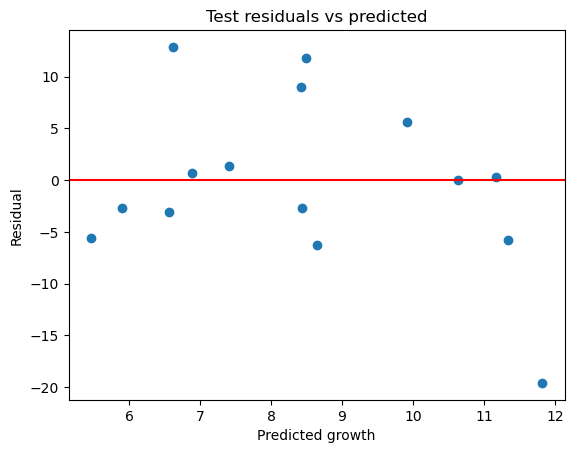
What the residual plot shows
- One extreme negative residual around −20.
- Several positive residuals between +8 and +12.
- Increasing spread at higher predicted values.
- Residuals not tightly clustered around zero.
Interpretation of residual structure
1.Influence of the extreme negative residual
The large negative residual (~ −20) implies:
- The model severely overpredicted growth for one country.
- Squared error from this observation alone heavily inflates RMSE.
- It contributes significantly to negative test R².
Because the test set has only 15 observations:
- Each country accounts for ~6.7% of the test sample.
- One extreme case has disproportionate influence.
This explains why:
- RMSE increases sharply,
- R² becomes negative,
- MAE is less dramatically affected.
2.Systematic bias at higher predicted values
At predicted growth values above ~9–10%, residual dispersion increases.
This suggests:
- Possible heteroskedasticity,
- The linear model may overfit moderate-growth countries,
- High-growth economies may follow nonlinear patterns.
This pattern implies:
The relationship between predictors and income growth may not be well captured by a purely linear specification.
3.Asymmetry of residuals
Residuals appear:
- Slightly right-skewed among moderate predictions,
- With one very large negative outlier.
This suggests:
- The model struggles particularly with at least one structurally atypical economy.
- Growth processes may be driven by country-specific shocks not captured by structural variables.
Economic Interpretation
Income growth:
- Is volatile,
- Is influenced by political shocks, commodity cycles, institutional transitions,
- May respond nonlinearly to trade structure.
A linear model with ten predictors may not adequately capture:
- Threshold effects,
- Interaction effects,
- Structural break dynamics.
The residual structure is consistent with:
Model misspecification rather than pure noise.
We could have used different data-driven methods to select model features e.g RFE (recursive feature elimination), SFS (sequential feature selection) or mutual information
RFE recursively removes predictors based on contribution to model performance. SFS adds predictors sequentially using cross-validation. Mutual Information captures nonlinear dependence between predictors and outcome. Check the scikit-learn documentation to try and understand these feature selection techniques better.
These methods provide algorithmic perspectives but should complement economic reasoning.
# Recursive Feature Elimination
rfe = RFE(LinearRegression(), n_features_to_select=6)
rfe.fit(X_train_scaled, y_train)
rfe_selected = X_train.columns[rfe.support_]

# Sequential Forward Selection
sfs = SequentialFeatureSelector(
    LinearRegression(),
    n_features_to_select=6,
    direction="forward",
    cv=5
)
sfs.fit(X_train_scaled, y_train)
sfs_selected = X_train.columns[sfs.get_support()]

# Mutual Information
mi = mutual_info_regression(X_train_scaled, y_train, random_state=42)
mi_df = pd.DataFrame({
    "variable": X_train.columns,
    "mutual_information": mi
}).sort_values("mutual_information", ascending=False)

rfe_selected, sfs_selected, mi_df.head()(Index(['KOFTrGIdf', 'NY.GDP.TOTL.RT.ZS', 'SP.POP.TOTL', 'SI.POV.GINI',
'SE.SEC.CUAT.UP.ZS', 'GE.EST'],
dtype='object'),
Index(['total_exports', 'hhi', 'diversification', 'effective_partners',
'NY.GDP.PCAP.PP.CD', 'NE.TRD.GNFS.ZS'],
dtype='object'),
variable mutual_information
13 GE.EST 0.088430
10 SI.POV.GINI 0.018534
11 SE.SEC.CUAT.UP.ZS 0.008895
0 total_exports 0.007607
1 hhi 0.000000)Interpretation
GE.EST consistently ranks highly, both in MI and RFE.
- Governance appears to contain the strongest independent signal.
SFS selects structurally redundant trade variables
diversificationandeffective_partnersare both derived fromhhi.- This reflects algorithmic selection ignoring economic redundancy.
Mutual information values are small overall
- Suggesting limited strong nonlinear dependence.
- Reinforces the idea that predictive signal is weak.
Different methods select different variables.
- Indicates instability in feature importance.
- Suggests signal-to-noise ratio is low.
This reinforces the conclusion that:
The predictive structure in this dataset is weak and unstable under small-sample cross-country modelling.
Conclusion of 4.1
The baseline linear model:
- Extracts limited stable signal,
- Performs worse than naive prediction under RMSE,
- Is highly sensitive to one extreme observation,
- Shows evidence of heteroskedasticity,
- Exhibits unstable feature importance across selection methods.
The primary limitation appears not to be scaling or imputation, but:
Structural noise and weak linear signal in cross-country income growth.
4.2 Regularised Regression – Ridge
4.2.1 Why Ridge Is Appropriate Here
The baseline OLS model exhibited three structural weaknesses:
Weak predictive signal
- Test R² = −0.098
- RMSE ≈ 7.90, roughly equal to outcome standard deviation (~7.2)
Moderate multicollinearity
- VIF up to ~5.7
- Governance and trade variables moderately correlated
Instability in feature importance
- RFE, SFS, and mutual information selected different predictors
- Suggests high coefficient variance
OLS minimises in-sample squared error without penalising coefficient magnitude. In small samples (57 training observations) with correlated predictors, this leads to:
- High variance in coefficient estimates
- Sensitivity to individual observations
- Poor generalisation
Ridge regression directly targets this issue by shrinking coefficients toward zero.
Unlike LASSO, Ridge does not remove variables. Given that:
- Signal appears diffuse rather than sparse,
- Predictors were theory-driven and pre-filtered,
- No clear evidence suggests only 1–2 predictors truly matter,
Ridge is conceptually preferable to LASSO at this stage.
4.2.2 Choosing the Shrinkage Parameter (α)
We tune α using a validation split inside the training set only (i.e we split the training set into a sub-training set and a validation set, train a Ridge model with varying \(\lambda\) on the sub-training set, test on the validation set and retain the \(\lambda\) that maximizes model performance on the validation set). The test set remained untouched to preserve comparability with OLS.
X_subtrain, X_val, y_subtrain, y_val = train_test_split(
    X_reduced, y_train, test_size=0.25, random_state=42
)
alphas = np.logspace(-3, 3, 30)
results = pd.DataFrame([
    {
        "alpha": a,
        "RMSE_val": np.sqrt(mean_squared_error(
            y_val,
            Ridge(alpha=a).fit(X_subtrain, y_subtrain).predict(X_val)
        )),
        "MAE_val": mean_absolute_error(
            y_val,
            Ridge(alpha=a).fit(X_subtrain, y_subtrain).predict(X_val)
        ),
        "R2_val": r2_score(
            y_val,
            Ridge(alpha=a).fit(X_subtrain, y_subtrain).predict(X_val)
        )
    }
    for a in alphas
]).sort_values("RMSE_val")

results| alpha | RMSE_val | MAE_val | R2_val | |
|---|---|---|---|---|
| 29 | 1000.000000 | 6.268883 | 5.280184 | -0.099450 |
| 28 | 621.016942 | 6.316023 | 5.320089 | -0.116048 |
| 27 | 385.662042 | 6.388334 | 5.379857 | -0.141749 |
| 26 | 239.502662 | 6.497660 | 5.466640 | -0.181162 |
| 25 | 148.735211 | 6.660205 | 5.587607 | -0.240997 |
From the tuning results:
| alpha | RMSE_val | MAE_val |
|---|---|---|
| 1000 | 6.27 | 5.28 |
| 621 | 6.32 | 5.32 |
| 386 | 6.39 | 5.38 |
| … | … | … |
| 0.001 | 13.68 | 9.81 |
Validation RMSE improves monotonically as α increases. The best-performing model corresponds to:
\[ \alpha = 1000 \]
This is a very strong penalty.
Interpretation:
- The validation data strongly favours heavy shrinkage.
- The model performs best when coefficients are pushed close to zero.
- This indicates that baseline OLS was overfitting training variation.
In practical terms:
The validation process suggests that most predictors contribute limited stable signal.
4.2.3 Ridge Performance (Final Model)
Using α = 1000, fitted on the full training set:
Final Ridge model fitting code
#| code-fold: true
ridge = Ridge(alpha=best_alpha)
ridge.fit(X_reduced, y_train)

y_train_pred_ridge = ridge.predict(X_reduced)
y_test_pred_ridge  = ridge.predict(X_test_reduced)

ridge_metrics = {
    "alpha": best_alpha,
    "R2_train": r2_score(y_train, y_train_pred_ridge),
    "R2_test":  r2_score(y_test, y_test_pred_ridge),
    "RMSE_train": np.sqrt(mean_squared_error(y_train, y_train_pred_ridge)),
    "RMSE_test":  np.sqrt(mean_squared_error(y_test, y_test_pred_ridge)),
    "MAE_train": mean_absolute_error(y_train, y_train_pred_ridge),
    "MAE_test":  mean_absolute_error(y_test, y_test_pred_ridge),
}

ridge_metrics{'alpha': 1000.0,
'R2_train': 0.00686,
'R2_test': -0.01368,
'RMSE_train': 6.98,
'RMSE_test': 7.59,
'MAE_train': 5.41,
'MAE_test': 6.19}For comparison:
| Metric | OLS | Ridge | Naive |
|---|---|---|---|
| R²_test | −0.098 | −0.014 | −0.007 |
| RMSE_test | 7.90 | 7.59 | 7.56 |
| MAE_test | 5.84 | 6.19 | 6.19 |
4.2.4 Interpretation of Metrics
R²
- Training R² drops from 0.13 (OLS) to 0.007 (Ridge).
- Test R² improves from −0.098 to −0.014.
Interpretation:
Ridge dramatically reduces in-sample fit. This is expected: shrinkage introduces bias.
However, test R² becomes less negative and approaches the naive benchmark (−0.007).
This suggests:
Ridge reduces overfitting but does not uncover strong predictive structure.
The fact that test R² remains slightly negative indicates that:
- Even after stabilisation, predictive signal remains weak.
RMSE
- OLS RMSE_test = 7.90
- Ridge RMSE_test = 7.59
- Naive RMSE = 7.56
Ridge reduces RMSE relative to OLS, confirming that shrinkage improves stability.
However, Ridge RMSE remains essentially equal to the naive benchmark.
This implies:
Once coefficient variance is controlled, the model behaves very similarly to predicting the mean.
The data do not contain strong linear predictive structure beyond central tendency.
MAE
- OLS MAE_test = 5.84
- Ridge MAE_test = 6.19
- Naive MAE = 6.19
Interestingly:
- OLS slightly outperformed naive in MAE.
- Ridge matches naive MAE almost exactly.
This suggests:
- OLS captured some moderate deviations.
- Ridge, under heavy shrinkage, essentially predicts near the mean.
In fact, with α = 1000, Ridge predictions cluster tightly (as visible in the residual plot).
4.2.5 Residual Analysis (Ridge)
Ridge residuals plot code
#| code-fold: true

residuals_test_ridge = y_test - y_test_pred_ridge

plt.scatter(y_test_pred_ridge, residuals_test_ridge)
plt.axhline(0, color='red')
plt.xlabel("Predicted growth")
plt.ylabel("Residual")
plt.title("Test residuals vs predicted (Ridge regression)")
plt.show()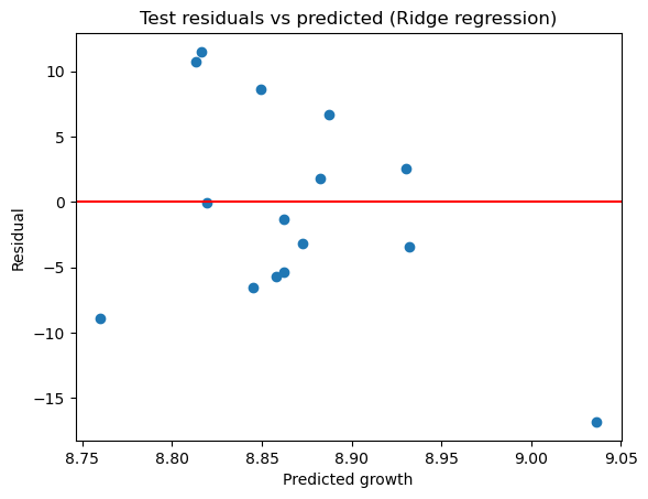
The Ridge residual plot shows:
- Predicted values tightly concentrated around ~8.8–9.0.
- Residual dispersion driven mostly by variation in actual outcomes.
- The extreme negative residual remains present (~ −17 to −20).
- Residuals appear symmetrically distributed around zero but with limited variation in fitted values.
This behaviour reflects strong shrinkage:
- The model no longer produces extreme predictions.
- It avoids large squared errors from exaggerated fitted values.
- However, it does not meaningfully differentiate countries.
The extreme negative residual persists because:
- Ridge does not change the underlying relationship,
- It merely shrinks coefficient magnitude,
- Structural misspecification or omitted variables likely drive that outlier.
4.2.6 Coefficient Shrinkage
With α = 1000:
- All coefficients are substantially closer to zero than OLS.
- Relative ranking may remain similar,
- Absolute magnitudes are dramatically reduced.
This confirms:
- OLS coefficients were high-variance.
- Ridge stabilises them by reducing magnitude.
However, heavy shrinkage also reduces interpretability:
- Effects become small.
- Marginal impact interpretation becomes muted.
This illustrates the classical bias–variance trade-off:
- Ridge sacrifices explanatory strength for stability.
- In this dataset, stability improves modestly.
- Predictive performance remains weak overall.
4.3 Comparing Models
We now compare:
- OLS (baseline)
- Ridge (α = 1000)
- Naive mean predictor
Predictive Performance
Ridge improves over OLS in terms of:
- Lower RMSE
- Less negative R²
- Smaller train–test gap
However:
- Ridge performs almost identically to naive prediction.
- OLS slightly outperforms Ridge in MAE.
Conclusion:
The fundamental limitation is weak signal, not just overfitting.
Coefficient Stability
OLS:
- Larger coefficients
- Higher training R²
- Sensitive to individual countries
Ridge:
- Coefficients strongly shrunk
- Training R² collapses to near zero
- Much smaller train–test discrepancy
Thus:
Ridge clearly reduces variance.
Economic Interpretability
OLS:
- Provides interpretable marginal effects.
- Suggests possible structural relationships.
- But unstable and unreliable.
Ridge:
- Coefficients small and less economically meaningful.
- Interpretation becomes “directional” rather than quantitative.
- Offers little improvement in explanatory clarity.
In this context:
Ridge enhances numerical stability but does not meaningfully improve substantive insight.
Overall Assessment
The key finding across models is:
- Adjusted Net National Income growth in 2018 is difficult to predict from cross-sectional trade and macro-structural indicators.
- Weak out-of-sample performance persists even after controlling coefficient variance.
- One extreme country heavily influences results.
- Signal appears diffuse and noisy.
Thus:
- Overfitting was part of the problem.
- But the deeper issue is limited linear predictive structure in this dataset.
Question 5 – Reflection
5.1 What information is gained — and what is lost — by aggregating bilateral trade data into country-level indicators?
Aggregating bilateral trade data into country-level indicators transforms a relational network structure into scalar summary measures. This transformation enables modelling, but it fundamentally alters the information content of the data.
What is gained
The primary gain is analytical tractability. Bilateral trade data form a weighted network where countries are nodes and trade flows are edges. Modelling at the dyadic level would require addressing exporter and importer fixed effects, dyadic dependence, and potentially thousands of observations per year. Aggregation reduces this complexity to a cross-section of 72 countries in 2018, making integration with macroeconomic variables feasible.
Aggregation also aligns predictors with the outcome variable. Adjusted Net National Income growth is defined at the country level. Using country-level trade concentration indicators ensures unit consistency.
Furthermore, concentration measures such as the Herfindahl-Hirschman Index (HHI) provide interpretable structural summaries. The HHI and its inverse (effective number of partners) quantify diversification in a way that is comparable across countries of very different sizes. Such measures are widely used in industrial organisation and trade analysis for precisely this reason, including in competition policy guidelines where HHI thresholds are used to classify markets as unconcentrated, moderately concentrated, or highly concentrated (Rhoades 1993) (U.S. Department of Justice and the Federal Trade Commission 2010).
Finally, aggregation dampens idiosyncratic bilateral noise. Temporary disruptions in one trade relationship are less likely to dominate a structural summary measure than they would at the dyadic level.
In this sense, aggregation makes modelling possible.
What is lost
However, aggregation discards crucial structural information.
Loss of network topology
Trade data are inherently relational. By collapsing bilateral flows, we remove network structure. Network science emphasises that a node’s position within a network matters independently of aggregate volume (Newman 2010). In the context of trade, empirical work also shows that countries’ network centrality is related to outcomes such as growth and the propagation of shocks (e.g. (Kali and Reyes 2010)). For example:
- Betweenness centrality measures how often a country lies on shortest paths between others — capturing “broker” roles.
- Eigenvector centrality measures not just how many partners a country has, but how central those partners are.
- Closeness centrality captures how quickly a country can reach all others through trade links.
These metrics capture systemic importance and embeddedness, which may plausibly affect resilience, diffusion of shocks, or growth. None of this information survives aggregation into HHI.
Loss of partner identity
Two countries can share identical concentration indices but trade with very different types of partners. Dependency on advanced diversified economies may have different implications than dependency on a single commodity importer. Aggregation removes qualitative distinctions in trade composition.
Loss of sectoral and value-chain information
Aggregate trade flows do not distinguish between:
- High-technology exports,
- Primary commodities,
- Intermediate inputs,
- Final consumption goods.
Growth theory often emphasises structural transformation and sectoral upgrading (Hausmann and Hidalgo 2011) (Rodrik 2009). By aggregating trade flows without sectoral breakdown, we remove precisely the variation that may matter most for income growth.
Amplification of measurement limitations
We observed that roughly 45–47% of bilateral flows are missing. Concentration measures were computed conditional on observed flows. If missing flows disproportionately consist of small relationships, HHI may mechanically overstate concentration. Aggregation therefore embeds data sparsity into structural indicators.
Loss of temporal variation
By selecting 2018 alone, the analysis collapses time. Yet trade–growth relationships are inherently dynamic. (Frankel and Romer 1999) demonstrate that trade’s effect on income operates through long-run structural channels, identified using an instrumental-variables strategy. A single-year cross-section is unlikely to capture such mechanisms.
The weak predictive performance observed in Q4 — negative test R², RMSE approximately equal to the outcome’s standard deviation — suggests that cross-sectional structural indicators in one year do not strongly explain cross-country income growth variation.
5.2 How do data availability and indicator overlap constrain modelling choices?
Data constraints were not peripheral; they structured the entire analysis.
Coverage constraints
Although CEPII records 243 exporters, the World Bank dataset restricted the modelling sample to 72 countries. Over 170 exporters were excluded due to missing macroeconomic data. This creates potential selection bias: countries with weaker statistical systems are more likely absent.
Thus, the modelling sample is not globally representative. The predictive weakness observed may partly reflect this truncation.
Indicator overlap and multicollinearity
Correlation analysis showed substantial overlap between:
- Trade openness,
- KOF trade globalisation,
- Governance indicators,
- Income levels.
Variance Inflation Factors confirmed moderate collinearity. Multicollinearity inflates coefficient variance and destabilises interpretation (Wooldridge 2010).
The Ridge tuning results are particularly revealing. Validation favoured an extremely high penalty (α = 1000), indicating that heavy shrinkage substantially improved validation RMSE relative to weaker penalties. Yet even under strong shrinkage, test performance only converged toward the naive mean predictor.
This suggests:
The core limitation is not merely coefficient instability but limited independent signal across predictors.
Regularisation reduced variance, but it did not uncover strong predictive structure.
Would nonlinear models help?
One might argue that linear specification is too restrictive and that nonlinear models (e.g., random forests or gradient boosting) could capture interaction effects.
In principle, nonlinear models can approximate complex relationships (Hastie, Tibshirani, and Friedman 2009). However, with only 72 observations (57 in training), high-capacity models would likely overfit severely unless strongly regularised, reflecting standard bias–variance trade-offs in small samples (Hastie, Tibshirani, and Friedman 2009). Given that Ridge — which directly reduces variance — converged toward the naive benchmark, it is unlikely that increasing model complexity would recover substantial stable signal.
In small-sample cross-sectional contexts, model flexibility often increases variance faster than it increases bias correction.
Thus:
The empirical results suggest that limited signal — rather than linear misspecification — is the dominant constraint.
What additional data would improve the analysis?
Several additions could materially strengthen explanatory power:
Panel data across multiple years
This would increase observations, allow fixed effects, and exploit within-country variation. Panel methods are standard in growth empirics precisely because cross-sectional identification is weak and unobserved heterogeneity is pervasive (Wooldridge 2010) (Barro 1996).Sectoral trade composition or economic complexity measures
(Hausmann and Hidalgo 2011) argue that productive complexity predicts growth. Such measures may outperform simple concentration metrics by capturing sectoral upgrading and product sophistication.Network centrality measures
Including eigenvector or betweenness centrality could reintroduce structural information lost in aggregation and capture countries’ systemic roles in the trade network (Newman 2010) (Kali and Reyes 2010).Institutional and innovation indicators
Governance was included, but richer institutional data (e.g., regulatory quality, R&D expenditure) might better capture growth determinants.Lagged predictors
Growth may respond to prior trade structure, not contemporaneous structure. Including lagged trade and institutional variables would better align with the dynamic nature of growth processes.
5.3 One concrete improvement to the analysis
The most meaningful improvement would be to extend the analysis into a panel framework with lagged predictors.
The empirical evidence from Q4 is clear:
- Baseline OLS test R² = −0.10
- Ridge test R² ≈ −0.01
- RMSE ≈ outcome standard deviation
- Heavy shrinkage dramatically reduced in-sample fit
These results indicate that cross-sectional trade structure indicators in a single year do not strongly predict income growth differences across countries.
A panel model would:
- Increase statistical power,
- Control for unobserved country heterogeneity,
- Allow lagged structural effects,
- Reduce sensitivity to single-year shocks.
Given that growth is inherently dynamic, this improvement directly addresses the central weakness observed in the formative.
Overall Critical Assessment
The formative demonstrates that:
- Aggregation makes modelling feasible but strips away relational structure.
- Data overlap sharply restricts sample size.
- Predictor overlap limits independent signal.
- Regularisation stabilises coefficients but does not recover predictive strength.
- Model complexity is unlikely to compensate for limited cross-sectional variation.
The core lesson is methodological rather than technical:
When predictive performance remains near the naive benchmark even after variance reduction, the constraint is informational, not algorithmic.
In this context, better data — not more sophisticated models — are the primary path forward.