
✅ Week 02 Lab: Solutions
2025/26 Winter Term
This solution file follows the format of the Jupyter notebook you had to fill in during the lab session.
Downloading the student solutions
Click on the below button to download the solutions file.
import numpy as np
import pandas as pd
import seaborn as sns
import matplotlib.pyplot as plt
from lets_plot import *
LetsPlot.setup_html()
📋 Lab Tasks
🛠 Part 1: Data manipulation with pandas (45 min)
✨ pandas data frame attributes
A pandas data frame has a lot of attributes, several of which we shall explore:
shape: shows the number of rows and columns.index: prints the name of each row in the data frame.columns: prints the name of each column in the data frame.
🔧 pandas data frame methods
pandas data frames have a lot of methods! We will focus our attention on the following:
head/tail: shows the first / last n observations of a data frame.to_frame: converts a series (pandaswill automatically convert a data frame into a series if one variable is selected) to a data frame.unique: shows all unique values for qualitative features selected.value_counts: counts the number of times a unique value appears in a qualitative feature.query: keeps rows that conform to one or more logical criteria.reset_index: a subset of a data frame will keep the index of an old data frame. We use this method to change the index to one integer increments.filter: keeps columns that are included in a user-supplied list (via theitemsparameter).drop: drops columns that are included in a user-supplied list.rename: renames already existing columns based on a user-supplied dictionary.assign: creates a new variable based on alambdafunction.apply: applies alambdafunction across a set of variables.get_dummies: transforms qualitative features into a series of dummy features.groupby: perform grouped calculations within qualitative features.
Import gapminder
gapminder = pd.read_csv("data/gapminder.csv")1.1: Printing pandas data frames
Let’s print gapminder.
# Printing the object itself
print(gapminder)

# Printing the first 5 rows
print(gapminder.head(5))

# Printing the last 5 rows
print(gapminder.tail(5))
country continent year lifeExp pop gdpPercap
0 Afghanistan Asia 1952 28.801 8425333 779.445314
1 Afghanistan Asia 1957 30.332 9240934 820.853030
2 Afghanistan Asia 1962 31.997 10267083 853.100710
3 Afghanistan Asia 1967 34.020 11537966 836.197138
4 Afghanistan Asia 1972 36.088 13079460 739.981106
... ... ... ... ... ... ...
1699 Zimbabwe Africa 1987 62.351 9216418 706.157306
1700 Zimbabwe Africa 1992 60.377 10704340 693.420786
1701 Zimbabwe Africa 1997 46.809 11404948 792.449960
1702 Zimbabwe Africa 2002 39.989 11926563 672.038623
1703 Zimbabwe Africa 2007 43.487 12311143 469.709298
[1704 rows x 6 columns]
country continent year lifeExp pop gdpPercap
0 Afghanistan Asia 1952 28.801 8425333 779.445314
1 Afghanistan Asia 1957 30.332 9240934 820.853030
2 Afghanistan Asia 1962 31.997 10267083 853.100710
3 Afghanistan Asia 1967 34.020 11537966 836.197138
4 Afghanistan Asia 1972 36.088 13079460 739.981106
country continent year lifeExp pop gdpPercap
1699 Zimbabwe Africa 1987 62.351 9216418 706.157306
1700 Zimbabwe Africa 1992 60.377 10704340 693.420786
1701 Zimbabwe Africa 1997 46.809 11404948 792.449960
1702 Zimbabwe Africa 2002 39.989 11926563 672.038623
1703 Zimbabwe Africa 2007 43.487 12311143 469.709298We can see the dimensions of our data by calling the shape attribute of gapminder.
gapminder.shape(1704, 6)Here, we find that gapminder has 1,704 rows and 6 columns.
1.2: Data frames and series
We can see that gapminder has a list of countries and continents. We will explore continents further. To select only the continent column, we quote the variable name inside brackets next to gapminder.
gapminder["continent"]0 Asia
1 Asia
2 Asia
3 Asia
4 Asia
...
1699 Africa
1700 Africa
1701 Africa
1702 Africa
1703 Africa
Name: continent, Length: 1704, dtype: objectYou can also reference variables using .:
gapminder.continent0 Asia
1 Asia
2 Asia
3 Asia
4 Asia
...
1699 Africa
1700 Africa
1701 Africa
1702 Africa
1703 Africa
Name: continent, Length: 1704, dtype: object👉 NOTE: If you have variables separated by any white space or variables that contain special characters such as - or @, you can only use the brackets notation to select a column. The . (dot) notation can only be used for column names that are valid Python identifiers (e.g., no spaces, must start with a letter or underscore, and contain only alphanumeric characters or underscores).
This changes the data frame to a series. If you want the output to remain a data frame, however, you can use the to_frame method.
gapminder["continent"].to_frame()| continent | |
|---|---|
| 0 | Asia |
| 1 | Asia |
| 2 | Asia |
| 3 | Asia |
| 4 | Asia |
| … | … |
| 1699 | Africa |
| 1700 | Africa |
| 1701 | Africa |
| 1702 | Africa |
| 1703 | Africa |
1704 rows × 1 columns
1.3: Finding / counting unique values
To find the names of all the continents we can use the unique method.
gapminder["continent"].unique()array(['Asia', 'Europe', 'Africa', 'Americas', 'Oceania'], dtype=object)To see how many times each continent appears, we can use the value_counts method. We use reset index in order to turn continent into its own column.
gapminder["continent"].value_counts().reset_index()| continent | count | |
|---|---|---|
| 0 | Africa | 624 |
| 1 | Asia | 396 |
| 2 | Europe | 360 |
| 3 | Americas | 300 |
| 4 | Oceania | 24 |
❓Question: Do you see anything odd?
Yes, there are only 24 observations for Oceania, despite the fact that gapminder contains multiple measurements of the same country from 1952 to 2007.
1.4: Performing grouped calculations
Suppose we want to calculate average GDP per capita across time. We can use a combination of the groupby and mean methods from Pandas.
gapminder.groupby("year", as_index=False)["gdpPercap"].mean()| year | gdpPercap | |
|---|---|---|
| 0 | 1952 | 3725.276046 |
| 1 | 1957 | 4299.408345 |
| 2 | 1962 | 4725.812342 |
| 3 | 1967 | 5483.653047 |
| 4 | 1972 | 6770.082815 |
| 5 | 1977 | 7313.166421 |
| 6 | 1982 | 7518.901673 |
| 7 | 1987 | 7900.920218 |
| 8 | 1992 | 8158.608521 |
| 9 | 1997 | 9090.175363 |
| 10 | 2002 | 9917.848365 |
| 11 | 2007 | 11680.071820 |
1.5: Subsetting rows
Suppose we want to investigate as to why Oceania has only 24 observations (see Part 1.3), we can start by using the query method, which filters rows by one or more conditions.
gapminder_oceania = gapminder.query("continent == 'Oceania'")📝Task: Find the unique values of country in gapminder_oceania.
gapminder_oceania["country"].unique()array(['Australia', 'New Zealand'], dtype=object)❓Question: Do you see the reason now?
Yes, this is because only Australia and New Zealand are included in Oceania. No other island nations are included.
1.6: Subsetting columns
Suppose we only want our data frame to include country, year and population. We can use the filter method in a Pandas data frame setting the items parameter equal to a list of feature names that we want to include.
gapminder.filter(items=["country","year","pop"])| country | year | pop | |
|---|---|---|---|
| 0 | Afghanistan | 1952 | 8425333 |
| 1 | Afghanistan | 1957 | 9240934 |
| 2 | Afghanistan | 1962 | 10267083 |
| 3 | Afghanistan | 1967 | 11537966 |
| 4 | Afghanistan | 1972 | 13079460 |
| … | … | … | … |
| 1699 | Zimbabwe | 1987 | 9216418 |
| 1700 | Zimbabwe | 1992 | 10704340 |
| 1701 | Zimbabwe | 1997 | 11404948 |
| 1702 | Zimbabwe | 2002 | 11926563 |
| 1703 | Zimbabwe | 2007 | 12311143 |
1704 rows × 3 columns
Another option is to use the drop method which takes a list of features to drop. Here, we specify axis=1 which signifies columns, not rows (to specify rows, we set axis=0).
gapminder.drop(["lifeExp","continent","gdpPercap"],axis=1)| country | year | pop | |
|---|---|---|---|
| 0 | Afghanistan | 1952 | 8425333 |
| 1 | Afghanistan | 1957 | 9240934 |
| 2 | Afghanistan | 1962 | 10267083 |
| 3 | Afghanistan | 1967 | 11537966 |
| 4 | Afghanistan | 1972 | 13079460 |
| … | … | … | … |
| 1699 | Zimbabwe | 1987 | 9216418 |
| 1700 | Zimbabwe | 1992 | 10704340 |
| 1701 | Zimbabwe | 1997 | 11404948 |
| 1702 | Zimbabwe | 2002 | 11926563 |
| 1703 | Zimbabwe | 2007 | 12311143 |
1704 rows × 3 columns
Yet another way to achieve the same result as the filter and drop methods we’ve just shown is the double square bracket subsetting:
gapminder[["country","year","pop"]]| country | year | pop | |
|---|---|---|---|
| 0 | Afghanistan | 1952 | 8425333 |
| 1 | Afghanistan | 1957 | 9240934 |
| 2 | Afghanistan | 1962 | 10267083 |
| 3 | Afghanistan | 1967 | 11537966 |
| 4 | Afghanistan | 1972 | 13079460 |
| … | … | … | … |
| 1699 | Zimbabwe | 1987 | 9216418 |
| 1700 | Zimbabwe | 1992 | 10704340 |
| 1701 | Zimbabwe | 1997 | 11404948 |
| 1702 | Zimbabwe | 2002 | 11926563 |
| 1703 | Zimbabwe | 2007 | 12311143 |
1704 rows × 3 columns
👉 NOTE: If you have used pandas, you may have used the loc and iloc methods on data frames. These functions enable users to select both columns and rows in one function. While, in theory, this sounds great, these methods are computationally inefficient, so we advise that you do not use these methods and, instead, opt for query and filter.
1.7: Renaming columns
It is good practice to convert variable names to “snake case” whereby all characters are lower case and each word in the variable is separated by an underscore. To find the variable names expressed as an index, we call the columns attribute.
gapminder.columnsIndex(['country', 'continent', 'year', 'lifeExp', 'pop', 'gdpPercap'], dtype='object')From there, we can amend the variable names using a dictionary where the key is the current variable name and the value is the variable name you would like it to be. We then use the rename method, setting the columns parameter equal to the dictionary created.
# Create a dictionary of variable names using snake case
snake_case_var_names = {
  "country":"country",
  "continent":"continent",
  "year":"year",
  "lifeExp": "life_exp",
  "pop":"pop",
  "gdpPercap":"gdp_per_cap"
}

# Set the columns attribute to this list
gapminder = gapminder.rename(columns=snake_case_var_names)

# Check the columns attribute
gapminder.columnsIndex(['country', 'continent', 'year', 'life_exp', 'pop', 'gdp_per_cap'], dtype='object')1.8: Creating new variables
We know that Gross Domestic Product can be obtained from multiplying GDP per capita and population. To do this in Pandas, we simply insert * between the gdp_per_cap and pop columns found in gapminder.
gapminder["gdp"] = gapminder["gdp_per_cap"] * gapminder["pop"]
gapminder| country | continent | year | life_exp | pop | gdp_per_cap | gdp | |
|---|---|---|---|---|---|---|---|
| 0 | Afghanistan | Asia | 1952 | 28.801 | 8425333 | 779.445314 | 6.567086e+09 |
| 1 | Afghanistan | Asia | 1957 | 30.332 | 9240934 | 820.853030 | 7.585449e+09 |
| 2 | Afghanistan | Asia | 1962 | 31.997 | 10267083 | 853.100710 | 8.758856e+09 |
| 3 | Afghanistan | Asia | 1967 | 34.020 | 11537966 | 836.197138 | 9.648014e+09 |
| 4 | Afghanistan | Asia | 1972 | 36.088 | 13079460 | 739.981106 | 9.678553e+09 |
| … | … | … | … | … | … | … | … |
| 1699 | Zimbabwe | Africa | 1987 | 62.351 | 9216418 | 706.157306 | 6.508241e+09 |
| 1700 | Zimbabwe | Africa | 1992 | 60.377 | 10704340 | 693.420786 | 7.422612e+09 |
| 1701 | Zimbabwe | Africa | 1997 | 46.809 | 11404948 | 792.449960 | 9.037851e+09 |
| 1702 | Zimbabwe | Africa | 2002 | 39.989 | 11926563 | 672.038623 | 8.015111e+09 |
| 1703 | Zimbabwe | Africa | 2007 | 43.487 | 12311143 | 469.709298 | 5.782658e+09 |
1704 rows × 7 columns
After having calculated GDP, you may be interested in coding whether or not a country has above median GDP. We can turn where in Numpy into a function and create a new column using the assign method.
# Returns a boolean array if a quantitative feature is above median values
def is_above_median(var):
  return np.where(var > np.median(var), True, False)

# Apply the function to GDP
gapminder[["country","year","gdp"]].assign(above_median = lambda x: is_above_median(x["gdp"]))| country | year | gdp | above_median | |
|---|---|---|---|---|
| 0 | Afghanistan | 1952 | 6.567086e+09 | False |
| 1 | Afghanistan | 1957 | 7.585449e+09 | False |
| 2 | Afghanistan | 1962 | 8.758856e+09 | False |
| 3 | Afghanistan | 1967 | 9.648014e+09 | False |
| 4 | Afghanistan | 1972 | 9.678553e+09 | False |
| … | … | … | … | … |
| 1699 | Zimbabwe | 1987 | 6.508241e+09 | False |
| 1700 | Zimbabwe | 1992 | 7.422612e+09 | False |
| 1701 | Zimbabwe | 1997 | 9.037851e+09 | False |
| 1702 | Zimbabwe | 2002 | 8.015111e+09 | False |
| 1703 | Zimbabwe | 2007 | 5.782658e+09 | False |
1704 rows × 4 columns
👉 NOTE: When using assign you can see that we use lambda x: followed by the function. All we are doing is using x as a placeholder for our data frame (country, year and gdp). In doing so, we can select the column we are interested in using to create our new boolean variable.
💁Tip: You may have noticed that we can string multiple methods together in Pandas. This is extremely useful, but you might find that your code will get too “long”. If you find this to be the case, you can use \ to spread your code over multiple lines. Here’s an example of how to do this with the above code:
gapminder[["country","year","gdp"]].\
assign(above_median = lambda x: is_above_median(x["gdp"]))| country | year | gdp | above_median | |
|---|---|---|---|---|
| 0 | Afghanistan | 1952 | 6.567086e+09 | False |
| 1 | Afghanistan | 1957 | 7.585449e+09 | False |
| 2 | Afghanistan | 1962 | 8.758856e+09 | False |
| 3 | Afghanistan | 1967 | 9.648014e+09 | False |
| 4 | Afghanistan | 1972 | 9.678553e+09 | False |
| … | … | … | … | … |
| 1699 | Zimbabwe | 1987 | 6.508241e+09 | False |
| 1700 | Zimbabwe | 1992 | 7.422612e+09 | False |
| 1701 | Zimbabwe | 1997 | 9.037851e+09 | False |
| 1702 | Zimbabwe | 2002 | 8.015111e+09 | False |
| 1703 | Zimbabwe | 2007 | 5.782658e+09 | False |
1704 rows × 4 columns
📝Task: This output is not very helpful. Try using some of the commands we have gone over to create a more useful data frame.
gapminder[["country","year","gdp"]].\
  assign(above_median = lambda x: is_above_median(x["gdp"])).\
    query("above_median == True").\
      drop("above_median", axis=1).\
reset_index(drop=True)| country | year | gdp | |
|---|---|---|---|
| 0 | Afghanistan | 2007 | 3.107929e+10 |
| 1 | Algeria | 1952 | 2.272563e+10 |
| 2 | Algeria | 1957 | 3.095611e+10 |
| 3 | Algeria | 1962 | 2.806140e+10 |
| 4 | Algeria | 1967 | 4.143324e+10 |
| … | … | … | … |
| 847 | Vietnam | 2007 | 2.081746e+11 |
| 848 | Yemen, Rep. | 1992 | 2.512511e+10 |
| 849 | Yemen, Rep. | 1997 | 3.351236e+10 |
| 850 | Yemen, Rep. | 2002 | 4.179396e+10 |
| 851 | Yemen, Rep. | 2007 | 5.065987e+10 |
852 rows × 3 columns
1.9: Preparing data for scikit-learn, an example
📝Task: Filter the data to only include observations from 2007.
gapminder_07 = gapminder.query("year == 2007").reset_index(drop=True)
gapminder_07| country | continent | year | life_exp | pop | gdp_per_cap | gdp | |
|---|---|---|---|---|---|---|---|
| 0 | Afghanistan | Asia | 2007 | 43.828 | 31889923 | 974.580338 | 3.107929e+10 |
| 1 | Albania | Europe | 2007 | 76.423 | 3600523 | 5937.029526 | 2.137641e+10 |
| 2 | Algeria | Africa | 2007 | 72.301 | 33333216 | 6223.367465 | 2.074449e+11 |
| 3 | Angola | Africa | 2007 | 42.731 | 12420476 | 4797.231267 | 5.958390e+10 |
| 4 | Argentina | Americas | 2007 | 75.320 | 40301927 | 12779.379640 | 5.150336e+11 |
| … | … | … | … | … | … | … | … |
| 137 | Vietnam | Asia | 2007 | 74.249 | 85262356 | 2441.576404 | 2.081746e+11 |
| 138 | West Bank and Gaza | Asia | 2007 | 73.422 | 4018332 | 3025.349798 | 1.215686e+10 |
| 139 | Yemen, Rep. | Asia | 2007 | 62.698 | 22211743 | 2280.769906 | 5.065987e+10 |
| 140 | Zambia | Africa | 2007 | 42.384 | 11746035 | 1271.211593 | 1.493170e+10 |
| 141 | Zimbabwe | Africa | 2007 | 43.487 | 12311143 | 469.709298 | 5.782658e+09 |
142 rows × 7 columns
📝Task: Create a list of numeric variables (life expectancy, population, GDP per capita, and GDP) and string variables (continent).
num_vars = ["life_exp","pop","gdp_per_cap","gdp"]
str_vars = ["continent"]📝Task: Subset the new data frame to only include these variables. Remember you can add elements to a list by using +.
gapminder_07 = gapminder_07.filter(items=num_vars+str_vars)
gapminder_07| life_exp | pop | gdp_per_cap | gdp | continent | |
|---|---|---|---|---|---|
| 0 | 43.828 | 31889923 | 974.580338 | 3.107929e+10 | Asia |
| 1 | 76.423 | 3600523 | 5937.029526 | 2.137641e+10 | Europe |
| 2 | 72.301 | 33333216 | 6223.367465 | 2.074449e+11 | Africa |
| 3 | 42.731 | 12420476 | 4797.231267 | 5.958390e+10 | Africa |
| 4 | 75.320 | 40301927 | 12779.379640 | 5.150336e+11 | Americas |
| … | … | … | … | … | … |
| 137 | 74.249 | 85262356 | 2441.576404 | 2.081746e+11 | Asia |
| 138 | 73.422 | 4018332 | 3025.349798 | 1.215686e+10 | Asia |
| 139 | 62.698 | 22211743 | 2280.769906 | 5.065987e+10 | Asia |
| 140 | 42.384 | 11746035 | 1271.211593 | 1.493170e+10 | Africa |
| 141 | 43.487 | 12311143 | 469.709298 | 5.782658e+09 | Africa |
142 rows × 5 columns
We will now apply standardise to numeric variables
# Create a function that normalises variables
def standardise(var):
  return (var-var.mean())/var.std()

# Apply normalise function over all numeric variables
gapminder_07_normal = gapminder_07.filter(items=num_vars).\
  apply(lambda x: standardise(x), axis=0)
👉 NOTE: Standardising continuous features is good practice in machine learning, and becomes essential when dealing with algorithms that are sensitive to the scale of the inputs, such as principal components analysis and many distance-based methods.
Along with standardising continuous features, we need to transform categorical features into one-hot encoded dummy (that is, 0 or 1) variables. One-hot encoding means that one reference category for each feature is omitted and does not appear in the transformed data frame. To apply one-hot encoding, we can use get_dummies in pandas.
❓ Can you find a function in scikit-learn that will help you standardise numeric data without having to write your own function?
🧮 Standardising numeric variables
In practice, we rarely standardise variables “by hand”. Instead, we rely on well-tested library tools that ensure consistency, reproducibility, and correct handling of training vs test data.
Below are three idiomatic ways of standardising numeric variables in Python.
✅ Option 1: Using StandardScaler from scikit-learn (recommended)
The most common and robust approach is to use StandardScaler from scikit-learn.
from sklearn.preprocessing import StandardScaler
import pandas as pd

scaler = StandardScaler()

gapminder_07_normal = pd.DataFrame(
    scaler.fit_transform(gapminder_07[num_vars]),
    columns=num_vars,
    index=gapminder_07.index
)
What this does
- Subtracts the mean and divides by the standard deviation for each variable
- Uses population standard deviation (
ddof = 0) - Returns standardised variables with mean 0 and variance 1
Why this is preferred
- The fitted scaler can later be reused on new data
- Prevents data leakage when used correctly (fit on training data only)
- Integrates naturally with pipelines and machine-learning workflows
✅ Option 2: Using a scikit-learn Pipeline
When standardisation is part of a modelling workflow, it is idiomatic to place it inside a pipeline.
from sklearn.pipeline import Pipeline
from sklearn.preprocessing import StandardScaler

pipe = Pipeline([
    ("scale", StandardScaler())
])

gapminder_07_normal = pipe.fit_transform(gapminder_07[num_vars])
Why pipelines matter
- Guarantee that preprocessing is applied consistently
- Become essential once cross-validation or test data are introduced
- Represent best practice in applied data science
At this stage, the output is a NumPy array. Converting it back to a DataFrame is optional unless column names are needed.
✅ Option 3: Using zscore (stats-oriented approach)
A more statistics-oriented approach uses the zscore function from scipy.
from scipy.stats import zscore

gapminder_07_normal = gapminder_07[num_vars].apply(zscore)
This applies z-score standardisation independently to each column.
Notes
- Produces the same mathematical transformation as
StandardScaler - More concise, but does not create a reusable fitted object
- Less suitable for machine-learning pipelines
📝 Summary
| Approach | Recommended for |
|---|---|
StandardScaler |
General use, ML workflows |
Pipeline + StandardScaler |
Modelling and cross-validation |
zscore |
Exploratory or statistics-focused analysis |
In practice, Options 1 or 2 should be preferred whenever the analysis may later involve prediction or model evaluation.
gapminder_07_dummies = pd.get_dummies(gapminder_07["continent"],
                                      columns=["continent"],
                                      drop_first=True,
                                      dtype=int)
print(gapminder_07_dummies)
After having transformed our continuous and categorical features, we can concatenate the two into a new data frame.
gapminder_07_cleaned = pd.concat([gapminder_07_normal, gapminder_07_dummies], axis=1)
gapminder_07_cleaned| life_exp | pop | gdp_per_cap | gdp | Americas | Asia | Europe | Oceania | |
|---|---|---|---|---|---|---|---|---|
| 0 | -1.919936 | -0.082178 | -0.832468 | -0.288250 | 0 | 1 | 0 | 0 |
| 1 | 0.779886 | -0.273813 | -0.446584 | -0.295646 | 0 | 0 | 1 | 0 |
| 2 | 0.438463 | -0.072401 | -0.424318 | -0.153810 | 0 | 0 | 0 | 0 |
| 3 | -2.010799 | -0.214066 | -0.535216 | -0.266522 | 0 | 0 | 0 | 0 |
| 4 | 0.688525 | -0.025195 | 0.085483 | 0.080659 | 1 | 0 | 0 | 0 |
| … | … | … | … | … | … | … | … | … |
| 137 | 0.599815 | 0.279371 | -0.718394 | -0.153254 | 0 | 1 | 0 | 0 |
| 138 | 0.531315 | -0.270983 | -0.672999 | -0.302674 | 0 | 1 | 0 | 0 |
| 139 | -0.356947 | -0.147739 | -0.730898 | -0.273324 | 0 | 1 | 0 | 0 |
| 140 | -2.039541 | -0.218635 | -0.809402 | -0.300559 | 0 | 0 | 0 | 0 |
| 141 | -1.948180 | -0.214807 | -0.871728 | -0.307533 | 0 | 0 | 0 | 0 |
142 rows × 8 columns
👉 NOTE: These kinds of transformations and concatenations will be employed a lot during this course, so please be sure to get used to them.
As a final (optional) step, we can convert our Pandas data frame to a Numpy array by employing the to_numpy method.
gapminder_07_cleaned.to_numpy()array([[-1.91993566, -0.08217844, -0.8324684 , ..., 1. ,
0. , 0. ],
[ 0.77988582, -0.27381326, -0.446584 , ..., 0. ,
1. , 0. ],
[ 0.43846339, -0.07240145, -0.42431811, ..., 0. ,
0. , 0. ],
...,
[-0.35694651, -0.14773926, -0.73089796, ..., 1. ,
0. , 0. ],
[-2.03954118, -0.21863487, -0.8094021 , ..., 0. ,
0. , 0. ],
[-1.94818045, -0.21480678, -0.87172762, ..., 0. ,
0. , 0. ]], shape=(142, 8))🏆Challenge: Which countries had above average life expectancy in 1952?
Try these steps:
- Define a function that returns a boolean if a value in a feature exceeds the average value.
- Include only the year 1952 by using
query. - Subset the data frame to only include country and life expectancy using
filter. - Create a new boolean variable using the user defined function using
assign. - Include all rows with above average life expectancy using
query. - Subset the data frame to only include country using square bracket indexing.
- Pull the unique values into an array using
unique.
# Returns a boolean array based on whether a quantitative feature has above average values
def is_above_average(var):
  return np.where(var > np.mean(var), True, False)

# Answer to be provided
gapminder.\
  query("year == 1952").\
    filter(items=["country","life_exp"]).\
      assign(above_average = lambda x: is_above_average(x["life_exp"])).\
        query("above_average == True")\
         ["country"].\
unique()array(['Albania', 'Argentina', 'Australia', 'Austria', 'Bahrain',
'Belgium', 'Bosnia and Herzegovina', 'Brazil', 'Bulgaria',
'Canada', 'Chile', 'Colombia', 'Costa Rica', 'Croatia', 'Cuba',
'Czech Republic', 'Denmark', 'Finland', 'France', 'Germany',
'Greece', 'Hong Kong, China', 'Hungary', 'Iceland', 'Ireland',
'Israel', 'Italy', 'Jamaica', 'Japan', 'Korea, Dem. Rep.',
'Kuwait', 'Lebanon', 'Mauritius', 'Mexico', 'Montenegro',
'Netherlands', 'New Zealand', 'Norway', 'Panama', 'Paraguay',
'Poland', 'Portugal', 'Puerto Rico', 'Reunion', 'Romania',
'Serbia', 'Singapore', 'Slovak Republic', 'Slovenia', 'Spain',
'Sri Lanka', 'Sweden', 'Switzerland', 'Taiwan', 'Thailand',
'Trinidad and Tobago', 'United Kingdom', 'United States',
'Uruguay', 'Venezuela'], dtype=object)This solution closely follows the suggested steps and is designed to make each transformation explicit. In particular, it introduces user-defined functions and method chaining, both of which are important Python and pandas concepts.
❓ Suggest another way of solving the challenge that doesn’t follow the steps above.
There are many valid ways to obtain the same result in pandas. Below are a few alternatives that express the same logic using different idioms. These are not “better” solutions — they simply reflect different ways of thinking about the problem.
🔁 Alternative 1: Vectorised comparison (no user-defined function)
gapminder.\
  query("year == 1952").\
    filter(items=["country", "life_exp"]).\
      assign(
        above_average=lambda x: x["life_exp"] > x["life_exp"].mean()
      ).\
        query("above_average")\
         ["country"].\
unique()array(['Albania', 'Argentina', 'Australia', 'Austria', 'Bahrain',
'Belgium', 'Bosnia and Herzegovina', 'Brazil', 'Bulgaria',
'Canada', 'Chile', 'Colombia', 'Costa Rica', 'Croatia', 'Cuba',
'Czech Republic', 'Denmark', 'Finland', 'France', 'Germany',
'Greece', 'Hong Kong, China', 'Hungary', 'Iceland', 'Ireland',
'Israel', 'Italy', 'Jamaica', 'Japan', 'Korea, Dem. Rep.',
'Kuwait', 'Lebanon', 'Mauritius', 'Mexico', 'Montenegro',
'Netherlands', 'New Zealand', 'Norway', 'Panama', 'Paraguay',
'Poland', 'Portugal', 'Puerto Rico', 'Reunion', 'Romania',
'Serbia', 'Singapore', 'Slovak Republic', 'Slovenia', 'Spain',
'Sri Lanka', 'Sweden', 'Switzerland', 'Taiwan', 'Thailand',
'Trinidad and Tobago', 'United Kingdom', 'United States',
'Uruguay', 'Venezuela'], dtype=object)What’s different here?
- Instead of defining a custom function, we rely on
pandas’ vectorised operations. - Comparisons like
>operate element-by-element on entire columns. - This is a very common and idiomatic pandas pattern.
Why this matters
This highlights an important idea in data science workflows:
In
pandas, we often work with whole columns at once rather than looping over individual values.
🔁 Alternative 2: Boolean indexing (no query)
df_1952 = gapminder[gapminder["year"] == 1952]

df_1952[
    df_1952["life_exp"] > df_1952["life_exp"].mean()
]["country"].unique()array(['Albania', 'Argentina', 'Australia', 'Austria', 'Bahrain',
'Belgium', 'Bosnia and Herzegovina', 'Brazil', 'Bulgaria',
'Canada', 'Chile', 'Colombia', 'Costa Rica', 'Croatia', 'Cuba',
'Czech Republic', 'Denmark', 'Finland', 'France', 'Germany',
'Greece', 'Hong Kong, China', 'Hungary', 'Iceland', 'Ireland',
'Israel', 'Italy', 'Jamaica', 'Japan', 'Korea, Dem. Rep.',
'Kuwait', 'Lebanon', 'Mauritius', 'Mexico', 'Montenegro',
'Netherlands', 'New Zealand', 'Norway', 'Panama', 'Paraguay',
'Poland', 'Portugal', 'Puerto Rico', 'Reunion', 'Romania',
'Serbia', 'Singapore', 'Slovak Republic', 'Slovenia', 'Spain',
'Sri Lanka', 'Sweden', 'Switzerland', 'Taiwan', 'Thailand',
'Trinidad and Tobago', 'United Kingdom', 'United States',
'Uruguay', 'Venezuela'], dtype=object)What’s different here?
- We use boolean indexing instead of
query. - The expression inside the square brackets creates a boolean mask.
- This mask is then used to filter rows directly.
Why this matters
This makes the filtering logic very explicit and mirrors how NumPy-style indexing works. You will see this pattern frequently in real-world pandas code.
🔁 Alternative 3: Using Polars (expression-based, lazy evaluation)
Polars — and how does it compare to pandas?
Polars is a DataFrame library (like pandas) designed with performance, scalability, and clarity in mind.
At a high level:
pandas
- Executes operations eagerly (each step runs immediately)
- Is very flexible and beginner-friendly
- Is ideal for small-to-medium datasets and interactive analysis
Polars
- Uses lazy evaluation by default (the whole pipeline is optimised before execution)
- Encourages expression-based thinking rather than step-by-step mutation
- Scales much better to large datasets and complex pipelines
You might consider using Polars instead of pandas when:
- your data is very large,
- performance becomes a bottleneck,
- or you want a more database-style, declarative workflow.
For this lab, pandas is absolutely sufficient.
The Polars example is included to show how the same analytical logic can be expressed in a different ecosystem, not because you are expected to switch tools.
The same logic can also be expressed using Polars, an alternative DataFrame library designed for performance and clarity.
import polars as pl

(
    pl.from_pandas(gapminder)
      .filter(pl.col("year") == 1952)
      .with_columns(
          (pl.col("life_exp") > pl.col("life_exp").mean())
          .alias("above_average")
      )
      .filter(pl.col("above_average"))
      .select("country")
      .unique()
)| country |
|---|
| str |
| "Argentina" |
| "Panama" |
| "Greece" |
| "New Zealand" |
| "Slovak Republic" |
| … |
| "Iceland" |
| "Trinidad and Tobago" |
| "Spain" |
| "France" |
| "Czech Republic" |
What changes conceptually here?
Polarsuses expression-based column operations (pl.col(...)).- Operations are lazy by default: the full pipeline is planned and optimised before execution.
- DataFrames are immutable, which avoids several common pandas pitfalls.
Why might this be a good idea?
Even though this dataset is small, this approach:
- scales naturally to very large datasets,
- encourages declarative, database-style thinking,
- makes performance considerations explicit.
You are not expected to use Polars for this lab — this example is included to show how the same analytical logic can be expressed in different ecosystems.
🧠 Key takeaway
There is no single “correct”
pandassolution. What matters is that the logic is correct, clear, and reproducible.
As you gain experience, you’ll naturally move between:
- step-by-step pipelines,
- vectorised expressions,
- boolean indexing,
- and even alternative libraries like
Polars.
Being able to recognise equivalent solutions is an important data-science skill in itself.
📋 Part 2: Data visualisation (45 min)
They say a picture paints a thousand words, and we are, more often than not, inclined to agree with them (whoever “they” are)! Thankfully, we can use a number of different graphical libraries. Some of the more popular graphical libraries in Python include:
matplotlib: Python’s premier plotting library.seaborn: A package that builds uponmatplotlibto produce high-quality visualisations with greater ease.plotly: Plotly allows you to create publication quality interactive visualisations.lets_plot: Python’s version ofggplot2. An added bonus is that you can get interactivity in the graphs.lets_plotis less well-known in the Python community but if you have done so much as dabble in R, you will be well-aware of the syntax.
2.0 Visualisation Design Principles
When creating effective data visualisations, the focus should be on design principles that enhance clarity, accessibility, and insight generation rather than just technical implementation. This section explores key visualisation types through a design-first lens.
2.1 Histograms
Suppose we want to plot the distribution of an outcome of interest. We can use a histogram to plot the distribution of life expectancy in gapminder. Histograms excel at showing the shape and spread of continuous data.
# Basic histogram for life expectancy
plt.figure(figsize=(8, 5))
sns.histplot(data=gapminder, x="life_exp", bins=30, alpha=0.7)
plt.title("Modal life expectancy is ~ 70 years in the sample")
plt.xlabel("Life Expectancy (years)")
plt.ylabel("Frequency")
plt.show()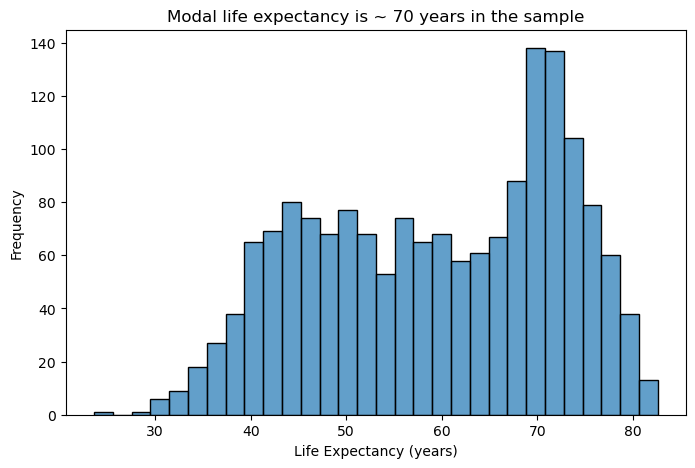
Design Considerations:
- Bin width matters: Too few bins oversimplify the distribution; too many create noise. Start with 20-40 bins for most datasets and adjust based on your data’s characteristics.
- Transparency aids comparison: Using alpha transparency (0.5-0.8) allows overlapping distributions to remain visible when comparing groups.
- Reduce visual clutter: Remove unnecessary grid lines, especially vertical ones that compete with the bars for attention.
- Clear labeling: Descriptive axis labels help readers understand what they’re viewing without referring to external documentation.
👥 DESIGN EXERCISE:
Consider how adjusting bin count affects the story your histogram tells. Experiment with transparency levels to find the balance between visibility and clarity. Think about when vertical grid lines add value versus when they create visual noise.
plt.figure(figsize=(8, 5))
sns.histplot(data=gapminder, x="life_exp", bins=40, alpha=0.7)
plt.title("Modal life expectancy is ~ 70 years in the sample")
plt.xlabel("Life Expectancy (years)")
plt.ylabel("Frequency")
plt.show()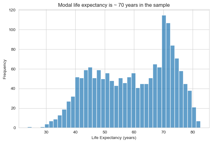
2.2 Bar Charts: Comparing Categories
Bar charts are the workhorse of categorical data visualisation. When visualising the number of countries by continent in the gapminder dataset, their strength lies in making comparisons easy and immediate.
# Filter data for 1997 (similar to original example)
gapminder_97 = gapminder[gapminder['year'] == 1977]  # Using 1977 as we have it in sample data

# Basic bar chart for continent counts
plt.figure(figsize=(8, 5))
sns.countplot(data=gapminder_97, x="continent")
plt.title("Africa has the highest number of countries in the sample")
plt.xlabel("Continent")
plt.ylabel("Count")
plt.show()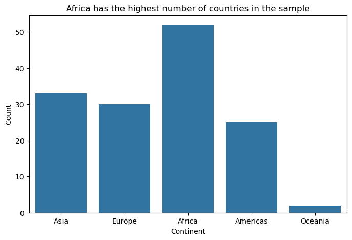
Design Principles:
- Start from zero: Bar length represents magnitude, so truncated axes can mislead viewers about relative differences.
- Order thoughtfully: Arrange categories by frequency, alphabetically, or by meaningful progression rather than randomly.
- Minimise decoration: Remove unnecessary elements like 3D effects, heavy borders, or excessive grid lines that don’t aid comprehension.
- Consider orientation: Horizontal bars work better for long category names and make labels more readable.
👥 DESIGN EXERCISE:
Practice creating clean, focused bar charts. Consider when to use horizontal versus vertical orientation. Experiment with different ordering strategies and observe how they change the story your visualisation tells.
# Order continents by frequency
order = (
    gapminder_97['continent']
    .value_counts()
    .index
)

plt.figure(figsize=(8, 5))
sns.countplot(
    data=gapminder_97,
    y="continent",
    order=order,
    color="steelblue"
)

plt.title("Number of countries by continent (1977)")
plt.xlabel("Number of countries")
plt.ylabel("Continent")
sns.despine()
plt.show()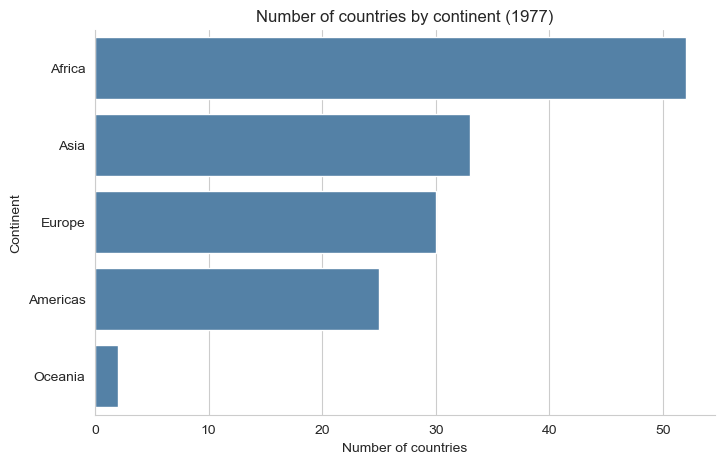
2.3 Scatter Plots: Exploring Relationships
Scatter plots reveal relationships between continuous variables and are essential for exploratory data analysis. When examining the relationship between gdp_per_cap and life_exp in the gapminder data, they help visualise potential correlations and patterns.
# Basic scatter plot for GDP per capita vs life expectancy
plt.figure(figsize=(8, 6))
sns.scatterplot(data=gapminder, x="gdp_per_cap", y="life_exp", alpha=0.6)
plt.title("Past average incomes of $10,000, life expectancy improvement slows down")
plt.xlabel("GDP per Capita")
plt.ylabel("Life Expectancy (years)")
plt.show()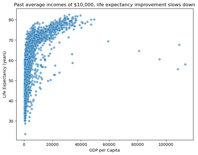
Effective Design Strategies:
- Handle overplotting: Use transparency, jittering, or smaller point sizes when dealing with many overlapping points.
- Scale appropriately: Consider log transformations for skewed data to reveal relationships that might be hidden in linear scales.
- Guide the eye: Clear axis labels and appropriate scales help viewers understand the relationship being shown.
- Show uncertainty: Consider adding trend lines or confidence intervals when appropriate to highlight patterns.
👥 DESIGN EXERCISE:
Explore how different transformations (log, square root) can reveal hidden patterns in your data. Practice using transparency effectively to handle overplotting while maintaining readability.
plt.figure(figsize=(8, 6))
sns.scatterplot(
    data=gapminder,
    x="gdp_per_cap",
    y="life_exp",
    alpha=0.6,
    s=40
)

plt.xscale("log")
plt.title("Life expectancy rises with income, but at a diminishing rate")
plt.xlabel("GDP per Capita (log scale)")
plt.ylabel("Life Expectancy (years)")
sns.despine()
plt.show()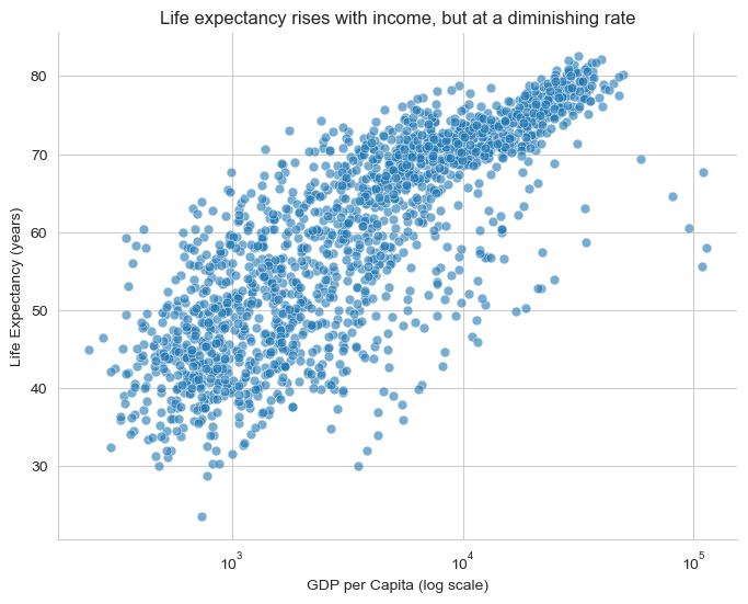
2.4 Line Charts: Tracking Change Over Time
Line charts excel at showing trends, patterns, and changes over time or other continuous sequences. For tracking average gdp_per_cap across year in the gapminder dataset, they reveal long-term economic trends.
# Calculate average GDP per capita by year
gdp_per_cap_by_year = gapminder.groupby("year")["gdp_per_cap"].mean().reset_index()

# Basic line plot
plt.figure(figsize=(10, 6))
sns.lineplot(data=gdp_per_cap_by_year, x="year", y="gdp_per_cap")
plt.title(
    "The average country has seen per capita incomes rise from 4,000 to 12,000 USD"
)
plt.xlabel("Year")
plt.ylabel("Average GDP per Capita")
plt.show()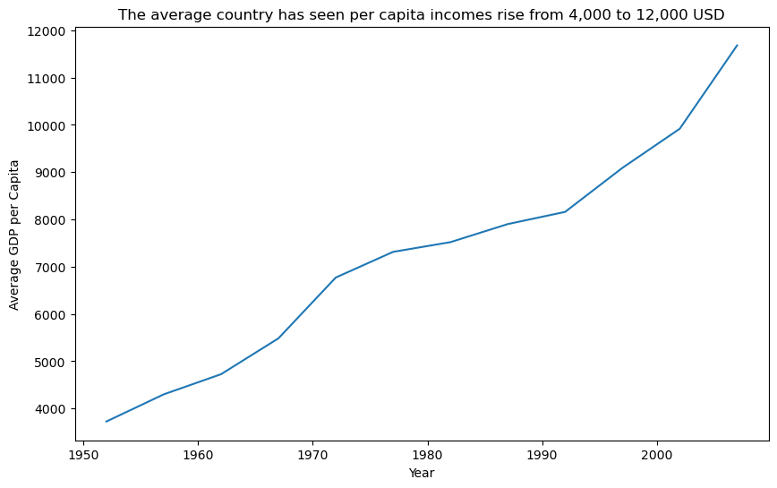
Design Best Practices:
- Connect meaningfully: Only connect points where the progression between them is meaningful (typically time-based data).
- Choose appropriate styling: Dotted lines can suggest uncertainty or projection; solid lines imply measured data.
- Layer thoughtfully: Combining points with lines helps readers identify individual measurements while seeing the overall trend.
- Scale to show variation: Ensure your y-axis scale reveals meaningful variation without exaggerating minor fluctuations.
- Consider filled areas: Area charts can effectively show cumulative quantities or emphasize the magnitude of change, but use them judiciously.
👥 DESIGN EXERCISE:
Experiment with different line styles to convey different types of information. Consider when adding area fill enhances understanding versus when it creates confusion. Practice setting appropriate time axis intervals that match your data’s natural rhythm.
plt.figure(figsize=(10, 6))

sns.lineplot(
    data=gdp_per_cap_by_year,
    x="year",
    y="gdp_per_cap",
    linewidth=2.5
)

sns.scatterplot(
    data=gdp_per_cap_by_year,
    x="year",
    y="gdp_per_cap",
    s=40,
    color="black"
)

plt.title("Average GDP per capita across countries has risen steadily over time")
plt.xlabel("Year")
plt.ylabel("Average GDP per Capita (USD)")
sns.despine()
plt.show()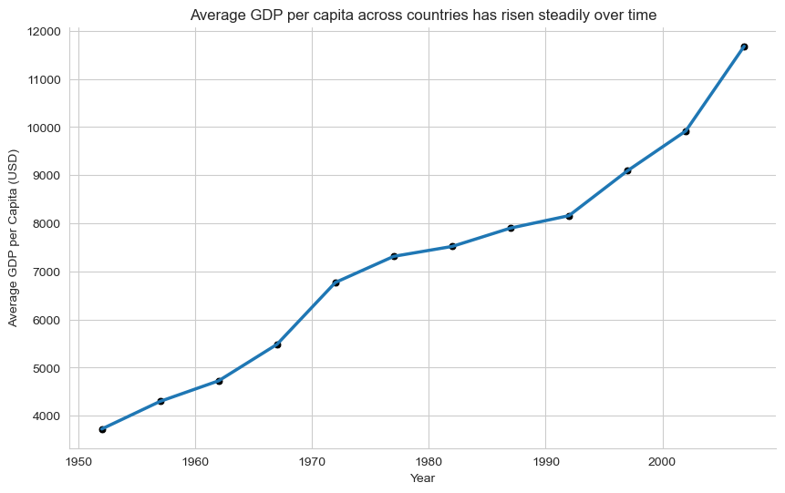
Why this is better than the original line plot?
Points + line:
points = observed averages
line = trend across time
Avoids implying interpolation between sparse observations
Reinforces that this is measured data, not a smooth process
plt.figure(figsize=(10, 6))

plt.fill_between(
    gdp_per_cap_by_year["year"],
    gdp_per_cap_by_year["gdp_per_cap"],
    alpha=0.25
)

plt.plot(
    gdp_per_cap_by_year["year"],
    gdp_per_cap_by_year["gdp_per_cap"],
    linewidth=2.5
)

plt.title("Rising average GDP per capita over time")
plt.xlabel("Year")
plt.ylabel("Average GDP per Capita (USD)")
sns.despine()
plt.show()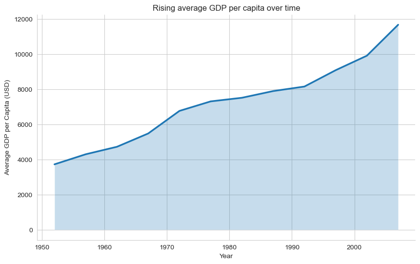
When this works / when it doesn’t
✔️ Works when:
Emphasising magnitude of change
Showing long-run growth
❌ Avoid when:
Comparing multiple lines
Variation matters more than accumulation
2.5 Box Plots: Summarizing Distributions Across Groups
Box plots efficiently communicate multiple statistical measures while enabling group comparisons. When comparing pop distributions across continent in the gapminder dataset, they reveal differences in medians, spreads, and outliers between geographic regions.
# Filter data for 1982 and exclude Oceania (similar to original example)
gapminder_oceania_82 = gapminder[
    (gapminder["continent"] != "Oceania") & (gapminder["year"] == 1982)
]

# Basic box plot with log scale
plt.figure(figsize=(8, 6))
sns.boxplot(data=gapminder_oceania_82, x="continent", y="pop")
plt.yscale("log")
plt.title("Distribution of Population by Continent (1982, excluding Oceania)")
plt.xlabel("Continent")
plt.ylabel("Population (log scale)")
plt.xticks(rotation=45)
plt.show()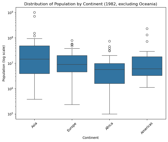
Design Considerations:
- Handle extreme values: Log scales can be essential when comparing groups with very different ranges or when dealing with skewed data.
- Simplify visual elements: Remove unnecessary grid lines that don’t aid in reading values or making comparisons.
- Provide context: Clear group labels and axis titles help viewers understand what comparisons they’re making.
- Consider alternatives: Violin plots or strip charts might better serve your purpose when sample sizes are small or when showing full distributions is important.
👥 DESIGN EXERCISE:
Practice deciding when log transforms reveal meaningful patterns. Experiment with removing different grid elements to create cleaner, more focused visualisations.
plt.figure(figsize=(8, 6))

sns.boxplot(
    data=gapminder_oceania_82,
    x="continent",
    y="pop",
    showfliers=False
)

sns.stripplot(
    data=gapminder_oceania_82,
    x="continent",
    y="pop",
    color="black",
    alpha=0.4,
    size=4,
    jitter=True
)

plt.yscale("log")
plt.title("Population distributions with individual countries visible (1982)")
plt.xlabel("Continent")
plt.ylabel("Population (log scale)")
sns.despine()
plt.show()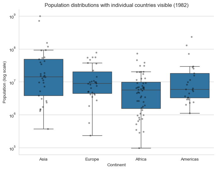
2.6 Density Plots: Understanding Continuous Distributions
Density plots provide smooth representations of data distributions and are particularly useful for comparing multiple groups. When examining the distribution of gdp per capita values in a specific year from the gapminder dataset, they reveal the shape and concentration of economic development across countries.
# Filter data for 1952 (similar to original example)
gapminder_52 = gapminder[gapminder["year"] == 1952]

# Basic density plot (only density curve, no hitogram)
plt.figure(figsize=(8, 5))
sns.kdeplot(data=gapminder_52, x="gdp_per_cap")
plt.xscale("log")
plt.title("Density Distribution of GDP per Capita (1952)")
plt.xlabel("GDP (log scale)")
plt.ylabel("Density")
plt.show()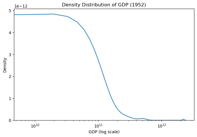
Effective Design Elements:
- Transform when needed: Log scales can reveal patterns in skewed data that would be invisible on linear scales.
- Minimise visual noise: Reduce grid lines and other decorative elements that don’t contribute to understanding.
- Consider bandwidth: The smoothing parameter affects how much detail versus generalisation your plot shows.
- Enable comparison: When showing multiple densities, use transparency and distinct colors to enable easy comparison.
👥 DESIGN EXERCISE:
Explore how different transformations affect the insights you can draw from density plots. Practice balancing detail with clarity by adjusting smoothing parameters.
plt.figure(figsize=(8, 5))

sns.kdeplot(
    data=gapminder_52,
    x="gdp_per_cap",
    hue="continent",
    common_norm=False,
    alpha=0.5
)

plt.xscale("log")
plt.title("GDP per capita distributions by continent (1952)")
plt.xlabel("GDP per capita (log scale)")
plt.ylabel("Density")
sns.despine()
plt.show()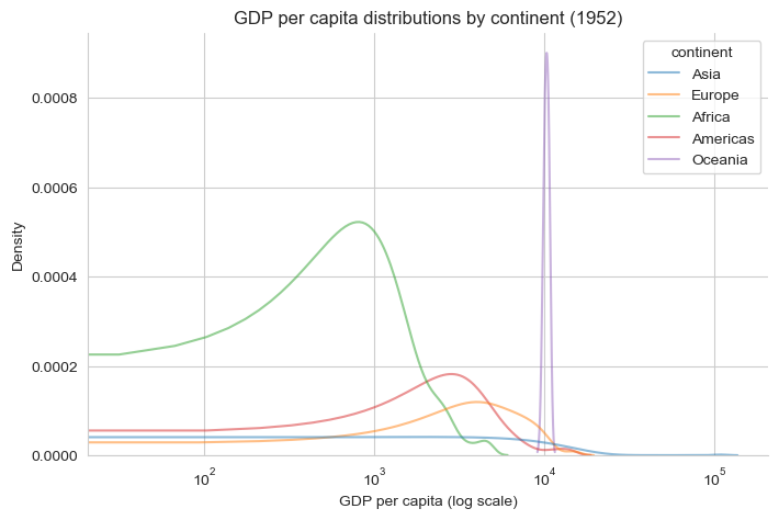
Universal Design Principles
Across all visualisation types, several principles enhance effectiveness:
Accessibility: Ensure your visualisations work for colorblind viewers and can be understood in black and white. Use patterns, shapes, and positioning alongside color.
Clarity: Every element should serve a purpose. Remove or de-emphasize anything that doesn’t directly contribute to understanding your data.
Context: Provide enough information for viewers to understand what they’re seeing without overwhelming them with unnecessary detail.
Consistency: Use consistent scales, colors, and styling across related visualisations to enable easy comparison.
Focus: Direct attention to the most important insights through strategic use of color, size, and positioning.
Remember: the goal of data visualisation is to facilitate understanding and insight, not to showcase technical capabilities. Always prioritize clarity and accessibility over visual complexity.