
🛣️ Reading Week Homework
2025/26 Winter Term
📚 Preparation: Downloading homework materials
 Materials to download
Use the link below to download the homework materials:
as well as the dataset we will use for this homework:
⚙️ Loading libraries
# Prefer conda-forge for dependency resolution; use pip only if unavailable.
#
# conda install -c conda-forge pandas scikit-learn matplotlib seaborn xgboost plotly shap
#
# pip fallback (only if needed):
# !pip install shap
import numpy as np
import pandas as pd
import matplotlib.pyplot as plt
import matplotlib.patches as mpatches
import seaborn as sns
import shap
from joblib import Parallel, delayed
from scipy.stats import loguniform
import plotly.graph_objects as go
from sklearn.model_selection import (
train_test_split, StratifiedKFold,
cross_validate, GridSearchCV, RandomizedSearchCV
)
from sklearn.linear_model import LogisticRegression
from sklearn.tree import DecisionTreeClassifier
from sklearn.svm import SVC
from sklearn.preprocessing import StandardScaler
from sklearn.pipeline import Pipeline
from sklearn.metrics import f1_score, precision_score, recall_score, make_scorer
from xgboost import XGBClassifier
sns.set_theme(style='whitegrid', palette='muted')
RANDOM_STATE = 123🥅 Homework objectives
We have introduced a range of supervised learning algorithms in previous labs and lectures. Selecting the best model is rarely straightforward in practice. In this assignment, we guide you through that process using a real labour economics dataset.
- Compare the decision boundaries produced by four models trained to predict whether a US worker earns above the median wage.
- Apply 5-fold cross-validation to determine which model performs best overall.
- Fine-tune a Support Vector Machine and an XGBoost model.
- Use SHAP values to understand what drives predictions in the best model.
- Use multinomial logistic regression to predict wage tercile membership and interpret its coefficients in the context of the gender wage gap.
Loading the CPS-MORG 2019 dataset
We use the 2019 Current Population Survey Merged Outgoing Rotation Group (CPS-MORG), the benchmark dataset in the US labour economics literature on wage inequality and the gender pay gap (Blau & Kahn 2017 (Blau and Kahn 2017), among many others). Freely available from the NBER — US Government public domain data.
Each row is a full-time wage/salary worker aged 18–64 surveyed in 2019.
| Variable | Description |
|---|---|
hourly_wage |
Computed hourly wage (weekly earnings ÷ hours, or direct rate if paid hourly) |
above_median_wage |
Binary outcome: 1 if wage > sample median |
wage_tercile |
Three-class outcome: bottom, middle, top |
female |
1 = female, 0 = male |
educ_years |
Years of schooling (recoded from CPS categories) |
potential_exp |
age − educ_years − 6 (Mincer convention) |
age |
Age in years |
married |
1 = married with spouse present |
union_mem |
1 = union member or covered by contract |
public_sector |
1 = government industry |
occ_group |
management, professional, service, sales_office, blue_collar |
white, black, hispanic |
Race/ethnicity indicators |
📋 Data preparation note
The CSV was constructed from the NBER CPS MORG file (
morg19.dta) using the following steps:
- Sample restrictions: full-time workers (≥ 35 hours/week), age 18–64, with valid earnings.
- Hourly wage:
- If paid hourly, use
earnhre.
- Otherwise compute
earnwke ÷ uhourse.- Education:
educ_yearsrecoded fromgrade92to represent completed years of schooling.- Potential experience:
\[ \text{potential\_exp} = \text{age} - \text{educ\_years} - 6 \] This follows the Mincer (1974) earnings framework (Mincer 1974), which models wages as a function of schooling and labour market experience.- Union membership:
union_mem=unionmmeORunioncov.- Public sector indicator:
ind02∈ [8770, 9590].- Occupation group: derived from
occ2012.You are not required to reproduce these transformations, but you should understand what each constructed variable represents and why it may matter economically.
df = pd.read_csv('data/cps_morg_2019_wages.csv')
print(df.shape)
df.head()
Before fitting any models, explore the data.
❓ Question 1: Compute the mean hourly wage for men and women separately. What is the raw (unadjusted) hourly wage gap? Does the size surprise you?
# Code hereThink about what a ‘raw’ gap means — no controls, just the difference in means. What sample restriction might explain why this figure differs from the BLS headline (~82 cents)?
Docs: pandas GroupBy
Consider who is excluded from a full-time-only sample. Is the direction of the exclusion likely to widen or narrow the measured gap?
Feature setup
occ_group is categorical and must be one-hot encoded before passing to scikit-learn.
NUMERIC_FEATURES = [
    'female', 'educ_years', 'potential_exp', 'age',
    'married', 'union_mem', 'public_sector',
    'white', 'black', 'hispanic'
]
TARGET_BINARY = 'above_median_wage'

df_enc = pd.get_dummies(df, columns=['occ_group'], drop_first=True)
OCC_DUMMIES = [c for c in df_enc.columns if c.startswith('occ_group_')]
ALL_FEATURES = NUMERIC_FEATURES + OCC_DUMMIES

X = df_enc[ALL_FEATURES]
y = df_enc[TARGET_BINARY]
print(f'Features ({len(ALL_FEATURES)}): {ALL_FEATURES}')
Inspecting class balance (binary outcome)
Before splitting the data, inspect the distribution of the binary outcome.
❓ Are the two classes balanced? What might this imply for how you evaluate model performance?
# Code hereDo not assume balance: verify it.
If one class were much rarer than the other, would all metrics still be informative?
Train / test split
Perform a stratified 75/25 split. Stratifying on y preserves class balance in both sets.
# Code here
X_train, X_test, y_train, y_test = ...You need a stratified split to preserve the class balance of the outcome variable.
Docs: train_test_split
Stratified subsample for SVM steps
SVMs scale as O(n²)–O(n³) in training samples. We draw a 5,000-row stratified subsample — preserving class balance — which keeps wall time under a minute while producing stable cross-validated estimates at this feature dimensionality.
X_train_sub, _, y_train_sub, _ = train_test_split(
    X_train, y_train,
    train_size=5_000,
    stratify=y_train,
    random_state=RANDOM_STATE
)
print(f'Full training set : {len(X_train):,} rows  (balance: {y_train.mean():.3f})')
print(f'SVM subsample     : {len(X_train_sub):,} rows  (balance: {y_train_sub.mean():.3f})')
The two balance figures should be nearly identical — confirmation that stratification worked.
5-fold cross-validation setup
We will evaluate models using 5-fold cross-validation.
This means:
- Split the training data into 5 equally sized folds.
- Train on 4 folds.
- Evaluate on the remaining fold.
- Repeat so each fold serves as validation once.
For classification problems, it is important that each fold preserves the class proportions of the outcome.
# Code here
cv = ...Use a cross-validator that preserves the class distribution in each fold.
Why might this matter for metrics such as ROC AUC or F1?
Docs: StratifiedKFold
Evaluation metrics
We will evaluate models using multiple metrics.
Think about what each metric measures:
- Does it depend on a probability threshold?
- Does it treat false positives and false negatives symmetrically?
- Does it assume balanced classes?
You should construct a dictionary mapping metric names to scorer objects.
# Code here
scoring = ...make_scorer converts a metric function into a scorer object usable in cross-validation.
If a metric requires additional arguments (e.g. averaging strategy), pass them inside make_scorer.
Docs: make_scorer
🗺️ Decision boundaries
Each model is trained on all features in ALL_FEATURES.
To visualise its behaviour, we take a 2D slice of the high-dimensional feature space:
- Vary
potential_exp(x-axis) - Vary
educ_years(y-axis) - Fix all other features at their training-set median
This produces a cross-section of a 14-dimensional decision surface.
We then:
- Generate a dense grid of points in this 2D plane.
- Ask the model to predict at each grid point.
- Plot the predicted class regions.
❓ Which models produce linear boundaries?
❓ Which allow nonlinear curvature?
❓ How does flexibility differ across models?
Initialise the five models
We compare five classifiers spanning a range of boundary shapes:
- Logistic regression — linear boundary, interpretable coefficients.
- Decision tree — axis-aligned rectangular regions, fully interpretable but prone to overfitting.
- Linear SVM — margin-maximising linear boundary.
- RBF SVM — radial basis function kernel; the most widely used SVM kernel in practice. Boundary shape is controlled by
C(margin width) andgamma(kernel bandwidth). - Polynomial SVM (degree 2) — quadratic boundary. Less common than RBF but useful to contrast: polynomial kernels expand the feature space explicitly, RBF kernels do so implicitly via an infinite-dimensional mapping.
# Instantiate five models — logistic regression, decision tree, and three SVMs
# (linear, RBF, polynomial degree-2). SVMs must be wrapped in a Pipeline with
# a StandardScaler. Do NOT set probability=True.
# Code here
models = {
    'Logistic\nRegression': ...,
    'Decision\nTree':       ...,
    'SVM\nLinear':          ...,
    'SVM\nRBF':             ...,
    'SVM\nPolynomial':      ...,
}Build the 2D visualisation grid
We want to visualise how predicted probabilities vary across two key features: - potential_exp (x-axis) - educ_years (y-axis)
We therefore construct two objects:
1️⃣ obs_grid
obs_grid summarises the observed data: - For each integer combination of (potential_exp, educ_years) - Compute the observed proportion of above-median earners
This will later be used to colour observed data points.
2️⃣ vis_grid
vis_grid is a dense prediction grid used for model visualisation.
Steps:
- Create evenly spaced sequences for
potential_expandeduc_yearsusingnp.linspace. - Use
np.meshgridto create all coordinate pairs. - Construct a DataFrame where:
- Every row corresponds to one grid point.
- All other features are fixed at their training-set median.
- Only
potential_expandeduc_yearsvary across rows.
❓ Why do we use continuous sequences rather than only observed values?
❓ What does fixing other features at their median imply about this visualisation?
obs_grid = (
    df_enc
    .assign(potential_exp=df_enc['potential_exp'].astype(int))
    .groupby(['potential_exp', 'educ_years'])[TARGET_BINARY]
    .mean().reset_index()
    .rename(columns={TARGET_BINARY: 'prop_above_median'})
)

medians  = X_train.median()
N_GRID   = 80
exp_lin  = np.linspace(df['potential_exp'].min(), df['potential_exp'].max(), N_GRID)
educ_lin = np.linspace(df['educ_years'].min(),   df['educ_years'].max(),   N_GRID)
exp_mesh, educ_mesh = np.meshgrid(exp_lin, educ_lin)

# Build vis_grid: start from the median feature vector repeated for every grid point,
# then overwrite potential_exp and educ_years with the meshgrid values.
# Code here
vis_grid = ...You want a DataFrame where each row represents a single grid point.
A useful strategy: 1. Start from the median feature vector. 2. Replicate it N × N times. 3. Overwrite the two varying columns using the meshgrid values.
Docs: np.meshgrid
Fit models and generate predictions
joblib.Parallel runs independent tasks concurrently across CPU cores. Since each model fit is independent of the others, we can parallelise across them. The pattern is always:
def my_task(arg):               # define the work as a plain function
    return do_something(arg)

results = Parallel(n_jobs=-1)(  # n_jobs=-1 uses all available cores
    delayed(my_task)(x)         # delayed() wraps each call lazily
    for x in my_list
)
Write a fit_one helper that fits one model and returns (name, {y_pred, grid_pred, f1}), then dispatch it with Parallel.
# The joblib pattern is shown above — adapt it here.
# Write fit_one, then dispatch it across models.items() with Parallel.
# Code here
results = ...
Visualising decision boundaries
We now compare how different classifiers partition the feature space.
Using two selected features:
- Fit each model on the training data.
- Generate predictions over a fine grid spanning the feature space.
- Plot the predicted class regions.
- Overlay the training observations.
❓ How do the boundaries differ across models?
❓ Which models produce linear separations? Which allow nonlinear structure?
# Produce a 2×3 facet plot (5 models + 1 hidden panel) using pcolormesh
# for the background and scatter for the observed data points.
# x-axis: potential_exp, y-axis: educ_years.
# Use fig.subplots_adjust() and a dedicated fig.add_axes([...]) for the colorbar.
# Code hereThe background is a filled 2D grid — think about which matplotlib function renders a matrix as a colour mesh rather than individual points. For the colorbar, creating a separate axes avoids the tight_layout conflict.
Docs: pcolormesh · fig.add_axes
❓ Question 2: Which model achieves the highest F1? Which produces the most interpretable boundary shape, and why is that shape more or less useful for understanding this dataset?
Look at both the F1 values and the visual shape of each boundary. What does a rectangular boundary tell you that a smooth linear one does not? What important features are invisible in this 2D slice?
📊 5-fold cross-validation
Apply the same Parallel pattern to run cross_validate for all four models. Set n_jobs=1 inside cross_validate — the outer Parallel already uses all cores, so allowing each worker to also spawn its own thread pool would over-subscribe the CPU.
# Apply the Parallel pattern to run cross_validate for each model.
# Remember: set n_jobs=1 inside cross_validate.
# Code here
cv_results = ...Follow the same structure as the fit_one pattern above — define a helper function, then dispatch it with Parallel. The n_jobs conflict arises because joblib workers cannot safely spawn their own sub-processes on all platforms.
Docs: cross_validate
Build a tidy long-format DataFrame and plot mean ± 95% CI with Plotly.
# Build long_df (columns: model, metric, fold, score) from cv_results,
# compute mean ± 95% CI per (model, metric), then plot with plotly.graph_objects.
# Show all three metrics on a single chart, models ranked by F1.
# Code hereThe CV results dict maps model name → dict of arrays (one array per metric per fold). Flatten this into a tidy long DataFrame first, then aggregate. For the plot, use go.Scatter with error_y and small horizontal offsets so the three metric dots per model don’t overlap.
Docs: plotly error bars
❓ Question 3: How does the polynomial SVM compare on precision vs. recall? What does the overlap of confidence intervals across models tell you about model selection here?
When confidence intervals overlap, can you confidently say one model is better? Think about what it means for model selection when several models are statistically indistinguishable.
🔧 SVM hyperparameter tuning
We tune two SVM kernels separately, each with its own parameter space.
RBF SVM
Two continuous parameters:
C: controls the penalty for misclassification (margin width).gamma: controls the kernel bandwidth, determining how far the influence of a single training point extends.
We search a 5 × 5 log-spaced grid (25 combinations).
Polynomial SVM
Cdegree(integer controlling polynomial complexity)
We search a 5 × 3 grid (15 combinations).
Both use GridSearchCV with 5-fold cross-validation, optimising ROC-AUC.
If you use a Pipeline, remember that hyperparameters are referenced using:
stepname__parameter (e.g. svm__C).
C_vals     = [0.000977, 0.0131, 0.177, 2.38, 32]
gamma_vals = [0.001, 0.01, 0.1, 1.0, 10.0]
degree_vals = [1, 2, 3]

# Tune the RBF SVM over C × gamma, and the polynomial SVM over C × degree.
# Both should use GridSearchCV with roc_auc scoring.
# Code here
rbf_gs  = ...
poly_gs = ...The RBF kernel has two parameters that interact — large C with small gamma behaves very differently from large C with large gamma. Think about what gamma controls geometrically before choosing a search range.
Docs: GridSearchCV · SVM kernels
Visualising SVM tuning results
After running cross-validation, examine how performance varies across hyperparameters.
For the RBF kernel:
- Extract the cross-validation results.
- Plot mean CV AUC as a function of C for selected values of gamma.
- Include error bars reflecting cross-validation variability.
❓ How sensitive is performance to C?
❓ Does performance change smoothly or abruptly across gamma values?
For the polynomial kernel:
- Plot mean CV AUC as a function of C for different polynomial degrees.
- Compare the behaviour across degrees.
❓ Does increasing model flexibility consistently improve performance?
❓ Is there evidence of overfitting?
# Left panel: RBF results as line plots of mean CV AUC vs C
#             for selected gamma values.
# Right panel: Polynomial results as line plots of mean CV AUC vs C
#              for each degree, with error bars.
# Star the best-performing combination in each panel.
# Code hereThe RBF kernel has two interacting parameters:
Ccontrols margin tightness.gammacontrols how local each training point’s influence is.
Large gamma creates highly local decision regions. Small gamma produces smoother boundaries.
Consider how these two parameters interact geometrically when interpreting your plots.
❓ Question 4: Compare the two tuning plots. For the RBF kernel, which region of the C × gamma space performs best, and what does that tell you about the decision boundary? For the polynomial kernel, which degree wins and why?
For RBF: think about what happens at the extremes of gamma — very wide vs very narrow kernel. What kind of boundary does each extreme produce?
For polynomial: what does degree=1 mean geometrically? Is that consistent with what you found in the CV comparison?
🌲 XGBoost tuning
Gradient boosting models contain several continuous hyperparameters that strongly influence model complexity.
Here we tune the learning rate, which controls how much each tree contributes to the ensemble.
Because learning rate spans several orders of magnitude, we use RandomizedSearchCV with a log-uniform prior rather than a fixed grid.
This allows us to: - Explore small and large values efficiently - Avoid over-concentrating on one region of the parameter space
📝 The boosting family
The same
RandomizedSearchCVpattern applies to:
lightgbm.LGBMClassifiercatboost.CatBoostClassifiersklearn.ensemble.RandomForestClassifierimblearn.ensemble.BalancedRandomForestClassifierAll follow the scikit-learn
fit/predictAPI.Some variants (e.g. BalancedRandomForest) explicitly address class imbalance during training.
xgb_param_dist = {'learning_rate': loguniform(1e-4, 1.0)}
# Instantiate XGBClassifier and RandomizedSearchCV, then fit on the subsample.
# Code here
xgb_rs = ...
xgb_rs.fit(X_train_sub, y_train_sub)
print('Best learning rate:', round(xgb_rs.best_params_['learning_rate'], 5))
print('Best AUC: ', round(xgb_rs.best_score_, 4))Why is a log-uniform distribution appropriate for learning rate?
Hint: A change from 0.001 to 0.01 is proportionally much larger than a change from 0.9 to 0.91.
Think about how the parameter influences model behaviour across scales.
Docs: RandomizedSearchCV
Visualising XGBoost tuning results
After running RandomizedSearchCV:
- Identify the most influential hyperparameters (e.g. depth, learning rate).
- Plot mean CV AUC against one hyperparameter while keeping others fixed.
- Inspect variability across folds.
❓ Does increasing model complexity consistently improve performance?
❓ How stable are the cross-validation results?
# Plot mean AUC vs learning_rate on a log x-axis.
# Mark the best value with a vertical line.
# Then print a comparison of best SVM AUC vs best XGBoost AUC.
# Code here
❓ Question 5: How do all three tuned models compare on AUC? What are the practical trade-offs between them for a large-scale deployment?
Metric reflection
You have evaluated models using ROC AUC.
- Is ROC AUC always the most appropriate metric?
- Under what circumstances might it be insufficient?
- Can you think of alternative evaluation metrics that may be more appropriate in some contexts?
For example, you may wish to explore:
- Precision–Recall AUC
- Class-specific recall or precision
- The \(F_\beta\) score (see (Van Rijsbergen 1979) or check this page)
Now consider the application more concretely:
- If the goal were to identify high-wage workers for targeted recruitment, would another metric be preferable?
- What if the goal were to identify low-wage workers for policy intervention?
Briefly justify your reasoning.
All AUCs are very close — the interesting comparison is not about accuracy. What does O(n²) mean for SVM training time as n grows toward 100k, 1M, or 10M rows? Which model has the fewest constraints on input data quality?
🔍 Feature importance: SHAP values
A central challenge in applied machine learning is interpretability: understanding which features drive predictions and by how much.
- Logistic regression is interpretable by design — its coefficients are exact, additive feature attributions. No further tools are needed.
- XGBoost and SVMs are black-box or quasi-black-box models. SHAP (SHapley Additive exPlanations) adds a layer of interpretability grounded in cooperative game theory, decomposing each prediction into per-feature contributions that are consistent and locally accurate.
We show three panels side by side:
- Logistic regression coefficients: direct interpretation, no SHAP needed.
- XGBoost SHAP via
TreeExplainer: exact and fast for tree-based models. - RBF SVM SHAP via
KernelExplainer: model-agnostic: works on anypredictfunction by approximating Shapley values via weighted linear regression over a background sample. We use 50 background rows to keep it tractable; accuracy improves with more rows at the cost of runtime. This slowness is the price of model-agnosticism.
If all three agree on feature ranking and direction, we can be confident the patterns reflect the data. Disagreement points to genuine non-linearity that only the more flexible model captures.
# ── 1. Logistic regression — coefficients directly ───────────────────────────
lr_model = LogisticRegression(max_iter=1000, random_state=RANDOM_STATE)
lr_model.fit(X_train_sub, y_train_sub)
lr_coef  = pd.Series(lr_model.coef_[0], index=ALL_FEATURES)
lr_coef  = lr_coef.reindex(lr_coef.abs().sort_values().index)

# ── 2. XGBoost — TreeExplainer (exact, fast) ──────────────────────────────────
explainer_xgb = shap.TreeExplainer(xgb_rs.best_estimator_)
shap_vals_xgb = explainer_xgb.shap_values(X_train_sub)

# ── 3. RBF SVM — KernelExplainer (model-agnostic, slow) ─────────────────────
# KernelExplainer only needs a predict function — works on any sklearn model.
# Background sample: 50 rows keeps runtime tractable.

def svm_decision(X):
    # Ensure input is DataFrame with correct feature names
    if not isinstance(X, pd.DataFrame):
        X = pd.DataFrame(X, columns=ALL_FEATURES)
    return rbf_gs.best_estimator_.decision_function(X)

# Small background sample
background = shap.sample(X_train_sub, 50, random_state=RANDOM_STATE)

explainer_svm = shap.KernelExplainer(svm_decision, background)

# Explain only 50 observations
X_explain = X_train_sub.iloc[:50]

shap_vals_svm = explainer_svm.shap_values(
    X_explain,
    nsamples=100   # explicitly limit coalition samples
)

# ── Plot three panels ─────────────────────────────────────────────────────────
fig, axes = plt.subplots(1, 3, figsize=(22, 7))

lr_coef.plot(kind='barh', ax=axes[0],
             color=['#d73027' if v < 0 else '#4575b4' for v in lr_coef])
axes[0].axvline(0, color='black', linewidth=0.8)
axes[0].set_xlabel('Coefficient value')
axes[0].set_title('Logistic Regression\ncoefficients (no SHAP needed)', fontsize=11)

plt.sca(axes[1])
shap.summary_plot(shap_vals_xgb, X_train_sub, feature_names=ALL_FEATURES,
                  show=False, plot_size=None)
axes[1].set_title('XGBoost\nSHAP values (TreeExplainer)', fontsize=11)

plt.sca(axes[2])
shap.summary_plot(shap_vals_svm, X_train_sub.iloc[:50], feature_names=ALL_FEATURES,
                  show=False, plot_size=None)
axes[2].set_title('RBF SVM\nSHAP values (KernelExplainer, 50 obs)', fontsize=11)

plt.tight_layout()
plt.show()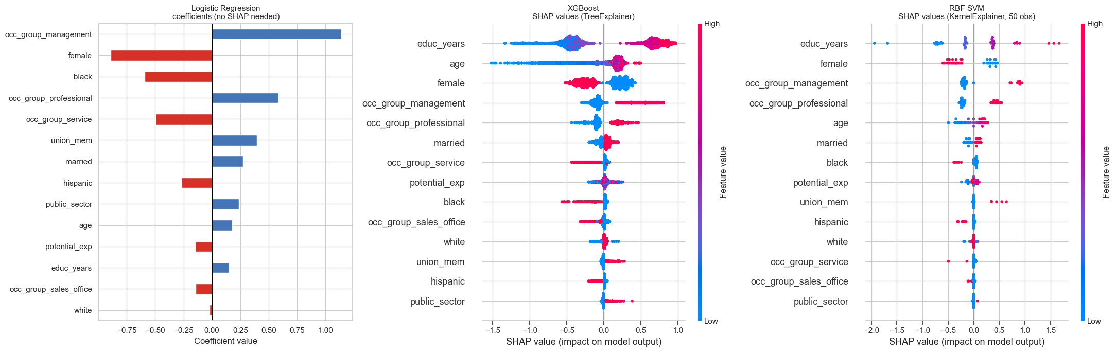
Each horizontal row corresponds to a feature.
Each dot represents one observation.
- The x-axis is the SHAP value:
- Positive → pushes the prediction toward the positive class.
- Negative → pushes the prediction away from it.
- Magnitude → strength of influence.
- The colour encodes the feature value:
- Red → high feature value
- Blue → low feature value
To interpret:
- Look at how wide the row spreads → overall importance.
- Look at colour patterns:
- If red dots cluster on the right, high values increase predicted probability.
- If red dots cluster on the left, high values decrease predicted probability.
- Look for asymmetry:
- Wide spread on one side suggests nonlinear or threshold effects.
- Compare spread across models:
- Linear models tend to produce symmetric spreads.
- Tree or kernel models often show uneven, clustered patterns reflecting interactions.
SHAP explains local contributions, but the beeswarm aggregates them into a global importance view.
TreeExplainer exploits the internal structure of tree ensembles for an exact result. KernelExplainer treats any model as a black box — think about what the background sample represents and why its size creates a speed/accuracy trade-off.
❓ Question 6: Do all three representations agree on which features matter most? What does the comparison between logistic regression coefficients and the SHAP plots reveal about the added value of SHAP for the black-box models?
For logistic regression, what do the coefficients already tell you that SHAP would add? For the black-box models, what would you know about feature importance without SHAP? When two models agree on rankings, what does that increase your confidence in?
🧮 Multinomial logistic regression and the gender wage gap
We now move from a binary outcome to a three-class outcome:
bottom / middle / top
This allows us to ask:
- What predicts entry into the top of the wage distribution?
- Are effects symmetric across the distribution?
Multinomial logistic regression models the probability of each class simultaneously using a softmax function.
Prepare the multi-class outcome
y_mc = df_enc['wage_tercile']
# Stratified train/test split on y_mc
# Code here
X_mc_train, X_mc_test, y_mc_train, y_mc_test = ...
print(y_mc_train.value_counts())
Inspecting class balance (wage terciles)
Before fitting the multinomial model, inspect the distribution of the three classes.
❓ Are they roughly balanced? What might this imply for your choice of evaluation metric?
# Code hereIf one class were substantially rarer, would treating all classes symmetrically in evaluation/training still be appropriate?
Fit the multinomial logistic regression
With a multiclass target and solver='lbfgs', scikit-learn automatically uses the softmax (multinomial) loss.
This estimates one coefficient vector per wage class.
# Use solver='lbfgs' — it selects multinomial (softmax) loss automatically
# for a target with more than two classes. Do NOT pass multi_class=.
# Code here
multi_logit = ...
multi_logit.fit(X_mc_train, y_mc_train)
print('Classes:', multi_logit.classes_)In scikit-learn ≥ 1.5, you do not need to specify multi_class=.
The solver determines the appropriate loss automatically.
Docs: LogisticRegression
Extract and display coefficients
coef_ has shape (n_classes, n_features) — one row per wage class. Reshape into a tidy long DataFrame for plotting.
# multi_logit.coef_ has shape (n_classes, n_features).
# Reshape to a long DataFrame with columns: class, feature, log_odds, odds_ratio.
# Code here
coef_df = ...Think about how to go from a (n_classes × n_features) matrix to a tidy long format. pandas has a method that ‘melts’ a DataFrame from wide to long by stacking columns.
Docs: DataFrame.stack
Interpreting the coefficients
In multinomial (softmax) logistic regression:
- There is one coefficient vector \(\boldsymbol{\beta}_k\) for each class \(k\).
- \(\mathbf{x}_i\) denotes the feature vector for worker \(i\).
- \(\beta_{k,j}\) is the coefficient on feature \(j\) for class \(k\).
The predicted probability of class \(k\) is:
\[ P(y_i = k \mid \mathbf{x}_i) = \frac{\exp(\boldsymbol{\beta}_k^\top \mathbf{x}_i)} {\sum_{m} \exp(\boldsymbol{\beta}_m^\top \mathbf{x}_i)} \]
This is the softmax function.
Interpretation:
- A one-unit increase in feature \(j\) changes the log-odds of class \(k\) relative to the model’s overall normalisation.
- \(\exp(\beta_{k,j})\) gives the multiplicative change in relative odds for class \(k\), holding other features constant.
Unlike binary logistic regression, there is no single explicit reference category in this parameterisation — probabilities are normalised across all classes.
Coefficients from this model (selected features):
| Feature | β_bottom | β_middle | β_top | Interpretation |
|---|---|---|---|---|
female |
+0.57 | +0.05 | −0.62 | Being female → odds ratio 0.54 for top tercile — a 46% reduction in relative odds, conditional on all other controls |
educ_years |
+0.13 | −0.05 | −0.07 | Weakly positive for bottom, near-zero elsewhere — explained by softmax normalisation (see below) |
potential_exp |
+0.33 | −0.05 | −0.28 | More experience → higher odds of bottom and lower odds of top, conditional on age and occupation |
occ_group_management |
−0.84 | −0.05 | +0.89 | Management occupation → odds ratio 2.44 for top tercile |
union_mem |
−0.40 | +0.17 | +0.22 | Union membership compresses wages upward — reduces bottom odds, raises both middle and top |
On the educ_years sign: The negative coefficient for top may seem surprising — more education reducing top-tercile odds. This is a softmax artefact: the model already controls for age, potential_exp, and occ_group, which are themselves strong positive correlates of both education and wages. Once those are held constant, the marginal education signal shrinks and can even flip sign due to the softmax normalisation. This is not a causal claim — it reflects multicollinearity in the softmax parameterisation.
On potential_exp: The negative sign for top reflects that highly experienced workers (conditional on age, education, and occupation) are not disproportionately concentrated in the top tercile — they cluster in the middle. Early-career workers with high education and management roles drive the top, not tenure per se.
We now plot log-odds and odds ratios for the five focus features.
# Plot log-odds and odds ratios as grouped bar charts for the five focus features.
# Code hereYou need to go from long format (coef_df) to wide format for plotting. A pivot table with feature as rows and class as columns gives you the right shape for a grouped bar chart.
Reading the plot:
female— the largest coefficient in the model (by magnitude fortop). The odds ratio of 0.54 fortopmeans women face a 46% reduction in the relative odds of top-tercile membership after conditioning on education, experience, occupation, and all other controls.occ_group_management— strongest positive predictor oftop(odds ratio 2.44). Management occupation triples the relative odds of top-tercile membership.union_mem— raisesmiddleandtopodds while reducingbottomodds, consistent with unions compressing the wage distribution upward.educ_years— near-zero across all classes once occupation and experience are controlled. This is a known multicollinearity effect in softmax models, not a substantive finding.
Cross-validated macro F1
For a multiclass problem, the F1 score must specify an averaging strategy.
Macro F1:
- Computes F1 separately for each class.
- Averages them equally.
- Treats all classes symmetrically, regardless of size.
# Code here
mc_cv = ...The default binary F1 scorer assumes a numeric 0/1 outcome.
For string-labelled multiclass targets, explicitly specify the averaging strategy.
Docs: f1_score
Decision boundaries by gender
We now visualise how the predicted wage-tercile regions differ by gender.
Using the same 2D grid as before:
- Fix all features at their median.
- Set
female = 0in one panel. - Set
female = 1in the other.
Plot the predicted class regions side by side.
# Plot two side-by-side panels: female=0 and female=1.
# Reuse exp_mesh, educ_mesh and medians from the earlier vis_grid section.
# Code hereReuse exp_mesh, educ_mesh, and medians from the binary boundary section — same grid dimensions, same median values. The only difference between the two panels is the value assigned to the female column.
Only one feature differs between the two panels.
If the coefficient on female for the top class is negative, how should the top-region boundary shift?
❓ Question 7: Look at the female log-odds for the top class (−0.62, odds ratio 0.54). What does this imply about the adjusted gender wage gap at the top of the distribution? How is this visible in the side-by-side boundary plot?
❓ Question 8: In scikit-learn’s softmax model, how does the female coefficient for top differ from what you would get in a reference-category model (e.g. statsmodels.MNLogit with bottom as base)? When would each parameterisation be preferable?
❓ Question 9: The model controls for occ_group. Does this mean occupation is fully ‘accounted for’ in the gender gap estimate? What is the debate about whether to include it?
Q7: Compare where the red region starts in the Men vs Women panels. Does the boundary shift?
Q8: In softmax, all class probabilities are normalised jointly.
In a reference-category model, one class is explicitly chosen as the base.
How does that affect interpretation of a single coefficient?
Q9: If occupation partly reflects structural gender sorting, conditioning on it may change the estimated gap.
Does that mean occupation is a confounder, a mediator, or both?