
flowchart TB A[Input: 25 scaled test scores] --> B[Linear 25 to 16] B --> C[ReLU] C --> D[Dropout 0.2] D --> E[Linear 16 to 12] E --> F[ReLU] F --> G[Dropout 0.2] G --> H[Linear 12 to 6] H --> I((Bottleneck: 6 numbers)) I --> J[Linear 6 to 12] J --> K[ReLU] K --> L[Dropout 0.2] L --> M[Linear 12 to 16] M --> N[ReLU] N --> O[Dropout 0.2] O --> P[Linear 16 to 25] P --> Q[Output: reconstructed 25 scores]
✅ LSE DS202A 2025: Week 07 - Lab Solutions (Python)
This solution file follows the format of a Jupyter Notebook file .ipynb you had to fill in during the lab session.
⚙️ Setup
Downloading the student solutions
Click on the below button to download the student notebook.
Welcome to week 7 of DS202W! Today we’ll explore three powerful dimensionality reduction techniques: PCA, MCA, and Autoencoders using Python.
🥅 Learning Objectives
By the end of this lab, you will be able to:
- Understand different approaches to dimensionality reduction
- Apply Principal Component Analysis (PCA) for continuous data
- Use Multiple Correspondence Analysis (MCA) for categorical data
- Implement neural network autoencoders for non-linear dimensionality reduction
- Compare and interpret results from different dimensionality reduction methods
⚙️ Setup (5 mins)
# Load required libraries
import numpy as np
import pandas as pd
import matplotlib.pyplot as plt
import seaborn as sns
# Install adjustText if needed: conda -c conda-forge install adjustText
from adjustText import adjust_text
from sklearn.decomposition import PCA
from sklearn.preprocessing import StandardScaler
from sklearn.model_selection import train_test_split
from prince import MCA  # For Multiple Correspondence Analysis
import torch
import torch.nn as nn
import torch.optim as optim
from torch.utils.data import DataLoader, TensorDataset
import warnings
warnings.filterwarnings('ignore')

# Set style for plots
plt.style.use('default')
sns.set_palette("husl")

# Set random seeds for reproducibility
np.random.seed(12345)
torch.manual_seed(42)🧑🏫 Teaching Moment: The Curse of Dimensionality 🪄
Tip
As the number of variables (dimensions) grows:
- Data become sparse — points sit far apart; similarity becomes harder to judge.
- Models risk overfitting — they can memorise quirks of high-dimensional noise.
- Computation grows — training becomes slower and sometimes unstable.
Dimensionality reduction helps by compressing many variables into fewer, informative dimensions that preserve most of the structure:
- PCA (continuous data): finds new linear axes (principal components) that capture the largest variance.
- MCA (categorical data): places categories in space using chi-square distances based on co-occurrence patterns.
- Autoencoders (neural nets): learn to squeeze inputs into a small set of numbers and rebuild them, enabling non-linear compressions when needed.
Why it matters in practice:
- Fewer, well-chosen dimensions can reduce overfitting, speed up downstream models, and clarify the structure you’re modelling.
- Different methods make different assumptions (linearity, data type, distance), which guides which one you should use.
Part I: Principal Component Analysis (PCA) - Continuous Data (20 mins)
PCA is ideal for continuous numerical data where we want to find linear combinations of variables that capture maximum variance.
Load and Prepare IQ Data
We’ll use IQ test data from the Holzinger-Swineford dataset to demonstrate PCA. The Holzinger–Swineford IQ dataset (1939) 1 measures performance on multiple cognitive tests. We use PCA to summarise broad ability patterns.
# Load IQ data
data = pd.read_csv("data/iq-data.csv")

# Remove non-test columns and prepare data
data_clean = data.drop(columns=['t25_frmbord2', 't26_flags', 'mo', 'ageyr', 'grade', 'female', 'agemo'], errors='ignore')

# Split data early to avoid bias
X = data_clean.select_dtypes(include=[np.number])  # Keep only numeric columns
y = data.get('school', pd.Series([0] * len(data)))  # Use school as target if available

X_train, X_test, y_train, y_test = train_test_split(
    X, y, test_size=0.2, random_state=12345, stratify=y if len(y.unique()) > 1 else None
)

print(f"Training points: {len(X_train)}")
print(f"Test points: {len(X_test)}")
print(f"Features: {list(X_train.columns)}")
Training points: 240
Test points: 61
Features: ['case', 't01_visperc', 't02_cubes', 't03_frmbord', 't04_lozenges', 't05_geninfo', 't06_paracomp', 't07_sentcomp', 't08_wordclas', 't09_wordmean', 't10_addition', 't11_code', 't12_countdot', 't13_sccaps', 't14_wordrecg', 't15_numbrecg', 't16_figrrecg', 't17_objnumb', 't18_numbfig', 't19_figword', 't20_deduction', 't21_numbpuzz', 't22_probreas', 't23_series', 't24_woody']
Note
Why split before PCA in an unsupervised context? (pipeline mindset)
Even though PCA is “unsupervised”, we often want to use PCA outputs downstream (e.g., for clustering, classification, regression, or school comparisons).
If we choose the number of components, inspect the separation by school, or tune anything after seeing the full dataset, we risk “peeking” and over-stating how well structure generalises.
In this lab:
- We fit the scaler and PCA on
X_trainonly.
- We transform the held-out
X_testto check whether patterns (e.g., variance structure, loadings dominance) are stable.
That is exactly the same “fit on training, apply to test” rule you already know from regression models — here the “model” is the preprocessing transformation.
Explore High-Dimensional Relationships
❓ How are the variables in your dataset related?
# Correlation heatmap of IQ test variables
plt.figure(figsize=(12, 10))
correlation_matrix = X_train.corr()
sns.heatmap(correlation_matrix,
           annot=False,
           cmap='RdBu_r',
           center=0,
           square=True,
           cbar_kws={'label': 'Correlation'})
plt.title('IQ Test Correlation Matrix')
plt.xticks(rotation=45, ha='right')
plt.yticks(rotation=0)
plt.tight_layout()
plt.show()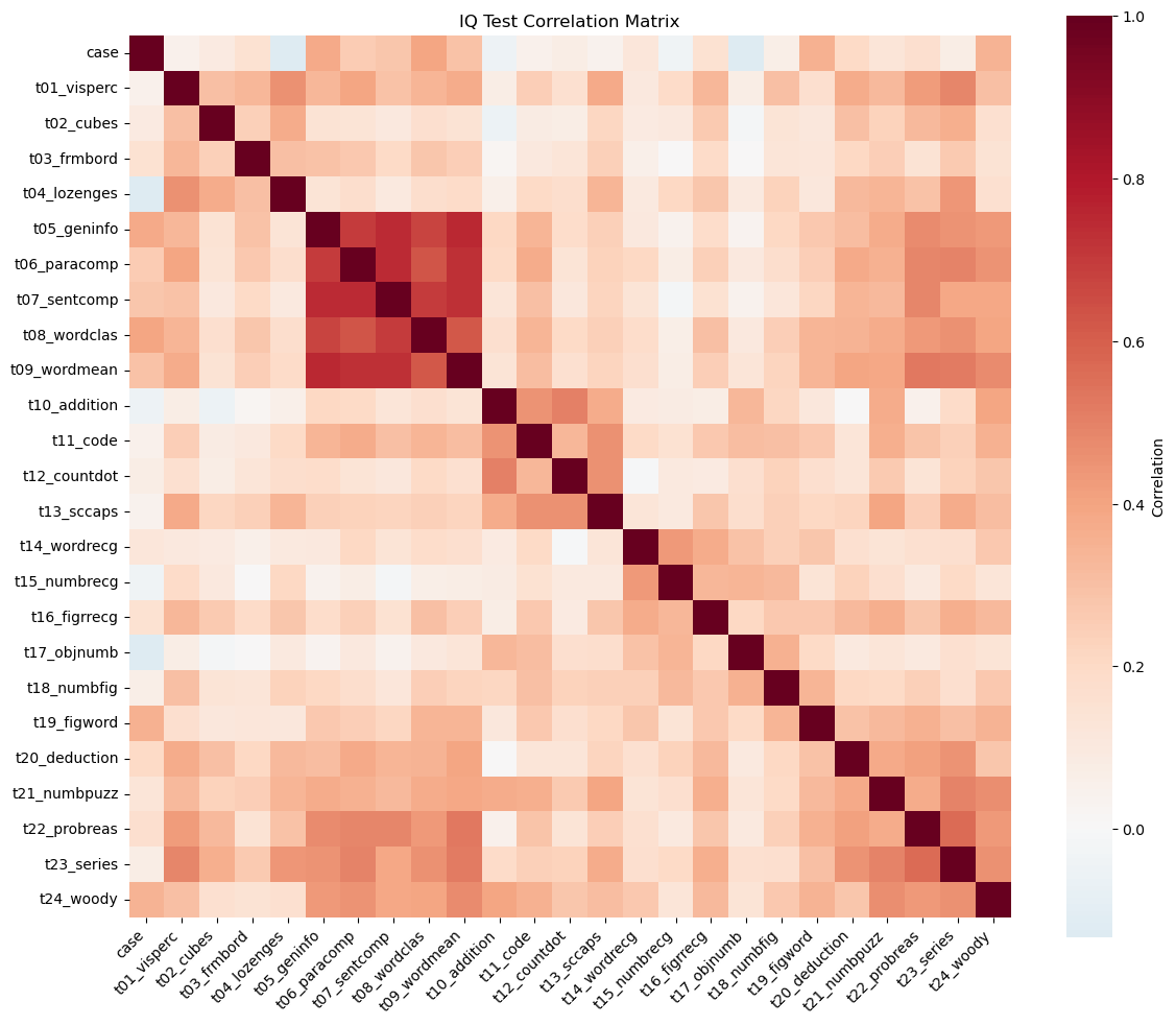
Answer / Interpretation
The heatmap shows that most test pairs have positive correlations (mostly light-to-medium red shades), and almost no large blue blocks. In plain terms: people who score high on one test tend to score high on many others.
What stands out most clearly in our figure:
A very strong verbal / knowledge block.
The tightest deep-red pocket is around:t05_geninfo(general information),t06_paracomp(paragraph comprehension),t07_sentcomp(sentence completion),t08_wordclas(word classification),t09_wordmean(word meaning).
These are all language-and-knowledge-heavy tasks, so it makes sense that they “move together”.
A reasoning / higher-order block in the later tests.
Another clearly warm region appears for:t20_deduction,t21_numbpuzz,t22_probreas,t23_series,t24_woody.
These require pattern finding / induction / multi-step reasoning, and they are visibly more correlated with each other than with many other tests.
Spatial / perceptual tests are positively related but less tightly clustered.
The earlier spatial tasks (t01_visperc,t02_cubes,t03_frmbord,t04_lozenges) show moderate correlations with many tests, but you don’t see a single “super tight” square as strong as the verbal block.
Why this is exactly the kind of structure PCA is designed for
- There is redundancy (many tests track overlapping abilities). PCA can “compress” that redundancy into fewer dimensions.
- The heatmap is not uniform: there is both a general positive pattern and local pockets. That often means: one big general factor (PC1) plus additional domain contrasts (PC2, PC3, …)
Apply PCA
# Standardize the features
scaler = StandardScaler()
X_train_scaled = scaler.fit_transform(X_train)
X_test_scaled = scaler.transform(X_test)

# Apply PCA
n_components = 5
pca = PCA(n_components=n_components)
X_train_pca = pca.fit_transform(X_train_scaled)
X_test_pca = pca.transform(X_test_scaled)

# Create DataFrame with PCA results
pca_columns = [f'PC{i+1}' for i in range(n_components)]
pca_df = pd.DataFrame(X_train_pca, columns=pca_columns)
pca_df['y'] = y_train.values

print("PCA transformation completed!")
print(f"Original shape: {X_train.shape}")
print(f"PCA shape: {X_train_pca.shape}")
print("\nFirst few rows of PCA data:")
print(pca_df.head())
PCA transformation completed!
Original shape: (240, 25)
PCA shape: (240, 5)
First few rows of PCA data:
PC1 PC2 PC3 PC4 PC5 y
0 -1.417344 2.299027 2.541139 2.166749 -0.490483 Pasteur
1 0.738345 1.060462 -0.640236 0.173993 -0.946356 Pasteur
2 -1.102512 -1.412361 -0.563015 -0.483498 -1.202279 Pasteur
3 3.867453 0.306824 0.413926 -1.133936 -1.610800 Pasteur
4 -2.322018 -1.321775 1.995586 -2.427672 1.975811 Grant-WhitePipeline mindset: what happened in these lines?
Think of this as a 2-step pipeline:
StandardScaler learns parameters on training data
fit_transform(X_train)computes each column’s mean & standard deviation on the 240 training rows, then standardises them.
transform(X_test)uses those same means & SDs to standardise the 61 test rows.
PCA learns a rotation on training data
fit_transform(X_train_scaled)learns the principal directions (the “best axes”) and produces PC scores for the 240 rows.
transform(X_test_scaled)projects the 61 held-out rows onto the same axes.
So even though PCA is not “predicting y”, it is still a learned transformation — so we treat it like a model component in a pipeline.
Interpret PCA Results
# Calculate variance explained
variance_explained = pca.explained_variance_ratio_
cumulative_variance = np.cumsum(variance_explained)

# Create subplots for variance explanation
fig, (ax1, ax2) = plt.subplots(1, 2, figsize=(15, 5))

# Variance explained by each component
ax1.bar(range(1, n_components + 1), variance_explained * 100, color='steelblue')
ax1.set_xlabel('Principal Component')
ax1.set_ylabel('Percentage of Variance Explained')
ax1.set_title('Variance Explained by Each PC')
ax1.set_xticks(range(1, n_components + 1))
for i, v in enumerate(variance_explained * 100):
    ax1.text(i + 1, v + 0.5, f'{v:.1f}%', ha='center', va='bottom')

# Cumulative variance explained
ax2.bar(range(1, n_components + 1), cumulative_variance * 100, color='darkgreen')
ax2.set_xlabel('Principal Component')
ax2.set_ylabel('Cumulative Percentage of Variance')
ax2.set_title('Cumulative Variance Explained')
ax2.set_xticks(range(1, n_components + 1))
for i, v in enumerate(cumulative_variance * 100):
    ax2.text(i + 1, v + 1, f'{v:.1f}%', ha='center', va='bottom')

plt.tight_layout()
plt.show()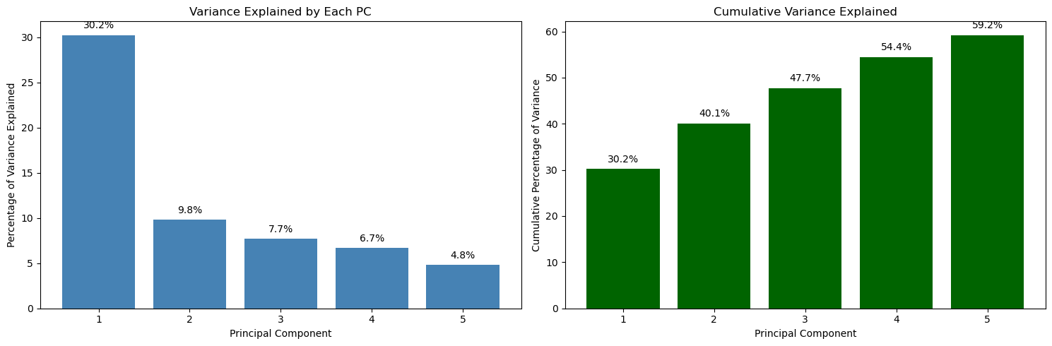
Answer / Interpretation
Reading directly from the plot:
- PC1 explains 30.2% of the variance.
- PC2 explains 9.8%.
- PC3 explains 7.7%.
- PC4 explains 6.7%.
- PC5 explains 4.8%.
Cumulatively (right plot):
- 2 PCs explain 40.1%.
- 3 PCs explain 47.7%.
- 4 PCs explain 54.4%.
- 5 PCs explain 59.2%.
What this means in the Holzinger–Swineford IQ context
You started with 25 test variables. With PCA:
- One single dimension (PC1) already captures nearly one third of the entire variation in the test battery. That is strong evidence that the test scores share a big common signal.
- Going from 1 → 2 PCs adds ~10 percentage points, which is meaningful but far smaller than PC1’s contribution.
- By PC5 you are down to ~5% per component — still real information, but with diminishing returns.
Why 5 components is defensible here
- 5 PCs get you to ~59% of the structure, while reducing 25 variables → 5.
- That’s a large compression, but you still keep the “major directions” of variation.
How to judge whether results are “good”
For PCA, you typically check:
- Variance explained: here, PC1 is large and the first few PCs together capture a substantial share. That suggests PCA is not just capturing noise.
- Stability: if you refit on another sample, does PC1 remain dominant? (This is one reason for having a test split or repeating with resamples.)
- Interpretability via loadings: do the loadings correspond to meaningful domains (verbal, spatial, numeric, reasoning)? We check this next.
# Visualize first two principal components
plt.figure(figsize=(10, 8))
if len(np.unique(y_train)) > 1:
    for class_val in np.unique(y_train):
        mask = y_train == class_val
        plt.scatter(
            X_train_pca[mask, 0],
            X_train_pca[mask, 1],
            label=f"Class {class_val}",
            alpha=0.7,
            s=50,
        )
    plt.legend()
else:
    plt.scatter(
        X_train_pca[:, 0], X_train_pca[:, 1], alpha=0.7, s=50, color="steelblue"
    )

plt.xlabel(f"PC1 ({variance_explained[0]:.1%} variance)")
plt.ylabel(f"PC2 ({variance_explained[1]:.1%} variance)")
plt.title("First Two Principal Components")
plt.grid(True, alpha=0.3)
plt.tight_layout()
plt.show()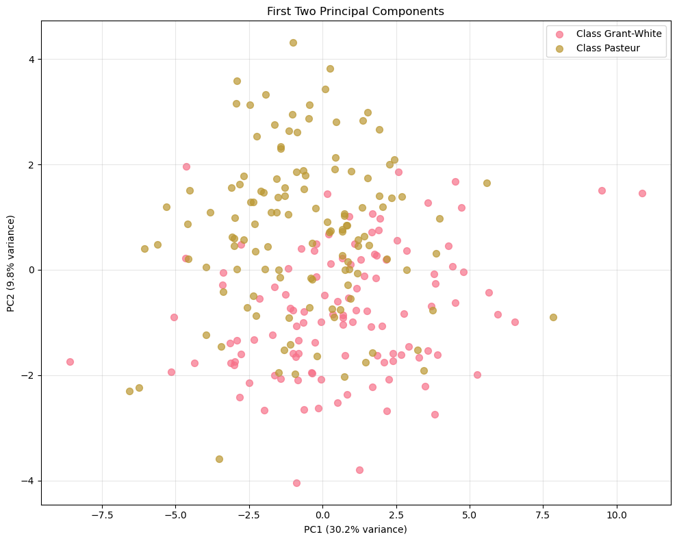
Answer / Interpretation
There is no clean separation between the two schools.
The Grant-White points and the Pasteur points overlap heavily across both PC1 and PC2.PC1 dominates the spread more than PC2.
This is consistent with the variance plot: PC1 explains 30.2% whereas PC2 explains 9.8%.
Visually, you see a wider horizontal range than vertical range.What PC1 likely represents here (linked to the IQ context).
Since most tests are positively correlated (heatmap), PC1 typically becomes a “general performance” axis:- students on the far right of PC1 tend to be above-average across many tests,
- students on the far left tend to be below-average across many tests.
What PC2 is doing (linked to domain contrasts).
PC2 is usually a “contrast axis”: it separates students whose profile leans toward one domain (e.g. verbal/knowledge) vs another (e.g. spatial/perceptual).
We confirm which domains it contrasts by reading the loadings plot next.What you can and cannot conclude from this plot.
You can conclude that “school” is not the main driver of variation in the first two PCs.
You cannot conclude that schools are identical overall — differences might exist but be:
- small,
- expressed in higher PCs,
- or simply not captured in this battery.
Good practice check (unsupervised evaluation idea):
You can project X_test into the same PC space and see if the cloud shape is similar. If the geometry looks wildly different on test, your PCA structure may be unstable.
A useful habit:
Always check a correlation heatmap before running PCA. If everything were near zero, there would be no shared structure for PCA to find, and a low-dimensional representation would not be meaningful.
Visualize PCA Loadings
# Extract loadings (components)
loadings = pca.components_[:3]  # First 3 components
feature_names = X_train.columns

# Create loadings plot
fig, axes = plt.subplots(1, 3, figsize=(18, 6))

for i, (ax, loading) in enumerate(zip(axes, loadings)):
    # Sort features by absolute loading value
    sorted_indices = np.argsort(np.abs(loading))
    sorted_features = feature_names[sorted_indices]
    sorted_loadings = loading[sorted_indices]

    # Color by positive/negative
    colors = ['coral' if x < 0 else 'steelblue' for x in sorted_loadings]

    ax.barh(range(len(sorted_features)), sorted_loadings, color=colors)
    ax.set_yticks(range(len(sorted_features)))
    ax.set_yticklabels(sorted_features, fontsize=8)
    ax.set_xlabel('Loading Value')
    ax.set_title(f'PC{i+1} Loadings')
    ax.grid(True, alpha=0.3)

    # Add vertical line at 0
    ax.axvline(x=0, color='black', linestyle='-', alpha=0.5)

plt.tight_layout()
plt.show()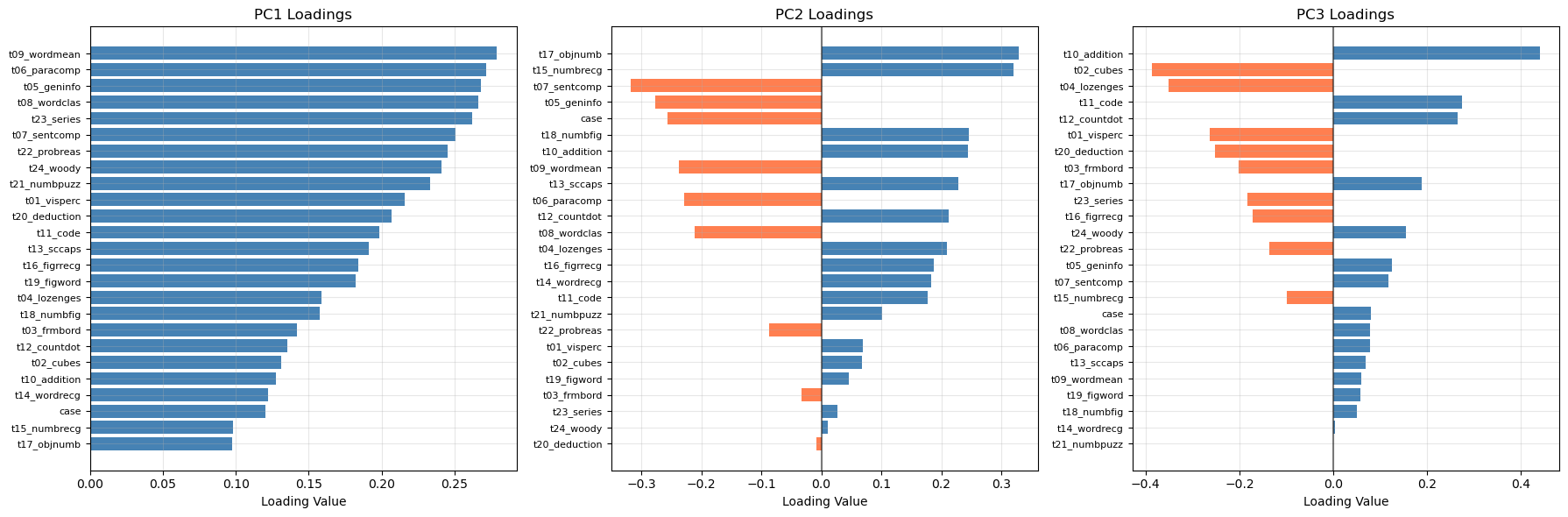
Answer / Interpretation (based on the actual loadings plot shown)
PC1 loadings (left panel)
In our plot, all PC1 bars are positive and many are of similar size. That pattern is the textbook signature of a general factor:
- If a student scores high on PC1, the reconstruction tends to push most test scores upward together.
- If a student scores low on PC1, the reconstruction tends to push most test scores downward together.
The largest PC1 loadings in oour plot include:
t09_wordmean,t06_paracomp,t05_geninfo,t08_wordclas,
and also high reasoning tests liket23_series,t22_probreas,t24_woody.
So PC1 here is not “just verbal”: it is a broad overall performance / overall ability direction, heavily influenced by the most mutually correlated tests in the dataset (as seen in the heatmap).
PC2 loadings (middle panel)
PC2 has a clear split of positive vs negative bars, meaning it is a contrast.
From our plot:
- Large positive PC2 loadings include:
t17_objnumb,t15_numbrecg, and alsot18_numbfig,t10_addition. - Large negative loadings include:
t07_sentcomp,t05_geninfo, andt06_paracomp(and alsot08_wordclasappears negative).
That is a very interpretable contrast:
PC2 separates “number recognition / numeric handling” from “verbal comprehension / knowledge”.
So if a student has a high PC2 score, they lean relatively more toward number/recognition tasks compared to verbal tasks; low PC2 means the opposite.
PC3 loadings (right panel)
PC3 has strong positives and negatives too.
From our plot:
- The strongest positive appears to be
t10_addition(very large positive bar). - The strongest negative include
t02_cubesandt04_lozenges(large negative bars).
So PC3 is mainly contrasting:
arithmetic fluency vs spatial/figural reasoning
This matches the interpretation “numeric operations vs spatial manipulation”.
How to know if the PCA interpretation is “any good”
- Consistency check with heatmap: the verbal group is strongly correlated; it makes sense that several of those tests load strongly on PC1 and that PC2 contrasts them with numeric recognition tasks.
- Sign doesn’t matter: if someone refits PCA and PC2 flips sign, the interpretation is unchanged (it’s still the same contrast, just reversed direction).
- Stability check: if you rerun PCA on a different split and the same tests dominate PC1 and the same contrast appears in PC2, that’s strong evidence the structure is real, not noise.
🗣️ DISCUSSION: How much variance do the first 5 components capture? What patterns do you see in the PC1 vs PC2 plot?
Answer
- The first 5 PCs capture 59.2% of the variance (from the cumulative plot).
- In the PC1–PC2 plot, the two schools overlap strongly, meaning school membership is not cleanly separated by the dominant variation directions.
- PC1 is the main driver of spread (30.2%), consistent with an “overall performance” factor across the battery.
- PC2 adds a smaller contrast (9.8%), which loadings suggest is a numeric recognition vs verbal comprehension trade-off.
Part II: Multiple Correspondence Analysis (MCA) - Categorical Data (20 mins)
MCA extends PCA to categorical variables by analyzing patterns in contingency tables.
Introducing ethical norms data
In this part, you’ll use items from the World Values Survey (WVS) on ethical attitudes. The WVS provides information on 19 ethical issues which respondents can rate from 0 (never justifiable) to 10 (always justifiable).
“The World Values Survey (WVS) is an international research program devoted to the scientific and academic study of social, political, economic, religious and cultural values of people in the world. The project’s goal is to assess which impact values stability or change over time has on the social, political and economic development of countries and societies” (Source: World Values Survey website)
For more details on the WVS, see the World Values Survey website or the reference in footnote 22.
Original responses are 0–10; here each item will be binarised into “support” vs “oppose” using the global median for interpretability.
🗣️ CLASSROOM DISCUSSION: How could we explore relationships between these features?
Why we need MCA instead of PCA (pipeline mindset)
These responses are categorical (after binarisation): "y" vs "n".
- PCA expects numbers where distances like “2 is twice as big as 1” make sense. For continuous test scores, that arithmetic is meaningful.
- With
"y"/"n", there is no meaningful arithmetic difference: you cannot compute an average of “yes” and “no”. MCA handles this by turning categories into an indicator (one-hot) representation internally and measuring structure via category co-occurrence rather than numeric variance.
What does “chi-square distance” mean?
PCA measures how numerically far apart observations are (Euclidean distance). MCA uses a different ruler: chi-square distance. Rather than asking “how far apart are two numbers?”, it asks “how surprisingly often do certain response combinations appear together?”
To make this concrete: if terrorism__y and violence_against_spouse__y co-occurred at exactly the rate expected from random, independent responding — no more, no less — their chi-square distance would be zero and they would contribute nothing to the MCA dimensions. Chi-square distance is large when categories co-occur much more (or much less) than random chance predicts. MCA finds the low-dimensional axes that best summarise these surprising co-occurrence patterns.
This is the right distance for nominal categories: the numbers 0 and 1 that encode “n” and “y” have no arithmetic meaning, but the pattern of who answers “y” on both terrorism and violence together carries genuine information about moral attitudes. The core idea of MCA is identical to PCA: find low-dimensional axes that capture the most “structure”. The difference is only in how “structure” is measured.
Load and Prepare Ethical Norms Data
📝 Note: We’ll transform variables so that values above the global median reflect “support” and those below reflect “oppose”.
# Define variable names for ethical attitudes
values = [
    "cheating_benefits",
    "avoid_transport_fare",
    "stealing_property",
    "cheating_taxes",
    "accept_bribes",
    "homosexuality",
    "sex_work",
    "abortion",
    "divorce",
    "sex_before_marriage",
    "suicide",
    "euthanasia",
    "violence_against_spouse",
    "violence_against_child",
    "social_violence",
    "terrorism",
    "casual_sex",
    "political_violence",
    "death_penalty",
]

# Load and binarize the data
np.random.seed(123)
norms = pd.read_csv("data/wvs-wave-7-ethical-norms.csv")

# Convert to binary based on median (efficient vectorized approach)
norms_binary = pd.DataFrame()
for i, col in enumerate(norms.columns):
    median_val = norms[col].median()
    norms_binary[values[i]] = np.where(norms[col] > median_val, "y", "n")

print("Ethical norms data shape:", norms_binary.shape)
print("\nFirst few rows:")
print(norms_binary.head())
Ethical norms data shape: (94278, 19)
First few rows:
cheating_benefits avoid_transport_fare stealing_property cheating_taxes \
0 n n n n
1 n n n n
2 n n n n
3 n n n n
4 n n n n
accept_bribes homosexuality sex_work abortion divorce sex_before_marriage \
0 n y y n n n
1 n y y y y y
2 n y y y y y
3 n y y y y y
4 n y y y y y
suicide euthanasia violence_against_spouse violence_against_child \
0 n n n n
1 n y n n
2 y y n n
3 y y n n
4 n y n n
social_violence terrorism casual_sex political_violence death_penalty
0 n n n n n
1 n n y n n
2 y n y n n
3 n n y n n
4 n n y n nApply MCA
# Perform MCA (excluding first variable as supplementary)
mca = MCA(n_components=5, n_iter=10, random_state=123)
mca_result = mca.fit_transform(norms_binary.iloc[:, 0:])  # Exclude first column

# Get coordinates (convert to numpy array first)
mca_coords = mca_result.values[:, :2]  # First two dimensions

print("MCA completed!")
print(f"Explained variance by dimension: {mca.percentage_of_variance_[:2]}")
print(f"Cumulative variance explained: {mca.cumulative_percentage_of_variance_[:2]}")
print(f"Eigenvalues: {mca.eigenvalues_[:2]}")
MCA completed!
Explained variance by dimension: [36.37824915 15.6337829 ]
Cumulative variance explained: [36.37824915 52.01203204]
Eigenvalues: [0.36378249 0.15633783]
NoteMCA: choosing the number of dimensions and understanding the metric
The metric: percentage of inertia explained
MCA reports percentage of inertia explained rather than “percentage of variance explained”. Inertia is MCA’s term for the total chi-square structure in the data — the degree to which category co-occurrence patterns depart from what random, independent responding would produce. The interpretation is conceptually the same as PCA’s variance: a higher percentage means the dimension captures more of the observed pattern.
Why raw percentages are deflated
Raw MCA inertia percentages are systematically lower than they should be, not because the dimensions are weak, but because of how MCA works internally. MCA one-hot encodes every variable (each “y”/“n” pair becomes two binary columns, giving 38 columns for 19 items). The total inertia denominator includes a large “trivial” component: each category column is always the exact complement of the other (terrorism__y + terrorism__n = 1 for every respondent), so part of the total inertia is mechanically guaranteed and carries no real information. The more variables you have, the larger this trivial share becomes, making every dimension appear to explain a smaller percentage than it truly does.
Two widely-used corrections remove this deflation:
Benzecri correction (most common)
Works in two steps:
- discard eigenvalues below the trivial threshold \(1/K\) where \(K\) is the number of variables: these capture the mechanical complement structure;
- rescale the remaining eigenvalues. For each raw eigenvalue \(\lambda_k > 1/K\):
\[ \tilde{\lambda}_k = \left(\frac{K}{K-1}\right)^2 \left(\lambda_k - \frac{1}{K}\right)^2 \]
The corrected percentage is \(\tilde{\lambda}_k / \sum_k \tilde{\lambda}_k \times 100\%\).
Greenacre correction
Adjusts the denominator rather than the eigenvalues: subtracts the expected trivial inertia from the total, giving a “corrected total inertia” against which raw eigenvalues are expressed. In practice the two corrections give very similar results, as the output below confirms.
Applying corrections in Python
The prince library applies both corrections natively via the correction constructor argument — no manual formula needed:
mca_benz  = MCA(n_components=5, n_iter=10, random_state=123, correction='benzecri').fit(norms_binary)
mca_green = MCA(n_components=5, n_iter=10, random_state=123, correction='greenacre').fit(norms_binary)

print("Raw % inertia:      ", np.round(mca.percentage_of_variance_[:5], 2))
print("Benzécri corrected: ", np.round(mca_benz.percentage_of_variance_[:5], 2))
print("Greenacre corrected:", np.round(mca_green.percentage_of_variance_[:5], 2))
Raw % inertia: [36.38 15.63 6.09 4.72 3.78]
Benzécri corrected: [89.95 9.99 0.06 0. 0. ]
Greenacre corrected: [91.64 10.18 0.06 0. 0. ]Both corrections tell a much clearer story than the raw percentages:
- Dim 1 captures ~90% of the corrected inertia: the harm/corruption dimension is by far the dominant structure in the data.
- Dim 2 captures ~10%: the personal morality dimension is real but secondary.
- Dims 3–5 drop to near zero after correction. The raw values (6.1%, 4.7%, 3.8%) looked potentially meaningful, but the corrections reveal they are essentially noise — this strongly reinforces the 2-dimension solution.
- Both corrections give nearly identical results, so the conclusion does not depend on which you use.
The raw percentages are still useful for comparing dimensions to each other (Dim 1 is clearly dominant regardless of scale), but the corrected values show that the 2-dimension solution is even more complete than the raw 52% suggested.
How to judge whether percentages are “strong”
A rough reference: if all respondents answered at random, each MCA dimension would explain \(100\% \div 38 \approx 2.6\%\). Against this:
- Dim 1 at 36.4% is roughly 14x the random baseline — very strong structure.
- Dim 2 at 15.6% is roughly 6x the random baseline — still substantial.
How to choose n_components
1. Scree plot with a random-baseline reference line
Plot percentage of inertia per dimension. Add the random baseline as a horizontal reference — dimensions well above it are capturing real co-occurrence structure:
K = norms_binary.shape[1]
random_baseline = 100 / (K * 2)   # 2 indicator cols per binary variable

plt.figure(figsize=(8, 4))
plt.bar(range(1, 6), mca.percentage_of_variance_[:5], color='steelblue', label='% inertia explained')
plt.axhline(y=random_baseline, color='red', linestyle='--',
            label=f'Random baseline ({random_baseline:.1f}%) — above this = meaningful')
plt.xlabel('MCA Dimension')
plt.ylabel('% Inertia Explained')
plt.title('MCA Scree Plot')
plt.legend()
plt.tight_layout()
plt.show()
All five dimensions are well above the baseline. The large drops from Dim 1 (36.4%) to Dim 2 (15.6%) to Dim 3 point to 2 dimensions as dominant, while Dims 3–5 remain above random and may contain additional weaker structure.
Why the scree plot shows raw inertia (i.e not corrected)
The scree plot uses raw inertia percentages rather than Benzécri/Greenacre-corrected values. This is intentional for two reasons:
The elbow is the same either way. The corrections are monotone rescalings of the eigenvalues, so the relative drop-off pattern is preserved. The big step down from Dim 1 to Dim 2, and again to Dim 3, is visible on either scale — the “use 2 dimensions” conclusion does not change.
The random baseline is meaningful on the raw scale. The red dashed line at 2.6% represents the expected share of raw inertia per dimension if respondents answered completely at random. This baseline would also need rescaling if you switched to corrected values — but the corrections zero out trivial dimensions by construction, so the corrected “random” reference point collapses to essentially zero, making it uninformative as a visual guide. Dims 3–5 sitting just above 2.6% on the raw scale is genuinely useful: it signals “marginally above noise” rather than the flat near-zero those dimensions show after correction.
What the corrected plot looks like:
MCA scree plot with Benzécri correction (code)
mca_benz = MCA(n_components=5, n_iter=10, random_state=123, correction='benzecri').fit(norms_binary)

K = norms_binary.shape[1]
corrected_pct = mca_benz.percentage_of_variance_[:5]

# Corrected baseline: apply Benzécri formula to the raw random baseline eigenvalue (1/K)
# A dimension at exactly the threshold gets zeroed out, so the corrected baseline is 0.
# We nudge just above threshold to show where near-trivial dimensions land.
raw_baseline_eig = 1 / K + 1e-6   # just above the discard threshold
corrected_baseline = ((K / (K - 1)) * (raw_baseline_eig - 1/K)) ** 2
corrected_baseline_pct = 100 * corrected_baseline / (mca_benz.eigenvalues_ ** 2 * ((K/(K-1))**2)).sum()

plt.figure(figsize=(8, 4))
plt.bar(range(1, 6), corrected_pct, color='steelblue', label='% inertia explained (Benzécri corrected)')
plt.axhline(y=corrected_baseline_pct, color='red', linestyle='--',
            label=f'Corrected baseline (~{corrected_baseline_pct:.2f}%) — near zero by construction')
plt.xlabel('MCA Dimension')
plt.ylabel('% Inertia Explained (Benzécri corrected)')
plt.title('MCA Scree Plot (Benzécri corrected)')
plt.legend()
plt.tight_layout()
plt.show()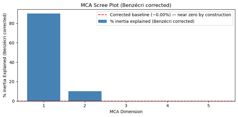
Compare this plot to the raw scree plot above. The corrected baseline (red dashed line) collapses to ~0% by construction, Dims 3–5 are indistinguishable from zero, and the plot gives no useful guidance for choosing between 2, 3, or more dimensions. The only clear message is “Dim 1 dominates”, which you could already see on the raw plot. This is why raw inertia is preferred for the scree plot, reserving corrected values for reporting absolute effect sizes in the text. The corrected values are most useful when reporting how much structure was captured (see the interpretation above), not for choosing the number of dimensions.
2. Interpretability of the biplot
Keep enough dimensions that each one organises the biplot around a meaningful cluster of categories. In this WVS dataset, 2 dimensions give a very clean and interpretable biplot, adding a 3rd would require checking whether it reveals a genuinely new moral domain.
3. The “all variables contribute” check After fitting, check that every variable is reasonably well represented in your retained dimensions. A variable near the origin on all retained dimensions was not well captured — its co-occurrence pattern may be too weak or idiosyncratic to appear in the main dimensions.
The standard measure is each category’s quality of representation (called cos² in correspondence analysis): the proportion of its variation across the retained dimensions that is explained by the first two. A value near 1 means the category is almost fully described by the Dim 1–2 plane; a value near 0 means its structure lives mostly in Dims 3–5 and its biplot position is unreliable.
col_coords = mca.column_coordinates(norms_binary)  # let it use its own index
total_sq = (col_coords ** 2).sum(axis=1)
retained_sq = (col_coords.iloc[:, :2] ** 2).sum(axis=1)
quality = (retained_sq / total_sq).reset_index()
quality.columns = ['category', 'quality']
quality = quality.sort_values('quality')

plt.figure(figsize=(10, 8))
colors = ['coral' if q < 0.5 else 'steelblue' for q in quality['quality']]
plt.barh(quality['category'], quality['quality'], color=colors)
plt.axvline(x=0.5, color='red', linestyle='--',
            label='50% threshold — coral = poorly represented in Dims 1–2')
plt.xlabel('Quality of representation (0 = not captured, 1 = fully captured)')
plt.title('Category representation quality in MCA Dims 1–2')
plt.legend(); plt.tight_layout(); plt.show()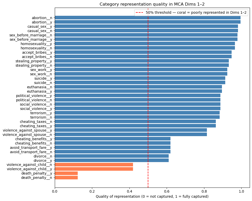
Most categories are well represented (quality > 0.5), confirming the 2-dimension solution captures the bulk of the structure. The exceptions are death_penalty__y/n (quality ~0.1) and violence_against_child__y/n (quality ~0.45): both sit close to the origin in the biplot, not because they lack structure, but because their structure is not aligned with the two main moral dimensions. A third MCA dimension would likely capture them better.
4. Downstream purpose
If you are using MCA coordinates as inputs to a downstream model, experiment with 2, 3, and 5 dimensions and compare performance using an appropriate metric. Note that raw accuracy is most often not the right choice: for imbalanced outcomes, AUC-ROC, F1, or precision/recall may be more informative. Use cross-validation to avoid overfitting to the number of dimensions chosen.
In this lab we use n_components=5 and focus on the first 2 for plotting. For this dataset, 2 dimensions are strongly interpretable and explain 52% of raw inertia (well above the random baseline), making them the primary result.
How to judge if MCA results are any good (in this lab)
- Dim 1 explains 36.4% and Dim 2 explains 15.6%: strong structure for categorical attitude data, i.e roughly 14x and 6x the random baseline of ~2.6% per dimension respectively.
- The key quality check is interpretability: do clusters correspond to meaningful moral domains? We check that directly from the biplot next.
Visualize MCA Results
# Get the actual variable coordinates for MCA biplot
eigenvals = mca.eigenvalues_[:2]
print("Eigenvalues for first 2 dims:", eigenvals)

# Get the V matrix (right singular vectors) from SVD
V = mca.svd_.V[:2].T
print("V matrix shape:", V.shape)

# Calculate variable coordinates: V * sqrt(eigenvalues)
coords = V * np.sqrt(eigenvals)
print("Coordinates shape:", coords.shape)

# Create the proper biplot DataFrame with actual coordinates
df_biplot = pd.DataFrame(
    {"labels": mca.one_hot_columns_, "dim1": coords[:, 0], "dim2": coords[:, 1]}
)

print("First few rows of biplot data:")
print(df_biplot.head())

# Plot with repelling text and no backgrounds
plt.figure(figsize=(12, 10))

texts = []
for i, row in df_biplot.iterrows():
    plt.scatter(row["dim1"], row["dim2"], color="red", s=30, alpha=0.8, zorder=5)
    text = plt.text(
        row["dim1"],
        row["dim2"],
        row["labels"],
        fontsize=10,
        ha="center",
        va="center",
        alpha=0.9,
        zorder=10,
    )
    texts.append(text)

adjust_text(
    texts,
    arrowprops=dict(arrowstyle="->", color="gray", alpha=0.5, lw=0.5),
    expand_points=(1.2, 1.2),
    expand_text=(1.1, 1.1),
)

plt.xlabel(f"Dimension 1 ({mca.percentage_of_variance_[0]:.1f}%)")
plt.ylabel(f"Dimension 2 ({mca.percentage_of_variance_[1]:.1f}%)")
plt.title("MCA Biplot: Ethical Attitudes (Variable Coordinates)")
plt.grid(True, alpha=0.3)
plt.axhline(y=0, color="black", linestyle="-", alpha=0.3)
plt.axvline(x=0, color="black", linestyle="-", alpha=0.3)
plt.show()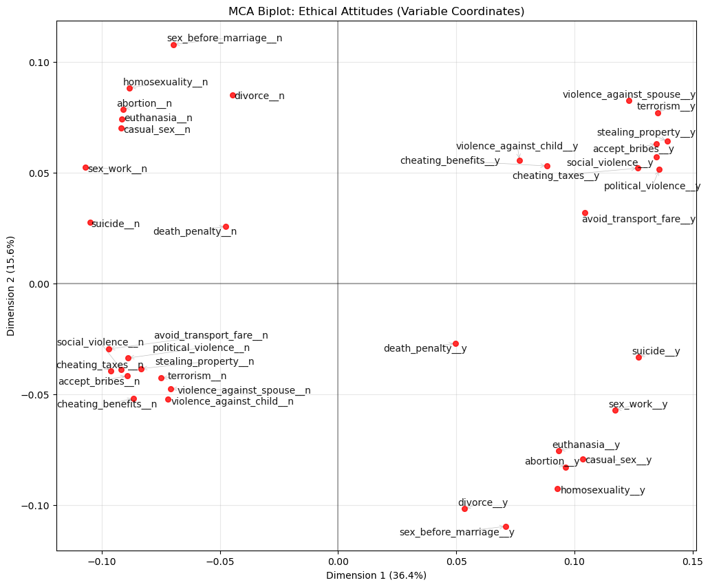
Answer / Interpretation
How to read this plot
Each label is a category (e.g., terrorism__y or terrorism__n). Categories that are close together tend to occur together in respondents’ profiles.
What Dim 1 is doing (36.4%)
On the right side of Dim 1 you see a clear cluster of “y” categories for acts that involve harm, violence, or corruption, including:
violence_against_spouse__yterrorism__ystealing_property__yaccept_bribes__ysocial_violence__ypolitical_violence__yavoid_transport_fare__y
On the left side you see the matching “n” categories for the same group.
Dimension 1 is an axis of permissiveness vs rejection of harmful/corrupt behaviours.
What Dim 2 is doing (15.6%)
- In the top-left: “n” categories for personal/sexual morality items:
sex_before_marriage__n,homosexuality__n,abortion__n,euthanasia__n,casual_sex__n,sex_work__n. - In the bottom-right: the corresponding “y” categories for those same items.
Dimension 2 is an axis separating conservative vs permissive attitudes about personal/sexual morality.
A useful “story” of the map (what the quadrants mean)
- Top-left: reject harm/corruption and reject permissive sexual morality → morally restrictive across domains.
- Bottom-right: accept harm/corruption and accept permissive sexual morality → morally permissive across domains.
- Top-right: accept harm/corruption but reject permissive sexual morality → mixed profile.
- Bottom-left: reject harm/corruption but accept permissive sexual morality → mixed profile.
The fact that the plot supports these mixed profiles is exactly why MCA is useful: it separates different moral dimensions instead of collapsing everything into one average score.
Projecting individual respondents onto the MCA plane
# Symmetric map: overlay respondents using principal coordinates for both rows and columns
col_principal = mca.column_coordinates(norms_binary)

plt.figure(figsize=(12, 10))
plt.scatter(mca_coords[:, 0], mca_coords[:, 1],
            alpha=0.01, s=3, color='steelblue', label='Respondents')
for label, row in col_principal.iterrows():
    plt.scatter(row.iloc[0], row.iloc[1], color='red', s=40, zorder=5)
    plt.text(row.iloc[0], row.iloc[1], label, fontsize=7, zorder=10)
plt.xlabel(f"Dimension 1 ({mca.percentage_of_variance_[0]:.1f}%)")
plt.ylabel(f"Dimension 2 ({mca.percentage_of_variance_[1]:.1f}%)")
plt.title("MCA Symmetric Map: Respondents + Category Labels")
plt.legend(); plt.show()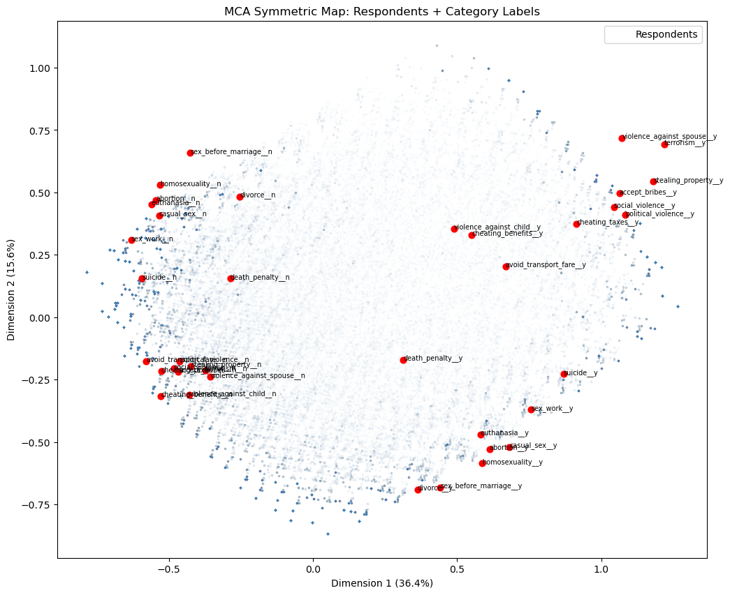
The symmetric map overlays the 94,278 respondents (blue) onto the same space as the category labels (red). A respondent’s position is the weighted average of the category coordinates for the answers they gave, so respondents cluster near the categories that best describe their profile.
For a meaningful overlay, both rows and columns must use principal coordinates, the default for rows in prince, and obtained via column_coordinates() for columns. A naive overlay using the manually computed coords from the biplot above would place category labels on a different scale, causing them to bunch up in the centre of the respondent cloud.
The respondent cloud confirms the two-dimensional structure from the biplot: harm/corruption “y” categories sit top-right with their corresponding respondents, personal morality “y” categories sit bottom-right, and the “n” categories anchor the left side. Colouring the respondent points by country, age group, or political affiliation would reveal whether these moral attitude dimensions correspond to meaningful demographic or geographic variation.
Caveat: even with matching principal coordinates, distances between a respondent point and a category point are not strictly interpretable — only distances among respondent points and among category points are. The overlay is best read qualitatively: respondents near a category label tend to have endorsed it.
🗣️ DISCUSSION: What patterns do you see in the ethical attitudes? Which attitudes cluster together?
Answer
You see two big clusters:
Harm/corruption cluster:
terrorism,political_violence,social_violence,violence_against_spouse,stealing_property,accept_bribes,cheating_taxes,avoid_transport_fare(the “y” versions cluster together on the right; the “n” versions cluster together on the left).Personal morality cluster:
abortion,euthanasia,homosexuality,casual_sex,sex_work,sex_before_marriage(the “y” versions cluster in the bottom-right; the “n” versions cluster in the top-left).
So the map separates:
- “views on harm/corruption” from
- “views on personal/sexual morality”
Part III: Autoencoders - Non-linear Dimensionality Reduction (25 mins)
Autoencoders use neural networks to learn non-linear compressions of data, potentially capturing more complex patterns than PCA.
Prepare Data for Autoencoders
# Clean and normalize IQ data for autoencoder
autoencoder_data = X_train.copy()

# Standardize the data
scaler_ae = StandardScaler()
data_scaled = scaler_ae.fit_transform(autoencoder_data)

print(f"Input dimensions: {data_scaled.shape}")
input_dim = data_scaled.shape[1]
encoding_dim = 6

# Convert to PyTorch tensors
data_tensor = torch.FloatTensor(data_scaled)
Input dimensions: (240, 25)Pipeline mindset (autoencoder preprocessing)
This section is doing the same pipeline logic as PCA:
StandardScaler()is fitted on the training matrix that will be fed into the network.- The network then tries to reconstruct those scaled values.
Scaling is especially important for neural networks because it stabilises training: if one feature ranges 0–1000 and another ranges 0–1, the network will “care” much more about the huge feature unless you scale.
What is a PyTorch tensor?
A tensor is essentially a multi-dimensional array i.e like a NumPy array, but designed for use inside PyTorch’s neural network framework. You can think of torch.FloatTensor(data_scaled) as copying the data into a format that PyTorch can work with directly.
PyTorch needs to keep track of every mathematical operation applied to the data as the network runs, so that it can later figure out how to adjust the network’s weights to improve its output. Think of it as putting the data into a “smart spreadsheet” that not only stores the numbers but also remembers every calculation it goes through, so that when we want to improve the network, we can work backwards through those calculations to find out which weights to adjust and by how much. Converting to a tensor “registers” the data with this tracking system. You do not need to interact with this tracking directly; PyTorch handles it automatically.
Define Autoencoder Architecture
class IQAutoencoder(nn.Module):
    def __init__(self, input_dim=24, encoding_dim=6):
        super(IQAutoencoder, self).__init__()

        # Encoder: compress input_dim -> encoding_dim dimensions
        self.encoder = nn.Sequential(
            nn.Linear(input_dim, 16),
            nn.ReLU(),
            nn.Dropout(0.2),
            nn.Linear(16, 12),
            nn.ReLU(),
            nn.Dropout(0.2),
            nn.Linear(12, encoding_dim)
        )

        # Decoder: reconstruct encoding_dim -> input_dim dimensions
        self.decoder = nn.Sequential(
            nn.Linear(encoding_dim, 12),
            nn.ReLU(),
            nn.Dropout(0.2),
            nn.Linear(12, 16),
            nn.ReLU(),
            nn.Dropout(0.2),
            nn.Linear(16, input_dim)
        )

    def forward(self, x):
        encoded = self.encoder(x)
        decoded = self.decoder(encoded)
        return decoded

    def encode(self, x):
        return self.encoder(x)

# Initialize the model
model = IQAutoencoder(input_dim=input_dim, encoding_dim=encoding_dim)
print("Autoencoder architecture:")
print(model)
Autoencoder architecture:
IQAutoencoder(
(encoder): Sequential(
(0): Linear(in_features=25, out_features=16, bias=True)
(1): ReLU()
(2): Dropout(p=0.2, inplace=False)
(3): Linear(in_features=16, out_features=12, bias=True)
(4): ReLU()
(5): Dropout(p=0.2, inplace=False)
(6): Linear(in_features=12, out_features=6, bias=True)
)
(decoder): Sequential(
(0): Linear(in_features=6, out_features=12, bias=True)
(1): ReLU()
(2): Dropout(p=0.2, inplace=False)
(3): Linear(in_features=12, out_features=16, bias=True)
(4): ReLU()
(5): Dropout(p=0.2, inplace=False)
(6): Linear(in_features=16, out_features=25, bias=True)
)
)
Note
Understanding the autoencoder code: objects, classes, and methods
What is an object?
An object is a self-contained “thing” in Python that bundles together two kinds of content:
- Data it stores, called attributes. A trained autoencoder, for example, stores its learned weights.
- Actions it can perform, called methods. The autoencoder can compress a new input or reconstruct it.
You have already worked with objects throughout this course. A DataFrame is an object: it stores a table of data (its attribute) and can .head(), .corr(), or .dropna() (its methods). A StandardScaler is an object: it stores the mean and SD it learned (attributes) and can .fit_transform() or .transform() new data (methods).
What is a class?
A class is a blueprint for creating objects. It defines what attributes and methods objects of that type will have. When you write model = IQAutoencoder(...), Python uses the IQAutoencoder blueprint to build one specific autoencoder object called model.
Think of it like a recipe card: the class is the recipe, and model is the dish you made by following it. You can make many dishes from the same recipe — e.g., model_small = IQAutoencoder(encoding_dim=2) and model_large = IQAutoencoder(encoding_dim=10) are two separate objects built from the same blueprint.
What is __init__?
__init__ (short for “initialise”) is a special method that runs once, automatically, the moment you create a new object from the class. Its job is to set up the object’s initial state — creating the attributes it will need.
In IQAutoencoder.__init__:
- It receives
input_dim(25) andencoding_dim(6) as inputs. - It builds two neural-network blocks —
self.encoderandself.decoder— and stores them as attributes on the object. Theselfkeyword refers to the object being created;self.encodermeans “this object’s encoder attribute”.
After model = IQAutoencoder(input_dim=25, encoding_dim=6) runs, model now contains a ready-to-train encoder and decoder.
The methods in this autoencoder
__init__— sets up the architecture (runs once at creation).forward(self, x)— defines the full encode-then-decode pass. PyTorch calls this automatically whenever you domodel(some_data).encode(self, x)— runs only the encoder, returning the compressed bottleneck representation. We call this after training to extract latent codes.
What each layer type does
nn.Linear(in_features, out_features)— a “fully connected” layer. Every input value is connected to every output value through a learned weight. Think of it as a matrix multiplication: the layer hasin_features × out_featureslearnable numbers (weights), plus one bias per output. During training these weights are adjusted to minimise reconstruction error — exactly like learning coefficients in linear regression, but happening simultaneously across many layers.nn.ReLU()— the activation function. After eachLinearlayer, ReLU is applied element-wise: negative values become 0, positive values pass through unchanged. Without this, stackingLinearlayers would still produce only a linear transformation overall (because a product of linear operations is still linear). ReLU is what gives the network the ability to learn non-linear patterns that PCA cannot capture.nn.Dropout(0.2)— a regularisation layer. During training, each call randomly sets 20% of neurons’ outputs to zero — a different 20% each time. This prevents the network from over-relying on any single neuron, which would cause memorisation rather than generalisation. Dropout is disabled automatically during evaluation (model.eval()). Conceptually similar to how ridge regularisation discourages linear regression from over-relying on individual predictors.
Quick mental picture of the architecture
Input (25 test scores)
     |
  Linear(25->16)  + ReLU + Dropout    <- first encoder layer
     |
  Linear(16->12)  + ReLU + Dropout    <- second encoder layer
     |
  Linear(12->6)                        <- bottleneck (no activation)
     |
  Linear(6->12)   + ReLU + Dropout    <- first decoder layer
     |
  Linear(12->16)  + ReLU + Dropout    <- second decoder layer
     |
  Linear(16->25)                       <- output (raw reconstruction)
The 6-number bottleneck is the “compressed representation” — like PC scores in PCA, but learned non-linearly.
Architecture diagram (same model, visualised)
Autoencoders: understanding and choosing parameters
The metric: reconstruction loss (MSE)
The fundamental question an autoencoder asks is: how well can the network reconstruct the original input from its compressed bottleneck? If reconstruction is near-perfect, the bottleneck must be capturing the essential information. If reconstruction is poor, important information is being lost.
We need a single number that summarises reconstruction quality across all features and all data points. The natural approach is to measure the average “distance” between each original value and its reconstruction. Mean Squared Error (MSE) does exactly this:
\[\text{MSE} = \frac{1}{n \cdot p} \sum_{i=1}^{n} \sum_{j=1}^{p} (\hat{x}_{ij} - x_{ij})^2\]
where \(\hat{x}_{ij}\) is the reconstructed value and \(x_{ij}\) is the original (scaled) value.
Why MSE? Squaring the differences makes all errors positive (so positive and negative errors don’t cancel), and penalises large errors more than small ones. Because the data is standardised (mean 0, SD 1), each feature contributes equally — no single test dominates the loss just because it has a larger numerical range. A final validation MSE of ~0.64 means the reconstructed value is typically about \(\sqrt{0.64} \approx 0.8\) standard deviations from the original — reasonable for a 6-number bottleneck reconstructing 25 features.
What each parameter controls
Before discussing how to set each parameter, here is what they mean:
| Parameter | What it controls |
|---|---|
encoding_dim |
Size of the bottleneck — analogous to n_components in PCA |
| Hidden layer widths (16, 12) | Capacity of the stepping stones between input and bottleneck |
| Dropout (0.2) | Proportion of neurons randomly disabled per training pass |
| Learning rate (0.001) | Step size of each weight update |
| Epochs (100) | Number of complete passes through the training data |
| Batch size (32) | Number of examples processed before each weight update |
How to set each parameter (rules of thumb)
encoding_dim (bottleneck size, currently 6)
This is the number of values each input is compressed into — directly analogous to n_components in PCA. A smaller bottleneck forces more aggressive compression: the network must find a very compact summary, which may lose detail but produces a simpler latent representation. A larger bottleneck makes reconstruction easier but compresses less. Sweep several values and pick the elbow in validation loss (see code below), just as you would read a PCA scree plot.
Layer widths (16 and 12 here)
The hidden layers are the intermediate steps between the input (25 features) and the bottleneck (6 values). Their widths control how much capacity the network has to learn complex transformations along the way. Think of them as stepping stones: going 25→16→12→6 gives the network room to gradually restructure the representation rather than collapsing it all at once. Too narrow and the network cannot learn complex patterns (underfitting); too wide relative to the dataset size and the network memorises the training data rather than generalising (overfitting). A rough guide: the total number of learnable parameters should not substantially exceed the number of training examples. With 240 rows, the current architecture (total parameters ≈ 25×16 + 16×12 + 12×6 + 6×12 + 12×16 + 16×25 ≈ 1,300) is conservative and safe. A 512-wide layer with 240 rows would create hundreds of thousands of parameters and would almost certainly overfit.
Dropout (0.2 here)
Dropout is the proportion of neurons randomly disabled on each forward pass during training. It acts as a regulariser: by preventing the network from relying too heavily on any single neuron, it discourages memorisation of the training set. Higher values (0.3–0.5) are appropriate when validation loss starts rising while training loss falls (overfitting). With only 240 rows, dropout is particularly important. For large datasets (tens of thousands of rows), you might reduce or remove it.
Learning rate (0.001 here)
The learning rate controls how large each weight update step is after each batch. Too large and the updates overshoot i.e loss bounces or diverges. Too small and training is very slow or gets stuck. We use the Adam optimiser (optim.Adam), which automatically adapts the step size per parameter based on recent update history, making it more robust than a fixed step size. That said, 0.001 is a reliable default starting point. If training loss is not decreasing after 20 epochs, try 0.003. If training is unstable (bouncing), try 0.0001.
Epochs (100 here)
One epoch is one complete pass through the training data. More epochs give the network more opportunity to learn, but beyond a point the network starts fitting noise rather than structure. Look at the loss curves: if both train and val loss are still clearly declining at epoch 100, train longer. If they plateaued by epoch 60, 100 epochs is already more than needed. A practical approach is early stopping i.e monitor validation loss and stop training when it fails to improve for several consecutive epochs.
Batch size (32 here)
Rather than updating weights after seeing all 192 training examples at once, the network updates after each batch of 32. This makes training faster and introduces a small amount of noise per update that can help the optimiser avoid poor solutions. Larger batches (64, 128) give more stable weight updates but often generalise slightly worse. Smaller batches (16) are noisier, sometimes helpful but slower. 32 is a standard, reliable default.
Choosing encoding_dim: sweep and look for the elbow
results = {}
for dim in [1, 2, 3, 4, 6, 8, 10, 15]:
    model_k = IQAutoencoder(input_dim=input_dim, encoding_dim=dim).to(device)
    optimizer_k = optim.Adam(model_k.parameters(), lr=0.001)
    criterion_k = nn.MSELoss()

    for epoch in range(100):
        model_k.train()
        for batch in train_loader:
            optimizer_k.zero_grad()
            output = model_k(batch)
            loss = criterion_k(output, batch)
            loss.backward()
            optimizer_k.step()

    model_k.eval()
    val_loss_k = 0.0
    with torch.no_grad():
        for batch in val_loader:
            output = model_k(batch)
            val_loss_k += criterion_k(output, batch).item()
    results[dim] = val_loss_k / len(val_loader)
    print(f"encoding_dim={dim}: val MSE = {results[dim]:.4f}")

plt.figure(figsize=(8, 4))
plt.plot(list(results.keys()), list(results.values()), 'bo-', linewidth=2, markersize=6)
plt.xlabel('Bottleneck size (encoding_dim)')
plt.ylabel('Validation MSE')
plt.title('Reconstruction Loss vs Bottleneck Size')
plt.axvline(x=6, color='red', linestyle='--', label='Current model')
plt.legend(); plt.grid(True, alpha=0.3); plt.show()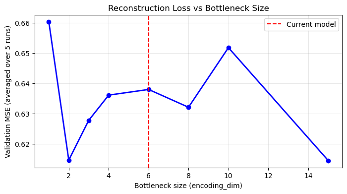
What to look for: just like a PCA scree plot, you expect the loss to drop quickly for the first few dimensions (capturing major structure) and then level off. The “elbow” is a good guide for the minimum useful bottleneck size.
Why does the elbow appear near the PCA scree elbow?
Both methods are compressing the same data. PCA’s scree plot showed a large PC1 (30.2%), a meaningful PC2 (9.8%), and progressively smaller components, suggesting most genuine shared structure can be represented in roughly 3–6 dimensions. An autoencoder compressing the same data should find the same: encoding_dim=1–2 will have high loss (too narrow to capture multi-domain structure); encoding_dim=5–6 should show a substantial drop; encoding_dim=15+ offers only marginal further improvement, increasingly fitting noise. Looking at the PCA scree plot first gives you a useful prior expectation for where the AE elbow should appear.
Caveat: On small datasets the sweep is noisy (and there is no clear elbow); the PCA scree plot is a more stable guide, and this is one reason PCA is often preferred when n is small.
What unhealthy training curves look like
Look at both train and validation loss after training:
| Pattern | What it means | What to do |
|---|---|---|
| Both fall and plateau | Healthy convergence | Nothing |
| Train falls, val rises after initial drop | Overfitting | Increase dropout, reduce layer width, add early stopping |
| Both plateau early at high loss | Underfitting | More epochs, wider layers, reduce dropout |
Loss bounces wildly or goes NaN |
Instability | Reduce learning rate; check scaling |
Why val loss < train loss throughout (this model): Dropout is active only during training — it randomly disables 20% of neurons per pass, making training artificially harder. During validation, model.eval() disables Dropout and the full network is active, so reconstruction is naturally better. This is expected behaviour, not data leakage.
Train vs validation split
We use 80% of the 240 rows (192 students) to train the autoencoder (adjust its weights), and hold out 20% (48 students) for monitoring. The model never adjusts its weights based on the validation set — validation data is only used to measure reconstruction error on data the model has not seen during training. If both losses decrease together, the model is learning genuine structure. If training loss keeps falling while validation loss rises, the model is overfitting.
Train the Autoencoder
# Training setup
device = torch.device('cuda' if torch.cuda.is_available() else 'cpu')
model = model.to(device)
data_tensor = data_tensor.to(device)

# Split data for training and validation
train_size = int(0.8 * len(data_tensor))
val_size = len(data_tensor) - train_size
train_data, val_data = torch.utils.data.random_split(data_tensor, [train_size, val_size])

# Create data loaders
batch_size = 32
train_loader = DataLoader(train_data, batch_size=batch_size, shuffle=True)
val_loader = DataLoader(val_data, batch_size=batch_size, shuffle=False)

# Training parameters
optimizer = optim.Adam(model.parameters(), lr=0.001)
criterion = nn.MSELoss()
epochs = 100

# Training loop
train_losses = []
val_losses = []

print("Training autoencoder...")

for epoch in range(epochs):
    # Training phase
    model.train()
    train_loss = 0.0
    for batch in train_loader:
        optimizer.zero_grad()
        output = model(batch)
        loss = criterion(output, batch)
        loss.backward()
        optimizer.step()
        train_loss += loss.item()

    # Validation phase
    model.eval()
    val_loss = 0.0
    with torch.no_grad():
        for batch in val_loader:
            output = model(batch)
            loss = criterion(output, batch)
            val_loss += loss.item()

    train_losses.append(train_loss / len(train_loader))
    val_losses.append(val_loss / len(val_loader))

    if (epoch + 1) % 20 == 0:
        print(f"Epoch {epoch + 1}, Train Loss: {train_losses[-1]:.4f}, Val Loss: {val_losses[-1]:.4f}")

print("Training complete!")
Training autoencoder...
Epoch 20, Train Loss: 0.8105, Val Loss: 0.7457
Epoch 40, Train Loss: 0.7764, Val Loss: 0.7025
Epoch 60, Train Loss: 0.7351, Val Loss: 0.6679
Epoch 80, Train Loss: 0.7164, Val Loss: 0.6520
Epoch 100, Train Loss: 0.7204, Val Loss: 0.6417
Training complete!
Note
Training loop explanation (what each line is doing)
The goal is to make output as close as possible to batch (reconstruction). For each mini-batch of ~32 students:
optimizer.zero_grad()— clear any leftover weight-adjustment signals from the previous batch. PyTorch accumulates these by default, so without this step each update would incorrectly mix signals from multiple batches.output = model(batch)— forward pass: the students’ scaled test scores pass through the encoder (25→16→12→6) producing 6 bottleneck numbers, then through the decoder (6→12→16→25) producing reconstructed scores.loss = criterion(output, batch)— compute MSE between reconstructed and original scores.loss.backward()— PyTorch automatically works out how much each weight in the network contributed to the MSE, using the chain rule of calculus applied backwards through all the layers. You can think of this as the network asking: “if I nudge this particular weight slightly up or down, does the reconstruction error get better or worse?” PyTorch computes this for every single weight simultaneously. You do not need to write this mathematics yourself — this is one of the core things PyTorch does for you.optimizer.step()— adjust all weights slightly in the direction that decreases MSE. Adam does this with an adaptive step size — larger for weights that have had small, consistent signals; smaller for weights that have had noisy or variable signals — making training more efficient than a fixed step size.
Why mini-batches (32) rather than all 240 at once? Each update is slightly noisy (based on only 32 examples) but you make many more updates per epoch, and the noise can help the optimiser avoid poor local solutions.
model.eval() + torch.no_grad() in the validation phase: runs the forward pass on held-out data without any updates, purely to measure how well the current model reconstructs unseen data. torch.no_grad() tells PyTorch not to track operations during this phase, saving memory.
Extract and Analyze Encoded Representations
# Plot training loss
plt.figure(figsize=(12, 5))

plt.subplot(1, 2, 1)
plt.plot(train_losses, label='Training Loss', color='steelblue')
plt.plot(val_losses, label='Validation Loss', color='orange')
plt.xlabel('Epoch')
plt.ylabel('Reconstruction Loss (MSE)')
plt.title('Autoencoder Training Loss')
plt.legend()
plt.grid(True, alpha=0.3)

# Get encoded representations
model.eval()
with torch.no_grad():
    encoded_data = model.encode(data_tensor).cpu().numpy()

encoded_df = pd.DataFrame(encoded_data, columns=[f'AE_Component_{i+1}' for i in range(encoding_dim)])

# Visualize first two autoencoder components
plt.subplot(1, 2, 2)
plt.scatter(encoded_df['AE_Component_1'], encoded_df['AE_Component_2'],
           alpha=0.6, color='darkred', s=30)
plt.xlabel('Component 1')
plt.ylabel('Component 2')
plt.title('Autoencoder Components 1 vs 2')
plt.axhline(y=0, linestyle='--', alpha=0.5, color='gray')
plt.axvline(x=0, linestyle='--', alpha=0.5, color='gray')
plt.grid(True, alpha=0.3)

plt.tight_layout()
plt.show()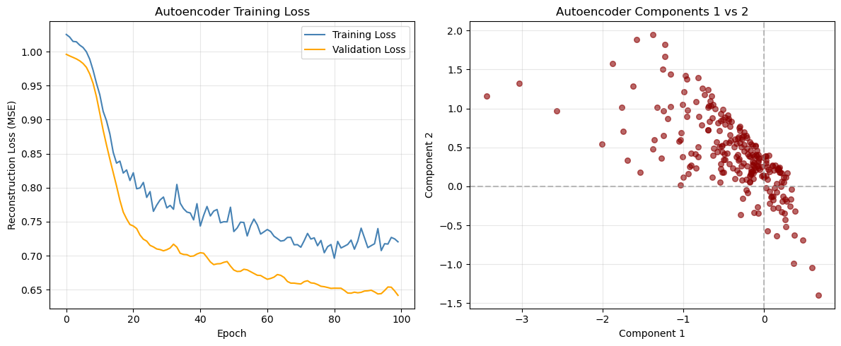
Answer / Interpretation
Loss curve (left panel)
From our outputs:
- At epoch 20: Train ~0.8105, Val ~0.7457
- At epoch 100: Train ~0.7204, Val ~0.6417
So both curves improve steadily and then flatten.
What patterns are “healthy” vs “problem” patterns?
Healthy (what we have):
- both train and validation go down,
- neither explodes upward,
- flattening suggests convergence.
Possible problems (what to look for in other runs):
- Overfitting: train keeps decreasing but validation starts increasing.
What to do: increase dropout, reduce model size, early stopping. - Underfitting: both flatten early at a high value and don’t improve.
What to do: increase hidden layer width, reduce dropout, train longer. - Instability: loss jumps wildly or becomes
nan.
What to do: reduce learning rate, check scaling, reduce model complexity.
Latent scatter (right panel)
You see a clear slanted “band” rather than a circular cloud. Two main takeaways:
AE components are not forced to be orthogonal (unlike PCA).
So strong dependence between components is normal.The autoencoder seems to have learned that much of the structure can be represented along a low-dimensional, non-orthogonal path in latent space — consistent with there being a dominant “general ability” signal in the IQ battery.
This does not mean “only one dimension exists”, but it does suggest:
- the dominant pattern is very strong,
- and the network encodes it in a coordinated way across components.
Correlation with original featuress
# Calculate correlations between original variables and encoded components
original_data_df = pd.DataFrame(data_scaled, columns=X_train.columns)
correlations_ae = np.corrcoef(original_data_df.values.T, encoded_df.values.T)

# Extract correlations between original variables and autoencoder components
n_original = len(original_data_df.columns)
correlations_subset = correlations_ae[:n_original, n_original:]

# Create heatmap of correlations
plt.figure(figsize=(12, 8))
sns.heatmap(correlations_subset,
           xticklabels=[f'AE_Comp_{i+1}' for i in range(encoding_dim)],
           yticklabels=original_data_df.columns,
           annot=True,
           cmap='RdBu_r',
           center=0,
           fmt='.2f')
plt.title('Original IQ Tests vs Autoencoder Components')
plt.tight_layout()
plt.show()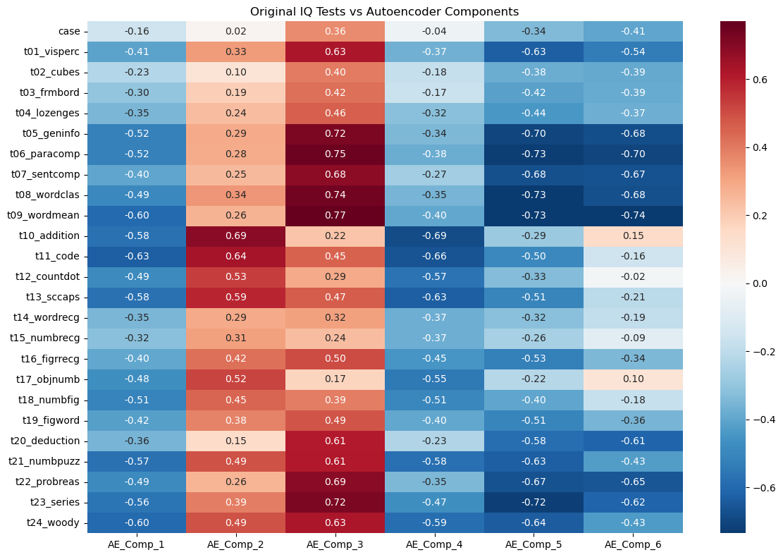
Answer / Interpretation
How to read this heatmap
- Each row is an original IQ test.
- Each column is a learned AE component.
- Values are correlations: closer to ±1 means stronger association.
The strongest “general ability” direction appears in AE_Comp_3
Look at the AE_Comp_3 column:
It has very strong positive correlations with the verbal/knowledge tests:
t09_wordmean: 0.77t06_paracomp: 0.75t08_wordclas: 0.74t05_geninfo: 0.72t07_sentcomp: 0.68
This is exactly the same verbal block that dominated our correlation heatmap and heavily loaded on PC1.
So in our trained autoencoder:
AE_Comp_3 is a strong “verbal/knowledge + general performance” component.
AE_Comp_2 is strongly tied to arithmetic/coding style tasks
AE_Comp_2 shows high positives on:
t10_addition: 0.69t11_code: 0.64t13_sccaps: 0.59t12_countdot: 0.53
That looks like a “speed/fluency/structured processing” cluster (arithmetic + coding + symbol-like tasks).
AE_Comp_5 and AE_Comp_6 look like “opposite poles” of AE_Comp_3
Notice AE_Comp_5 and AE_Comp_6 are very negative for the same verbal tests:
- For
t09_wordmean: AE_Comp_5 -0.73, AE_Comp_6 -0.74 - For
t06_paracomp: AE_Comp_5 -0.73, AE_Comp_6 -0.70 - For
t05_geninfo: AE_Comp_5 -0.70, AE_Comp_6 -0.68
This tells you the autoencoder is representing a strong shared pattern (similar to PC1/general factor) using multiple related latent directions — unlike PCA, it does not force a single clean axis for it.
How to know if the autoencoder representation is “any good”
- The loss decreased smoothly and validation improved → training worked.
- The latent correlations show coherent clusters (verbal block, arithmetic/coding block) → representation is structured, not random.
- If you changed the random seed and got completely different heatmaps every time, that would be a warning sign. Here, the structure is strong enough that you typically expect broad stability.
Part IV: Method Comparison and Discussion (15 mins)
Side-by-Side Comparison
Let’s compare the three methods we’ve learned:
| Method | Data Type | Assumptions | Interpretability | Complexity |
|---|---|---|---|---|
| PCA | Continuous | Linear relationships | High | Low |
| MCA | Categorical | Chi-square distances | Medium | Low |
| Autoencoders | Any | Non-linear relationships | Low | High |
# Compare first two dimensions from each method
fig, axes = plt.subplots(1, 2, figsize=(18, 5))

# PCA plot
axes[0].scatter(X_train_pca[:, 0], X_train_pca[:, 1], alpha=0.6, color='blue', s=30)
axes[0].set_title('PCA: First 2 Components')
axes[0].set_xlabel('PC1')
axes[0].set_ylabel('PC2')
axes[0].grid(True, alpha=0.3)

# Autoencoder plot
axes[1].scatter(encoded_df['AE_Component_1'], encoded_df['AE_Component_2'],
               alpha=0.6, color='red', s=30)
axes[1].set_title('Autoencoder: First 2 Components')
axes[1].set_xlabel('Component 1')
axes[1].set_ylabel('Component 2')
axes[1].grid(True, alpha=0.3)

plt.tight_layout()
plt.show()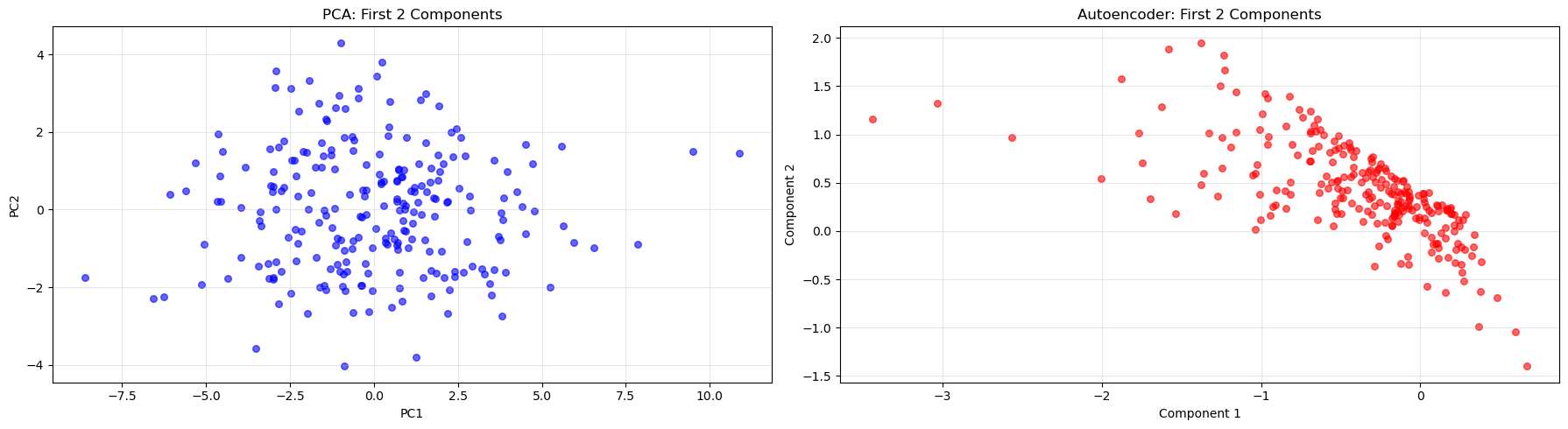
Answer / Interpretation
In our PCA plot (left), you see a broadly “cloud-like” distribution. That is expected because PCs are:
- linear combinations,
- orthogonal,
- designed to spread variance across axes.
In our autoencoder plot (right), you see a much more structured, slanted band. This reflects:
- no orthogonality constraint,
- the network re-using multiple latent coordinates to represent the same dominant pattern.
So:
- PCA produces a clean linear coordinate system.
- The autoencoder produces a coordinate system that can be “bent” and dependent across coordinates.
The fact that both show a strong dominant pattern is consistent with earlier results: there is a powerful general ability signal in this IQ dataset.
Key Takeaways
🔑 When to use each method:
- PCA: When you have continuous data and want interpretable linear combinations
- MCA: When working with categorical data or contingency tables
- Autoencoders: When you suspect non-linear relationships or need flexible architectures
Discussion Questions
🗣️ Think about these questions:
- Which method captured the most variance with fewer components?
Answer
These three methods use different metrics and were run on different datasets — direct percentage comparisons are not valid.
PCA (IQ data, continuous): 2 PCs → 40.1% of variance; 5 PCs → 59.2%. This is a well-defined percentage of total numeric variance in the standardised test scores.
MCA (WVS data, categorical): 2 dimensions → 52.0% of raw inertia (36.4% + 15.6%). Two important caveats:
- this is a different dataset from PCA — the WVS ethical norms data, not the IQ tests — so the percentage cannot be compared to PCA’s numbers above;
- raw MCA inertia percentages are artificially deflated (see the parameter callout above) — Benzecri-corrected percentages for these two dimensions would be substantially higher.
Autoencoders (IQ data, same as PCA): do not report “% of variance explained” at all. Evaluated by reconstruction loss: final validation MSE ≈ 0.64 using 6 bottleneck components. You can obtain a rough approximation of “% variance retained” as \((1 - \text{MSE}) \times 100\% \approx 36\%\) per feature on average, but this is not directly comparable to PCA’s variance explained.
The key takeaway: the choice of metric is itself a methodological decision. PCA’s variance explained is the most interpretable and widely understood. MCA’s inertia needs correction to be meaningfully comparable. Autoencoders are evaluated on reconstruction quality, a different concept altogether. You cannot simply compare “52% MCA” vs “40.1% PCA with 2 components” and conclude one method is “better”.
- How do the visualizations differ between methods?
Answer (linked to the plots you generated)
- PCA projection: broad cloud — reflects orthogonal linear axes.
- MCA biplot: category points cluster by co-occurrence — shows moral structure.
- AE latent scatter: tight band — reflects dependent latent coordinates encoding a dominant pattern.
- When might you choose a more complex method like autoencoders over PCA?
Answer (with practical criteria)
Choose autoencoders when:
- Variable relationships are likely non-linear (images, audio, time-series, biological data). PCA can only capture linear co-variation; autoencoders can learn curved, non-linear structure.
- You want a compressed representation for a downstream task. The bottleneck layer can serve as a learned feature set for any downstream model — not just neural networks. Logistic regression, random forests, or clustering algorithms can all use AE latent vectors as inputs, potentially benefiting from the non-linear feature extraction.
- You want to use the autoencoder for anomaly detection: train on “normal” data, then flag new observations with unusually high reconstruction error (the model fails to reconstruct them because they look unlike anything in training). This is a powerful use case in fraud detection, equipment monitoring, and quality control.
- You care about reconstruction/compression quality more than the interpretability of individual components.
- You have a large dataset (thousands+ rows) where the network can be trained reliably without overfitting.
Choose PCA when:
- Interpretability matters: loadings directly identify which variables drive each component.
- You need fast, stable, deterministic results — PCA has a unique mathematical solution; autoencoders depend on random initialisation and training stochasticity.
- You want simple diagnostics: scree plots and variance percentages are well-understood and easy to communicate.
- Your data is small (< a few hundred observations) — autoencoders risk unstable representations.
A note on time-series and sequential data
None of the three methods covered today explicitly handles the time dimension. If your data has meaningful temporal structure (panel surveys measured repeatedly, financial returns, sensor readings), dimensionality reduction requires additional care: PCA applied naively will ignore temporal dependencies, and a standard autoencoder treats each time step as independent. Methods designed for sequences — such as recurrent autoencoders (LSTM/GRU layers) or time-series decompositions — are more appropriate in that setting.
A note on text data
Reducing the dimensionality of text is a distinct problem. Raw text cannot be fed into PCA or a standard autoencoder — it must first be represented numerically (e.g., as word counts or embeddings). The dominant methods for text include topic models (LDA) and transformer-based embeddings. We will return to text representation and dimensionality reduction in Week 10.
- What are the trade-offs between interpretability and flexibility?
Answer
- PCA/MCA: interpretable axes, simple diagnostics, easy to explain.
Limit: linear structure (PCA) and specific geometry (MCA). - Autoencoders: flexible and powerful representations.
Limit: latent components are not guaranteed to be directly interpretable, and results depend on tuning/training.
Extension Activities
🚀 Try these on your own:
- Experiment with different numbers of components/dimensions
Hint + code stub (PCA)
for k in [2, 3, 5, 10]:
    pca_k = PCA(n_components=k)
    X_train_pca_k = pca_k.fit_transform(X_train_scaled)
    print(k, "components -> cumulative variance:", np.sum(pca_k.explained_variance_ratio_))
What to look for: diminishing returns after the first few components (you already saw PC1 dominates).
Hint + code stub (Autoencoder)
Try changing encoding_dim and compare:
- final validation loss,
- latent scatter shape,
- correlation heatmap structure.
results = {}
for dim in [1, 2, 3, 4, 6, 8, 10, 15]:
    model_k = IQAutoencoder(input_dim=input_dim, encoding_dim=dim).to(device)
    optimizer_k = optim.Adam(model_k.parameters(), lr=0.001)
    criterion_k = nn.MSELoss()

    for epoch in range(100):
        model_k.train()
        for batch in train_loader:
            optimizer_k.zero_grad()
            output = model_k(batch)
            loss = criterion_k(output, batch)
            loss.backward()
            optimizer_k.step()

    model_k.eval()
    val_loss_k = 0.0
    with torch.no_grad():
        for batch in val_loader:
            output = model_k(batch)
            val_loss_k += criterion_k(output, batch).item()
    results[dim] = val_loss_k / len(val_loader)

plt.figure(figsize=(8, 4))
plt.plot(list(results.keys()), list(results.values()), 'bo-', linewidth=2, markersize=6)
plt.xlabel('Bottleneck size (encoding_dim)')
plt.ylabel('Validation MSE')
plt.title('Reconstruction Loss vs Bottleneck Size')
plt.axvline(x=6, color='red', linestyle='--', label='Current model')
plt.legend(); plt.grid(True, alpha=0.3); plt.show()
What to look for: just like a PCA scree plot, expect the loss to drop quickly for the first few dimensions (capturing major structure) and then level off. The elbow is the minimum useful bottleneck size. It should appear near the same number of components as the PCA scree elbow — because both methods are compressing the same underlying structure.
- Apply these methods to your own datasets
Hint
- If your dataset is numeric + mixed scales → scale first, then PCA.
- If your dataset is categorical → MCA or related methods.
- If your dataset is mixed numeric + categorical → look up FAMD (Factor Analysis of Mixed Data) from the
princelibrary. - If your dataset is large and you suspect non-linear structure → consider autoencoders, but also look at UMAP (Uniform Manifold Approximation and Projection), a fast, non-linear dimensionality reduction method that often produces very clean 2D visualisations without requiring any architecture decisions:
# conda -c conda-forge install umap-learn
import umap
reducer = umap.UMAP(n_components=2, random_state=42)
X_umap = reducer.fit_transform(X_train_scaled)
plt.scatter(X_umap[:, 0], X_umap[:, 1], alpha=0.6)
plt.title("UMAP projection")
plt.show()
UMAP does not learn a reconstruction — it is primarily for visualisation and feature extraction — but it is much faster to train and requires no architecture decisions.
- If your data is text → standard PCA/MCA/autoencoders do not apply to raw text directly. See Week 10 for text-specific representation and dimensionality reduction methods.
- Combine dimensionality reduction with clustering or classification
Hint + code stub
We’ll see clustering next week so don’t worry too much about the code below.
from sklearn.cluster import KMeans

kmeans = KMeans(n_clusters=3, random_state=123)
clusters = kmeans.fit_predict(X_train_pca[:, :2])  # cluster on first 2 PCs
plt.scatter(X_train_pca[:,0], X_train_pca[:,1], c=clusters, alpha=0.6)
plt.title("KMeans clusters on PCA space")
plt.show()
Try clustering on:
- PCA scores,
- AE latent vectors, and compare whether clusters look more separated.
- Explore other variants like kernel PCA or variational autoencoders
Kernel PCA stub
from sklearn.decomposition import KernelPCA

kpca = KernelPCA(n_components=2, kernel="rbf", gamma=0.1)
X_train_kpca = kpca.fit_transform(X_train_scaled)
plt.scatter(X_train_kpca[:,0], X_train_kpca[:,1], alpha=0.6)
plt.title("Kernel PCA (RBF)")
plt.show()
Variational Autoencoders (VAEs): what they are and why they differ
A standard autoencoder (like the one we built) maps each input to a single fixed point in the bottleneck space. This works well for compression and reconstruction, but creates a problem: if you try to generate new data by picking a random point in the bottleneck space and decoding it, you will often produce nonsensical output. The bottleneck space is not organised in any particular way — there may be large “empty regions” between the points the encoder has learned to map to, and the decoder has never seen those regions during training.
A Variational Autoencoder (VAE) solves this by changing what the encoder outputs. Instead of producing a single fixed bottleneck point, the encoder produces two things: a mean and a standard deviation describing a probability distribution in the bottleneck space. The actual bottleneck value used for reconstruction is then sampled randomly from this distribution during training.
Think of it this way: a standard autoencoder says “this student’s 25 test scores map to exactly this point (3.2, -1.4, 0.7, …) in bottleneck space.” A VAE says “this student’s scores are best described by a small cloud centred around (3.2, -1.4, 0.7, …) with some spread.” Because the bottleneck value is sampled from this cloud rather than fixed, the decoder must learn to handle slight variations around each learned point — which forces the bottleneck space to be smooth and well-filled rather than scattered.
The training loss has two components:
Reconstruction loss — same as a standard autoencoder (MSE or BCE): how well does the decoder reconstruct the original input from the sampled bottleneck?
KL divergence penalty — measures how much the learned distribution (mean and SD for each input) deviates from a standard normal distribution (mean 0, SD 1). This regularises the bottleneck space so that different inputs’ distributions overlap and fill the space smoothly — sampling from anywhere in the space produces a plausible output.
In plain terms: a standard autoencoder draws one precise dot per input in the bottleneck space. A VAE draws a small fuzzy circle per input, and the KL penalty forces the circles to overlap and fill the space — so that points between training examples still decode to something meaningful. This makes VAEs useful for generative modelling (creating new synthetic examples) and interpolation (smoothly blending between two data points in latent space).
Congratulations! You’ve now experienced three fundamental approaches to dimensionality reduction using Python. Each has its strengths and appropriate use cases in the data scientist’s toolkit.
Footnotes
Holzinger, K. J., & Swineford, F. (1939). A study in factor analysis: The stability of a bi-factor solution. Supplementary Educational Monographs, no. 48. Chicago: University of Chicago, Department of Education. The data that you have is a copy of the dataset available through the
holzinger.swinefordlibrary in R. You can have a look at the documentation of the package for more of a description of the dataset.↩︎Haerpfer, C., Inglehart, R., Moreno, A., Welzel, C., Kizilova, K., Diez-Medrano J., M. Lagos, P. Norris, E. Ponarin & B. Puranen (eds.). 2022. World Values Survey: Round Seven – Country-Pooled Datafile Version 6.0. Madrid, Spain & Vienna, Austria: JD Systems Institute & WVSA Secretariat. doi:10.14281/18241.24↩︎