💡Some of you have mentioned that your R version cannot handle tidymodels. We recommend you update R to version 4.2.0 or above.
Packages you will need
library('tidyverse') # to use things like the pipe (%>%)library('tidymodels') # for model tuning, cross-validation etc.# Vanity packages:library('GGally') # for pretty correlation plot
Step 1: The Data (50 min)
In this lab we will use the following dataset:
Paine, Jack, 2019, “Replication Data for: Democratic Contradictions in European Settler Colonies”, https://doi.org/10.7910/DVN/LU8IDT, Harvard Dataverse, V1, UNF:6:d6rzxrgBZEM6Sv5y7PIHpg== [fileUNF]
From the academic article:
Paine, Jack. “Democratic Contradictions in European Settler Colonies.” World Politics 71, no. 3 (2019): 542–85. doi:10.1017/S0043887119000029.
This panel data shows the evolution of the independence and democracy in European colonies from the year 1600 to 2000.
Step 1.1. Explore the data
Load the Data
Download the dataset from Moodle and place it in the same directory of this RMarkdown file. Run the cell below to read it as a data frame:
df <-read_csv("colonial_panel.csv")
How many rows and columns are there in the dataset?
dim(df)
What are the columns?
colnames(df)
Select columns of interest
We will focus on a few columns and use distinct() to drop duplicated rows:
💡: The column first_elect_year represents the first elected representative body in British territories colonized before 1800.
🎯: ACTION POINT: Type View(df_filtered) in the R Console to visualize our data of interest. Locate the missing values present in this data frame. What do they mean? How would deal with those?
your text here
Step 1.2. Let’s create ggpairs plots
🤝WORKING TOGETHER. We will split the class into three groups. Each group will have to explain one row of the pairs plot.
When we run the code above, we see a few messages about warnings. What do they tell us?
your text here
Step 1.3. Plot year_indep x year_colonized
plot_df <- df_filtered %>%select(cname, year_indep, year_colonized) %>%na.omit()g <- (ggplot(plot_df, aes(x=year_indep, y=year_colonized)) +geom_point(alpha=0.4, size=3) +theme_bw()+labs(x="Year of independence", y="Year colonized", title="Do you spot any clusters?"))g
Let’s highlight an area of the chart
We use the function annotate from ggplot and define the boundaries (xmin, xmax, ymin, ymax) on top of the plot we created above
g +annotate("rect", alpha=0.1,color="red", fill="red", xmin=1930, xmax=2000, ymin=1600, ymax=1700)
In case you want to ZOOM IN 🔎…
You can use limits=... of the scale_x_continuous and scale_y_continuous to control the limits of the X & Y axis of the plot, plus geom_text to plot the name of the countries instead of the circles:
🎯: ACTION POINT: Reading the plot. When was Bahamas colonized and when did it get independent?
your text here
Step 1.4. Find your own clusters!
🤝WORKING TOGETHER. In groups or in pairs, you are now asked to manually cluster the data in the original graph g. Use what you just learned above about annotate and add several rectangles to the graph g. Give each rectangle a unique colour1.
# This is just a template of three rectangles(g +annotate(geom="rect", alpha=0.1, fill="...", colour="...", xmin=..., xmax=..., ymin=..., ymax=...)+annotate(geom="rect", alpha=0.1, fill="...", colour="...", xmin=..., xmax=..., ymin=..., ymax=...)+annotate(geom="rect", alpha=0.1, fill="...", colour="...", xmin=..., xmax=..., ymin=..., ymax=...))
🗣️: CLASSROOM DISCUSSIONS:
Compare how many rectangles other people used in their own plots.
How are your rectangles/clusters different to others?
Step 2. K-Means Clustering (40 min)
As we learned in 🗓️ Week 07, K-means is a technique that identifies clusters automatically. You have to inform how many clusters you want it to find (\(k\) clusters) and then the algorithm will do the following:
Initialize \(k\) random centroids, then proceed to to step 2 below.
Go over each data point and identify the nearest centroid. All points associated with a centroid are said to belong to the same cluster. Proceed to step 3 below.
Now, for each cluster, ignore the centroid and calculate the point that corresponds to the mean value of each dimension of the data. Think of it as the “centre of gravity” of the cluster. This point is now the new centroid of the cluster. Proceed to step 4 below.
Go over each data point again, and identify the nearest centroid. If all data points still belong to the same cluster, stop. Otherwise, go back to step 3 above.
The algorithm can also stop if you loop over Steps 3 and 4 too many times. There is a parameter that controls the maximum number of iterations called iter.max.
It is easy to visualize the trajectory of the centroids If we only have two dimensions. This is what we will do here.
Step 2.1. Initial k centroids
Let’s run the k-means but only for ONE iteration. That is, after k-means adjusted the random centroids for the first time.
# Say we believe there are three clustersk <-10set.seed(10)model <-kmeans(plot_df %>%select(year_indep, year_colonized), centers=k, iter.max=1)model
🎯: ACTION POINT: Run the chunk of code below. What do you think each row represents?
your text here
model$centers
Visualize the centroids
df_centroids <-as_tibble(model$centers)df_centroids$cluster_id <-factor(seq(1, nrow(df_centroids)))g3 <- (ggplot(plot_df, aes(x=year_indep, y=year_colonized))+geom_text(aes(label=cname), alpha=0.2, size=3) +geom_point(data=df_centroids, aes(color=cluster_id), size=4, shape="X") +theme_bw()+labs(x="Year of independence", y="Year colonized", title="Visualize the k initial centroids"))g3
🗣️: CLASSROOM DISCUSSIONS:
Locate India, Cuba and Egypt in the plot above. Considering the centroids, which clusters do you expect will belong to?
Step 2.2 Colour data points according to their clusters
Using tidymodels, we can include the clusters in our data frame by augmenting it:
plot_df <-augment(model, plot_df)tail(plot_df)
And we can use the new column .cluster to colour the dots:
g4 <- (ggplot(plot_df, aes(x=year_indep, y=year_colonized, colour=.cluster)) +geom_point(alpha=0.1, size=3)# Or use geom_text#+ geom_text(aes(label=cname), alpha=0.25, size=3) +geom_point(data=df_centroids, aes(color=cluster_id), size=4, shape="X")+theme_bw()+labs(x="Year of independence", y="Year colonized"))g4
Step 2.3. Run K-Means fully
Now, let’s allow k-means to run fully, not just for one single iteration.
k <-10set.seed(10)model_full <-kmeans(plot_df %>%select(year_indep, year_colonized), centers=k, trace=TRUE)plot_df <-augment(model_full, plot_df)df_centroids <-as_tibble(model_full$centers)df_centroids$cluster_id <-factor(seq(1, nrow(df_centroids)))g5 <- (ggplot(plot_df, aes(x=year_indep, y=year_colonized, colour=.cluster)) +geom_point(alpha=0.1, size=3)# Or use geom_text#+ geom_text(aes(label=cname), alpha=0.25, size=3) +geom_point(data=df_centroids, aes(color=cluster_id), size=4, shape="X")+theme_bw()+labs(x="Year of independence", y="Year colonized"))g5
🎯: ACTION POINT: We set the trace=TRUE parameter to see what the algorithm is doing. That is why, in addition to the plot, you also got a few messages printed out. What do you think this printed messages tell us?
your text here
Now, look at the centroids of this last model:
model_full$centers
🎯: ACTION POINT: Compare the centroids above to the ones you got in Step 2.1. How are they similar/different?
your text here
Step 2.4 What is the best number of clusters?
Is it k=3, k=10, k=20??? Unfortunately, there is no absolute final objective solution to this question. It usually depends on what you want to do with this data. Do you want to investigate and compare the characteristics of a large number of groups or just a few?
But here we will show you one possible strategy to automate the process of finding an “optimal” number of clusters based on the total within-cluster sum of squares, which we are going to refer to as $tot.withinss.
(Your class teacher might need to use the blackboard here)
How?
The code below is a bit tricky so let’s go through it step-by-step.
We subset the data using select and we get rid of the NAs
We then create a list column called data.
Tibbles are different from data frames as you can nest an entire object (whether a data frame, model object etc.) into a single cell.
While it may seem like an odd thing to do, look at the next step.
Remember crossing? We use crossing to come up with a new tibble of all possible combinations between n.clust which goes from 1 to 20 and data.
Because of the above, we now have the ability to run 20 k-means clustering models using one tibble, and we did not need to write a single for loop!
Because we are looping over a list column, we use different varieties of the map function (which is part of the tidyverse ecosystem).
The map which applies a function over the list column, and returns back an object of the same length.
We use map2 as we want to loop over data and n.clust.
The kmeans function takes two parameters to run, the first of which specifies the data, while the second specifies the number of clusters or centers to include in the model.
Finally, we want to find the total within-cluster sum of squares tot.withinss. - We do this by using map_dbl on the k.means list column which returns a vector of doubles.
To access tot.withinss, we use glance on k.means and include $tot.withinss.
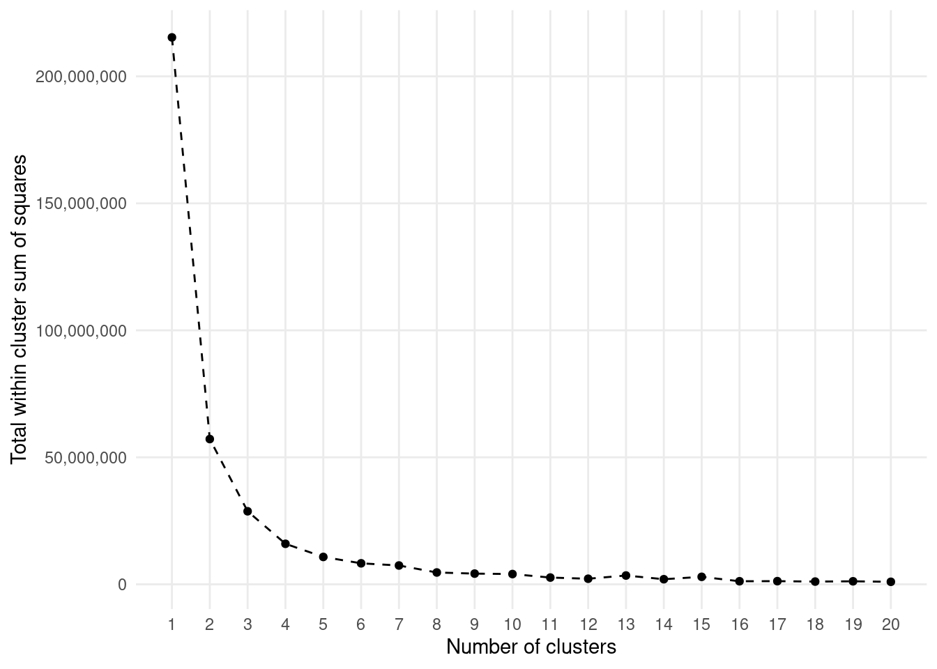
Let’s create an elbow plot to evaluate what number of clusters is most appropriate.
Generally, we are looking to identify significant elbow points beyond which no significant decreases in TWCSS occur.
For our data, k=6 or k=10 are probably among the most appropriate. But do you see how that is a little bit subjective?
km.models %>%ggplot(aes(n.clust, tot.withinss)) +geom_line(linetype ='dashed') +geom_point() +theme_minimal() +theme(panel.grid.minor =element_blank()) +scale_x_continuous(breaks =1:20) +scale_y_continuous(labels = comma) +labs(x ='Number of clusters', y ='Total within cluster sum of squares')
🏠 Take-home exercises
Q1: Cluster of penguins
Load the palmerpenguins dataset and filter the data to omit missing values. Ignoring the columns species and year, run k-means on this data with \(k=3\).
How do the clusters identified by k-means compare to the species of penguins?
library(tidyverse)
── Attaching core tidyverse packages ──────────────────────── tidyverse 2.0.0 ──
✔ dplyr     1.1.0     ✔ readr     2.1.4
✔ forcats   1.0.0     ✔ stringr   1.5.0
✔ ggplot2   3.4.1     ✔ tibble    3.1.8
✔ lubridate 1.9.2     ✔ tidyr     1.3.0
✔ purrr     1.0.1
── Conflicts ────────────────────────────────────────── tidyverse_conflicts() ──
✖ dplyr::filter() masks stats::filter()
✖ dplyr::lag()    masks stats::lag()
ℹ Use the conflicted package (<http://conflicted.r-lib.org/>) to force all conflicts to become errors
Attaching package: 'palmerpenguins'

The following object is masked from 'package:modeldata':

    penguins
# There was a mistake in the question. Variable `year` is not even present in the dataset. # The question should actually have requested to remove all non-numeric columns. df_filtered <- penguins %>%na.omit()k <-3set.seed(10)model <-kmeans(df_filtered %>%select(-species, -island, -sex), centers = k)cross_tabulation <-augment(model, df_filtered) %>%bind_rows(df_filtered %>%select(species)) %>%select(species, .cluster) %>%table()
1
2
3
Adelie
94
52
0
Chinstrap
46
22
0
Gentoo
0
39
80
From the above, we see that the clusters identified by k-means are not very similar to the species of penguins. The first cluster is mostly Adelie penguins, but it also contains Chinstrap penguins while the second cluster is a mix of all species. The third cluster is the different case, as it contains only Gentoo penguins, but it does not contain ALL Gentoo penguins.
The clusters are still not very similar to the species of penguins. This shows that clustering is not a great tool for distinguishing between the species of penguins.
Q2: Elbow plot
Run k-means on the same data, but this time vary k from \(\{1, 2, \ldots, 19, 20\}\) and generate an elbow plot. According to the plot, what is a “good” number of clusters?
km.models <- df_filtered %>%select(-species, -island, -sex) %>%nest(data =everything()) %>%crossing(n.clust =1:20) %>%mutate(k.means =map2(.x = data,.y = n.clust,.f =~kmeans(.x, centers = .y)),tot.withinss =map_dbl(.x = k.means, .f =~glance(.x)$tot.withinss))km.models %>%ggplot(aes(n.clust, tot.withinss)) +geom_line(linetype ='dashed') +geom_point() +theme_minimal() +theme(panel.grid.minor =element_blank()) +scale_x_continuous(breaks =1:20) +scale_y_continuous(labels = comma) +labs(x ='Number of clusters', y ='Total within cluster sum of squares')
It is only after k=10 that the elbow plot starts to show a significant decrease in TWCSS. So, k=10 is probably a good number of clusters.
Footnotes
Take a look at the following website for more creative colours: https://www.color-hex.com/↩︎