
🐍 Full code for life expectancy modelling (Week 5 lecture)
2023/24 Autumn Term
The content below contains the full code that was used to do the exploratory data analysis and linear regression modelling from the case study from the Week 05 lecture. The case study explored the WHO Life expectancy dataset from Kaggle, which is a dataset that aims at studying which factors affect life expectancy.
Click on the button below to download the source files (.csv dataset and .ipynb notebook) that were used to create this page, if you ever want to try the code for yourselves:
(this is a zip file because there are source code files in it)
Python library imports
As usual, before starting our analysis/modelling, we import the Python libraries we need to do the job (this week, in addition to the usual libraries, you might need to install the missingno library, the sklearn library, the statsmodels library and the miceforest library1).
import missingno as msno #missing data analysis library
import pandas as pd
import numpy as np
import math

#Data visualization
import matplotlib.pyplot as plt
import seaborn as sns
%matplotlib inline
colors = ['#c1121f','#669bbc', '#f4d35e', '#e9724c', '#ffc857']
plt.style.use('seaborn-v0_8-white')
plt.rc('figure', figsize=(12,8))
plt.rc('font', size=18)
plt.rc('axes', labelsize=14, titlesize=14)
plt.rc('legend', fontsize=14)
plt.rc('xtick', labelsize=10)
plt.rc('ytick', labelsize=10)

#Preprocessing and modelling
from sklearn.impute import KNNImputer #import for KNN imputation
from sklearn.impute import SimpleImputer #import for mean/median imputation
import miceforest as mf # import for multiple imputation
import statsmodels.api as sm
from statsmodels.tools.eval_measures import rmse
from scipy.stats import skew, kurtosis

#General
import warnings
warnings.filterwarnings(action='ignore') # ignoring warning messages from packages
import re #library to use regular expressions (useful in data cleaning e.g columns renaming)
Reading the dataset file
We read the .csv file that contains our dataset into a Pandas dataframe that we can manipulate.
data = pd.read_csv("Life_Expectancy_Data.csv")Checking the properties of the dataset columns
We check the properties of the columns/variables of our dataset.
data.info()<class 'pandas.core.frame.DataFrame'>
RangeIndex: 2938 entries, 0 to 2937
Data columns (total 22 columns):
# Column Non-Null Count Dtype
--- ------ -------------- -----
0 Country 2938 non-null object
1 Year 2938 non-null int64
2 Status 2938 non-null object
3 Life expectancy 2928 non-null float64
4 Adult Mortality 2928 non-null float64
5 infant deaths 2938 non-null int64
6 Alcohol 2744 non-null float64
7 percentage expenditure 2938 non-null float64
8 Hepatitis B 2385 non-null float64
9 Measles 2938 non-null int64
10 BMI 2904 non-null float64
11 under-five deaths 2938 non-null int64
12 Polio 2919 non-null float64
13 Total expenditure 2712 non-null float64
14 Diphtheria 2919 non-null float64
15 HIV/AIDS 2938 non-null float64
16 GDP 2490 non-null float64
17 Population 2286 non-null float64
18 thinness 1-19 years 2904 non-null float64
19 thinness 5-9 years 2904 non-null float64
20 Income composition of resources 2771 non-null float64
21 Schooling 2775 non-null float64
dtypes: float64(16), int64(4), object(2)
memory usage: 505.1+ KBData cleaning: renaming of column names
Before we proceed with the analysis, we do some data cleaning i.e we rename mis-named columns (e.g the variable originally named thinness 1-19 years instead of thinness 10-19 years), rename columns to remove trailing and leading spaces from column names as any special characters (e.g spaces, “-”, “/”) and make the column names lowercase.
columns_names = []
for column in data.columns:
    if column == ' thinness  1-19 years':  #the variable that was originally misnamed as thinness  1-19 years is renamed (while dealing with special characters) thinness_10_19_years
        column = 'thinness_10_19_years'
    else:
        column = re.sub("\s|-|/","_",column.strip(' ').replace("  ", " ")) #removing leading/trailing spaces in column names and dealing with special characters
        column = column.lower() #making column names lowercase

    columns_names.append(column)

data.columns = columns_names
data.head() # checking processing of column names by printing first rows of dataframe| country | year | status | life_expectancy | adult_mortality | infant_deaths | alcohol | percentage_expenditure | hepatitis_b | measles | … | polio | total_expenditure | diphtheria | hiv_aids | gdp | population | thinness_10_19_years | thinness_5_9_years | income_composition_of_resources | schooling | |
|---|---|---|---|---|---|---|---|---|---|---|---|---|---|---|---|---|---|---|---|---|---|
| 0 | Afghanistan | 2015 | Developing | 65.0 | 263.0 | 62 | 0.01 | 71.279624 | 65.0 | 1154 | … | 6.0 | 8.16 | 65.0 | 0.1 | 584.259210 | 33736494.0 | 17.2 | 17.3 | 0.479 | 10.1 |
| 1 | Afghanistan | 2014 | Developing | 59.9 | 271.0 | 64 | 0.01 | 73.523582 | 62.0 | 492 | … | 58.0 | 8.18 | 62.0 | 0.1 | 612.696514 | 327582.0 | 17.5 | 17.5 | 0.476 | 10.0 |
| 2 | Afghanistan | 2013 | Developing | 59.9 | 268.0 | 66 | 0.01 | 73.219243 | 64.0 | 430 | … | 62.0 | 8.13 | 64.0 | 0.1 | 631.744976 | 31731688.0 | 17.7 | 17.7 | 0.470 | 9.9 |
| 3 | Afghanistan | 2012 | Developing | 59.5 | 272.0 | 69 | 0.01 | 78.184215 | 67.0 | 2787 | … | 67.0 | 8.52 | 67.0 | 0.1 | 669.959000 | 3696958.0 | 17.9 | 18.0 | 0.463 | 9.8 |
| 4 | Afghanistan | 2011 | Developing | 59.2 | 275.0 | 71 | 0.01 | 7.097109 | 68.0 | 3013 | … | 68.0 | 7.87 | 68.0 | 0.1 | 63.537231 | 2978599.0 | 18.2 | 18.2 | 0.454 | 9.5 |
5 rows × 22 columns
Dataset nullity matrix
We produce the nullity matrix corresponding to our dataset to get a better picture of the missingness patterns within our dataset. There seems to be a MAR mechanism at play here…We save the matrix as figure.
ax=msno.matrix(data)
fig_copy = ax.get_figure()
fig_copy.savefig("who_missingness_matrix.png",bbox_inches = 'tight')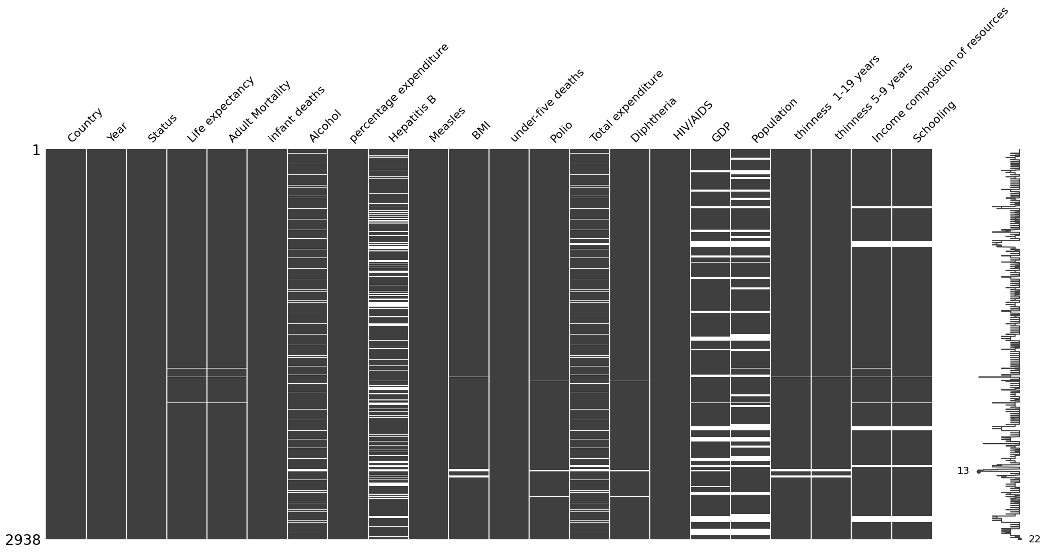
Producing density plots for life expectancy per country status
We use the seaborn library to produce density plots of life expectancy per country status (i.e developed vs developing countries). This allows us to see that life expectancy seems to follow two distinct distributions depending on whether the countries are classified as developed or developing. If we were to really model things properly (and not over-simplistically as we are doing now), we might need distinct models for life expectancy per country status.
data_developed = data.loc[data['status']=='Developed'].copy() #selecting the data that corresponds to developed countries
data_developing = data.loc[data['status']=='Developing'].copy() # selecting the data that corresponds to developing countriessns.kdeplot(data_developed['life_expectancy'], # Plot the density of life expectancy for developed countries
label='Developed', # Label the developed countries' density plot
fill=True, # Fill the area under the density curve
color = colors[0], # Set the color of the developed countries' density plot
alpha = 0.8) # Set the transparency of the developed countries' density plot
sns.kdeplot(data_developing['life_expectancy'], # Plot the density of life expectancy for developing countries
label='Developing', # Label the developing countries' density plot
fill=True, # Fill the area under the density curve
color=colors[1], # Set the color of the developing countries' density plot
alpha = 0.8) # Set the transparency of the developing countries' density plot
plt.legend(loc='upper left') # Add a legend to the plot
plt.ylabel('Density') # Label the y-axis as "Density"
plt.xlim(30,95) # Set the limits of the x-axis
plt.xlabel('Life Expectancy (years)') # Label the x-axis as "Life Expectancy (years)"
plt.title('Life Expectancy based on Status \n', fontsize=18); # Set the title of the plot
plt.savefig("life_expectancy_kde.png")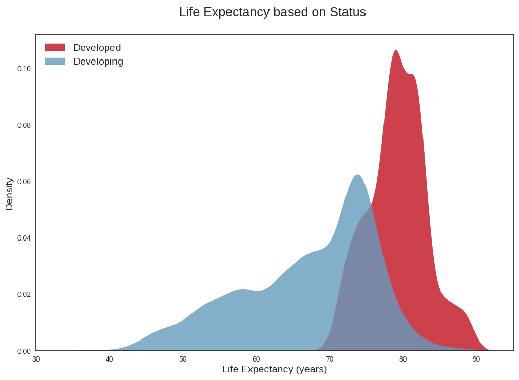
Average life expectancy plot
We plot the average of life expectancy over the years, differentiating between developed and developing countries. This is again a plot that confirms that life expectancy in developed countries follows a distinct pattern from life expectancy in developing countries.
# Plot average Life Expectancy over the years
fig, ax = plt.subplots(figsize=(10,6))

ax.plot(data_developed.groupby('year')['life_expectancy'].mean(),
       label='Developed',
       color=colors[0],
       linewidth=4)

# Fill area between the line plot and the x-axis
ax.fill_between(data_developed.groupby('year')['life_expectancy'].mean().index,
                data_developed.groupby('year')['life_expectancy'].mean().values,
                color=colors[0],
                alpha=0.8)

ax.plot(data_developing.groupby('year')['life_expectancy'].mean(),
       label='Developing',
       color=colors[1],
       linewidth=4,)

ax.fill_between(data_developing.groupby('year')['life_expectancy'].mean().index,
                data_developing.groupby('year')['life_expectancy'].mean().values,
                color=colors[1],
                alpha=0.8)

plt.legend(loc='upper left', fontsize=12)
ax.set_xlabel('Year')
ax.set_ylabel('Average Life Expectancy (years)')

# Set y-axis limits
ax.set_ylim(60,82)

ax.set_title('Average Life Expectancy over the years in developed and developing countries\n');
plt.savefig("avg_life_expectancy_peryear.png")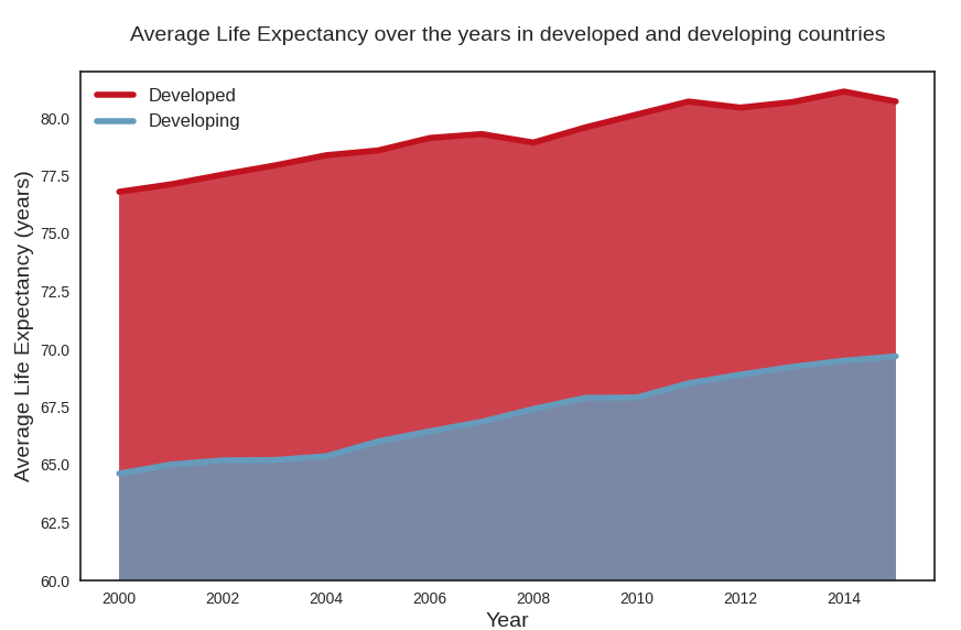
Dataset variables correlation heatmap
We draw the correlation heatmap between the variables in our dataset (the heatmap represents the Pearson correlation coefficient between variables i.e only captures linear relationships between variables). In red, are highly positively correlated variables and blue highly negatively correlated variables.
From the correlation heatmap, we can conclude the following:
- the dependent variable i.e life expectancy has a high positive correlation with the features
schooling,income_composition_of_resources, andbmi, and a high negative correlation with the featuresadult_mortalityandhiv_aids. - the features
schoolingandincome_composition_of_resourcesalso have a high correlation between them, as doadult_mortalityandhiv_aids. - though some features do not have to a high correlation with the dependent variable, it is still important to visualize the relationship between these features and life expectancy graphically. This is because the heatmap only captures linear relationships between variables (since it shows the Pearson coefficient) and does not capture other types of relationships that the dependent variable may have with the other variable, which may well be relevant and important (though our focus in this lecture was exclusively linear relationships).
plt.figure(figsize=(17,17))

heatmap_colors = [colors[1], '#d6d5c9', colors[0]]

corr = data.corr()
mask = np.triu(np.ones_like(corr, dtype=bool))

sns.heatmap(data.corr(),
            mask=mask,
            center=0,
            annot=True,
            fmt='.2f',
            cmap=heatmap_colors,
            square=True,
            linewidths=.2,
            cbar_kws={"shrink": .6})

plt.title('Features Correlation Matrix Heatmap', fontsize=25);
plt.savefig("who_correlation_heatmap.png",bbox="tight")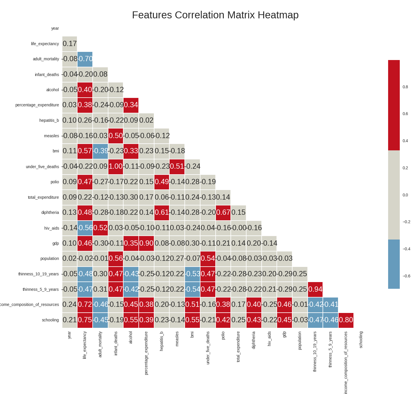
Plotting scatterplots of variables relationships
Next, we’ll plot a series of scatterplots to graphically evaluate the relationships between life_expectancy and the other variables. First, we start by defining a function that plots scatterplots of life_expectancy (in the y-axis) versus other variables (in the x-axis) and colors each of the data points depending on whether the data point belongs to a developed or developing country.
#Function to plot scatter plots
def plot_scatterplot(df, features, title = 'Features', columns = 2, x_lim=None):

    df = df.copy()

    rows = math.ceil(len(features)/2)

    fig, ax = plt.subplots(rows, columns, sharey = True, figsize = (14,14))

    for i, feature in enumerate(features):
        ax = plt.subplot(rows, columns, i+1)
        sns.scatterplot(data = df,
                        x = feature,
                        y = 'life_expectancy',
                        hue = 'status',
                        palette=[colors[1], colors[0]],
                        ax = ax)
        if (i == 0):
            ax.legend()
        else:
            ax.legend("")

    fig.legend(*ax.get_legend_handles_labels(),
               loc='lower center',
               bbox_to_anchor=(1.04, 0.5),
               fontsize='small')
    fig.suptitle('{} x Life Expectancy'.format(title),
                 fontsize = 25,
                 x = 0.56);

    fig.tight_layout(rect=[0.05, 0.03, 1, 1])
We use this function to first draw scatterplots of life_expectancy versus positively correlated variables (i.e income_composition_of_resources,schooling,gdp,total_expenditure,bmi and diphtheria).
#Plot Life Expectancy x positively correlated features
pos_correlated_features = ['income_composition_of_resources', 'schooling',
                           'gdp', 'total_expenditure',
                           'bmi', 'diphtheria']

title = 'Positively correlated features'

plot_scatterplot(data, pos_correlated_features, title)
plt.savefig("pos_corr_variables.png", bbox_inches='tight')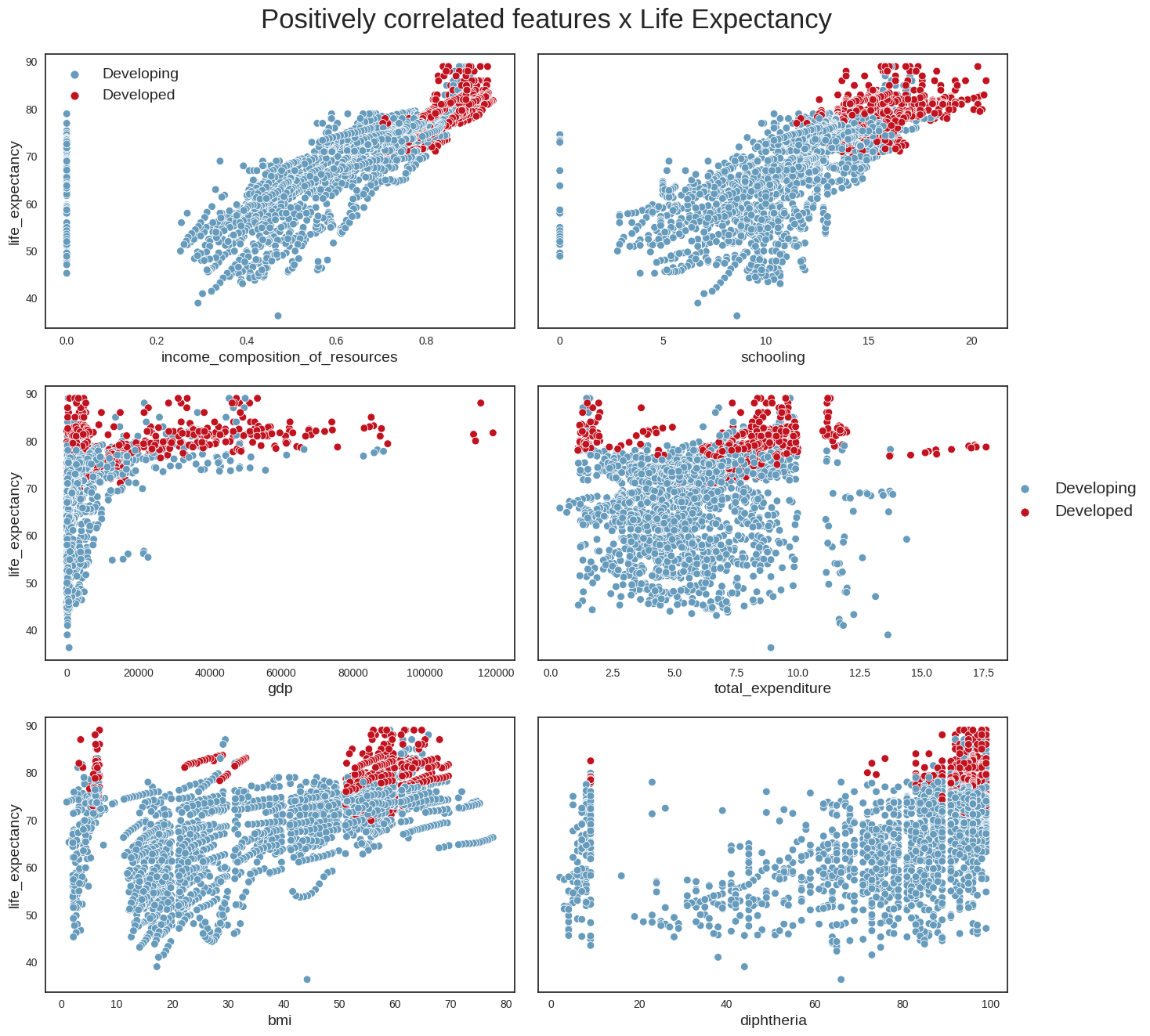
Then, we draw the scatterplots of life_expectancy versus negatively correlated variables (i.e adult_mortality,hiv_aids,thinness_10_19_years,infant_deaths)
#Plot Life Expectancy x negatively correlated features
neg_correlated_features = ['adult_mortality', 'hiv_aids',
                           'thinness_10_19_years', 'infant_deaths']

title = 'Negatively correlated features'

plot_scatterplot(data, neg_correlated_features, title)

plt.savefig('neg_corr_variables.png', bbox_inches='tight')
And, finally, we draw the scatterplots of life_expectancy versus some additional variables such as population and alcohol.
#Check other correlations
data_temp = data.loc[data['population'] <= 1*1e7, :]
features = ['population', 'alcohol']
plot_scatterplot(data_temp, features)
plt.savefig("other_corr.png",bbox_inches='tight')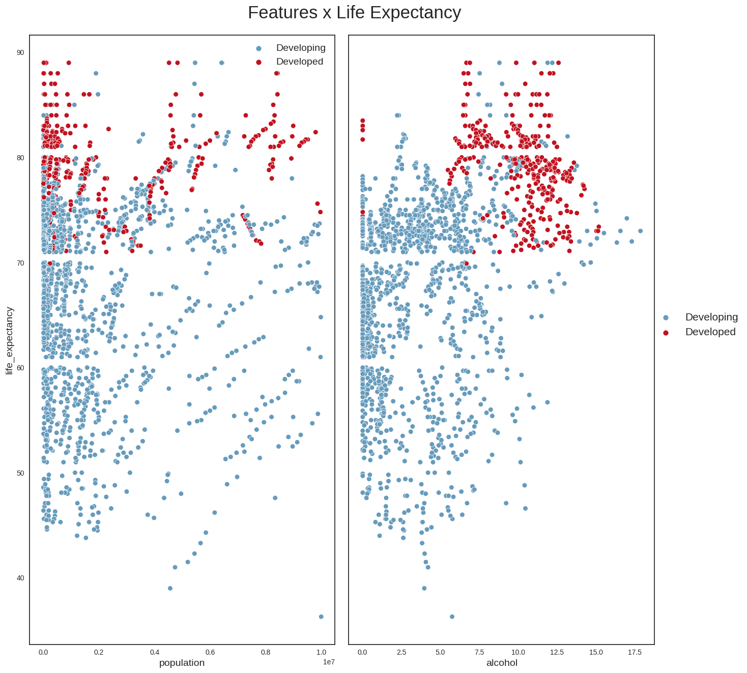
From these plots, we can conclude the following: - we can confirm that life_expectancy does indeed have strong linear relationships with some variables (e.g income_compostion_of_resources,schooling,adult_mortality) - it looks as if the absolute number of a country’s population does not have a direct relationship with life expectancy; a more interesting variable perhaps might have been population density, which could provide more clues about the country’s social and geographical conditions - Another interesting point is that countries with the highest alcohol consumption also seem to have the highest life expectancies. This looks however to be the classic case for using the maxim ‘Correlation does not imply causation’. The life expectancy of someone who owns a Ferrari is possibly higher than that of the rest of the population, but that does not mean that buying a Ferrari will increase their life expectancy. The same applies to alcohol. One hypothesis is that in developed countries, the population’s average has better financial conditions, allowing for greater consumption of luxury goods such as alcohol. We probably see a similar phenomenon with BMI: countries with the highest average BMI have the highest life expectancies, which looks counterintuitive, and is probably more aa reflection of these countries’ financial condition and level of development.
Independent variables distributions
We next examine the distributions of the independent variables (the goal here is to check for the existence of outliers in each of the independent variables).
#Function to plot distribution
def plot_distribution(df, columns, title="Distribution of Features"):

    df = df.copy()

    rows = math.ceil(len(columns)/2)

    fig, ax = plt.subplots(rows, 2, figsize = (14,14))

    for i, column in enumerate(columns):
        ax = plt.subplot(rows, 2, i+1)

        sns.kdeplot(data.loc[data['status']=='Developed', column],
                    label='Developed',
                    fill=True,
                    color = colors[0],
                    alpha = 0.8,
                    ax = ax)

        sns.kdeplot(data.loc[data['status']=='Developing',column],
                    label = 'Developing',
                    fill = True,
                    color = colors[1],
                    alpha = 0.8,
                    ax = ax)

        ax.set_xlabel(column)
        ax.set_ylabel('')

    fig.legend(labels=['Developed', 'Developing'],
               loc='center right',
               bbox_to_anchor=(1.145, 0.5))

    fig.suptitle(title,
                 fontsize=24,
                 x = 0.56);

    fig.text(0.04, 0.5,
             'Density',
             va='center',
             rotation='vertical',
             fontsize=16)

    fig.tight_layout(rect=[0.05, 0.03, 1, 1])
We plot the distribution of the positively correlated variables:
title = 'Distribution of Positively correlated features'
plot_distribution(data, pos_correlated_features, title)
plt.savefig("dist_pos_corr_features.png",bbox_inches="tight")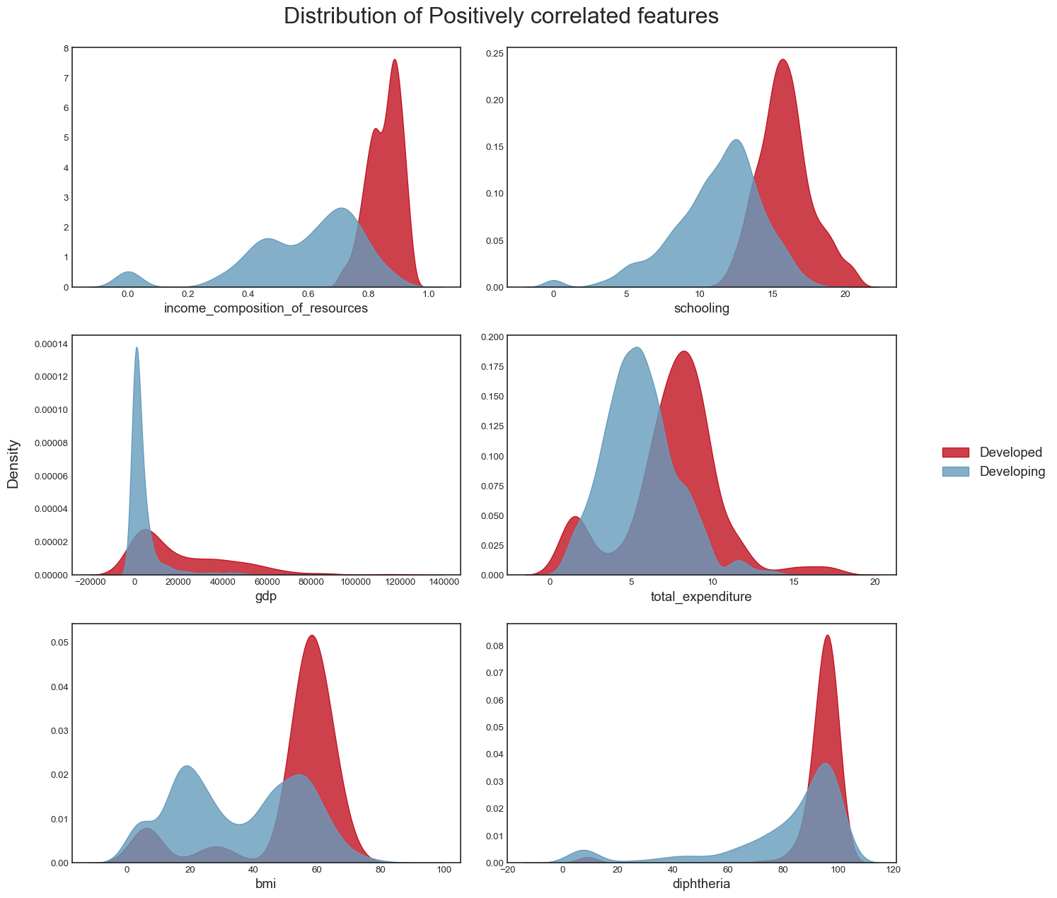
And the distribution of the negatively correlated variables:
title = 'Distribution of Negatively correlated features'
plot_distribution(data, neg_correlated_features, title)
plt.savefig("dist_neg_corr_features.png",bbox_inches="tight")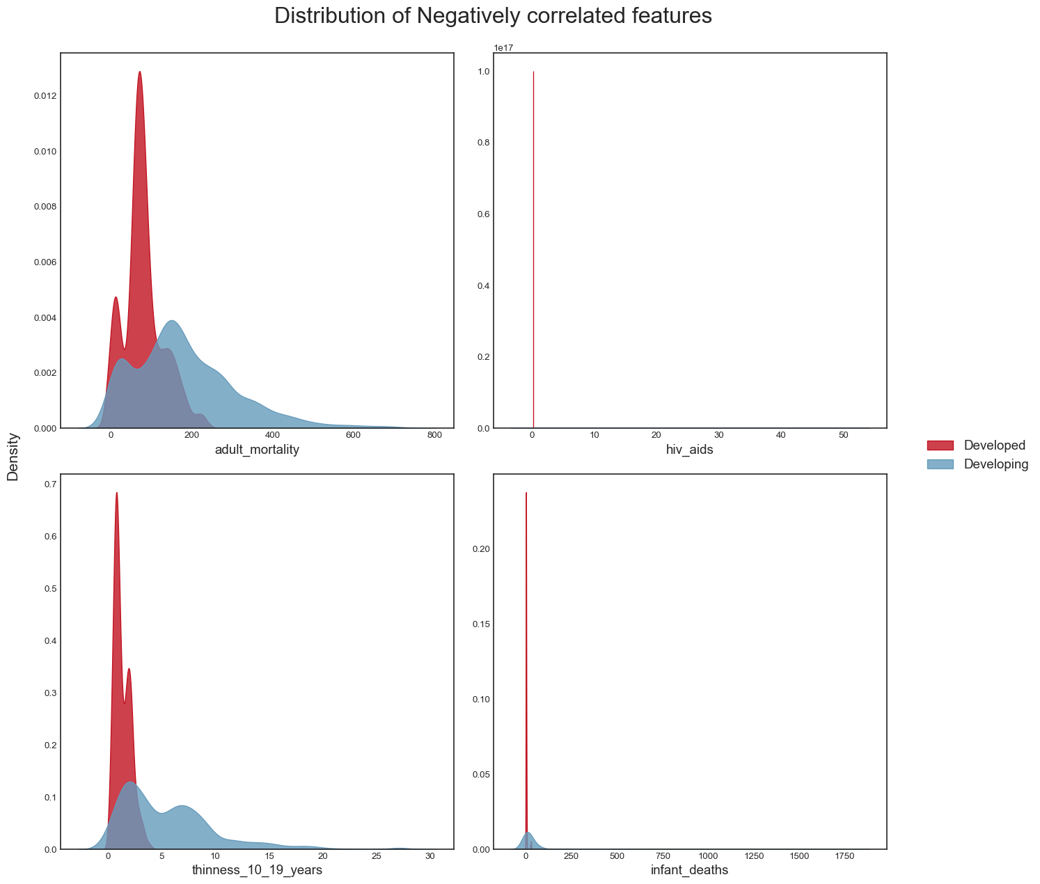
As well as the distribution of other variables such as population and alcohol:
plot_distribution(data_temp, features)
plt.savefig("dist_other_features.png",bbox_inches="tight")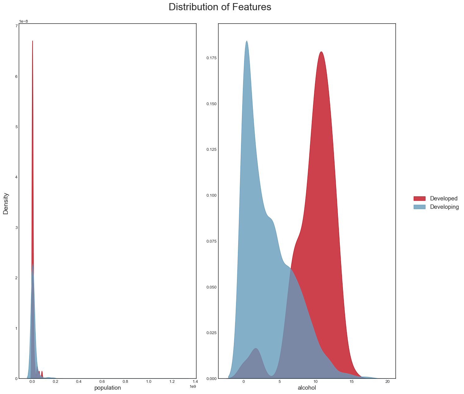
#Function to plot box plot
def plot_boxplot(df, columns, title = 'Box plot of features'):

    df = df.copy()

    rows = math.ceil(len(columns)/2)

    fig, ax = plt.subplots(rows, 2, figsize = (14,14))

    for i, column in enumerate(columns):
        ax = plt.subplot(rows, 2, i+1)

        sns.boxplot(x = df[column],
                    data = df,
                    ax = ax,
                    color = colors[0])

        ax.set_xlabel(column)
        ax.set_ylabel('')

    fig.suptitle(title,
                 fontsize=24,
                 x = 0.56);

    fig.text(0.04, 0.5,
             'Density',
             va='center',
             rotation='vertical',
             fontsize=16)

    fig.tight_layout(rect=[0.05, 0.03, 1, 1])
We draw the boxplots for the positively correlated variables:
title = 'Box Plot of Positively correlated features'
plot_boxplot(data, pos_correlated_features, title)
plt.savefig('boxplot_pos_corr_features.png',bbox_inches="tight")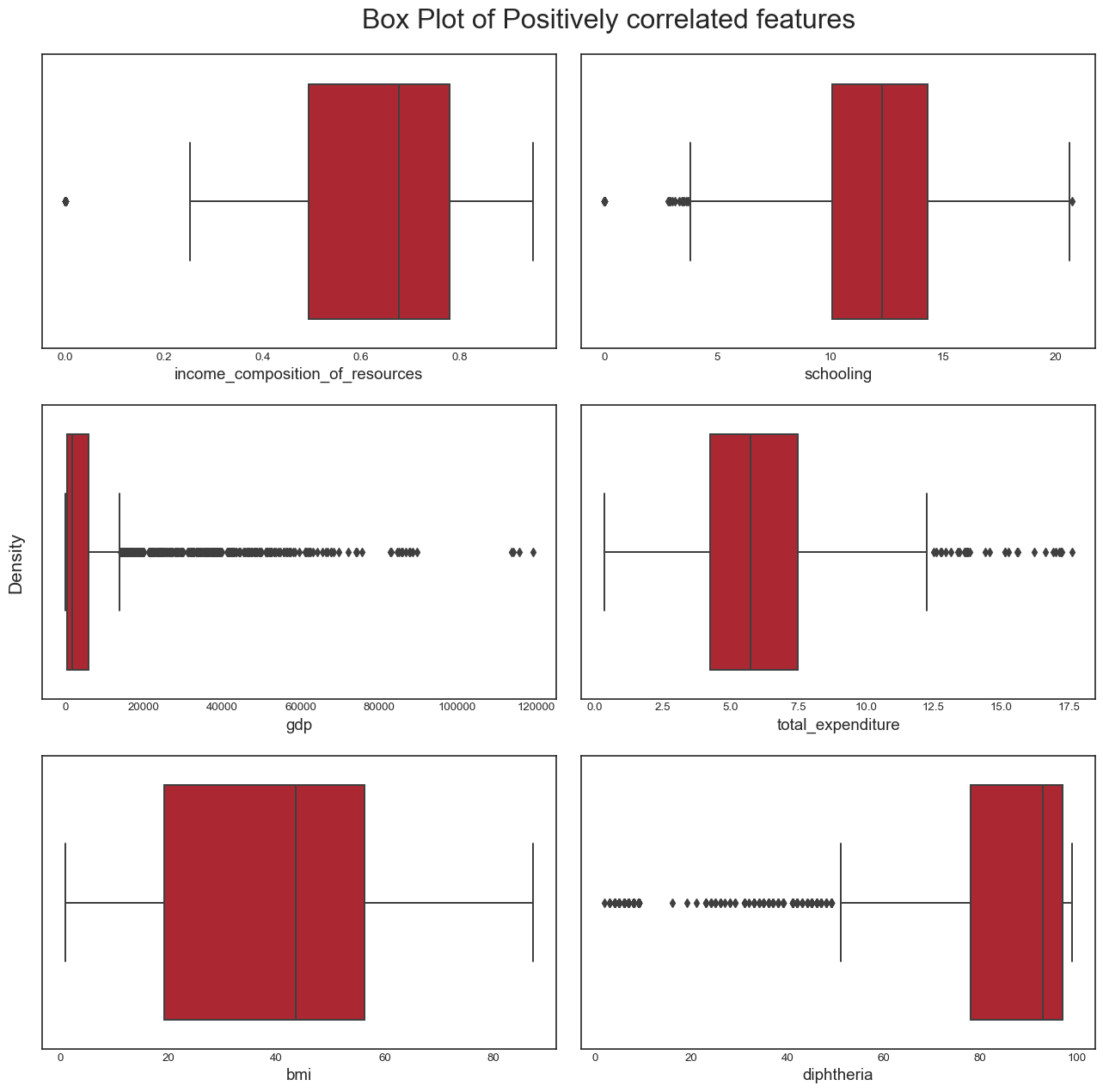
And the boxplots for negatively correlated variables:
title = 'Boxplot of Negatively correlated features'
plot_boxplot(data, neg_correlated_features, title)
plt.savefig('boxplot_neg_corr_features.png',bbox_inches="tight")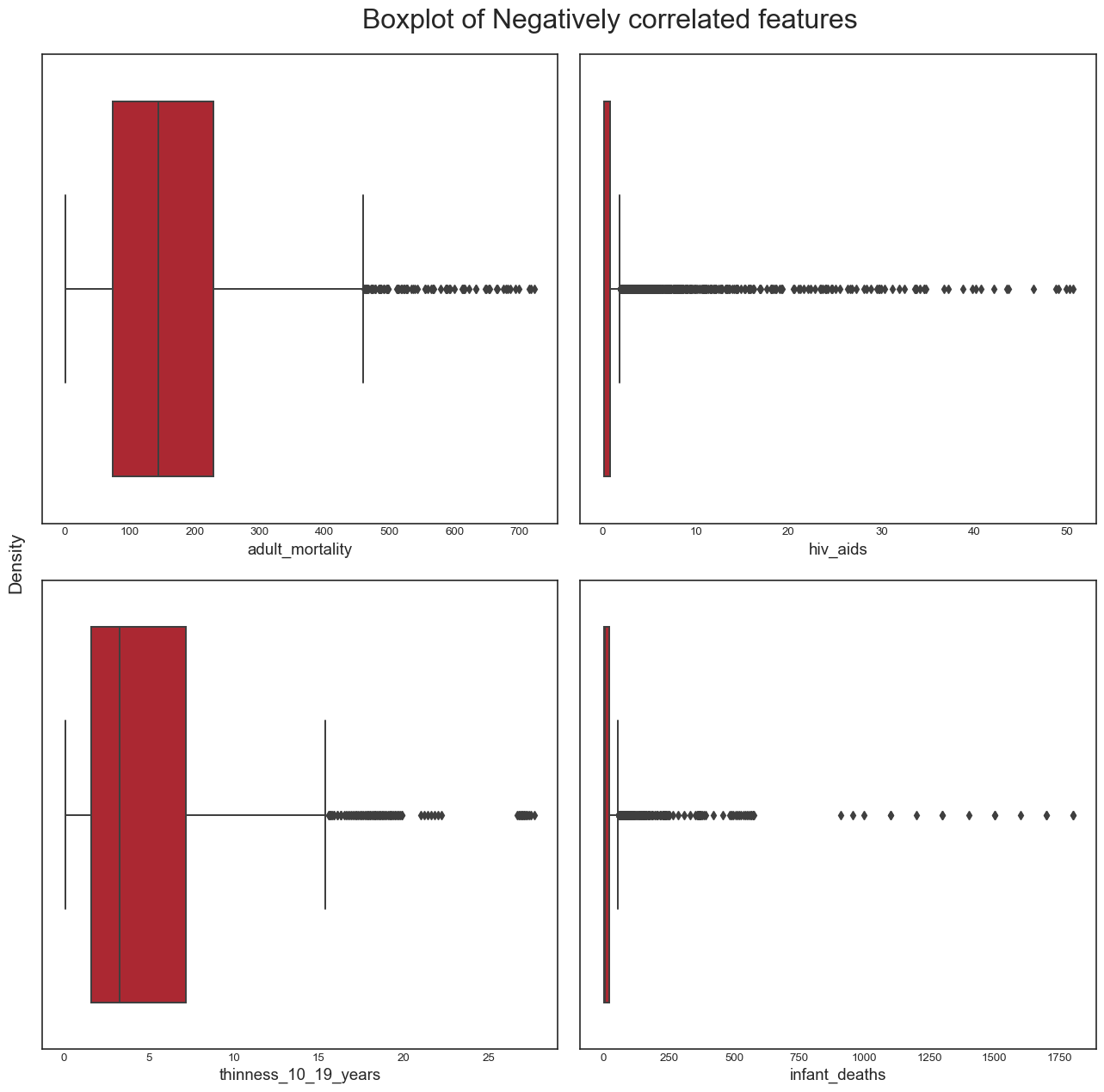
And finally, the boxplots for variables such as population and alcohol:
plot_boxplot(data_temp, features, "Boxplot of other features")
plt.savefig("boxplot_other_features.png",bbox_inches="tight")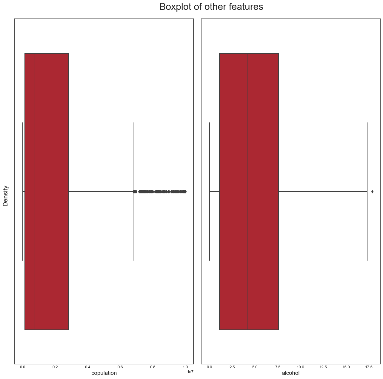
From this analysis, we conclude the following: - the dataset seems to have a significant amount of outliers that would need to be treated. It is highly likely that some of these outliers are actually valid data: some countries may have metrics that are very different from the others e.g China and India have a population almost 5 times larger than the third most populous country in the world, the USA. However, it is also plausible to assert that many of the outliers are likely to be errors introduced during data computation or entry. Some ways to deal with outliers might be to remove them (not desirable as it would result in huge loss of data) or removing the outliers, treating them as missing data and doing data imputation (the idea here is to replace the outlier data by data that comes from the same distribution as the rest of the dataset). - again, we confirmed this trend of developing countries and developed countries of having distinct variable distributions
Removing the country column, making status numerical and imputing missing values
Next, we do a bit of data cleaning: - we remove the country column (it’s irrelevant in our analysis) - we make the status column numerical (we substitute the value of 1 for ‘Developed’ and 0 for ‘Developing’) - we fill in missing values in the data by imputation
data_num = data.drop(columns='country', axis=1, inplace=False) #dropping the `country` column - Note that we produce a copy of the original dataframe here and keep the original dataframe intact
data_num['status'].replace(['Developing', 'Developed'], [0, 1], inplace=True) #we replace the values of status i.e "Developing" and "Developed" by 0 and 1 respectively
d=data_num.isnull().sum() #checking the number of missing values per variable in the dataframe
d
year 0
status 0
life_expectancy 10
adult_mortality 10
infant_deaths 0
alcohol 194
percentage_expenditure 0
hepatitis_b 553
measles 0
bmi 34
under_five_deaths 0
polio 19
total_expenditure 226
diphtheria 19
hiv_aids 0
gdp 448
population 652
thinness_10_19_years 34
thinness_5_9_years 34
income_composition_of_resources 167
schooling 163
dtype: int64We get the list of features that have null values (i.e missing values):
null_features = d.where(d>0).dropna().index.tolist()We impute missing values using four different methods (i.e mean imputation, median imputation, KNN imputation, multiple imputation):
#KNN imputation
imp_knn = KNNImputer()
imputed_knn = imp_knn.fit_transform(data_num)
data_imp_knn = pd.DataFrame(imputed_knn, columns=data_num.columns) #complete dataset for KNN imputation

#mean imputation
imp_mean = SimpleImputer(strategy='mean')
imputed_mean = imp_mean.fit_transform(data_num)
data_imp_mean = pd.DataFrame(imputed_mean, columns=data_num.columns) #complete dataset for mean imputation

#median imputation
imp_median = SimpleImputer(strategy='median')
imputed_median = imp_median.fit_transform(data_num)
data_imp_median = pd.DataFrame(imputed_median, columns=data_num.columns) #complete dataset for median imputation

#multiple imputation or MICE
kds = mf.ImputationKernel(
  data_num,
  random_state=100
)
# Run the MICE algorithm for 10 iterations
kds.mice(10)
# Return the completed dataset (for MICE)
data_imp_mice = kds.complete_data(dataset=0)
And we confirm that our datasets, after imputation, no longer contain missing values:
print(data_imp_mice.isnull().values.any(), data_imp_knn.isnull().values.any(),
      data_imp_mean.isnull().values.any(), data_imp_median.isnull().values.any())
False False False FalseWe next draw the distributions of our data before and after imputation and compare skewness and kurtosis for each of the variables
Code to plot feature distribution before and after imputation
color_pal = sns.color_palette(palette='muted')
def draw_histplot():
    f, axes = plt.subplots(nrows=len(null_features), ncols=5, figsize=(24, len(null_features)*6))
    for x in range(0, len(null_features)):
        sns.histplot(data_num, x=null_features[x], kde=True, ax=axes[x, 0], color=color_pal[0])
        sns.histplot(data_imp_mice, x=null_features[x], kde=True, ax=axes[x, 1], color=color_pal[1])
        sns.histplot(data_imp_knn, x=null_features[x], kde=True, ax=axes[x, 2], color=color_pal[2])
        sns.histplot(data_imp_mean, x=null_features[x], kde=True, ax=axes[x, 3], color=color_pal[3])
        sns.histplot(data_imp_median, x=null_features[x], kde=True, ax=axes[x, 4], color=color_pal[4])

    for i, ax in enumerate(axes.reshape(-1)):
        if i % 5 == 0:
            selected_title = 'Before Imputation'
            selected_data = data_num[null_features[int(i/5)]].dropna()
        elif i % 5 == 1:
            selected_title = 'Multiple Imputation'
            selected_data = data_imp_mice[null_features[int(i/5)]]
        elif i % 5 == 2:
            selected_title = 'KNN Imputation'
            selected_data = data_imp_knn[null_features[int(i/5)]]
        elif i % 5 == 3:
            selected_title = 'Mean Imputation'
            selected_data = data_imp_mean[null_features[int(i/5)]]
        elif i % 5 == 4:
            selected_title = 'Median Imputation'
            selected_data = data_imp_median[null_features[int(i/5)]]
        ax.set_title(selected_title)
        ax.text(x=0.97, y=0.97, transform=ax.transAxes, s="Skewness: %f" % skew(selected_data),\
            fontsize=9, verticalalignment='top', horizontalalignment='right')
        ax.text(x=0.97, y=0.91, transform=ax.transAxes, s="Kurtosis: %f" % kurtosis(selected_data),\
            fontsize=9, verticalalignment='top', horizontalalignment='right')
draw_histplot()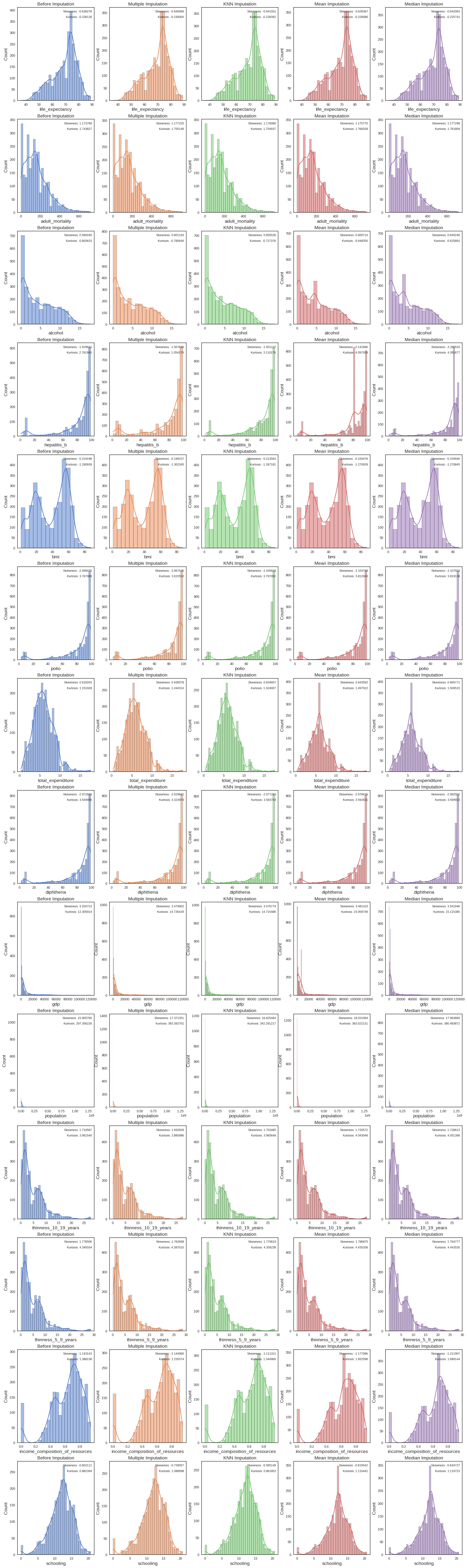
Code to compute skewness and kurtosis differences between feature distributions before and after imputation
#Creating dictionary that holds differences of skewness and kurtosis between data distribution per feature prior to imputation and after imputation
diff_dict=dict((k,{}) for k in null_features)
for k in null_features:
  knn_dist=data_imp_knn[k]
  mean_dist=data_imp_mean[k]
  median_dist=data_imp_median[k]
  mice_dist=data_imp_mice[k]
  before_dist=data_num[k].dropna()
  skew_knn=skew(before_dist)-skew(knn_dist) # computing the skew difference between feature distribution after KNN imputation and before imputation
  skew_mean=skew(before_dist)-skew(mean_dist) # computing the skew difference between feature distribution after mean imputation and before imputation
  skew_median=skew(before_dist)-skew(median_dist) # computing the skew difference between feature distribution after mean imputation and before imputation
  skew_mice=skew(before_dist)-skew(mice_dist) # computing the skew difference between feature distribution after multiple imputation and before imputation
  kurtosis_knn=kurtosis(before_dist)-kurtosis(knn_dist)  #computing the kurtosis difference between feature distribution after KNN imputation and before imputation
  kurtosis_mean=kurtosis(before_dist)-kurtosis(mean_dist) #computing the kurtosis difference between feature distribution after mean imputation and before imputation
  kurtosis_median=kurtosis(before_dist)-kurtosis(median_dist) #computing the kurtosis difference between feature distribution after median imputation and before imputation
  kurtosis_mice=kurtosis(before_dist)-kurtosis(mice_dist) #computing the kurtosis difference between feature distribution after multiple imputation and before imputation
  diff_dict[k]={**diff_dict[k],**{"KNN":(skew_knn,kurtosis_knn),"mean":(skew_mean,kurtosis_mean),"median":(skew_median,kurtosis_median),"mice":(skew_mice,kurtosis_mice)}} #grouping skew and kurtosis differences for all imputation methods for feature in dictionary
diff_dict
d=pd.DataFrame.from_dict(diff_dict, orient='index') #converting dictionary into Pandas DataFrame
# Converting DataFrame into tidy format
d['KNN_skew'], d['KNN_kurtosis'] = zip(*d.KNN)
d['mean_skew'], d['mean_kurtosis'] = zip(*d['mean'])
d['median_skew'], d['median_kurtosis'] = zip(*d['median'])
d['mice_skew'], d['mice_kurtosis'] = zip(*d.mice)
d.drop(columns=["KNN","mean","median","mice"],inplace=True) #dropping non-tidy columns
d #printing new dataframe| KNN_skew | KNN_kurtosis | mean_skew | mean_kurtosis | median_skew | median_kurtosis | mice_skew | mice_kurtosis | |
|---|---|---|---|---|---|---|---|---|
| life_expectancy | 0.003273 | -0.007734 | 0.001089 | -0.009439 | 0.003785 | -0.010385 | 0.002119 | -0.007351 |
| adult_mortality | -0.002312 | -0.011111 | -0.002003 | -0.016202 | -0.003530 | -0.017982 | -0.003158 | -0.013306 |
| alcohol | -0.016289 | -0.076257 | -0.020474 | -0.155283 | -0.060006 | -0.177741 | -0.007418 | -0.015234 |
| hepatitis_b | 0.001497 | -0.348235 | 0.212056 | -1.335997 | 0.350902 | -1.629737 | -0.423851 | 1.679670 |
| bmi | -0.005635 | -0.003758 | 0.001279 | -0.020010 | 0.009842 | -0.020094 | -0.019852 | 0.007942 |
| polio | 0.003941 | -0.029102 | 0.006814 | -0.044053 | 0.010858 | -0.051149 | -0.027594 | 0.155344 |
| total_expenditure | -0.016264 | -0.172079 | -0.025249 | -0.345994 | -0.042427 | -0.357587 | -0.007157 | -0.022841 |
| diphtheria | 0.005596 | -0.033747 | 0.006731 | -0.042634 | 0.010814 | -0.049918 | -0.021518 | 0.113035 |
| gdp | -0.272051 | -2.409572 | -0.276379 | -2.753835 | -0.337224 | -2.809472 | -0.288867 | -2.495431 |
| population | -0.919674 | -44.934991 | -2.126174 | -85.665905 | -2.057870 | -83.127646 | -1.610394 | -70.415098 |
| thinness_10_19_years | 0.007102 | -0.004108 | -0.009985 | -0.081506 | -0.018026 | -0.089857 | 0.007764 | 0.015117 |
| thinness_5_9_years | 0.005887 | -0.010074 | -0.010369 | -0.086044 | -0.018271 | -0.094371 | 0.008863 | 0.008734 |
| income_composition_of_resources | -0.031833 | 0.043169 | 0.033943 | -0.264460 | 0.068763 | -0.301006 | -0.012557 | 0.140861 |
| schooling | -0.016962 | 0.020542 | 0.017431 | -0.228047 | 0.032617 | -0.237329 | 0.112653 | -0.182313 |
The best imputation method for most features is KNN imputation so we’ll stick with this imputation method going forward. There was no case where median or mean imputation performed best.
Linear regression modelling
First model: single predictor model
Now, we turn our attention to modelling and we’ll be building a first linear regression model for life_expectancy using a single predictor: income_composition_of_resources.
y_knn = data_imp_knn['life_expectancy'] ##Selecting the data that corresponds to our dependent variable
X_knn = data_imp_knn['income_composition_of_resources'] ##Selecting the data that corresponds to our independent variable
We build a linear regression model using the statsmodels library and compute a few summary metrics for our model:
mod = sm.OLS(y_knn, X_knn)
res = mod.fit()
ypred = res.predict(X_knn)

# calculate the rmse
rmse_mod = rmse(y_knn, ypred)
print('RMSE: ',rmse_mod)
print(res.summary()) #print summary metrics

#calculate and print the 95% confidence interval
print("\n95% confidence interval:\n", res.conf_int(0.05))
RMSE: 16.72575831404811
OLS Regression Results
=======================================================================================
Dep. Variable: life_expectancy R-squared (uncentered): 0.943
Model: OLS Adj. R-squared (uncentered): 0.943
Method: Least Squares F-statistic: 4.834e+04
Date: Sun, 28 Sep 2025 Prob (F-statistic): 0.00
Time: 21:21:24 Log-Likelihood: -12445.
No. Observations: 2938 AIC: 2.489e+04
Df Residuals: 2937 BIC: 2.490e+04
Df Model: 1
Covariance Type: nonrobust
===================================================================================================
coef std err t P>|t| [0.025 0.975]
---------------------------------------------------------------------------------------------------
income_composition_of_resources 102.9273 0.468 219.866 0.000 102.009 103.845
==============================================================================
Omnibus: 1458.350 Durbin-Watson: 0.366
Prob(Omnibus): 0.000 Jarque-Bera (JB): 8557.027
Skew: 2.350 Prob(JB): 0.00
Kurtosis: 9.915 Cond. No. 1.00
==============================================================================
Notes:
[1] R² is computed without centering (uncentered) since the model does not contain a constant.
[2] Standard Errors assume that the covariance matrix of the errors is correctly specified.
95% confidence interval:
0 1
income_composition_of_resources 102.009374 103.84519We visualise our model:
plt.scatter(X_knn, y_knn, color="black")
plt.plot(X_knn, 102.9273*X_knn, color="blue", linewidth=3)

plt.xlabel("income_composition_of_resources")
plt.ylabel("life_expectancy")
plt.show()
plt.savefig("regression_1var_OLS.png",bbox_inches="tight")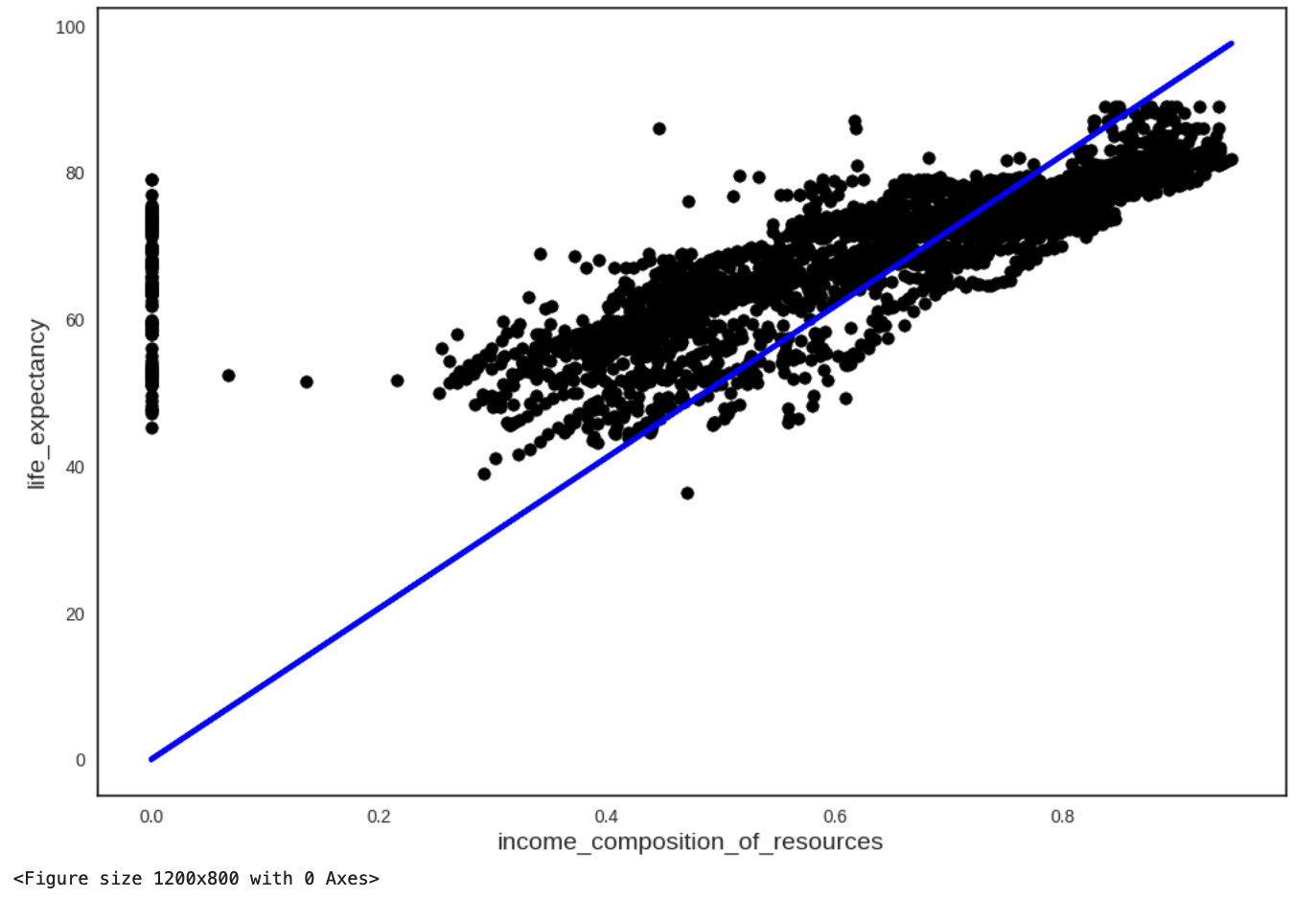
Multivariate linear regression
In a similar fashion, we build models with multiple predictors. Our dependent variable stays unchanged here but our independent variables vary.
In our first try, we select income_composition_of_resources,adult_mortality,gdp,hiv_aids,thinness_10_19_years,diphtheria,bmi,alcohol and polio as predictors.
X_ind=data_imp_knn[['income_composition_of_resources','adult_mortality','gdp','hiv_aids','thinness_10_19_years','diphtheria','bmi','alcohol','polio']] #new independent variables
model = sm.OLS(y_knn, X_ind)
result = model.fit()
y_predicted = result.predict(X_ind)

# calc rmse
rmse_multivar = rmse(y_knn, y_predicted)
print("RMSE: ", rmse_multivar)
print(result.summary())
print("\n95% confidence interval:\n", result.conf_int(0.05))
RMSE: 9.75957572236227
OLS Regression Results
=======================================================================================
Dep. Variable: life_expectancy R-squared (uncentered): 0.980
Model: OLS Adj. R-squared (uncentered): 0.980
Method: Least Squares F-statistic: 1.636e+04
Date: Sun, 28 Sep 2025 Prob (F-statistic): 0.00
Time: 21:21:48 Log-Likelihood: -10862.
No. Observations: 2938 AIC: 2.174e+04
Df Residuals: 2929 BIC: 2.180e+04
Df Model: 9
Covariance Type: nonrobust
===================================================================================================
coef std err t P>|t| [0.025 0.975]
---------------------------------------------------------------------------------------------------
income_composition_of_resources 38.9115 1.097 35.470 0.000 36.760 41.062
adult_mortality 0.0254 0.002 15.335 0.000 0.022 0.029
gdp 6.661e-07 1.54e-05 0.043 0.965 -2.95e-05 3.08e-05
hiv_aids -0.5993 0.042 -14.288 0.000 -0.682 -0.517
thinness_10_19_years 1.0417 0.046 22.776 0.000 0.952 1.131
diphtheria 0.1472 0.010 14.226 0.000 0.127 0.168
bmi 0.2209 0.011 19.909 0.000 0.199 0.243
alcohol 0.3061 0.054 5.663 0.000 0.200 0.412
polio 0.1615 0.010 15.662 0.000 0.141 0.182
==============================================================================
Omnibus: 543.558 Durbin-Watson: 0.794
Prob(Omnibus): 0.000 Jarque-Bera (JB): 1114.455
Skew: 1.090 Prob(JB): 9.98e-243
Kurtosis: 5.085 Cond. No. 9.10e+04
==============================================================================
Notes:
[1] R² is computed without centering (uncentered) since the model does not contain a constant.
[2] Standard Errors assume that the covariance matrix of the errors is correctly specified.
[3] The condition number is large, 9.1e+04. This might indicate that there are
strong multicollinearity or other numerical problems.
95% confidence interval:
0 1
income_composition_of_resources 36.760496 41.062478
adult_mortality 0.022184 0.028688
gdp -0.000030 0.000031
hiv_aids -0.681531 -0.517047
thinness_10_19_years 0.952026 1.131384
diphtheria 0.126935 0.167521
bmi 0.199179 0.242698
alcohol 0.200144 0.412149
polio 0.141239 0.181665All variables come back as significant except for GDP, so we try another model that has gdp replaced with total_expenditure. This time, all variables come back significant.
X_ind=data_imp_knn[['income_composition_of_resources','adult_mortality','total_expenditure','hiv_aids','thinness_10_19_years','diphtheria','bmi','alcohol','polio']] #new independent variables
model = sm.OLS(y_knn, X_ind)
result = model.fit()
y_predicted = result.predict(X_ind)

# calc rmse
rmse_multivar = rmse(y_knn, y_predicted)
print("RMSE: ", rmse_multivar)
print(result.summary())
print("\n95% confidence interval:\n", result.conf_int(0.05))
RMSE: 9.212757334610943
OLS Regression Results
=======================================================================================
Dep. Variable: life_expectancy R-squared (uncentered): 0.983
Model: OLS Adj. R-squared (uncentered): 0.983
Method: Least Squares F-statistic: 1.840e+04
Date: Sun, 28 Sep 2025 Prob (F-statistic): 0.00
Time: 21:22:14 Log-Likelihood: -10693.
No. Observations: 2938 AIC: 2.140e+04
Df Residuals: 2929 BIC: 2.146e+04
Df Model: 9
Covariance Type: nonrobust
===================================================================================================
coef std err t P>|t| [0.025 0.975]
---------------------------------------------------------------------------------------------------
income_composition_of_resources 37.1246 1.009 36.783 0.000 35.146 39.104
adult_mortality 0.0210 0.002 13.445 0.000 0.018 0.024
total_expenditure 1.3447 0.071 18.921 0.000 1.205 1.484
hiv_aids -0.6377 0.040 -16.097 0.000 -0.715 -0.560
thinness_10_19_years 0.9971 0.043 23.154 0.000 0.913 1.082
diphtheria 0.1252 0.010 12.733 0.000 0.106 0.144
bmi 0.1801 0.011 16.834 0.000 0.159 0.201
alcohol 0.1187 0.052 2.301 0.021 0.018 0.220
polio 0.1439 0.010 14.722 0.000 0.125 0.163
==============================================================================
Omnibus: 473.872 Durbin-Watson: 0.784
Prob(Omnibus): 0.000 Jarque-Bera (JB): 938.828
Skew: 0.976 Prob(JB): 1.37e-204
Kurtosis: 4.964 Cond. No. 1.36e+03
==============================================================================
Notes:
[1] R² is computed without centering (uncentered) since the model does not contain a constant.
[2] Standard Errors assume that the covariance matrix of the errors is correctly specified.
[3] The condition number is large, 1.36e+03. This might indicate that there are
strong multicollinearity or other numerical problems.
95% confidence interval:
0 1
income_composition_of_resources 35.145660 39.103615
adult_mortality 0.017952 0.024083
total_expenditure 1.205311 1.483997
hiv_aids -0.715405 -0.560039
thinness_10_19_years 0.912662 1.081536
diphtheria 0.105914 0.144472
bmi 0.159084 0.201029
alcohol 0.017551 0.219826
polio 0.124742 0.163076Footnotes
Make sure you have the
bloscversion at least 1.11.1 installed when you usemiceforest. To check package versions, you can use the commandconda listorpip liston the terminal, command line prompt or powershell↩︎