✅ Week 04 Lab - Solutions
2024/25 Autumn Term
This solution file follows the format of the Quarto file .qmd you had to fill in during the lab session. If you want to render the document yourselves and play with the code, you can download the .qmd version of this solution file by clicking on the button below:
Welcome to our DS202A fourth lab!
This week, you will explore logistic regression, an important classification technique. You will perform data exploration, build a logistic regression model and evaluate its performance using standard classification metrics such as precision, recall and the area under the precision-recall curve.
🥅 Learning Objectives
By the end of this lab, you will be able to:
- Fit a logistic regression model in R.
- Evaluate the performance of a logistic regression model using standard classification metrics.
📚 Preparation
In this lab, we will use a few R libraries to help with data handling, model evaluation and visualization:
doParallel: to help us utilise multiple cores when running code that demands a lot of memory.ggsci: for nice colour palettes.tidymodels: an ecosystem for machine-learning models.kknn: a library specifically for the \(K\)-NN model we’ll discover at the end of this lab.tidyverse: an ecosystem for data manipulation and visualisation.
⚙️ Setup
Install missing libraries:
You probably don’t have the doParallel and kknn libraries installed so you’ll need to install it.
#make sure you run this code only once and that this chunk is non-executable when you render your qmd
install.packages("doParallel")
install.packages("kknn")
Import required libraries:
library("ggsci")
library("tidymodels")
library("tidyverse")
library("kknn")
Create functions
# Define a metric set
# purrr::partial allows you to preset parameters for defined functions
# and turn them into their own objects.

class_metrics <- metric_set(precision, recall)
class_metrics <- partial(class_metrics, event_level = "second")

# ggplot2 plot themes

theme_histogram <- function() {

  theme_minimal() +
  theme(panel.grid.minor = element_blank(),
        panel.grid.major.x = element_blank())

}

theme_boxplot <- function() {

  theme_minimal() +
  theme(panel.grid.minor = element_blank(),
        panel.grid.major.x = element_blank(),
        legend.position = "none")

}

theme_line <- function() {

  theme_minimal() +
  theme(panel.grid.minor = element_blank(),
        panel.grid.major.x = element_blank(),
        legend.position = "none")

}

theme_bar <- function() {

  theme_minimal() +
  theme(panel.grid.minor = element_blank(),
        panel.grid.major.y = element_blank())

}

theme_scatter <- function() {

  theme_minimal() +
  theme(panel.grid.minor = element_blank(),
        legend.position = "bottom")

}
📋 Lab Tasks
Part I - Exploratory data analysis (20 min)
The first step is to load the dataset. In this lab, we will be using the diabetes dataset which contains health-related data. It includes variables associated with medical conditions, lifestyle factors and demographic information:
diabetes: indicates whether the individual has diabetes.high_bp: indicates whether the individual has high blood pressure.high_chol: indicates whether the individual has high cholesterol.chol_check: indicates whether the individual has had their cholesterol checked.bmi: represents the individual’s Body Mass Index.smoker: indicates whether the individual is a smoker.stroke: indicates whether the individual has had a stroke.heart_diseaseor_attack: indicates whether the individual has/had heart disease/attack.phys_activity: indicates whether the individual engages in physical activity.fruitsandveggies: indicate the consumption of fruits and vegetables.hvy_alcohol_consum: indicates heavy alcohol consumption.no_docbc_cost: refers to whether an individual was unable to see a doctor due to cost-related barriers.any_healthcare: indicates whether the individual has any form of healthcare.gen_hlth: indicates the individual’s self-reported general health.diff_walk: indicates whether the individual has difficulty walking of faces mobility challenges.sex: indicates the individual’s gender.age: represents the individual’s age.education: represents the individual’s education level.income: represents the individual’s income level.
diabetes_data <- read_csv("data/diabetes.csv")Rows: 25368 Columns: 20
── Column specification ────────────────────────────────────────────────────────────────────────────────────────────────────────────────────
Delimiter: ","
dbl (20): diabetes, high_bp, high_chol, chol_check, bmi, smoker, stroke, hea...
ℹ Use `spec()` to retrieve the full column specification for this data.
ℹ Specify the column types or set `show_col_types = FALSE` to quiet this message.Question 1: Check the dimensions of the dataframe. Check whether there are any missing values.
diabetes_data# A tibble: 25,368 × 20
diabetes high_bp high_chol chol_check bmi smoker stroke
<dbl> <dbl> <dbl> <dbl> <dbl> <dbl> <dbl>
1 0 0 0 1 21 0 0
2 0 1 1 1 28 0 0
3 0 0 0 1 24 0 0
4 0 0 0 1 27 1 0
5 0 0 1 1 31 1 0
6 0 1 1 1 33 0 0
7 0 0 1 1 29 1 0
8 0 0 1 1 27 1 0
9 0 1 1 1 25 0 0
10 0 0 0 1 33 1 0
# ℹ 25,358 more rows
# ℹ 13 more variables: heart_diseaseor_attack <dbl>, phys_activity <dbl>,
# fruits <dbl>, veggies <dbl>, hvy_alcohol_consump <dbl>,
# any_healthcare <dbl>, no_docbc_cost <dbl>, gen_hlth <dbl>, diff_walk <dbl>,
# sex <dbl>, age <dbl>, education <dbl>, income <dbl>
# ℹ Use `print(n = ...)` to see more rows
diabetes_data %>%
  summarise(across(everything(), ~ sum(is.na(.x)))) %>%
  glimpse()
Rows: 1
Columns: 20
$ diabetes <int> 0
$ high_bp <int> 0
$ high_chol <int> 0
$ chol_check <int> 0
$ bmi <int> 0
$ smoker <int> 0
$ stroke <int> 0
$ heart_diseaseor_attack <int> 0
$ phys_activity <int> 0
$ fruits <int> 0
$ veggies <int> 0
$ hvy_alcohol_consump <int> 0
$ any_healthcare <int> 0
$ no_docbc_cost <int> 0
$ gen_hlth <int> 0
$ diff_walk <int> 0
$ sex <int> 0
$ age <int> 0
$ education <int> 0
$ income <int> 0Question 2: What are the types of the variables in the dataset (continuous, discrete, categorical, ordinal) ? Convert the continuous variables to numeric, discrete variable to integers and categorical variables to factors.
continuous_vars <- c("age", "bmi")
discrete_vars <- c("gen_hlth", "education", "income")
categorical_vars <- c("diabetes", "high_bp", "high_chol", "chol_check",
                      "smoker", "stroke", "heart_diseaseor_attack",
                      "phys_activity", "fruits",  "veggies",
                      "hvy_alcohol_consump", "any_healthcare", "no_docbc_cost",
                      "diff_walk", "sex")

diabetes_data <-
  diabetes_data %>%
  mutate(across(all_of(continuous_vars), ~ as.numeric(.x)),
         across(all_of(discrete_vars), ~ as.integer(.x)),
across(all_of(categorical_vars), ~ as.factor(.x)))👉Note: Imagine how cumbersome it would be to perform these transformations if we had to do them for each variable! For more information on what across is doing, click here.
Question 3: Generate box plots for the variable bmi for each class of the column diabetes . Repeat the same for the variables education and income. What do you observe from the box plots ? How do BMI, education and income vary across the diabetes classes ?
diabetes_data %>%
  ggplot(aes(diabetes, bmi, fill = diabetes)) +
  geom_boxplot() +
  theme_boxplot() +
  scale_fill_npg() +
  labs(x = "Diabetes", y = "BMI")
diabetes_data %>%
  ggplot(aes(diabetes, education, fill = diabetes)) +
  geom_boxplot() +
  theme_boxplot() +
  scale_fill_npg() +
  labs(x = "Diabetes", y = "Education")
diabetes_data %>%
  ggplot(aes(diabetes, income, fill = diabetes)) +
  geom_boxplot() +
  theme_boxplot() +
  scale_fill_npg() +
  labs(x = "Diabetes", y = "Income")
Question 4: How many observations fall into each class of the variable diabetes ? Comment. What are the challenges you would expect when training a model ?
count(diabetes_data, diabetes)# A tibble: 2 × 2
diabetes n
<fct> <int>
1 0 21874
2 1 3494Our dataset is what we call imbalanced: there are many more individuals that are healthy (class 0) than individuals that have diabetes (class 1), as could be expected.
Part II - Fitting a logistic regression (25 min)
We want to perform a logistic regression using the available variables in the dataset to predict whether an individual has diabetes.
👨🏻🏫 TEACHING MOMENT: Your class teacher will formalize the logistic regression in the context of the data at our disposal.
Now, we need to split the data into training and testing sets. Having a test set will help us evaluate how well the model generates.
In the training phase, we will use part of the data to fit the logistic regression model.
In the testing phase, we will assess the model’s performance on the remaining data (test set) which was not used during training.
Question 1: Why can’t we rely solely on the model’s performance on the training set to evaluate its ability to generalize?
Question 2: Split the dataset into training and testing sets using 75% of the data for training and 25% for testing. Use slice_sample to create a sample of 1% of the training data.
set.seed(123)

split_grid <- initial_split(diabetes_data, prop = 0.75, strata = diabetes)
train <- training(split_grid)
test <- testing(split_grid)

train_sample <- slice_sample(train, prop = 0.01)💡Tip: When using initial_split try specifying strata = diabetes. This ensures that the training and test sets will have identical proportions of the outcome.
Question 3: Fit a logistic regression model on the training data. Should all variables be included in the model ?
model <-
  logistic_reg() %>%
  fit(diabetes ~ ., data = train)
Question 4: Generate a summary of the model. Compare the \(p\)-values for bmi and for education.
summary(model$fit)Call:
stats::glm(formula = diabetes ~ ., family = stats::binomial,
data = data)
Coefficients:
Estimate Std. Error z value Pr(>|z|)
(Intercept) -7.534466 0.334759 -22.507 < 2e-16 ***
high_bp1 0.828299 0.055054 15.045 < 2e-16 ***
high_chol1 0.657774 0.050809 12.946 < 2e-16 ***
chol_check1 1.028935 0.244147 4.214 2.50e-05 ***
bmi 0.060443 0.003311 18.253 < 2e-16 ***
smoker1 -0.077750 0.048463 -1.604 0.1086
stroke1 0.060800 0.093133 0.653 0.5139
heart_diseaseor_attack1 0.274445 0.065499 4.190 2.79e-05 ***
phys_activity1 -0.045627 0.052866 -0.863 0.3881
fruits1 -0.112121 0.049981 -2.243 0.0249 *
veggies1 -0.072613 0.058018 -1.252 0.2107
hvy_alcohol_consump1 -0.983620 0.152806 -6.437 1.22e-10 ***
any_healthcare1 0.031944 0.120491 0.265 0.7909
no_docbc_cost1 0.061150 0.082576 0.741 0.4590
gen_hlth 0.507024 0.027349 18.539 < 2e-16 ***
diff_walk1 -0.066814 0.061151 -1.093 0.2746
sex1 0.230670 0.049621 4.649 3.34e-06 ***
age 0.125081 0.010148 12.326 < 2e-16 ***
education -0.027124 0.025683 -1.056 0.2909
income -0.053043 0.013027 -4.072 4.67e-05 ***
---
Signif. codes: 0 ‘***’ 0.001 ‘**’ 0.01 ‘*’ 0.05 ‘.’ 0.1 ‘ ’ 1
(Dispersion parameter for binomial family taken to be 1)
Null deviance: 15250 on 19024 degrees of freedom
Residual deviance: 11965 on 19005 degrees of freedom
AIC: 12005
Number of Fisher Scoring iterations: 6👨🏻🏫 TEACHING MOMENT: Your class teacher will explain how to interpret the summary of the model (\(p-\)values, AIC …).
Part III - Evaluation (45 min)
Question 1: We are going to generate predictions on both the training and testing sets using our logistic regression model. Generate predictions for both sets.
# Generate predictions on the training set
train_preds <-
  model %>%
  augment(new_data = train, type.predict = "response")

# Generate predictions on the testing set
test_preds <-
  model %>%
augment(new_data = test, type.predict = "response")💡Tip: When using augment for logistic regression, specify type.predict = "response".
Question 2: Copy and paste pull(test_preds, .pred_1)[1:10] into the console and hit enter to get the first ten predictions for the test set. The model’s predictions are scores ranging between 0 and 1 while the target variable diabetes is binary and takes only the values 0 or 1. How can we use the predictions to classify whether an individual has diabetes ?
pull(test_preds, .pred_1)[1:10] [1] 0.007612360 0.142840941 0.102032878 0.259230352 0.389565277 0.018752068
[7] 0.056227020 0.223643890 0.329659820 0.006778071Question 3: We are going to set an arbitrary threshold \(\alpha\). All the scores that are higher than \(\alpha=0.8\) will be classified as 1 and the scores lower than \(\alpha=0.8\) will be classified as 0.
# Convert predicted scores to binary outcomes for the training set
train_preds <-
  train_preds %>%
  mutate(.pred_class = as.factor(if_else(.pred_1 > 0.8, 1, 0)))

# Convert predicted scores to binary outcomes for the testing set
test_preds <-
  test_preds %>%
mutate(.pred_class = as.factor(if_else(.pred_1 > 0.8, 1, 0)))👨🏻🏫 TEACHING MOMENT: Your class teacher will explain what precision and recall are.
Question 4: What would be the recall if we only predicted 1’s on the test set?
💡💡Tips:
- Create a new factor variable. When using
factor()make sure to specifylevels = c(0, 1)! - Try the
recallfunction, don’t forget to setevent_level = "second"!
test_preds %>%
  mutate(one = factor(1, levels = c(0, 1))) %>%
  recall(truth = diabetes, estimate = one, event_level = "second")
# A tibble: 1 × 3
.metric .estimator .estimate
<chr> <chr> <dbl>
1 recall binary 1Question 5: Now, let’s measure precision and recall for both training and testing sets.
list(
  "train" = train_preds,
  "test" = test_preds
) %>%
  bind_rows(.id = "set") %>%
  group_by(set) %>%
  class_metrics(truth = diabetes, estimate = .pred_class)
# A tibble: 4 × 4
set .metric .estimator .estimate
<chr> <chr> <chr> <dbl>
1 test precision binary 0.636
2 train precision binary 0.545
3 test recall binary 0.00801
4 train recall binary 0.00687Question 6: Compare the results you obtain for both the training and testing sets. Was this expected ? Does the model overfit ? underfit ?
We find that, if anything, performance on the test set is slightly better when compared to the training set, which is unexpected.
Question 7: What is the problem with setting an arbitrary threshold \(\alpha=0.8\) ? How should we expect the precision and the recall to behave if we increase the threshold \(\alpha\) ? If we decrease \(\alpha\) ?
First of all, we need to consider how balanced our data are between different classes in the outcome. If we plot the distribution of predictions of diabetes, for example, very few observations have a probability of above 0.5, let alone 0.8! This will result in recall being very low. However, setting the threshold too low will result in reduced precision as more individuals with a low probability of having diabetes will nevertheless be classified as such.
Question 8: Compute the precision and recall for the test set for different values of the threshold \(\alpha\). Compute them for \(\alpha \in \{0.1, 0.2, 0.3, 0.4, 0.5, 0.6, 0.7 \}\).
# Create a list of probability thresholds

alpha_list <- c(0.1, 0.2, 0.3, 0.4, 0.5, 0.6, 0.7)

# This function helps create a probability threshold
# and subsets the data.

set_prob_th <-
  as_mapper(
    ~ .x %>%
      mutate(truth = as.factor(diabetes == "1"),
             estimate = as.factor(as.numeric(.pred_1) > .y)) %>%
      select(truth, estimate)
  )

# Register multiple cores

doParallel::registerDoParallel()

# Calculate probability thresholds across nested
# tibbles

ev_metrics <-
  crossing(alpha = alpha_list,
           nest(augment(model, new_data=train), .key="augmented")) %>%
  mutate(preds = map2(augmented, alpha, ~set_prob_th(.x,.y)),
         metrics = map(preds, ~class_metrics(.x, truth=truth, estimate=estimate))) %>%
  unnest(metrics) %>%
select(alpha, .metric, .estimate)👨🏻🏫 TEACHING MOMENT: Your teacher will explain what the map function is doing.
- Because we need to perform operations over list columns, we need
mapandmap2to apply functions to each cell. Withmap2we are telling R to calculate different probability thresholds found inalpha_listover the nested tibblesaugmented. - With
purrr::mapfunctions, we can use anonymous functions (starting with~) which provide a more compact syntax for function writing. We could usefunction(.x,.y) et_prob_th(.x,.y)to achieve the same thing but this would make the code longer. .x(and.y) are the placeholders used when specifying an anonymous function.
Question 9: Create a plot that shows performance over different thresholds, using colour to distinguish between the different evaluation metrics.
ev_metrics %>%
  ggplot(aes(alpha, .estimate, colour = .metric)) +
  geom_line(linetype = "dashed") +
  geom_point() +
  theme_line() +
  scale_colour_uchicago() +
  labs(x = "Probability threshold", y = "Evaluation metric estimate",
       colour = "Evaluation metric") +
  theme(legend.position = "right")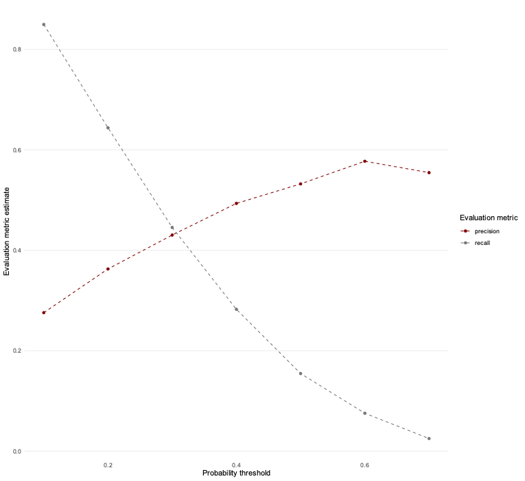
💰🎁🎉 Bonus: Try redefining class_metrics to also include f_meas (the f1-score) and see what happens.
class_metrics_expanded <- metric_set(precision, recall, f_meas)
class_metrics_expanded <- partial(class_metrics_expanded, event_level = "second")
Let’s try it out on various thresholds as before.
# Create a list of probability thresholds

alpha_list <- c(0.1, 0.2, 0.3, 0.4, 0.5, 0.6, 0.7)

# This function helps create a probability threshold
# and subsets the data.

set_prob_th <-
  as_mapper(
    ~ .x %>%
      mutate(truth = as.factor(diabetes == "1"),
             estimate = as.factor(as.numeric(.pred_1) > .y)) %>%
      select(truth, estimate)
  )

# Register multiple cores

doParallel::registerDoParallel()

# Calculate probability thresholds across nested
# tibbles

ev_metrics_expanded <-
  crossing(alpha = alpha_list,
           nest(augment(model, new_data=train), .key="augmented")) %>%
  mutate(preds = map2(augmented, alpha, ~set_prob_th(.x,.y)),
         metrics = map(preds, ~class_metrics_expanded(.x, truth=truth, estimate=estimate))) %>%
  unnest(metrics) %>%
  select(alpha, .metric, .estimate)
ev_metrics_expanded %>%
ggplot(aes(alpha, .estimate, colour = .metric)) +
geom_line(linetype = "dashed") +
geom_point() +
theme_line() +
scale_colour_uchicago() +
labs(x = "Probability threshold", y = "Evaluation metric estimate",
colour = "Evaluation metric") +
theme(legend.position = "right")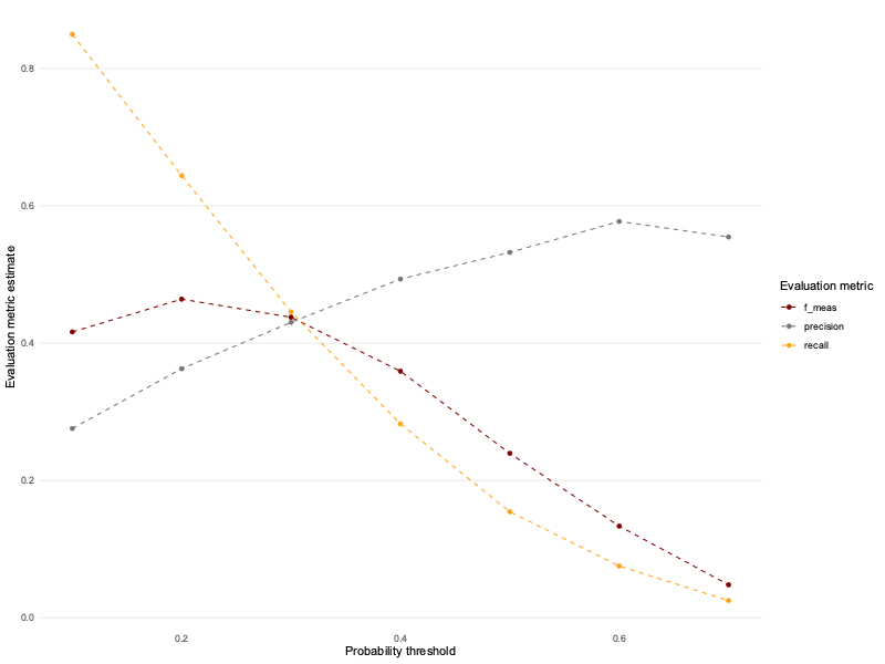
Question 10: Based on the precision and recall values you calculated, create a precision-recall plot to visualize the relationship between these two metrics. How does the shape of the precision-recall curve help you assess model performance ? What trade-offs do you observe between precision and recall ?
ev_metrics %>%
  pivot_wider(id_cols = alpha, names_from = .metric, values_from = .estimate) %>%
  ggplot(aes(x = recall, y = precision)) +
  geom_point(color="turquoise4")+
  geom_text(aes(label = paste0("\u03b1 = ", alpha)) , position = position_nudge(x = -0.045)) +
  geom_line(linetype = "dashed",color="turquoise4") +
  theme_line() +
labs(x = "Recall", y = "Precision") 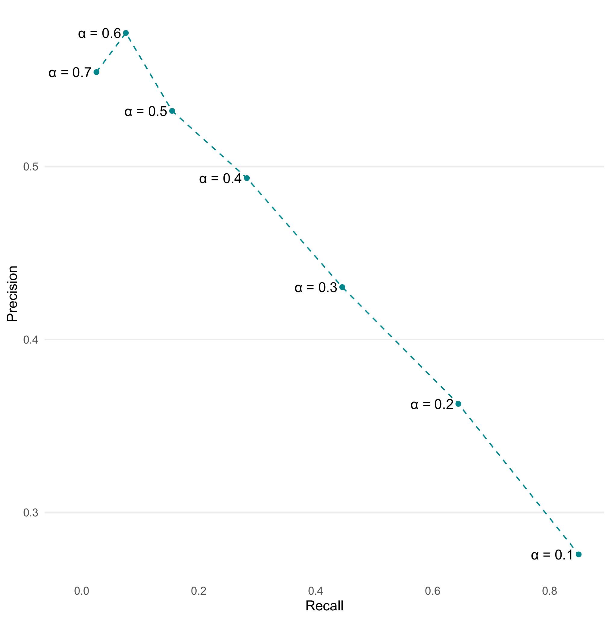
Question 11: Let’s employ train_sample built earlier. Train a new logistic regression model using all the variables and then evaluate its performance on the testing set by generating a precision-recall curve. Compare the precision-recall curves of the original model and the new model.
new_model <-
  logistic_reg() %>%
  fit(diabetes ~ ., data = train_sample)

new_preds <-
  new_model %>%
  augment(new_data = test, type.predict = "response")

new_preds %>%
  class_metrics(truth = diabetes, estimate = .pred_class)
# A tibble: 2 × 3
.metric .estimator .estimate
<chr> <chr> <dbl>
1 precision binary 0.411
2 recall binary 0.208
ev_metrics_new <-
  crossing(alpha = alpha_list,
         nest(new_preds, .key = "preds")) %>%
  unnest(preds) %>%
  mutate(estimate = as.factor(if_else(.pred_1 > alpha, 1, 0))) %>%
  group_by(alpha) %>%
  class_metrics(truth = diabetes, estimate = estimate) %>%
  select(-.estimator)

ev_metrics %>%
  bind_rows(ev_metrics_new, .id = "sample") %>%
  mutate(sample = if_else(sample == 1, "Full sample", "25% of sample")) %>%
  pivot_wider(id_cols = c(sample, alpha), names_from = .metric, values_from = .estimate) %>%
  ggplot(aes(x = recall, y = precision, colour = sample)) +
  geom_point() +
  geom_line(linetype = "dashed") +
  theme_line() +
  theme(legend.position = "bottom") +
  scale_colour_uchicago() +
  labs(x = "Recall", y = "Precision", colour = NULL)
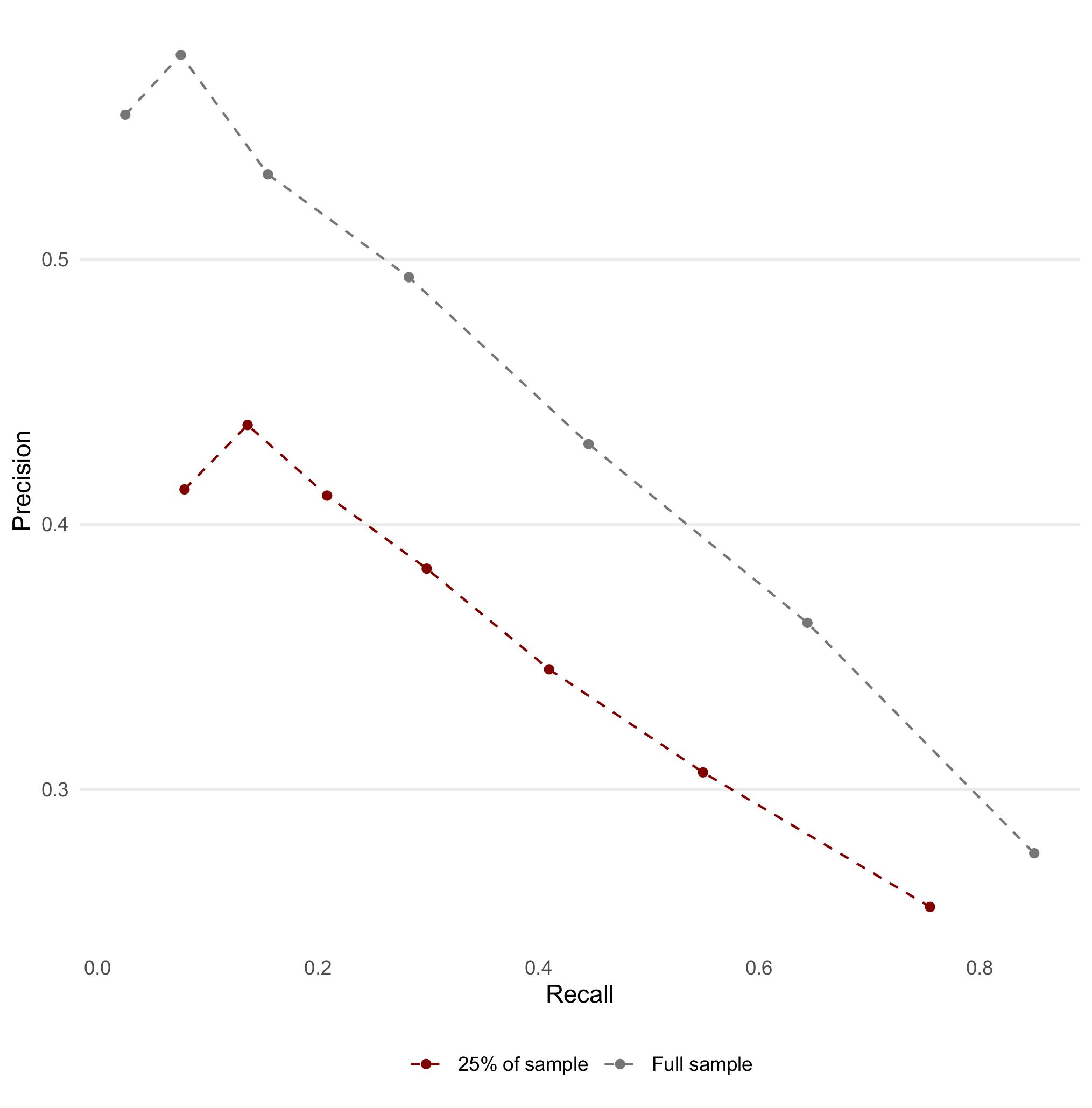
Question 12: What differences do you observe between the two models’ precision-recall curves? How does training on less data affect the performance of the logistic regression model?
list(
  "Full data" = ev_metrics,
  "1% of data" = ev_metrics_new
) %>%
  bind_rows(.id = "sample") %>%
  ggplot(aes(alpha, .estimate, colour = sample)) +
  facet_wrap(. ~ .metric) +
  geom_point() +
  geom_line() +
  theme_line() +
  theme(legend.position = "bottom") +
  scale_colour_uchicago() +
  labs(x = "Probability threshold", y = "Evaluation metric estimate",
       colour = NULL)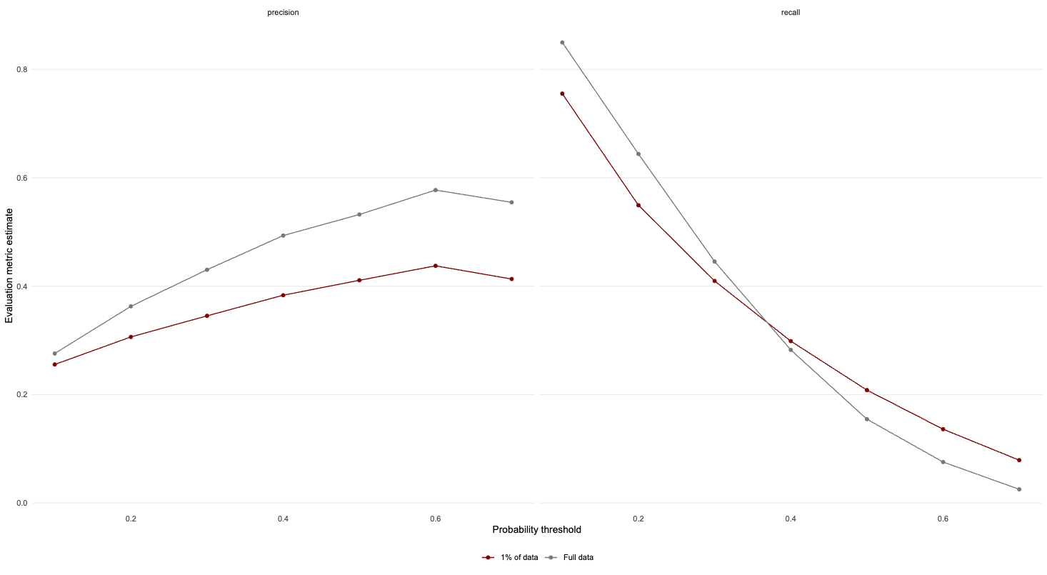
In this instance, we find that at intermediate thresholds, training the model on less data will result in a slight decrease in test set performance.
💡💡Tips:
- Try finding a way of combining the evaluation metrics when using the full data and the sample.
- Create a list with two named elements
- Pipe in
bind_rows(.id = "sample") - Plot the results, add
facet_wrap(. ~ .metric)to your ggplot and see what happens
Part IV - Cross-validation (X min)
In this part, we will explore a technique often used in Machine Learning to evaluate the performance and generalizability of our models. Cross-validation is often used to get a better estimation of the model’s performance on new data (test set).
💡Tip: We have been creating a lot of objects that, in turn, have used up a lot of memory. It is worth, sometimes, removing the objects we have no use for anymore. We can then use gc() (“garbage collection” 😂) which can then help free up memory in RStudio.
rm(list = ls(pattern = "ev_metrics$|model|pred"))
gc()
The idea of \(k\)-fold cross validation is to split a dataset into a training set and testing set (just as we did previously), then to split the training set into \(k\) folds.
👨🏻🏫 TEACHING MOMENT: Your class teacher will give more details on how cross-validation works and what its purpose is.
Question 1: Use the tidymodels package to perform leave one out cross-validation.
# Create leave one out resamples

loocv <- loo_cv(train_sample)

# Instantiate a logistic regression model

logit <- logistic_reg()

# Register multiple cores

doParallel::registerDoParallel()

# Create a nested tibble of fitted models

loocv_fit <-
  loocv %>%
  mutate(train = map(splits, ~ training(.x)),
         holdout = map(splits, ~ testing(.x)),
         fit = map(train, ~ fit(logit, diabetes ~ ., data = .x))
         )

# Apply the model to the training data

loocv_preds <-
  loocv_fit %>%
  select(fit, holdout) %>%
  mutate(preds = map2(fit, holdout, ~ augment(.x, new_data = .y)))

# Unnest the predictions and calculate evaluation metrics

loocv_preds %>%
  unnest(preds) %>%
  class_metrics(truth = diabetes, estimate = .pred_class)
# A tibble: 2 × 3
.metric .estimator .estimate
<chr> <chr> <dbl>
1 precision binary 0.455
2 recall binary 0.185Question 2: Try manipulating the probability threshold and create a graph similar to Part II Question 9
loocv_preds %>%
  select(preds) %>%
  crossing(alpha = alpha_list) %>%
  unnest(preds) %>%
  mutate(estimate = as.factor(if_else(.pred_1 > alpha, 1, 0))) %>%
  group_by(alpha) %>%
  class_metrics(truth = diabetes, estimate = estimate) %>%
  ggplot(aes(alpha, .estimate, colour = .metric)) +
  geom_line(linetype = "dashed") +
  geom_point() +
  theme_line() +
  scale_colour_uchicago() +
  labs(x = "Probability threshold", y = "Evaluation metric estimate",
       colour = "Evaluation metric")+
  theme(legend.position="right")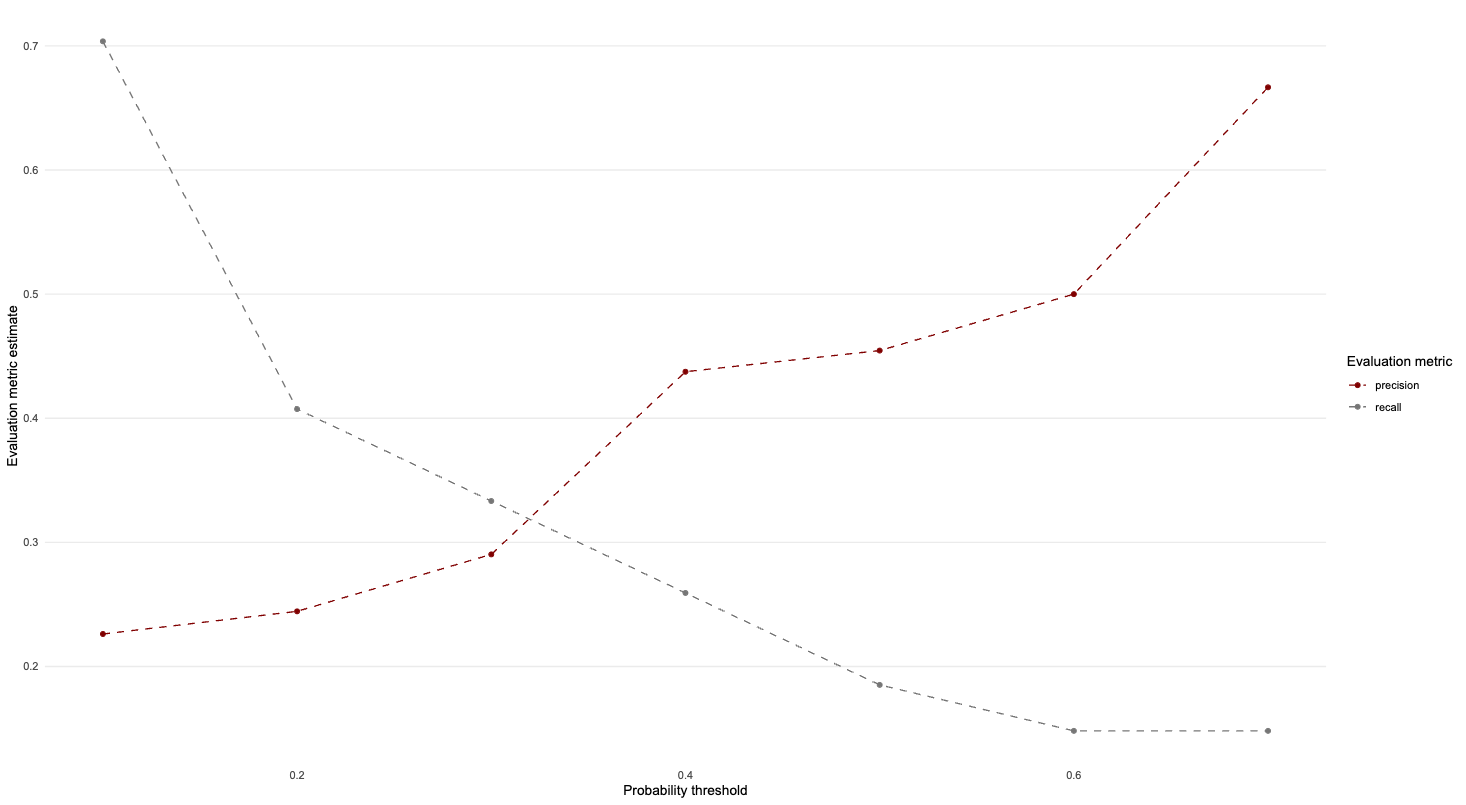
Part V - \(k\)-nearest neighbours (X min)
💡Tip: See previous tip for why the below code is necessary.
rm(list = ls(pattern = "loocv|ev_metrics_new"))
gc()👨🏻🏫 TEACHING MOMENT: Your class teacher will explain how \(k\)-nn works.
Question 1: Start by normalizing the continuous variables. Explain why it can be useful to carry out this transformation.
# Create a standardise function

standardise <- function(.x) {
  out <- (.x - mean(.x)) / sd(.x)
  out
}

# Apply function to training and testing data

train_std <-
  train_sample %>%
  mutate(across(where(is.double), ~ standardise(.x)))

test_std <-
  test %>%
  mutate(across(where(is.double), ~ standardise(.x)))
Question 2: Perform a \(k\)-nn classification with \(k=5\). Generate the predictions for the set and compute both precision and recall.
# Register multiple cores

doParallel::registerDoParallel()

# Fit a kNN model

knn_fit <-
  nearest_neighbor(neighbors = 5) %>%
  set_mode("classification") %>%
  set_engine("kknn") %>%
  fit(diabetes ~ ., data = train_std)

# Evaluate the model on the test set

knn_fit %>%
  augment(new_data = test_std) %>%
  class_metrics(truth = diabetes, estimate = .pred_class)
# A tibble: 2 × 3
.metric .estimator .estimate
<chr> <chr> <dbl>
1 precision binary 0.301
2 recall binary 0.192💰🎁🎉 Bonus:
Rerun the following code chunk:
new_model <-
  logistic_reg() %>%
  fit(diabetes ~ ., data = train_sample)

new_preds <-
  new_model %>%
  augment(new_data = test, type.predict = "response")

new_preds %>%
  class_metrics(truth = diabetes, estimate = .pred_class)
# A tibble: 2 × 3
.metric .estimator .estimate
<chr> <chr> <dbl>
1 precision binary 0.411
2 recall binary 0.208Does kNN do a better job than logistic regression at predicting diabetes?
To answer this question, think about the meaning of precision and recall. Precision, also called the positive predictive value (PPV), measures the ratio between true positives and the sum of true positives and false positives.
\[ precision = \frac{TP}{TP+FP}\] where \(TP\) is the number of true positives and \(FP\) the number of false positives
In our example, the positive class is diabetes so true positives are individuals who have diabetes and are correctly assigned to the diabetes class while false positives are individual who are healthy but are falsely classified as having diabetes by the model (therefore resulting in unnecessary treatment and tests). The higher the number of false positives, the lower the precision and the higher the proportion of unnecessary treatments.
Recall, sometimes also called true positive rate or sensitivity, is by contrast the ratio of true positives over the sum of true positives and false negatives i.e:
\[ recall = \frac{TP}{TP+FN}\] where \(TP\) is the number of true positives and \(FN\) the number of false negatives
We already know what true positives mean in the diabetes example. What about false negatives? They are individuals who have diabetes but are falsely classified as healthy, resulting in delayed diagnosis and/or treatment. Again the higher the number of false negatives, lower the recall and the higher the proportion of delayed diagnoses and/treatments.
In our context, delayed diagnoses and treatments are more detrimental than unnecessary tests and treatments so we need to prioritize recall over precision and a model with higher recall is a better performing model in this context.
With this consideration in mind, the logistic regression model performs better than \(K\)-NN (at least for the \(K\) we set) as it has better recall as well as better precision than \(K\)-NN.
💰🎁🎉💰🎁🎉 Super Bonus
Can you create a bar plot that demonstrates this difference? Again, please consider using one of these plots when comparing model performance.
list(
  "Logistic regression" = class_metrics(new_preds, truth = diabetes, estimate = .pred_class),
  "kNN" = knn_fit %>%
  augment(new_data = test_std) %>%
  class_metrics(truth = diabetes, estimate = .pred_class)
) %>%
  bind_rows(.id = "model") %>%
  ggplot(aes(.estimate, .metric, fill = model)) +
  geom_col(position = position_dodge(), alpha = 0.75, colour = "black") +
  scale_fill_uchicago() +
  theme_bar() +
  theme(legend.position = "bottom") +
  labs(x = "Performance", y = NULL, fill = NULL)