
💻 Week 09 - Class Roadmap (90 min)
2023/24 Autumn Term
Welcome to Week 09! Today, it’s time for a hands-on exercise delving into metrics in supervised learning. We’re revisiting the (hopefully) familiar UCI Diagnostic Wisconsin Breast Cancer Database(Wolberg and Street 1995) from Week 07. We’ll be revisiting the same models we looked at in week 7: Logistic Regression, Decision Tree, and SVM. Get ready to apply your knowledge in this exciting session! 🚀
In this class, you’ll need to run code a Jupyter Notebook: it’s up to you to decide whether you want to open a new Jupyter Notebook in Nuvolos, Google Colab or simply in VSCode.
Part 1 - (Re-)download the dataset (~5min)
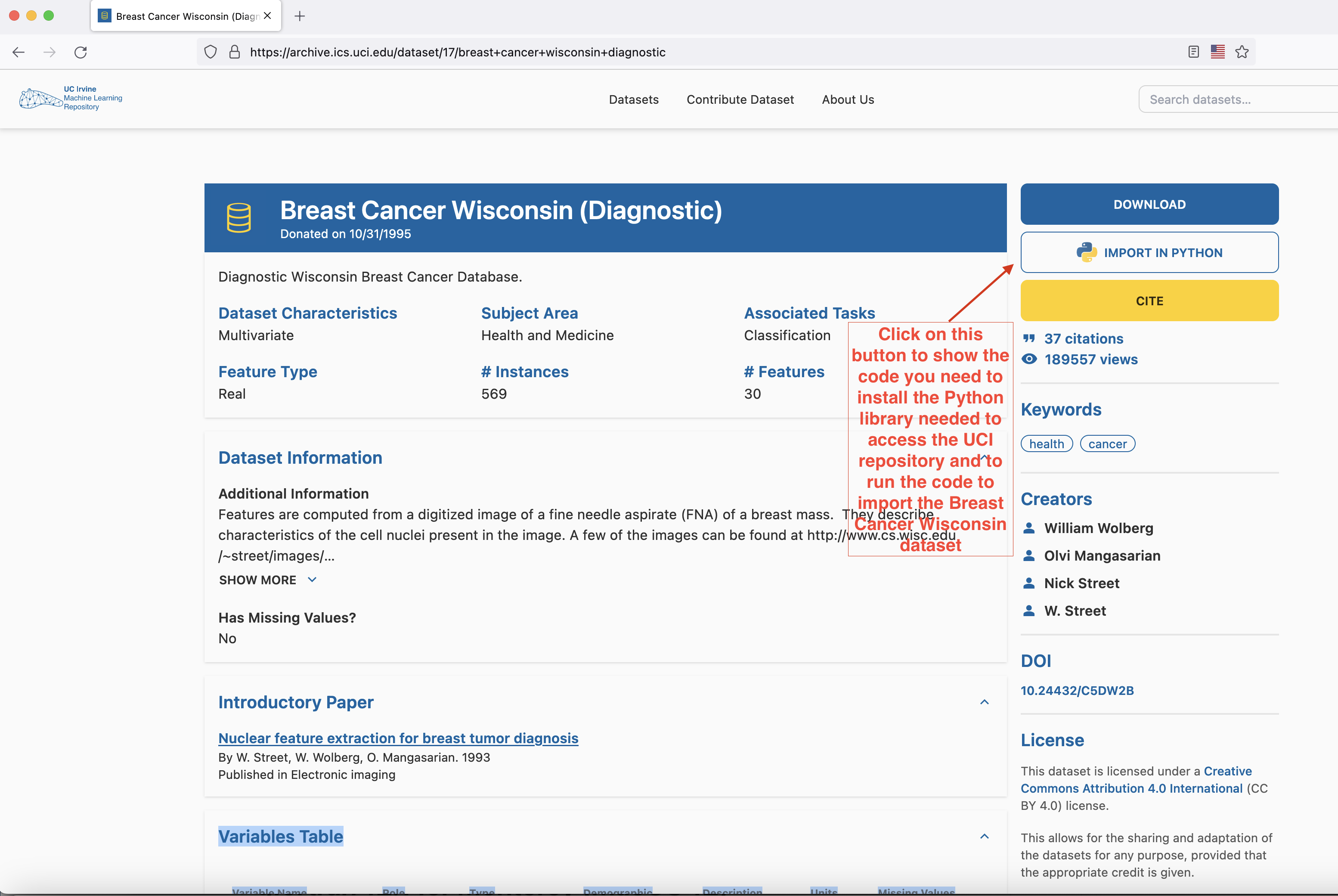
Head to here to download the dataset. The easiest way to proceed is to open a Jupyter Notebook file (either through Google Colab or through VSCode) and follow the instructions of the popup that shows up when you press the IMPORT IN PYTHON button on the page.
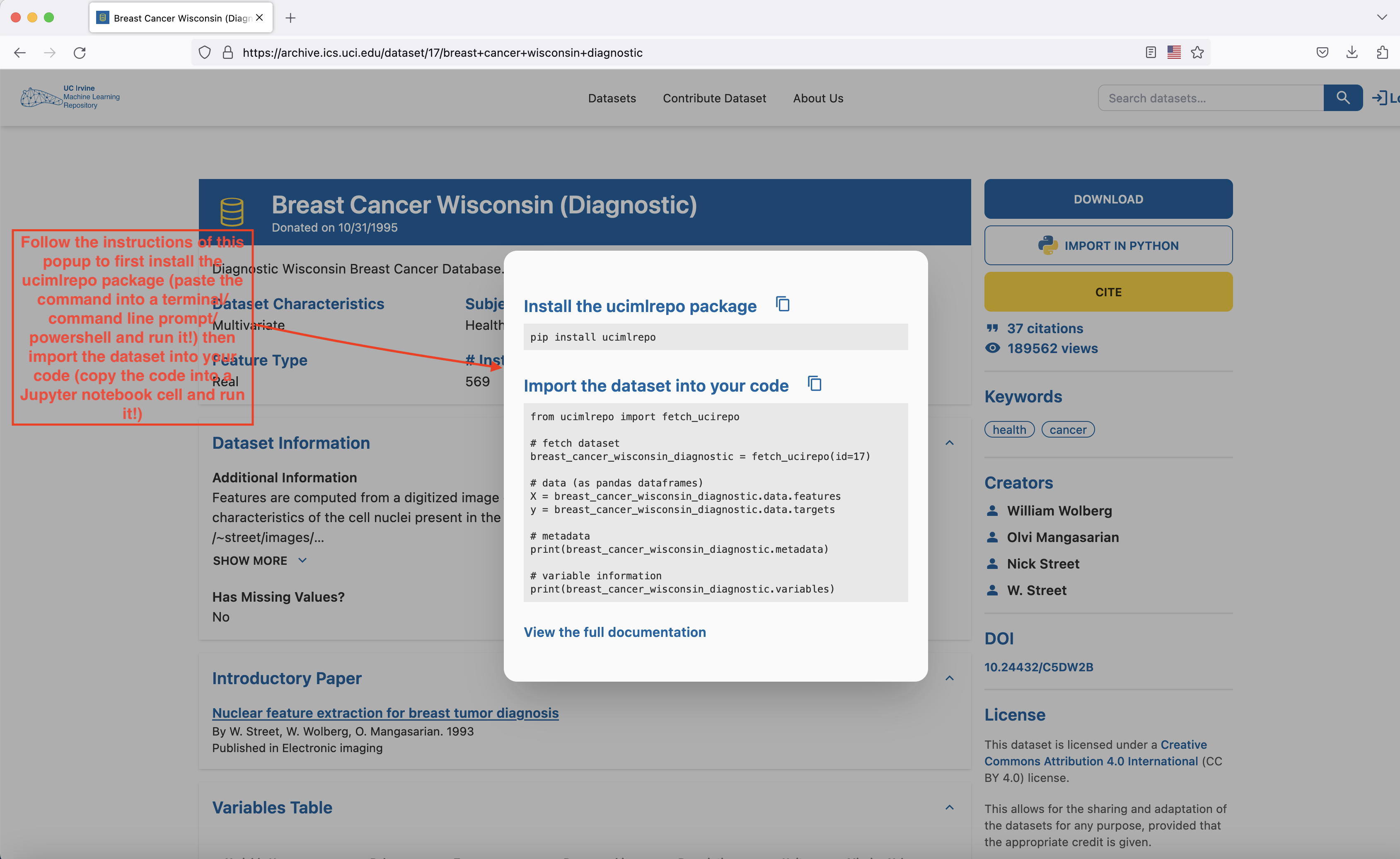
- Install the
ucimlrepopackage with thepip install ucimlrepocommand (run this command either on a cell in your Google Colab notebook or open Terminal/Command line prompt/Power Shell in your laptop, paste this command into it and run it) - Copy the block of code that appears in the
Import the dataset into your codesection of the popup into a cell of your Google Colab or VSCode notebook and run it. The dataset has now been loaded and you’re ready to proceed to the next part of the lab - Let’s keep our imports at one place:
import pandas as pd
import numpy as np

# Data visualization
import matplotlib.pyplot as plt
import seaborn as sns

# For styling the graphs
%matplotlib inline
colors = ['#c1121f','#669bbc', '#f4d35e', '#e9724c', '#ffc857']
plt.style.use('seaborn-v0_8-white')
plt.rc('figure', figsize=(12,8))
plt.rc('font', size=18)
plt.rc('axes', labelsize=14, titlesize=14)
plt.rc('legend', fontsize=14)
plt.rc('xtick', labelsize=10)
plt.rc('ytick', labelsize=10)

# Import the dataset into your code
from ucimlrepo import fetch_ucirepo

#library for the visualisation of missing values in a dataset
import missingno as msno

#imports needed to flatten the target dataframe and count the number of values of each class
from itertools import chain
from collections import Counter

#imports needed for logistic regression
import statsmodels.api as sm
import statsmodels.formula.api as smf

#import to be able to use the SMOTE method (oversampling technique)
from imblearn.over_sampling import SMOTE

#import needed to split data into training and test set
from sklearn.model_selection import train_test_split

#import required to compute accuracy scores
from sklearn.metrics import accuracy_score

#import needed to train decision tree model
from sklearn.tree import DecisionTreeClassifier

#imports for SVM Classifier
from sklearn.ensemble import BaggingClassifier
from sklearn.multiclass import OneVsRestClassifier
from sklearn.svm import SVC

#imports for metrics
from sklearn.metrics import accuracy_score , classification_report , confusion_matrix, precision_score, recall_score, f1_score, auc, roc_curve
Part 2 - Quick and dirty data cleaning and processing (~15min)
This week, since we already explored our dataset in week 7, we’ll pick up from the lessons we learnt then and just apply some very basic cleaning to our data before we move on to the main object of today’s session: modelling and metrics’ exploration. If you want to review the detailed exploration steps for this dataset, please have a look at the class 7 roadmap and the full code for the week 7 class If you need more information on the Breast Cancer Wisconsin Dataset, the full information about the dataset can be found here.
In the Breast Cancer Wisconsin dataset, the independent variables and the dependent variable are not part of a single dataframe but are two distinct dataframes contained in distinct data structures.
If you need to access the dataframe corresponding to the independent variables in the dataset, you need to get the breast_cancer_wisconsin_diagnostic.data.features variable and if you need to access the dependent variable, then the variable you need to access is breast_cancer_wisconsin_diagnostic.data.targets.
- First, let’s simply print out our independent variables and visualise the first ten rows of the dataframe that corresponds to our independent variables
- Let’s remove all the unnecessary variables that we identified in week 7 by running the code below:
data=pd.concat([breast_cancer_wisconsin_diagnostic.data.features,breast_cancer_wisconsin_diagnostic.data.targets],axis=1) #concatenating all independent variables and dependent variable ("Diagnosis") in a single dataframe
cleaned_data = data[['Diagnosis', 'radius1', 'texture1', 'smoothness1',
       'compactness1', 'symmetry1', 'fractal_dimension1',
       'radius2', 'texture2', 'smoothness2', 'compactness2',
'symmetry2', 'fractal_dimension2']]- Let’s now split our dataset in two: a training set (on which we’ll train our models) and a test set (on which we’ll test their performance). To do that use the code below:
# Split the data into training and testing sets
X = cleaned_data.drop(columns=['Diagnosis'])
y = cleaned_data['Diagnosis']

X_train, X_test, y_train, y_test = train_test_split(X, y, test_size=0.3, random_state=42)
This code is splitting the data into training and testing sets using the train_test_split function from the sklearn.model_selection module:
The
Xandyvariables are the input features and target variable (obtained by oversampling earlier), respectively.The
test_sizeparameter specifies the proportion of the data that should be used for testing, in this case 30% (and 70% for the training set).The
random_stateparameter sets the seed for the random number generator, ensuring that the same split is obtained each time the code is run.The function returns four arrays:
X_trainandy_trainare the training set, whileX_testandy_testare the test set.
🎯 ACTION POINT: Quickly print out the dependent variable from the training set to see what it looks like
To close this setup phase, we’ll just quickly check how many instances of each class we have in both our training and test set. To do this, run the code below:
print("Count of class labels in the training set: ", Counter(y_train))
print("Count of class labels in the test set: ", Counter(y_test))
Part 3 - Exploring classification algorithms and metrics (~55min)
In this part, we’ll explore 3 classication algorithms that we already did in week 07
- We’ll first start with logistic regression:
We need to prepare a parameter that is going to be used in the logistic regression function from the
statsmodelslibrary:# Create a string for the formula cols = cleaned_data.columns.drop('Diagnosis') formula = 'Diagnosis ~ ' + ' + '.join(cols) print(formula, '\n')We run the model and report the results:
  # Run the model and report the results
  model = smf.glm(formula=formula, data=pd.concat([X_train,y_train],axis=1), family=sm.families.Binomial())
  logistic_fit = model.fit()
print(logistic_fit.summary())- We make predictions on unseen data using the model we’ve just trained:
 # predict the test data and show the first 10 predictions
predictions = logistic_fit.predict(X_test)
predictions[0:10]
🐍 Can you show the 40th to the 100th prediction? (Hint: Python indices start at zero, so prediction number 1 is predictions[0] instead of predictions[1])
We have now shown the probability of each element of the test of belonging to one class or another. To assign each element to a class, we need a probability cut-off point or threshold. Here, we set the threshold to 0.5 and assign to class “M” all elements whose probability is lower than 0.5 and to class “B” all elements with probability higher than 0.5.
This is what this looks like translated in code:
# Note how the values are numerical.
# Convert these probabilities into nominal values and check the first 10 predictions again.
predictions_nominal = [ "M" if x < 0.5 else "B" for x in predictions]
predictions_nominal[0:10]
Finally, we assess the performance of our model using the accuracy metric:
#1. Accuracy score
logistic_accuracy = accuracy_score(y_test, predictions_nominal)
print('Accuracy from Logistic Regression model: {:.2f}%'.format(logistic_accuracy * 100))- Now, let’s explore some additional metrics crucial for assessing a model’s credibility. We’ll generate a comprehensive report using the
classification_reportlibrary from scikit-learn.
# 2. Lets print a more comprehensive report covering
  print(classification_report(y_test, predictions_nominal))
Let’s break down the precision, recall, and f1-score using the above classification report:
👩🏻🏫 Teaching moment: We already talked about true positives, false positives, true negatives, false negatives, precision, recall, F1-score and confusion matrix during the week 8 lecture. Your class teacher will give a brief recap of these notions here.
- Precision:
- Definition: Precision is the ratio of correctly predicted positive observations to the total predicted positives.
- Explanation: For the ‘B’ class (Benign), a precision of 0.97 means that 97% of the instances predicted as Benign were indeed Benign. Similarly, for the ‘M’ class (Malignant), a precision of 0.92 indicates that 92% of the instances predicted as Malignant were truly Malignant.
- Recall (Sensitivity):
- Definition: Recall is the ratio of correctly predicted positive observations to the all observations in actual class.
- Explanation: For the ‘B’ class, a recall of 0.95 means that 95% of the actual benign instances were correctly predicted. Regarding the ‘M’ class, a recall of 0.95 indicates that 95% of the actual malignant instances were correctly identified.
- F1-Score:
- Definition: F1-score is the weighted average of precision and recall. It ranges from 0 to 1, where 1 is the best score.
- Explanation: The F1-score balances precision and recall. A high F1-score (0.96 for ‘B’ and 0.94 for ‘M’) suggests a good overall performance of the model. It is especially useful when the class distribution is imbalanced. (which, is our case, the classes are imbalanced!)
Next to these scores is confusion matrix, which tells us the actual vs. predicted classifications made by the model (in this case Logistics Regression model). Note that, the x-axis shows the predicted labels (malignant or benign), and the y-axis shows the true labels.
Before we print the confusion matrix lets convert the categorical labels (M, B) into quantitative values for prediction
# To convert categorical label into quantitative values for prediction
factor = pd.factorize(data.Diagnosis)
diagnosis = factor[0]
definitions = factor[1]

# To check what is in definitions
definitions
# 3. Confusion Matrix
logistic_confusion_matrix = confusion_matrix(y_test, predictions_nominal,labels=["M","B"])
print(logistic_confusion_matrix)To make it easy to understand let’s plot the above confusion matrix:
# Visualise the confusion matrix
plt.figure(figsize=(8, 6))
sns.heatmap(logistic_confusion_matrix, annot=True, fmt='d', cmap='Blues')

# Set the xticks at the middle of the axis
plt.xticks([i + 0.5 for i in range(len(definitions))], definitions.values, rotation=0, fontsize=11)

# Set the yticks at the middle of the axis
plt.yticks([i + 0.5 for i in range(len(definitions))], definitions.values, rotation=0, fontsize=11)

plt.title('Confusion Matrix')
plt.xlabel('Predicted Label')
plt.ylabel('True Label')
plt.show()
The confusion matrix plot visually represents the actual vs. predicted classifications made by the model, in this case- Logistics Regression model. The x-axis indicates the predicted labels (malignant or benign), while the y-axis represents the true labels.
From the matrix, we observe the following:
The model correctly predicted 60 cases as malignant (True Positives). True positives indicate instances where the model correctly predicted the positive class, i.e., the model predicted that the instance is positive, and the instance is indeed positive. True positives are crucial in scenarios like medical diagnoses because they represent correct positive predictions.
It accurately identified 103 cases as benign (True Negatives). True negatives denote instances where the model correctly predicts the negative class. In this context, it signifies the model correctly identifying cases as benign.
The model incorrectly predicted 5 cases as malignant that were actually benign (False Positives). False positives occur when the model predicts that an instance belongs to a class it actually does not. In medical applications, false positives may lead to unnecessary tests or treatment. The false positive rate is the proportion of all negative examples that are predicted as positive.
It incorrectly predicted 3 cases as benign that were actually malignant (False Negatives). False negatives represent instances where the model fails to predict the positive class correctly. In medical contexts, false negatives can be critical as they indicate cases where the model missed actual positive instances. False negatives are often more serious than false positives (poor patient prognosis due delayed or missed diagnosis, potentially risk of death), and it is crucial to consider them when evaluating the performance of a classification model.
Let’s compute some metrics (with reference to the positive class i.e malignant cells) e.g precision, recall, F1-score. We’ll need those for later model comparisons
p_reg=precision_score(y_test, predictions_nominal,pos_label="M",labels=["M","B"])
r_reg=recall_score(y_test, predictions_nominal,pos_label="M",labels=["M","B"])
f1_reg=f1_score(y_test, predictions_nominal,pos_label="M",labels=["M","B"])
print("Precision Logistic regression:"+ str(p_reg)+"\n"+"Recall Logistic regression:"+ str(r_reg)+"\n"+"F1-score Logistic regression:"+ str(f1_reg)+"\n")
- Next is Decision Tree model, for that we will again split the dataset.
# Split the data into training and testing sets (this time by dropping target column)
X = cleaned_data.drop(columns=['Diagnosis'])
y = cleaned_data['Diagnosis']

X_train, X_test, y_train, y_test = train_test_split(X, y, test_size=0.3, random_state=42)
Next we wil start by converting target variable into numerical values (as decision tree models require target variables to be in numeric values). The below code block assigns a unique numerical value to each category. And to avoid confusion, we will be defining our custom encoding mapping:
custom_encoding = {
    'M': 0,
    'B': 1
}

# Use a list comprehension to apply the custom encoding
y_train_encoded = [custom_encoding[label] for label in y_train]
y_test_encoded = [custom_encoding[label] for label in y_test]

#Let's get the predictions from our logistic regression model encoded (we'll need that for comparisons with other models later)
encoded_logistic_predictions=[custom_encoding[e] for e in predictions_nominal]
encoded_logistic_predictions[0:10] #showing the first 10 predictions (encoded)
(We also encoded the predictions that we obtained with logistic regression so that we could compare both models later on).
Let’s run the next block to double-check our encoding worked.
# To double-check your encoding
# Create a dictionary to store the mapping
encoding_mapping = {label: var for label, var in zip(y_train, y_train_encoded)}

# Print the mapping
for label, var in encoding_mapping.items():
    print(f"{label} corresponds to {var}")
Let’s define the Decision Tree model with one of sklearn libraries DecisionTreeClassifier
# We define the model
dtcla = DecisionTreeClassifier(random_state=9)

# We train model
dtcla.fit(X_train, y_train_encoded)

# We predict target values
y_dt_predict = dtcla.predict(X_test)

print("first 10 predictions for decision tree model", y_dt_predict[0:10].tolist() ) #showing the first ten predictions

# In comparison to logistic regression

print("first 10 predictions for logistic model",encoded_logistic_predictions[0:10])
Note that we also compare the first ten predictions of the decision tree model with those of the logistic regression model. How do they compare?
🐍 Can you show the 40th to the 100th prediction of both models? (Hint: Python indices start at zero, so prediction number 1 is predictions[0] instead of predictions[1]) How do they compare?
Finally, we assess the performance of our decision tree model using the accuracy metric:
# 1: Calculate accuracy
DT_accuracy = accuracy_score(y_test_encoded, y_dt_predict)
print('Accuracy from Decision Tree model: {:.2f}%'.format(DT_accuracy * 100))
dt_predictions_nominal = [ "M" if x < 0.5 else "B" for x in y_dt_predict]
dt_predictions_nominal[0:10]# 2. Comprehensive report covering
print(classification_report(y_test, dt_predictions_nominal))Let’s decode above output matrix:
- Precision:
- Explanation: Precision measures the accuracy of positive predictions. For ‘B’ (Benign), a precision of 0.95 means that 95% of the instances predicted as Benign were indeed Benign. For ‘M’ (Malignant), the precision is 0.89, indicating that 89% of the instances predicted as Malignant were truly Malignant.
- Recall (Sensitivity):
- Explanation: Recall gauges how well the model captures all instances of a particular class. A recall of 0.94 for ‘B’ implies that 94% of the actual Benign instances were correctly predicted. For ‘M’, a recall of 0.92 means that 92% of the actual Malignant instances were correctly identified by the model.
- F1-Score:
- Explanation: The F1-score is the harmonic mean of precision and recall, providing a balance between the two. The F1-score is 0.94 for ‘B’ and 0.91 for ‘M’, indicating a good overall balance between precision and recall for both classes.
Note: In overall summary, these metrics collectively indicate a model with a high level of accuracy and a balanced performance in predicting both Benign and Malignant cases.
# 3. Confusion Matrix
dt_confusion_matrix = confusion_matrix(y_test, dt_predictions_nominal,labels=["M","B"])

print(dt_confusion_matrix)
# Visualise the confusion matrix
plt.figure(figsize=(8, 6))
sns.heatmap(dt_confusion_matrix, annot=True, fmt='d', cmap='Blues')
# Set the xticks at the middle of the axis
plt.xticks([i + 0.5 for i in range(len(definitions))], definitions.values, rotation=0, fontsize=11)
# Set the yticks at the middle of the axis
plt.yticks([i + 0.5 for i in range(len(definitions))], definitions.values, rotation=0, fontsize=11)
plt.title('Confusion Matrix')
plt.xlabel('Predicted Label')
plt.ylabel('True Label')
plt.show()True Positives (TP): 101 These are instances correctly predicted as Malignant. The model accurately identified 101 cases that were actually malignant. True positives are crucial in scenarios like medical diagnoses because they represent correct positive predictions.
True Negatives (TN): 58 These are instances correctly predicted as benign. The model accurately identified 58 cases that were actually benign. True negatives signify the correct identification of negative instances, contributing to the overall accuracy of the model.
False Positives (FP): 5 These are instances incorrectly predicted as malignant. The model mistakenly classified 5 cases as malignant that were actually benign. False positives are important to consider, especially in fields like medical diagnosis, as they represent cases where the model may lead to unnecessary concern, tests or treatment.
False Negatives (FN): 7 These are instances incorrectly predicted as benign. The model misclassified 7 cases as benign that were actually malignant. False negatives can be critical, particularly in medical contexts, as they indicate cases where the model failed to identify actual positive instances.
And let’s once again compute precison, recall and F1-score:
p_dt=precision_score(y_test, dt_predictions_nominal,pos_label="M",labels=["M","B"])
r_dt=recall_score(y_test, dt_predictions_nominal,pos_label="M",labels=["M","B"])
f1_dt=f1_score(y_test, dt_predictions_nominal,pos_label="M",labels=["M","B"])
print("Precision Decision Tree:"+ str(p_dt)+"\n"+"Recall Decision Tree:"+ str(r_dt)+"\n"+"F1-score Decision Tree:"+ str(f1_dt)+"\n")
💭 How does the decision tree compare to the logistic regression?
- Our final model for today is the SVM model and the principle is the same as before: we train the model on the training set using the appropriate
sklearnfunction, summarise the results, show the first ten predictions and the metrics and further compare them to those of the two previous models.
# We define the SVM model
svmcla = OneVsRestClassifier(BaggingClassifier(SVC(C=10, kernel='rbf',random_state=9, probability=True), n_jobs=-1))

# We train model
svmcla.fit(X_train, y_train_encoded)

# We predict target values
y_svm_predict = svmcla.predict(X_test)


print("first 10 predictions for SVM model", y_svm_predict[0:10].tolist() ) #showing the first ten predictions

# In comparison to the other two models

print("first 10 predictions for decision tree model", y_dt_predict[0:10].tolist() ) #showing the first ten predictions

print("first 10 predictions for logistic model",encoded_logistic_predictions[0:10])
We compute the accuracy metric.
# 1: Calculate accuracy
svm_accuracy = accuracy_score(y_test_encoded, y_svm_predict)
print('Accuracy from SVM model: {:.2f}%'.format(svm_accuracy * 100))
We transform model predictions from probabilities to labels (using a threshold) and check the first ten model predictions (on the test set)
svm_predictions_nominal = [ "M" if x < 0.5 else "B" for x in y_svm_predict]
svm_predictions_nominal[0:10]
We generate more metrics
# 2. comprehensive report covering
print(classification_report(y_test, svm_predictions_nominal))
For the above SVM model, let’s break down the precision, recall, and f1-score using the provided classification report:
- Precision:
- Explanation: Precision measures the accuracy of positive predictions. For ‘B’ (Benign), a precision of 0.91 means that 91% of the instances predicted as Benign were indeed Benign. For ‘M’ (Malignant), the precision is also 0.91, indicating that 91% of the instances predicted as Malignant were truly Malignant.
- Recall (Sensitivity):
- Explanation: Recall gauges how well the model captures all instances of a particular class. A recall of 0.95 for ‘B’ implies that 95% of the actual Benign instances were correctly predicted. For ‘M’, a recall of 0.84 means that 84% of the actual Malignant instances were correctly identified by the model.
- F1-Score:
- Explanation: The F1-score is the harmonic mean of precision and recall, providing a balance between the two. The F1-score is 0.93 for ‘B’ and 0.88 for ‘M’, indicating a good overall balance between precision and recall for both classes.
We generate our confusion matrix.
# 3. Confusion Matrix
svm_confusion_matrix = confusion_matrix(y_test, svm_predictions_nominal,labels=["M","B"])

print(svm_confusion_matrix)
# Visualise the confusion matrix
plt.figure(figsize=(8, 6))
sns.heatmap(svm_confusion_matrix, annot=True, fmt='d', cmap='Blues')
# Set the xticks at the middle of the axis
plt.xticks([i + 0.5 for i in range(len(definitions))], definitions.values, rotation=0, fontsize=11)
# Set the yticks at the middle of the axis
plt.yticks([i + 0.5 for i in range(len(definitions))], definitions.values, rotation=0, fontsize=11)
plt.title('Confusion Matrix')
plt.xlabel('Predicted Label')
plt.ylabel('True Label')
plt.show()From the above plot, we can infer the following:
True Positives (TP): 54 Explanation: These are instances correctly predicted as positive (let’s assume it’s ‘M’). The model accurately identified 54 cases that were actually positive.
True Negatives (TN): 101 Explanation: These are instances correctly predicted as negative (let’s assume it’s ‘B’). The model accurately identified 101 cases that were actually negative.
False Positives (FP): 7 Explanation: These are instances incorrectly predicted as positive. The model mistakenly classified 5 cases as positive that were actually negative.
False Negatives (FN): 9 Explanation: These are instances incorrectly predicted as negative. The model misclassified 10 cases as negative that were actually positive.
Let’s also compute as usual precision, recall and F1-score:
p_svm=precision_score(y_test, svm_predictions_nominal,pos_label="M",labels=["M","B"])
r_svm=recall_score(y_test, svm_predictions_nominal,pos_label="M",labels=["M","B"])
f1_svm=f1_score(y_test, svm_predictions_nominal,pos_label="M",labels=["M","B"])
print("Precision SVM:"+ str(p_svm)+"\n"+"Recall SVM:"+ str(r_svm)+"\n"+"F1-score SVM:"+ str(f1_svm)+"\n")
🤔 Now that you have the precision, recall, and f1 score of all three models, what do you think is the best choice to opt for the breast cancer classification problem?
- 👩🏻🏫 Teaching: Your class teacher will explain the concepts of ROC curve and AUC metric. For more information about ROC/AUC, you can consult this link
We end this section by drawing the ROC curves for our three models then computing the AUC metric for them. To do so, please execute the following code blocks:
# Ensure y_dt_predict is a 2D array
y_dt_predict = y_dt_predict.reshape(-1, 1)
# Now you can access the second column
fpr_dt, tpr_dt, thresholds = roc_curve(y_test, y_dt_predict,pos_label='M')

# Ensure y_predictions is a 2D array
encoded_logistic_predictions = np.array(encoded_logistic_predictions).reshape(-1, 1)
# Now you can access the second column
fpr_lr, tpr_lr, thresholds = roc_curve(y_test, encoded_logistic_predictions,pos_label='M')

# Ensure y_svm_predict is a 2D array
y_svm_predict = y_svm_predict.reshape(-1, 1)
# Now you can access the second column
fpr_svm, tpr_svm, thresholds = roc_curve(y_test, y_svm_predict,pos_label='M')

# Plot ROC curve now
fig = plt.figure(figsize=(12,10))
ax = fig.add_subplot(111)

# Connect diagonals
#ax.plot([0, 1], [0, 1], ls="--")

# Labels etc
ax.set_xlabel('False Positive Rate')
ax.set_ylabel('True Positive Rate')
ax.set_title('ROC curve')

# Set graph limits
ax.set_xlim([0.0, 1.0])
ax.set_ylim([0.0, 1.0])

# Plot each graph now
ax.plot(fpr_dt, tpr_dt, label = "Decision Tree")
ax.plot(fpr_svm, tpr_svm, label = "SVM")
ax.plot(fpr_lr, tpr_lr, label = "Logistic Regression")
# Set legend and show plot
ax.legend(loc="upper left")
plt.show()auc_lr=auc(fpr_lr, tpr_lr)
auc_dt=auc(fpr_dt, tpr_dt)
auc_svm=auc(fpr_svm, tpr_svm)
print("AUC Logistic Regression: "+str(auc_lr)+"\n"+"AUC Decision Tree: "+str(auc_dt)+"\n"+"AUC SVM: "+str(auc_svm)+"\n")💭 What do you think of our models?
Part 4 - Performance of logistic regression on oversampled dataset (~15min)
In week 7, we had applied an oversampling technique (SMOTE) to make sure we had as many samples of the minority class (malignant cells) as samples of the majority class (benign cells). We will reapply this technique here and compare the performance of a logistic regression model after applying it.
To apply oversampling, run this code:
oversample=SMOTE()
X,y=oversample.fit_resample(cleaned_data.drop(columns="Diagnosis"),cleaned_data["Diagnosis"])
We check that our technique worked with this code block:
target_values=y.values.tolist()
target_values=list(chain(*target_values))
counts=Counter(target_values)
for k in counts.keys():
   print("---------------------------\ntarget value:", k, '\nnumber of elements for target value',k,":",counts[k],'\nproportion in data:',counts[k]/len(target_values))
We split our data in training and test set once again
X_train, X_test, y_train, y_test = train_test_split(X, y, test_size=0.30, random_state=42)We train a logistic regression model on this oversampled dataset just as we did before
# Create a string for the formula:
cols = X.columns
formula = 'Diagnosis ~ ' + ' + '.join(cols)
print(formula, '\n')

# Run the model and report the results
model = smf.glm(formula=formula, data=pd.concat([X_train,y_train],axis=1), family=sm.families.Binomial())
logistic_fit = model.fit()

print(logistic_fit.summary())

y_predictions = logistic_fit.predict(X_test)
predictions_nominal = [ "M" if x < 0.5 else "B" for x in y_predictions]

# 1: Calculate accuracy
logistic_accuracy = accuracy_score(y_test, predictions_nominal)
print('Accuracy from Logistic Regression model: {:.2f}%'.format(logistic_accuracy * 100))
And we compute some additional metrics:
# Before we print the confusion matrix let's convert categorical label into quantitative values for prediction
factor = pd.factorize(data.Diagnosis)
diagnosis = factor[0]
definitions = factor[1]

# To check what is in definitions
definitions

# 2. Confusion Matrix
logistic_confusion_matrix = confusion_matrix(y_test, predictions_nominal,labels=["M","B"])

print(logistic_confusion_matrix)

# Visualise the confusion matrix
plt.figure(figsize=(8, 6))
sns.heatmap(logistic_confusion_matrix, annot=True, fmt='d', cmap='Blues')

# Set the xticks at the middle of the axis
plt.xticks([i + 0.5 for i in range(len(definitions))], definitions.values, rotation=0, fontsize=11)

# Set the yticks at the middle of the axis
plt.yticks([i + 0.5 for i in range(len(definitions))], definitions.values, rotation=0, fontsize=11)

plt.title('Confusion Matrix')
plt.xlabel('Predicted Label')
plt.ylabel('True Label')
plt.show()
p_reg=precision_score(y_test, predictions_nominal,pos_label="M",labels=["M","B"])
r_reg=recall_score(y_test, predictions_nominal,pos_label="M",labels=["M","B"])
f1_reg=f1_score(y_test, predictions_nominal,pos_label="M",labels=["M","B"])
print("Precision Logistic regression:"+ str(p_reg)+"\n"+"Recall Logistic regression:"+ str(r_reg)+"\n"+"F1-score Logistic regression:"+ str(f1_reg)+"\n")
💭 What do you think? How did the model’s performance change with oversampling?
🐍 This concludes the material for this week’s class. If you want to go deeper and explore things further, have a go at these questions: