Week 05
Summarising and Presenting Data
DS105W – Data for Data Science
🗓️ 19 Feb 2026
Today’s Goals
- Learn: Custom functions and the
.apply()method
- Discover: Temporal grouping and summarisation
- Apply: Present summary tables with pandas Styler
Why this matters: These skills directly support your ✍️ Mini-Project 1 work.
1️⃣ From Loops to Functions

In the 💻 W04 Lab, you explored nested np.where() and boolean columns when classifying weather attributes like temperature and rainfall.
Today, we’ll solve that same problem with a different (cleaner) approach: custom functions and the .apply() method.
The Problem We’re Solving
The task was to classify weather based on temperature and rainfall into the following categories:
| Category | Description |
|---|---|
| Hot & Dry | temperature > 25°C and rainfall < 1mm |
| Hot & Wet | temperature > 25°C and rainfall >= 1mm |
| Mild & Dry | temperature in 20-25°C and rainfall < 1mm |
| Mild & Wet | temperature in 20-25°C and rainfall >= 1mm |
| Cool | temperature < 20°C and rainfall any |
What if…
Instead of using nested np.where(), I could just more naturally say:
and get this as a response:
(a single normal string)
… so that I could apply this to every combination of temperature and rainfall I have in my dataset?
In the olden days…
Back in the days where we used for loops and separate lists/arrays, this would look like this:
But we don’t do for loops anymore 🙃
In the age of pandas…
If we had such a way to classify weather, we could use vectorised operations in pandas to classify weather for every row in our dataset in a single line of code (instead of a for loop).
What is a function?
It’s a reusable block of code that takes inputs and produces an output. You can invoke it by calling its name with the appropriate inputs.
How to define a function:
Key components:
def: defines a function
- Function name: you choose a descriptive and clear name
- Parameters: are the inputs to the function
- Docstring explains what it does
returnproduces the output
Functions Make Logic Testable
You always test a function on single values first.
Why test first? Easier to debug a function than nested np.where()!
From loops to functions
The
.apply()method inpandasallows you to apply a function to every element in a Series.It works kind of like a
forloop, but cleaner and more efficient.It looks like this:
The output is a new pandas Series with the same index as the original Series.
That is, something like this:
Adding a new column to the DataFrame
If you assign the output of the
.apply()method to a new column in the DataFrame…using the
=operator:alternatively, you can use the
.assign()method:
- Either way, you would get a new column in the DataFrame with the results:
| date | temperature | is_hot |
|---|---|---|
| 2024-08-15 | 28 | True |
| 2024-08-16 | 22 | False |
| 2024-08-17 | 26 | True |
Filtering data (recap)
Last week, we talked about code that looked like this:
That is, you create a boolean array using a logical condition and then use it to filter the DataFrame.
By the way, sometimes I find it clearner to split this into two steps:
It makes it easier to read and debug.
Filtering data with .apply()
You can also use
.apply()to filter data.This is equivalent to the code we saw last week.
When to use which?
In this particular case, I think the first approach is easier to read and debug: df[df['temperature'] > 25].
This is because greater than (>) is a simple logical operation that is already vectorised and implemented in the pandas (and numpy) library.
- Make it a habit to search through the
pandasdocumentation to see if the operation you want to perform is already vectorised.
The two types of .apply()
- When you do
df[column].apply(function), you are applying the function to every element in the pandas Series. - But if you do
df.apply(function), you are applying the function to each dimension (row or column) in the DataFrame.
The two types of data in pandas
The two types of .apply() (continued)
When you do
df[column].apply(function), you are applying the function to every element in the pandas Series.But if you do
df.apply(function), you are applying the function to each dimension (row or column) in the DataFrame.You can specify an
axisargument to control which dimension you want to apply the function to.axis=0means “down the rows” (column-wise) andaxis=1means “across columns” (row-wise).
One-liners with lambda
Sometimes you just want a quick, inline function for a one-liner. Use lambda.
You can also combine with .assign() for method chaining:
When logic grows complex, prefer a named def function for readability and testing.
Comparing Approaches
Nested np.where() (W04 Lab):
Function + .apply() (Clean):
💭 Note: I used row as the parameter rather than the individual columns.
When to Use Functions
Extract functions when:
- Logic is complex (multiple conditions)
- You need to test edge cases
(lots ofif-elif-elsestatements)
- You’ll reuse the logic elsewhere
- Nested conditionals would become unreadable
Use built-in operations when:
- Logic is simple (one condition)
- Vectorised operations suffice
- Pandas/NumPy already has the operation 💡 Get used to searching the documentation. We can’t possibly teach you all the operations that are available in
pandasandnumpy.
Connecting to Your Work
You might need to use custom functions (def statements) and apply() in your ✍️ Mini-Project 1 either to filter data based on complex logic or to create classification labels.
2️⃣ Temporal Data
To answer questions like the one you are working on in your Mini-Project 1, that is,
“Does London’s air clean up on weekends?”
You need to:
- Work with
datetimeobjects - Extract date components (year, month, day, day of week)
- Aggregate data by date components to reveal patterns
DateTime Conversion
APIs typically return timestamps as Unix epoch (seconds since 1970):
Convert to datetime:
Now you get readable dates:
2021-10-01 00:00:00+00:00The .dt Accessor
Once you have datetime objects, you have superpowers!
You can extract components of the datetime object using the .dt accessor:
Before:
| date |
|---|
| 2024-08-15 |
| 2024-08-16 |
| 2024-08-17 |
After:
| date | year | month | day | dayofweek |
|---|---|---|---|---|
| 2024-08-15 | 2024 | 8 | 15 | 3 (Thursday) |
| 2024-08-16 | 2024 | 8 | 16 | 4 (Friday) |
| 2024-08-17 | 2024 | 8 | 17 | 5 (Saturday) |
Recommended readings
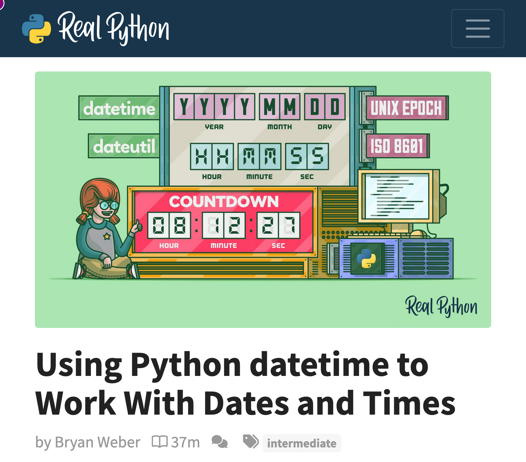
I really like this RealPython tutorial Using Python datetime to Work With Dates and Times. Give it a read!
Most of the features that exist in the Python default datetime module are also available in the pandas library.
This pandas documentation page is also a good resource.
☕ Coffee Break
![]()
After the break:
- The
groupby()method: split-apply-combine strategy - pandas Styler for presenting your data
3️⃣ Split -> Apply -> Combine
Very often, we need to calculate summary statistics for groups of data instead of for the entire dataset.
For example, you might want to calculate the average temperature for each month in a year.
The groupby() method
The pandas library provides a method called groupby() to help you do precisely this:
Before (raw data):
| date | year | temperature |
|---|---|---|
| 2021-01-15 | 2021 | 5 |
| 2021-06-15 | 2021 | 22 |
| 2022-01-15 | 2022 | 6 |
| 2022-06-15 | 2022 | 24 |
What pandas will do:
- Separate the data into groups based on the
yearcolumn. - Calculate the
meanfor the entiretemperaturecolumn for each year. - Combine the results back together into a new DataFrame 👉
After:
| year | temperature |
|---|---|
| 2021 | 13.5 |
| 2022 | 15.0 |
GroupBy Fundamentals
Basic pattern:
Common aggregation functions:
.mean()- average.median()- middle value.sum()- total.max()- maximum.min()- minimum.count()- number of items
Method Chaining for Readability
When chaining multiple operations, split them across lines:
Each operation is on its own line, making the transformation clear and debuggable. (R users might recognise this as similar to the %>% operator.)
Alternative (harder to read?):
Temporal Grouping Examples
or, say:
You can group by multiple columns
Here is an example of grouping by (year, month) combination:
4️⃣ Presenting Your Data
You just learned to produce summary tables with .groupby(). Now let’s make them readable.
From GroupBy to Presentation
Here is the yearly_stats table we produced earlier:
| year | mean | max | min | std |
|---|---|---|---|---|
| 2006 | 14.675342 | 31.5 | 0.8 | 6.764682 |
| 2007 | 14.390685 | 26.4 | 1.6 | 5.042399 |
It’s fine but it would be better if all the decimal places were aligned.
pandas Styler basics
The .style method returns a Styler object you can customise:
| year | mean | max | min | std |
|---|---|---|---|---|
| 2006 | 14.7 | 31.5 | 0.8 | 6.8 |
| 2007 | 14.4 | 26.4 | 1.6 | 5.0 |
Documentation tips:
- Read all about the
.stylemethod in the pandas documentation.
.format() for number control
You can format different columns differently. For example, you can format the mean column to show 1 decimal place and the std column to show 2 decimal places:
This doesn’t change the underlying data but just how it is displayed.
👉 Train your documentation skills by reading about these {:1f} strings in the official Python documentation.
.background_gradient() for visual patterns
The gradient highlights the column values using colour. Hotter years get warmer colours.
Can you see the warming trend now? The colour does the work.
💡 cmap stands for “colour map”. 'YlOrRd' goes from yellow (low) to red (high). Other useful maps: 'Blues', 'RdYlGn', 'coolwarm'.
👉 Train your documentation skills by reading about the cmap parameter in the matplotlib documentation.
.bar() for inline comparison
Inline bars within cells give immediate visual comparison of magnitude. You can see which years had the highest maximum temperatures at a glance.
Combining Styler methods
Chain methods together to build a complete presentation:
.set_caption() is where your narrative title goes. The caption tells the reader what the table means, not what it contains.
A note on AI and styling
Formatting tables is the kind of task that I really don’t mind if you delegate to an AI chatbot. The Styler API has dozens of options and memorising them is not a good use of your time.
What I’d recommend:
- Do the DataFrame transformation yourself (the
.groupby(), the filtering, the.reset_index()). That’s where your analytical thinking lives. - Once you have the table you want to present, ask an AI chatbot to produce the Styler code. Something like: “Style this DataFrame so the mean column has a yellow-to-red gradient and all temperatures show one decimal place.”
- Then check the output. Does the colour scale make sense for your data range? Are the column names what you expected? Does
.set_caption()say what you actually found?
Compare what the chatbot gives you against the pandas Styler documentation. AI chatbots sometimes hallucinate method names or use deprecated parameters. The docs are the ground truth.
💡 The skill here is knowing what table you want and being able to verify the result. The syntax is just plumbing.
Styler for your Mini-Project 1
Your NB03 requires two insights. You can present them as:
- 2 styled DataFrames
- 1 styled DataFrame + 1 seaborn visualisation
- 2 seaborn visualisations
You now have everything you need to produce styled DataFrame insights and tomorrow’s lab will give you the essentials of seaborn if you choose to use visualisations in your Mini-Project 1.
Looking Ahead
- Tomorrow’s lab: the essentials of seaborn (in case you want to use visualisations in your Mini-Project 1)
- You now have the tools to start NB02 and NB03 using styled DataFrames
- Seaborn is optional for MP1 but gives you more presentation options
Resources:
- 📓 Lecture notebook (downloadable)
- 💻 W05 Lab tomorrow
- 💬 Post questions in
#helpon Slack
- 📅 Attend drop-in sessions
Looking ahead: Week 06 (Reading Week) is focus time for Mini-Project 1 completion.
![]()
LSE DS105W (2025/26)