
💻 Week 10 - Class Roadmap (90 min)
2023/24 Autumn Term

In today’s class, we’ll be exploring unsupervised learning techniques and more specifically clustering (with k-means) and anomaly detection (through clustering with DBSCAN) with the help of a very simple dataset called penguins(Gorman, Williams, and Fraser 2014), which as its name suggests is a dataset that contains various features that record characteristics of three Antarctic penguin species (Adelie, Chinstrap and Gentoo).
You can download the csv version of this dataset below:
For more information on this dataset, see here
You can also download the Jupyter notebook that goes along with this class below so you can directly execute code blocks when required or type in your own code when called upon to do that:
Put the files you’ve just downloaded in the same folder and open the notebook file in either VSCode or Colab.
To work through this class roadmap, you can work in pairs or small groups.
First part: Basic setup and data exploration
- We’ll start, as usual, by loading the libraries we need for this class.
If you encounter a ModuleNotFoundError: No module found 'xyz' type of error, then open an operating system terminal (command line prompt or powershell for Windows/terminal for Linux or Mac) and try: 1. conda install xyz (xyz is the name of the missing library e.g plotnine, scikit-learn, numpy) 2. if 1 fails, conda install -c conda-forge xyz``` 3. if 2 fails,pip install xyz`
If you are using Colab, just try 3. directly in a new code block.
# Load libraries

import numpy as np
import pandas as pd
from plotnine import ggplot, aes, geom_point, geom_line, theme_bw, scale_x_continuous, scale_colour_manual, labs
from os import chdir
from sklearn.cluster import KMeans, DBSCAN- Next, let’s load our data into a dataframe. Replace
penguins.csvby the correct file path if needed…
penguins = pd.read_csv('penguins.csv')Can you print out the first fifteen rows of this dataframe?
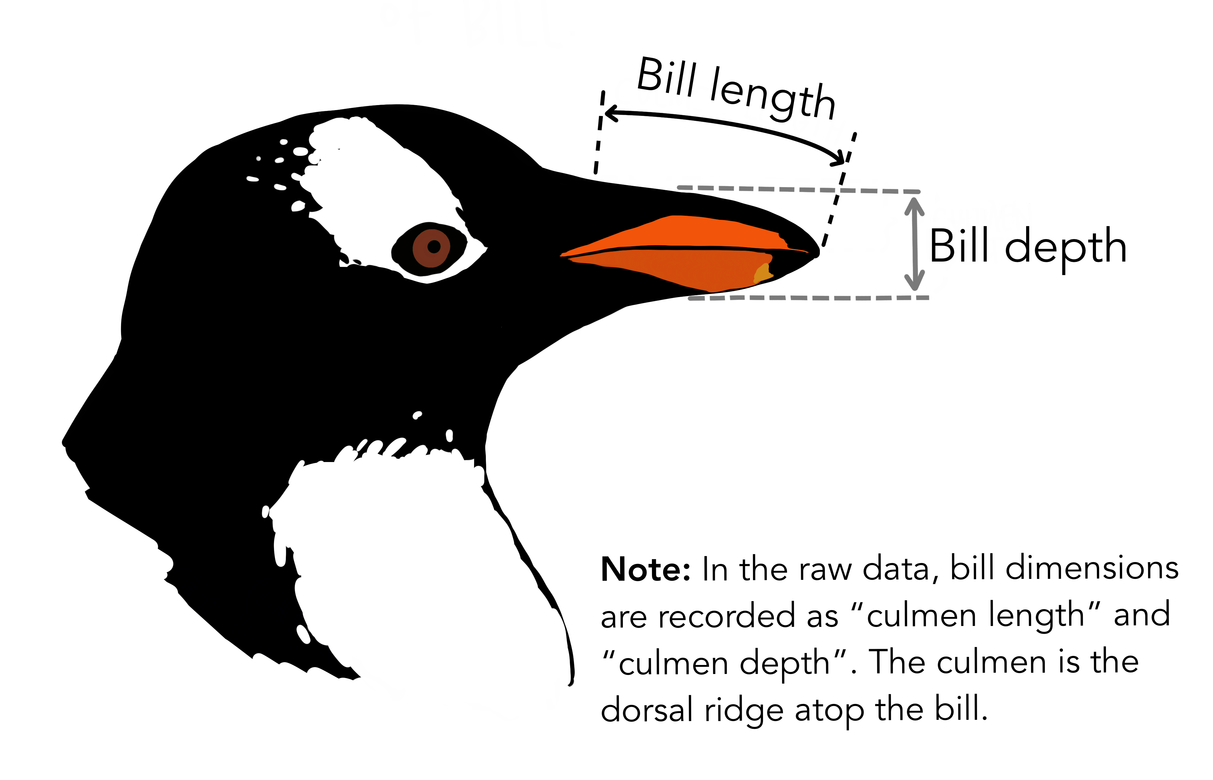
Penguin species are apparently differentiated by their bills and more specifically bill length and bill depth: you can see the image below to visualise what that corresponds to.
Let’s visualise our data set and more specifically the relationship bill length/bill depth per penguin species.
# Distinguishing between three species using bill length / depth

(ggplot(penguins, aes('bill_length_mm', 'bill_depth_mm', colour = 'species'))
 + geom_point()
 + theme_bw()
 + labs(x = 'Bill length (mm)', y = 'Bill depth (mm)', colour = 'Species'))
Can you write a piece of code to only keep the columns
bill_length_mmandbill_depth_mmin the dataframe and to remove null/missing values in the columns you kept? Call this new dataframepenguins_cleanedWe convert the newly cleaned dataframe to a numpy array format. WARNING: This piece of code can only run if
penguins_cleanedhas been defined in the previous question!
# We need to convert this subsetted data to a numpy array
# WARNING! Only run this code after you have defined `penguins_cleaned` in the previous code cell!

penguins_array = np.array(penguins_cleaned)
Second part: Data clustering with k-means
- We will use the “elbow method” to choose the number of clusters to use for the k-means algorithm.
In this method, we vary the number of clusters k, apply k-means to the data and measure what we call the within-cluster-sum-of-squares (WCSS) i.e the sum of the squared distance between each point in a cluster and the centroid of the cluster it belongs to. We then plot the WCSS against k: the optimal value of clusters (i.e the number of clusters we need to choose for k-means) corresponds to the value of k starting from which the decrease rate of the WCSS curve inflects and the graph starts to look like a straight line. For more details on the elbow method, you can have a look at this page.
The code below implements the “elbow method”:
- the function
compute_kmeans_inertiacomputes the WCSS given a datasetdatasetsplit intonb_clustersby k-means (the use ofseedmakes the results of the clustering reproducible between runs of the algorithm) - we then run the
compute_kmeans_inertiaon thepenguins_arraydataset multiple times, varying the number of clusters from 1 to 10, collecting the outputs of each run in a list calledtot_within_ssq - we then create a dictionary (
elbow_dict) that associates number of clusters (n_clusters) with WCSS (tot_within_ssq). We convert this dictionary into a dataframe (elbow_data), print it out before using it to plot the curve number of clusters versus WCSS with theggplotfunction from theplotninelibrary
def compute_kmeans_inertia(dataset,nb_clusters,seed=123):
    kmeans = KMeans(n_clusters = nb_clusters, random_state = seed)
    kmeans.fit(dataset)
    return kmeans.inertia_

tot_within_ssq = [compute_kmeans_inertia(penguins_array,i) for i in range(1,11)]
elbow_dict = {'n_clusters': range(1, 11),
              'tot_within_ssq': tot_within_ssq}

elbow_data = pd.DataFrame(elbow_dict)
elbow_data
(ggplot(elbow_data, aes('n_clusters', 'tot_within_ssq'))
+ geom_point()
+ geom_line(linetype = 'dashed')
+ theme_bw()
+ scale_x_continuous(breaks = range(1, 11))
+ labs(x = 'Number of clusters', y = 'Total within cluster sum of squares'))- How many clusters would you pick based on the curve from question 1? Fill in the value of
k(number of clusters) in the code block below before running it (i.e running k-means with your chosen number of clusters and plotting the result, with dataset points colored according to the cluster they were assigned to)
# Fill in the number of clusters you chose in the line below before running this code block
k =

#k-mean run on penguins data
kmeans = KMeans(n_clusters = k, random_state = 123)

kmeans.fit(penguins_array)

#associating each data point with its cluster label (as generated by k-means)
cluster_dict = {'bill_length_mm': penguins_array[:,0],
                'bill_depth_mm': penguins_array[:,1],
                'cluster': kmeans.labels_ + 1}

cluster_data = pd.DataFrame(cluster_dict)

#plotting data points colored according to cluster label
(ggplot(cluster_data, aes('bill_length_mm', 'bill_depth_mm', colour = 'factor(cluster)'))
 + geom_point()
 + theme_bw()
 + labs(x = 'Bill length (mm)', y = 'Bill depth (mm)', colour = 'Cluster'))
What do you think of this clustering?
Third part: Anomaly detection with DBSCAN
We know move on to experimenting with anomaly detection and we’ll try out anomaly detection by clustering with a density-based clustering algorithm called DBSCAN. If you want to read up more about DBSCAn, head here.
- For this part, we only select the Chinstrap penguin species (i.e the rows in the
penguindataframe where thespeciescolumn has value'Chinstrap') and again only select thebill_length_mmandbill_depth_mmproperties for the data points that belong to that species, while dropping all the null/missing values.
# Isolate Chinstrap penguins and include only complete data for bill length / depth
chinstraps = penguins.query("species=='Chinstrap'")[['bill_length_mm', 'bill_depth_mm']].dropna()- We visualise our reduced data
# Plot the data

(ggplot(chinstraps, aes('bill_length_mm', 'bill_depth_mm'))
 + geom_point()
 + theme_bw()
+ labs(x = 'Bill length (mm)', y = 'Bill depth (mm)'))- We convert the data (dataframe) to numpy array format
# Convert dataframe to array

chinstraps_array = np.array(chinstraps)- This time, we seek to find anomalies in the data and for that, we’ll use another (density-based) clustering algorithm called DBSCAN. (Very) roughly speaking, DBSCAN clusters together points that are “densely packed” together and a point does not belong to any cluster then it is an outlier. If you want to read up on the details of DBSCAN, check up this page.
We run DBSCAN on our data (we set the DBSCAN parameter as eps=3 i.e neighbourhood radius=3 and min_samples=10 i.e minimum number of points per neighbourhood=10)
# Initialize and fit a DBSCAN

dbscan = DBSCAN(eps = 3, min_samples = 10)

dbscan.fit(chinstraps_array)- We associate each data point with its cluster label (as defined by DBSCAN)
# Append the DBSCAN clusters to the Chinstrap variables

dbscan_dict = {'bill_length_mm': chinstraps_array[:,0],
               'bill_depth_mm': chinstraps_array[:,1],
               'cluster': dbscan.labels_ }

dbscan_data = pd.DataFrame(dbscan_dict)- We create a column
anomalyin ourdbscan_datadataframe to label data points as anomalous or not:
- if the cluster label of the data point (i.e the value of the
clustercolumn) is -1, then the data point is an anomaly and so the value of theanomalycolum is set toYes - otherwise the data point is not an anomaly and the value of the
anomalycolum is set toNo
dbscan_data['anomaly'] = np.where(dbscan_data['cluster'] == -1, 'Yes', 'No')- We plot the data, coloring anomalous data points in red and other points in grey.
# Let's plot the data!

(ggplot(dbscan_data, aes('bill_length_mm', 'bill_depth_mm', colour = 'anomaly'))
 + geom_point()
 + theme_bw()
 + scale_colour_manual(values = ['grey', 'red'])
+ labs(x = 'Bill length (mm)', y = 'Bill depth (mm)', colour = 'Anomaly?'))- Can you try and vary the parameters of the DBSCAN algorithm in the code block below and check the effect of the change?
Hint: Change one parameter at a time e.g e while keeping m constant and vice-versa, start with the values of e and m we used previously i.e 3 and 10 respectively and decrease these values
e =
m =
dbscan = DBSCAN(eps = e, min_samples = m)

dbscan.fit(chinstraps_array)
# Append the DBSCAN clusters to the Chinstrap variables

dbscan_dict = {'bill_length_mm': chinstraps_array[:,0],
               'bill_depth_mm': chinstraps_array[:,1],
               'cluster': dbscan.labels_ }

dbscan_data = pd.DataFrame(dbscan_dict)
dbscan_data['anomaly'] = np.where(dbscan_data['cluster'] == -1, 'Yes', 'No')
# Let's plot the data!

(ggplot(dbscan_data, aes('bill_length_mm', 'bill_depth_mm', colour = 'anomaly'))
 + geom_point()
 + theme_bw()
 + scale_colour_manual(values = ['grey', 'red'])
 + labs(x = 'Bill length (mm)', y = 'Bill depth (mm)', colour = 'Anomaly?'))
🎬 ** THE END**
⛏️Dig deeper: In this class, we evaluated our clustering visually. But how would we evaluate our clustering outputs more systematically? Have a look here or here or if you want even more technical details, pore over the scikit-learn documentation page.