Demos and Recipes LSE ME204 · Data Engineering Principles for the Social Sciences
🖥️ Week 03 Day 03 Lecture
Dashboards, Responsible Reporting, and Quarto

☕ Coffee Break
11:00 – 11:15

When we come back:
- Two published data reports and how each one is put together
- Whether a chart still makes its finding clear on its own
- In-class demo: building and rendering a Quarto page
The Data Science Workflow
Let’s see how the final project maps to this diagram.
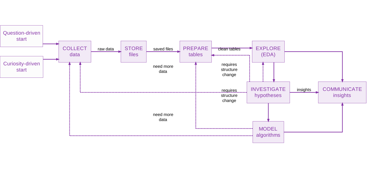
Data science workflow from collecting and storing data through preparation, exploration, investigation, modelling, and communication.
Smaller towns, better results
Read the headings in order and you have the whole story.
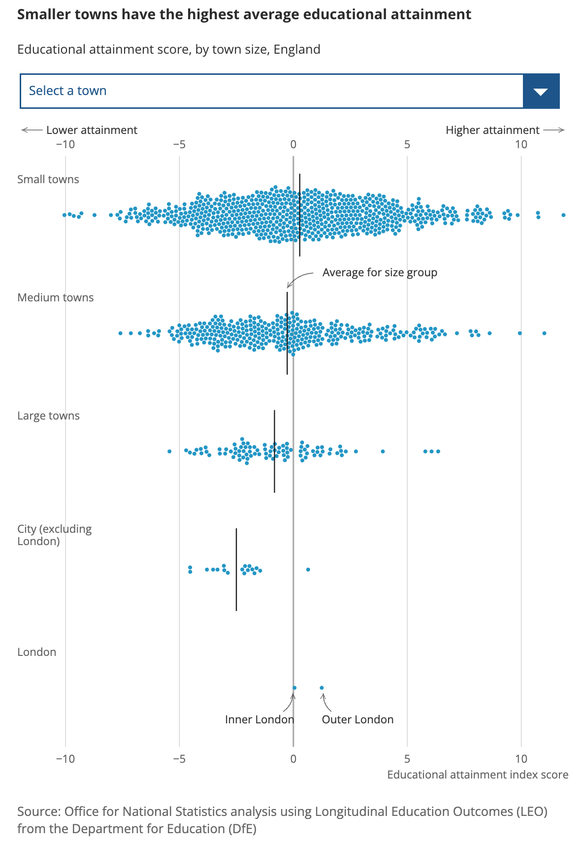
The article’s six section headings, in order:
- Smaller towns have better attainment
- Educational outcomes are worse in income deprived towns
- The relationship between attainment and income deprivation differs between English regions
- The gap in attainment between pupils in high and low deprivation towns widens through school
- Around a third of young people from towns of all sizes enter higher education
- Young people see better education outcomes if the local community in their town are highly qualified
🔗 Why do children and young people in smaller towns do better academically? (ONS, July 2023)
Eight AI search engines, all bad at it
The findings are in the headings again. What differs is where the method goes.
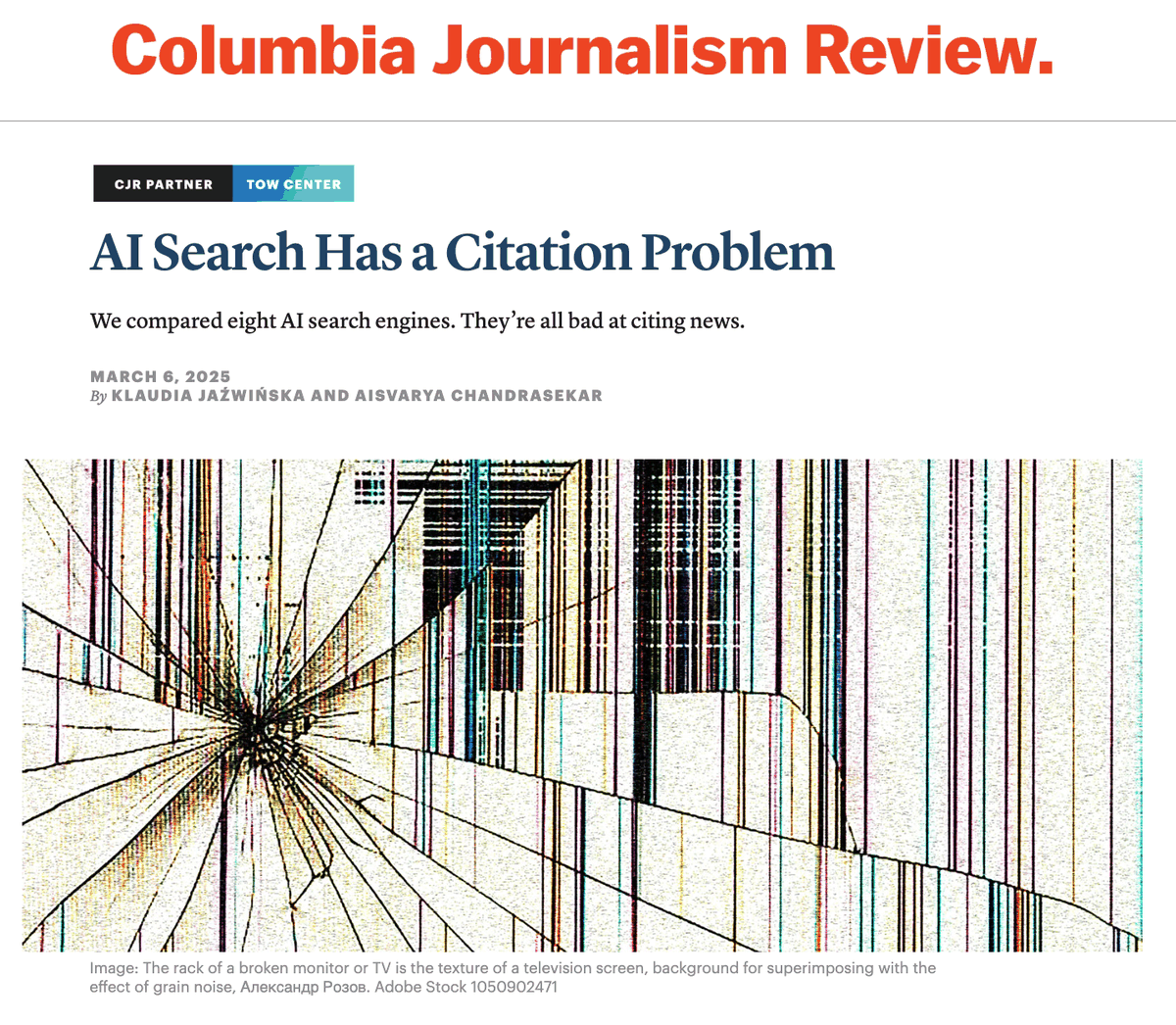
The article’s section headings, in order:
- Methodology
- Chatbots’ responses to our queries were often confidently wrong
- Premium models provided more confidently incorrect answers than their free counterparts
- Platforms retrieved information from publishers that had intentionally blocked their crawlers
- Platforms often failed to link back to the original source
- The presence of licensing deals didn’t mean publishers were cited more accurately
- Conclusion, then Limitations of our experiment
🔗 We compared eight AI search engines. They’re all bad at citing news. (Columbia Journalism Review, March 2025)
Would this chart survive on its own?
The same chart, with the article taken away.
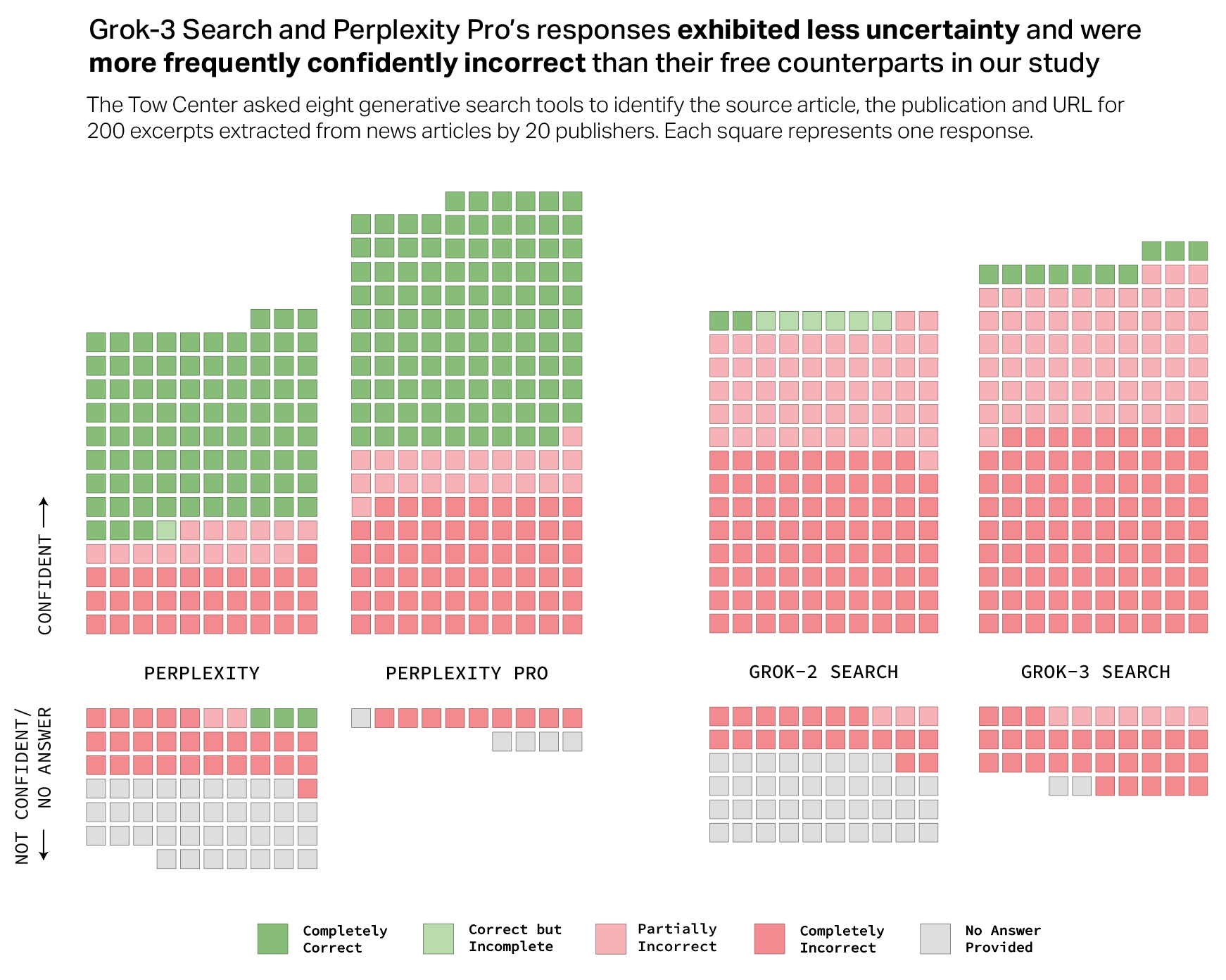
If you write a big report, there is a good chance you will want to reuse your main figures elsewhere: in a slide deck, or in an email making the same point more concisely to someone else. It is a good idea, then, to make sure your chart works as a standalone piece, so it still states its finding once the surrounding writing is gone.
⚠️ A title naming the variables tells a reader what they are looking at. A title naming the finding tells them what you found.
2️⃣ Two lines moving together is not a finding
11:50 – 12:00
We saw this chart on 🖥️ W02D01, in the bad plot hunt.
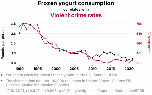
A chart like this is already making a claim. Two lines, one axis each, scaled until they move together.
Adding “of course this is only a correlation” underneath does not undo it. You still chose these two variables, put them on one chart, and gave it space in your report. You are still leading your reader to believe one causes the other.
⚠️ The hedge does not save you. If you cannot defend the causal claim, do not put up the chart that makes it.
3️⃣ Publishing Your Story
12:00 – 12:50
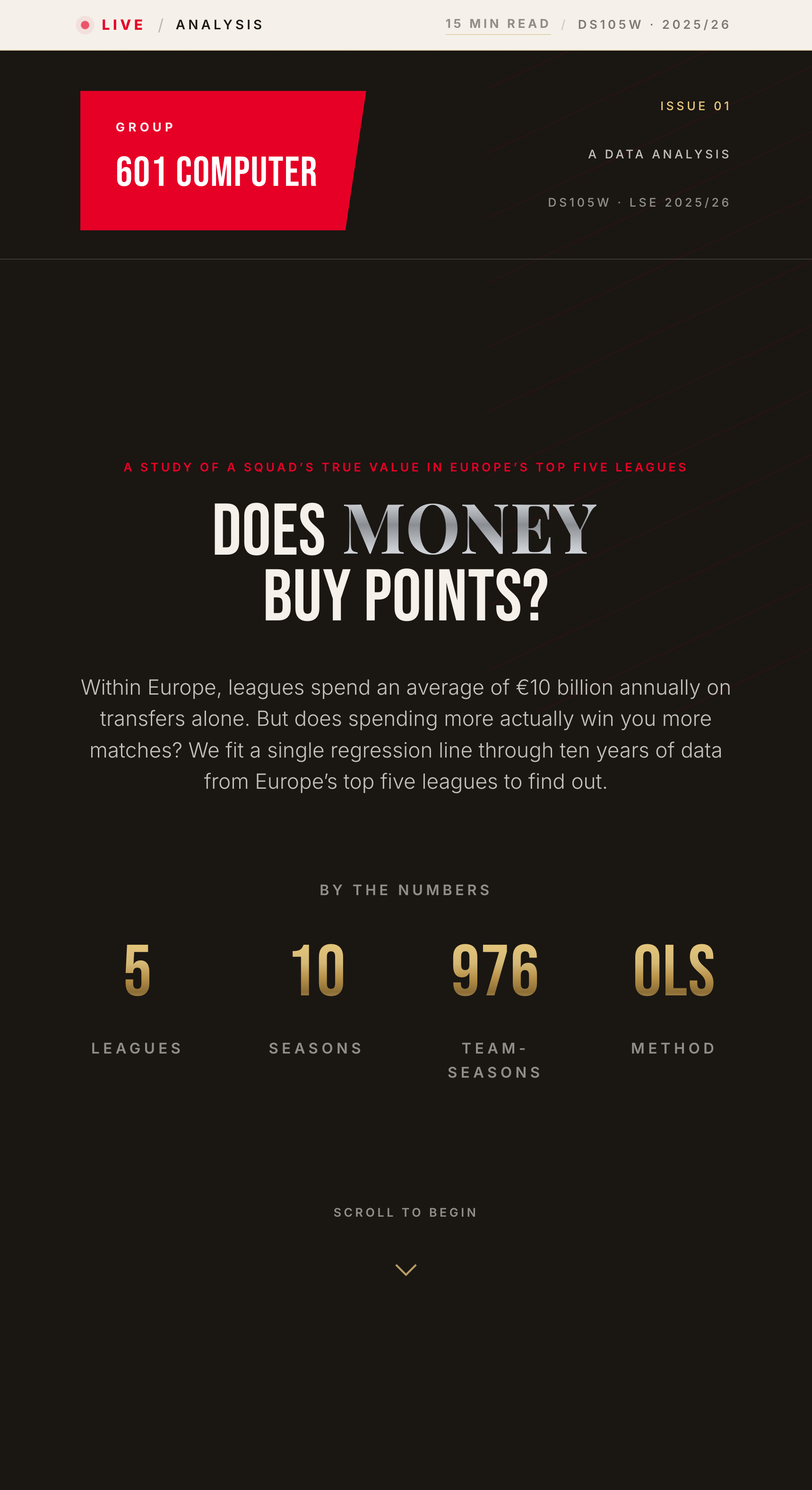
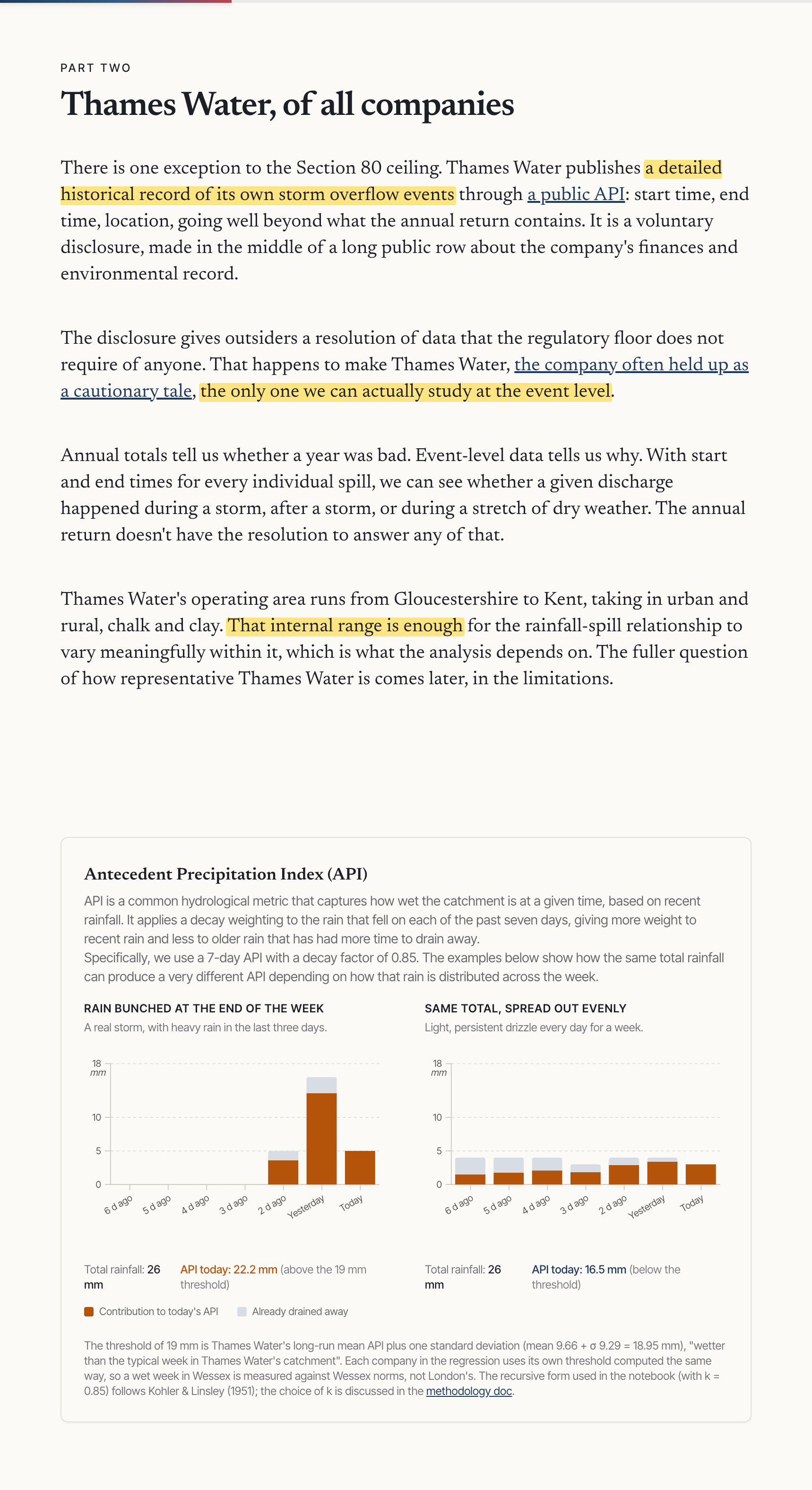
Two group projects from DS105, our sister course. Both teams communicated their findings so well that you can follow everything they did without ever opening their notebooks.
The football one is a Quarto page rendered into docs/. The sewage one uses a JavaScript framework we never teach.
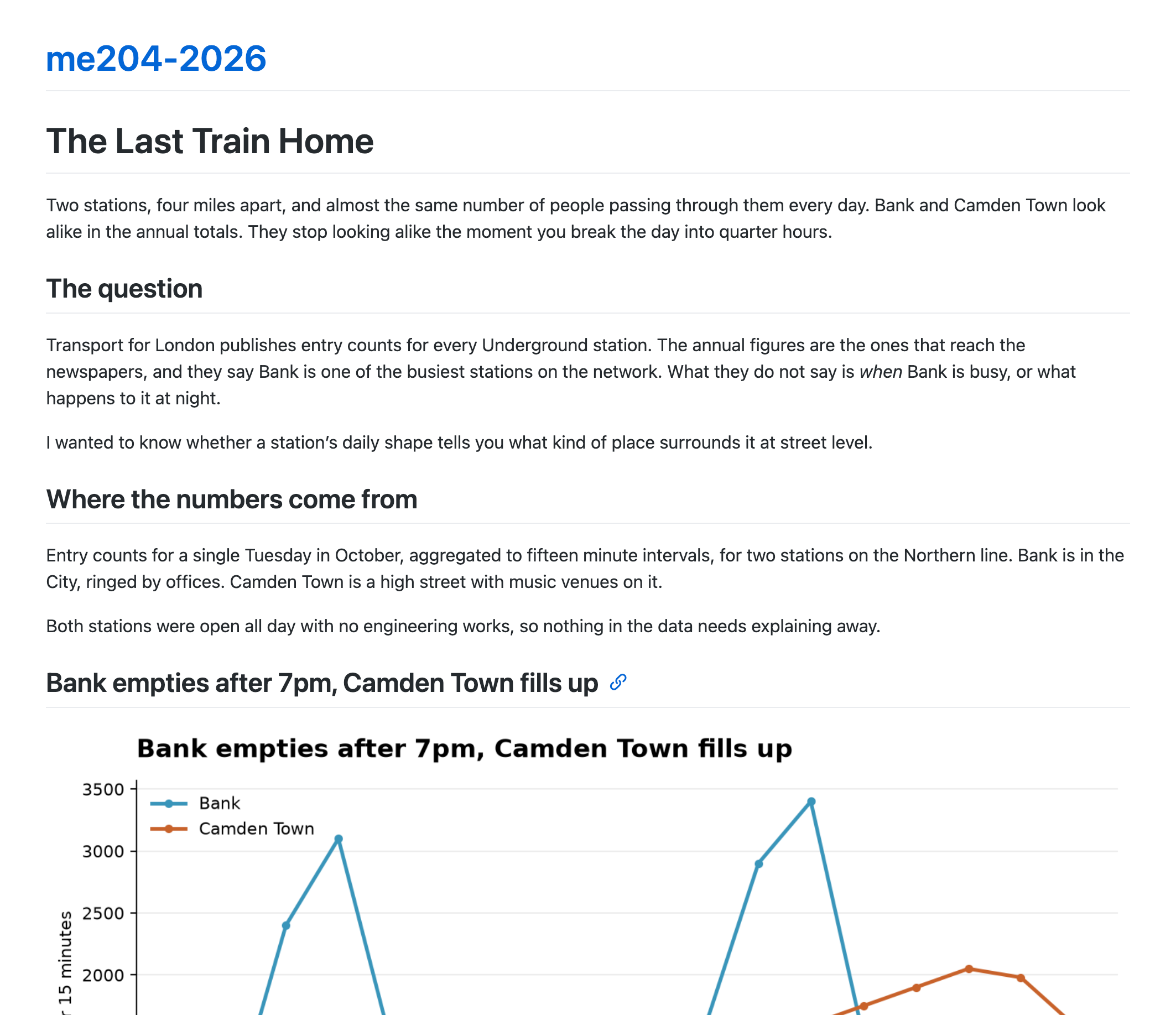
Write in Markdown → see it as HTML
Anything you put in docs/index.md comes back as a web page.
- You set a repository up this way in 🖥️ W02D03. GitHub finds the Markdown in
docs/, converts it, and serves the result. - Nothing to install, and no command to run.
- The page on the right is one
.mdfile: a title, three headings, a paragraph each, and one image. - It looks like that because you never told GitHub how it should look. Every page published this way looks the same.
🔗 GitHub Pages documentation, and the quickstart if you want to set up a second site from scratch.
Choosing the theme
Change the theme line in _config.yml to see your website with a different look.
theme: jekyll-theme-minimal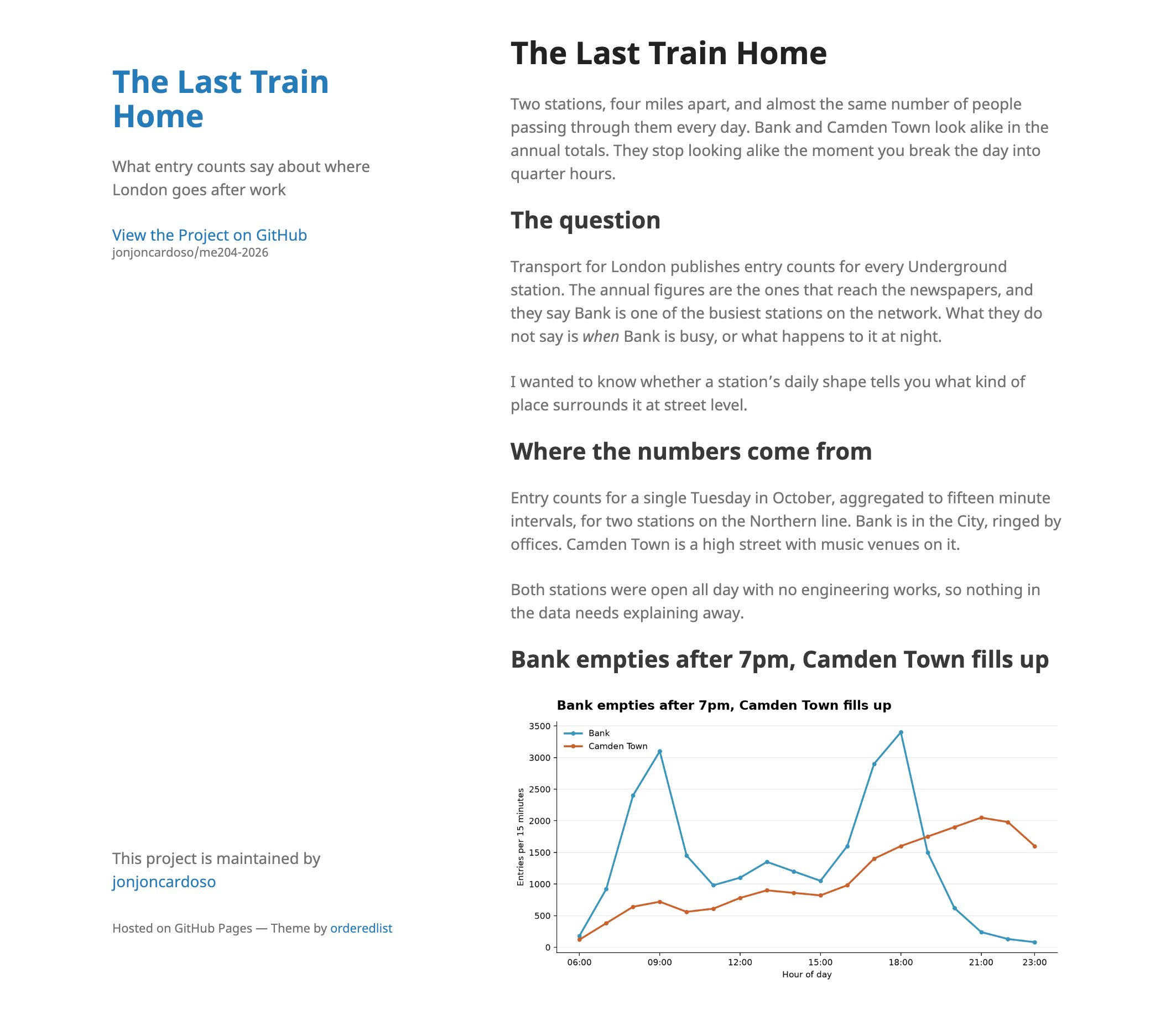
theme: jekyll-theme-hacker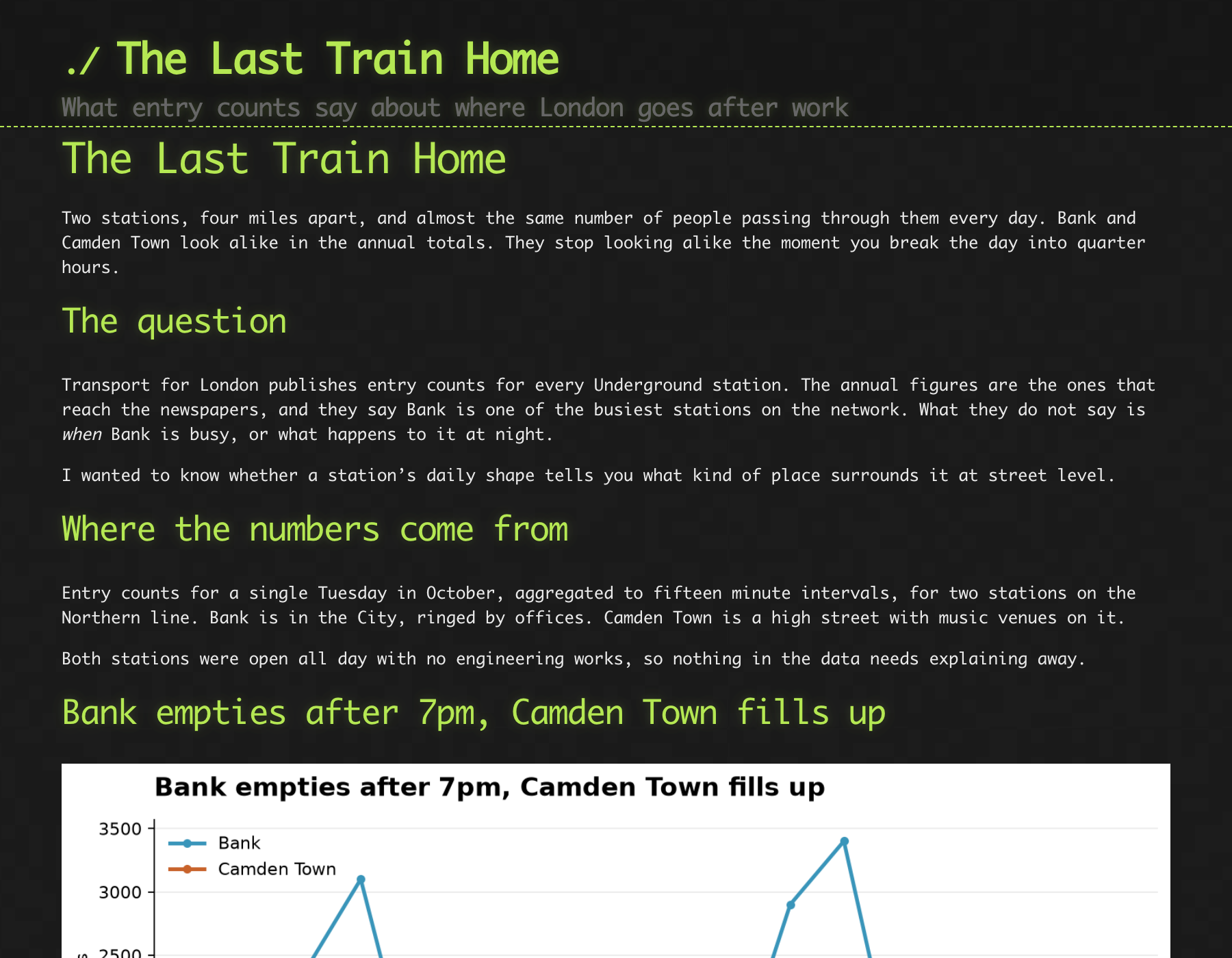
⚠️ This is a fully vibecoded website. Do not take the content, or the sloppy writing, seriously.
🔗 You can find all the default themes here, and the Jekyll docs explain what else you can change.
Asking an LLM for the HTML
Keep writing in Markdown. Hand that to the chatbot and ask for the HTML at the end.
- Write your content and section order in a
.mdfile, and keep it as your reference. - Rearrange the structure with the chatbot before you ask for any HTML.
- Ask for one column, one accent colour, and heading sizes you chose yourself.
- Keep charts and images in
docs/assets/, and have the HTML point at them. - Find your own numbers in the finished file, and delete anything you cannot trace to your data.
Gemini, ChatGPT, and Claude will all do this. What you ask for matters more than which one you pick.
Write Markdown, choose how it looks
You write Markdown and set the look yourself.
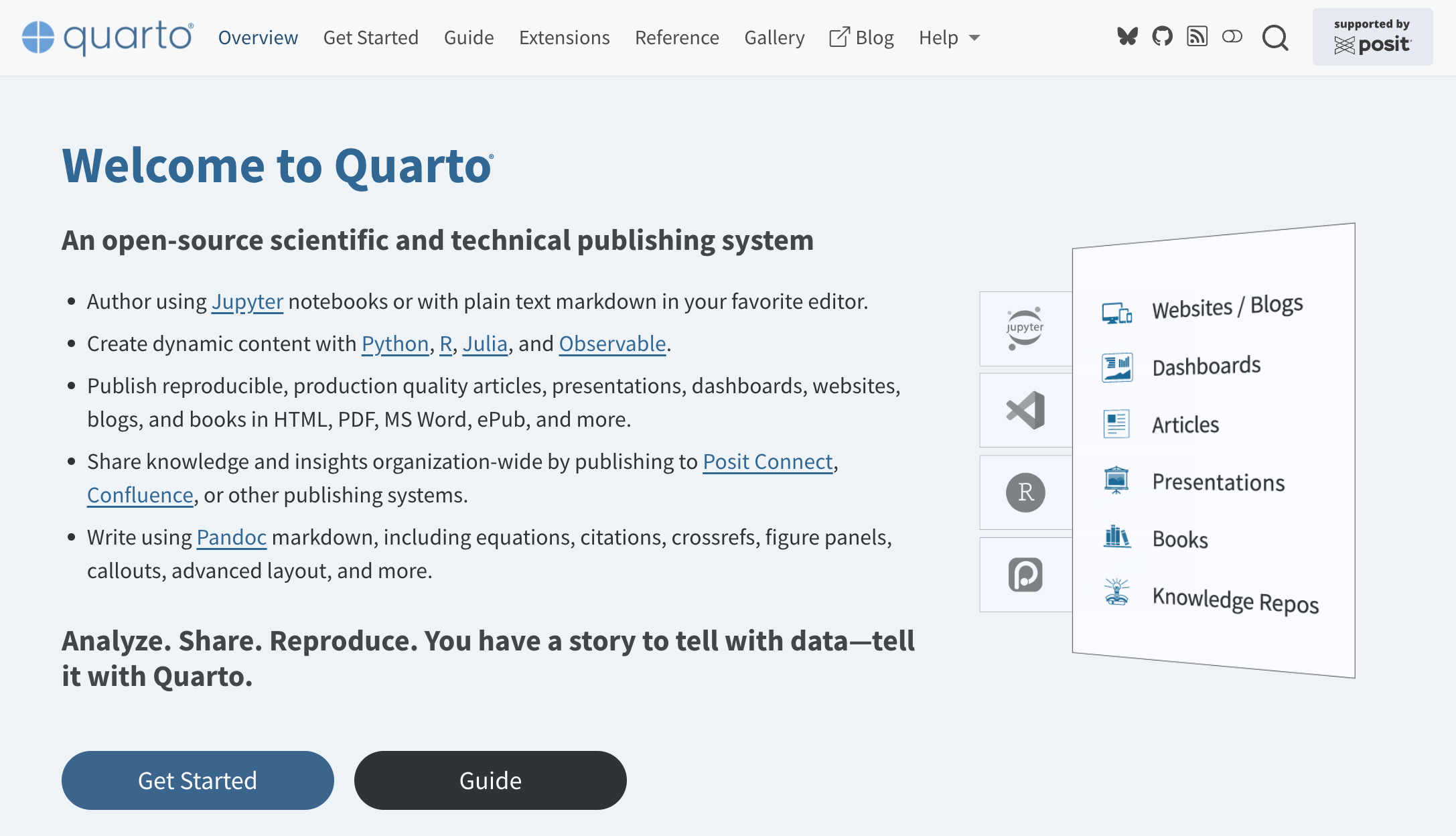
- Every lecture page, every lab page, and every slide deck on this course site is a
.qmdfile, including the one on screen now. - You write one source file and render it as a website, a slide deck, a PDF, or a Word document.
- A
.qmdfile can contain Python code as well as text. Quarto runs that code on your machine when you render, then puts the chart into the page it builds. - If you code in R, you have probably used Quarto already. Quarto Markdown replaced R Markdown as the standard way to write reproducible reports in R, and it does the same job for Python.
We will build one of these together in a moment, starting from a blank file.
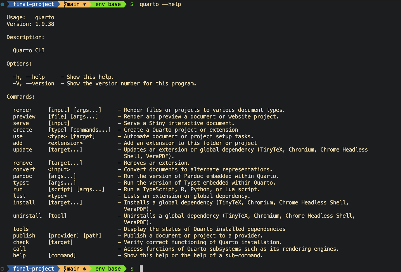
quarto --help
Open a terminal on Nuvolos and type this.
quarto --helpQuarto is already installed on the workspace. Nothing to set up.
Two of these commands are the ones you will use today: render and publish.
Building docs/index.qmd
The top of the file:
---
title: "My ME204 Final Project"
format:
  html:
    toc: true
    embed-resources: true
---
Then in the terminal:
quarto render docs/index.qmd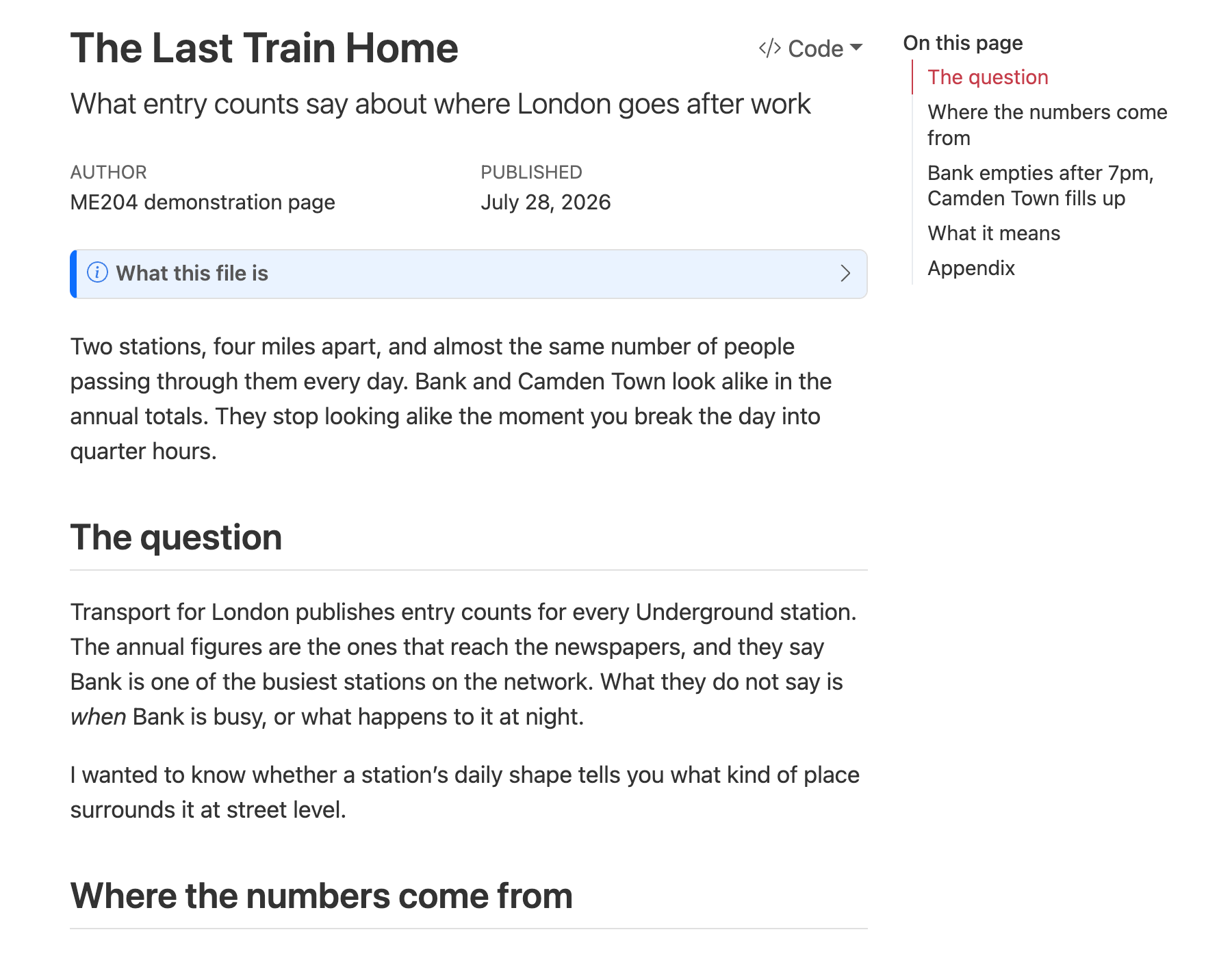
The top of the page.
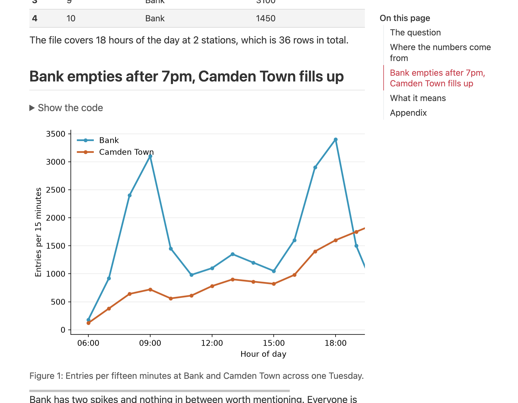
Scroll down and the chart is there, drawn by the code in the file.
Rendering from inside VS Code
The same render, from a button in the editor.
Open the Extensions panel, search for Quarto, and select Install. Same panel you used for SQLite Viewer in 💻 W03D02.
You get a Render button and a preview pane beside the file. Make a small edit and see the result without switching to the terminal.
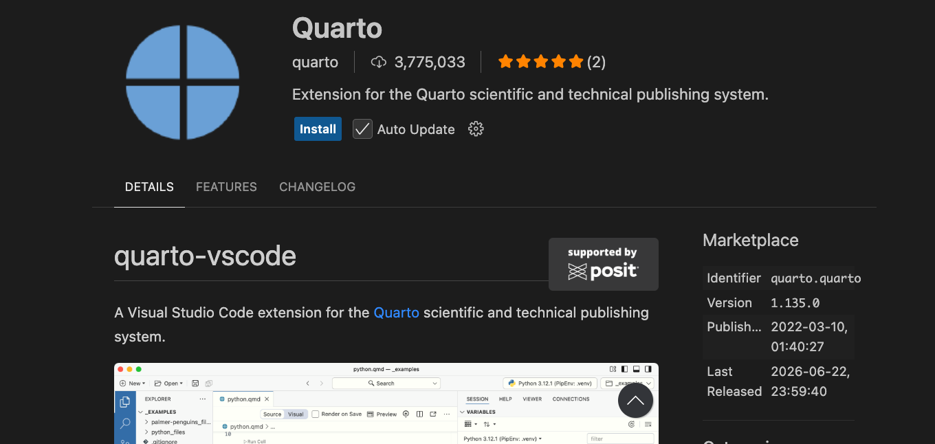
The one you want is published by Quarto, identifier quarto.quarto.
🏁 Thanks!
12:50 – 13:00
This afternoon
Pick the route your own project will take. Markdown in docs/ with a Jekyll theme, one HTML file from a chatbot, or a Quarto page you render yourself.
Then work on your charts and your website, with your class teacher there to help you.
💻 Start by writing down which route you picked and why. Your class teacher will ask you.
Where you want to be by tonight
- One route chosen, and a page that renders or publishes, even if the writing is still rough.
- Your charts in
docs/assets/ordocs/figures/, and the page pointing at them. - Every chart title stating the finding a reader should take from it.
- Any claim about why a pattern appears either sourced or written as something you could not separate.

LSE Summer School 2026 | ME204 Week 03 Day 03