Ten minutes for midterm questions. Longer support returns at 12:40.
Midterm building blocks
🌍 Cities Fair coastal versus inland comparison
Choose three or four cities and explain what they share
🔑 OpenWeather key Your account, your requests
Sign up, open the API keys page, store the key in .env
📡 Path A or Path B Same research question, same marking rubric
Path A: historical data; needs a card on file with OpenWeather
Path B: free forecast endpoint; no card required
🌙 Nighttime cooling Define the measure, then compute it
Decide which hours count as night for your cities
📓 Notebooks or scripts Collect, transform, analyse
NB01–NB03, or the matching .py scripts route in the brief
🖼️ Insight in the README State the finding up front
A chart, or a styled pandas DataFrame, embedded in the README
1️⃣ Charts Worth Looking At
10:10 – 11:25
Essential chart types, common mistakes, and a first look at plotly for this course. A chart can be technically correct and still mislead, hide the data, or make the wrong comparison easy. We build first, then look at ways charts go wrong.
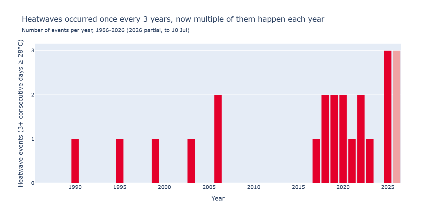
Continuity: London heatwaves
Let’s see how I wrote the code for this plot I showed you last week.
Data source: Open-Meteo Historical Weather API (ERA5). Definition: 3+ consecutive days at or above 28°C (Met Office London threshold). Period: 1986 to 10 Jul 2026.
How plotly maps a DataFrame to a chart
In the course this year we want you to use plotly exclusively for your charts. Each argument names a column in the table.
Same fig = px.bar(...) call as before. Then adjust the labels with update_layout, and thin out the year ticks:
fig.update_layout( title=dict( text="London heatwave events rose after 2000", subtitle=dict(text="Events per year, 1986-2026 (Met Office threshold)"), ), xaxis_title="Year", yaxis_title="Number of heatwave events",)fig.update_xaxes(dtick=5) # a tick label every 5 yearsfig.show()
Customise the colours
Same call again. Name an exact colour for each category so the palette matches the rest of your report:
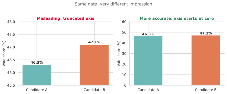
On the left, the y-axis starts near the values, so a gap of one percentage point looks huge. On the right, the axis starts at zero, so you see the true scale.
Rule of thumb: bar charts that show counts or proportions should start at zero. If you zoom a line chart, say why in a note on the figure.
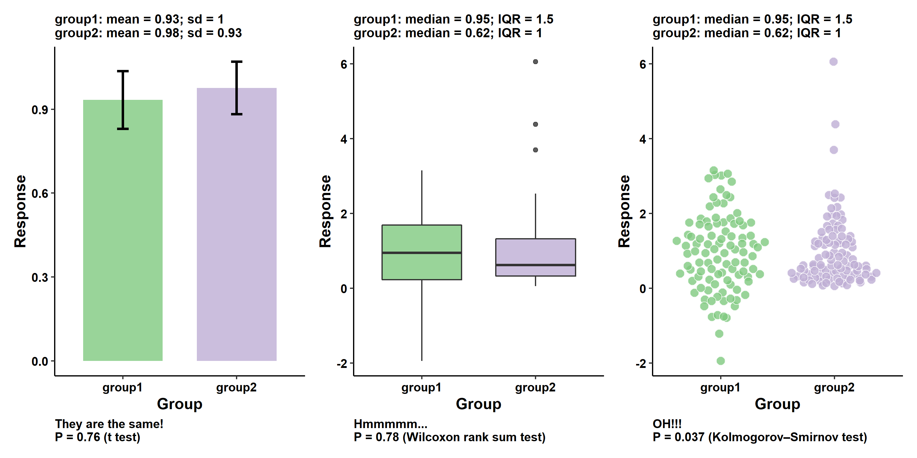
Sure, this type of chart has a place, and I can see why it gets used in certain situations. But I find them very misleading. It is easy to rush and jump to conclusions that aren’t warranted.
💬 Bad plot hunt (Moodle)
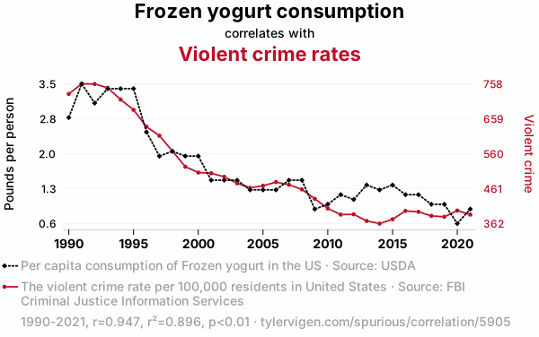
About five minutes. On your phone or laptop, find a chart in the wild that is misleading, confusing, or hard to read (news, reports, papers, social posts).
The call declares which columns to use. The DataFrame holds the data.
We prefer the declarative form:
Name columns in the call. Do not paste parallel lists into x and y.
Keep the DataFrame as the thing you curate: store and reload tables first, then shape tables for analysis and plotting.
Many AI tools default to the list style. Send them back to column names.
Think in columns before you plot
For scatter, line, or bar, the habit is the same: one column for each thing you want on the chart, then name those columns in the call. The tables below are made up, and the titles are just placeholders.
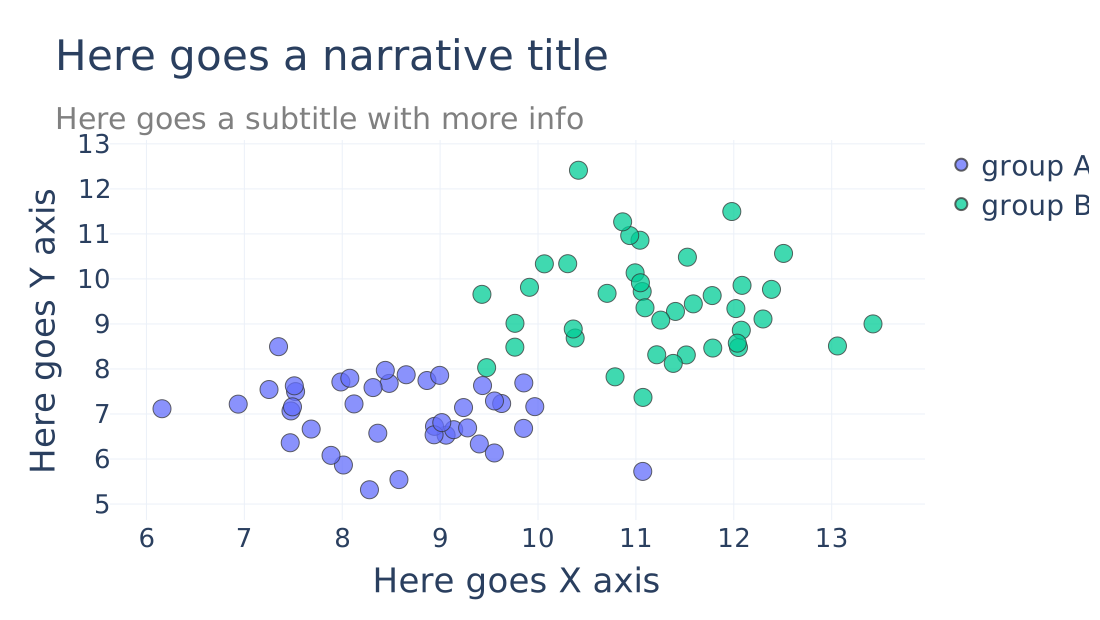
Scatter: two numerics (+ colour)
x_val
y_val
group
8.1
6.4
group A
9.4
7.9
group A
11.2
9.1
group B
12.0
8.5
group B
fig = px.scatter( df, x="x_val", y="y_val", color="group", title="Here goes a narrative title", subtitle="Here goes a subtitle with more info",)fig.update_layout( xaxis_title="Here goes X axis", yaxis_title="Here goes Y axis",)fig.show()
Line: ordered x, numeric y (+ series)
month
value
series
1
12.0
series A
2
13.5
series A
1
9.0
series B
2
8.7
series B
fig = px.line( df, x="month", y="value", color="series", markers=True, title="Here goes a narrative title", subtitle="Here goes a subtitle with more info",)fig.update_layout( xaxis_title="Here goes X axis", yaxis_title="Here goes Y axis",)fig.show()
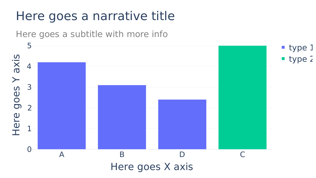
Bar: category and height (+ colour)
category
count
bucket
A
4.2
type 1
B
3.1
type 1
C
5.0
type 2
D
2.4
type 1
fig = px.bar( df, x="category", y="count", color="bucket", title="Here goes a narrative title", subtitle="Here goes a subtitle with more info",)fig.update_layout( xaxis_title="Here goes X axis", yaxis_title="Here goes Y axis",)fig.show()
Shape the table, then plot
Get the DataFrame into the shape the chart expects before you call plotly.express.
Daily rows
date
tmax_c
heatwave_day
2003-08-04
30.1
True
2003-08-05
31.0
True
2003-08-06
29.4
True
2003-08-07
24.2
False
…
…
…
Useful for defining events. Not the table for a yearly bar chart.
Same collapse as the previous slide. .agg names the output column, and the tuple names which column to summarise, so you do not need ["heatwave_day"] first or a separate .rename.
Tell the model that plots must use plotly.express with a DataFrame, naming columns in the call (not parallel lists in x and y)
Prefer: “I have a dataframe like this […]. I want a plot that […].”
Prefer: “I have this chart, but I don’t like [x, y, z]. Help me tweak while aligning to the rules I previously specified.”
Paste a small head of the DataFrame (column names and two rows), not a vague description of the file
If the model returns lists in x and y, reject the snippet and ask again for a DataFrame with column names in the call
Titles that state a finding
A title should state the takeaway, not only the variable names.
Weak: "Heatwave events by year"
Stronger: "London heatwave events rose after 2000 (1986–2026, Met Office threshold)"
A styled DataFrame counts as a plot
If your midterm insight is a styled pandas table rather than a chart, treat that table like a figure. Use Styler.set_caption() for a title and subtitle that state the finding before the numbers.
caption = ("<b>Coastal cities cool faster at night</b><br>""<span style='font-size:0.85em;font-weight:400'>""Mean overnight drop (°C), four cities""</span>")( summary_df.style .format({"cooling_rate": "{:.1f}"}) .background_gradient( subset=["cooling_rate"], cmap="Blues", ) .set_caption(caption))
Coastal cities cool faster at night Mean overnight drop (°C), four cities
city
coastal
cooling_rate
Brighton
yes
4.2
Bournemouth
yes
3.8
Reading
no
2.1
Oxford
no
1.9
Save a screenshot or export of the styled table into figures/ and embed it in the README the same way you would embed a chart.
3️⃣ Midterm Support
12:40 – 13:00
Open work and questions. Use the time for problems that are blocking you, not for new lecture content.
Topics people often ask about
Cities and fair comparison
OpenWeather signup, API key, and the first request
What belongs in the collection step versus later notebooks or scripts
Chart and styled-table practice continues in the afternoon lab