Week 09
📊 Exploratory Data Analysis & Data Visualisation

DS105W – Data for Data Science

🗓️ 19 Mar 2026

Hour 1: 📊 Exploratory Data Analysis

Last week you learned four tools to reshape and merge your MP2 data.

This week: how to understand that data before drawing conclusions.

Why you can’t just look at the numbers

In 1973, statistician Francis Anscombe created four datasets that have nearly identical summary statistics:

Statistic Dataset I Dataset II Dataset III Dataset IV
Mean of x 9.0 9.0 9.0 9.0
Mean of y 7.50 7.50 7.50 7.50
Std dev of y 2.03 2.03 2.03 2.03
Correlation 0.816 0.816 0.816 0.816

All of these datasets have the same mean, same standard deviation, and same correlation. At this point, you would expect these datasets to look similar but they don’t.

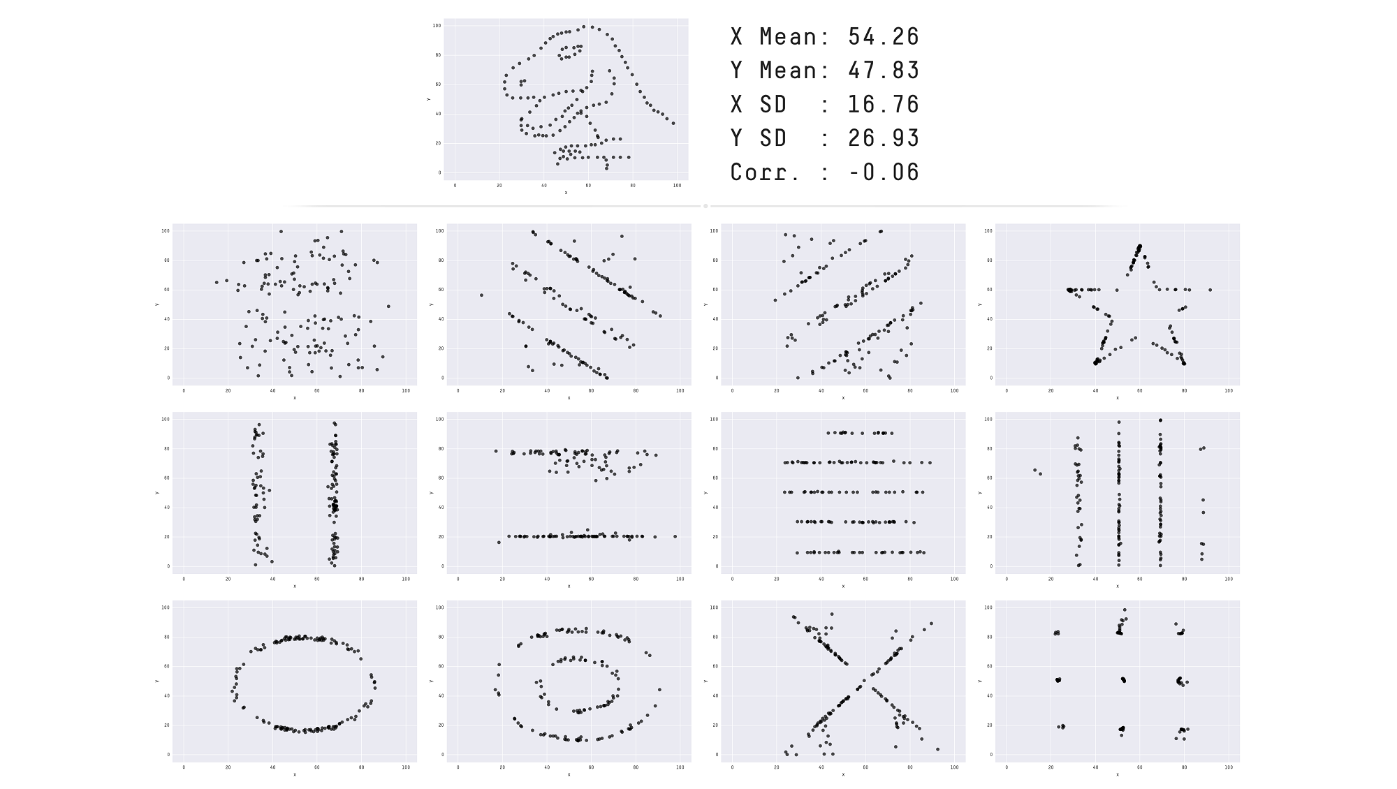
The Datasaurus Dozen: same stats, very different shapes

Matejka & Fitzmaurice (2017) pushed this idea to its extreme.

All 13 datasets have the same summary statistics to two decimal places:

  • x mean = 54.26
  • y mean = 47.83
  • x SD = 16.76
  • y SD = 26.93
  • Pearson’s R = −0.06

When you plot them, they look completely different.

Lesson: .describe() is where you start, not where you stop. Always visualise your data.

Today’s EDA dataset: IMDb

Let me show you one particular dataset that could help me illustrate some of these concepts.

I will use data from the Internet Movie Database (IMDb), which is a popular online database of movies, TV shows, and the people involved in making them.

The data is spread across multiple tables, just like your MP2 data is spread across TfL journey files and the ONS Postcode Directory:

Table What a row describes
title_basics One title (movie, series, episode)
title_ratings One title’s average rating and vote count
title_principals One person’s role in one title
name_basics One person (director, actor, etc.)

How the IMDb tables connect

Tables are connected by shared columns (we also call them keys), the same principle as last week’s pd.merge().

tconst appears in both title_basics and title_ratings, just like postcodes appear in both your TfL data and the ONS directory.

# Same pattern as your MP2 merge!
df_movies = pd.merge(
    df_title_basics,
    df_title_ratings,
    on="tconst"    # shared key
)

title_basics:

tconst primaryTitle titleType
tt0111161 The Shawshank Redemption movie
tt0068646 The Godfather movie

title_ratings:

tconst averageRating numVotes
tt0111161 9.3 3120155
tt0068646 9.2 2175958

Connected by tconst → one merge gives you titles + ratings.

🔮 Coming in 🖥️ W10 Lecture: You’ll learn how to do this same merge using the SQL language (JOIN) inside a database, rather than in pandas

1. Always check if your data is complete

# Quick and dirty way to check all columns at once
df_title_basics.notna().sum() / len(df_title_basics) * 100

Result:

tconst             100.000000
title_type         100.000000
primary_title       99.999809
original_title      99.999809
is_adult           100.000000
start_year          88.028503
end_year             1.238095
runtime_minutes     35.460020
genres              95.623222
dtype: float64

That is

  • 100% of the lines have a tconst, title_type, and is_adult
  • But only 1.24% has an end_year
  • Weirdly, only 88% has a start_year?!

1.1 Investigate which rows are missing data

Run a follow-up check:

df_title_basics[df_title_basics['start_year'].isna()].head(n=10)

Then check which rows are missing data, and why.

  • Is this a data collection failure? → try to fix it → document if unable to

  • Is it just how the data is structured? → acknowledge how it might impact your analysis

  • Don’t try to ‘impute’ missing data. It’s too advanced for this course.

1.2 Check if missingness is systematic

Sometimes missing data is the insight. Check whether missingness is systematic, meaning it appears more often for certain categories.
Table 1. How complete is table title_basics? (breakdown per field and title_type)
  start_year end_year runtime genres total
title_type          
tvPilot 100.00 % 0.00 % 0.00 % 0.00 % 1
tvShort 99.07 % 0.00 % 87.65 % 100.00 % 10,810
videoGame 97.43 % 0.00 % 1.06 % 85.28 % 45,838
tvSpecial 99.26 % 0.00 % 48.10 % 87.25 % 55,604
tvMiniSeries 93.26 % 57.00 % 35.06 % 95.24 % 66,293
tvMovie 97.20 % 0.00 % 68.70 % 91.24 % 152,979
tvSeries 91.65 % 38.40 % 37.36 % 92.06 % 290,570
video 99.42 % 0.00 % 68.01 % 97.35 % 318,364
movie 85.22 % 0.00 % 63.15 % 89.41 % 731,704
short 96.10 % 0.00 % 64.11 % 100.00 % 1,094,537
tvEpisode 86.48 % 0.00 % 28.22 % 95.82 % 9,296,511

Code recipe: completeness table

Step 1: Define a helper function that computes completeness percentages per group:

def count_completeness(group):
    total = len(group)
    return pd.Series({
        'total': total,
        'start_year': group['start_year'].notna().sum() / total * 100,
        'end_year': group['end_year'].notna().sum() / total * 100,
        'runtime': group['runtime_minutes'].notna().sum() / total * 100,
        'genres': group['genres'].notna().sum() / total * 100
    })

Step 2: Apply it to each title_type group and style with bars:

plot_df = (
    df_title_basics.groupby('title_type')
    .apply(count_completeness)[['start_year', 'end_year', 'runtime', 'genres', 'total']]
)

(plot_df.sort_values('total')
 .style
 .bar(vmin=0, vmax=100, height=100, width=100, 
      props="border: 1px solid #212121;",
      subset=['start_year', 'end_year', 'runtime', 'genres'])
 .format('{:,.2f} %', subset=['start_year', 'end_year', 'runtime', 'genres'])
 .format('{:,.0f}', subset=['total'])
 .set_caption('Table 1. How complete is table title_basics?'))

What does this tell us?

Look at the end_year column:

  • Only tvSeries and tvMiniSeries have end years. All other types show 0%.
  • The missingness is structural: only multi-episode content have an end year.

Now look at runtime:

  • tvEpisode has only 28% runtime data. videoGame has only 1%.
  • Video games don’t have runtimes. This missingness is also systematic and not random.

For your ✍️ Mini-Project 2: If, say, some routes or time bands have more missing journey legs than others, that might be the insight.

2. Check the distribution

I have this table of all directors listed on IMDb:

  • In total I have n = 266 466 directors
  • Two numeric columns per director:
    • total_movies: how many movies they directed overall in their entire career
    • top1000_movies: how many of those fall in the top 1000 most popular and highly-rated movies

How could I make sense of the distribution of these two columns?

plot_df.head(10)

primary_name total_movies top1000_movies
Akira Kurosawa 31 13
Ingmar Bergman 41 10
Alfred Hitchcock 57 9
Martin Scorsese 53 9
Quentin Tarantino 15 9
Christopher Nolan 14 9
Stanley Kubrick 13 9
Ertem Egilmez 44 8
Steven Spielberg 37 8
Billy Wilder 26 8

2.1 How to get a sense of the distribution

You can use describe():

plot_df['total_movies'].describe()

Which produces:

count    266466.000000
mean          2.662099
std           5.968662
min           1.000000
25%           1.000000
50%           1.000000
75%           2.000000
max         438.000000
Name: total_movies, dtype: float64

How to read this output?

  • count is the total number of directors
  • mean is the statistical mean number of movies directed
  • std is the standard deviation of the number of movies directed
  • min is the minimum number of movies directed
  • 25% is the 25th percentile of the number of movies directed
  • 50% is the median number of movies directed
  • 75% is the 75th percentile of the number of movies directed
  • max is the maximum number of movies directed

2.2 How to get a visual sense of the distribution

Histogram approach:

A histogram allows you to see the full distribution of the data.

In this case, the distribution is heavily skewed.

For NB03 exploratory plots, you don’t need a polished title yet.

  • When you are just exploring your data in your NB03, it’s alright to just plot the histogram without a title for your own observations.
  • 💡 If you think this is worth adding to your REPORT.md, then add a narrative title to your plot.

2.3 Second attempt at visualising the distribution

If you further process the data carefully, you can get a more informative histogram 👉

  • The mean number of movies (2.66) isn’t a good measure of average when you have skewed distributions like this.
  • The median number of movies (1) is a better measure of average in this case

2.4 Mean vs Median: why they disagree

The mean and median measure “center” in different ways:

  • The mean minimises squared distances, so a value that’s 10 away counts as 100× worse than one that’s 1 away. This is why outliers drag the mean: they get squared.
  • The median only cares whether a value is above or below the middle, not how far. It’s immune to extremes.

A concrete example:

journeys = [45, 48, 50, 52, 180]  # one disrupted trip
np.mean(journeys)   # → 75.0   (pulled by 180)
np.median(journeys) # → 50.0   (unaffected)

Replace 180 with 500 and the mean jumps to 139, while the median stays at 50.

Mean Median
Measures Balance point (mass) Middle position (rank)
Outlier
sensitivity
One extreme value can wreck it Barely moves
Best for Symmetric data; totals & budgets Skewed data; “typical” value
Partner
statistic
Standard deviation Interquartile range (IQR)

For example, The UK Office for National Statistics (ONS) reports median household income, not mean, because a few very high earners pull the mean above what any “typical” household actually experiences.

2.5 The gap between mean and median sometimes IS the insight

The size of the gap between these two measures can tell you something:

Mean vs Median What it tells you
If mean ≈ median → distribution is roughly symmetric
If mean > median → distribution is right-skewed
(long tail of high values)
If mean < median → distribution is left-skewed
(long tail of low values)

In your ✍️ Mini-Project 2: compute both. Report the gap. If they differ noticeably, that’s evidence of skew, and the rubric rewards justifying your choice based on what your data looks like. Reporting only one without checking the other hides information. If you want to be more precise, read on kurtosis and consider using Pandas’ DataFrame.kurt()

3. Check your distributions (another example)

Now, let’s look at a distribution that is not skewed.

I selected only movies (title_type = 'movie') that have more than 10,000 votes.

Here are the top 10 highest-rated popular movies of all time:

primary_title year average_rating num_votes
The Shawshank Redemption 1994 9.30 3120155
The Godfather 1972 9.20 2175958
The Chaos Class 1975 9.20 45308
Attack on Titan the Movie: The Last Attack 2024 9.20 21568
Ramayana: The Legend of Prince Rama 1993 9.10 17401
The Dark Knight 2008 9.10 3095865
The Lord of the Rings: The Return of the King 2003 9.00 2119280
Schindler’s List 1993 9.00 1555434
12 Angry Men 1957 9.00 956229
The Godfather Part II 1974 9.00 1462039

3.1 Boxplot as a visual summary of the distribution

Once again, you can use describe():

plot_df['average_rating'].describe()

Which produces:

count    12118.000000
mean         6.584832
std          1.016968
min          1.000000
25%          6.000000
50%          6.700000
75%          7.300000
max          9.300000
Name: average_rating, dtype: float64

Alternatively, you can view this as a boxplot:

You can describe this as:

  • Typically, popular movies have an average rating between 6.0 and 7.3.
  • There are only a few movies with an exceptionally high rating (9.3)
  • There is a small group (albeit a sizeable group) of movies with an average rating below 4.0

3.2 This time the histogram works

Because the distribution is not skewed, the distribution of the data is symmetric similar to a normal distribution.

When the data looks like a bell curve, the mean and the median are very similar and it makes sense to use mean and standard deviation to describe the distribution.

Using the mean and standard deviation as estimators, you can describe this as:

  • Most popular movies have an average rating between 5.6 and 7.6, with an average rating of about 6.6.

4. Outliers are always worth investigating

Just who are these highly prolific directors?

df_top_directors[df_top_directors['total_movies'] > 400]
nconst primary_name total_movies top1000_movies
710 nm0644554 Kinya Ogawa 438 0
711 nm0183659 Gérard Courant 402 0

Do a bit of research to find out who these directors are and to confirm that this is not an error in your data collection process but rather a reflection of very unique individual careers.


What are these exceptionally highly rated movies?

df_top_movies[df_top_movies['average_rating'] > 9]
primary_title year avg_rating num_votes
The Shawshank Redemption 1994 9.30 3120155
The Godfather 1972 9.20 2175958
The Chaos Class 1975 9.20 45308
Attack on Titan the Movie: The Last Attack 2024 9.20 21568

Whether this is an insight depends on your research question.

For your MP2: if some journeys take 3 hours when most take 45 minutes, is that a data error or a real phenomenon (e.g. disruptions)?

☕ Coffee Break

Hour 2: 📈 Data Visualisation & Communication

You’ve checked your data quality and understand your distributions.

In Hour 2, you’ll focus on how to show your findings honestly and avoid common mistakes.

The Seven Sins of Data Visualisation

(Or some sins, at least. There are many more.)

Sin What goes wrong How to fix it
🪓 Truncated axis Y-axis doesn’t start at zero, inflating differences Start charts with countable or proportion at zero. Annotate if you MUST truncate
🥧 Pie chart overload Too many slices and human eyes struggle with angle comparison Use a bar chart instead or a maximum of 4-5 slices if you insist
🧊 3D for 2D data Perspective distorts values, and back slices look smaller Use 2D charts, because 3D adds no information
🌈 Rainbow colour maps Perceptually uneven, with misleading yellow band Use sequential or diverging palettes (viridis, coolwarm)
📦 Overcrowding Too many variables, labels, or data points in one chart Simplify the chart, and use FacetGrid for multi-group comparison
📏 Inconsistent scales Different y-axes* or icon sizes distort comparison Keep scales consistent across panels
🤥 Correlation as causation Two trends may grow together and be unrelated State associations, not causes (more on this later)

Sin #1: The truncated axis

The same data, two very different impressions.

On the left, the y-axis starts at 44%, making a 1-percentage-point difference look enormous. On the right, the y-axis starts at 0, showing the true proportion.

Rule of thumb: bar charts should always start at zero. Line charts sometimes have legitimate reasons to zoom in, but you should annotate why.

📖 Flourish: Common Mistakes in Data Visualization

Sin #2: Bar plots hide distributions

All four distributions produce the same bar graph (same mean, same error bar). But look at the actual data:

  • One is normally distributed ✅
  • One has two outliers pulling the mean ⚠️
  • One is bimodal (two distinct groups!) 🚨
  • One has a single extreme outlier 🚨

You saw this principle in 🖥️ W08 Lecture with the strip+box+mean plot. This is the research paper behind it.

The same lesson as the Datasaurus

What good data visualisation looks like

Good visualisations make your message clear and help your audience interpret complex information.

Here’s one I really love 👇

🔗 LINK: We compared eight AI search engines. They’re all bad at citing news. (Columbia Journalism Review)

Why this visualisation works

  1. Progressive disclosure: Guides the reader step-by-step
  2. Clear annotations: Explains what you’re seeing
  3. Thoughtful colour use: Consistent meaning throughout
  4. Hierarchy of information: Most important insights are emphasised
  5. Multiple views: Shows the same data in different ways for deeper understanding

More examples I love

Across these examples, the author guides interpretation with a clear narrative rather than leaving the viewer with an unlabeled chart.

🏆 Hall of Fame / 🗑️ Hall of Shame

Now it’s your turn. Open the #social channel on Slack and find two threads:

🏆 Hall of Fame: Share a link or screenshot of a data visualisation you think is excellent. Explain in one sentence what makes it work.

🗑️ Hall of Shame: Share a link or screenshot of a data visualisation that is misleading, confusing, or ugly. Identify which sin it commits.

Take 5 minutes now. We’ll look at a few submissions together.

Let’s look at what you found

For each example, ask:

  • What story is the visualisation trying to tell?
  • Does the chart type fit the data? (categorical → bar; time → line; distribution → histogram/box)
  • Could it mislead? Truncated axis? Missing context? Pie chart with 15 slices?
  • What would you change to make it clearer?

These are the same questions you should ask about your own plots before putting them in REPORT.md of your ✍️ Mini Project 2.

Static Insights vs Interactive Dashboards

📊 Static insights
(what your REPORT.md should do)

  • Guide the reader through YOUR analytical conclusions
  • Present findings in a structured narrative
  • Make specific claims supported by evidence
  • Even “there is no noticeable pattern” is a valid conclusion
  • The author (you) is making the argument

🎛️ Interactive dashboards
(complementary only)

  • Allow readers to explore data themselves
  • No pre-determined narrative or conclusions
  • Enable filtering, selection, custom views
  • The reader makes their own discoveries
  • Better suited for the 📦 Group Project (and even then, only AFTER you’ve told the story)

For your ✍️ Mini-Project 2 REPORT.md: Present clear findings and arguments. Your two insights should state what you found and why it matters, with evidence beyond the chart itself.

FacetGrid: comparing groups systematically

When you have multiple groups (destinations, time bands, boroughs), plotting them all on one axis gets crowded.

sns.FacetGrid creates a grid of subplots, one per group, with consistent axes so comparisons are fair.

g = sns.FacetGrid(
    df_all,
    col="destination",
    col_wrap=3,
    height=3
)
g.map_dataframe(
    sns.histplot,
    x="duration_min",
    binwidth=5
)

Each panel shows the distribution for one destination. Same x-axis, same y-axis, so you can compare shapes at a glance.

FacetGrid with hue

Add hue to compare subgroups within each panel:

g = sns.FacetGrid(
    df_all,
    col="destination",
    hue="time_band",
    col_wrap=3,
    height=3,
)
g.map_dataframe(
    sns.histplot,
    x="duration_min",
    binwidth=5,
    alpha=0.5,
)
g.add_legend()

Now you can see whether peak vs off-peak distributions differ within each destination and across destinations. But the key takeaway might not be super obvious, you need to guide your reader if you produce more complex visualisations like these.

5. Correlation is not causation

Key rule: “correlation does not imply causation.”

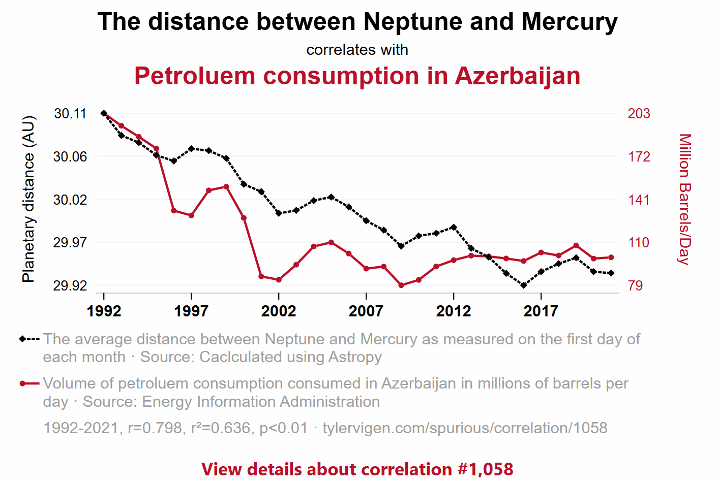
Two trends can move together because:

  1. Coincidence: the variables correlate in this time period
  2. Confounding variable: a third factor drives both
  3. Reverse causation: the direction is the opposite of what you assumed
  4. Actual causation: rare, and requires much more evidence than a chart

📖 Tyler Vigen’s Spurious Correlations: hilarious examples of correlation without causation.

What this means for your MP2

If you merged your TfL journey data with the ONS Postcode Directory, you might find:

“Boroughs with higher deprivation scores (lower IMD rank) tend to have longer peak journey times.”

That’s a correlation. It is NOT evidence that deprivation causes worse transport. Many confounding factors could explain this:

  • More deprived boroughs may be further from central London (geography, not deprivation)
  • They may have fewer transport connections (infrastructure investment, not deprivation itself)
  • Your sample of postcodes may not be representative

In your REPORT.md: State what you observe. Use language like “is associated with” or “tends to co-occur with” rather than “causes” or “leads to.”

Closeread: an optional upgrade for your REPORT.md

Closeread is a Quarto extension for scrollytelling, where text narrates alongside highlighted visuals as the reader scrolls.

Many of the examples from earlier use scrollytelling.

If you use closeread for your MP2:

  • It fully replaces REPORT.md (you don’t submit both)
  • It’s one route to higher Communication marks if used well
  • But a solid REPORT.md with clear narrative titles and well-chosen visuals is enough

👉 If going for that route, you would have to go through the Quarto documentation yourself!

Getting started:

quarto add qmd-lab/closeread
---
title: "My MP2 Report"
format:
  closeread-html: default
---

🔗 closeread.dev: documentation and examples

🔗 Closeread Prize Winners (Posit): see what’s possible

🔔 Course announcements (W09 update)

These updates are now reflected in the syllabus and coursework information pages on Moodle/public website:

✍️ Mini-Project 2 New submission deadline Wed 1 Apr 2026
8 pm UK time
💻 Week 10 Lab Project board setup for group coordination, task ownership, and delivery planning Week 10
🖥️ Week 11 Lecture Agentic AI coding for productivity on the new Nuvolos VS Code setup, including GitHub Copilot prompts, skills, and team Git workflows Week 11
🗣️ W11 Labs
Group project setup and formative pitch presentations Formative,
no longer graded
📦 Group Project Group submission plus individual reflection 40% group
+ 10% individual

Please reserve time in Week 11 to agree how your team will organise work after term ends and across the Easter Break.

What’s Next?

  • In the 💻 W09 Lab tomorrow: NB03 working session (apply today’s EDA to your MP2 data) + form your groups for the 📦 Group Project (3-4 people, ideally from the same lab section).
  • Week 10 Lecture: Using Git as a team: git fetch, git pull, merge conflicts. Essential for your group project.

  • Monday W11: Formative group pitch presentations (not graded, but you’ll get feedback from Jon and the TAs that will help your project). The 📦 Group Project is worth 40% of your final grade, assessed on the final submission in May.

The EDA checklist for your NB03

Before you write your REPORT.md, make sure you’ve done this in NB03:

Step What to check Tools
1️⃣ Completeness: what percentage of each column has data? .notna().sum() / len(df)
2️⃣ Systematic missingness: does missingness vary by group? .groupby().apply() with a completeness function
3️⃣ Distribution shape: is it skewed or symmetric? sns.histplot(), .describe()
4️⃣ Central tendency: is mean or median more appropriate? Compare both; justify your choice
5️⃣ Outliers: are extreme values errors or real phenomena? Filter and investigate; domain reasoning
6️⃣ Relationships: do variables co-vary? (association, not causation) Grouped comparisons, FacetGrid
7️⃣ Visualisation: does your plot show the data honestly? Strip+box+mean for small n; narrative titles

Then pick your two best insights for REPORT.md. Each insight needs a narrative title that states your finding.

🔖 Appendix

Post-Lecture Actions

  • Start applying the EDA checklist to your MP2 NB03
  • Compute both mean and median for your journey times: do they differ?
  • Try at least one FacetGrid with your MP2 data
  • Come to tomorrow’s lab ready to form your group project team

Looking Ahead

  • Tomorrow (W09 Friday): NB03 working session + group formation
  • W10 Lecture (Thursday): Git collaboration for teams
  • Wednesday 1 April, 8pm: ✍️ Mini-Project 2 deadline
  • Monday W11: Formative group pitches (optional but recommended)
  • May 2026: 📦 Group Project final submission (40% of grade)