🗓️ Week 07
Machine Learning I
DS101 – Fundamentals of Data Science
10 Nov 2025
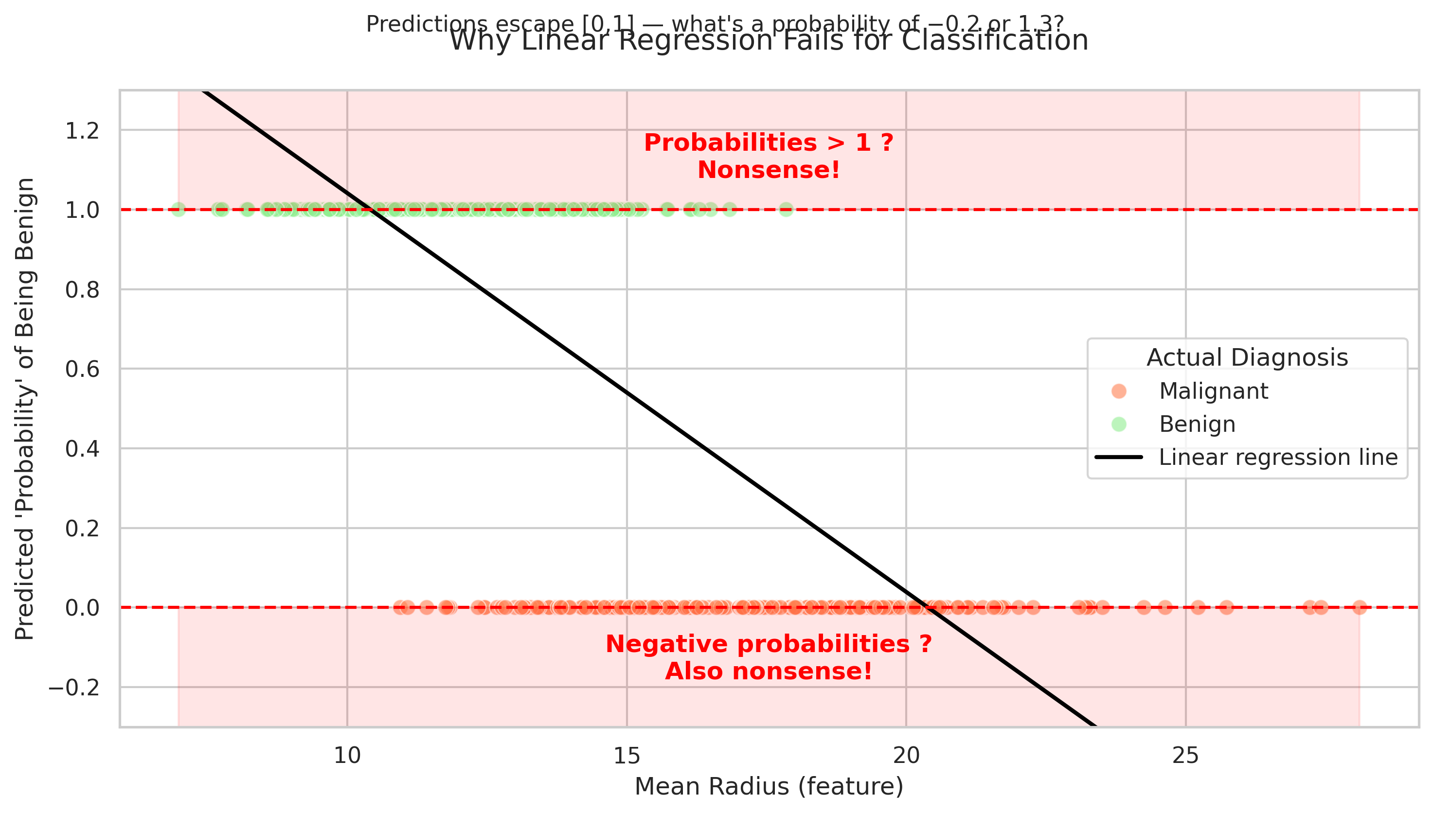
🩺 Binary/categorical outcomes: The Breast Cancer Dataset
Linear regression predicts continuous outcomes — like price, height, or temperature. But what happens when the target is Yes/No?
Note
Linear regression assumes continuous change — but here, the outcome is either 0 or 1 (benign or malignant).
Trying to “fit a line” between two categories can lead to impossible values like probabilities below 0 or above 1. Linear regression doesn’t know probabilities must be between 0 and 1. Here, small tumors lead to predicted probabilities below 0, large ones above 1.
We’ll need another model type for this later — logistic regression.
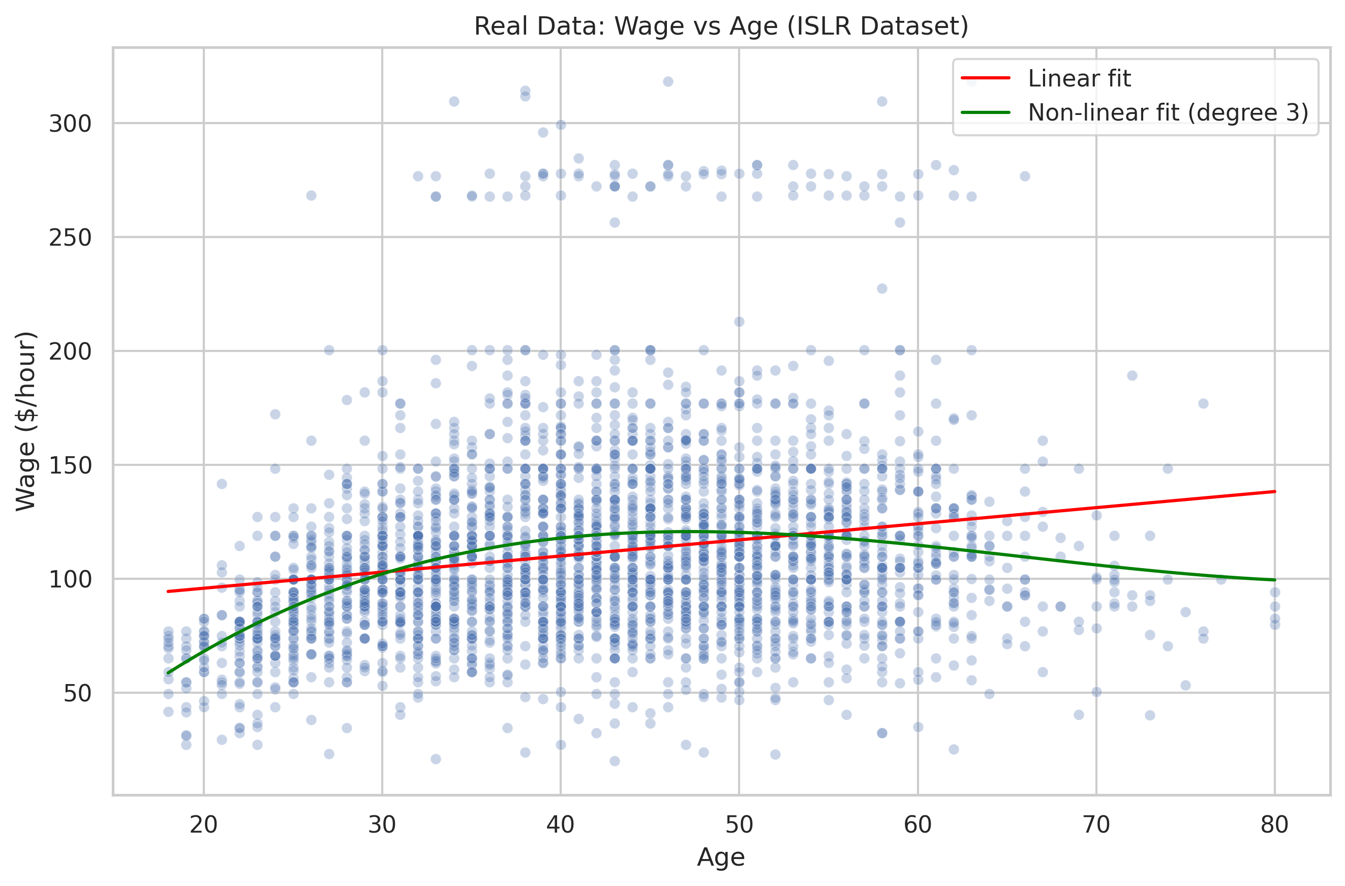
Non-Linear Patterns: The Wage Dataset
Now let’s look at a real dataset: wage and age from the ISLR book.
Note
Real data shows diminishing returns — wages rise, then flatten, and sometimes fall slightly. The real data reveals curvature: wages rise rapidly early in careers, then plateau and sometimes decline.
Linear regression assumes a constant slope: every extra year of age increases wage by the same amount. It draws a single straight line — it misses the curve.
That’s why we later use polynomial regression or other flexible methods. This shows that a straight line is too simple for curved, real-world data.
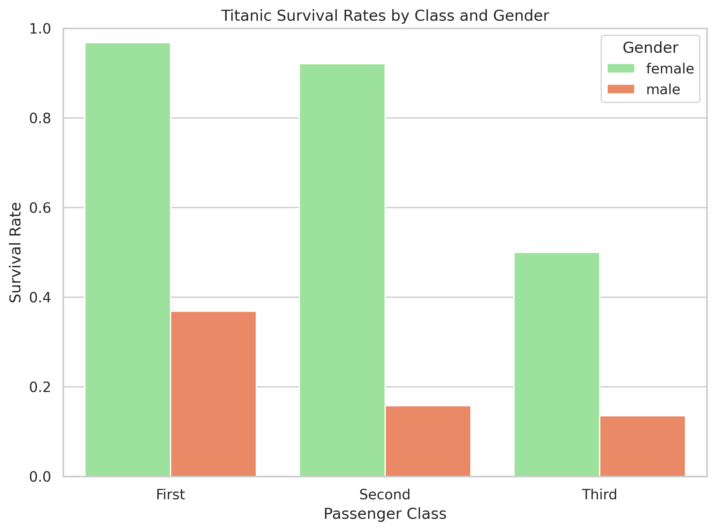
Interactions: Titanic Survival
Sometimes, even if variables look simple individually, their combination tells the real story.
Note
Linear regression assumes each variable contributes a fixed, independent effect. But here, the effect of gender changes by class:
- Women in 1st and 2nd class mostly survived.
- In 3rd class, the difference shrinks a lot.
A single “gender coefficient” can’t capture that. This is what we call an interaction — the effect of one variable depends on another.
Titanic: non-parallel lines show interactions clearly
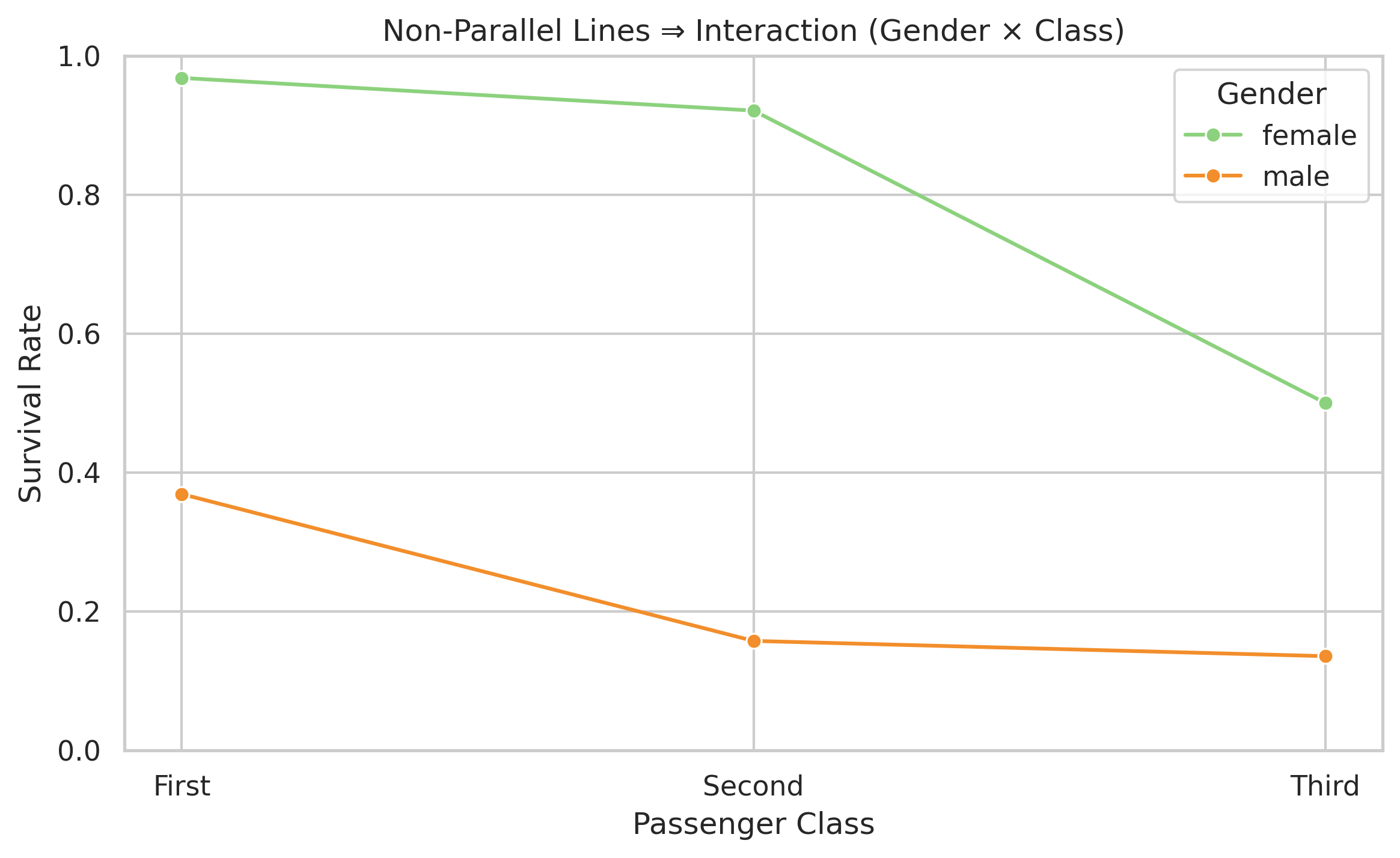
Note
If there were no interaction, the lines would be parallel. But they’re not — the “female advantage” shrinks as class drops. Linear regression would try to average across both and get it wrong.
How it works
How it works
- The process is similar to the regular algorithms (think recipes) we saw in W03.
- Only this time, the ingredients are data.
INPUT (data)
⬇️
ALGORITHM
⬇️
OUTPUT (prediction)

One Practical Example
Suppose you’re a record executive at a major label. Two artists pitch you new songs. You can only invest your marketing budget in one.

Image source: Unsplash
How would you decide which song will be a hit?
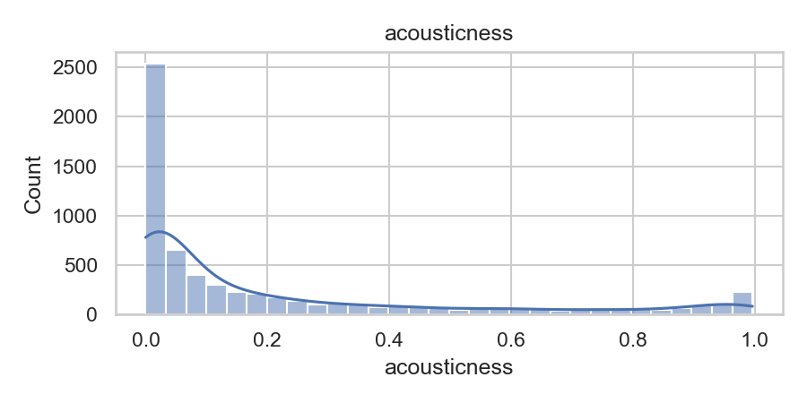
A quick look at the data features
From “Hit or Flop?” to Logistic Regression
Let’s say our response is binary — a song either hits 🎯 or flops 💀:
\[ Y = \begin{cases} 0 & \text{= Flop} \\ 1 & \text{= Hit} \end{cases} \]
We want to model how the probability of a hit changes with some feature (e.g., energy, danceability).
→ Instead of predicting 0 or 1 directly,
we predict a probability between 0 and 1 using the logistic (sigmoid) function:
\[ P(Y = 1 \mid X) = p(X) = \frac{e^{\beta_0 + \beta_1 X}}{1 + e^{\beta_0 + \beta_1 X}} \]
🌀 As \(X\) increases, the curve smoothly transitions from near 0 (flop)
to near 1 (hit) — perfect for probabilities!

Dataset Balance
Let’s check our Spotify dataset:
---------------------------
Target value: Hit
Number of songs: 3,199
Proportion: 0.50
---------------------------
Target value: Flop
Number of songs: 3,199
Proportion: 0.50
---------------------------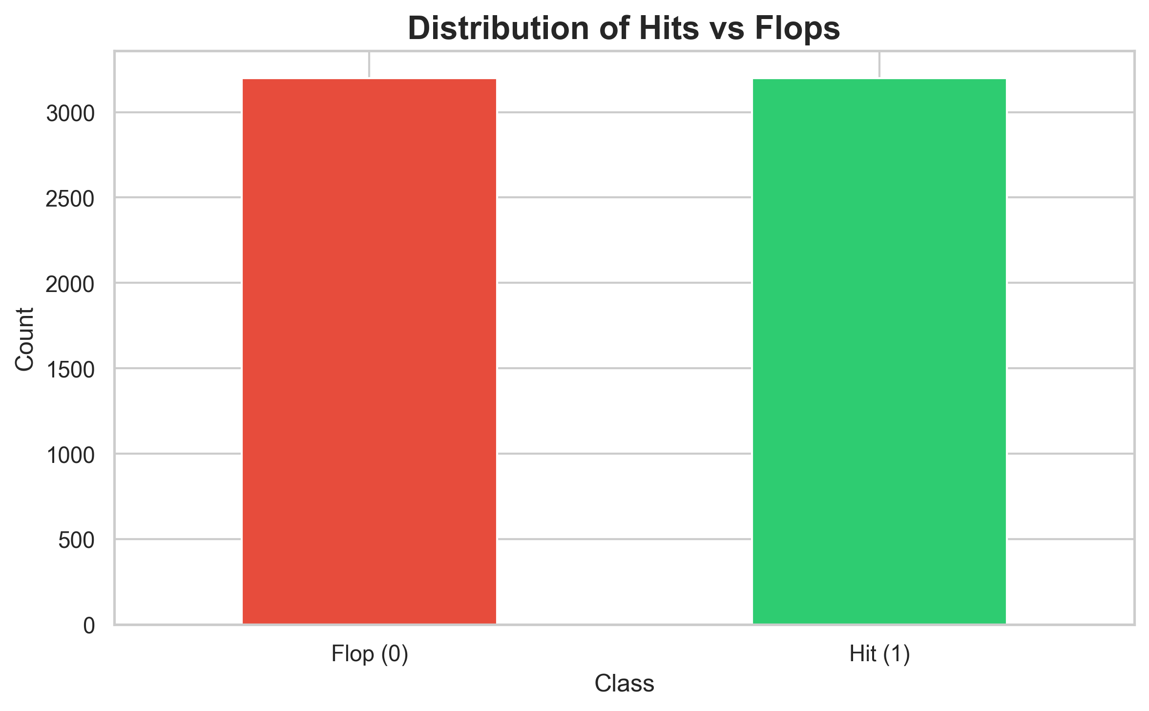
Note
Good news! Our dataset is balanced (50-50 split). This means accuracy is actually a reasonable metric to use, though we’ll still look at precision, recall, and F1-score for a complete picture.
Confusion Matrix — Logistic Regression
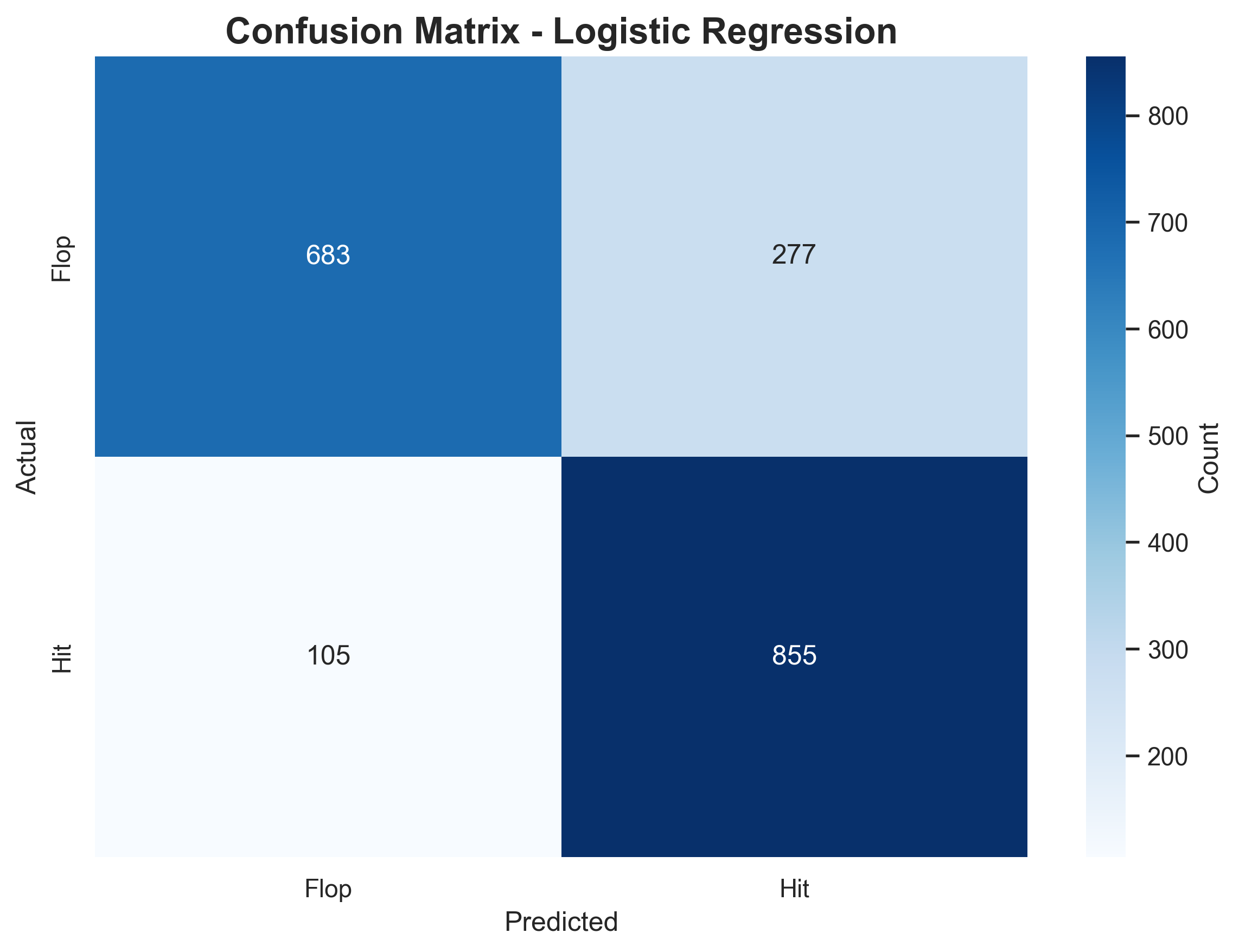
How to read this:
| Term | Meaning | Spotify context |
|---|---|---|
| ✅ True Positives (855) | Predicted Hit → Actually Hit | Correctly spotted popular songs |
| ✅ True Negatives (683) | Predicted Flop → Actually Flop | Correctly dismissed weak songs |
| ⚠️ False Positives (277) | Predicted Hit → Actually Flop | 💸 Wasted promo budget on bad calls |
| ⚠️ False Negatives (105) | Predicted Flop → Actually Hit | 🎯 Missed breakout songs |
Takeaway:
- The model is risk-averse — safer but not visionary
- Would a record label prefer fewer false alarms or fewer missed hits?
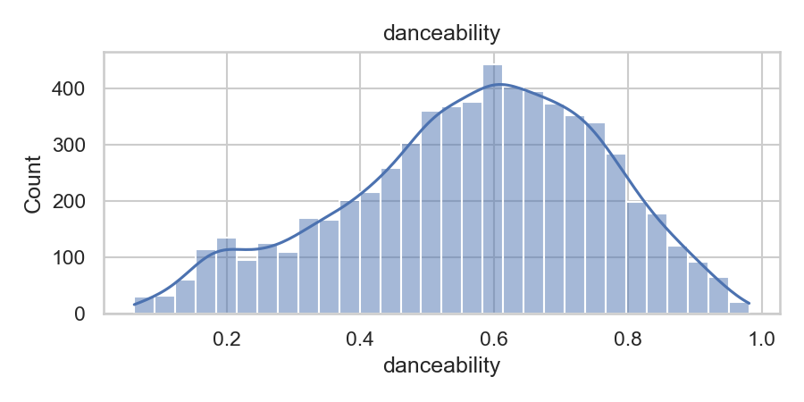
🎵 What Makes a Hit Song?
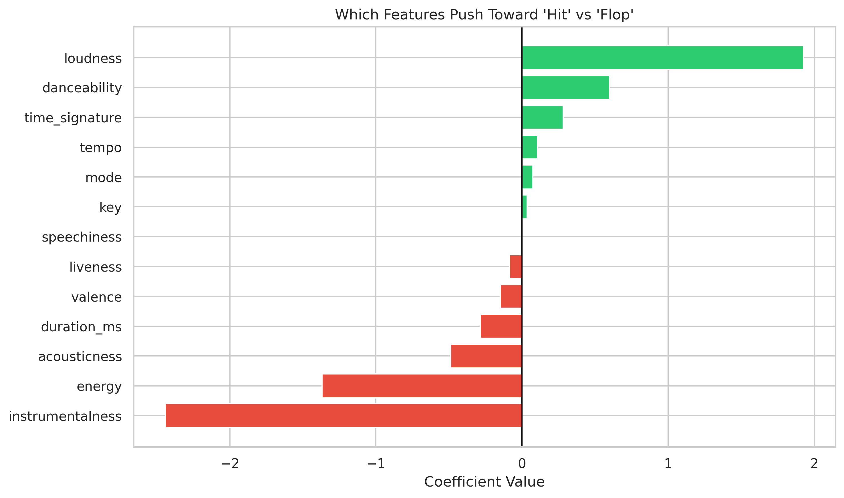
Tip
Understanding the chart:
Each bar shows how a musical feature influences the model’s prediction of whether a song becomes a Hit or Flop.
Green bars → make a song more likely to be a hit:
- 🎧 Loudness, danceability, and energy push the prediction upward — the model “believes” energetic, upbeat songs succeed.
Red bars → make a song less likely to be a hit:
- 🎻 Instrumentalness and acousticness pull the prediction downward — quiet or mostly instrumental tracks tend to underperform.
The direction of the bar shows how a feature affects the outcome (helps vs. hurts), while the length shows how strongly it matters.
The model treats these effects as independent — like separate volume knobs. That’s a simplification: it can’t capture subtle combinations (e.g., quiet and emotional songs that still succeed).
💬 Discussion prompt:
Can you think of a real song that breaks this pattern? Why might the model misclassify it as a “flop”?
Time for a break 🍵

After the break:
- Other supervised learning algorithms
- Decision Trees
- Support Vector Machines
- Neural Networks & Deep Learning
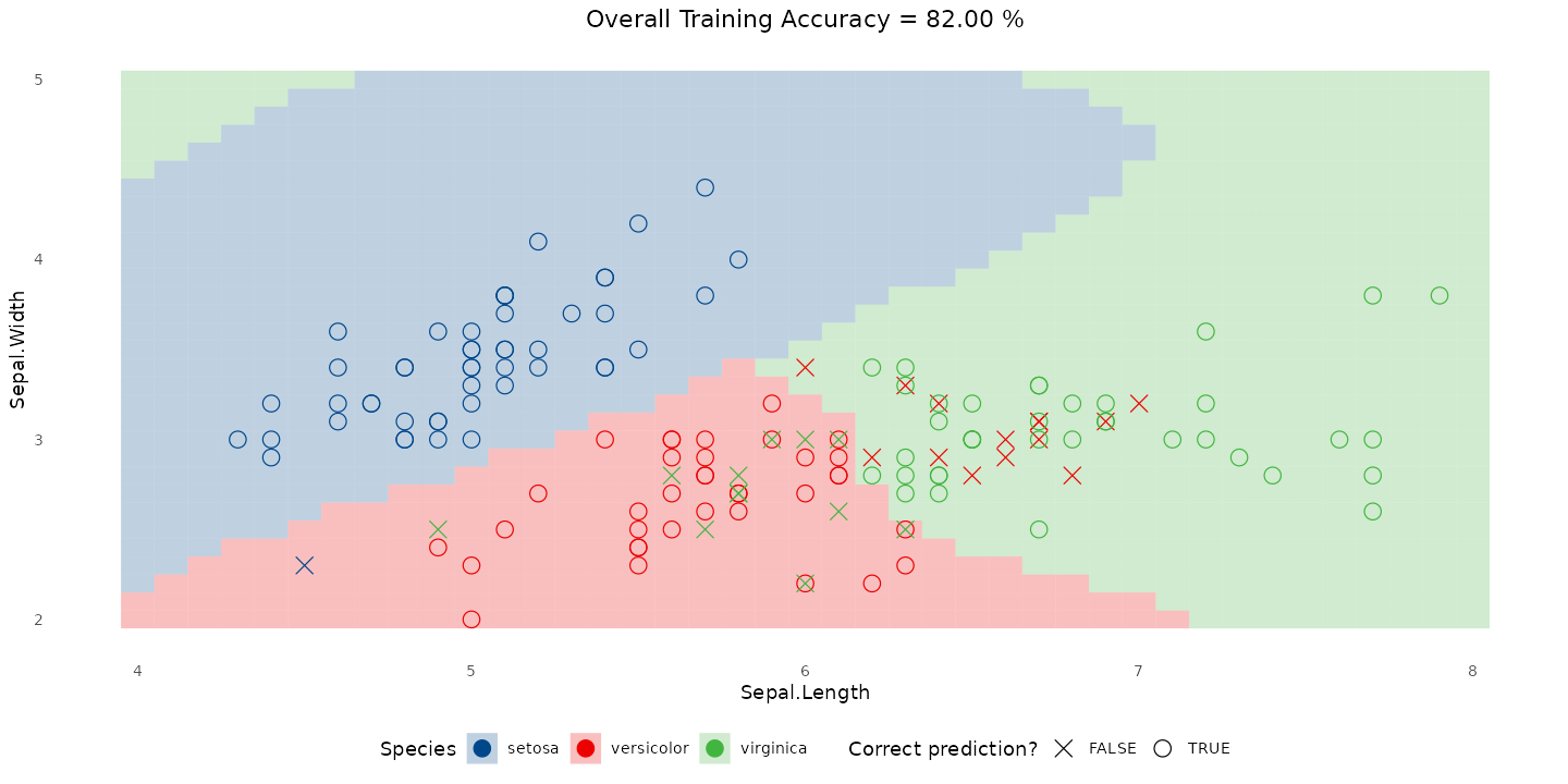
🌳 The Decision Tree Model
Decision trees make predictions by asking a sequence of yes/no questions about song features — similar to how a person might reason through a choice.
Tip
How to read this:
- The tree starts with all songs at the top.
- Each split asks a question like “Is instrumentalness ≤ 0.001?” or “Is energy > 0.7?”
- Each branch divides the data based on the answer.
- A leaf node at the bottom gives a prediction i.e “Hit” or “Flop,” depending on which group dominates.
Each step narrows down possibilities until the model can make a confident decision.
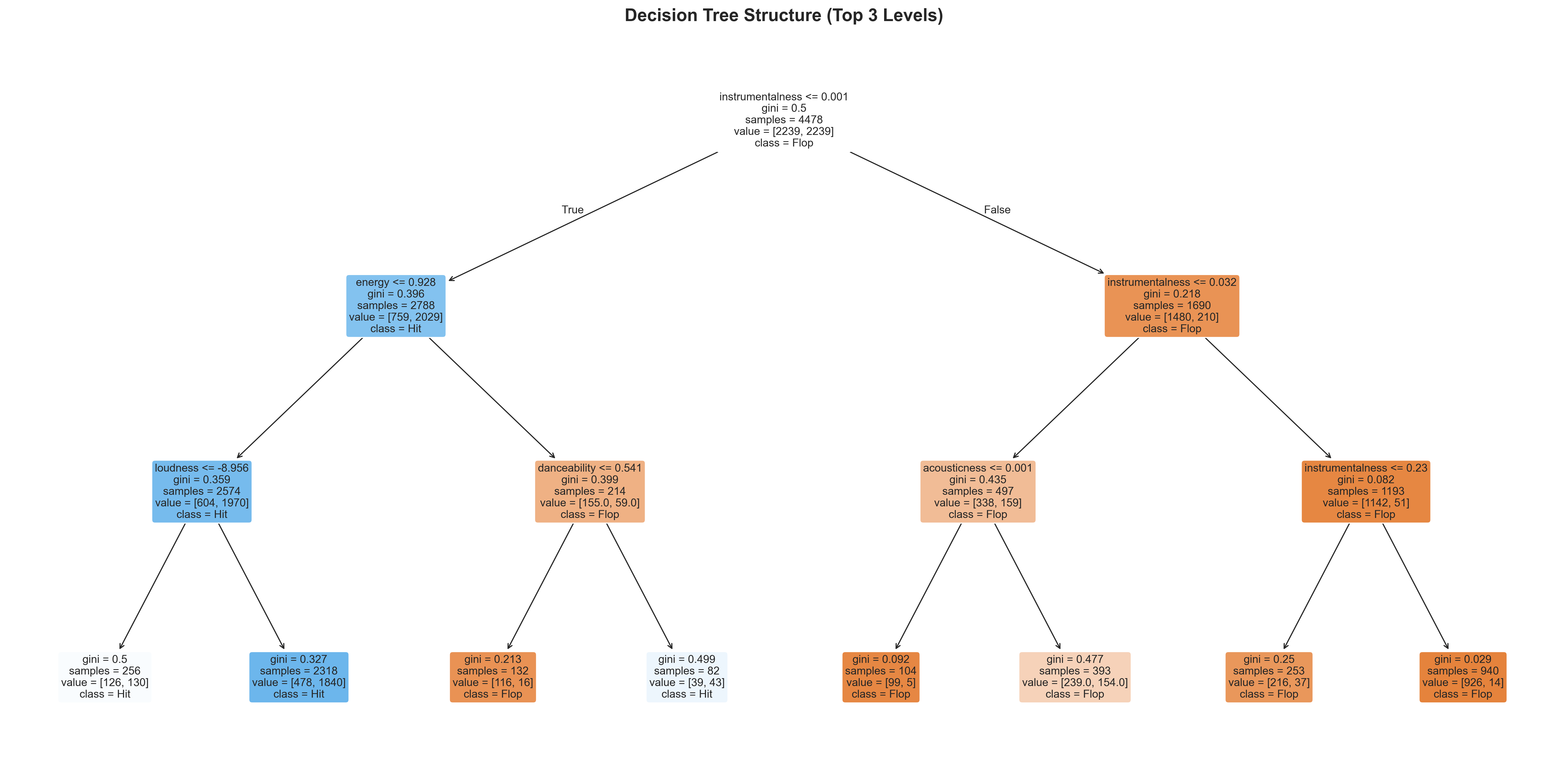
🎧 Decision Tree on Spotify Songs
Performance Metrics:
Classification Report:
              precision    recall  f1-score   support

        Flop       0.86      0.70      0.77       960
         Hit       0.75      0.89      0.81       960

    accuracy                           0.79      1920
   macro avg       0.81      0.79      0.79      1920
weighted avg 0.81 0.79 0.79 1920- Accuracy is about the same as Logistic Regression (~80%).
- Tree trades a tiny bit of precision for slightly better flexibility.
Confusion Matrix:
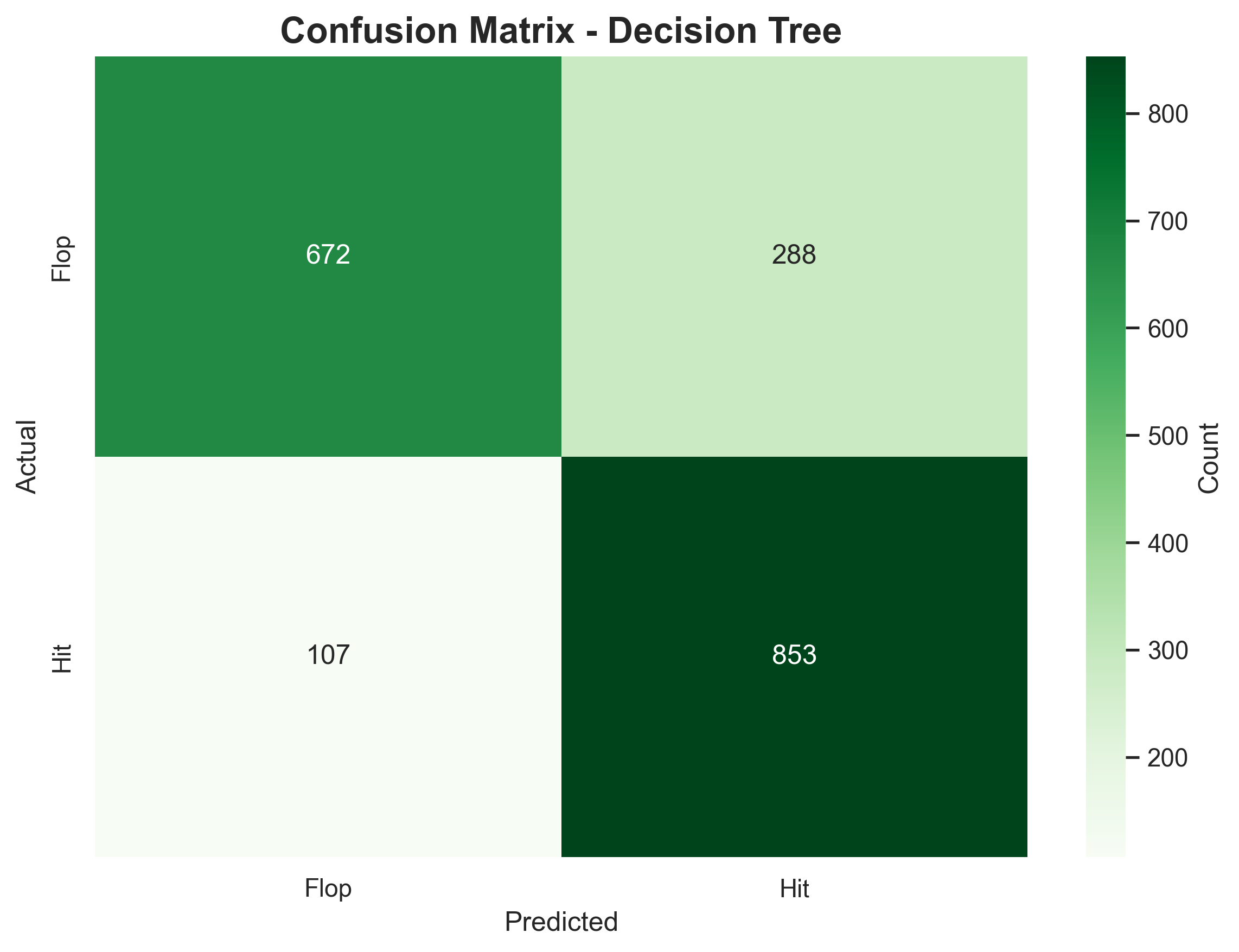
📊 Interpretation:
- Still confuses some flops as hits.
- Captures non-linear patterns like “High energy and low instrumentalness → hit.”
- Not more accurate — but more flexible and interpretable.
⚠️ Even if accuracy doesn’t improve, trees help us see relationships that a straight-line model can’t.
⚠️ Warning: Decision trees can easily overfit i.e memorize training patterns instead of learning general trends.
The Support Vector Machine model
Say you have a dataset with two classes of points:
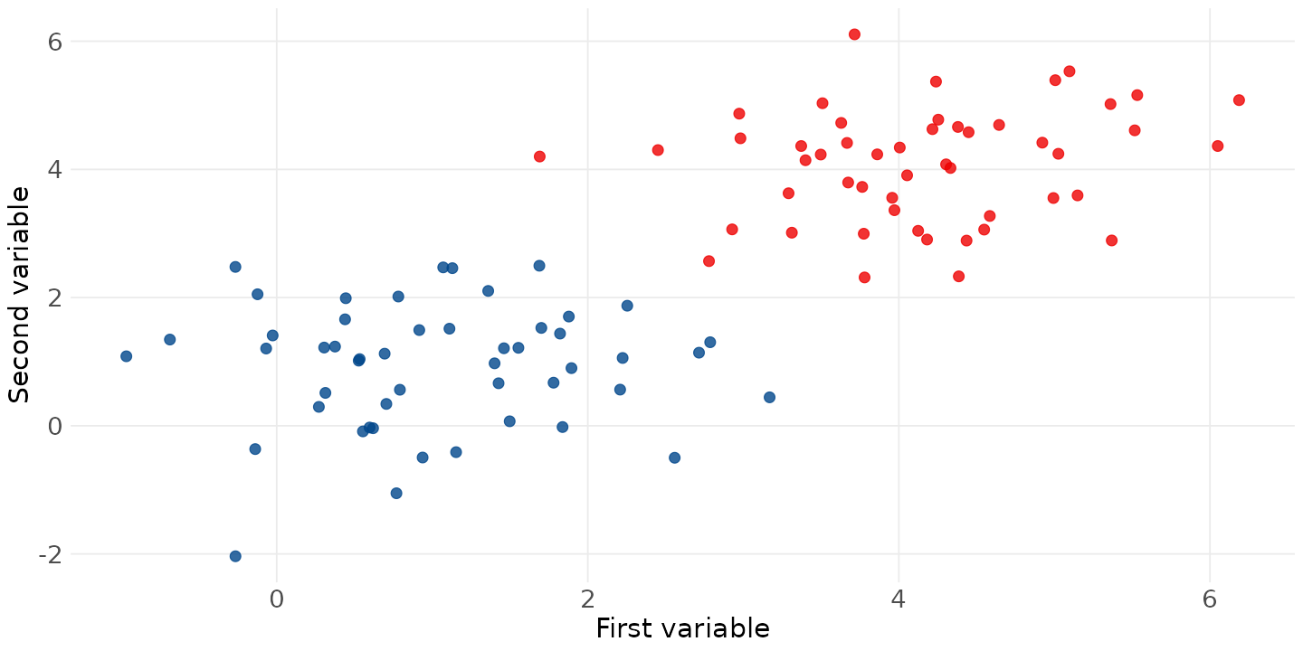
The Support Vector Machine model
The goal is to find a line (or hyperplane) that best separates the two classes:
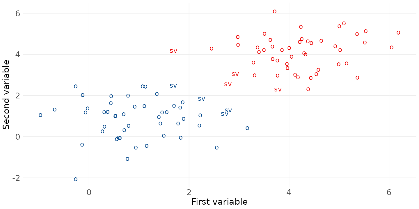
The Support Vector Machine model
It can get more complicated than just a line - using the “kernel trick” to handle non-linear patterns:
Note
- When data isn’t linearly separable, SVM can use kernels (polynomial, radial basis function)
- This projects data into higher dimensions where it becomes separable
- Powerful but less interpretable than decision trees
🎯 Spotify data and Support Vector Machines (SVM)
Idea in a nutshell: SVMs find the boundary that best separates the classes — not just any boundary, but the one with the widest margin between hits and flops.
Unlike logistic regression (a straight line) or trees (boxy splits), SVMs can bend the boundary smoothly.
Tip
How to think about it:
- Each song is a point in feature space.
- SVM draws a smooth curve (via the kernel trick) that best divides hits and flops.
- The support vectors are the most critical songs — those near the boundary that “hold it up.”
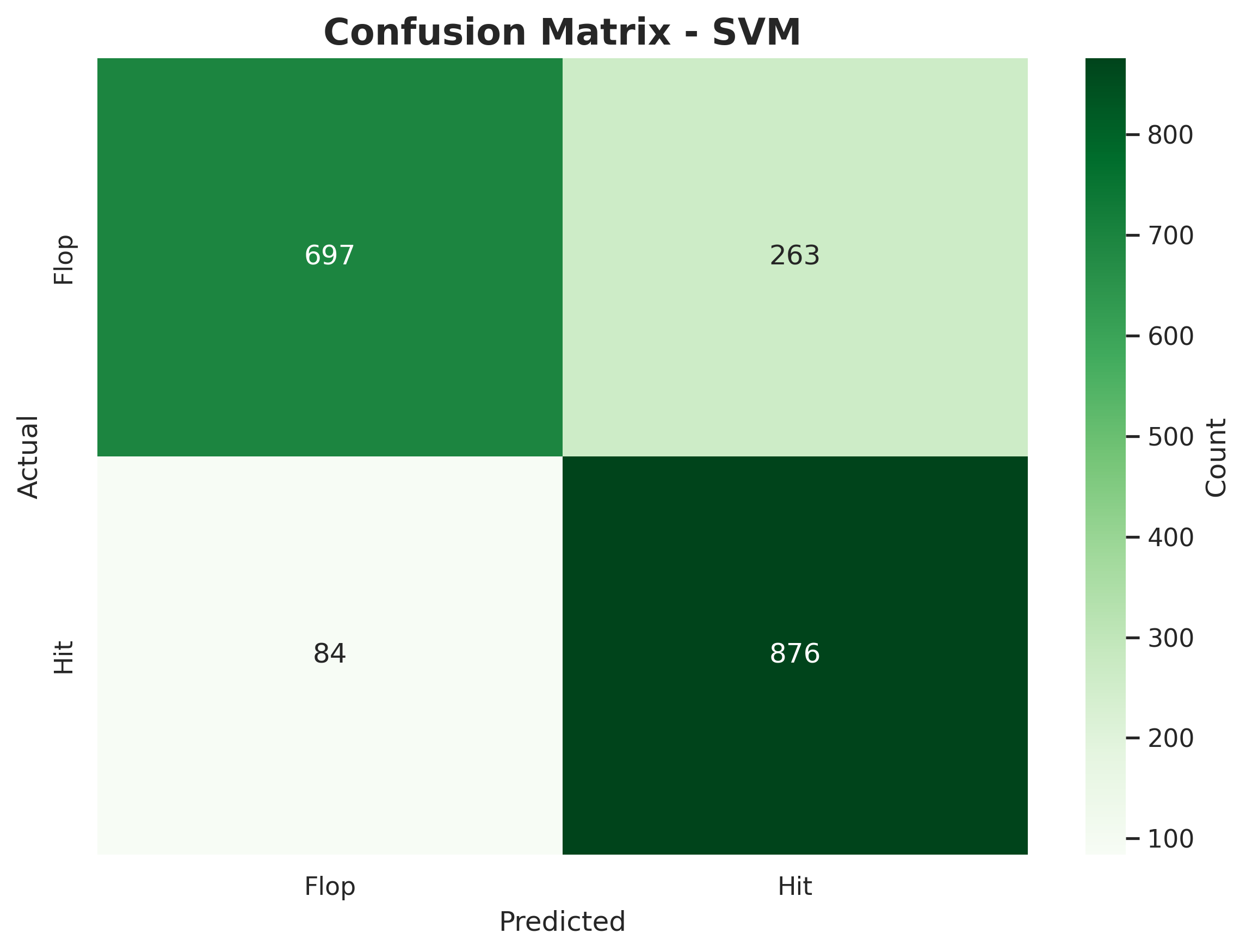
🎧 SVM on Spotify Songs
Performance Metrics:
Classification Report:
              precision    recall  f1-score   support

        Flop       0.89      0.73      0.80       960
         Hit       0.77      0.91      0.83       960

    accuracy                           0.82      1920
   macro avg       0.83      0.82      0.82      1920
weighted avg       0.83      0.82      0.82      1920
Confusion Matrix:
📊 Interpretation:
- Accuracy improved slightly to ~82 %.
- The SVM correctly classifies more hits than the tree or logistic regression.
- It handles curved, overlapping relationships better than straight-line or boxy splits.
- But SVMs are harder to interpret — we lose the clear “if–then” logic of trees.
💡 Conceptual takeaway: The model isn’t just smarter — it’s smoother. It balances flexibility and generalization without memorizing the data.
🧠 Neural Networks
Neural networks are inspired by how the human brain processes information — they consist of layers of interconnected “neurons.”
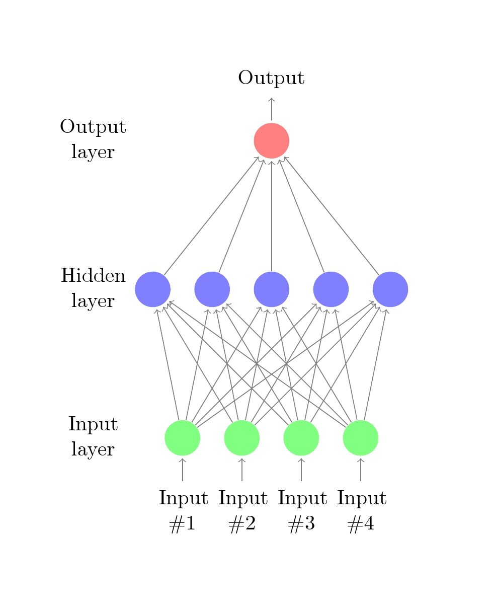
- Each neuron applies a simple mathematical function to its inputs.
- Layers combine these functions, building a chain of transformations: \[f(x) = f_3(f_2(f_1(x)))\]
- Each layer’s output becomes the input to the next — turning raw data → patterns → predictions.
- During training, the network learns the weights that make its predictions most accurate.
- A neural network with one hidden layer can already model non-linear relationships. Adding more hidden layers helps capture hierarchies of patterns in data.
Note
You could compare each layer to a filter pipeline:
“Layer 1 extracts beats, layer 2 recognizes rhythm patterns, layer 3 recognizes the song’s mood.” Each layer’s function refines the previous one — like stacking musical effects.
✨ Attention & Transformers
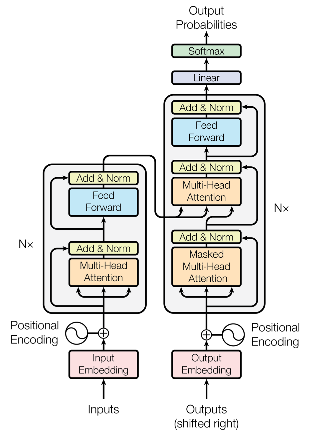
The Transformer architecture introduced an attention mechanism (Vaswani et al. 2017) — it lets the model focus on relevant context within the input.
Attention dynamically computes a new function: \[y = f(\text{input}, \text{context})\] where context is derived from relationships among all inputs.
Example:
- In “The bank by the river,” the model focuses on “river” to interpret “bank” correctly.
Transformers stack layers of attention, combining local understanding with global context — forming deep, context-aware representations.
This architecture revolutionized modern AI: powering ChatGPT, BERT, Gemini, Claude, and others.
Note
“When reading a paragraph, do we process words one by one, or in context?” Attention allows the model to look around — to weigh which parts of the input provide the most useful information.