🗓️ Week 05
From Randomness to Models
DS101 – Fundamentals of Data Science
2025-10-27
From Randomness to Probability
Where we left off last week
- We explored sampling and the Central Limit Theorem (CLT).
- The CLT told us that sample means fluctuate around the population mean in a roughly Normal way.
- But we have not yet asked:
> what do we mean by “chance,” exactly?
Why talk about probability?
- Probability is how we quantify uncertainty.
- It lets us move from anecdotes (“probably rain tomorrow”) to numbers.
- Every data pattern involves some probability model underneath.
Example questions:
- What’s the chance of scoring above 15 on a test?
- What’s the probability that our sample average differs by more than 2 points from the truth?
What is a probability?
A probability is a number between 0 and 1 that measures the likelihood of an event.
| Event | Probability | Example meaning |
|---|---|---|
| Impossible | 0 | Drawing 8 hearts in a row from a deck |
| Certain | 1 | Getting an even number from {2, 4, 6} |
| Intermediate | 0 < p < 1 | 30 % chance of rain tomorrow |
Three ways to interpret probability
Probability does not have a single universal meaning — it depends on how we think about uncertainty.
| Interpretation | Core idea | Example |
|---|---|---|
| Classical | Probability is based on counting equally likely outcomes. All possibilities are known and symmetric. | Rolling a fair six-sided die: each face has 1 chance out of 6, so \(P(3)=\frac{1}{6}\). |
| Frequentist | Probability is the long-run relative frequency of an event after many repetitions of the same process. | Flip a fair coin 1 000 times → expect about 500 heads. The observed frequency (≈ 0.5) approaches the true probability as the number of trials increases. |
| Bayesian | Probability measures our degree of belief in a statement, which can be updated when new information arrives. | Before seeing data: you believe a vaccine is 90 % effective (\(P(\text{effective})=0.9\)). After new clinical results, you update that belief via Bayes’ rule. |
Note
Classical → symmetry of outcomes
Frequentist → repetition and empirical frequencies
Bayesian → belief updating through evidence
Randomness in data
Randomness enters our analyses from several directions — not as “chaos,” but as variation we must model.
| Source of randomness | What it means in practice | Example |
|---|---|---|
| Sampling variability | The specific individuals or observations we happen to select differ from one sample to another. | Two randomly chosen student groups produce slightly different average marks. |
| Measurement error | Our instruments or procedures introduce small fluctuations in values. | Teachers’ scoring differs by a few points even for similar work. |
| Behavioural or natural variability | Human and environmental processes are inherently variable. | Motivation, sleep, or stress levels vary daily — affecting performance. |
| Model uncertainty | Even the best model is an approximation; residual error remains. | Regression predictions never fit perfectly — the “ε” term captures what’s left unexplained. |
Describing Uncertainty: Probability Distributions
The idea of a distribution
A probability distribution shows how likely different outcomes are.
- Uniform: all outcomes equally likely
- Normal: most near the centre
- Skewed: rare but extreme values in a long tail
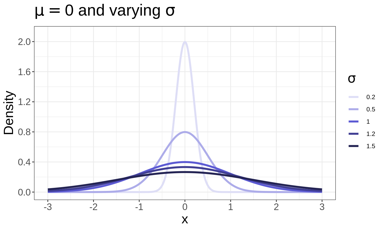
The Normal distribution
Formula:
\[
f(x; \mu, \sigma) = \frac{1}{\sqrt{2\pi\sigma^2}} e^{-\frac{(x-\mu)^2}{2\sigma^2}}
\]
Where:
- \(x\): variable of interest
- \(\mu\): mean (centre)
- \(\sigma\): standard deviation (spread)
Examples: heights, exam marks, measurement errors.
≈ 68 % of values within ±1σ, 95 % within ±2σ.
The Binomial distribution
Used for counting successes in n independent yes/no trials.
Formula:
\[
P(X = k) = \binom{n}{k} p^k (1-p)^{n-k}
\]
Where:
- \(n\): number of trials
- \(k\): number of successes
- \(p\): probability of success in a single trial
- \(\binom{n}{k}\): number of possible ways to get k successes
Example: number of correct answers in 10 true/false questions.
As n grows and \(p≈0.5\), the shape becomes approximately Normal.
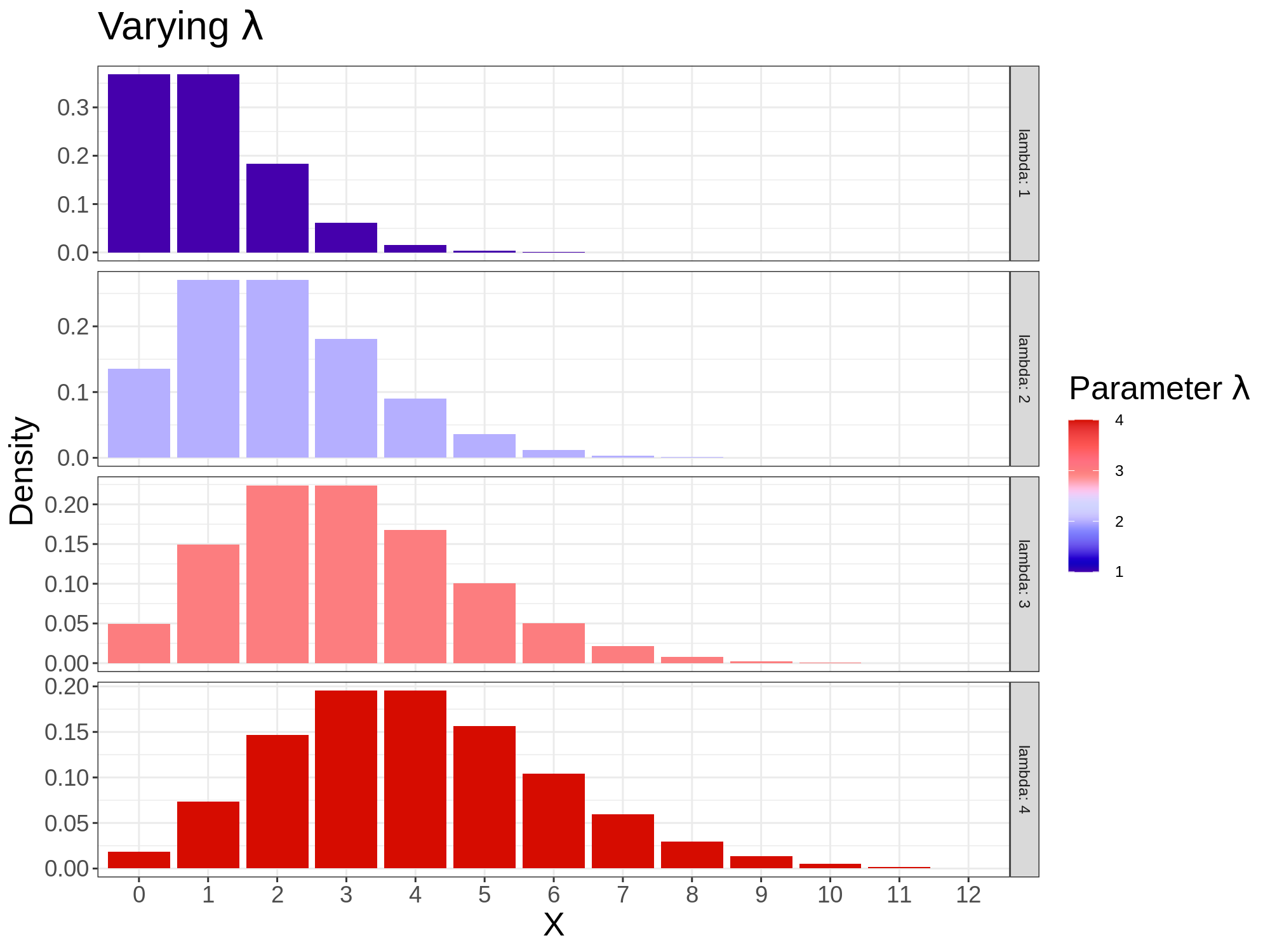
The Poisson distribution
Used for counts of rare events in a fixed interval.
Formula:
\[
P(X = k) = \frac{e^{-\lambda}\lambda^k}{k!}
\]
Where:
- \(k\): number of occurrences
- \(\lambda\): average rate (mean number of events per interval)
Examples:
- Number of emails received per hour
- Accidents per day on a road
If \(\lambda\) is large → Poisson ≈ Normal.
The Exponential distribution
Models waiting times between independent events.
Formula:
\[
f(x; \lambda) = \lambda e^{-\lambda x}, \quad x \ge 0
\]
Where:
- \(x\): waiting time or duration
- \(\lambda\): rate (average number of events per unit time)
Example: minutes between bus arrivals.
Has the memoryless property i.e the probability of waiting another t minutes doesn’t depend on how long you’ve already waited.
The Gamma distribution
A flexible family for non-negative, skewed variables.
Includes the Exponential distribution as a special case (when shape = 1).
Formula:
\[
f(x; k,\lambda) = \frac{\lambda^k x^{k-1} e^{-\lambda x}}{\Gamma(k)}, \quad x \ge 0
\]
Where:
- \(x\): variable (non-negative quantity)
- \(k\): shape parameter (controls skewness)
- \(\lambda\): rate parameter (controls spread)
- \(\Gamma(k)\): the Gamma function (generalises factorial)
Applications: rainfall amounts, service times, insurance claims.
From distributions to modelling
Once we know how single variables behave, we can ask: > how do two variables vary together?
That’s the step from describing uncertainty → modelling relationships,
which leads us to linear regression.
From Association to Prediction
Why modelling?
- Probability helps us quantify randomness in one variable.
- Modelling helps us explain relationships between variables.
- Instead of asking “what is likely?”, we now ask “what changes with what?”
Association vs Prediction vs Causation
| Question type | Example | What it tells us |
|---|---|---|
| Association | Do students who study more get higher marks? | They move together |
| Prediction | Can we predict a mark from study time? | Quantifies the relationship |
| Causation | Does studying more cause higher marks? | Requires experimental control |
Regression sits between association and causation:
it models associations but doesn’t, by itself, prove cause and effect.
The Student Performance dataset
We’ll use a real dataset from Portuguese secondary schools (UCI repository).
Each row is a student, with variables such as:
| Variable | Description | Type |
|---|---|---|
studytime |
weekly study time (1 = <2h, 4 = >10h) | ordinal |
absences |
number of missed classes | numeric |
failures |
past course failures | numeric |
G3 |
final year grade in Mathematics (target variable) | numeric |
Goal:
> Can we describe and predict students’ final grades from study time?
| studytime | absences | failures | G3 | |
|---|---|---|---|---|
| 0 | 2 | 6 | 0 | 6 |
| 1 | 2 | 4 | 0 | 6 |
| 2 | 2 | 10 | 3 | 10 |
| 3 | 3 | 2 | 0 | 15 |
| 4 | 2 | 4 | 0 | 10 |
Visualising the relationship
Even with broad categories, students in higher studytime brackets tend to get higher grades.
What is univariate linear regression?
A linear model describes the average trend between two variables:
\[ \text{Grade} = \beta_0 + \beta_1(\text{Study Time}) + \varepsilon \]
| Term | Interpretation |
|---|---|
| β₀ | predicted grade when study time = 0 |
| β₁ | expected difference in average grade for each step up in studytime bracket |
| ε | random error (individual differences) or leftover part the model couldn’t explain |
Interpreting the line
Example:
\[ \widehat{G3} = 9.33 + 0.53 \times \text{studytime} \]
- A student who studies less than 2 hours (
studytime=1) → predicted grade ≈ 9.86 - A student who studies more than 10 hours (
studytime=4) → predicted grade ≈ 11.45
Each for each step up in studytime bracket is associated with an average +0.53 points on the final grade.
What is a residual?
A residual is the difference between what the model predicts and what we actually observe:
\[ \text{Residual} = \text{Actual grade} - \text{Predicted grade} \]
- If residual = 0 → perfect prediction
- If positive → model underestimates
- If negative → model overestimates
How good is our model?
We can summarise its performance with:
| Metric | Meaning | Interpretation |
|---|---|---|
| R² (R-squared) | Proportion of total variation in grades explained by the model | Higher is better (0–1) |
| MAE (Mean Absolute Error) | Average size of prediction errors (in grade points) | Lower is better |
| Residuals | The individual differences between predictions and actuals | Should scatter evenly around 0 |
Fitting the model
OLS Regression Results
==============================================================================
Dep. Variable:                     G3   R-squared:                       0.010
Model:                            OLS   Adj. R-squared:                  0.007
Method:                 Least Squares   F-statistic:                     3.797
Date:                Mon, 27 Oct 2025   Prob (F-statistic):             0.0521
Time:                        06:53:46   Log-Likelihood:                -1159.3
No. Observations:                 395   AIC:                             2323.
Df Residuals:                     393   BIC:                             2331.
Df Model:                           1
Covariance Type:            nonrobust
==============================================================================
                 coef    std err          t      P>|t|      [0.025      0.975]
------------------------------------------------------------------------------
const          9.3283      0.603     15.463      0.000       8.142      10.514
studytime      0.5340      0.274      1.949      0.052      -0.005       1.073
==============================================================================
Omnibus:                       33.290   Durbin-Watson:                   2.012
Prob(Omnibus):                  0.000   Jarque-Bera (JB):               39.231
Skew:                          -0.742   Prob(JB):                     3.03e-09
Kurtosis:                       3.429   Cond. No.                         6.83
==============================================================================

Notes:
[1] Standard Errors assume that the covariance matrix of the errors is correctly specified.
R² = 0.010, MAE = 3.40
Typical results:
- β₁ ≈ +0.53 → each higher studytime bracket ≈ +0.53 grade point
- R² ≈ 0.010 → model explains 1% of grade variation: studytime alone doesn’t predict grades well, most of the variation in grades is due to other factors (e.g. prior performance, attendance, etc.).
- MAE ≈ 3.40 → predictions off by ~3.4 points on average i.e by 17% (since the scale is over 20). In practice, if someone’s actual grade is 9, the model will predict a grade between 5.6 and 12.4!
How confident are we in the coefficients’ estimates?
Confidence intervals for the coefficients of our univariate model
\[ G3 = \beta_0 + \beta_1(\text{studytime}) + \varepsilon \]
| Coefficient | Estimate | 95 % CI (lower – upper) | Interpretation |
|---|---|---|---|
| Intercept (β₀) | 9.33 (avg.) | 8.14 – 10.51 | baseline grade for students in the lowest studytime bracket |
| Studytime (β₁) | 0.53 (avg.) | -0.0048 – 1.072 | each higher studytime bracket adds ≈ 0.53 points, with 95 % confidence that the true effect lies between -0.0048 and 1.072 |
How confident are we in the coefficients’ estimates?
What this means visually
- The dotted lines show how uncertain our estimate is.
- If we re-sampled data many times, most fitted lines would fall inside that band.
- Narrower bands → more certainty (less sampling variability).
What regression tells us
- There’s a slight positive association between study time and grades. It also shows that study time on its own is not enough as a predictor of grades.
- The line quantifies this relationship and allows simple prediction.
- But we cannot yet say why this relationship exists.
When Correlation Misleads: Confounding
A “productivity paradox”
Let’s imagine we collect this data:
| Person | Cups of coffee/day | Productivity score |
|---|---|---|
| A | 1 | 68 |
| B | 2 | 74 |
| C | 3 | 81 |
| D | 4 | 86 |
| E | 5 | 92 |
Looks like ⬆ coffee → ⬆ productivity.
Adding a third variable
What if productivity also depends on income?
People in higher income jobs may both drink more coffee and have more resources or autonomy — not because coffee itself boosts productivity.
What’s a confounder?
A confounder is a third variable that influences both the predictor and the outcome, creating a spurious association.
| Variable | Relation to Coffee | Relation to Productivity | Effect |
|---|---|---|---|
| Income | High-income workers can afford more coffee | High-income jobs often allow more focus/resources | Creates false appearance of causation |
The observed correlation disappears when we control for the confounder.
Why it matters
- Confounding is the reason “correlation ≠ causation.”
- Observational data alone often cannot distinguish between direct and indirect effects.
- To move from association to causation, we need controlled experiments or natural variation that mimics random assignment.
That’s exactly what economists David Card and Alan Krueger (Card and Krueger 1993) famously did.
Multiple Regression and Causal Thinking
From simple to multiple regression
A simple model has one predictor:
\[ G3 = \beta_0 + \beta_1(\text{studytime}) + \varepsilon \]
But grades depend on several factors, not only study time.
\[ G3 = \beta_0 + \beta_1(\text{studytime}) + \beta_2(\text{absences}) + \beta_3(\text{failures}) + \varepsilon \]
| Term | Meaning |
|---|---|
| β₀ | average grade for a student with all predictors = 0 |
| β₁ | expected change in grade per study time step, holding others fixed |
| β₂ | change per extra absence |
| β₃ | change per past failure |
| ε | individual noise or unmeasured factors |
Fitting the model
OLS Regression Results
==============================================================================
Dep. Variable:                     G3   R-squared:                       0.135
Model:                            OLS   Adj. R-squared:                  0.128
Method:                 Least Squares   F-statistic:                     20.29
Date:                Mon, 27 Oct 2025   Prob (F-statistic):           3.07e-12
Time:                        07:16:09   Log-Likelihood:                -1132.6
No. Observations:                 395   AIC:                             2273.
Df Residuals:                     391   BIC:                             2289.
Df Model:                           3
Covariance Type:            nonrobust
==============================================================================
                 coef    std err          t      P>|t|      [0.025      0.975]
------------------------------------------------------------------------------
const         10.5172      0.622     16.903      0.000       9.294      11.741
studytime      0.2158      0.261      0.826      0.409      -0.298       0.729
absences       0.0341      0.027      1.260      0.208      -0.019       0.087
failures      -2.2015      0.295     -7.470      0.000      -2.781      -1.622
==============================================================================
Omnibus:                       30.800   Durbin-Watson:                   2.027
Prob(Omnibus):                  0.000   Jarque-Bera (JB):               35.771
Skew:                          -0.699   Prob(JB):                     1.71e-08
Kurtosis:                       3.468   Cond. No.                         30.9
==============================================================================

Notes:
[1] Standard Errors assume that the covariance matrix of the errors is correctly specified.
R² = 0.135, MAE = 3.25
Typical summary:
| Predictor | Coefficient | p-value | Interpretation |
|---|---|---|---|
| studytime | +0.22 | 0.409 | more study → slightly higher grade |
| absences | 0.03 | 0.0208 | more absences → slightly higher grade! |
| failures | −2.2 | < 0.001 | each failure ≈ −2.2 points |
| constant | 10.5 | — | baseline grade |
Visualising two predictors at once
Confidence intervals in multiple regression: How reliable are our coefficients?
Our model
\[ G3 = \beta_0 + \beta_1(\text{studytime}) + \beta_2(\text{absences}) + \beta_3(\text{failures}) + \varepsilon \]
95 % Confidence intervals
| Coefficient | 95 % CI (lower–upper) | Includes 0? | Interpretation |
|---|---|---|---|
| Intercept (β₀) | 9.29 – 11.74 | ❌ | baseline grade lies safely above 0 → well estimated |
| Studytime (β₁) | −0.30 – 0.73 | ✅ | crosses 0 → effect not reliably positive once other factors included |
| Absences (β₂) | −0.02 – 0.09 | ✅ | overlaps 0 → weak, possibly no clear effect |
| Failures (β₃) | −2.78 – −1.62 | ❌ | clearly below 0 → strong negative association |
Confidence intervals in multiple regression: How reliable are our coefficients?
Visual summary
Once we add absences & failures, the “studytime effect” nearly disappears.
This illustrates how adding confounders changes what seems significant.
Only the
failuresbar lies entirely below 0 → we’re confident that past failures really reduce grades.The intervals for
studytimeandabsencesstraddle 0 → their effects could be small or even zero after controlling for other variables.
Confidence intervals in multiple regression: How reliable are our coefficients?
What this means
- A confidence interval that includes 0 → model can’t rule out no effect.
- A confidence interval entirely above or below 0 → likely a real effect.
- Wider intervals mean greater uncertainty; narrower = more precise estimate.
Why multivariate regression matters
- Controls for confounders directly (e.g. absences).
- Lets us test several hypotheses in one equation.
- Still uses ordinary least squares (OLS)—we just add more columns.
Next we see how the same logic allows economists to study policy changes like the 1992 minimum-wage rise.
Tip
Ordinary Least Squares (OLS)
OLS finds the line that best fits the data by making the vertical gaps (errors) between the observed points and the line as small as possible on average.
In other words, it minimizes the sum of squared residuals — the total squared “miss” of the model.
What is Linear Regression
The generic supervised model:
\[ Y = \operatorname{f}(X) + \epsilon \]
is defined more explicitly as follows ➡️
Simple linear regression
\[ \begin{align} Y = \beta_0 +& \beta_1 X + \epsilon, \\ \\ \\ \end{align} \]
when we use a single predictor, \(X\).
Multiple linear regression
\[ \begin{align} Y = \beta_0 &+ \beta_1 X_1 + \beta_2 X_2 \\ &+ \dots \\ &+ \beta_p X_p + \epsilon \end{align} \]
when there are multiple predictors, \(X_p\).
Warning
- True regression functions are never linear!
- Although it may seem overly simplistic, linear regression is extremely useful both conceptually and practically.
The Card & Krueger Natural Experiment (Card and Krueger 1993)
The idea
New Jersey raised its minimum wage in 1992; neighbouring Pennsylvania did not.
How did employment in fast-food restaurants change?
This setup forms two groups (NJ = treatment, PA = control) and two time periods (before / after).
The regression model
\[ \text{Employment}_{it} = \beta_0 + \beta_1\text{Post}_t + \beta_2\text{NJ}_i + \beta_3(\text{Post}_t \times \text{NJ}_i) + \varepsilon_{it} \]
| Symbol | Meaning | Interpretation |
|---|---|---|
| (i) | Restaurant | Each observation refers to a specific fast-food restaurant. |
| (t) | Time (before / after) | Indicates whether the observation is before or after New Jersey’s minimum-wage increase. |
| Postₜ | 1 = after policy, 0 = before | Captures the time effect: how employment changed after the policy, for all restaurants. |
| NJᵢ | 1 = New Jersey (treated), 0 = Pennsylvania (control) | Captures the group effect: how New Jersey differs from Pennsylvania before the policy. |
| Postₜ × NJᵢ | 1 only for New Jersey after the policy | The interaction term — measures how New Jersey’s change after the policy compares to Pennsylvania’s. |
| β₃ | Difference-in-Differences effect | The estimated impact of the minimum-wage increase on employment (the causal treatment effect). |
| εᵢₜ | Random error | Captures other unobserved factors affecting employment (e.g., local demand, management, random noise). |
Evaluating the four cases
| Group | Post | NJ | Predicted mean | Interpretation |
|---|---|---|---|---|
| PA before | 0 | 0 | \(\beta_0\) | Pennsylvania baseline (control, before) |
| PA after | 1 | 0 | \(\beta_0 + \beta_1\) | Time trend common to both states |
| NJ before | 0 | 1 | \(\beta_0 + \beta_2\) | Baseline NJ–PA difference |
| NJ after | 1 | 1 | \(\beta_0 + \beta_1 + \beta_2 + \beta_3\) | NJ change after the law |
Subtracting rows:
\[ \text{Difference-in-Differences} = (\text{After–Before})_{NJ} - (\text{After–Before})_{PA} = \boxed{\beta_3}. \]
Now β₃ directly measures the employment impact of the policy.
Worked example
| State | Before | After | Change |
|---|---|---|---|
| NJ | 23.0 | 24.0 | +1.0 |
| PA | 23.5 | 22.0 | −1.5 |
\[ (\Delta NJ) - (\Delta PA) = 1.0 - ( -1.5 ) = 2.5 \]
→ about 2½ extra jobs per restaurant in New Jersey.
Seeing it graphically
Parallel lines would mean no effect; the gap shows the policy impact.
Using the real dataset
                            OLS Regression Results
==============================================================================
Dep. Variable:              EMP_TOTAL   R-squared:                       0.006
Model:                            OLS   Adj. R-squared:                  0.002
Method:                 Least Squares   F-statistic:                     1.636
Date:                Mon, 27 Oct 2025   Prob (F-statistic):              0.179
Time:                        08:19:38   Log-Likelihood:                -3134.9
No. Observations:                 801   AIC:                             6278.
Df Residuals:                     797   BIC:                             6297.
Df Model:                           3
Covariance Type:            nonrobust
==============================================================================
                 coef    std err          t      P>|t|      [0.025      0.975]
------------------------------------------------------------------------------
Intercept     29.6923      1.376     21.584      0.000      26.992      32.393
post          -2.1728      1.952     -1.113      0.266      -6.004       1.659
state         -3.2859      1.531     -2.146      0.032      -6.292      -0.280
post:state     2.4867      2.173      1.144      0.253      -1.780       6.753
==============================================================================
Omnibus:                      154.337   Durbin-Watson:                   1.242
Prob(Omnibus):                  0.000   Jarque-Bera (JB):              400.203
Skew:                           0.992   Prob(JB):                     1.25e-87
Kurtosis:                       5.838   Cond. No.                         11.3
==============================================================================

Notes:
[1] Standard Errors assume that the covariance matrix of the errors is correctly specified.

Model performance:
R² = 0.006
MAE = 9.34

Average employment by state and period:
state  period
0      after     27.519481
       before    29.692308
1      after     26.720312
       before    26.406442
Name: EMP_TOTAL, dtype: float64
Model performance
| Metric | Value | Interpretation |
|---|---|---|
| R² | 0.006 | The model explains less than 1 % of the variation in restaurant employment — expected for a difference-in-differences (DiD) setup, which focuses on average group changes, not individual prediction. |
| MAE | 9.3 employees | On average, predictions differ from actual employment by about 9 workers — roughly one-third of the typical restaurant’s staff size. This reflects wide variation in employment across restaurants rather than model failure. |
Note
💡 Takeaway
- Low R² and high MAE are normal in policy evaluations like this one.
- The DiD model isn’t built to predict employment precisely — it estimates average treatment effects.
- The key result is the coefficient on the interaction term (β₃ ≈ +2.5): New Jersey’s employment rose by about 2½ jobs more than Pennsylvania’s after the minimum-wage increase.
Why this matters
- The regression is a standard OLS model — each β multiplies a column of numbers (0/1).
- The interaction term automatically computes the DiD contrast.
- Card & Krueger’s finding: raising the minimum wage did not reduce employment — if anything, jobs rose slightly in NJ.
When Models Mislead: Reinhart & Rogoff
The claim
Reinhart & Rogoff (2010) (Reinhart and Rogoff 2010):
“When debt > 90 % of GDP, growth collapses.”
Their spreadsheet error later overturned that conclusion.
What went wrong
- Excel range excluded 5 countries.
- Unusual averaging and data omissions.
- Corrected result: high-debt countries grew only slightly slower, not disastrously.
What went wrong
What went wrong
| Debt/GDP range | Reinhart&Rogoff(2010) (Reinhart and Rogoff 2010) | Herndon (2013) (Herndon, Ash, and Pollin 2013) | What the plot shows |
|---|---|---|---|
| 0–30 % | ≈ 4 % | ≈ 4 % | ✅ identical high growth |
| 30–60 % | ≈ 2.8 % | ≈ 3.1 % | ✅ small gap, both around 3 % |
| 60–90 % | ≈ 2.9 % | ≈ 3.2 % | ✅ almost flat |
| > 90 % | −0.1 % | 2.2 % | ❌ large difference at high debt |
Lesson: transparency and replication prevent huge policy mistakes.
Looking Ahead: From Linear Models to Machine Learning
Regression to prediction
All our models so far fit the pattern
\[ Y = f(X) + \varepsilon \]
where \(f\) is linear. Machine-learning methods simply let (f) be more flexible.
Ethics and responsibility
This week’s class: The Ofqual algorithm fiasco
How biased models can amplify inequality and why transparency, testing, and humility matter.
Important
All models are approximations. Some are useful—if we understand their limits.
References

LSE DS101 2025–2026 | Autumn Term