🗓️ Week 04 — Statistical Inference Foundations
From Exploration to Evidence
LSE Data Science Institute
20 Oct 2025
Looking Back → Looking Forward 🔮
Where We’ve Come From 📚
Over the past three weeks, we’ve built the foundation of data science layer by layer.
| Week | Focus | Core Idea |
|---|---|---|
| 01 | What is Data Science? | The fundamental cycle: Data → Insight → Action. Data science transforms raw observations into informed decisions that drive real-world outcomes. |
| 02 | Data types & storage | How we represent and store data shapes what we can compute. Choices about integers vs floats, precision, and structures have downstream consequences. |
| 03 | Computational thinking & algorithms | Algorithms provide systematic, efficient solutions to problems. But even perfect code can mislead if data or assumptions are flawed. |
Each building block is essential, but there’s a critical gap we haven’t yet addressed.
Why we now need Statistics 📈
So far, we’ve learned to collect, store, and process data using computational tools. We can write algorithms, manage data structures, and execute calculations efficiently.
But now we face a more subtle challenge:
When we observe a pattern in our data, how do we determine whether it’s real—or just random noise?
Consider these scenarios:
- Revenue increased after a marketing campaign. Was the campaign effective, or would sales have risen anyway?
- Students who attend more lectures get higher grades. Does attendance cause better performance, or do motivated students both attend and study more?
- Patients taking a new drug recover faster. Is the drug working, or were these patients healthier to begin with?
Algorithms detect patterns—they find correlations, clusters, and predictions. Statistics provides the framework for deciding whether those patterns are meaningful or artifacts of chance.
Statistics is the bridge from data processing to reasoning under uncertainty. It gives us tools to quantify confidence, assess evidence, and make principled decisions when we can’t observe everything.
A Question That Changed Economics
The Card & Krueger Study (1994) 🪙
Let’s ground these ideas in a concrete example—a landmark study that challenged economic wisdom and demonstrated the power of statistical reasoning.
Does raising the minimum wage reduce employment?
Classical economic theory predicted a clear answer: higher wages → fewer workers hired. Supply and demand curves suggest raising the price floor for labour should reduce quantity demanded.
The Card & Krueger Study (1994) 🪙
But in the early 1990s, economists David Card and Alan Krueger (Card and Krueger 1993) saw an opportunity to test this with real data.
The Natural Experiment:
- April 1, 1992: New Jersey raised minimum wage $4.25 → $5.05 (19% increase)
- Pennsylvania kept minimum wage unchanged at $4.25
- Card & Krueger surveyed 410 fast-food restaurants in both states, before and after minimum wage raise
This created a “natural experiment”—New Jersey as treatment group, Pennsylvania as control. The timing provided clear before-and-after comparison.
What They Found ✅
The results surprised many economists and sparked intense debate that continues today.
Employment in New Jersey restaurants did not fall after the minimum wage increase. In fact, compared to Pennsylvania, employment may have risen slightly.
This finding directly contradicted the standard prediction. Instead of laying off workers in response to higher labour costs, New Jersey restaurants maintained or even slightly increased their workforce.
What They Found ✅
Why This Mattered:
This study became a cornerstone of evidence-based policy for several reasons:
- Methodological Rigour: Rather than relying on theory alone or making broad cross-country comparisons, Card and Krueger used a carefully designed comparison that controlled for many confounding factors. Both states had similar economies, similar fast-food industries, and similar labour markets—the main difference was the policy change.
- Challenged Assumptions: The study forced economists to reconsider whether simple supply-and-demand models fully captured the complexity of labour markets. Perhaps monopsony power (where employers have wage-setting ability), efficiency wages, or other factors were at play.
- Policy Implications: The findings suggested that moderate minimum wage increases might not have the employment costs that policymakers feared, opening up new possibilities for anti-poverty policies.
However, as we’ll see throughout today’s lecture, observing a pattern is just the beginning. We need statistical tools to determine whether what we observe is likely to reflect a real causal relationship or could have arisen by chance.
Visual Exploration 🖼️ Employment and Wages
Before formal statistical tests, let’s do Exploratory Data Analysis (EDA)—the crucial first step. EDA means examining data visually and descriptively to understand structure, spot anomalies, and formulate hypotheses.
Employment histograms show:
- Most restaurants cluster around 20–40 employees (typical for fast-food)
- Some right skewness—a few restaurants employ substantially more workers
- The shape barely changes between before and after. If wage increases caused massive layoffs, we’d expect leftward shift. We don’t see that.
Visual Exploration 🖼️ Employment and Wages
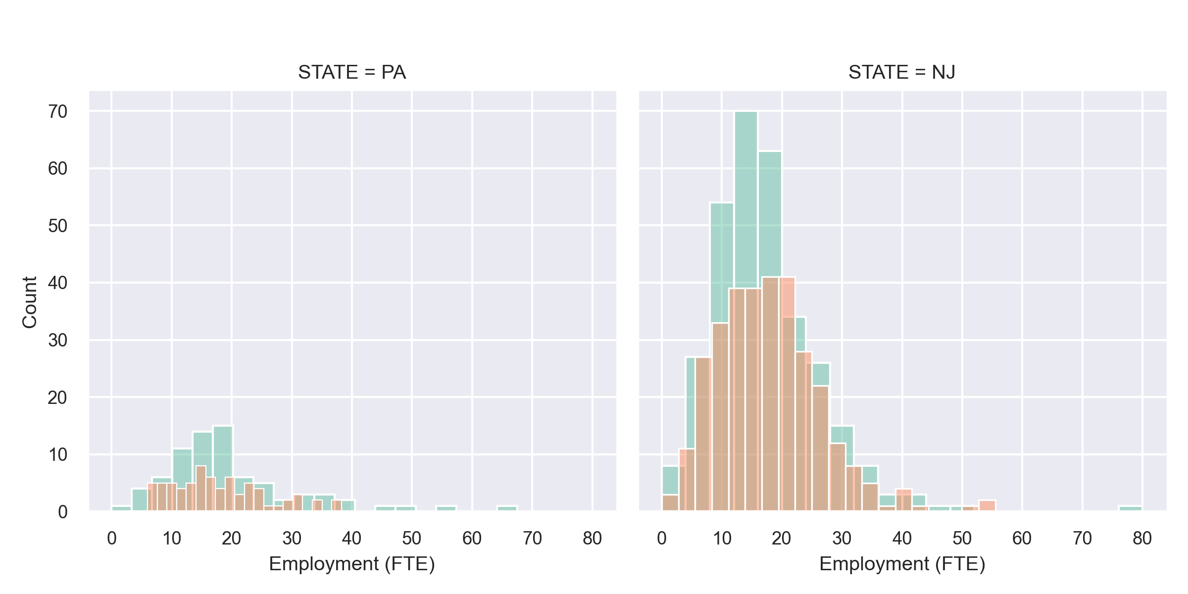
🧩 What the plot shows
- Each panel: employment distribution (full-time-equivalent workers) • Left: Pennsylvania (control) • Right: New Jersey (treatment)
- Teal = before, salmon = after April 1992 minimum-wage rise.
📊 Interpretation
New Jersey:
- Distributions almost identical before/after.
- No visible leftward shift → no layoffs.
- Slight rightward overlap → possible small employment rise.
Pennsylvania:
- Stable shape too; serves as baseline (no policy change).
Comparison:
- NJ restaurants larger on average.
- No NJ-specific employment drop.
- Visual evidence suggests no negative effect of higher minimum wage.
Visual Exploration 🖼️ Employment and Wages
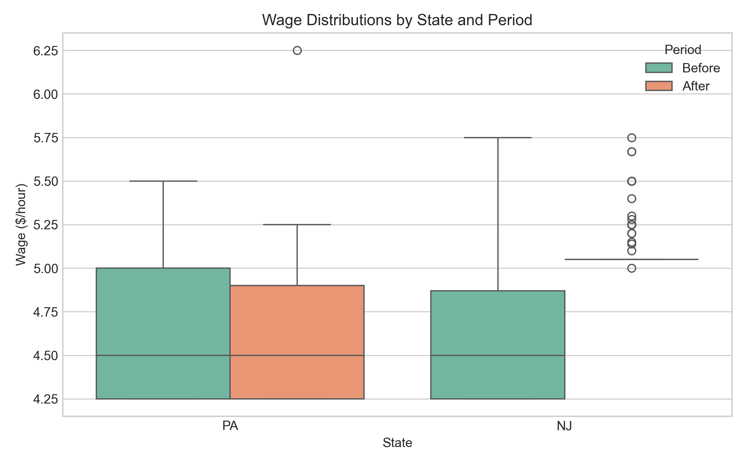
Wage boxplots reveal:
- Box = middle 50% of data (interquartile range); line inside = median
- Whiskers = typical range; points beyond = outliers
- NJ wages shift upward after April 1992 (as expected from mandated increase)
- PA wages stay flat (no policy change)
Interpretation 💬
Visual evidence suggests no obvious employment collapse. Histograms show stable employment; boxplots confirm NJ wage increases while PA remained flat.
But:
- EDA suggests patterns, not proof.
- Visual inspection can mislead—humans see patterns even in random data. We can’t tell from charts alone whether small changes are meaningful or just sampling variability.
This is why we need formal statistical inference.
Relationship Between Wage and Employment Change
Let’s examine whether restaurants that increased wages most also reduced employment most—supporting traditional theory.
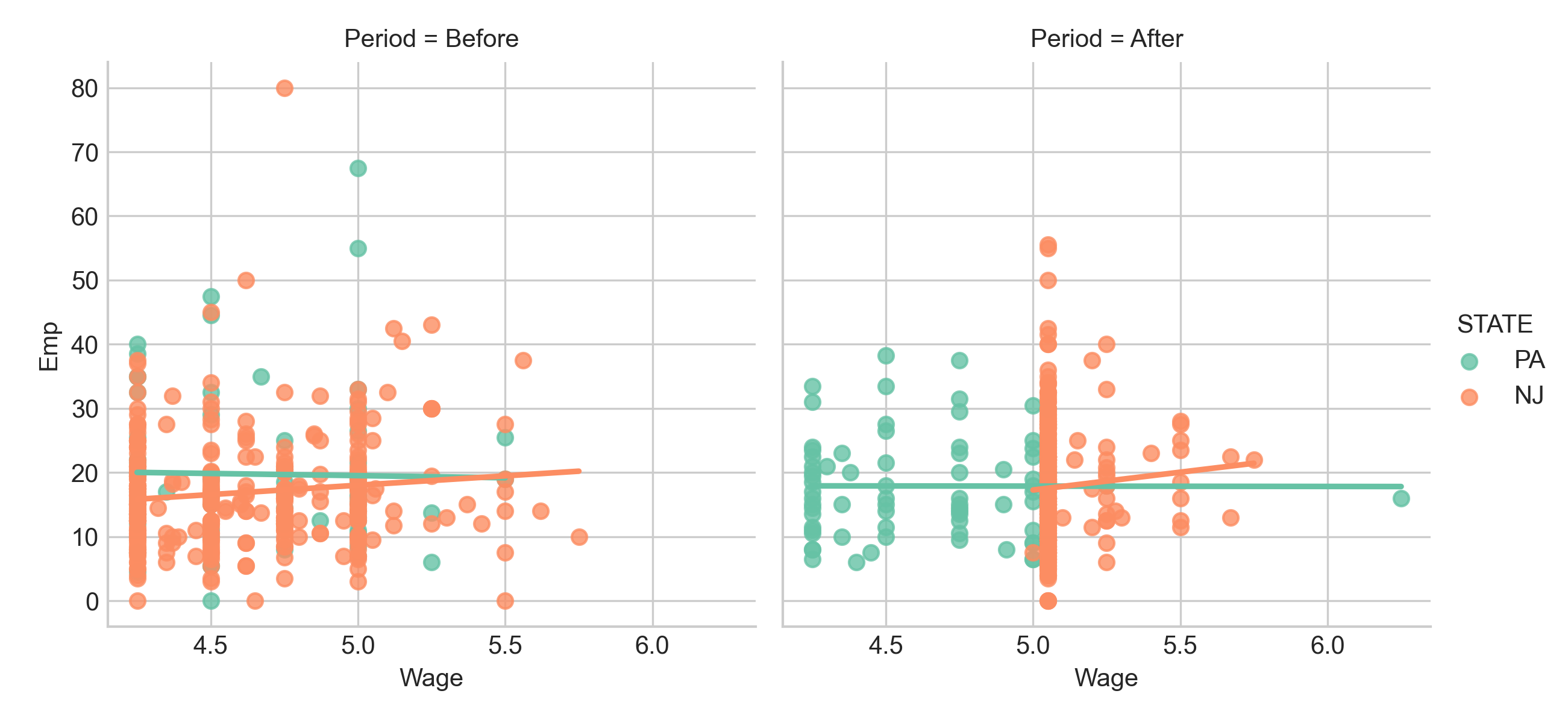
Reading this scatter plot:
- Each point = one restaurant
- Horizontal axis = wage change ($/hour)
- Vertical axis = employment change (FTE)
- If higher wage increases → larger employment reductions, we’d expect clear downward slope
What we observe:
Considerable variation. Some restaurants with large wage increases reduced workforce—but many maintained or increased employment. Restaurants appear in all four quadrants.
Crucially, no strong negative trend. If simple theory held, points would cluster along downward line—bigger wage increases = bigger employment drops. Instead, the relationship appears weak and noisy.
This challenges “higher wages → fewer jobs” as universal law. Perhaps other factors matter: local labour conditions, competition for workers, productivity effects, adjustment frictions.
But visual inspection isn’t enough. We’re seeing a sample of 410 restaurants, not the entire population. Could this weak relationship be real? Could strong negative relationship exist but be hidden by measurement error or confounding?
This is why we need formal inference: EDA generates hypotheses; statistical tests provide rigorous evidence about whether patterns are likely real.
Exploratory Data Analysis (EDA)
What EDA Is and Why It Matters
Exploratory Data Analysis (EDA) is the systematic visual and quantitative inspection of data before formal modelling or hypothesis testing. It’s the conversation you have with your data before making claims.
Why EDA is essential 🧠
| Purpose | What It Does | Example |
|---|---|---|
| Spot data quality issues | Identify errors, impossible values, missing data patterns | Employment = 999 instead of 99; negative wages |
| Understand distributions | Learn whether variables are normal or skewed; identify typical ranges | Most restaurants have 20-40 employees; wage distribution right-skewed |
| Discover relationships | Find correlations and patterns that inform analysis | Wage increases cluster in certain restaurant chains |
| Formulate hypotheses | Move from vague questions to specific testable predictions | “Does wage increase differ by restaurant size?” |
| Check assumptions | Assess whether statistical test requirements seem reasonable | Is employment change roughly normally distributed? |
Key principle: EDA is exploration and questioning—not yet proving or concluding. You’re gathering evidence, noting patterns, and generating theories before formal inference.
Spotting Gaps — A Preview of Missing Data
One of the most important skills: noticing what’s not in your data. Missing data isn’t just inconvenient—it can fundamentally bias conclusions.
Even Card & Krueger’s careful study had gaps:
- Wave 2 non-response: Some restaurants never responded to follow-up. If these were systematically different (struggling businesses unable to spare time?), their absence creates bias.
- Closures: A few restaurants closed after wage increase. Count as “employment fell to zero” or exclude? The choice changes conclusions.
- Partial responses: Some gave employment but not wage data, or vice versa. How we handle these affects estimates.
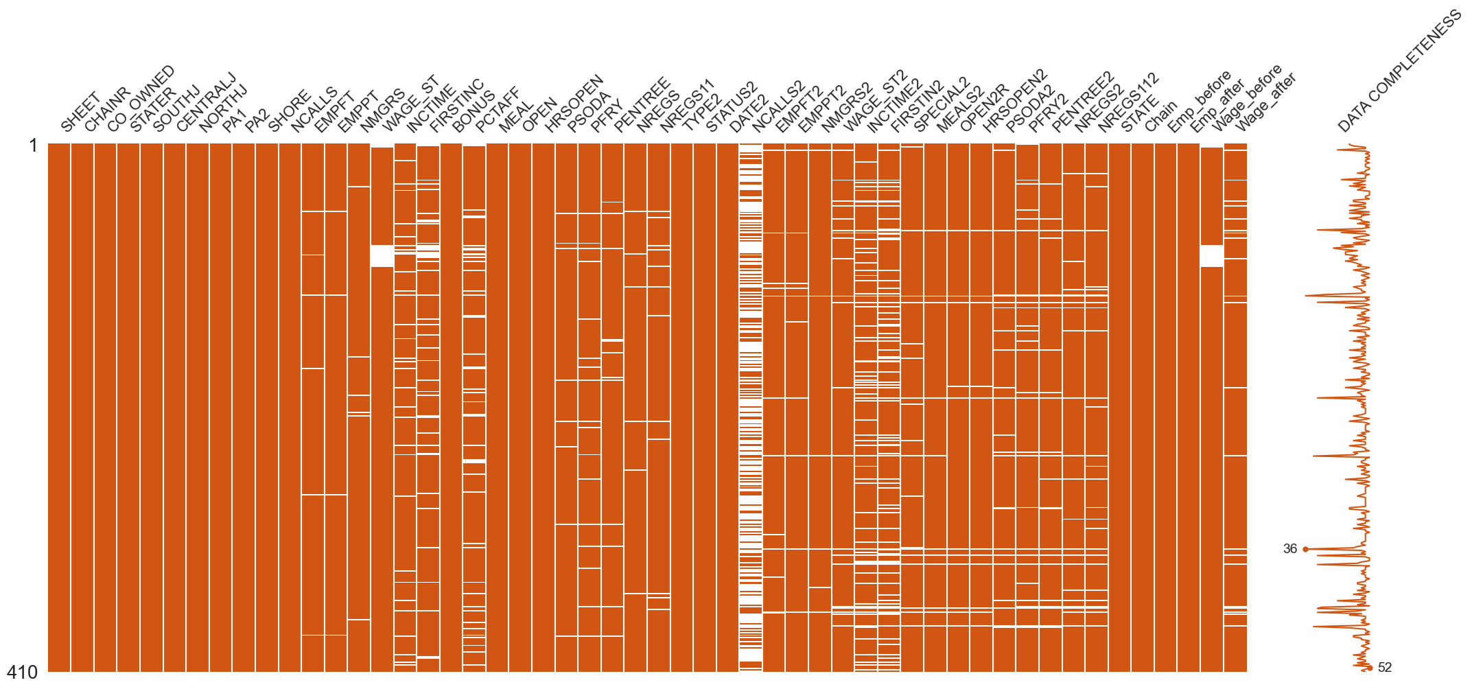
Missingness mechanisms matter because data rarely disappears randomly
| Mechanism | Definition | Example in Card & Krueger | Bias Risk |
|---|---|---|---|
| MCAR (Missing Completely At Random) | Probability of missing is unrelated to any variable | Research assistant spills coffee on random survey forms | Low—missing data just reduces sample size |
| MAR (Missing At Random) | Missingness depends on observed variables, not the missing value | Large chains more likely to skip questions, but we know chain size | Moderate—can often adjust statistically |
| MNAR (Missing Not At Random) | Missingness depends on the unobserved value itself | Restaurants with large layoffs less likely to respond | High—creates systematic bias |
If restaurants that laid off workers were more likely to close or refuse follow-up (MNAR), observed data would underestimate employment effects.
Always ask not just “What does my data show?” but “What might be hidden by what’s missing?”
Activity 🧩 — Your EDA Interpretation
Now it’s your turn to practice the kind of thinking that good EDA requires.
Exercise instructions:
Look again at the employment histograms, wage boxplots, and wage-employment scatter plot we examined earlier. Take 3–4 minutes to discuss with a partner:
Question 1: What patterns stand out to you?
- What shapes do you see in the distributions?
- Are there outliers or unusual features?
- What relationships (or lack thereof) do you notice?
Question 2: Are New Jersey and Pennsylvania comparable at baseline?
- Do the two states look similar before the policy change?
- If they differ substantially, how might that affect our conclusions?
- What assumptions are we making by using Pennsylvania as a control group?
Question 3: What questions should we test statistically?
- Based on what you’ve seen, what specific hypotheses would you want to test?
- What would constitute convincing evidence for or against an employment effect?
- What could cause us to reach wrong conclusions even with these data?
Activity 🧩 — Your EDA Interpretation
After your discussion:
We’ll do a quick Menti poll to gather your predictions:
“Based on the visual evidence, what do you expect the formal statistical test to show?”
Options:
- Employment in New Jersey rose relative to Pennsylvania
- Employment in New Jersey fell relative to Pennsylvania
- No significant change in employment
- Too noisy to tell—the data are inconclusive
This exercise helps develop your intuition, but remember: intuition and visual inspection are starting points, not conclusions. The formal statistical framework gives us tools to move beyond gut feelings to rigorous evidence.
What EDA allows you to show
What EDA allows you to show
Sampling and Bias
Live Sampling Demo 😴
Let’s make this concrete with real data from this very room. We’re going to conduct a miniature sampling study right now to illustrate key concepts about how we collect data and what can go wrong.
Menti (Scales question): “How many hours did you sleep last night?”
- Range: 0–10 hours
- Increments: 0.5 hours
- Display: Bar chart with average line
Instructions:
Pull out your phone, go to the Menti link on screen, and report how many hours you slept last night. Be honest—this is anonymous, and we’re using these data to learn about sampling, not to judge anyone’s sleep habits!
While you’re responding, consider:
- Are you typical of all LSE students?
- Who’s not in this room, and how might they differ?
- How accurate is your estimate of your own sleep?
This simple exercise creates a tiny dataset we can use to think deeply about representativeness, bias, and generalisability—concepts that apply whether we’re studying sleep in this classroom or employment in fast-food restaurants across two states.
Discuss the Results 🧩
Let’s analyse our mini-dataset. Looking at Menti results, we can calculate basic statistics and think about meaning.
Calculate together:
- Mean: Add all sleep hours ÷ number of responses
- Median: Middle value (half slept less, half more)
- Range: Gap between least and most sleep
- Outliers: Anyone unusually far from centre
Discuss the Results 🧩
Would this sample represent all LSE students? Let’s think systematically about potential biases:
| Bias Type | In Our Classroom Demo | In Card & Krueger Study |
|---|---|---|
| Selection | Only students attending this lecture, this day, this section are included. Might students who attend differ in sleep patterns from those who skip? | Only open, willing restaurants surveyed. Closed restaurants or those refusing to participate excluded. Might closed restaurants have been affected differently? |
| Non-response | Some students skip the poll—perhaps embarrassed, disinterested, or without phones. Does non-response correlate with sleep? | Some restaurants declined follow-up. Perhaps managers who made difficult staffing decisions were less willing to share. |
| Measurement | Self-reported sleep is notoriously inaccurate. People round, forget when they fell asleep, misremember. Social desirability may influence reports. | Managers report employment from memory or imperfect records. May round, estimate, or strategically misreport if they think it affects policy. |
The fundamental lesson: These biases operate at every scale. Whether surveying 30 students or 30,000 employees, the same logic applies.
Size doesn’t fix bias. A biased sample of 1,000,000 can be less informative than an unbiased sample of 100. Bias is systematic, not random—more data doesn’t wash it out.
Why Bias Matters 🎯
Definition: Bias is systematic error. It’s not random fluctuation—it’s a consistent tendency for estimates to be wrong in a particular direction. This makes it fundamentally different from sampling error.
Key insight: Size doesn’t fix bias. Enormous datasets can produce completely wrong conclusions if sampling is biased. Large biased samples can be more dangerous than small ones because they give false certainty.
Example 1: Geographic selection bias 💡
Want to estimate average cappuccino price in London. You systematically survey 500 coffee shops in a grid pattern—sounds rigorous!
But if you only survey shops within 10 minutes of LSE (Holborn), you’ll systematically over-estimate London-wide prices. Near-campus cafes cater to students and professionals in central London where rent is high. Coffee in Stratford, Croydon, or Barking tells a different story.
Surveying 5,000 Holborn shops won’t fix this bias. The solution isn’t more data—it’s better sampling design.
Example 2: Establishment-type selection bias
Want to understand fast-food wages and employment. Focus on McDonald’s because they’re easy to find and willing to share data.
But if McDonald’s is systematically different—larger, more corporate, different labour practices—results won’t generalise to all fast-food. KFC, local burger joints, and sandwich shops might respond very differently to policy changes.
10,000 McDonald’s won’t fix this. Problem isn’t sample size—it’s sample representativeness.
The lesson: Bias must be prevented through careful design before data collection. No statistical technique fully corrects for bias after the fact. Good design prevents systematic error (bias); statistics quantifies random error (sampling variability).
Populations and Samples
From Sample to Population 🌍
The distinction between population and sample is foundational to statistical inference.
The fundamental problem: We want to know about a population but can only observe a sample. How do we make reliable inferences from the part we see to the whole we can’t?
From Sample to Population 🌍
| Concept | Meaning | Symbol | Notes |
|---|---|---|---|
| Population | Complete set of all units we care about. For Card & Krueger: every fast-food restaurant in NJ and PA—including closed ones, non-participants, and ones never contacted. | \(N\) | Typically too large, expensive, or impossible to measure directly |
| Sample | Subset we actually observe. Card & Krueger surveyed 410 restaurants—these are the only ones with data. | \(n\) | Should represent population fairly; sampling design determines whether it does |
| Parameter | Numerical summary of the population—the “true” value we want but typically can’t observe. Example: true average employment change across all NJ restaurants. | \(\mu\) (mean), \(\sigma^2\) (variance), \(p\) (proportion) | Fixed, unknown quantities—the “ground truth” |
| Statistic | Numerical summary from our sample—what we actually compute. Example: average employment change in our 410 surveyed restaurants. | \(\bar{x}\) (sample mean), \(s^2\) (sample variance), \(\hat{p}\) (sample proportion) | Varies from sample to sample; our best estimate of parameters |
Key formulas:
Sample mean estimates population mean: \(\bar{x} = \frac{1}{n}\sum_{i=1}^{n}x_i = \frac{x_1 + x_2 + \cdots + x_n}{n}\)
Sample variance measures spread (\(n-1\) corrects for bias): \(s^2 = \frac{1}{n-1}\sum_{i=1}^{n}(x_i-\bar{x})^2\)
Sample standard deviation: \(s = \sqrt{s^2}\)
The challenge: How do we use \(\bar{x}\) and \(s^2\) (which we calculate) to make reliable statements about \(\mu\) and \(\sigma^2\) (which we want to know)? That’s what confidence intervals and hypothesis tests accomplish.
Mini Exercise 🧮
Practice identifying populations and samples. For each scenario, identify:
- The population (full group we want to understand)
- The sample (subset we observe)
- Representativeness concerns
- Limitations of generalisation
Scenario 1: Screen-Time Study 📱 Researchers survey 200 students about daily screen-time.
Scenario 2: Card & Krueger’s Restaurant Study 🍔 Card & Krueger surveyed 410 fast-food restaurants in NJ and PA.
Scenario 3: Library Visitors 📚 You count visitors entering the library every hour on Tuesday.
Discussion prompts:
| Scenario | Consider |
|---|---|
| Screen-time | If survey was online via Facebook groups, who’s systematically excluded? |
| Restaurants | Why fast-food specifically? Would findings generalise to all restaurants? To all employers? |
| Library | Why might Tuesday be unrepresentative? What about chosen hours? |
Take 3–4 minutes to discuss in pairs, then share as a class.
Sampling Design Matters ☕
Example 1 — Coffee and Productivity
Let’s explore a subtle point: the unit of analysis determines what population you’re studying and what questions you can answer.
Investigate: Does coffee consumption affect student productivity?
Seems straightforward, but how we collect data fundamentally shapes what we learn.
Two sampling strategies:
Strategy 1: Sample students - Randomly select students - Record cups consumed yesterday, hours studied, self-reported productivity
Strategy 2: Sample cups of coffee - Randomly sample all cups sold on campus yesterday - Record purchaser, purchase time, subsequent behaviour
Exercise ✍️
Form two groups—one per strategy.
Discuss: 1. What population does your sample represent? 2. What biases might appear? 3. Which better answers our research question?
🗣️ Share after five minutes.
Debrief — Coffee Example ☕
Let’s interpret what each sampling design really measures.
| Aspect | Strategy 1: Sample Students | Strategy 2: Sample Cups |
|---|---|---|
| Population | All students on campus | All coffee transactions |
| What’s measured | Typical student’s intake and productivity | Distribution of cups sold (not people) |
| Strengths | • Connects to individual behaviour • Can measure confounders (sleep, stress) • Can track same students over time |
• Very large dataset → low sampling error • Objective measurement • Observes real purchases, not recalls |
| Weaknesses | • Self-report bias (misremember intake) • Social desirability bias • Recall bias for studying time • Heavy drinkers may self-select |
• Over-represents frequent buyers • Under-represents non-buyers completely • Hard to link to productivity outcomes • Purchases ≠ consumption |
| Question answered | “How does average student’s coffee intake relate to productivity?” | “What does campus coffee purchasing look like?” |
Debrief — Coffee Example ☕
🧭 Takeaway: Both are random samples but from different populations answering different questions.
Always ask: What is my unit of analysis, and what population does it represent?
measurement: No recall bias for the transaction itself—we know a cup was sold
Real behaviour: Unlike self-reports, we observe actual purchases, not stated intentions or misremembered behaviour
Weaknesses and possible biases:
Over-represents frequent buyers: A student who buys five coffees per day contributes 35 observations per week, while a student who buys one per week contributes one observation. Our “sample” is heavily weighted toward heavy coffee drinkers.
Under-represents non-buyers: Students who never buy coffee (maybe they bring their own, or don’t drink coffee, or drink tea instead) are completely invisible in this dataset. We have zero information about them.
Difficult to link to outcomes: Even if we know who bought each cup, tracking their subsequent productivity is challenging. We’d need to follow purchasers around or match transaction data to academic records—raising privacy and logistics issues.
Purchases ≠ consumption: Someone might buy coffee for a friend, buy it but not drink it, or drink coffee that wasn’t purchased on campus
What question it answers: “What does the distribution of campus coffee sales look like?”—which is interesting for the campus café’s business model but doesn’t directly answer our question about individual productivity.
🧭 Critical takeaway:
Both sampling strategies are “random” in some sense, but they’re random samples from different populations and therefore answer different questions.
Strategy 1 treats students as the unit of analysis → answers questions about typical student behaviour
Strategy 2 treats transactions as the unit of analysis → answers questions about purchasing patterns but conflates frequent and infrequent buyers
The lesson: Before collecting data, always ask yourself: What is my unit of analysis? What population does each unit represent? And does my sampling design give me a representative sample of that population?
This isn’t just academic hair-splitting—it fundamentally determines what conclusions you can draw. In published research, many errors stem from treating one type of sample as if it were another.
Example 2 — Studying Wage Effects 💰
Apply the same logic to minimum wage studies.
Suppose we want to study how minimum wage affects employment.
Two possible samples:
Strategy 1: Sample restaurants - Randomly sample 10% of restaurants - Track all their employees
Strategy 2: Sample employees - Randomly sample 10% of all employees across restaurants
Exercise ✍️
In pairs, discuss:
- What does each sample represent?
- Which biases could appear?
- Which approach matches Card & Krueger’s study?
Debrief — Wage Sampling Example 💰
| Aspect | Strategy 1: Sample Restaurants | Strategy 2: Sample Employees |
|---|---|---|
| Unit of analysis | Each restaurant = one observation | Individual worker |
| Population | All fast-food establishments in region | All employees in region |
| Strengths | • Hiring decisions made at restaurant level • Matches policy mechanism • Captures firm-level responses |
• Captures worker-level variation • Shows individual hours/job loss • Individual employment probability |
| Weaknesses | • Large chains may dominate • Small independents under-represented |
• Firms with many workers over-represented • High-turnover outlets over-represented |
| Question answered | “Average change in employment per restaurant after wage rise” | “Average change in hours/employment probability per worker” |
🧠 Key insight: Changing the sampling unit changes the population and therefore the conclusion.
Card & Krueger sampled restaurants because policy affects firms’ hiring choices, not individual workers’ willingness to work.
Sampling is design, not decoration. Your sampling strategy determines the question you can answer.
Sampling Error vs Bias ⚖️
| Concept | What it is | Example | How we handle it |
|---|---|---|---|
| Sampling error | Random fluctuation from observing only part of population | Two random samples of NJ restaurants give slightly different average wages | ✅ Can be modelled statistically with probability theory |
| Bias | Systematic deviation from poor design, non-response, or measurement | If only large chains respond, results overstate average wage | 🚫 Must be prevented by design—no statistical fix |
Why it matters:
Sampling error is noise from randomness—every sample tells a slightly different story. We can use probability models to describe this variation.
Bias is distortion that pushes results in one direction. No statistical technique can fix it after data collection.
From description to inference ⏭️
To make sense of sampling error, we need:
1️⃣ A model for how estimates fluctuate (probability distributions)
2️⃣ Tools to summarise uncertainty—confidence intervals and hypothesis tests
That’s the starting point for statistical inference.
☕ Break Time — 10 minutes 🕒

Take a short break!
- Stretch your legs
- Grab coffee or water
- When we return: From estimation to testing—what does “significant” really mean?
(Lecture resumes in 10 minutes.)
Estimation: what we want to know 🎯
We rarely have data on entire populations, so we use sample statistics to estimate population parameters.
| Quantity | Represents | Symbol(s) | Examples |
|---|---|---|---|
| Average level | Expected or central value | \(\mu\), \(\bar{x}\) | Average employment per restaurant |
| Proportion | Share of units with property | \(p\), \(\hat{p}\) | Proportion that raised wages |
| Spread | How dispersed values are | \(\sigma^2\), \(s^2\) | Variation in hours or wages |
| Rate | Frequency of events per unit | \(\lambda\) | New hires per month |
Each estimate fluctuates from sample to sample—that variation forms a sampling distribution we use to quantify uncertainty.
Confidence intervals: quantifying uncertainty
We don’t just want a point estimate—we want a range likely to contain the true value.
The logic behind:
1️⃣ The sample mean fluctuates due to sampling error
2️⃣ We can model that variability
3️⃣ Central Limit Theorem says \(\bar{X}\) is roughly normal for large \(n\)
4️⃣ So a 95% confidence interval is: \(\text{Estimate} \pm 1.96 \times SE\)
where \(SE = s/\sqrt{n}\) (standard error)
Interpreting a 95% CI:
If we repeated this study many times, about 95% of the intervals would include the true value. We’re confident in the method, not any single interval.
Where ± 1.96 comes from
Key insight: 95% of the area under the standard normal curve lies between −1.96 and +1.96.
This is why we multiply the standard error by 1.96 for a 95% confidence interval.
Worked Example: NJ vs PA Employment ⚒️
From our sample, the mean employment change was 0.60 FTE with standard deviation 5.0 and sample size 410.
Calculate standard error: \(SE = \frac{s}{\sqrt{n}} = \frac{5.0}{\sqrt{410}} \approx 0.25\)
95% Confidence Interval: \(0.60 \pm 1.96 \times 0.25 = [0.10,\; 1.10]\)
Interpretation: We’re 95% confident the true mean employment change lies between +0.10 and +1.10 FTE.
What this means: The interval doesn’t include zero, suggesting employment didn’t fall (and may have risen slightly).
💤 Activity: Confidence Interval for Sleep Hours
Let’s estimate how much sleep this class gets on average.
Instructions:
1️⃣ Look at the Menti poll results: “How many hours did you sleep last night?”
2️⃣ Calculate together:
- Sample mean: \(\bar{x}\)
- Sample SD: \(s\)
- Sample size: \(n\)
- Standard error: \(SE = s/\sqrt{n}\)
- 95% CI: \(\bar{x} \pm 1.96 \times SE\)
Discuss:
- Does the CI include 8 hours (often cited as “optimal”)?
- Why might our estimate differ from population averages?
- What biases might affect this estimate?
From Estimation to Testing 🎯
- Confidence intervals tell us how uncertain we are about our estimate.
- Hypothesis tests answer a different question: Is an effect big enough to matter relative to that uncertainty?
Both use the same ingredients:
- Estimate from sample
- Standard error
- Sampling distribution
But they frame the question differently.
Hypothesis testing: structured questioning 🧩
| Symbol | Statement | Example |
|---|---|---|
| \(H_0\) | Null hypothesis—no effect | “No difference in mean employment between NJ & PA” |
| \(H_A\) | Alternative hypothesis | “NJ employment increased relative to PA” |
The process:
- Assume \(H_0\) is true (status quo, typically “no effect” or “no difference”)
- Compute a test statistic (z or t) that measures how far our estimate is from the null value (often zero), expressed in standard errors: \(\text{test statistic} = \frac{\text{estimate} - \text{null value}}{SE}\)
- Under the assumption that our sampling distribution is approximately normal (justified by Central Limit Theorem for large samples), ask: How likely are data this extreme if \(H_0\) were true?
- That probability = the p-value
The p-value — Meaning & Limits 🔍
\(p = P(\text{observing a test statistic as or more extreme than ours} \mid H_0 \text{ is true})\)
| p-value | What it means | What it does NOT mean |
|---|---|---|
| < 0.05 | Data unlikely under \(H_0\) → evidence against \(H_0\) | ❌ “Probability \(H_0\) is false” |
| > 0.05 | Data consistent with \(H_0\) | ❌ “Proof \(H_0\) is true” |
Example:
NJ–PA difference = 0.6, SE = 0.25
\(z = 0.6/0.25 = 2.4 \rightarrow p = 0.016\)
Evidence against \(H_0\) (no employment effect).
The p-value as a ‘Surprise Score’ 🎁
If \(H_0\) describes a world with no difference, the p-value tells us how surprising our data would be in that world.
Low p → high surprise → doubt \(H_0\)
But remember:
- Surprise ≠ importance (statistical vs practical significance)
- Large \(n\) makes \(p\) tiny even for tiny effects
- Small \(n\) makes \(p\) large even for big effects
Common misinterpretations:
- p-value is NOT the probability that \(H_0\) is true
- p-value is NOT the probability of replicating the result
- p < 0.05 doesn’t mean the effect is large or important
You’ll see more of this in the upcoming formative. Also see (Aschwanden 2015), (Greenland et al. 2016), (Nuzzo 2014), (Nuzzo 2015) and (Bohannon 2015)
🤔 Why 5 %?
The “magic” 0.05 threshold isn’t magical at all — it’s a historical rule of thumb.
R. A. Fisher (1920s) suggested 5 % as a convenient cutoff for “rare events,” not a law of nature.
It means: if the data would occur less than 1 in 20 times under the null hypothesis, we call it “statistically significant.”
Other fields use other levels:
- Physics → 0.000001 (5 σ)
- Medicine → 0.01 or 0.10 depending on risk trade-offs
The threshold should reflect context and consequences, not tradition.
Takeaway: 0.05 is a convention to guide judgment, not a rule that determines truth.
What affects the p-value 📈
Three key factors determine whether you’ll get a small p-value:
| Factor | Direction | Explanation |
|---|---|---|
| Sample size ↑ | p ↓ | More precision → easier to detect effects |
| Effect size ↑ | p ↓ | Stronger signal → more surprise under \(H_0\) |
| Variability ↑ | p ↑ | More noise → harder to detect signal |
Implication: You can get p < 0.05 by:
- Finding a large, meaningful effect (good!)
- Collecting massive amounts of data to detect a tiny, meaningless effect (less useful)
Always report effect size alongside p-values.
Visualising p-values
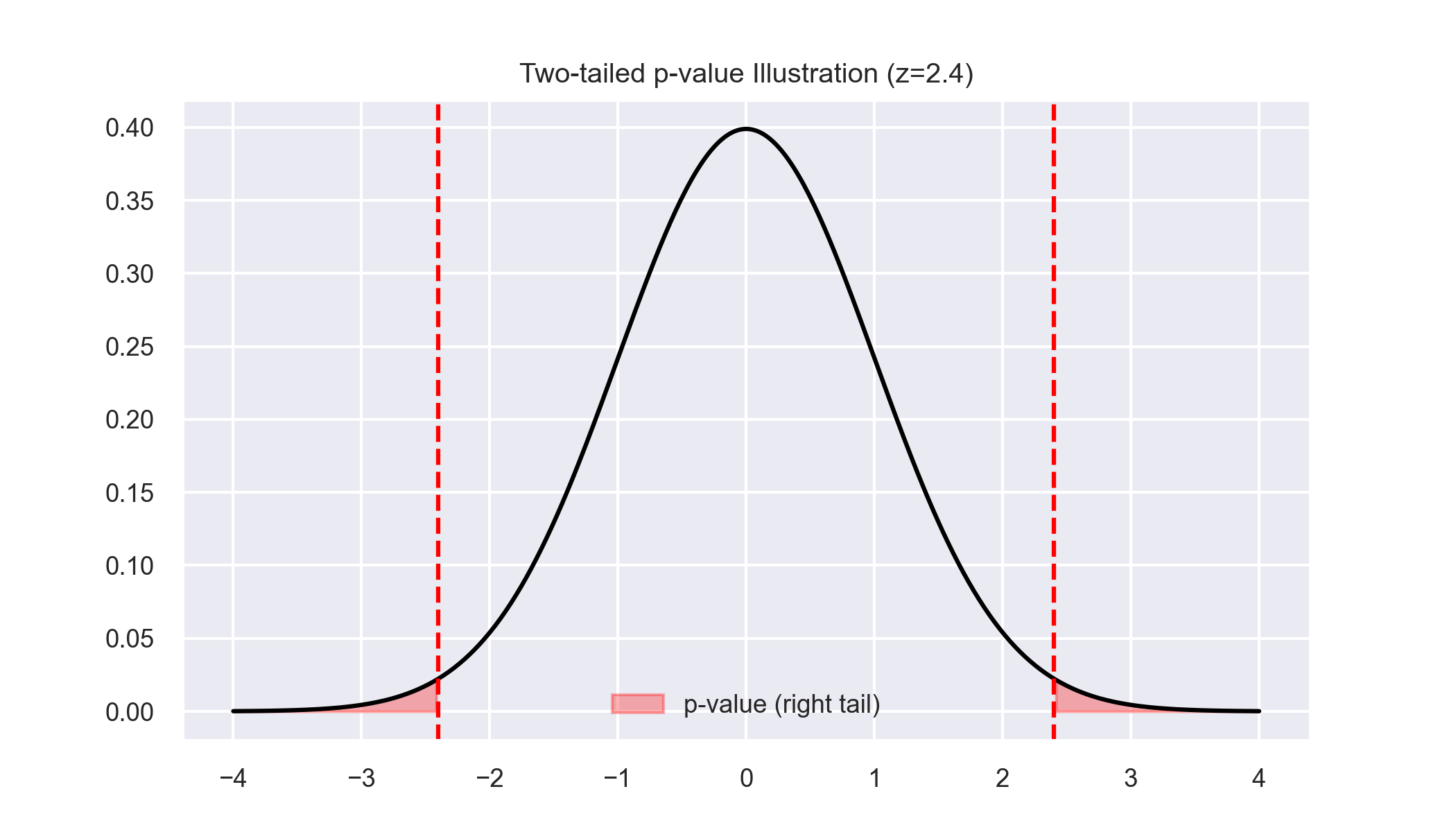
How to read this:
- Grey curve = null distribution (what we’d expect if \(H_0\) were true)
- Red tails = extreme values that would surprise us
- Our test statistic (red line) falls in the tail
- Shaded area = p-value
The further into the tail, the smaller the p-value, the more evidence against \(H_0\).
Confidence intervals & tests: same logic 🔗
CIs and hypothesis tests are two sides of the same coin:
| Relationship | Interpretation |
|---|---|
| If 0 inside 95% CI | p > 0.05 (not statistically significant) |
| If 0 outside 95% CI | p < 0.05 (statistically significant) |
Both use the same sampling distribution—just different ways of presenting the evidence.
Central Limit Theorem Simulation
Key insight: A 95% CI contains all values of the parameter that we wouldn’t reject at the 5% level.
Randomised Experiments / A-B Testing 🧪


![]()
Randomised Experiments / A-B Testing 🧪
Random assignment balances confounders → enables causal inference.
| Group | Treatment |
|---|---|
| A (Control) | Standard condition |
| B (Treatment) | New intervention |
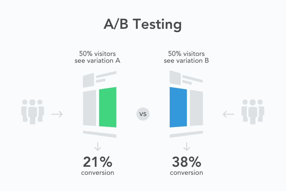
Image source: Devopedia
Same logic across contexts:
- Card & Krueger → policy change (NJ) vs no change (PA)
- Online A/B test → new website feature vs old
- Medical RCT → drug vs placebo
Why randomisation matters:
- Makes groups comparable on average
- Balances observed AND unobserved confounders
- Allows causal interpretation (not just association)
Correlation — Measuring Co-movement
Correlation (\(r\)) measures strength and direction of linear relationship between two continuous variables.
\(r = \frac{\sum (x_i-\bar{x})(y_i-\bar{y})}{\sqrt{\sum (x_i-\bar{x})^2}\sqrt{\sum (y_i-\bar{y})^2}}\)
| \(r\) | Interpretation |
|---|---|
| +1 | Perfect positive linear relationship |
| 0 | No linear relationship (might still be nonlinear!) |
| −1 | Perfect negative linear relationship |
Key properties:
- Unit-free—changing measurement scale doesn’t affect \(r\)
- Outliers can strongly distort \(r\)
- Only captures linear dependence
- \(r^2\) shows proportion of variance explained by straight-line fit
Coffee ☕ and Productivity 📚
Here \(r \approx 0.69\) → moderate positive correlation.
Possible explanations:
- Caffeine → alertness → more studying ☕→📚
- OR busy students both study more AND drink more coffee 📚↔︎☕
- OR a third factor (fatigue, deadlines) drives both ⚡→📚+☕
Critical point:
Correlation alone can’t tell us:
- Direction of causation
- Whether there’s causation at all
- What confounders might be at play
Spurious Correlations 🎭
Correlation ≠ causation
Sometimes both variables are driven by a lurking variable, creating spurious correlation.
For more on causation, see (Pearl and Mackenzie 2018)

Spurious Correlations 🎭


Check more on the Spurious Correlations website
Spurious Correlations 🎭


Check more on the Spurious Correlations website
Spurious Correlations 🎭


The lesson: Always ask “What else could explain this pattern?”
Check more on the Spurious Correlations website
Categorical Associations
When both variables are categorical, use contingency tables and the χ² test.
Example: Smoking and test results
| Positive | Negative | Total | |
|---|---|---|---|
| Smoker | 80 | 20 | 100 |
| Non-smoker | 40 | 60 | 100 |
| Total | 120 | 80 | 200 |
Chi-square test: \(\chi^2 = \sum \frac{(O-E)^2}{E}\)
where \(O\) = observed count, \(E\) = expected count under independence
Effect size: Cramer’s V \(V = \sqrt{\frac{\chi^2}{n(k-1)}}\)
Here \(V \approx 0.4\) → moderate association
Simpson’s Paradox: When Aggregation Misleads
A pattern in overall data can reverse within subgroups.
Usually caused by an unevenly distributed confounder.
Think of it as “aggregation bias”—combining groups inappropriately hides the real pattern.
This is one of the most important warnings in all of statistics: Always check whether your aggregated results hold within meaningful subgroups.
For more on this paradox, see this Youtube video or this video
Real Example: The Whickham Study (UK 1970s) 🚬
20-year follow-up study of 1,314 women initially surveyed in 1972–74 (see (Appleton, French, and Vanderpump 1996)).
Surprising aggregate finding: Smokers appeared to have lower mortality!
But stratified by age:
| Age group | Smokers dead (%) | Non-smokers dead (%) | Sample size |
|---|---|---|---|
| 18–44 | 3 | 1 | 502 |
| 45–64 | 14 | 8 | 513 |
| 65+ | 73 | 65 | 217 |
| All ages | 16 | 15 | 1,314 |
Within every age group, smokers had higher mortality.
The paradox: Smokers were younger on average → aggregate mortality looked lower → Simpson’s reversal
Why Simpson’s Paradox Matters 🎯
Four critical lessons:
- Aggregation can conceal or reverse relationships
What’s true overall may be false within every subgroup (or vice versa)
- Importance of conditioning on confounders
Always check whether a third variable might be driving both variables of interest
- Connects to causal inference
Controlling for the right variables restores truth; controlling for wrong ones distorts it
- Question your aggregations
Always ask: “Could subgroups tell a different story?”
Practical advice: When you find a surprising result, stratify your data by potentially important variables (age, location, size, time) to see if the pattern holds.
Week 04 Summary 📘
| Concept | Key Takeaway |
|---|---|
| EDA | Explore and question data before modelling—spot issues, understand patterns, form hypotheses |
| Central Limit Theorem | Sample means stabilize and become normal as \(n\) grows—enables inference |
| Confidence Intervals | Quantify range of plausible population values with specified confidence |
| Hypothesis Tests | Structured framework for assessing evidence against null hypothesis |
| p-values | ‘Surprise score’ under \(H_0\)—not probability that \(H_0\) is true |
| Correlation | Measures linear association—but correlation ≠ causation |
| Categorical Association | χ² test and Cramer’s V for relationships between categories |
| Simpson’s Paradox | Beware aggregation bias—check subgroups before concluding |
Looking Ahead — Week 05 📉
“We’ve measured uncertainty and association; next week we’ll model relationships explicitly.”
Coming up:
- Simple & multiple regression—modeling \(Y\) as a function of \(X\)
- Interpreting coefficients—what does each number mean?
- Checking assumptions & diagnostics—when can we trust our model?
- Rogoff–Reinhart case study—a cautionary tale about coding errors
References

LSE DS101 2025/26 Autumn Term